Guest essay by David Burton
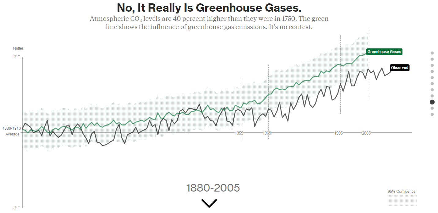
Bloomberg’s Eric Roston and Blacki Migliozzi are just regurgitating made-up, model-generated nonsense, in place of real data. You want proof? Look at their graph of “greenhouse gases.”
I saved a copy on my web site, here (with four X-axis markers spliced together from four screenshots). Here’s a shrunken version:
![bloomberg_GHGs[1]](https://wattsupwiththat.files.wordpress.com/2015/06/bloomberg_ghgs1.png?quality=75)
Click image for the full-size version:
Here’s a close-up of the key part of the full-size version of their graph, showing the period for which we have Mauna Loa CO2 measurement data (March 1958 to present):
![bloomberg_GHGs_cropped[1]](https://wattsupwiththat.files.wordpress.com/2015/06/bloomberg_ghgs_cropped1.png?quality=75)
Compare that to a graph of actual measured CO2 levels since 1958:
![co2_data_mlo[1]](https://wattsupwiththat.files.wordpress.com/2015/06/co2_data_mlo1.png?quality=75)
Reality doesn’t look very much like the Bloomberg graph, does it?
For one thing, Roston & Migliozzi ended their graph with 2005, because GISS gave them old data. That’s convenient, considering the widening divergence between models and reality:
![spencer-73-cmip5-model-fail[1]](https://wattsupwiththat.files.wordpress.com/2015/06/spencer-73-cmip5-model-fail1.png?quality=75)
For another, if you read the “methodology” section of the Bloomberg piece, you’ll discover why Roston & Migliozzi showed no separate scale for their GHG levels. It’s because, despite the “greenhouse gases” label on their graph, they did not actually graph greenhouse gas levels.
That’s right. even though the graph’s caption says, “It Really Is Greenhouse Gases,” they really did not graph greenhouse gases.
Instead, they graphed what GISS’s favorite computer model apparently calculated that temperatures ought to have been, in an alternate reality in which GHG levels increased as they really did, but all other possible causes for climate change remained constant. (That’s the sort of thing they call an “experiment” these days, at NASA GISS. The scientists who made NASA great must be spinning in their graves.)
In other words, their graph just illustrates the assumptions in their own model.
Even so, it’s still obviously very wrong, and here’s why:
First: look at all those zig-zags, up and down, in their graph of GHG levels. Out of the 47 years they graphed since 1958, they show downward-zags in GHG levels for about a dozen of those years.
But there are no downward-zags in the real GHG data. CO2 levels have been monotonically rising at least since 1958 (and almost certainly well before that), and we have excellent, precise measurements since March, 1958.
Likewise, as far as is known, the (distant) second-most-important GHG, CH4 (methane), has not seen any decreases in levels over that time period (though good measurements don’t go back as far as for CO2). CH4 levels plateaued for a while, but they have never dropped, since measurements began.
Supposedly they actually graphed the temperatures which GISS’s ModelE2 model calculated would be caused by GHG forcings alone. But those model-calculated temperatures obviously could not driven solely by GHG levels, because, if they were, they could not decline as GHG levels were continuously increasing. So, at the very least, GISS clearly had other factors in their model driving temperatures, which were conflated with GHGs, which did not remain constant, and which also affected the reported calculated temperatures. If nothing else, they’re were at least driven by pseudo-random number generators (“fake noise”).
In fact, if you examine the source code, that model has lots of pseudo-random number generator calls! ModelE2 consists of about a half-million lines of moldy Fortran code, which it is safe to assume nobody actually understands. They’ve got so many fudge factors, “knobs” and pseudo-random number generator calls in there that they can make it do just about anything at all, but It doesn’t in any sense represent an understanding of the Earth’s climate system.
That means their so-called “experiments” with varying climate inputs are just about useless. Their “experiments” don’t really test anything except their ability to write Fortran code which models their own assumptions.
“With four parameters I can fit an elephant, and with five I can make him wiggle his trunk.”
– attributed to John von Neumann
Second, look at the slope of that green line. Roston & Migliozzi show an essentially constant upward slope in “greenhouse gases” (GHG-derived modelE2-predicted temperatures) for the entire Mauna Loa CO2 record period. But that’s just plain wrong. There was actually a large, sustained acceleration in the rate of CO2 level rise in the 1960s through 1980s.
It would be instructive to compare the first ten years of that record (1959-1969) with the last ten, but since GISS / Roston & Migliozzi ended their graph with 2005 we’ll have to compare to the last ten which they graphed, instead: 1995-2005.
From 1959 (the first full year of Mauna Loa data) to 1969, the annually averaged CO2 level at Mauna Loa increased from 315.98 to 324.63, an average increase of only 0.865 ppmv per year. But from 1995 to 2005 (the last ten years of Bloomberg’s graph), CO2 went from 360.88 to 379.67, an average increase of 1.879 ppmv per year, or more than twice the 1959-1969 rate of rise.
The rate of CO2 rise more than doubled, which is a hefty acceleration, but that acceleration is missing from Bloomberg’s graph.
In fact, they actually show a slightly larger increase for the 1959-1969 period than for the 1995-2005 period. I used WebPlotDigitizer to digitize points from the green (“greenhouse gases”) line of Bloomberg’s graph, for 1959, 1969, 1995 & 2005. The increase from 1959 to 1969 is actually 12% greater than the increase from 1995 to 2005. (I digitized those points before I realized that they hadn’t actually graphed greenhouse gas levels. So, assuming that 1959 represented 315.98 ppmv CO2 and 2005 represented 379.67 ppmv CO2, from the measured graph points I calculated 1969’s CO2 level as 331.70 (compared to the actual level of 324.63), and 1995’s level as 365.54 (compared to the actual level of 360.88). In other words, if that had actually been a graph of greenhouse gas levels, then it would show a 1959-1969 ten year increase of 15.72 ppmv CO2 [compared to the actual increase of only 8.65 ppmv], verses a 1995-2005 ten year increase of only 14.14 ppmv CO2 [compared to the actual 18.79 ppmv]. That made me think of Jeff Foxworthy: If you think GHG levels increased by less from 1995 to 2005 than they did from 1959 to 1969, you might be a Bloomberg subscriber.)
They didn’t really graph GHG levels, they graphed the supposed effect on temperature of GHG levels, but even that wasn’t realistic. The warming effect of CO2 diminishes logarithmically as levels go up, so it is true that an increase in CO2 levels starting from 316 ppmv causes less warming that an increase by the same amount starting from 361 ppmv. But the warming effect is not reduced by nearly as much as the Bloomberg graph indicates.
You can calculate it (very closely) like this: (18.79 / 365.5) / (8.65 / 316) = 1.88 In other words, the 18.79 ppmv ten-year increase in CO2 from 365.5 starting in 1995 should have caused 188% of the warming which was caused by the 8.65 ppmv ten-year increase from 316 ppmv starting in 1959. But the GISS / Bloomberg ModelE2 graph shows only 90% (rather than 188%) of the warming effect from CO2 for the 1995-2005 period, compared to the 1959-1969 period.
There’s obviously something very wrong with their model. (My guess is that they’ve been “tweaking the knobs” to try to minimize the model’s divergence from reality without dialing back climate sensitivity or the importance of CO2, either of which would amount to admitting they were wrong, and anthropogenic CO2 isn’t a catastrophe.)
Third, and most obvious: look at Bloomberg’s supposed “95% confidence interval” for “greenhouse gases.” Do you see it? They have just as much “confidence” for 1880 as they do for 2015!
What nonsense! The truth is that we know almost exactly what all the GHG levels are for recent decades, and we have only very rough estimates for the 1800s and the first half of the 20th century. It is ridiculous to ignore the confidence interval of the supposed driver, when calculating the confidence interval of the supposed effect. But that’s exactly what they obviously did.
“… In other words, their graph just illustrates the assumptions in their own model.
Even so, it’s still obviously very wrong, and here’s why:”
Amazing! Thanks for the post and the information.
It seems every time I look at the graphs, charts, or output from the alarmist side it is full of chicanery. Always.
Mark, could not have put it better myself. I have said before that the whole scenario is ALWAYS doom and gloom. They never, for instance, mention increased crop yields, beneficial effects of increased temperature (although they probably haven’t mentioned that latter because there has been no increase in temperature).
Their predictions without exemption art all totally wrong!
1. Create crisis.
2. Never let a crisis go to waste.
3. Profit.
The data plotted for CO2 isn’t actual CO2 but temperature response to CO2, as are all the other factors, see:
http://www.bloomberg.com/graphics/2015-whats-warming-the-world/data/forcings.csv
The confidence intervals are for the AOGCM simulations and are not for the observational SAT time series.
The random numbers are all used based on the uncertainties of the underlying estimates, those random numbers are all fixed prior to the actual run.
If you have any further questions, you should directly contact either Kate Marvel or Gavin Schmidt.
From ICU:
If you have any further questions, you should directly contact either Kate Marvel or Gavin Schmidt.
Yes, listed at the end, and apparently overlooked. The stuff is basically a retelling of a 2014 CMIP paper co-authored by Schmidt.
“Atmospheric CO2 levels are 40% higher than they were in 1750. The green line show the influence of greenhouse gas emissions. It is no contest.”
That’s dodgy IMO. First sentence alleges a measurable fact. The second line does not clearly state that a model is plotted. The words “It’s no contest” implies a contest between stated CO2 levels and the GISS temp history. I believe the intent is probably more to confuse than to be clear, and certainly totally the avoids the issue whether the relationship is logarithmic or not. If not, this is totally outside of “consensus” science and Bloomberg should have the duty to have the proponents of this data explain their new theory on sensitivity.
I am living on the west coast close to Seattle and it is the hottest summer that we have recorded in history. The temperature has risen to over a hundred degrees on a few days, and yes there has been a huge change in the temperature. Yesterday it was 106 degrees F and that’s not normal here. People in Pakastan are dying from heatstroke and you’re over here hopping around and farting, saying “Oh it’s just a hoax. I know everything I am so educated and I have an associates degree in cash registering.” It doesn’t take a genius to understand how climate change works. It doesn’t even take an educated person to undrestand it. If you’re going to believe politicians over scientists, then you probably don’t care much for you kids’ and grandkids’ generations. Politicians are trying to make you deny climate change because if you believe it coal burning energy companies will lose a lot of money. So if you value future genorations, why don’t you just spread the word about it and eventually if everyone beleives it, we will start to take action and hopefully we will bring climate change to a halt. And also, energy will be much more affordable and less commercial.
Benno: “Yesterday it was 106 degrees F and that’s not normal here.”
No, it was nothing of the sort.
Why do you alarmist buffoons lie all the time?
The CAGW disciples need their Constantine.
Sorry Bloomberg it ain’t gonna be you. , Poorly constructed plagiarism won’t cut the mustard.
And it isn’t you either little “o” – you cant even get close to those high notes. – At least C produced a convincing argument for his time and occupied (by force of arms) some nifty buildings.
Whoever, it will have to be someone who can offer up something akin to the ‘loaves and fishes’ gig, lot’s of luck.
Hey Bloomberg, have you considered how this ludicrous rehash will impact on your core business?
I like the subheading in the top graph. They claim CO2 is 40$ higher than in 1750, but they neglect to add that it is currently 25% less than in the 1940s and was higher than now during tow other periods in the 1800s. (Ernst Beck’s paper on direct CO2 chemical bottle data over 200 years)
Higley7: Even if the measurements were accurate, Beck’s record don’t constitute a record of GLOBAL atmospheric CO2. The amount of CO2 in the air isn’t constant everywhere – it is perturbed by local sources of CO2 and sinks for CO2. (Allegedly, the amount of CO2 in the air between spears of grass in a lawn on a still day is much lower than a few meters above, because photosynthesis has depleted the CO2.) Mauna Loa was the first experiment that attempted to make a proper long-term record of CO2 with fixed reliable methodology at a single site as far away from sources and sinks as possible: 4 km above the Pacific Ocean where there are steady winds and at night when the air being sampled subsides from far above the mountain top and becomes off-shore breezes.
Then we have numerous ice cores, which all say that the level of CO2 in two different polar regions (also far from sinks and sources) was stable for 100 centuries before the Industrial Revolution, but dropped during ice ages and began to rise gradually after the Industrial Revolution began. It is possible that more diffusion takes place in these cores than scientists expect, but the data is difficult to reconcile with the large random changes in Beck’s record.
The record of consumption of fossil fuel, ice cores and Mauna Loa combined create a consistent picture of how GLOBAL levels of CO2 in the atmosphere have changed with time. Beck’s compilation is incompatible with this picture. All experimental data isn’t equally reliable, and the experiments compiled by Beck weren’t performed under conditions that create a meaningful challenge (IMO) to this picture.
Right.
I saw that BS in the anti-skeptic talking points, too.
It’s still wrong.
And readings from an Hawaiian volcano ARE representative? A-hem.
If you think that measuring temperature on a hot asphalted parking lot is representative for global temperatures, then the late Ernst Beck’s data show historical global CO2 levels of that time…
Mauna Loa indeed is on a volcano but mostly measures trade winds and if the wins is downslope from the vents (or upslope from the valley) these data are noticed but not used for daily to yearly averages.
Moreover CO2 was measured at the South Pole first, where the nearest volcano is thousands of km away and no vegetation can interfere, in contrast to many historical measurements taken in the middle of Paris, Philadelphia, forests, below, between and over growing crops (!) etc…
See for the many stations that measure CO2 in minimum contaminated places:
http://www.esrl.noaa.gov/gmd/dv/iadv/
And my comment on Beck’s data, after several years of direct discussion with him:
http://www.ferdinand-engelbeen.be/klimaat/beck_data.html
I would really enjoy the debates. Only the question is not whether global warming ‘is’ or ‘is not’. The fact is 97% of the real scientific body on this planet is screaming beware! This warning incudes the Pontifical Academy of Sciences and the Pope. So if 97 of the 100 canaries in your coal mine were sick or dying, would you continue to go in that coal mine?? I think not. This is about risking our planet. Who would play that game when your canaries are dead?
The green line shows the influence of greenhouse gas emissions, not the actual co2 level.
Remember, CO2 emission to temperature rise in not linear, so the two graphs should not look the same.
Wait… do you ACTUALLY believe what you just typed?!?!?!
so what ever happend to this…. ?w=380&h=351
(ok, something going on that I’m not aware of, scratch that last link and use this one)
what ever happened to this….
http://drtimball.com/wp-content/uploads/2012/05/Callendar-circle.gif
The surface boundry layer affects local mixing of CO2 from the soil biology. This varies with wind speed.
Thererfore the “apparent” CO2 concentration at the surface varies with wind speed. That’s pretty erratic.
As technology improved, the existence of the boundry layer caused increased interest in taking measurements from balloons, to get above the boundry layer. There are many papers on this. Pielke has a summary paper on surface boundry layer effects.
One of my all-time favorite charts. Apparently, the scatter in the 1800s is quite real. That is to say not measurement error, bias or sampling artifact. The selection of all the low points to construct the historical record tells it’s own story.
I have always thought it would be interesting to monitor at sea level as winds come off the ocean. The monitored level would vary, at the least, according to sea surface temperature and barometric pressure. It would be interesting see how large the range goes, and if you really do see a 280-550 ppm spread on an hourly, daily, seasonal basis. Well mixed, anyone?
TonyL,
Only in the first few hundred meters over land, CO2 levels are not mixed, as many sources and sinks are at work. One can measure 600 ppmv in a forest at night under inversion and 250 ppmv during the day when photosynthesis is at work. Once above a few hundred meters and everywhere over the oceans, CO2 levels are within 2% of full scale. No matter if you measure near the North Pole (Alert, Barrow) at sea level, Mauna Loa at 3,400 m or the South Pole at near 3,000 m. That is for 95% of the atmosphere (as mass).
La Jolla, Barrow, Alert and other stations are coastal and measure mostly CO2 with winds from the ocean side. The (1 hour average) raw data from Barrow can be plotted, here for 2007-2008:
http://www.ferdinand-engelbeen.be/klimaat/klim_img/co2_trends_brw_2007_2008.jpg
Most of the outliers are when the wind blows from land side…
Professor Tim Patterson, (who does have the right credentials), commented on the Reuters “model” … “Since there has been no warming since 1998 during the so-called pause with a massive disconnect between model projections and global temperature reality I think that I am doing ok so far. As to the Bloomberg article by Roston and Migliozzi, an accurate deconstruction by David Burton was published two days ago on “Watts Up With That” entitled “Bloomberg’s made-up climate widget” that summarizes what is wrong with the figure that you forwarded quite nicely. See: http://wattsupwiththat.com/2015/06/27/bloombergs-made-up-climate-widget/
The disconnect between reality and the stuff that you get from the media, including the piece that you passed on, is quite remarkable. A lot of checking brains at the door going on these days….
all the best
Tim”
As I understand it, Canadian businesses operating in the north and needing to know viability of “Ice Roads” in light of “Global Warming”, paid Professor Patterson to do research. Perhaps our Government needs to listen to his conclusions!
Greg.
“Roston, … holds an M.A. in Russian history, and a B.A. in modern European history, both from Columbia University.”
Perfect academic training for contributing to the subject matter of climate change, Comrade reader.
Reminds me of a certain viscount in Great Britain with a BA in the classics, and a diploma in journalism.
..
Perfect academic training for contributing to the subject matter of climate change.
The aforementioned Viscount tends to be very careful with the scientific data he uses…so they’re quite different in that respect at least.
“Reminds me of a certain viscount in Great Britain with a BA in the classics, and a diploma in journalism.”
No, not really.
Hi mark.
Hmm M.A.in Russian history wonder what he did his Thesis on. No PHD?
michael
ad hominem – leave that to the alarmists
JEyon
no ad hominem. His B.A. was modern European History. He did a masters in modern Russian history
I majored military history and minored in Soviet studies. He seemed to like history why did he change areas of interest? And I really wonder what his take of modern Russia history is. Know your enemy and all that.
michael
Mike the Morlock –
i was actually responding to Mark from the Midwest and his issue of Roston’s credentials – nothing changes ad hominem from being ad hominem – Roston may in fact be wrong due to lack of training – but first you have to prove him wrong – not assume that he first
JEyon, When you study history you must learn how to “do” research. I have no problem with his education insofar as his ablity to write a postion paper on the subject of climate change. We do not know how he came to his conclusions.
michael
Mike the Morlock –
Mark from the Midwest made an ad hominem statement – do you deny that?
I don’t care really care about the credentials of the author(s).
I care about the accuracy of the measurements, the fidelity of the data reporting and the veracity of the conclusions.
They are afraid of plotting corresponding temperature anomalies after 2004 for a good reason.
Comparing CO2 increase from Mauna Lua starting in 1958 to any temperature anomalies time series show 3 phases:
1958-1977: No correlation between these two variables to show that CO2 was responsible for temperature increase during this period.
1978-2003: Good correlation between the two, so CO2 is a good possibility to explore.
2004-2015: No correlation between these two variables to show that CO2 was responsible for temperature increase during this period.
You can see the above relationships much better at:
climate4you.com
They also use Greenhouse gases for their label, not CO2. They seem to think that H2O is not a greenhouse gas. We also see this with “carbon pollution” instead of naming carbon dioxide itself and the old trick of changing global warming to climate change. Have fun.
Mauna Lua? That means “toilet mountain” in Hawaiian. Are you casting aspersions upon the CO2 data?
It’s just for s**** and grins.
…so it is true that an increase in CO2 levels starting from 316 ppmv causes less warming that an increase by the same amount starting from 361 ppmv.”
Besides the misspelling of than to “that,” isn’t the sentence backwards? Surely the logarithmic nature of CO2 causes less warming at higher concentrations, not more. Otherwise, alarmists would be even more alarming than they are. 🙂
Yes, you are correct, Louis. Thank you for spotting that!
Mods, can you please fix my goofs? So sorry!
Mods, I swapped “316” and “361” — can you please fix ’em for me? Thanks. -DB
“…so it is true that an increase in CO2 levels starting from 316 ppmv causes less warming that an increase by the same amount starting from 361 ppmv.” ”
Yes. The best way to calculate the influence of Co2 on temperature is to use the longer time period possible with accurate measurements, so go back to 1950.
Well, Mauna Loa measurements go back to March, 1958. Since CO2 levels vary a bit by location, there are potential pitfalls if you compare Mauna Loa measurements with measurements from other locations.
The most important “greenhouse gas” is water. Water vapor over the tropical ocean surface reaches 40000 ppm. Adding the 400 ppm CO2 you get a total of 40400 ppm of greenhouse gas. Next year the amount will reach 40401 ppm.
That water vapor quickly rises, cools and condenses into thick clouds. Clouds then reflect large amounts of incoming solar, which causes the surface stop warming.
In the upper atmosphere where water vapor is under 100ppm, the effect of “greenhouse gas” causes the air to cool more efficiently. The stratosphere is cooler than 20 years ago.
“But there are no downward-zags in the real GHG data.”
That may be true if CO2 is measured once a year at the same time of the year, but CO2 does measure lower during the growing season and higher just after winter ends.
Should be “Northern Hemisphere growing season”.
I’m still not convinced that pre-industrial CO2 values were at ~280 ppm.
Where does that number originate from?
Ice core data ?w=720
Ice core data at this time are highly doubtful. Layers have a huge time span to be exact in detail.
Instrumental data from 19th century show unequally higher values (300-400 ppm), even if the used equipment was not 100% reliable from a present-day perspective. Thermometers, however, weren’t also.
http://www.eike-klima-energie.eu/uploads/media/180CO2-D.pdf
So the whole general view from those times are likely somewhat distorted and “adjusted” to the AGW science.
Ice cores match broad based studies (i.e. Callendar 1938)
..
http://onlinelibrary.wiley.com/doi/10.1002/qj.49706427503/pdf
Callendar was just 1938. I’ll try to translate the decisive part from the German PDF:
“The findings [3% accuracy of Pettenkofer method, before Callendar] have been stated by reputable scientists with Nobel degrees. Modern climate scientists following Callendar simply ignored CO2 measurements in the past, let alone techniques, which were standard practice in textbooks. Chemical methods have been discredited as unreliable, allowing only few which fit the hypothesis, that climate is in relation to CO2.”
(Sorry for my bad english, I’m from Germany)
I consider ice cores are highly unreliable, especially the last few centuries above the firn layer.
The CO2 values of the relatively thin and uncompressed top layer (above the firn) are distorted by outgassing, gas diffusion and eluviation when the layer becomes thicker and thicker and pressure on it increases.
Top layers never give a correct measurement in my sight, and much less do older, almost depleted layers, which were formerly on top.
Not to mention wrong handling from drilling (coolants) and decompression of the deeper cores.
The best evaluation is from instrumental measurements, which should always preferred from nebulous proxies like ice cores.
Petermue,
There is no reason to doubt the CO2 data from ice cores: they are very reliable, with a repeatability of the CO2 levels from the same part of the core of 1.2 ppmv (1 sigma). The only drawback is the resolution, which depends of the snow accumulation rate. The cores with the highest resolution are from Law Dome, drilled around 1990 where the ice is 40 years old at closing depth but the CO2 levels are only 7 years older than the air in the atmosphere. It takes a few years more to close all bubbles which makes that the resolution is better than a decade and includes an overlap of ~20 years (1960-1980) between ice and direct measurements at the South Pole:
http://www.ferdinand-engelbeen.be/klimaat/klim_img/law_dome_sp_co2.jpg
The old wet method was accurate to +/- 3%, that is +/- 10 ppmv, not even accurate enough to have noticed the seasonal changes. What is clear is that the rules Callendar made up prior to separate “good” from “bad” data (like not in the middle of towns. forests, agricultural purposes,…) were quite effective: his classification of “good” CO2 measurements was around the levels measured in ice cores many years later.
Love the irony. How so many (97%) have wasted the time of so few when logic is applied! Fascinating. GHG rise 1800-1950 and 1950 to now strikingly similar!
Dr Tom A. Broadcast meteorologist.
has ever with climate ‘science’ we see that what really matters is the ‘effect’ of a paper not the quality of its data nor the honesty of its claims .
Also note uncertainty of “orbital changes” at a 95% confidence level. I did expect orbital changes to be known to an extreme precision. All that accuracy is lost when converting it to modeled temperature changes.
By the way, the “95% confidence level” has nothing to do with statistics. That’s simply an interval within which 95% of model results fall. Who selects those models and model runs I don’t know.
I think I have a degree in railway engineering.
Do you also write porn and harass women?
If yes, you qualify for a lucrative career in climate nescience!
I should think that methane would be the third, not second, most significant GHG, after water vapour and carbon dioxide, respectively.
I completely concur (like I’m somebody or something).
You forgot to add ‘robustly.’
Welcome to the wonderful new world of “Graphiti”!
Good one!
So according to Bloomberg’s Eric Roston and Blacki Migliozzi the only cause for the increase of 1.4 degrees Fahrenheit since 1880 to 2005 is human factors, in particular GHG emissions. This brings up a few question in my mind.
Had GHG not increased would the earth’s temperature have stay the same for the entire 125 years?
Has the earth’s temperature ever seen similar changes in temperature over the course of a century prior to the last 100 years?
I would ask them to explain what was the cause of the earth’s temperature changing prior to 1880?
The answer I get from warmists is that while we don’t know what caused temperature fluctuations prior to 100 years ago, it doesn’t matter. We know that the recent increase was caused by CO2, the models prove it.
As I recall, when one of the most prominent warmists finally tried fitting UHI into the temperature record, he did it completely backwards, then claimed that there’s no way that cities are heating the atmosphere significantly…
I’ve long suspected that a complete lack of logic is a requirement for believing the AGW hypothesis could possibly be correct.
They really are growing more delusional as time goes by!
But let’s face it, who here would ever refer to or rely on Bloomberg for information?
‘Diagram showing the GISS monthly global surface air temperature estimate (blue) and the monthly atmospheric CO2 content (red) according to the Mauna Loa Observatory, Hawaii. The Mauna Loa data series begins in March 1958, and 1958 has therefore been chosen as starting year for the diagram. Reconstructions of past atmospheric CO2 concentrations (before 1958) are not incorporated in this diagram, as such past CO2 values are derived by other means (ice cores, stomata, or older measurements using different methodology), and therefore are not directly comparable with modern atmospheric measurements. The dotted grey line indicates the approximate, overall linear temperature development, and the boxes in the lower part of the diagram indicate the relation between atmospheric CO2 and global surface air temperature, negative or positive. Last month shown: May 2015. Last diagram update: 15 June 2015’ (Prof. Ole Humlum):
http://www.climate4you.com/images/GISS%20GlobalMonthlyTempSince1958%20AndCO2.gif
This graph pretty well sums it all up very nicely.
Isn’t there some way we could crowd-fund an effort to buy a full page in USA Today and other press outlets to display this graph, and highlight the trend line a bit more?
It looks to my untrained eye that the blue temp line zigs up about from 0.5-ish to 0.6-ish just between 2010 and 2015, and that the center point of the squiggle in 2015 is 0.2 to 0.3 degrees C. higher than it was in 2002. Why is that stretch labeled “none” as if there’s been no change? Am I missing something obvious?
I have an idea as to why the temp dropped in the 60s and 70s, but it’s pure speculation. There was a major population shift from farms to cities in the 40s. Connecticut reverted from almost all farm and pastureland to the heavily wooded state it is now. This happened all over New England, and I suspect it may have happened in a lot of the developed world. While expanding coal use kept CO2 pushing up, the regrowth of trees would have slowed it as well as cooled a lot of land that was formerly plowed and open to the sun. That’s a wild guess. Thoughts from the real scientists here?
Bloomberg? Why do I always seems to read it as “Boiler room”?
Suppose that’s down to old age, experience and maybe just a little knowledge gained?
Simple formula that has improved my family’s well being over the years – Bloomberg = caveat emptor.
Would this be the same Bloomberg who has spent millions of dollars backing anti-gun laws and referendums?
Yes.
Adjusting (desperately) the temp data only, can not “revive” the AGW….the CO2 data must be adjusted too, shamelessly and regardless.
If it can be shown “scientifically” through the “adjusted” data that we just have somehow “missed” the “fact” that the CO2 emissions have actually decelerated lately instead of accelerating (as per the unadjusted real data), and somehow there can be shown some kinda of plateau of the overall CO2 emissions-concentration, for the last decade approximately, then voila the AGW gets another chance, through an idiotic “incarnation”.
Do not be surprised, desperate people resolve to desperate solutions….imagine what will resolve to, the desperate idiots……….
Fortunately, they can’t.
China started CO2 atmospheric measurements in 1990. They match Mauna Loa perfectly as you can see here:
http://www.cma.gov.cn/en2014/news/Features/201501/P020150109636386879852.pdf
What’s the link to the original Bloomberg’s Eric Roston and Blacki Migliozzi article?
http://www.bloomberg.com/graphics/2015-whats-warming-the-world/
Reply to rd50 ==> Thanks.
Thanks, rd50, I should have included that in the essay. (It originated as part of an email thread about that page.)
The warmists in Canberra Australia want a light rail to take cars off the road. A poll was done and the results showed Canberrans were against it.
So they analysed the figures and found only 15% of right wing voters wanted it. So they removed the portion that didn’t want it and rejigged the figures so they made it appear that people were actually in favor of light rail,
There is only deception and rank dishonesty coming from warmists, regardless of CO2 or temperature.
Sounds like something right out of the Agenda 21 playbook.
Interestingly there graph makes a pretty good argument for aerosols. Would of course needed to be flipped to compare, but looks pretty close. http://www.bloomberg.com/graphics/2015-whats-warming-the-world/
I agree, indeed this proposal has been made since the clean air act in USA started in 1970 there is no question about the decrease in aerosols and other European countries also started cleaning.
Look at the graph above from climate4you and see the temperature started to increase from around 1975 up to 2000 or so.
If you want to go further, then look at when China started polluting. I don’t know how much aerosols they have emitted. The temperature increase greatly diminished starting around 2000 or so. It may be due to the increase in aerosols from China. Intriguing possibility as also previously been speculated.
CMS,
If we have disturbed aerosol production (pollution of ocean surface with oil and surfactants, or alteration of DMS producing plankton numbers, or etc etc) then the post WWII warming is easily explained — not total replacement for GHG effects but sufficient to reduce panic levels to nil. This theory also explains the blip.
Gissa grant and I’ll do the research….
JF