Guest Post by Willis Eschenbach
Today I ran across an interesting presentation from 2013 regarding the Argo floats. These are a large number of independent floats spread all across the world oceans. They spend most of their time sleeping at a depth of 1,000 metres (3,300 feet) below the surface of the ocean. Then they drop down to 2,000 metres, which is followed by a slow ascent to the surface taking measurements of temperature and salinity. Once on the surface they call home like ET, and then drop down to the deeps and go to sleep again.
 Figure 1. Argo float operation. There are about 3,500 floats in the ocean, and a total of ~10,000 floats have been used over the period of operation.
Now, there were several interesting things in the presentation. The first was a total surprise to me. We hear a lot about how the heat is “hiding” in the ocean. But what I didn’t know was that according to the Argo floats, every bit of the warming is happening in the southern extratropical ocean, while the oceans of both the tropics and the northern hemisphere are actually cooling … color me puzzled.
 Figure 2. Change in ocean heat content by zone. Units are 10^22 joules. Graph from the presentation linked to above.
What does that indicate? I’m sure I don’t know … but I doubt very greatly if any of the climate models reproduce that curious combination of warming and cooling.
What I found most interesting, however, was a graph of the global change in ocean heat content over the period. Here is that graph:
 Figure 3. Global change in ocean heat content (OHC) since the time of the full deployment of the Argo floats. Data from the surface down to 2000 decibars (dbar), which is approximately 2000 metres.
I was sad to see a couple of things. First, this is the data with the monthly averages (the “climatology”) removed. I prefer to see the raw data so I can look at seasonal patterns. Second, the presentation lacks error bars … but needs must when the devil drives, so I use the data I have. I digitized the data so I could analyze it myself.
The first thing that I wanted to do was to look at the data using more familiar units. I mean, nobody knows what 10^22 joules means in the top two kilometres of the ocean. So I converted the data from joules to degrees C. The conversion is that it takes 4 joules to heat a gram of seawater by 1°C (or 4 megajoules per tonne per degree). The other information needed is that there are 0.65 billion cubic kilometres of ocean above 2,000 metres of depth, and that seawater weighs about 1.033 tonnes per cubic metre.
 Figure 4. Ocean volume by depth. Little of the ocean is deeper than about 5 km.
Using that information, I calculated what the change in heat content means in terms of temperature change. Here is that graph:
 Figure 5. Change in ocean temperature from the surface down to 2,000 dbar (~ 2,000 metres).
A change of two hundredths of a degree per decade … be still, my beating heart. Unfortunately, I can’t give you any error estimate on the trend because there are no error bars on the data in the presentation.
Let me take a detour here whose purpose will be clear in a moment. I want to look at the CERES data, which is satellite based data on the radiation budget of the earth. Here is the month-by-month change in the “Net TOA Radiation”. The net TOA radiation is the incoming radiation at the Top Of the Atmosphere (TOA) that hits the earth (sunlight) minus the outgoing radiation at the TOA leaving the earth (reflected sunlight plus thermal infrared [longwave] radiation). Figure 6 shows those changes:
 Figure 6. Decomposition of the CERES net TOA radiation into a seasonal and a residual component. Units are watts per square metre (W/m2). The residual component (bottom panel) is the raw data (top panel), with the monthly averages (seasonal component or “climatology”, middle panel) removed.
Now, this is an interesting graph in its own right. In the net radiation you can see the ~ 20 watts per square metre (W/m2) effect of the annual swing of the earth towards and away from the sun. The earth is closest to the sun in January, so the earth gains energy around that time, and loses it in the other half of the year. In addition, you can see the amazing stability of the system. Once we remove the monthly averages (the “climatology’), the net TOA imbalance generally only varies by something on the order of ± half a watt per square metre over the thirteen years of the record, with no statistically significant trend at all … astounding.
But I digress. The reason I’m looking at this is that the excess energy that comes in to the Earth (positive values), peaking in January, is stored almost entirely in the ocean, and then it comes back out of the ocean with a peak in outgoing radiation (negative values) in July. We know this because the temperature doesn’t swing from the radiation imbalance, and there’s nowhere else large enough and responsive enough for that amount of energy to be stored and released.
In other words, the net TOA radiation is another way that we can measure the monthly change in the ocean heat content, and thus we can perform a cross-check on the OHC figures. It won’t be exact, because some of the energy is stored and released in both ice and land … but the main storage is in the ocean. So the CERES net TOA data will give us a maximum value for the changes in ocean storage, the value we get if we assume it’s all stored stored in the ocean.
So all we need to do is to compare the monthly change in the OHC content minus the climatology, as shown in Figure 1, with the monthly change in downwelling radiation minus the climatology as shown in the bottom panel of Figure 6 … except that they are in different units.
However, that just means that we have to convert the net TOA radiation data in watts per square metre into joules per month. The conversion is
1 watt-month/m2 (which is one watt per square metre applied for one month) =
1 joule-month/sec-m2 * 5.11e+14 m2 (area of surface) * 365.2425/12 * 24 * 3600 seconds / month =
1.35e+21 joules
So I converted the net TOA radiation into joules per month, and I compared that to the Argo data for the same thing, the change in ocean heat content in joules/month. Figure 7 shows that comparison:
 Figure 7. A comparison of the monthly changes in ocean heat content (OHC) as measured by the CERES data and by the Argo floats.
Now, this is a most strange outcome. The Argo data says that there is a huge, stupendous amount of energy going into and out of the ocean … but on the other hand the CERES data says that there’s only a comparatively very small amount of energy going into and out of the ocean. Oh, even per CERES it’s still a whole lot of energy, but nothing like what the Argo data claims.
How are we to understand this perplexitude? The true answer to that question is … I don’t know. It’s possible I’ve got an arithmetical error, although I’ve been over and over the calculations listed above. I know that the CERES data is of the right size, because it shows the ~20 watt swing from the ellipticity of the earth’s orbit. And I know my Argo data is correct by comparing Figure 7 to Figure 2.
My best guess is that the error bars on the Argo data are much larger than is generally believed. I say this because the CERES data are not all that accurate … but they are very precise. I also say it because of my previous analysis of the claimed errors given by Levitus et al in my post “Decimals of Precision”.
In any case, it’s a most curious result. At a minimum, it raises serious questions about our ability to measure the heat content of the ocean to the precision claimed by the Argo folks. Remember they claim they can measure the monthly average temperature of 0.65 BILLION cubic kilometres of ocean water to a precision of one hundredth of a degree Celsius … which seems very doubtful to me. I suspect that the true error bars on their data would go from floor to ceiling.
But that’s just my thoughts. All suggestions gladly accepted.
Best of everything to all,
w.
My Standard Request: If you disagree with someone, please QUOTE THE EXACT WORDS YOU DISAGREE WITH. That way everyone can understand the exact nature of your objections.
Data and Code: The Argo data (as a .csv file) and R code is online in a small folder called Argo and CERES Folder. The CERES TOA data is here in R format, and the CERES surface data in R format is here. WARNING: The CERES data is 220 Mb, and the CERES surface data is 110 Mb.
Further Data:
Pardon my ignorance, but just how did the ARGO folks measure heat content in units of joules? It wasn’t clear, or I read too fast.
Joules would represent the biggest scariest numbers possible, while thousandths of a degree in temperature would not be alarming enough.
Peter Sable December 4, 2014 at 9:31 pm
Peter, the only ignorant question is the one you don’t ask …
They don’t measure joules. They measure temperature and convert it to joules.
w.
Willis, VERY interesting topic thank you. Have you had a chance to read the article mentioned above by Steve Case? http://earthobservatory.nasa.gov/Features/OceanCooling/ It begs the question- is your data the corrected or uncorrected version for the argo floats? Thanks again for your amazing analysis!
rgbatduke December 4, 2014 at 9:07 pm
Thanks, Dr. Robert. My “~20 W/m2” is actually about 22 W/m2, which represents the ~ 91 W/m2 you get, averaged over the entire surface. CERES puts the actual value at 22.23 W/m2. Note that these CERES numbers are monthly averages, so the swing would actually be slightly larger. Since 91/4 is 22.75, I’d say we agree.
Sorry for the confusion,
w.
The referenced Argo graph separated by latitude only isolates southern hemisphere oceans between 60 to 20 degrees as the source of all ocean warming. Bob Tisdale shows that surface warming is further constrained by longitude to the Indian and South Atlantic oceans, and further yet constrained to north of the Southern Ocean which is also cooling along with the south Pacific…weird stuff. Hard to reconcile with short wave solar warming. Harder yet to reconcile with “eating” atmospheric heat, which is impossible for several reasons.
“Remember they claim they can measure the monthly average temperature of 0.65 BILLION cubic kilometres of ocean water to a precision of one hundredth of a degree Celsius … which seems very doubtful to me.”
How many Argos are there in the oceans to take measures in a swimmingpool of that size? Common sense says that there are far too few. And common sense tells me that, when raw data AND error bars are unavailable. the process of homogenisation, pasteurisation, adaptation, amalgamation and sterilisation is nothing but a gigantic hoax, or, better, a deception.
Non Nomen December 4, 2014 at 11:07 pm Edit
True dat.
No, that’s a bridge too far. The raw data is assuredly available, something like a million temperature profiles, and from this anyone can calculate the error bars … I just haven’t had the time to go through and do it all. Which is why I was happy to find the graph above, so I didn’t have to do that.
w.
Where is the raw data? Got a link?
The climate scientists can measure/adjust land temperatures to within 0.1C from 300 miles away with no problems.
Very nice article with good info.
To counter our public forum in Oz (the Drum) in future discussions, where that obscure joule ocean heat content of 10^22 is mentioned, I intend to counter with a comment that it really means that the number of joules is less than the number of molecules in two spoonfuls of water (tongue in cheek but I will say it all the same!).
On the error level I think David Evans made a good point in an article where it is inappropriate to reduce the error by the root of the number of sample means. His reasoning was that each buoy is not sampling the same population. There are variations in the ocean and, as you have shown, actual physical differences in warming rates such that the error could not be reduced in a statistical manner.
In saying that, I do recall years ago playing with “Stein’s paradox” where all sorts of averages could be thrown into an average to improve the forecasts.
Perhaps it shrinks the error somewhat but not by the full sq root of N.
I believe also that to use that square root of N, one must first fully ascertain whether or not the population measured was “normal” in the first place. Statistics is a good deal more complex than I see applied in some of these assumptions. The “Law of Large Numbers” is another of those fallacies that only work if the underlying distribution is normal. Most of what I have seen is hand waving about normal, but not testing for it.
I have two concerns regarding the heat content of oceans.
1. Do we have data on variation of temperature over even relatively short distances in the ocean? My experience has been that it is very difficult to determine the average temperature of even a gallon of water unless it is well mixed. Consider the lengths that equipment suppliers have to go to with calibration baths.
2. Is the thermal lapse rate of the water considered? What is the change in temperature of a quantity of water rising adiabatically from 2000 meters to the surface? Does this mean that a volume of water moving with a vertical component can have a change in temperature of several hundredths of a degree Celsius in a matter of hours without any change in internal energy? Do the floats have any method of determining the vertical velocity of the water they are measuring?
Vertically or horizontally? Fairly easy to sample vertically e.g through the thermocline, anywhere you wish. ‘Easy’ to sample horizontally some area of the surface- just run an ocean research vessel around on some grid, like looking for MH17.
Very hard to do both at any reasonable grid resolution. Ocean is really big. Hence Argo as a ‘next best’ compromise, with sampling warts described upthread.
Haven’t found much about ocean thermal lapse rate. Unlike the warmer surface into the cooler atmosphere (giving rise to both convection cells and the atmospheric lapse rate)’ oceans are coldest at the bottom and warmest at the top. Convection cells per se are rare. There are density gradients such as cause thermohaline circulation. The usual ocean stratification is euphotic zone (light penetration, photosynthesis, maybe 100 meters), mixed layer (wave mixed gasses and temperatures, maybe 300 meters), thermocline (sharp temp fall off below, varies by latitude, maybe 700 meters), everything else. Hope that helps a bit.
The fact that the Southern Oceans are warmer may be related to the recently notes thickening of the Antarctica Sea Ice. If the were melting in a more normal way there would be more very cold and dense brine water falling to the sea beds and the following the usual flow channels to the north. Less melt, means less cold water flowing north. When I was reading this post I remembered seeing a tv show about how the Antarctica ice melt works. So I thought, maybe that is what explains what the observed data shows,
Tom, I would think the opposite, Bottom water is formed by the ice, which melts every year, so more SH winter ice, means more melt in the SH summer, means more bottom water forming.
The SH sst’s, have actually cooled. The Southern ocean Argo floats are actually quiet sparse relative to the NH, They are especially sparse the closer one gets to Antarctica??? See maps of Argo floats and map of surface ocean currents here. (see the first five or so comments below)
http://wattsupwiththat.com/2014/11/30/the-tempering-effect-of-the-oceans-on-global-warming/#comment-1803131
Hmm, I always thought the bottom water was formed by the freezing of the water every year…as the ice forms it force salt out of the crystals and the cold, salty water left behind sinks to the bottom due to being denser due to the salt concentration.
The water that is in the ice should actually float when it melts due to being relatively fresh while being at about the same temperature, thus less dense.
Owen, thank you, you are correct, yet my direction is cogent , although poorly spoken. More ice forming means more bottom water, and it repeats every year of course with the minimum variable being far less then the maximum,
In summary cooler ocean surface water leads to more ice, and SSTs are a matter of record, so all the hoopla about why is there more ice is fairly easy to understand, also leads to more bottom water.
You found that the ocean is warming in some areas and cooling in others. If the argo floats are drifting in a non random way and we are averaging their data, it seems like that alone could throw the numbers off by much more than total change in temperature (heat content). if 4 floats out of 3500 drifted to the extratropical south from the rest of the ocean (or many shifting overall a small bit that direction) wouldn’t that easily easily cause the total change in temp or heat content measured? This seems too simple so maybe I am missing something.
“tropics and the northern hemisphere are actually cooling”
Not after they have been homogenised they won’t.
Perhaps time to take a look at longer timescales.
From this article http://onlinelibrary.wiley.com/doi/10.1029/2011JC007255/abstract
comes this graph: http://onlinelibrary.wiley.com/store/10.1029/2011JC007255/asset/supinfo/jgrc12191-sup-0010-fs09.pdf?v=1&s=79e93e124ca1fd8a33753fc667ff17deaa20b3e6
It shows a reconstruction for the DEEP ocean temperatures over the last 108 million years.
Even considering the error bars, the deep oceans have a cooling trend over the last 85 million years, losing some 18K during that time. No wonder we started to have glacials/interglacials when the temperature dropped to ~ 3K above present temperatures.
1. A good measurement should be reproducible. If that is not possible then you should be able to describe how the measurement was made to enable others to understand exactly what was measured.
2. The measurement (sample) should be representative of the surroundings (population).
From what I have seen, the ARGO buoys are not adequate to support claims of warming.
Sampling is basic to science. RGB knows this. What proportion of the various depths are affected by upwelling?? Or downwelling?? The buoys fail to represent the ocean temp due to lack of spatial control.
The null hypothesis prevails here. There is no observed warming. Claims of warming are rejected.
BTW, the Ole Humlum chart for 0-2000 meter ocean heat content has a different latitude profile.
Scrol down on his Ocean page at
http://www.climate4you.com/index.htm
Considering that direct shortwave sunlight peneratrates water for a couple of meters and long wave infrared only a few microns, it’s the sun that heats the ocean, not infrared, this only contributes to more evaporation as the water molecules in the boundary layer get more agitated by IR absorption and get more energy to escape from the fluid.
So all you need is less clouds in the southern hemisphere to explain the heating pattern. I bet there must be data for that to support this.
rgbatduke : “Ocean currents at any depth are not random. They are driven by heat/temperature and salinity variations.”
I was about to make the same point, adding the Coriolis effect on surface (driven by wind) and deep ocean currents; bunching effect by the ocean gyres (e.g. the great Pacific garbage patch)
.
What do the ARGO sensors actually measure? Why is the ARGO data presented in Joules, can anyone tell me?. Isn’t it unlikely they are actually MEASURING joules in a volume, and so the data must already be a construct, and a rather complex construct, at that. And then Willis goes and converts it back into Kelvin..
Or have I got the wrong end of the stick?
But, irrespective of that, seems to me the TREND in the Argo data is the important thing for GW and the ‘heat hiding in the ocean explanation’ (or excuse – take your pick) is certainly NOT invalid, because of the vast total heat capacity of the oceans. Nor are the CERES radiation in/out measurements helpful, because a very small, perhaps unmeasurable, imbalance, over time can represent large atmospheric/oceanic effects.
I apologise for my naievity, of course. As always here, it’s great to be hearing the comments of real lateral thinkers such as Willis and rgb.
SI Units. The units of science and scientists since god knows when. Metres, Kilos, joules, etc. Look at wiki . It’s ok for that but not much else.
There are 7 fundamental SI units:
Temperature : the Kelvin (K) (formerly the degree Kelvin )
Time : second (s)
Length or distance : meter (m)
Mass ; kilogram (kg)
Quantity or amount of a substance : the mole (mol)
Unit of current : the ampere (A)
Luminous intensity : the candela (cd)
– – –
All other units of quantities are derived from these fundamental units.
– – –
These fundamental units are somewhat arbitrary. For example speed could have been chosen as a fundamental unit, then the unit of length would have been derived by the product of this speed unit and the unit of time.
In the U.S. customary system, the unit of force, the pound, is chosen as a fundamental unit instead of mass.
Well, okay. But that wasn’t quite my point. Joule is an amount of heat, Kelvin degrees are a measure of the level of heat. No? So you need to estimate other factors to make one into the other, and as the Argos are not measuring the depths, this introduces an approximation. Why don’t we stick to the temperatures themselves and look at trend vs. depth?
Mothcatcher, Argo RTDs measure resistance, which is converted to a temperature and reported. Subsequent calculations extrapolate that to an Energy value in Joules.
We don’t stick to temperatures because for the thermodynamics of climatology, only energy really matters.
A similar extrapolation was done for air temperatures, but more implicitly. The warmers didn’t want people to know that the energy level of the entire atmosphere was insignificant compared to the oceans. They preferred reporting the air temperature of hot summer days in urban jungles. They didn’t want people to know that it was a serious and fraudulent distortion because the energy responsible for that hot day in the city would raise the nearby ocean by a tiny fraction of a degree.
On Figure 4 the quantity “average depth” is something of a misnomer. What is shown is the average depth of equivolume elements, not the more usual average depth of equal surface area elements of the ocean. A recent published (Oceanography 2010) estimate of the mean depth was 3682.2 metre.
I like your posts. Not necessarily for their content, although that is usually very good, but because they provoke DEBATE and the debate roles on with NO ACRIMONY. Why can’t those assole warmist do they same ?
Maybe the descriptive term you use for them is unhelpful?
Stephen,
If you don’t mind I will re-phrase your question so as not to offend.
… why can’t those well- meaning ladies and gentlemen who are bereft of graft, devoid of greed, barren of the need for self- aggrandizement (the ones that honestly believe that a warming planet is a scary thing and that the human populace is likely responsible for the warming) contribute to a clear debate without ACRIMONY?
Possible answers (which may offend): same reason you can’t debate with a farm gnome or a forest elf … they don’t exist in the same reality as do most people. If you ever meet one let me know.
And there is over half the volume of the ocean (below 2000m) not even being measured at all ….
“My best guess is that the error bars on the Argo data are much larger than is generally believed. “
But you don’t say what is generally believed, or where it is stated. I think you are just seeing (Fig 7) the acknowledged Argo uncertainties. Your Fig 3 seems to be von Schuckman and Le Traon, who give an uncertainty of 0.1 W/m2 on the trend. My back calc on that says that if the trend was computed from monthly averages, the residuals would have a sd of about 4 ZJ (10^21). That is not too dissimilar from the fluctuations in your Fig 7. A bit on the low side, but in the review article of Abramson et al (Rev Geophysics 2013) they give a range of 0.2 to 0.4 in trends, implying greater uncertainty. Lyman and Johnson, J Clim 2013, analyze uncertainties in detail, and in Fig 5 show how sampling uncertainty has reduced over time, being about 5 ZJ in 2010. That’s just the sampling part.
Table 7, what happened at the end of 2011?
The ARGO results just stick together – they don’t at any other time in the record.
Instrument calibration changes, perhaps?
Or a question mark over the sampling in 2011?
Willis
A recent WUWT post by Bob Tisdale, i.e.
http://wattsupwiththat.com/2014/11/30/the-tempering-effect-of-the-oceans-on-global-warming/
also presented ARGO data but he reported a trend in heat content of 8.4 x 10^22 Joules per decade over the 2005-2013 period. You report a trend of 6.3 x 10^22 Joules per decade over the same period. Now it’s possible the difference is because he is covering the whole ocean whereas you are only covering 60N-60S but it seems unlikely this can explain all of the difference particularly given the pattern of heating you’ve described above.
I know a lot of people, including yourself, dismiss the small increases in ocean temperature as irrelevant but I think this misses the point. It’s clear that there are ‘ocean oscillation cycles’ (I’m not going to be any more specific than that) which have – let’s call them ‘warm’ phases and ‘cool’ phases.
During the warm phases less energy is absorbed by the ocean and more is taken up by the atmosphere and we experience “global warming” – similar to that seen between 1975 and 2005. During cool phases the oceans actually retain more solar energy while the atmosphere loses out and we experience “global cooling” – similar to that seen between 1945 and 1975. All of this does assume that factors such as cloud cover remain relatively constant but that’s not important to the main point here.
Now then, if we have an imbalance between incoming energy and outgoing energy the cycles will still carry on as before but the atmospheric cooling may be reduced (a bit like the last decade). This recent pause seems like an excellent opportunity to pin down the current imbalance (if it exists) since, apart from melting ice, it will be solely represented by OHC.
While a difference in ocean temperature trends of 0.02 deg per decade and 0.03 deg per decade may seem trivial, it will make a big difference to surface warming if the oceans start to absorb less and more energy remains in the atmosphere. [Note: This does not mean the ocean loses energy. It just means it takes up less].
Bob’s trend suggests an imbalance of 0.76 watts/m2 which is not that far off the Hansen estimate of 0.85 w/m2. Your figures suggest a lower value though the 0.4 w/m2 over the earth area seems a bit too low.
Sorry – I didn’t intend this to be so long.
John Finn
I didn’t see a response about the 8.4 v.s. 6.3 x 10^22 per decade. I consulted my calculator and it seems the heat needed from the ocean waters to melt all the glacier ice from land and snow that precipitates on the oceans is considerable.
The heat gain is not measured, it is calculated from the imbalance, right? So if it is only 6.3 x 10^21 per year, what is the heat required to melt all glacier ice and precipitation (which left the latent heat of fusion behind in the air)? Five per cent? 10 per cent? The imbalance has to cover this too.
Willis wrote: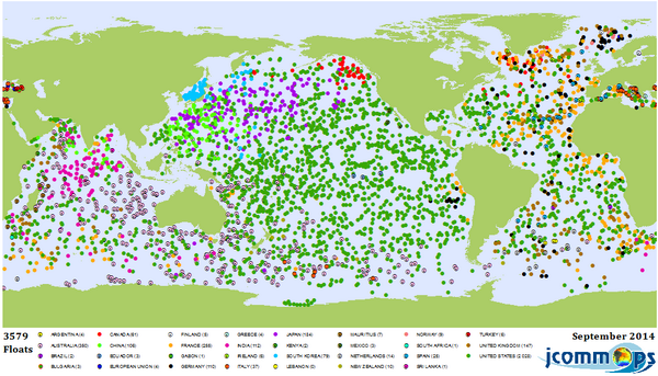 :large
“But what I didn’t know was that according to the Argo floats, every bit of the warming is happening in the southern extratropical ocean,”
As Bob Tisdale showed, in the South Atlantic and Indian Oceans. Which are the two regions with the lowest float density, particularly towards and into the Southern Ocean:
I have a question about the graphs.. How can the global rise in fig 3 be greater than the individual rise of the southern extratropical ocean show in figure 2? I know it has to be something simple, but what am I overlooking?
That is a fair point. The Fig 3 graph might be using additional, more recent data. There is a spike in Fig 3 in 2013 which is not evident in Fig 2 and which only seems to go up to the end of 2012. That could push up the trend a bit.
Willis – you could tighten the calculations by not approximating 1 month = 365.2524/12 days, i.e. use the exact days for each calendar month. It would also be interesting to know exactly how the Argo data have treated calendar effects: presumably you need to match them up.
R.
Very interesting post by Willis.
Equally interesting discussion/comments that followed.