Guest Post by Willis Eschenbach
On another post here on Watts Up With That, a commenter pointed out that NOAA says that September 2014 was the warmest September ever on record. The commenter asked, “Is NOAA wrong?”
Sadly, as near as I can tell the answer is “Quite possibly”.
Here is the NOAA graphic in question, showing their idea of the current year to date in black, and the five warmest years in color.
 Figure 1. NOAA’s graphic showing the progress of the year to date. SOURCE
Man, they are squeezing it to claim this year’s average up to September was the warmest average up to September, looks like a three-way tie to me … but I digress.
Now, I have read in a lot of places that we currently have good agreement between the satellite temperature data and the ground temperature data. Each time I read that, I just laugh. While the two measurements are closer than they have been in the past, there are still great differences. As one of many examples of the differences, consider the corresponding graph of the UAH satellite temperatures for the globe. I’ve used the same colors for the years as in Figure 1 for easy comparison:

Figure 2. My UPDATED graphic showing the UAH MSU T2LT lower temperature data. Sadly, lack of sleep took its toll, and I showed the individual monthly values in my previous graphic, rather than the year-to-date average. My error has no effect on the conclusions of the post. Note that the MSU anomalies have been re-baselined to match the NOAA anomalies. Data Source.
Now, we expect the lower troposphere temperature to vary more than the surface temperature, so the larger variation of the satellite data is no surprise. But far from showing this September as the warmest in the record, the MSU dataset has this September as being tied for eighth warmest September, and that’s only since 1979.
What is the reason for this huge difference in the surface and tropospheric records? I think it is a result of two things—the endless upwards adjustment of the surface data, along with the always-growing urban heat island effect.
But whatever the reason, it is clear that the satellite record tells a very different answer than the one given by the practitioners of the dark art of post-hoc historical temperature adjustment. Given my choice, I’d say that the satellite record is the better of the two … and while YMMV on that question, at a minimum we can say that the development of climate science is in such an early stage that we still don’t have general agreement on even the recent temperature history of the planet, much less the earlier temperature record. “Settled science” at its finest, I suppose.
Finally, acknowledgement is due to the originators of the method of satellite temperature measurements, Drs. Roy Spencer and John Christie. It is thanks to them that we have a satellite-based atmospheric temperature record to act as a reality check for the oft-adjusted surface temperature record. Very well done, gentlemen.
Best regards to everyone on this Friday night, and what could a working fool enjoy more than Friday night? There’s rain forecast for tomorrow, said to be the first real storm of this year of drought. The sky has been sending signals and signs all day. Now the wind has backed to the southwest, the dry earth lies quiet, the air smells of rain …
w.
The Usual—if you disagree with someone, please quote the exact words you disagree with. This allows everyone to understand what you think is incorrect.
Title says Sept. 2013. I think you mean 2014.
[Thanks, fixed. -w.]
[snip “ren” – I’m tired of your thread bombing with pointless off-topic content from “nullschool”. Stop it or be banned – Anthony]
Sorry, increase in solar activity.
After seeing the figures, it is clear that they are more in association with the local/regional general circulation impact and precipitation impact. The variation is large in January to April and the variation is small in August to December. This is a natural variation.
Dr. S. Jeevananda Reddy
Too right about the value of the Satellite record. Without it, it seems very likely indeed that the surface guys would have ‘adjusted’ the record to fit alarmist predictions.
True, without the satellite record we’d all be carbon traders by now and the UN would be our world government.
Science has quietly saved us from tyranny again folks.
The satellite record got me interested in the history of the satellites. Hope this isn’t too off-topic.
http://www.osd.noaa.gov/download/JRS012504-GD.pdf
Had someone among scientist bothered taking a good look at last year’s vulcano eruptions in water or close to water in region Berings Straight via Aleutian Islands over to Kodiak Islands, they would have a better understanding of why winds, streams and much more are effected by underwater vulcanos CO2-produce. Also why it’s impossible to use reradiation temperature instead of meassuring temperatures 1 resp 3 meter over actual waterlevel AND also under not only in a few places but at least each 100 square kilometer. The reradiation figure is in itself a fake reading. So many factors are involved in which reradiation can be “found” that this is more How to lie with statistics than not.
Thanks w, I hope the rains come for you and California but please I hope not all at once and have a great weekend!
Willis, looking at the 1st graph, I see that September is the only month of 2014 that even has a chance of being called the warmest ever. How is that earlier months of 2014 have also been called the warmest (xxx) ever when that graph clearly shows other years were much warmer.
SR
I think the answer to your question is where W writes:
“It is clear that the satellite record tells a very different answer than the one given by the practitioners of the dark art of post-hoc historical temperature adjustment.”
The satellite record is the 2nd graph. The 1st graph is from NOAA. Their own graph belies any earlier month of 2014 than September being designated “the warmest ever”.
SR
Coldest February in 20 years.
sunshinehours1,
That makes sense, because ‘globalwarmingclimatechange’ occurs in the colder months, and at the higher latitudes, and in minimum rather than maximum temperatures, as this chart shows:
http://www.science20.com/files/images/global.png
I asked the same thing when I saw it on Twitter. Apparently, they decided to have an accumulative graph, for some reason. Not sure why, but to me even with that, it looks like the 6 hottest months is still wrong.
Unless there was a separate typo already corrected, I think Kurt is referring to the first paragraph rather than the title. As I understand it, it should read ” …NOAA says that September 2014 was the warmest September ever on record.”
Wllis, thanks for a terrific job.
You’ve made the issues clear enough to explain and actually get through to those who do not wish to listen.
Apropos of ‘the dark art of post-hoc historical temperature adjustment’, you and others whose integrity I respect, have referred to it often enough that I accept it happened. But that’s faith on my behalf, not science. I’d like to know all about these changes.* Presumably, I can’t go to NOAA because they will only provide the revised figures.
I’ve read Steve Goddard’s claims, and the critiques. I’ve used Google but not found what I’m looking for. Do you, or any reader, know a site or article that might help?
What I fear is that the same thing is happening with Climate Scientists and temperature measurements as, according to Feynman**, previously happened with physicists and the charge on the electron. That is, when they got a result that differed from what they expected, they looked for reasons why it might be wrong, and find reasons why it might be wrong. But if it fits with what they expect, they don’t look so hard. And, that this has lead NOAA to be wrong for the same reasons it lead early physicists to be wrong in their field.
*Ideally, I’d like to know from personal knowledge how many adjustments have been made, what data have been adjusted, when it was done, what justification was given, and what the effect of the adjustment individually and in total was, how many exaggerate warming, and how many decrease it.
**http://neurotheory.columbia.edu/~ken/cargo_cult.html
If adjustments to Australian temperature data interest you click on some of the headings here http://joannenova.com.au/tag/australian-temperatures/
No one will ever “know all about these changes”, because they happened gradually, done by multiple individuals for different, sometimes undisclosed reasons. The motivation behind these adjustments is easier to identify though, it is to bring observations closer to theoretical expectations.
You can see a particularly well documented case of tampering in a comment at Judith Curry’s site, but it does not even touch the whys and hows, only the what.
An exercise everyone might want to try is to download the BEST data in its various forms. The non quality controlled data is quite fascinating. The first time I went to plot automagically, the chart was wacky. 1996 C… Wow. That was a hot day.
When i pulled the data, I was hoping to find daily data to plot. No such luck. Even the rawest form of the data on BEST has the form of Monthly AVE. There are datasets for TAVE, TMIN, and TMAX. You will be fooled reading the processing documents for the data. The data is stored in such a way as to allow data to be stored in multiple forms: hourly, daily, monthly. I suspect that someone ran into problems and it ended as just monthly averages.
Averages are your friend. Averages will also bite you in the ass and make you believe things that aren’t really there.
The HadCRUT4 Temperature anomaly above is cute, but it is also an example of people getting really carried away with averages and letting them bite them in the ass. The averages were all done ignoring enthalpy. The experts know better (they are experts aren’t they, they better know what enthalpy is and why it is that engineers get it beaten into their heads). The error bars on the data above associated with not using enthalpy to do the calculations are bigger than the range of the data.
This is the white elephant in the room. The second white elephant is not having the complete set of data shown next to this.
Plot all the data points. Plot the full range of data. The range of data is -80C to +40 C. When you start looking at the full range of the data you say “WTF!”
Go to Judith Curry’s “Climate Etc” blog.
Type “adjustments” into the “search” panel on the RH side.
Top of the list will be the recent post “Understanding adjustments to temperature data” where Zeke Hausfather and Steve Mosher attempt, to great skeptiscm and a very high level of wide eyed disbelief from most of the denizens, to explain the temperature adjustments to the data, both historical and current..
That post on Climate Etc has well over two thousand comments to it but the first thousand about round up the adjustments, the infilling, krieging, homogenisation, daily adjustments of historical temperatures and etc ??? and the results re the global temperature adjustments by NCDC, NOAA,.
Along with all the other in-between “and etc’s” the original recorded field data right through to the publication of the presumed and claimed current temperatures, the so called and passed off as “science” ain’t pretty at all.
In fact ANY claims on land based temperature records by any climate science based data processing organisation on temperatures here and now, past and present are downright dis-believable after going through that lot.
ROM on October 25, 2014 at 3:02 am
– – – – – – –
ROM,
Thanks for that lead . . .
John
You could look at Cheifio aka E.M.Smith’s site here
http://chiefio.wordpress.com/2014/07/14/a-rather-useful-archive-of-individual-station-modification-graphs/
There are multiple posts on GISS Temps and adjustments on his site.
Thanks for the ref. btw I also had a posting here on GHCN v1 vs v3. Summary here:
http://chiefio.wordpress.com/2012/06/20/summary-report-on-v1-vs-v3-ghcn/
As it is comparing what are supposed to be the same readings for the same stations it is fairly clear…
E.M. Smith,
Thank you. I frequently follow relevant links to your site. This is a good description and I only copy the link for clarity (any additional comments prior to this comment may cloud my comment). http://chiefio.wordpress.com/2012/06/20/summary-report-on-v1-vs-v3-ghcn/
For any newcomers to the issues discussed here at WUWT and CAGW there is a long learning curve with a lot of time, reading, following links, etc. to fully grasp the 20+ years of deception surrounding the CAGW scam focused on CO2 and temps. I have spent 5 years immersed in it and it has been a most enlightening experience, though quite sad as I wanted to believe the “scientists”. If you have a basic understanding of physics, thermodynamics, math, statistics (god forbid LOL), and basic common sense then hang in there. This issue is the greatest hurdle developed society has encountered in recent history. The stake are high and you need to know.
An essay suitable for the layman on the manipulations of the surface data and complete lack of coverage in large areas that have been infilled with fantasy results needs to be presented to those new to the adjustment scam. Steve Goddard has been presenting some good graphics recently. WUWT has the most and best sources of knowledge from extremely intelligent commenters that I follow closely.
Again, if you are new to the discussion (5 years for me) hang in there. The more you begin to know the more you will appreciate the contributions here. Inquiring minds need to know and this important issue we are facing has immense consequences to our civilized way of life. What’s not to like about an inquiring mind?
I’m very much with you on this but I expect it is such a mammoth task to check all the changes that have been made and to discover the reasons, real and those claimed by the adjusters, for these changes. It seems passing strange that adjustments to earlier records, say prior to 1970, are largely downward while those after 1970 are predominantly upward. If earlier thermometer readings over estimated temperature what was the change in siting/type of thermometer/reading process around 1970 that lead to underestimates of temperature?
Perhaps the solution is to only believe temperature measurements made with thermometers made and deployed in 1970? It seems they are the only ones our Government believes.
You can visit the web site of Pr Ole Humlum (climate4you) at http://www.climate4you.com/ where he discusses this issue and employs maturity diagrams to show the deviation over time.
Marko, thanks for the link. Interesting. I spent quite a bit of time there.
“Apropos of ‘the dark art of post-hoc historical temperature adjustment’, you and others whose integrity I respect, have referred to it often enough that I accept it happened. ”
jesus was raised from the dead. I heard that a lot too.
1. The historical temperatures are not measured, they are estimated.
2. Over time every group that estimates the past has improved their methodology.
3. Changes, even month to month changes, in the estimates of the past are due to
thes things
A) the addition of more data.
B) the removal of spurious records ( duplicates etc)
C) improved QC
D) changes in estimation algorithms.
Strange as it sounds adding data in 2014 will change our estimate of past temperatures.
This is especially true for GISS.
jesus was raised from the dead. I heard that a lot too.
Good zinger. That would apply in spades to cAGW, no?
In fact, it applies to the entire carbon scare. We’ve heard it so much, that it must be true!
Sorry Mosher, it does not explain away so easily.
“Strange as it sounds adding data in 2014 will change our estimate of past temperatures”
Positive feedback?
Apparently Judith Curry decided it was not for her.
Steven, I’m sure it’s not your intention, but when the vast majority of normal people encounter a situation where present events changes past facts, they consider it a lie. People don’t realize that when Climatologist say a temperature is X, that the temperature is a totally synthetic number, an average of spacialy and temporaly sparse data that is normalized and homogenized and adjusted in arcane manners. So when people start calling you and your comrades liars, now you’ll know why.
Mosh, always good to hear from you. A few questions.
You say “The historical temperatures are not measured, they are estimated.” I fear this is unclear. If the historical temperature at the San Francisco ground station on a given day in 1916 was measured at 11.6°C, how is this an “estimation”? It seems you may be using some unusual definition for “historical temperatures”.
You say “Over time every group that estimates the past has improved their methodology.”. This is very optimistic. A more accurate statement would be that “Over time every group that estimates the past has changed their methodology.” Whether the change has improved things is case-dependent and subject to question.
Finally, you say that the addition of data in 2014 will change our estimates of past temperatures. I fear I don’t understand that statement. If the temperature at the San Francisco ground station on a given day in 2014 is measured at 12.7°C, how can this possible change the measurement of the temperature at the San Francisco ground station on a given day in 1916?
What am I missing here? It seems that you are not distinguishing sufficiently between temperature measurements and temperature estimates, but I could easily be wrong. Some definitions and examples would be useful here.
In closing let me note that in a previous post I explored the problems with the “scalpel” method used by Berkeley Earth, a project with which you are involved. In that post I asked the following question:
At the time you never answered my question … do you have any answers now that some time has elapsed?
My best regards to you as always,
w.
Gosh, what a fantasy world some inhabit.
Past temperatures were measured; they are not estimates, but measurements taken by the equipment used with the results of the measurements being logged and recorded. .
We know, as FACT, the temperature measured, ie., that which was actually recorded.
The only issue that needs to be addressed is what is the margin of error of the measurement made?
This will depend upon a variety of factors, such as equipment used and its calibration, the siting of stations and their condition and maintenance, practice adopted when taking measurments (which will include TOB issues), encroachment of UHI etc.
There is no need to make any adjustment to raw data. The raw data can be presented around which an envelope of the error margins can be drawn. May be in the past the error margins are greater than today, but that is really the only enquiry that should be carried out.
The data should be presented for what it is, ie., with ‘warts and all’, with the scientists realistically estimating the magnitude of the ‘warts and all’ Then one can read the data for what it is, and what it really shows.
Presently all we are doing today is evaluating the efficacy of all the numerous adjustments that have been made and which have so bastardised the temperature record such as to have rendered it useless.
When you have the likes of a Gavin Schmidt doing all of the adjusting, infilling, homogenization, etc., what is the result? The hottest ever. In this important post, Willis has exposed the workings of Schmidt’s temperature workshop.
Paul Jackson nailed it IMO of the central problem with rationalizing by those who “change our estimate of past temperatures” when “adding data in 2014”, by calling past measurements merely “estimates.”
By calling past measurements simply “estimates” the scientists at GISS (and elsewhere) can avoid the professional ethical dilemma when hard data is changed to suit a preconceived bias of what the result must look like. Those who do realize what is happening can simply chalk it up as the “ends justifying the means”(aka, Noble Cause Corruption).
Practitioners of both the land-based measurements and the satellites measurements have to reconcile their temperature data and explain why they are given different results. According to the land-based instruments 2014 is one of the hottest years ever, while according to the satellites it’s nothing special. This is important because public policy decisions worth hundreds of billions of dollars will be based on these measurements.
Quite frankly in my opinion it is unconscionable that climate scientists have made no attempt to explain the discrepancy to see which is right, if either.
Bob Clark
w – Great post.
Great comment (October 25, 2014 at 12:39 pm)
Great clarity.
Great question (If the temperature at a given place on a given day was measured as a particular value, how is this an estimate?”.
Willis Eschenbach October 25, 2014 at 12:39 pm
If I may be so bold, Willis … the past has to be cooled to maintain the warming trend through the “Pause” and beyond. Current temperatures are warmed to not easily draw attention to the cooling of the past. ‘Steve Goddard’ is on to this. 😉
I would guess that based on the above statement, you are changing either model parameters or the models themselves, based on their failure to predict from some past time to the present. Or some other thing; really, it’s hard to tell from outside the box.
Historical temperatures are not measured? Even when we had the means to measure them directly?
Some explication is wanted, here. Please.
I’d add here that Mosher is NOT saying that data measured now is changing past measurements; just that it’s changing past estimates. That doesn’t sound out of bounds to me, on its face.
Interesting question but one which sadly I don’t think you will get am honest answer to from those who make the bold statements.
Although they may score very high if they tool the test for D’s.
http://wattsupwiththat.com/2014/10/24/friday-funny-youre-a-climate-denier-if/
All the best
James Bull
NOAA graph is showing year to date average, not individual months.
Yes, it is amazing how an entire post and over 100 comments will be based on misinterpretation of graph. Let’s see if the error is acknowledged.
People who are not citizens of the USA (and even the IPCC) look at Hadcrut4 for surface temperature, not at the data adjusted by the US administration:
http://www.woodfortrees.org/plot/hadcrut4gl/from:1979/to
Not that there’s everything right with it.
Yes, again by the Hadcrut4 data 2014 looks like nothing special which gives further doubt it will be the hottest ever.
Bob Clark
Willis,
Your Fig 2 looks odd. The file you have linked to shows the September anomaly at 0.3°C,
Thanks, Nick. I’ve re-baselined the MSU anomaly to match that of the NOAA anomaly.
w.
Steven Goddard says…”NASA and NCDC are going to claim that 2014 was the hottest year ever, when in fact satellites show that every month of the year was cooler than 1998, with the 1998 anomalies double the 2014 anomalies”
http://stevengoddard.wordpress.com/2014/10/24/visualizing-global-temperature-fraud-at-nasa-and-ncdc/
The atmosphere is for the most part heated by water vapor from the tropics so don’t expect sat data to equal global surface data
http://woodfortrees.org/plot/rss/mean:3/plot/uah/mean:3/plot/hadcrut4tr/from:1979/offset:-0.2/mean:3
Also an interesting post regarding how SL at the equator tracks the satellite record.
http://stevengoddard.wordpress.com/2014/10/25/relationship-of-sea-level-and-lower-troposphere-temperature-along-the-equator/
That makes sense since during an El Nino, the bulge of water in the western part of the equatorial Pacific ocean moves back east.
Suppose last month was indeed “the hottest September evah!” — at least, since reliable records began. When one considers the age of the planet and the length of the period for which no accurate record exists … what useful conclusions may be derived from this hottest of Septembers?
In any case, has the anthropogenic signal been plausibly distinguished from the natural one? If so, can it be definitively asserted that, in the absence of the anthropogenic signal, the Earth would not be warming? Is there any point pursuing this exercise any further?
I like this quote from Willis:
“practitioners of the dark art of post-hoc historical temperature adjustment”.
Harry Potter versus Lord Voldemort =
WUWT / Real Science / Roy Spencer / GWPF / Jo Nova et al., versus Real Climate / BEST / BOM / Hadcrut MET
Opportunity for Josh
So we can take it from Willis’s quote above that he thinks that GISS etc are indeed publishing/promoting fraudulent temp data?
the word fraud carries implicitly the context of intent to deceive.
At a minimum, the datasets are being manipulated without openess, or transparency of methods.
No, I wouldn’t say it was “fraudulent”. I’d say it was over-cooked, but I don’t imply bad intent. My general rule is to not ascribe things to malice that are adequately explained by ignorance and error …
According to ‘Steve Goddard’,
http://stevengoddard.wordpress.com/2014/10/24/visualizing-global-temperature-fraud-at-nasa-and-ncdc/
That has to ring the bell !
As Bill 2 says, Fig 1 is the average to date, not the monthly temperature. The NOAA average for Sept, anomaly baseline 1971-2000, was 0.501°C. That is the warmest in their record. next was 2005 at 0.457°C.
The reason it is so high is, as Bob Tisdale has been saying, SST is very warm. Troposphere readings taker some time to respond to that.
The North Pacific hot spot is well reflected in this 2014 RSS graphic. http://stevengoddard.wordpress.com/2014/09/18/us-government-agencies-just-cant-stop-lying/
They are not SST, but troposphere temperatures. Goddard somehow thinks that disproves current SST warmth.
Sorry Nick, I do not have them (a surface map and a troposphere map) in the same post, but here is the GISS surface map, compared to RSS for August 2014. Not how well they reflect each other. (Notable differences in areas which GSS in-fills.)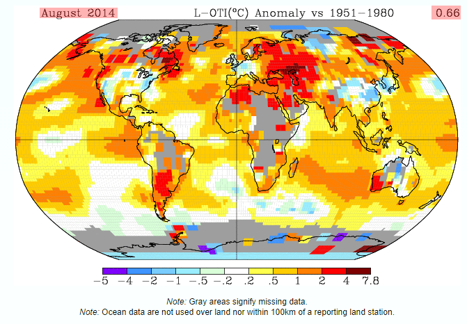
Wow, that August 2014 GISS temperature map shows a LOT of missing data. Can someone tell me how much missing data there is for 1980? 1960? 1940? 1920? 1900? I would be especially eager to know the historic temperatures in the Arctic and Antarctic around 1920, since the anomalies seem to be so high right now. Thanks.
Currently sometimes up to 30 percent of the data is made up from nearby stations. Most people that have looked closely at this and noted the dropping of hundreds of stations, the movements away from altitude, and towards airports, the up to 1200 K spreading and in-filling of T, the station sitting problems etc, feel this is essentially FUBAR, and that the past is no longer well recoverable.
I agree however that the SSTs have been very high, which is simply exemplary of how the oceans drive the GAT.
Nick, the overwhelming fact is that satellites show that every month of the year was cooler than 1998, with the 1998 anomalies double the 2014 anomalies.
It’s not an overwhelming fact; it’s just a fact. The surface has been warm; the troposphere cool. We live on the surface.
Nick Stokes, the piehole of govspeak.
It is probably correct to say that the GISS reported temperatures have been warm. It is less obvious what the actual temperatures were. And the actual heat retention in the atmosphere is totally obscured as air temperature is the incorrect metric.
@Ian: GISS do not report temperatures. They take in GHCN USHCN temperatures and some Hadley SST data and fabricate fictional gridcells via homogenizing and smearing averages. Averages of temperatures are not temperatures. It is an intrinsic property, after all…
I would have thought that all facts overwhelm all non-facts, even if they’re just facts.
That is, average global lapse rate was higher than average, implies less than average atmospheric moisture in the upper troposphere. Which contradicts to a positive water vapor / cloud feedback, cAGW theory devastated. I did not know you were a climate denier in disguise.
Both RSS and UAH showed August 2014 as the second coldest in the last ten years. I have never seen the surface diverge so greatly from the satellites.
http://stevengoddard.wordpress.com/2014/09/19/rule-1/
Maybe the “Co2 Rules Gang” started a new data base in August 2014 making September 2014 the warmest on record. LOL
Right or wrong, it’s a Warm herring. Warmunists just love to point out the warmest this or the warmest that evah. They know the lofo Believers will take it to mean that it is further proof that the earth is heating up and it’s our fault. Warm herrings are their go-to responses when you try to point out that warming has stopped for some 18 years now. Another favorite is to ask “so how come the poles are melting?”
Satellite measurements don’t have any ‘adjustable’ Urban Heat Island data to fiddle with, so they get my vote.
http://a-sceptical-mind.com/the-strange-death-of-the-themometers
Well I’ll ask Willis directly. Do you think that GISS is publishing fraudulent temperature data? And do you think that the GISS record has persistently altered the past temp record to show more warming since the late 1970s? Yes or no?
@Neville: You are asking W. an impossible question. GISS fabricates fictional grid cells from temperature averages. Temps are input from GHCN and USHCN but then huge manipulations are done. It is a “never the same way twice” automated data blender making a data food product that is not a temperature record. Details at my site under GIStemp topics. A few hundred postings…
So yes, GISS has persistently cooled the past and warmed the present (as has GHCN NOAA) but their work product is not a temperature series. It is a mathematical fantasy.
It is no accident and Gavin Schmidt has his cue: it is the run up to the election and the strategy is alarmist hype.
Here are the stakes: the dems will lose the senate and the GOP controls Congress and that puts Obama in trammels for the last two years of his term.
Remember the NYC parade and Poohtus’ flop at the UN last month? All part of the strategy to mobilize the vote of the gullible types.
So Schmidt’s task was to generate the hottest month evah. And he came through.
But guess what.
It backfired. Five Dem senators who are vulnerable have told Poohtus to can it because it is turning people off and they are running scared.
But the point is this: Gavin Schmidt is playing politics at GISS and purposefully fabricating data for propaganda (election) effect.
It is no accident and Schmidt has some things to answer for. He is not the only one.
The North Pacific and the North Atlantic were so warm in August and September that …
… Well nobody noticed and nothing unusual happened.
It’s more that all the previous Augusts and Septembers were adjusted colder.
Is the climatology of 1961 to 1990, or 1981 to 2000 the same as it used to be? No, they have lowered it and changed it. Every month they change it.
And the changes have impacted the summer months more than the winter months.
The ocean surface is still 15.8C in the August and September in the North Pacific and the North Atlantic just like it is has always been. But now, they pretend it used to be 14.9C in the summer and the anomaly is the warmest ever.
They have a profession and a belief system to protect.
Yes and one of the oldest too
Lol! That’s was quick witted!
‘Ho, ‘ho, ‘ho! ☺
🙂
… mind like a CRU rat trap, dbstealy 😉