Guest Post by Bob Tisdale
This year started off with a subsurface weather event below the surface of the tropical Pacific that made researchers and global warming alarmists hope for a super-duper El Niño in 2014. Sadly, things didn’t work out for them. The trade winds refused to cooperate. Now, there are replays taking place below the Pacific that could (<–crucial word) lead to an El Niño for the 2014/15 ENSO season.
This post provides an update on the progress of the evolution of the 2014/15 El Niño (assuming one forms) with data through the beginning of October 2014. The post is similar in layout to the earlier updates. (See the entire 2014/15 El Niño series of posts here.) The post includes 3 gif animations and 13 illustrations so the post might take a few moments to load on your browser. Please click on the illustrations and animations to enlarge them.
Included are updates of the weekly sea surface temperature anomalies for the four most-often-used NINO regions. Also included are updates of the GODAS map-based animations of sea surface height anomalies, T300 anomalies (depth-averaged temperature anomalies to 300 meters), sea surface temperature anomalies, and the cross sections of temperature anomalies at depth along the equator. These animations start in January 2014 for the full progress of this year’s event(s). Also included are a couple of graphs of the BOM Southern-Oscillation Index (SOI).
We compared the evolution of the 2014/15 El Niño to the 1982/83 and 1997/98 El Niños in a number of posts in this series, back when this El Niño was being compared to those two strong events. More recently, NOAA and IRI are forecasting in their El Niño/Southern Oscillation (ENSO) Diagnostic Discussion (my boldface):
Most models predict El Niño to develop during October-December 2014 and to continue into early 2015 (Fig. 6). The consensus of forecasters indicates a 2-in-3 chance of El Niño during the November 2014 – January 2015 season. This El Niño will likely remain weak (3-month values of the Niño-3.4 index between 0.5°C and 0.9°C) throughout its duration. In summary, El Niño is favored to begin in the next 1-2 months and last into the Northern Hemisphere spring 2015 (click CPC/IRI consensus forecast for the chance of each outcome).
(Thanks, Pamela Gray.)
So I’ve changed the reference El Niños for the evolution comparisons. The new references are the 2002/03 and 2009/10 El Niños. These reference El Niños are stronger than what NOAA and IRI are now forecasting (I’m giving the little El Niño something to strive for), but they are far lower than the ones we used earlier this year.
And since we’ve been watching the downwelling (warm) Kelvin wave as it makes its way east along the equator in the Pacific, also included in this post are evolution comparisons using warm water volume anomalies and depth-averaged temperature anomalies from the NOAA TOA project website.
Then, we’ll take a look at a number of Hovmoller diagrams comparing the progress so far this year to what happened in both 2002 and 2009.
NINO REGION TIME-SERIES GRAPHS
Note: The NOAA NOMADS website is still off-line, so I used the weekly NINO region sea surface temperature anomaly data for Figures 1 and 2 from the NOAA/CPC Monthly Atmospheric & SST Indices webpage, specifically the data here. The data from NOAA NOMADS was provided with oodles of significant figures, while the NOAA/CPC data are provided in tenths of a degree C. The base years for anomalies through NOMADS were 1971-2000, while the NOAA/CPC data are referenced to 1981-2010. So, along with the changes to the reference El Niños, that explains why the graphs are a little different than what you’re used to seeing.
Figure 1 includes the weekly sea surface temperature anomalies of the 4 most-often-used NINO regions of the equatorial Pacific. From west to east they include:
- NINO4 (5S-5N, 160E-150W)
- NINO3.4 (5S-5N, 170W-120W)
- NINO3 (5S-5N, 150W-90W)
- NINO1+2 (10S-0, 90W-80W)
As of last week, the sea surface temperature anomalies in the NINO1+2 regions were still elevated, while the NINO3 and NINO4 regions are at the +0.5 deg threshold of El Niño conditions. In the NINO3.4 region, the most widely referenced of the regions, sea surface temperature anomalies are below the threshold, meaning the east-central equatorial Pacific is in ENSO-neutral conditions.

Figure 1
EL NIÑO EVOLUTION COMPARISONS FOR NINO REGION SEA SURFACE TEMPERATURE ANOMALIES
Using weekly sea surface temperature anomalies for the four NINO regions, Figure 2 compares of the evolutions of this El Niño with the 2002/03 and 2009/10 events.

Figure 2
ANIMATION UPDATES
In the first post in this series, we discussed a number of animations of maps and animations of equatorial cross sections that are available from the NOAA Global Ocean Data Assimilation System (GODAS) website. Each cell of the animation is a 5-day (pentadal) average. Those animations ran from January 3rd to March 29th. The following are updates, again starting in January 3rd. GODAS only maintains their animations for 3 months. I’ve stored the maps since the first of the year and have continued to add maps as time progresses.
Animation 1 provides the sea surface height anomalies and the depth-averaged temperature anomalies for the top 300 meters (T300) side by side.

Animation 1
Animation 2 is a similar side-by-side comparison, but on the left are maps of sea surface temperature anomalies and on the right are the H300 maps. The sea surface temperature maps trail the others by a pentad or two, which is why they do not run through July 2. My apologies for the shift in the color scaling for the range of +0.5 to +1.0 deg C in the sea surface temperature anomaly maps. That appears to be a quirk in my computer, not the GODAS website.

Animation 2
Animation 3 is an update of the cross sections of temperature anomalies at depth along the equator.

Animation 3
The year began with the initial strong downwelling (warm) Kelvin wave. We discussed and illustrated in the post The 2014/15 El Niño – Part 14 – Warm Water Recirculated? how some of the subsurface warm water had spilled off the equator, traveled west and had then recirculated back to the equator. That warm water was then carried eastward in what is now being called (a second) downwelling Kelvin wave. Figure 3 shows the GODAS subsurface temperature anomaly profile along the equator back in early August.

Figure 3
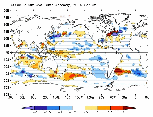
In the last post The 2014/15 El Niño – Part 17 – Is There Still Hope for a Moderate El Niño?, we discussed how there appears to have been a new influx of warmer-than-normal water at depth along the equator in the western equatorial Pacific. See the subsurface temperature anomalies in Figure 4 for the pentad dated October 5th. That warm water should migrate eastward along the equator, carried by the subsurface Cromwell Current (a.k.a. Pacific equatorial undercurrent), helping to supply the warm water for an El Niño.

Figure 4
Then all we need is the trade winds to respond, providing the atmospheric feedback necessary to further evolve the El Niño. That is, a couple of westerly wind bursts in the western equatorial Pacific will likely be needed.
EL NIÑO EVOLUTION COMPARISONS WITH TAO PROJECT SUBSURFACE DATA
The NOAA Tropical Atmosphere-Ocean (TAO) Project website includes data for two temperature-related datasets for the equatorial Pacific. See their Upper Ocean Heat Content and ENSO webpage for descriptions of the datasets. The two datasets are Warm Water Volume (above the 20 deg C isotherm) and the Depth-Averaged Temperatures for the top 300 meters (aka T300). Both are available for the:
- Western Equatorial Pacific (5S-5N, 120E-155W)
- Eastern Equatorial Pacific (5S-5N, 155W-80W)
- Equatorial Pacific (5S-5N, 120E-80W)
Keep in mind that the longitudes of 120E-80W stretch 160 deg, almost halfway around the globe. For a reminder of width of the equatorial Pacific, see the protractor-based illustration here.
In the following three graphs, we’re comparing data for the evolution of the 2014/15 El Niño so far (through month-to-date October 2014) with the data for the evolutions of the 2002/03 and 2009/10 El Niños. The Warm Water Volume data are the top graphs and the depth-averaged temperature data are the bottom graphs. As you’ll see, the curves of two datasets are similar.
Let’s start with the Western Equatorial Pacific (5S-5N, 120E-155W), Figure 5. The warm water volume and depth-averaged temperature data show the Western Equatorial Pacific had slightly less warm water or was slightly cooler this year than during the opening months of 2009. But 2014 had more warm water or was warmer than 2002. For 2014, the warm water volume and temperature to depth in the west dropped as the initial Kelvin wave this year carried some water east, but it has since rebounded.

Figure 5
The warm water volume and depth-averaged temperature data for the eastern equatorial Pacific are shown in Figure 6. This year, the eastern equatorial data both rose, a result of the Kelvin wave carrying warm water from the West Pacific Warm Pool to the east. Most of that warm water in the east has now been consumed, released to the atmosphere through evaporation or distributed away from the equator. At present, the two metrics are comparable to the September 2009 values, but well below the 2002 September values.

Figure 6
As a result, across the entire equatorial Pacific, Figure 7, warm water volume is lower, and depth-averaged temperatures are less, in 2014 than they were in 2002. Then again, they’re higher or comparable to the conditions in 2009. For this year, the warm water initially increased across the entire equatorial Pacific, as warm water from off the equator circulated to the equator. Then the warm water decreased as it rose to the surface and evaporated or was redistributed from the equator.

Figure 7
The NODC ocean heat content data for April-June 2014 are available. We’ll discuss it later in the post.
SOUTHERN OSCILLATION INDEX (SOI)
The reasons an El Niño did not continue to form this year in response to the Kelvin wave are well established. First, the atmospheric component of ENSO, the “SO” part, refused to cooperate. That is, the trade winds in the western equatorial Pacific did not weaken as expected to help reinforce the El Niño development. (The other reason, of course, was the upwelling (cool) Kelvin that formed in the wake of the downwelling (warm) Kelvin wave, the latter of which had everyone so excited earlier this year. That trailing cool Kelvin wave helped to counteract the warm Kelvin wave.)
The Southern Oscillation Index (SOI) from Australia’s Bureau of Meteorology is another widely used reference for the strength, frequency and duration of El Niño and La Niña events. We discussed the Southern Oscillation Index in Part 8 of this series. It is derived from the sea level pressures of Tahiti and Darwin, Australia, and as such it reflects the wind patterns off the equator in the southern tropical Pacific. With the Southern Oscillation Index, El Niño events are strong negative values and La Niñas are strong positive values, which is the reverse of what we see with sea surface temperatures. The September 2014 Southern Oscillation Index value is -7.5, which is within ENSO-neutral conditions but close to El Niño conditions. The BOM threshold for El Niño conditions is an SOI value of -8.0. We had ventured into those levels in August, but the SOI has relaxed a little. Figure 8 presents a time-series graph of the SOI data.

Figure 8
The graphs in Figure 9 compare the evolution of the SOI values this year to those in 2002 and 2009, the development years of the 2002/03 and 2009/10 El Niños. The top graph shows the raw data. Because the SOI data are so volatile, I’ve smoothed them with a 3-month filter in the bottom graph. Referring to the smoothed data, the Southern Oscillation Index this year is lagging well behind the values in 2002 but they are ahead of where they were in 2009.

Figure 9
For those of you interested in keeping a closer eye on the BOM Southern Oscillation Index, see the BOM Recent (preliminary) Southern Oscillation Index (SOI) values webpage. For the past month, the 30-day running-average of the SOI had cycled into El Niño conditions, but now it is well back into ENSO-neutral.
COMPARISONS OF HOVMOLLER DIAGRAMS OF THIS YEAR (TO DATE) WITH 2002 AND 2009
In past updates, in the following Hovmoller diagrams, I’ve used the development of the 1997/98 and 1982/83 El Niños as a reference for this year’s El Niño. That now seems to be overkill, because the feedbacks never kicked in this year…where all of the feedbacks freakishly aligned for the 1997/98 El Niño. The 1982/83 El Niño was a late bloomer; that is, it didn’t really start to take off until later in the year, and it was a very strong El Niño too.
Now, it’s unlikely that the El Niño, if it forms, would be a strong El Niño. So I’ve switched reference years for this post.
Hovmoller diagrams are a great way to display data. If they’re new to you, there’s no reason to be intimidated by them. Let’s take a look at Figure 10. It presents the Hovmoller diagrams of thermocline depth anomalies (the depth of the isotherm at 20 deg C. Water warmer than 20 deg C is above the 20 deg C isotherm and below it the water is cooler). 2014 is in the center, 2002 on the left and 2009 to the right. GODAS, unfortunately, furnishes the illustrations (not the data) in different dimensions for some years. Thus the dimensions of the Hovmoller in the left are larger than the other two.
The vertical (y) axis in all the Hovmollers shown in this post is time with the Januarys at the top and Decembers at the bottom. The horizontal (x) axis is longitude, so, moving from left to right in each of the three Hovmoller diagrams, we’re going from west to east…with the Indian Ocean in the left-hand portion, the Pacific in the center and the Atlantic in the right-hand portion. We’re interested in the Pacific. The data are color-coded according to the scales below the Hovmollers. (Click to enlarge them.)

Figure 10
Figure 10 is presenting the depth of the 20 deg C isotherm along a band from 2S to 2N. The positive anomalies, working their way eastward since the beginning of 2014, were caused by the downwelling Kelvin wave, which pushes down on the thermocline (the 20 deg C isotherm). You’ll note how the anomalies grew in strength as the Kelvin wave migrated east. That does not mean the Kelvin wave is getting stronger as it traveled east; that simply indicates that the thermocline is normally closer to the surface in the eastern equatorial Pacific than it is in the western portion. The secondary (and definitely weaker) downwelling Kelvin wave this year is also visible in the center Hovmoller.
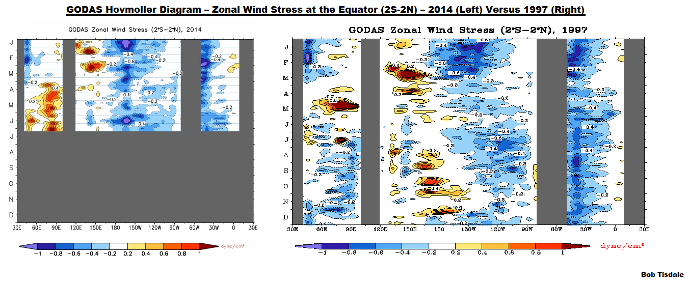
Figure 11 presents the 2014-to-date along with the 2002 and 2009 Hovmollers for wind stress (not anomalies) along the equator. The simplest way to explain them is that they’re presenting the impacts of the strengths and directions of the trade winds on the surfaces of the equatorial oceans. In this presentation, the effects of the east to west trade winds at various strengths are shown in blues, and the reversals of the trade winds into westerlies are shown in yellows, oranges and reds. To explain the color coding, the trade winds normally blow from east to west. Stronger than normal trade winds are associated with La Niñas; thus the cooler colors for stronger than normal east to west trade winds. The reversals of the trade winds (the yellows, oranges and reds) are the true anomalies and they’re associated with El Niños, which are the anomalous state of the tropical Pacific. (A La Niña is simply an exaggerated normal state.)

Figure 11
The two westerly wind bursts shown in red in the western equatorial Pacific in 2014 are associated with the strong downwelling Kelvin wave that formed at the time. (See the post ENSO Basics: Westerly Wind Bursts Initiate an El Niño.) Throughout both 2002 and 2009, there were series of westerly wind bursts in the western equatorial Pacific, with stronger ones later in the year. We’ll need some more westerly wind bursts this year if the El Niño wants to grow up to be big and strong.
Figure 12 presents the Hovmollers of wind stress anomalies…just a different perspective. Other than the two westerly wind bursts at the beginning of the year, the western equatorial Pacific has been quiet this year compared to 2002 and 2009.

Figure 12
And Figure 13 presents the Hovmollers of sea surface temperature anomalies. Unfortunately, the Hovmoller of sea surface temperature anomalies is delayed a few weeks. But as we’ve seen in the comparison graphs in Figure 2, the sea surface temperature anomalies of the NINO3.4 region in 2014 are behind those of 2002 and 2009, but in the eastern equatorial Pacific, the sea surface temperature anomalies this year in the NINO1+2 region are well above those in our two reference years.

Figure 13
NODC OCEAN HEAT CONTENT DATA FOR THE TROPICAL PACIFIC
Figure 14 presents the NODC ocean heat content data for the tropical Pacific (24S-24N, 120E-80W). The graph starts in 1990. The installation of the TAO project buoys was complete in the early 1990s, so the data are reasonable after then (before then, not so much). That data are then supplemented by ARGO floats starting around 2003 and there are occasional XBT readings all along. I’ve highlighted the past 12-months or so in purple. There was a minor upsurge in the ocean heat content of the tropical Pacific from late 2013 to the beginning of 2014, followed by a minor downtick. But the goings on this past year are dwarfed by the impacts of …
- the 1995/96 La Niña (during which all of the warm water for the 1997/98 El Niño appeared),
- the 1997/98 Super El Niño (which released to the atmosphere, and redistributed within the oceans, most of the heat gained during the 1995/96 La Niña), and
- the 1998-01 La Niña (which replenished much of the warm water released by the 1997/98 El Niño. The continued rise until 2003/04 is likely the return of some of the warm water released and redistributed from the tropical Pacific as a result of the 1997/98 El Niño.)

Figure 14
EARLIER POSTS IN THIS SERIES
- The 2014/15 El Niño – Part 1 – The Initial Processes of the El Niño.
- The 2014/15 El Niño – Part 2 – The Alarmist Misinformation (BS) Begins
- The 2014/15 El Niño – Part 3 – Early Evolution – Comparison with 1982/83 & 1997/98 El Niño Events
- The 2014/15 El Niño – Part 4 – Early Evolution – Comparison with Other Satellite-Era El Niños
- The 2014/15 El Niño – Part 5 – The Relationship Between the PDO and ENSO
- The 2014/15 El Niño – Part 6 – What’s All The Hubbub About?…
- The 2014/15 El Niño – Part 7 – May 2014 Update and What Should Happen Next
- The 2014/15 El Niño – Part 8 – The Southern Oscillation Indices
- The 2014/15 El Niño – Part 9 – Kevin Trenberth is Looking Forward to Another “Big Jump”
- The 2014/15 El Niño – Part 10 – June 2014 Update – Still Waiting for the Feedbacks
- The 2014/15 El Niño – Part 11 – Is the El Niño Dying?
- The 2014/15 El Niño – Part 12 – July 2014 Update – The Feedbacks Need to Kick in Soon
- The 2014/15 El Niño – Part 13 – More Mixed Signals
- The 2014/15 El Niño – Part 14 – Warm Water Recirculated?
- The 2014/15 El Niño – Part 15 – August 2014 Update – An El Niño Mulligan?
- The 2014 15 El Niño – Part 16 – September 2014 Update – Still Seeing Mixed Signals
- The 2014/15 El Niño – Part 17 – Is There Still Hope for a Moderate El Niño?
And for additional introductory discussions of El Niño processes see:
- An Illustrated Introduction to the Basic Processes that Drive El Niño and La Niña Events
- El Niño and La Niña Basics: Introduction to the Pacific Trade Winds
- La Niñas Do NOT Suck Heat from the Atmosphere
- ENSO Basics: Westerly Wind Bursts Initiate an El Niño
A STINKIN’ COMMERCIAL?
Yesterday, in the post Maybe It’s Time We Stopped Wasting Money Studying a Problem And Spent That Money Adapting to It, I discussed the Union of Concerned Scientists’ article Encroaching Tides. At the end of it, the UCS were looking for donations “to work to advance clean, renewable energy and so much more”, making their article appear to be nothing more than a commercial. Some of you might now see something similar in my promotion of my book Who Turned on the Heat? at the end of this post. But there is a difference.
The Union of Concerned Scientists is a thinly disguised political activist group, while I’m playing the role of educator, trying to help people understand the processes of El Niño and La Niña and their contributions to long-term global warming. The Union of Concerned Scientists is promoting “clean, renewable energy”, while I use book sales to help pay the rent and put food on my table. The Union of Concerned Scientists is looking for a handout, while I’m providing a product. With that in mind…
My ebook Who Turned on the Heat? goes into a tremendous amount of detail to explain El Niño and La Niña processes and the long-term aftereffects of strong El Niño events. Who Turned on the Heat? weighs in at a whopping 550+ pages, about 110,000+ words. It contains somewhere in the neighborhood of 380 color illustrations. In pdf form, it’s about 23MB. It includes links to more than a dozen animations, which allow the reader to view ENSO processes and the interactions between variables.
I’ve lowered the price of Who Turned on the Heat? from U.S.$8.00 to U.S.$5.00. A free preview in pdf format is here. The preview includes the Table of Contents, the Introduction, the first half of section 1 (which was provided complete in the post here), a discussion of the cover, and the Closing. Take a run through the Table of Contents. It is a very-detailed and well-illustrated book—using data from the real world, not models of a virtual world. Who Turned on the Heat? is only available in pdf format…and will only be available in that format. Click here to purchase a copy.
My sincerest thanks to everyone who has purchased a copy of Who Turned on the Heat? as a result of this series. I learned a lot preparing it. I hope you’ve learned a lot, too.
Thanks Bob!
Confused about figure 14. Why would heat content, which is energy in a volume of water, be divided by square meters?
I gues it’s just ‘total’ heat content (it’s an anomaly anyway) in GJ, divided by sea surface in m^2. It’s oceans heat anomaly per m^2 of ocean surface. It’s also the integrated net flux at sea surface over time, assuming negligible net flux at the ocean floor.
Edim, I suspect that it’s meaningless. The number of Joules of energy below a square meter of ocean?
E (Joules) / V (m^3) / m^2 = E/V J/m^5 ??
OR
E (Joules) / V (m^3) * m^2 = E/V J m (Joule-meter) ??
Neither makes sense.
VikingExplorer says: “Edim, I suspect that it’s meaningless. The number of Joules of energy below a square meter of ocean?”
Ocean heat content data is based on temperature and salinity measurements at various depths of the oceans. Each of those measurements is assigned to a depth range within a 5 deg latitude by 5 deg longitude grid. From those measurements the heat content of the water column (to different depths) is calculated for each 5×5 grid, and referenced to a climatology for that grid and depth range, so that anomalies can be calculated.
The NODC presents the ocean heat content data for the depths of 0-700 meters and 0-2000 meters, with the data presented for each 5×5 ocean grid.
The surface area of each grid (and thus the volume of the water column) must be considered when calculating the ocean heat content (anomalies) for an ocean basin and the globe. It is therefore logical to present the ocean heat content in gigajoules per square meter when subsets are presented based on global coordinates. Using GJ/m^2 also allows you to compare one subset to another without having to account for the area or volume of the subsets,
So as a metric, ocean heat content expressed as GJ/m^2 has meaning.
Bob,
>> Using GJ/m^2 also allows you to compare one subset to another without having to account for the area or volume of the subsets, So as a metric, ocean heat content expressed as GJ/m^2 has meaning.
Thanks for the response. I don’t believe that we can compare one grid to another. A much deeper column would naturally have more energy. It seems to me that Joules/m^3 makes a lot more sense. Instead of the energy below a square meter of ocean, it would be the energy in a cubic meter of ocean.
Also, for purposes of climatology, the total heat content of the oceans is a lot more useful than the average heat content of a cubic meter of water.
>> The surface area of each grid (and thus the volume of the water column) must be considered when calculating the ocean heat content
Actually, the only thing that must be considered is the “volume of the water column”. Surface area of the grid is irrelevant.
>> So as a metric, ocean heat content expressed as GJ/m^2 has meaning.
Since only a volume of water has energy, GJ/m^2 is meaningless by itself. Energy below a square meter of ocean is just a proxy for ocean depth.
You might say: ahh, but the depth is held constant.
Yes, but so is the 5×5 grid. So, why not use Joules for each constant volume column of water? If I’m not mistaken, that’s what NODC uses:
HEAT CONTENT UNITS:1022 joules
https://www.nodc.noaa.gov/OC5/3M_HEAT_CONTENT/basin_data.html
So if the charging up didn’t get released this year because the Trade Winds didn’t co-operate…
When the Trade Winds do let it out would we expect a super-duper charged El Nino?
Or does it dissipate when it misses it’s big chance.
I guess I’m asking if the charging up is like a coiled spring always wound-up, waiting to snap.. or just like a gathering of interested people who may start a riot or go home.
Having read the first couple of chapters of Bob’s book, I’m going to take a stab an answering your question. The ENSO neutral phase cannot accumulate heat forever. As Willis Eschenbach has shown, sea surface temperatures cannot get much warmer than about 30°C — if you pour in more sunshine it just results in more evaporation. It’s sort of like the gas-cap on recent model cars (at least in the US): you can only tighten it so much before the one-way ratchet built in simply allows the head of the cap to rotate without allowing any further tightening.
What makes an El Nino bigger is a greater relaxation of the tradewinds, which allows the warm water pool to spread out over a larger area of the central and eastern Pacific. Conversely, if the trade winds only relax a little bit, the warm water pool can’t spread out as much and therefore can’t release as much heat into the atmosphere.
What controls whether the tradewinds relax more or less, or not at all? We don’t know for sure, but the tradewinds control the various ENSO phases (neutral, El Nino, La Nina), but the El Nino also alters the tradewinds. In other words, they are interacting phenomena and not strictly cause or effect.
OK Bob, now tell me I need to read your book more carefully.
Hi M Courtney, Alan Watt gave a reasonably accurate reply. Let me expand on it.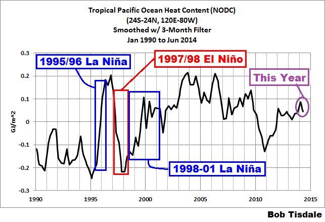


First, the ocean heat content of the tropical Pacific (0-700 meters) is less now that in was a decade ago. So the coiled spring has lost some of its oomph (<– technical word).
In fact, the ocean heat content of the tropical Pacific was less leading into this year, than it was in 1997:
http://bobtisdale.wordpress.com/2014/04/10/the-201415-el-nino-part-2-the-alarmist-misinformation-bs-begins/
While the heat content in the western tropical this year was comparable to that in 1997…
http://bobtisdale.files.wordpress.com/2014/04/figure-3.png
…the eastern tropical Pacific is much cooler:
http://bobtisdale.files.wordpress.com/2014/04/figure-41.png
So, while there was a lot of energy behind the Kelvin wave that started the ball this year, it moved into a cooler environment. That was one of my notes of caution back in April, in the second post in the series:
http://bobtisdale.wordpress.com/2014/04/10/the-201415-el-nino-part-2-the-alarmist-misinformation-bs-begins/
Now, I’m going to borrow a few illustrations from the July update.
http://bobtisdale.wordpress.com/2014/07/08/the-201415-el-nino-part-12-july-2014-update-the-feedbacks-need-to-kick-in-soon/
In it we were still comparing this year to 1997.
So, looking at the Hovmollers of thermocline depth, we can see that downwelling Kelvin wave this year was very strong. (But, again, it was traveling eastward into a cooler eastern tropical Pacific.)
The other thing that was different this year than in 1997 was the number and frequency of westerly wind bursts in the western equatorial Pacific. For that we’ll look at the Hovmoller of Zonal (East/West) wind stress on the equator. In 1997, the westerly wind bursts just kept coming and coming. This year, only two, one in January and one in February.
Now, consider that those westerly wind bursts back in 1997 are caused by weather. The weather conditions were just right to keep pushing warm water from the western tropical Pacific into the east. In other words, it was a freak.
A note about the zonal wind stress Hovmoller above. Those are anomalies. Those are absolutes, so they should be showing actual westerly wind bursts and not westerly wind anomalies.
Back to the coiled spring: We started this year with a pool of warm water in, and near to, the western equatorial Pacific. To confirm that, here’s the first cell of the T300 maps from Animations 1 and 2 in this post.
Here’s the most recent map.
Much of that warm water is gone. Your coiled spring has relaxed…for now. Some of that warm water that has traveled east again and it will eventually return to the western tropical Pacific. But the way things are going for the tropical Pacific as a whole, can we expect a continued decline in the overall heat content of the tropical Pacific? If not, we’ll need a strong La Niña to replenish it.
Cheers.
Bob Tisdale
October 10, 2014 at 5:10 pm
Mr Tisdale. Thank you for the plots above.
I’m looking at two very specific, very visible southern hemisphere “hot spots” – the first just east of Buenos Aires about 800 kilometers in diameter and +2 degrees “high”. The second is a longer, more elliptical “warm spot” between latitude 56 to 50 east-southeast of New Zealand that is +1 to +1.5 degrees above normal.
Fine.
So, what is the “height” above normal for these two specific regions?
If – after all – GRACE is supposedly able to measure the 1.9 mm difference in height caused by melting of Antarctic continental ice and the resulting rise in Antarctic ground level masses of 1.5 mm, then “surely” GRACE satellite will record the change in height of two isolated very specific sea level “mountains” of more than 1000 kilometers each.
Thanks Bob and Alan. My question is fully answered.
The spring is coiled but it does dissipate and has dissipated. But we still can’t predict the winds that charge up the spring and also allow the dissolution.
I think I’ve learnt something.
Bob, educating is exactly what you are doing and in an outstanding way.
Thank you.
Bob Tisdale
Thank you for this presentation. I learn from each one incrementally.
I had an observation upon which you have more insight:
Figures 12 (2014 wind stress anomalies) and Figure 13 (2014 sea surface temperature anomalies), both conditions seem to have lined up on the International Date Line for the last 10 months. When I look at both 2002 and 2009, much more a scatter gram for wind stress.
Judging by the Southern Oscillation Index; i.e., sea surface pressure differences between Tahiti and Darwin, I wonder about a connection amongst the wind stress and sea surface temp anomalies and the SOI. Is there a connection with these observations and lack of “kick” from Westerlies?
RiHo08 asked, “Judging by the Southern Oscillation Index; i.e., sea surface pressure differences between Tahiti and Darwin, I wonder about a connection amongst the wind stress and sea surface temp anomalies and the SOI. Is there a connection with these observations and lack of “kick” from Westerlies?”
One of the theories about why we’ve switched to a period when La Ninas dominate would support your observations.
Background:
The last time the eastern tropical Pacific showed any warming that wasn’t directly related to ENSO was in 1976 and 1977…a response to the Great Pacific Climate Shift of 1976/77. Sea surface temperatures for the entire eastern Pacific Ocean (and a couple of other subsets) simply shifted upwards. There are a few competing theories about that shift. All in all, though, the sea surfaces of the eastern tropical Pacific show little to no warming since 1976/1977.
On the other hand, the surfaces of the western tropical Pacific have warmed. They warmed in upward shifts in response to the strong El Nino events of 1986/87/88, and 1997/98, and (if memory serves) 2009/10. Basically, the upward shifts are responses to the warm water that’s left over from those strong El Ninos.
So the temperature difference between the eastern and western tropical Pacific has increased in that time.
The strength of the Pacific trade winds and the temperature difference between the eastern and western tropical Pacific are interdependent. Stronger trade winds yield a greater temperature difference between the surfaces of the eastern and western tropical Pacific, and a greater temperature difference between the surfaces of the eastern and western tropical Pacific yields stronger trade winds. They’re interdependent with positive feedback…called Bjerknes feedback.
So the theory goes, because the temperature difference between the surfaces of the eastern and western tropical Pacific has increased, the trade winds are stronger. Because the trade winds are stronger, they’re inhibiting westerly wind bursts and the general weakening of the trades associated with El Nino evolution.
I hope that answers your question.
Your reply also explains why a stratospheric volcanic super-eruption (Plinian – http://www.geology.sdsu.edu/how_volcanoes_work/Plinian.html ) in the equatorial Indonesian area can trigger an El Nino. The Walker Cell circulation is disrupted leading to trade wind diminution, setting up an El Nino event. That event can then trigger warming in certain areas of the globe but is then followed by dramatic dips into colder temperatures, and sometimes immediate dips into colder temperatures in certain parts of the globe.
Bob
AccordIng to the ONI INDEX , the only El Nino that started as late as November was the very weak 58/59 El Nino and that was just a few months after the 57/58 El Nino , so it may have been still part of the previous bigger one . I don’t think there will be any El Nino until the end of this decade .October is the critical month . If there is no change , forget about any El Ninos this year despite what the models say.
Herkimer, I would Love if there were no el-nino before the end of the decade. With a bit of luck, the Pause will last at least that long (if not signs of definite cooling by then), and it would exceed shaun lovejoy’s claim that the Pause would have to last until 2019, to invalidate ‘man-made’ global warming.
Thank you Bob – What jaypan said….
thanks Bob. With a coming weak Christmas El Nino conditions, seems to a good argument can be made for a January -February recurring Pineapple express. Could bring significant flooding to California. Not likely 1862 style, but maybe like 1955 when Yuba City got flooded. The blocking high setting up meridonal flow is already in place in the Gulf of Alaska.
So Bob, maybe a Pineapple Express tutorial as the 2014 ElNino seems to be fizzling out?
joelobryan, sorry, but I’m not the person to write a post about the Pineapple Express.
Cheers
Joel, I was just talking to a dear friend of mine about the drought here in NE Oregon and he mentioned the Pineapple express and was thinking we were about due for one, given present conditions. He also mentioned something much stormier:
A Columbus day storm.
Folks in Oregon are not fond of either Pineapple Express or Columbus Day storms. It blows wind up our skirts, makes our socks and shoes damp, and then we get cranky and start blaming elected folks.
Hi Pamela,
Another Oregonian here (EUG).
I was outside on the Columbus Day Storm – trying to fly. Using my coat with my hands in the pockets holding it out like a wing. Worked pretty good too until the roof shingles, plywood, and trash cans that were flying by at about 80mph, and my Mom, forced me inside. I think it was the same year we had golf ball sized hail. Used my coat as an umbrella on that one. Messed my knuckles up a little so I went inside. I love Eastern, OR.
Ron Richey
The convection is still in the west and in the ITCZ. Lucky if we get positive-neutral (0–0.5C)
Harry, great to see you here! For those who don’t know, Harry’s been working on el Nino since the International Geophysical Year in 1957-58, and before it was called el Nino.
Between figures 4 and 5, Bob Tisdale says: “a couple of westerly wind bursts in the western equatorial Pacific will likely be needed” to kick off the Kelvin waves that will warm the eastern ocean to get el Nino going. I agree completely. The season for westerly wind bursts is fast approaching. Looking at table 2 in “The Role of Cross-Equatorial Tropical Cyclone Pairs in the Southern Oscillation” (no paywall in a paper this old)
http://journals.ametsoc.org/doi/pdf/10.1175/1520-0493(1982)1102.0.CO;2
the strongest westerly wind busts, due to those “Cross-Equatorial Tropical Cyclone Pairs”, are most likely in November, December, and January. This is when the “thermal equator”, which is north of the geographical equator most of the year, moves down to zero degrees latitude. In other word, the Inter-tropical Convergence Zone (ITCZ) sits over the “coriolis equator”, and the convectively produced low pressure circulations break into two oppositely rotating cyclones. Hey, plow through the paper if this doesn’t make sense.
You can monitor the real-time tropical Pacific wind analyses
http://www.prh.noaa.gov/hnl/graphics/streamloop.gif to see if a cyclone pair is developing. Today it’s easterly trade winds from Bolivia to Borneo, so no Kelvin waves for the moment. When will a westerly burst occur to give Global Warming some CPR? Who know… Cyclone pairs are synoptic weather events, and as such can’t be predicted more than a few days in advance. Climatologically, they’re most likely November-January, and the passage of the proper phase of a Madden-Julian Oscillation (MJO) will raise the likelihood. There’s 24, 48, and 72-hour forecasts at http://www.prh.noaa.gov/hnl/pages/analyses.php
and the JTWC http://www.usno.navy.mil/JTWC/ shows Pacific cyclone forecasts, along with an annotated hemispheric satellite image http://www.usno.navy.mil/NOOC/nmfc-ph/RSS/jtwc/ab/abpwsair.jpg
Since el Nino forecasts are generally absolute busts, the next best thing is to follow the weather maps to see it actually starting to happen.
Thanks for the links, Richard.
And welcome to WUWT, Harry van Loon.
But Rich, you don’ t get a real EN starting at the end of the year.The 1958/59 was en extension of the IGY one which was year0, 58/59 was year+1. The situation this year was already clear in MJJ.
And thank you Bob.
I have to ask Harry, what say you about our man in Oregon? I think this guy does a bangup job! Farmers around here pretty much stick to his forecasts, which are, at times, opposite (or at least quite different from) our ENSO weekly http://www.cpc.ncep.noaa.gov/products/analysis_monitoring/lanina/enso_evolution-status-fcsts-web.pdf and monthly updates and discussions.
http://www.oregon.gov/ODA/NRD/docs/dlongrange.pdf
Harry, you have a point. With all the biggest Ninos in the past 60 years the first westerly bursts were in our spring (March-April-May, even June 1997). Bob noted this for 1997, 2002, and 2009. But as Bob also noted, it’s the more numerous reinforcing events in the fall (especially November) that really get the classic Nino going. As in 1982-83 and 1997-98, the warm pool moved east as each new westerly burst and cyclone pair kicked off yet another Kelvin wave, and that started in the fall. So the absence of cyclone pairs so far in 2014, except for some weak ones in January, February, and April, does not bode well for a Nino this winter, but does not preclude it. Equatorial SSTs west of the date line are warmer than normal, so the setup is somewhat favorable for a westerly/cyclone “kicker”. But if history is a guide, it’s got to happen by the end of November. For a real doozy, like 1982 or 1997, October would be preferable.
Quoting Bob again, “We’ll need some more westerly wind bursts this year if the El Niño wants to grow up to be big and strong.” I see a possibility, but not likelihood, of this occurring; Harry seems to think there’s no chance. We’ll know in a month or so.
I think, Pamela, that the two best predictions are gotten from the sea-level pressure anomalies in May-June-Ju;ly and from the outgoing long wave radiation.
Further afield in the far West Pac, SuperTyphoon VongFong is tearing up toward Japan and Korea in the coming days. Certainly it will weaken as it moves into cooler waters, before going extra-tropical. But in the week that follows, that deep LP system will get pulled up into the Arctic-polar Jet stream, giving that air river a nice kink that will move east. That kink will perturb the Gulf of Alaska high pressure eastward. But that perturbation may be like setting a pendulum swinging, the east-west oscillation of the GoA High. The oscillation can continuation for months, into early winter setting up Polar Vortex cold spells in the Easternhalf of NA, with a Pineapple Express setup in the opposite phase of the oscillation.
So, Just a random series of thoughts where what is happening in Japan today could (yes a big Could weasel word) affect NA weather into the winter, when you also throw in some waning patches of fizzled El Nino warm water for a PE rainfall setup into Cal.
Thanks Bob, Using my highly sophisticated and finely tuned California El Nino climate index, the yellow fin tuna are now north of the LA/Ventura county line. The further north they roam, the higher the probability of a larger El Nino. This has been an epic year for LFT so far. Not like 98 yet however.
Bob, Thorough as usual. I always look forward to your ideas and analysis. As I forecast the tropics in the SW Pacific everyday, and live in New Zealand I always chuckle at most of the comments that follow your analysis. Nearly everyone of them focus on the Northern Hemisphere, that’s what I find amusing. The data from the Southern Hemisphere is largely ignored which is not good as it’s ‘down under’ that the indices that analyse ENSO are located. The SOI, the Nino regions etc are all down here. I must look daily at surface wind flow and upper level wind flow for my forecasts and I don’t expect others to go to that extent. So this is not a criticism of anyone, but simply a reminder to your readers that to really understand what is happening real time, its available to all if you look south of the equator.
As an example it would not be a surprise for readers to find consistent easterly quadrant winds which of course encourage La Nina, and a look daily at the Anticyclone locations would also offer a heads up on atmospheric dynamics. And finally look at Sea Surface temperatures off the coast of Equador, and other locations off of western South America. This after all is the area where the whole concept of El Nino began.
Thanks for your hard work, its appreciated.
Weather Dave, may I suggest a collab with Bob, so as to bring the Southern hemisphere into the discussion, and thereby boost everyone’s education?
Hi Weather Dave. [sarc on] If I didn’t know better, I might think you were trying to provoke angry words between the hemispheres. Need I remind you that 3 of the 4 NINO regions straddle the equator. Only the NINO1+2 is exclusive property of the Southern Hemisphere.
Regarding the Southern Oscillation Index, if you were to examine the sea level pressures of two locations in the Northern Hemisphere, Hawaii and Philippines for example, you’d discover that they would also work well for an off-equatorial sea level pressure-based ENSO index…or in that case would we have to call it an ENNO Index? [sarc off]
BTW, the delta sea level pressure between Hawaii and the Philippines does, in fact, work. I examined that a couple of years ago.
Cheers
Well, yes Bob. That is a good reminder that the Earth is a unit. Real scientists look at the whole picture. Two comments: The South Pacific, as the biggest water body and energy absorber, needs watching. And, if certain so-called researchers had accessed our volcanically-dated lake-bed etc. climate records, they would not have made fools of us all with their false claims of AGW exceptionalism. We think of these as sad imaginings of the northern hemisphere. The world doesn’t stop at the equator, and this works both ways. Thanks from Brett Keane, NZ
Also you need to look at the flow of water to Australia’s North. The Indian Ocean and the Pacific interface. The IOD and ENSO need conversely aligned for a big event. That’s my theory anyway.
Thanks Bob.
Maybe the ball has just left the bat, but “The Gunner” might call it anyway:
“Kiss it goodbye!” [Bob Prince; voice of the Pittsburgh Pirates]
Dear Bob, thanks for update.
Another thing: I have read your words on the UKMO EN3 OHC 0-2000m dataset shortly available from the KNMI site.
The fact that you grabbed this data set, published your findings etc. acted quickly is as far as I can see one of the most important achievements from the sceptics side. A huge “thank you” for this.
In a Danish debate it is said that “of course the UKMO EN3 was no good, of course it was taken down” etc.
What do you think of such an opinion? Is really the UKMO EN3 of no use? Does it not to some degree tell us simply that there are more versions of the development of 0-2000m OHC temperatures?
Kind Regards, Frank Lansner
Frank, the UKMO EN3 data are basically the 2005 version of the NODC ocean heat content data with ARGO data spliced onto the end. It has value because it allows us to examine the data before the adjustments that eliminated the inconvenient hump in the 1970s and 80s. They eliminated the hump because climate models could not explain it, but there were explanations for it. And those explanations undermined the theories that only manmade greenhouse gases can cause the oceans to warm. I discussed that under the heading of COULD THE 1970s-80s HUMP HAVE BEEN EXPLAINED? in the post here:
http://bobtisdale.wordpress.com/2013/03/11/is-ocean-heat-content-data-all-its-stacked-up-to-be/
THank you so much, just what I was looking fore!
Kind Regards, Frank
Thank you Bob! Good summation. And thank you too Pamela. (Well Bob did so I did. I assume she sent him a note about the quiet on the side very low key prediction.
After all of the hoopla by the committed confirmed disaster desirous green trough addicted frauds; have any of them fessed up to their lost over-the-top ENSO opportunity?
One would think that all of those doom publicity weasels would get called out across the news media, government and educational institutions about their deep desires for human doom and loss of life based on demonizing CO2.
Why? Well, once the first few disaster criers get thrown off the CAGW bus, that should signal the beginning process for getting rid of CAGW’s greatest liabilities; especially weasels desperate for publicity.
Anyone can subscribe to the monthly discussions and consensusey sciencey discussioneys:>) Scroll to the bottom and send an email to automatically receive the info every month.
http://www.cpc.ncep.noaa.gov/products/analysis_monitoring/enso_advisory/ensodisc.html
Thanks Pamela, for the link. Been thinking about the lack of “Pineapple Express”storms myself. .
Bob thanks for your usual great info..
.
Bob
“The continued rise until 2003/04 is likely the return of some of the warm water released and redistributed from the tropical Pacific as a result of the 1997/98 El Niño.”
No, it was ‘created’ by ARGO
http://virakkraft.com/Trop-OHC-SOI.png
and, a wave is mostly a vertical transport, not a horisontal, so you should stop the warm-water-moving- around-nonsense. A moving anomaly is not a moving chunk of water.
lgl, my discussion of the continued warming until 2003 was about the ocean heat content of the tropical Pacific in Figure 14. Yet you provided a graph of the tropical Indian Ocean and most of the tropical Pacific: a totally different subset of the NODC data.
And your complaint about my discussions of Kelvin waves along the equatorial Pacific is unwarranted. A pulse of warmer-than-normal water in the eastward flowing Pacific equatorial undercurrent is commonly referred to as a downwelling Kelvin wave. Does the equatorial undercurrent carry water from west to east? Yes. Does a downwelling Kelvin wave have vertical motion? Yes, it forces the thermocline downward.
How far does the warm water travel, in actual km? Does an el Nino require warm water to travel from Australia to Peru? Are there tracer studies that have confirmed this?
A few weeks ago there was this hue and cry about record high SSTs in the north Pacific.
Not looking quite so hot now – nor the north Atlantic for that matter.
http://weather.unisys.com/surface/sst_anom_new.gif
Any comments?
phlogiston
Good observation. If you go to http;//earth.nullschool.net/ you will find an animated map of global wind . Note the strong winds blowing south from the Bering Sea, Alaska and the Arctic which may account for some of the cooling effect of the northwest Pacific SST previous warm spot. Also note the strong trade winds north and south of the NINO region blowing west with little evidence of these blowing east as they do during El Nino events. You will note that there is a large body of colder water just south of the equator over which the southern trade winds blow before reaching the Nino region.. I see very little evidence to support an EL Nino case to date in either the SST record or the trade winds in this region
phlogiston
Go to http://www.ospo.noaa.gov/data/sst/anomaly/2014/anomnight.10.9.2014.gif for an alternate plot of SST.
You will note that despite some cooling , there is still considerable heat today in the North Pacific SST. Also look at the GLOBAL plot but especially for the PACIFIC SST in the NINO region for 2014, 2009,and 2002 for Sept15 in each case . There appears to be more heat through the entire NINO region for 2002 and 2009 than 2014. Also in 2014, the heat seems to be more north of the Nino region ( that is north of N20) of the Nino region for 2014. The 2014 potential El Nino is running well behind the 2002/2003 and 2009/2010 El Nino’s development through the entire NINO region?
As a separate issue, the extra heat still in the NORTH PACIFIC this late in the year may set up similar very cold winter conditions( via action of the POLAR VORTEX and changes in the jet stream) this winter as during the past winter for central Canada and central United States. Some cold waves have already started especially over Canada.
Thanks, very informative. I guess SSTs are only surface and can be quite transient. Having said that, the south equatorial Pacific cool region has been quite persistent.
That NOAA anomaly map makes the NH look warmer – but the SH colder. Compared to the WUWT map.
lgl @ur momisugly 12:39 & Bob T. @ur momisugly 2:54
In Earth Science 101 the term “wave” in water is covered as up and down motion until shoaling. The term “Kelvin Wave” might imply this sort of movement. But there is more, maybe covered in Earth Science 102.
There is the term “flow” and, if I understand the literature (no guarantee there), the Kelvin Wave in the Pacific has a zonal flow and thus has a zonal velocity that is measured – and shown in the graphs and animations.
A large seismic event can create an ocean wave (Tsunami) that carries energy across the ocean in hours. The Kelvin “waves” being discussed as part of El Niño take 2 months to cover the west to east distance. Seems to me this is moving “a chunk of water.”
http://www.soest.hawaii.edu/MET/Faculty/bwang/bw/paper/wang_103.pdf
http://www.pmel.noaa.gov/people/gjohnson/gcj_1z.pdf
http://www.pmel.noaa.gov/pubs/outstand/john2337/john2337.shtml
IOW, nobody knows.
Bob Tisdale
Do you know if nomad1.ncep.noaa is still down ? . The last time I got a display plot of monoiv2.ctl for ssta for the period of 1981-2014 , it showed the south Pacific SST directly south of the Nino area ( -45 S-,0S, 150W,75W) to be cooling the last few years and colder than during the 2002/2003 and 2009/2010 El Nino’s. As the SOUTH EAST TRADE WINDS blow over this area heading west and north on their way to the Nino region , the colder trade winds will work against any extra warm winds from developing and reversing east. During years when there are no El NINO conditions, there is more colder water both south and north of the NINO region. I think the temperature of these waters is critical to whether the trade winds stall and reverse to blow east or just continue west as they are doing this year.
I’m doing a rain dance at my shamanic best … hoping for El Nino or some subset of El Nino.