Guest Post by Willis Eschenbach
Recently there have been a number of accusations and bad blood involving myself, David Evans, Joanne Nova, Lord Christopher Monckton, and Leif Svalgaard. Now, I cannot speak for any of them, but on my part, my own blood ended up mightily angrified, and I fear I waxed wroth.
However, I see no point in rehashing the past. What I want to do is to return to the underlying scientific questions. In that spirit, I apologize sincerely and completely for wherever I put in “something extra” in the previous discussion. In Buddhism, there’s a concept called “something extra”, and one is enjoined to avoid putting in “something extra”.
It is explained in the following way:
If I say “I am angry” that is simply a true statement.
But if I say “You made me angry”, that is something extra.
So I ask any and all of you to please accept my sincere apologies for whatever what I said that was something extra, so that we can move past this difficult time and get back to discussing the science. Both sides have legitimate grievances, and I am happy to make the first move to get past all of them by apologizing to all of you for whatever my part was in the bad blood. I hope that the other participants accept my apology in the spirit of reconciliation in which it is offered, and that we can move forwards without rancor or recriminations.
Regarding the science, let me go back to the original question, and see what I can do in the way of making my claims in a more Canadian manner. I’ll start by looking at the recent record of the “TSI”, the total solar irradiance:
 Figure 1. Monthly total solar irradiance as measured by the CERES satellite. Vertical blue line shows mid-2004.
Now, if you don’t like the data from the CERES satellite, here’s the SORCE satellite data:
 Figure 2. Daily total solar irradiance as measured by the SORCE satellite. Vertical red line indicates mid-2004. SOURCE
Note what is happening in both graphs after mid-2004 (vertical lines in both plots). As in every solar cycle, the TSI declines somewhat, and bottoms out. Then, it starts to rise again. And by the end of the datasets, in both cases the TSI is higher that it was in 2004.
So what was the scientific dispute all about, the discussion that underlies all of the bad feelings?
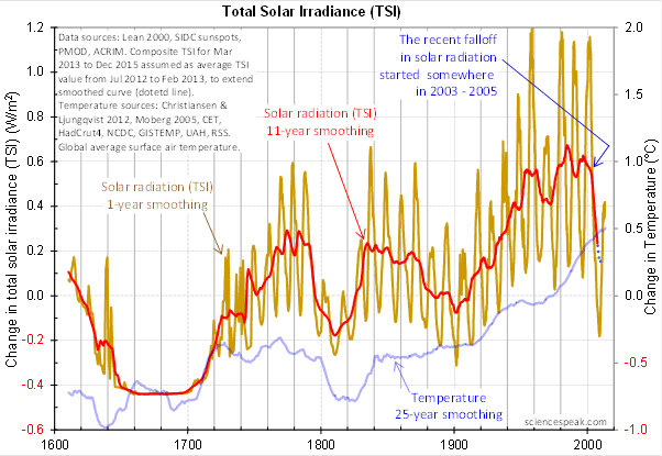
It revolved around the following graph from David Evans, referenced by both Leif Svalgaard and Lord Monckton, showing the basis of his predicted upcoming global cooling :
 Figure 3. David Evan’s graph of TSI (gold line), along with a centered 11-year moving average of the TSI data (red, with dotted blue extension), and a 25 year unspecified smooth of temperature, presumably a trailing average (blue line). (Click to enlarge)
Now, as you can see, the bright red line basically falls off the edge of the earth around 2004. The note says “The recent falloff in solar radiation started somewhere in 2003-2005″.
However, a look at both the SORCE and the CERES data shows no such “falloff in solar radiation”, neither precipitous nor otherwise. In fact, both datasets agree that by 2013 the TSI was well above the level in mid-2004.
Since there is no fall in the underlying data of any kind, why does the red 11-year average line show abrupt cooling starting around 2004?
The answer lies in the various problems with the graph.
• The TSI data is a splice of three datasets, with two of them showing the post-2000 period. This is a huge source of potential error in itself. However, it gets worse.
• One of the spliced datasets is the Lean TSI reconstruction, an outdated dataset that the authors of the reconstruction themselves admit is inaccurate.
• Another is the PMOD dataset. It is known to be reading low by 0.2 W/ms at the solar minimum, introducing a spurious apparently strong recent “cooling” where none exists.
• The 11-year centered average is an extremely bad choice for a filter for sunspot/TSI data. Because the solar cycle varies both longer and shorter than 11 years, at times the 11-year average actually reverses the sense of the data, converting peaks into valleys and valleys into peaks. Look at the period from 1760-1800 in Figure 3, for example. What is happening is that the frequency data is getting strongly aliased into the amplitude data. As a result, the average can end up far from the reality, particularly at the ends of the dataset.
For another example, look at the period just after 1740 in Figure 3. The 11-year average takes a huge vertical jump … but meanwhile back in the real word, the TSI itself is not rising at all. It is falling. Clearly, the large vertical jump in the red line is totally spurious.
• The TSI data has had about 900 days of “data” added to it using an arbitrarily chosen value. This is shown by the blue dots which indicate a continuing drop in the temperature.
So regarding the question of why the red line is acting so strangely, the answer is that we have a perfect storm of spliced data, bad data, arbitrary “data” added to the spliced bad data, and an extremely poor filter choice.
And as a result, the red line doesn’t represent reality in any shape or form. There is no precipitous drop in TSI starting around 2004. It doesn’t exist. Sure, the 11-year average says clearly that there is a huge drop starting around that time … but the actual data says something entirely different, as shown in Figures 1 and 2.
Now, in the heat of the moment Leif described the red line as being “almost fraudulent”. I think this was an over-reaction, but perhaps an understandable one. After all, if the red line were flipped over vertically it would make a lovely hockeystick, and if someone claimed warming was coming based on that hockeystick, people would call them alarmists … and calling someone an alarmist is certainly a close relative of calling them “almost fraudulent”.
However, my guideline is, never ascribe to malice what is adequately explained by error and misunderstanding. So I do not call their red line fraudulent, nor did I do so in the original discussion. Instead, I say that it is an error resulting from a misunderstanding. In any case, let me suggest that we leave out all ascription of motive and intent, that goes nowhere, and that we return to the science.
A more scientifically neutral description of the red line is that it is highly inaccurate and potentially misleading, because the apparent drop starting in 2003-2005 is simply an artifact of a combination of bad data and bad filtering.
Finally, to the degree that David Evans’ model predicts future cooling based on the red line, it is already falsified.
That is what I was trying to say, and I believe (subject to correction) that was what Leif was pointing out as well.
In closing, I will endeavor in this thread to keep my comments on as scientific a basis as possible, to avoid any personal references, and to not ascribe motive or intent. I request that everyone do the same. Many toes have already been stepped on in this discussion. Let’s see if we can simply discuss the science.
My best to all,
w.
VERY IMPORTANT: It is important in general, and in this discussion in particular, that you QUOTE THE EXACT WORDS THAT YOU DISAGREE WITH. Note that this doesn’t mean just referencing their entire comment. Quote the exact words of their comment that you think are in error, and tell us why you think those words are wrong. If you do not quote the exact words that you disagree with, none of us will know what you are referring to … and out of such misunderstandings grows animosity and misunderstanding.
Finally, please don’t delve into the rights and wrongs of what has happened in the previous discussions. I am not interested in the slightest in ascribing blame or responsibility. I have accepted my own responsibility for my own actions and apologized for wherever I was over the line. What I or the others did in the past is a blind alley, so please confine your comments to the science, and as the saying goes, “Let the dead past bury its dead”.
Bob Weber says:
July 19, 2014 at 10:28 am
F10.7 is so much easier – no trauma, no drama.
F10.7 does not show any dramatic drop from one minimum to the next:
Slide 6 of http://www.leif.org/research/SHINE-2010-Microwave-Flux.pdf
so I’m fine with F10.7 as an indicator of solar activity.
And I have added your beloved F10.7 to the comparison plot of solar indicators:
http://www.leif.org/researc/SSN-HMF-TSI-Evans.png
As you can see the F10.7 plot does not look like the Evans plot. Which one would you prefer?
And I have added your beloved F10.7 to the comparison plot of solar indicators:
http://www.leif.org/research/SSN-HMF-TSI-Evans.png
As you can see the F10.7 plot does not look like the Evans plot. Which one would you prefer?
Uk (us)
It tries to set down the rules of the fight that is sure to follow, almost as if the fight was the true end game ? (or nearly so).
henry says
is what I was thinking
as well
perhaps it is time to stop throwing our pearls for the pigs…
lsvalgaard says:
July 19, 2014 at 10:58 am
“Are you too lazy to look for yourself?” Maybe you are too *something* too!
Maybe I am too busy to defend your allegations against David Evans.
Is there a quote or not? If you were interested in being PROVEN right it seems you’d be offering up an exact quote. Now from their end- too many articles, too much beating around the bush, and too much loose wordage afoot. They need to learn like we all do to be as precise as possible. Just like I’m asking you to be precise as to the exact wordage where he compared 2003-05 to NOW. If he did that you should have no problem coughing up a quote, and if he really said that, he needs to tighten up his use of the language when it comes to describing solar activity. And if he didn’t… Well?
“I’m fine with F10.7 as an indicator of solar activity.” Finally.
How does CERES data compare with SORCE?
The MM occured over a period of many decades, and the 2008-09 min barely compares in length. I still have doubts as to the TSI being the same then as during the 08/09 min. [period comparison versus daily F10.7 comparison – your objection is noted].
Frank Davis says:
July 19, 2014 at 11:12 am
In the body of the post above, Willis Eschenbach wrote: Now, in the heat of the moment Leif described the red line as being “almost fraudulent.”. What is that if it’s not ferocious?! And,correct me if I’m wrong, but it was almost your first response to the Evans/Nova hypothesis
No, that was a statement of fact. It is scientific fraud to fabricate data or to use data that due diligence would have told you is unlikely to be valid without the necessary caveats and sensitivity analysis. I gave them an out by qualifying it by ‘almost’ as there is always the chance that they did not know what they were doing.
The meaning of ferocious: “exhibiting or given to extreme fierceness and unrestrained violence and brutality” does not cover my sober analysis of their claims.
Which is why new ideas ought (in my view) to be welcomed at the outset, even if they fairly soon prove to be fatally flawed in one way or other.
Absolutely, except that the data used were almost certainly wrong at the outset, so the new idea turns out to be stillborn. The ‘prediction’ of a steep drop in temperature [0.5C] is claimed to be ‘validated’ if the drop is only 0.1C, which is within the normal random fluctuations. That is another misconduct. So lots of valid reasons to be very critical of their claims.
From Frank Davis on July 19, 2014 at 11:17 am:
It is an eminently sensible prediction because it was basically already known there would be cooling when the PDO and the AMO flipped, among other indicators, and it was time for a neutral/cooling period as known by the record:
http://woodfortrees.org/plot/hadcrut4gl/to:2014/plot/hadcrut4gl/to:2014/mean:61/
Jumping on the float of the winning hometown team during the victory parade does not make one a champion.
Bob Weber says:
July 19, 2014 at 11:26 am
Is there a quote or not?
You can’t read?: “The reason for the cooling is the dramatic fall in solar radiation that started around 2004. [ http://joannenova.com.au/page/2/ ]”
Just like I’m asking you to be precise as to the exact wordage where he compared 2003-05 to NOW.
The best question is in his Figure http://www.leif.org/research/SSN-HMF-TSI-Evans.png
“The recent falloff in solar radiation started somewhere in 2003-2005” then followed by a curve that goes up to ‘now’. I have put a little arrow there to show you that his curve is dropping to lower than where his blue arrow points to 2004. A graph is also a direct quote.
“I’m fine with F10.7 as an indicator of solar activity.” Finally.
This has never been contentious, so your “finally’ is disingenuous.
And I have added your beloved F10.7 to the comparison plot of solar indicators:
http://www.leif.org/researc/SSN-HMF-TSI-Evans.png
As you can see the F10.7 plot does not look like the Evans plot. Which one would you prefer?
How does CERES data compare with SORCE?
Reasonably well [as Willis showed], although SORCE is the more accurate.
The MM occured over a period of many decades, and the 2008-09 min barely compares in length. I still have doubts as to the TSI being the same then as during the 08/09 min. [period comparison versus daily F10.7 comparison – your objection is noted].
There are many good arguments for the MM being comparable to current minima, e.g.
http://www.leif.org/EOS/2011GL046658.pdf
“[1] Variations in the total solar irradiance (TSI) associated with solar activity have been argued to influence the Earth’s climate system, in particular when solar activity deviates from the average for a substantial period. One such example is the 17th Century Maunder Minimum during which sunspot numbers were extremely low, as Earth experienced the Little Ice Age. Estimation of the TSI during that period has relied on extrapolations of correlations with sunspot numbers or even more indirectly with modulations of galactic cosmic rays. We argue that there is a minimum state of solar magnetic activity associated with a population of relatively small magnetic bipoles which persists even when sunspots are absent, and that consequently estimates of TSI for the Little Ice Age that are based on scalings with sunspot numbers are generally too low. The minimal solar activity, which measurements show to be frequently observable between active‐region decay products regardless of the phase of the sunspot cycle, was approached globally after an unusually long lull in sunspot activity in 2008–2009. Therefore, the best estimate of magnetic activity, and presumably TSI, for the least‐active Maunder Minimum phases appears to be provided by direct measurement in 2008–2009. The implied marginally significant decrease in TSI during the least active phases of the Maunder Minimum by 140 to 360 ppm relative to 1996 suggests that drivers other than TSI dominate Earth’s long‐term climate change. Citation: Schrijver, C. J., W. C. Livingston, T. N. Woods, and R. A. Mewaldt (2011), The minimal solar activity in 2008–2009 and its implications for long‐ term climate modeling, Geophys. Res. Lett. , 38, L06701″
Bob Weber says:
July 19, 2014 at 11:26 am
And I have added your beloved F10.7 to the comparison plot of solar indicators:
http://www.leif.org/research/SSN-HMF-TSI-Evans.png
As you can see the F10.7 plot does not look like the Evans plot. Which one would you prefer as correct description of solar activity?
leif keeps referring to HMF
as if that is important to watch…;
Note:it is the solar magnetic field strengths that are the important ones to watch
http://ice-period.com/wp-content/uploads/2013/03/sun2013.png
note the bi-nomial (quadratic function) you can draw from the top to bottom and from the bottom to top both showing that the minimum strengths will be reached around 2016….
@Bob Weber
And I have added your beloved F10.7 to the comparison plot of solar indicators:
http://www.leif.org/research/SSN-HMF-TSI-Evans.png
As you can see the F10.7 plot does not look like the Evans plot. Which one would you prefer as correct description of solar activity?
HenryP says:
July 19, 2014 at 11:56 am
leif keeps referring to HMF as if that is important to watch…
Note:it is the solar magnetic field strengths that are the important ones to watch
The plot you show is actually my plot of the Sun’s field at the poles, not what actually hits us at the earth. The HMF plot That I show is the Sun’s magnetic field measured at Earth. Which of the two would you say is most important for the Earth’s environment?
leif says
Which of the two would you say is most important for the Earth’s environment?
henry says
for many years, man has tried to duplicate the process on the sun [to generate energy]
but could not do so because of …???
[lacking strength of magnetic field, perhaps?]
It is the strength of the magnetic fields on the sun that determines what happens on earth
http://wattsupwiththat.com/2014/07/16/mending-fences/#comment-1689798
HenryP says:
July 19, 2014 at 12:16 pm
It is the strength of the magnetic fields on the sun that determines what happens on earth
And the solar wind carries that magnetic field out into the heliosphere and to the earth, so the HMF [Heliospheric Magnetic Field] is, as you surely will understand, what is important for the earth.
@leif
clearly
you are missing my point
higher solar polar field strengths means less USW
lower solar polar filed strengths means more USW
569 Responses to Mending Fences
For kcuf sake (or God’s if you’re a believer ), I come on here to learn more about climate, not to read the endless crap of petulant children squabbling “yaa boo he said”, “no he said”. You all need your heads banging together, backsides slapped & made to sit on the naughty step until you can be nice.
If you want to pick a fight, try Gore, Mann, Cook et al, plenty to pull apart there; we are all supposed to fighting the corruption of science, not each other, so stop acting like winging teenage to$$ers & stick to science ……or I’ll get really cross !!
HenryP says:
July 19, 2014 at 12:23 pm
you are missing my point
higher solar polar field strengths means less USW
lower solar polar field strengths means more USW
Assuming that USW is UV, then, again, no. The polar field strength has nothing to do with UV. The solar polar field strength goes to zero at solar maximum, and the magnetic fields at lower latitudes control UV. The polar fields as such have nothing to do with this. Now, there are good reasons to believe that the polar fields are a good predictor of solar activity in the next cycle, but that is something completely different.
leif says
Now, there are good reasons to believe that the polar fields are a good predictor of solar activity in the next cycle, but that is something completely different.
henry says
you are trying to change the subject again
truth is, nobody can measure USW (= ultra short wave) on a continuous basis
so,
my results tell me I am right
where are your [own] results?
HenryP says:
July 19, 2014 at 12:42 pm
you are trying to change the subject again
Trying to educate you a little bit [to the extent it is possible] about UV and magnetic fields.
truth is, nobody can measure USW (= ultra short wave) on a continuous basis
Oh yes, the Earth can. Here is a plot of UV since 1880s
http://www.leif.org/research/F107-from-rY.png
The UV creates the ionosphere and a dynamo current at 100 km height creates a magnetic field that we can measure on the ground. This effect was discovered way back in 1722.
Slides 46-50 of http://www.leif.org/research/HAO-Seminar,%20How%20Well%20Do%20We%20Know%20the%20SSN.pdf explains how.
leif says
Trying to educate you a little bit [to the extent it is possible] about UV and magnetic fields.
henry says
clearly
you don’t want to understand
I am trying to teach you:
e.g.
“On July 14, 2014, a sounding rocket will be ready to launch from White Sands Missile Range, New Mexico a little before noon local time. Soaring up to 180 miles into Earth’s atmosphere, past the layers that can block much of the sun’s high energy light, the Degradation Free Spectrometers experiment will have six minutes to observe the extreme ultraviolet and soft x-rays streaming from the sun, in order to measure the sun’s total energy output, known as irradiance, in these short wavelengths.
The total solar irradiance, and to an even greater degree, irradiance at high energy wavelengths is known to change over time in conjunction with the sun’s approximately-11-year solar cycle. How it changes over longer periods of time, however, is less certain – but fairly important if we’re going to understand how solar variability affects Earth’s space environment.”
http://www.nasa.gov/content/goddard/mission-to-study-the-suns-energy/#.U8PJf1V_sup
”
or perhaps you think you know that what we have not yet measured
[on a a continuous basis]
?
You think 6 minutes is enough for my specifications?
As stated before,
beside the 11/22 year cycle, as mentioned,
there is an 88 year cycle
and a 208 year cycle
http://www.nonlin-processes-geophys.net/17/585/2010/npg-17-585-2010.html
and
//
?
+ what we donot know yet
but their is NO
AGW
Only fools would believe that
on the data that is available
http://blogs.24.com/henryp/2013/02/21/henrys-pool-tables-on-global-warmingcooling/
Are you a fool?
Willis Eschenbach says:
July 19, 2014 at 7:47 am
“I never said the inverse, that people posting under their own name have to take responsibility for their words. I said I have to, but that’s just me. However, what I can’t do is walk away from them. I said them, my friends and enemies know I said them, I can’t disown them as anonymous posters can do.”
Respectfully, Willis – you cut off the part of my comment that explains how it relates to you – namely that you have been accused in a few instances of doing exactly what you claim you can’t do – namely walk away from errors. If I, as an anonymous poster, choose to stop commenting on one of my errors or acknowledge it when I am corrected, how is that different from when you do it? Only that there are records with your name on them that are associated with the error(which is not your choice)? If stopping commenting on an error and not acknowledging when you are corrected is bad behavior when an anonymous person does it, it is also bad behavior when a named person does it.
Cheers, 🙂
“A 50-year low in solar wind pressure: Measurements by the Ulysses spacecraft reveal a 20% drop in solar wind pressure since the mid-1990s—the lowest point since such measurements began in the 1960s. The solar wind helps keep galactic cosmic rays out of the inner solar system. With the solar wind flagging, more cosmic rays are permitted to enter, resulting in increased health hazards for astronauts. Weaker solar wind also means fewer geomagnetic storms and auroras on Earth.
A 12-year low in solar “irradiance”: Careful measurements by several NASA spacecraft show that the sun’s brightness has dropped by 0.02% at visible wavelengths and 6% at extreme UV wavelengths since the solar minimum of 1996. The changes so far are not enough to reverse the course of global warming, but there are some other significant side-effects: Earth’s upper atmosphere is heated less by the sun and it is therefore less “puffed up.” Satellites in low Earth orbit experience less atmospheric drag, extending their operational lifetimes. Unfortunately, space junk also remains longer in Earth orbit, increasing hazards to spacecraft and satellites.”
http://science.nasa.gov/science-news/science-at-nasa/2009/01apr_deepsolarminimum/
Such are the data of NASA.
http://www.nasa.gov/sites/default/files/styles/673xvariable_height/public/solar-irradiance_0.jpg?itok=u_EA2Rzp
ren says:
July 19, 2014 at 1:54 pm
Such are the data of NASA.
No need to show old stuff. Here is the newest composite as I have shown before:
http://www.leif.org/research/TSI_Composite_Kopp-with-TCTE.jpg
@Bob Weber
And I have added your beloved F10.7 to the comparison plot of solar indicators:
http://www.leif.org/research/SSN-HMF-TSI-Evans.png
As you can see the F10.7 plot does not look like the Evans plot. Which one would you prefer as correct description of solar activity?
Leif,
Easy now…. I just took “my beloved” to town for some ice cream, as she is my one true love, and F10.7cm is nothing by comparison… although very reliable!
Your addition of F10.7 to http://www.leif.org/research/SSN-HMF-TSI-Evans.png is not in keeping with your usual high standards of graph making, sir. But you were quick on the draw there….
I would not have used the solar graphic DE used. I personally think he needs some help but since this has gotten blown into loads of drama, nothing productive can occur until fences are mended. It’s still a lot of nitpicking over an indice with obvious problems, TSI.
The quote you mentioned isn’t on the link you provided (http://joannenova.com.au/page/2/), it is from here: http://joannenova.com.au/2014/06/big-news-viii-new-solar-model-predicts-imminent-global-cooling/ . If DE had been a little more careful and had said the TSI decline started at the beginning of 2002, we wouldn’t be arguing about this, we’d be arguing about something different.
Isn’t it time to change the subject?
Dr Svalgaard,
I’m glad you linked this (The minimal solar activity in 2008–2009 and its implications for long ‐
term climate modeling), as I was wondering about the implications for MM last night while thinking about the points you enumerated.
So, why don’t these ‘ephemeral regions’ end up modulate cosmic rays the same way that sunspots do? Is it that the magnetic forces involved are smaller relative to sunspots? Or .. something to do with alignment, or what?