Guest Post by Willis Eschenbach
Recently there have been a number of accusations and bad blood involving myself, David Evans, Joanne Nova, Lord Christopher Monckton, and Leif Svalgaard. Now, I cannot speak for any of them, but on my part, my own blood ended up mightily angrified, and I fear I waxed wroth.
However, I see no point in rehashing the past. What I want to do is to return to the underlying scientific questions. In that spirit, I apologize sincerely and completely for wherever I put in “something extra” in the previous discussion. In Buddhism, there’s a concept called “something extra”, and one is enjoined to avoid putting in “something extra”.
It is explained in the following way:
If I say “I am angry” that is simply a true statement.
But if I say “You made me angry”, that is something extra.
So I ask any and all of you to please accept my sincere apologies for whatever what I said that was something extra, so that we can move past this difficult time and get back to discussing the science. Both sides have legitimate grievances, and I am happy to make the first move to get past all of them by apologizing to all of you for whatever my part was in the bad blood. I hope that the other participants accept my apology in the spirit of reconciliation in which it is offered, and that we can move forwards without rancor or recriminations.
Regarding the science, let me go back to the original question, and see what I can do in the way of making my claims in a more Canadian manner. I’ll start by looking at the recent record of the “TSI”, the total solar irradiance:
 Figure 1. Monthly total solar irradiance as measured by the CERES satellite. Vertical blue line shows mid-2004.
Now, if you don’t like the data from the CERES satellite, here’s the SORCE satellite data:
 Figure 2. Daily total solar irradiance as measured by the SORCE satellite. Vertical red line indicates mid-2004. SOURCE
Note what is happening in both graphs after mid-2004 (vertical lines in both plots). As in every solar cycle, the TSI declines somewhat, and bottoms out. Then, it starts to rise again. And by the end of the datasets, in both cases the TSI is higher that it was in 2004.
So what was the scientific dispute all about, the discussion that underlies all of the bad feelings?
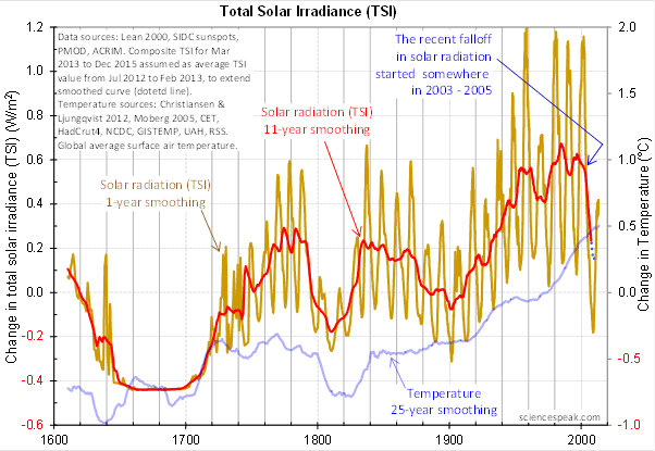
It revolved around the following graph from David Evans, referenced by both Leif Svalgaard and Lord Monckton, showing the basis of his predicted upcoming global cooling :
 Figure 3. David Evan’s graph of TSI (gold line), along with a centered 11-year moving average of the TSI data (red, with dotted blue extension), and a 25 year unspecified smooth of temperature, presumably a trailing average (blue line). (Click to enlarge)
Now, as you can see, the bright red line basically falls off the edge of the earth around 2004. The note says “The recent falloff in solar radiation started somewhere in 2003-2005″.
However, a look at both the SORCE and the CERES data shows no such “falloff in solar radiation”, neither precipitous nor otherwise. In fact, both datasets agree that by 2013 the TSI was well above the level in mid-2004.
Since there is no fall in the underlying data of any kind, why does the red 11-year average line show abrupt cooling starting around 2004?
The answer lies in the various problems with the graph.
• The TSI data is a splice of three datasets, with two of them showing the post-2000 period. This is a huge source of potential error in itself. However, it gets worse.
• One of the spliced datasets is the Lean TSI reconstruction, an outdated dataset that the authors of the reconstruction themselves admit is inaccurate.
• Another is the PMOD dataset. It is known to be reading low by 0.2 W/ms at the solar minimum, introducing a spurious apparently strong recent “cooling” where none exists.
• The 11-year centered average is an extremely bad choice for a filter for sunspot/TSI data. Because the solar cycle varies both longer and shorter than 11 years, at times the 11-year average actually reverses the sense of the data, converting peaks into valleys and valleys into peaks. Look at the period from 1760-1800 in Figure 3, for example. What is happening is that the frequency data is getting strongly aliased into the amplitude data. As a result, the average can end up far from the reality, particularly at the ends of the dataset.
For another example, look at the period just after 1740 in Figure 3. The 11-year average takes a huge vertical jump … but meanwhile back in the real word, the TSI itself is not rising at all. It is falling. Clearly, the large vertical jump in the red line is totally spurious.
• The TSI data has had about 900 days of “data” added to it using an arbitrarily chosen value. This is shown by the blue dots which indicate a continuing drop in the temperature.
So regarding the question of why the red line is acting so strangely, the answer is that we have a perfect storm of spliced data, bad data, arbitrary “data” added to the spliced bad data, and an extremely poor filter choice.
And as a result, the red line doesn’t represent reality in any shape or form. There is no precipitous drop in TSI starting around 2004. It doesn’t exist. Sure, the 11-year average says clearly that there is a huge drop starting around that time … but the actual data says something entirely different, as shown in Figures 1 and 2.
Now, in the heat of the moment Leif described the red line as being “almost fraudulent”. I think this was an over-reaction, but perhaps an understandable one. After all, if the red line were flipped over vertically it would make a lovely hockeystick, and if someone claimed warming was coming based on that hockeystick, people would call them alarmists … and calling someone an alarmist is certainly a close relative of calling them “almost fraudulent”.
However, my guideline is, never ascribe to malice what is adequately explained by error and misunderstanding. So I do not call their red line fraudulent, nor did I do so in the original discussion. Instead, I say that it is an error resulting from a misunderstanding. In any case, let me suggest that we leave out all ascription of motive and intent, that goes nowhere, and that we return to the science.
A more scientifically neutral description of the red line is that it is highly inaccurate and potentially misleading, because the apparent drop starting in 2003-2005 is simply an artifact of a combination of bad data and bad filtering.
Finally, to the degree that David Evans’ model predicts future cooling based on the red line, it is already falsified.
That is what I was trying to say, and I believe (subject to correction) that was what Leif was pointing out as well.
In closing, I will endeavor in this thread to keep my comments on as scientific a basis as possible, to avoid any personal references, and to not ascribe motive or intent. I request that everyone do the same. Many toes have already been stepped on in this discussion. Let’s see if we can simply discuss the science.
My best to all,
w.
VERY IMPORTANT: It is important in general, and in this discussion in particular, that you QUOTE THE EXACT WORDS THAT YOU DISAGREE WITH. Note that this doesn’t mean just referencing their entire comment. Quote the exact words of their comment that you think are in error, and tell us why you think those words are wrong. If you do not quote the exact words that you disagree with, none of us will know what you are referring to … and out of such misunderstandings grows animosity and misunderstanding.
Finally, please don’t delve into the rights and wrongs of what has happened in the previous discussions. I am not interested in the slightest in ascribing blame or responsibility. I have accepted my own responsibility for my own actions and apologized for wherever I was over the line. What I or the others did in the past is a blind alley, so please confine your comments to the science, and as the saying goes, “Let the dead past bury its dead”.
Evans’ theory hangs by just two threads. The first is the drop in TSI from 2003 to 2008.5 as presented from several different sources including Leif Svalgaard. All 6 data sets of TSI are dropping rapidly and this is the basis of Evans’ claim for a cooling earth.
http://jonova.s3.amazonaws.com/graphs/solar-radiation/tsi-datasets-ls.gif
I don’t understand why someone like Leif (this topic is in his wheel-house) would resort to listing 19 points about TSI and presumably why Evans’ theory is wrong without discussing the above graph. Anyone who thinks an 11 year filter on TSI makes it wrong is out to lunch. Evans correctly ends his graph in 2008.5 because his filter is centered at year 6 and he runs out of data in 2014.5. A slight variation in TSI period from 11.0 to 10.7 years will have no real effect on the record either. The filter is a straw man argument and draws us away from the drop in TSI starting around 2003.
So is PMOD, SORCE/TIM, ACRIM, Leif Svalgaard, Composite TSI, Lean 2000 Monthly and Sunspots SIDC all wrong, or is Evans doing something wrong with all these data sets – because they ALL point to a rapid drop in TSI from 2003 to 2008.5 (not present day).
The second thread supporting Evans’ theory is the extreme non-linear behavior between TSI and temperature that would have to exist in order for such small changes in TSI to have such large changes in global temperatures. I can’t accept his theory for that reason. If the earth was that sensitive to small TSI changes I doubt we would exist. But I accept his graph and wonder why Leif or Willis don’t discuss that more directly.
@Pamela. Don’t confuse time series analysis and statistics.
@Leif. Look at the link and tell me again the data is wrong. Your name is on the graph too. If the graph is wrong you should be able to tell us why in one sentence.
Willis:
Some people would prefer that you be more specific in your apology, after all, watching someone else apologies in great and excruciating detail can be fun. More groveling please! However, may I make a time and effort saving suggestion? If they want your apology to be more detailed, well, do it the warmist way, just make something up, and apologize for that. See, you save all that time and effort of looking through your back posts.
Hmm, on further reflection, that would take, like, effort, so, an even better idea, let someone else make something up, steal their idea, and apologize for that. Here is an example of exactly what you wrote (trust me!) which I am sure deserves the most sincere and heartfelt and gratuitously satisfying apology possible.
(Note to reader, reading beyond this line will leave you scarred for life, don’t say I didn’t warn you!)
The weather beaten trail wound ahead into the dust racked climes of the baren land which dominates large portions of the Norgolian empire. Age worn hoof prints smothered by the sifting sands of time shone dully against the dust splattered crust of earth. The tireless sun cast its parching rays of incandescense from overhead, half way through its daily revolution. Small rodents scampered about, occupying themselves in the daily accomplishments of their dismal lives. Dust sprayed over three heaving mounts in blinding clouds, while they bore the burdonsome cargoes of their struggling overseers.
“Prepare to embrace your creators in the stygian haunts of hell, barbarian”, gasped the first soldier.
“Only after you have kissed the fleeting stead of death, wretch!” returned Grignr.
Note, they are not “adjusting” the temperature record, they are putting in “something extra”.
I am just wondering…
This 11 year filter has obvious problems, because the sunspot record shows that only the average of sunspot cycles are 11 years, the specific individual cycles are not. Is it possible to make a filter that, by looking at the exact data, each of the 24 or so solar cycles, filters each by the exact number of years of each cycle, cycle by cycle, and then splice all those 24 or so filtered results together? I mean, there is only maybe at most 24 of them, no need for a blanket filter to save time, how much time could it take to do only 24 of them in this computer aided age? Is it possible?
“The average American has one ball and one tit. You now know everything you need to know about statistics.” – from _Mr Natural’s Rules of Women and the Universe_, circa 1977
Legatus says:
July 19, 2014 at 7:10 am
“I am just wondering…
This 11 year filter has obvious problems, because the sunspot record shows that only the average of sunspot cycles are 11 years, the specific individual cycles are not. Is it possible to make a filter that, by looking at the exact data, each of the 24 or so solar cycles, filters each by the exact number of years of each cycle, cycle by cycle, and then splice all those 24 or so filtered results together? I mean, there is only maybe at most 24 of them, no need for a blanket filter to save time, how much time could it take to do only 24 of them in this computer aided age? Is it possible?”
——————————————————————————————————————–
I would think a lot of us regular folks are wondering the same thing. Perhaps this method would not produce any significant results. After all, didn’t I read that Jo Nova and Dr Evans say they spent several years and lots of their own money on this model (parapharsing here)? Pretty disappointing if one does that and comes up with nothing.
Shawnhet says:
July 19, 2014 at 1:59 am
Thanks, Shawnhet. You’ve taken my statement and inverted it. My point was that people posting anonymously never have to take responsibility for their words. They can walk away from their words, change their alias, and never take responsibility.
I never said the inverse, that people posting under their own name have to take responsibility for their words. I said I have to, but that’s just me. However, what I can’t do is walk away from them. I said them, my friends and enemies know I said them, I can’t disown them as anonymous posters can do.
Again, I’m not saying that anonymous = wrong. There are lots of good reasons for someone to embrace anonymity … but there are also costs if they do so.
All the best,
w.
The good Viscount has reminded me the existence of PG Wodehouse’s Edwin, son of Lord Worplesdon. Edwin, an adolescent, and a Boy Scout, felt that it was his duty to do a good deed every day.The catastrophic consequences of that kind of thinking are catalogued at length, and in depth, in Wodehouse’s “Joy in the Morning.” Which happens to be by the bedside just now.
Pip pip.
J
Steve from Rockwood says:
July 19, 2014 at 5:38 am
Evans’ theory hangs by just two threads. The first is the drop in TSI from 2003 to 2008.5 as presented from several different sources including Leif Svalgaard.
No, he uses TSI from 2003 to 2013 [plus some fabricated data thereafter]. He did not use the smoothed data.
Steve from Rockwood says:
July 19, 2014 at 5:38 am
Evans’ theory hangs by just two threads. The first is the drop in TSI from 2003 to 2008.5 as presented from several different sources including Leif Svalgaard.
Also, note that Evans has a fall-off of more than 0.7 W/m2. Twice as large as the actual fall-off.
Monckton of Brenchley says:
July 19, 2014 at 3:59 am
Lord Monckton, I fear that your claims that I have insulted Dr. Evans are meaningless to me. If you want to tell me if and where I’ve insulted you, I’m more than willing to listen.
But unless Dr. Evans shows up to tell me that you are now his official spokesman regarding apologies, you claiming that I owe Dr. Evans an apology is as meaningless as if I were to claim that you owe Dr. Svalgaard an apology … I’m not Leif, I’m not his spokesdude, so you would be free to ignore any claims I might make that you’ve insulted him, and you’d be well advised to do so. If Leif wants an apology, that’s his business and none of mine, he can ask for an apology if he wishes … and the same is true with Dr. Evans. If he wants a different or more specific apology from me, that’s his business, not any of yours.
Finally, I have already apologized to Dr. Evans, to Joanne Nova, and to you for whatever I said that you think was over the top. If that apology REGARDING YOU is insufficient in your opinion, please let me know where and how, and we can discuss it.
And if you believe that you owe no one an apology after threatening people with monetary action and triple damages over what they said, not about you, but about a third person in a scientific discussion … well, in that case I may end up being the only person apologizing at all in this sorry episode.
However, I do note that despite your call that I should treat Dr. Evans with kid gloves, you are quite happy to say that I’ve lost my mind, that I’ve “departed from all reason”. However, be clear that I’m not asking for an apology or for triple damages for the attack on my reputation, because to me that’s simply part of the cut and thrust of debate …
w.
PS—Your main objection seems to be that I said that like Dr. Mann, Dr. Evans had not revealed his code and his results. This is still true to this day, we still have not seen the code to set the arbitrary parameters, nor has he released his out-of-sample results. Since without those we cannot falsify his work, it is no more science than the work of Michael Mann. And at this point it appears that we will never see the data and code that I originally requested, they’ve “moved on” from that to the new, improved code with nuclear trimmings.
So what I said regarding Dr. Evans refusal to release his code and his results was a statement of fact rather than an insult of any kind. However, if Dr. Evans objects to the way I stated that fact, he’s free to let me know, and we can discuss it.
Willis Eschenbach says:
July 19, 2014 at 8:12 am
Monckton, I fear that your claims that I have insulted Dr. Evans are meaningless to me.
Furthermore Monckton has no standing [locus standi] to demand apologies.
From Steve from Rockwood on July 19, 2014 at 5:38 am:
Spliced-together PMOD has problems, but it is quickly available from WoodForTrees, currently-available range 1978.83 to 2011.75:
http://woodfortrees.org/plot/pmod/from:1978.8/to:2011.8/offset:-1366/plot/pmod/from:1978.8/to:2011.8/mean:66/offset:-1366/plot/pmod/from:1978.8/to:2011.8/mean:132/offset:-1366/plot/pmod/from:1978.8/to:2011.8/mean:198/offset:-1366/
The “dropping rapidly” is not rapid. The “drop-off” is negligible. TSI is already heading back up.
The 5.5-year smoothing follows TSI, but the 11-year smoothing is noticeably inverting peaks and troughs, indicating 11 years is too much smoothing and creating distortion. Adding another 5.5 highlights the distortion, although it is amusing that at about the 2003 “drop” is where the 16.5-year smoothing is showing the upturn of a cycle starting.
http://woodfortrees.org/plot/pmod/from:1978.8/to:2011.8/offset:-1366/plot/pmod/from:1978.8/to:2011.8/mean:66/offset:-1366/plot/rss/from:1978.8/to:2011.8/plot/rss/from:1978.8/to:2011.8/mean:66/
Also global temperatures do not seem to care about TSI on these short time periods.
Or they have arrogantly decided to actually examine the effects of smoothing on the data rather than accept soothing assurances that it wasn’t an issue.
Chart neutrons indicates that UV radiation in 2009 was lower than in previous solar minima. This is an tip that a minimum of TSI is not permanent.
http://cosmicrays.oulu.fi/webform/query.cgi?startday=01&startmonth=06&startyear=1965&starttime=00%3A00&endday=19&endmonth=07&endyear=2014&endtime=00%3A00&resolution=Automatic+choice&picture=on
“Agnostic says:
July 19, 2014 at 5:28 am
@Willis and Steven Mosher
Right, so you think it sufficient to make your requests for important information on a blog rather than a direct email? Even though you emailed Phil Jones?”
This a version of the argument made against Steve Mcintyre and the rest of us.
we didnt ask in “RIGHT WAY”. Our letters were not nice enough ( google mcintyre and pretty please with sugar on it ” or FOIA was threatening.
Get the point. There is no obligation to ASK. there is no obligation to ask by phone, or in person, or by mail, or email, or by comment on their blog ( they could say Steve email us.. thats what I do when people ask me on blogs ) there is no obligation to ask. The obligation runs the other WAY. there is an obliigation to disclose SO THAT PEOPLE DONT HAVE TO ASK.
Get it.
because when we ask they say ‘you are not a scientist, you are not an academic, please ask by phone,
please ask by mail, please ask by mail and tell us why you want the information,, because then they play games like,, i sent Mcintyre the excel files..
So, test this for yourself. You ask, by mail. lets see if we get the same results.
and when they say no to you. you will come up with another excuse
ren says:
July 19, 2014 at 8:35 am
Chart neutrons indicates that UV radiation
The Neutron Monitor counts have nothing to do with UV radiation as such. You might get by by saying that solar activity in 2009 was lower than most solar minima, but that we knew already as the sunspot number is a good indicator of that.
You guys remind me of the never ending fight between the Israeli’s and the Palestinians.
Analysing that fight: It is [and has always been] :
an eye for an eye, a tooth for a tooth, a life for a life.
That philosophy can be found back in both their religions {Judaism and Islam}.
Yet, they both could be rich for all the Christians wanting to visit the Holy land….. if they just put their heads together.
Pity the theology from Jesus [which recommends that we should love our enemies] is completely lost on them….
http://blogs.24.com/henryp/2013/12/10/my-own-true-christmas-story/
lsvalgaard wrote: Let us first see the papers published in ‘learned journals’. So far, Evans’ ‘work’ does not look publishable in any shape or form.
But wasn’t it one of their intentions to get away from the ‘learned journals’ and use the power of the internet to publicize (i.e. publish) their ideas and attract advice/criticism from like-minded people? Do you think that something is only ‘science’ if it’s published in ‘learned journals’?. If so, it seems to me that you desire a scientific closed shop from which intruders are rigorously excluded..
One of the things I liked about David Evans/Jo Nova’s little enterprise was that they were thinking for themselves, constructing a model, and putting their findings out on the internet, complete with Excel code. I think that’s very admirable, and I’d like to applaud them for their efforts.
I think it’s a great shame that they have been so furiously attacked by Svalgaard, Eschenbach, and others. I can only suppose this is because, once science has become a closed shop, intruders (and possible competitors) like Evans and Nova must always attacked on sight. Which may be why Svalgaard regards science as a ‘blood sport’.
I should add that I hold no strong opinion about their theory. To the extent that I understand it, they seem to be saying that there is an 11 year filter which is stripping out small variations in TSI from the terrestrial temperature record. And if the filter is applied to the latest TSI figures, it predicts a fall in temperature 11 years later. Well and good: let’s wait and see. The proof will be in the pudding.
P.S. I am using my real name 😉
Frank Davis:
You’ve used the term “science” in reference to Dr. Evans’s model. A sometimes overlooked feature of this term is that it has several meanings. A consequence is for disambiguation of this term to be required when it is used in making an argument if false or unproved conclusions are to be avoided.
The Daubert standard of the courts of the U.S. supplies the required disambiguation. Under this standard, the falsifiability of the claims that are made by it is required of a scientific model ( see http://en.wikipedia.org/wiki/Daubert_standard ). The claims that are made by Dr. Evans’s model do not appear to me to be falsifiable. If so, this model not “scientific” under the Daubert standard’s disambiguation.
“Kip Hansen says:
July 18, 2014 at 7:37 pm
Reply to Mosher ==> There *is* no justification for this: “why willis and I demand…..”
Nothing whatever gives either of you any right to demand anything of anyone.
You do have the right, like anyone else, to politely contact a colleague directly and privately and ask for clarifications and/or to request copies or pointers to original data sets and code used in a piece of scientific work you are interested in. The preferred public communication on such would be a blog comment something like “I have contacted Dr So-and-so by email and asked for copies of original data and code used in his calculation. I’ll let you know in a few days the results of this request.”
###############################################
Kip draws from the bag of objections that Steve Mcintyre had to deal with.
Remember upthread where I said that WE HEARD THIS ALL BEFORE
what did mcintyre have to deal with
‘ he didnt ask in the right way’
google steve mcintyre pretty please with sugar on it.
CLUE BIRD KIP. There is no obligation to ask, or to ask nicely, or to say pretty please with sugar on it.
the obligation belongs to EVANS to show his work. he hasnt. end of story.
Evans has an obligation to produce. There is no obligation for willis to ask, to ask nicely, to ask by mail
by phone by morse code, by smoke signal, to ask at all.
Evans hasnt shown his work. fail.
Let us consider the long periods when the Rev was below normal. You can see that in these periods TSI had to be lower and the temperature dropped. As you can see the current chart is clearly below the blue line.
http://www.leif.org/research/Ap-1844-now.png
Agnostic says:
July 19, 2014 at 5:28 am
Since this is the 21st century, since they are obviously reading the blog posts, since “on a blog” is where they themselves have published their “important information”, since I’ve made the same request both on this thread, on the previous thread, on the thread before that, and on the same blog where they published their information, and since Joanne has responded directly to my comments requesting the information … yes, I absolutely think that is more than sufficient.
If you truly were concerned about the lack of email, you would email them yourself. As it is, you’re just inventing excuses.
Finally, the point of publishing your code and data is so that no one ever has to make a special request for you to pretty please stop hiding the results … I should not have to ask anywhere, whether it be by email or blog comment.
Agnostic, look at my blog posts. I regularly publish my code and data with each post … and this is not for some claimed major breakthrough like they are asserting for their work. As a result, nobody has to email me saying “Willis, would you be so kind as to send me your results?”. Nobody has to comment on the blog saying “Willis, when are you going to release the data and code that you used?”.
Nor is this some new idea or some onerous demand. My high school science teacher, Mrs. Henniger, would give us an “F” if we didn’t show our work, even if our results were 100% correct. If high school kids can show their work, how hard can it be for scientists to do the same? And more to your current point … since high school kids are required to show their work, why should I have to ask and plead with scientists to show their work?
And why are you claiming that the problem is that I’m not asking in the right manner or the right location?Agnostic, I should not have to ask at all.
And instead, I’ve asked, I’ve implored, I’ve begged them to show their work … and we’re still waiting.
Finally, I do appreciate your concern, your measured tone, and your attempt to move the situation forwards. However, I fear it is misplaced …
w.
Frank Davis says:
July 19, 2014 at 8:50 am
lsvalgaard wrote: ‘Let us first see the papers published in ‘learned journals’’.
But wasn’t it one of their intentions to get away from the ‘learned journals’
Monckton wants Willis to publish a rebuttal in the ‘learned journals’. To do so would, in my book, require that the paper being rebutted also is published in such journals. Perhaps monckton should reconsider what he said.
and use the power of the internet to publicize (i.e. publish) their ideas and attract advice/criticism from like-minded people?
Such advice/criticism from the faithful is not what is needed.
Frank Davis says:
July 19, 2014 at 8:50 am
To the extent that I understand it, they seem to be saying that there is an 11 year filter which is stripping out small variations in TSI from the terrestrial temperature record.
There is a much simpler [and likely more correct] reason, namely that the tiny 0.1 degree solar cycle variation is simply lost in the noise. And BTW, there are people who claim they have seen that 0.1C signal, so if you go with them, there is no ‘stripping out’ needed.
ren says:
July 19, 2014 at 8:55 am
Let us consider the long periods when the Rev was below normal. You can see that in these periods TSI had to be lower and the temperature dropped. As you can see the current chart is clearly below the blue line. http://www.leif.org/research/Ap-1844-now.png
But you can also see that there is no relationship between Ap and Temperature:
http://www.leif.org/research/Ap-and-Temp.png
Frank Davis says:
July 19, 2014 at 8:50 am
Dr. Evans’ work has been attacked on several grounds.
First, he has not published his data and code.
Second, the data shown in Figure 3 above are invalid, and his 11-year smoothing actually inverts the real data. This leads to their totally incorrect claim that there was a large fall in TSI starting in 2003-2005.
There are other issues, like the improbability of his model, the acausality of his claimed filter, and more, but those have not been the main points here.
Your idea that people are pointing out that Dr. Evans’ ideas and results are way wrong is because they are “intruders” doesn’t pass the laugh test. And the passion in it for me is because they are ignoring the fundamental rule of science, the one we learned in high school—you have show your work. They have not done so, and have received well-deserved opprobrium for their actions.
Finally, if you think that science is not a “blood sport”, consider what it means to a scientist who has spent his (her) whole life and staked his name and his job and his career on some theory, only to watch as some other scientist then falsifies that theory completely, and he sees his whole scientific career go up in smoke … it is not mere wordplay.
And that is the reason why science sometimes gets so savage and bloody, because so much more is at stake than just the science.
Best regards,
w.
From HenryP on July 19, 2014 at 8:40 am:
Inaccurate analysis, incorrect comparison, thus inconsequential, and also inappropriate given what is currently occurring. Written threats of legal action are not indiscriminately delivered by explosive-tipped rockets.