Guest Post by Willis Eschenbach
Recently there have been a number of accusations and bad blood involving myself, David Evans, Joanne Nova, Lord Christopher Monckton, and Leif Svalgaard. Now, I cannot speak for any of them, but on my part, my own blood ended up mightily angrified, and I fear I waxed wroth.
However, I see no point in rehashing the past. What I want to do is to return to the underlying scientific questions. In that spirit, I apologize sincerely and completely for wherever I put in “something extra” in the previous discussion. In Buddhism, there’s a concept called “something extra”, and one is enjoined to avoid putting in “something extra”.
It is explained in the following way:
If I say “I am angry” that is simply a true statement.
But if I say “You made me angry”, that is something extra.
So I ask any and all of you to please accept my sincere apologies for whatever what I said that was something extra, so that we can move past this difficult time and get back to discussing the science. Both sides have legitimate grievances, and I am happy to make the first move to get past all of them by apologizing to all of you for whatever my part was in the bad blood. I hope that the other participants accept my apology in the spirit of reconciliation in which it is offered, and that we can move forwards without rancor or recriminations.
Regarding the science, let me go back to the original question, and see what I can do in the way of making my claims in a more Canadian manner. I’ll start by looking at the recent record of the “TSI”, the total solar irradiance:
 Figure 1. Monthly total solar irradiance as measured by the CERES satellite. Vertical blue line shows mid-2004.
Now, if you don’t like the data from the CERES satellite, here’s the SORCE satellite data:
 Figure 2. Daily total solar irradiance as measured by the SORCE satellite. Vertical red line indicates mid-2004. SOURCE
Note what is happening in both graphs after mid-2004 (vertical lines in both plots). As in every solar cycle, the TSI declines somewhat, and bottoms out. Then, it starts to rise again. And by the end of the datasets, in both cases the TSI is higher that it was in 2004.
So what was the scientific dispute all about, the discussion that underlies all of the bad feelings?
It revolved around the following graph from David Evans, referenced by both Leif Svalgaard and Lord Monckton, showing the basis of his predicted upcoming global cooling :
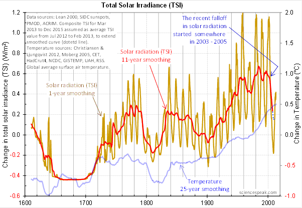
 Figure 3. David Evan’s graph of TSI (gold line), along with a centered 11-year moving average of the TSI data (red, with dotted blue extension), and a 25 year unspecified smooth of temperature, presumably a trailing average (blue line). (Click to enlarge)
Now, as you can see, the bright red line basically falls off the edge of the earth around 2004. The note says “The recent falloff in solar radiation started somewhere in 2003-2005″.
However, a look at both the SORCE and the CERES data shows no such “falloff in solar radiation”, neither precipitous nor otherwise. In fact, both datasets agree that by 2013 the TSI was well above the level in mid-2004.
Since there is no fall in the underlying data of any kind, why does the red 11-year average line show abrupt cooling starting around 2004?
The answer lies in the various problems with the graph.
• The TSI data is a splice of three datasets, with two of them showing the post-2000 period. This is a huge source of potential error in itself. However, it gets worse.
• One of the spliced datasets is the Lean TSI reconstruction, an outdated dataset that the authors of the reconstruction themselves admit is inaccurate.
• Another is the PMOD dataset. It is known to be reading low by 0.2 W/ms at the solar minimum, introducing a spurious apparently strong recent “cooling” where none exists.
• The 11-year centered average is an extremely bad choice for a filter for sunspot/TSI data. Because the solar cycle varies both longer and shorter than 11 years, at times the 11-year average actually reverses the sense of the data, converting peaks into valleys and valleys into peaks. Look at the period from 1760-1800 in Figure 3, for example. What is happening is that the frequency data is getting strongly aliased into the amplitude data. As a result, the average can end up far from the reality, particularly at the ends of the dataset.
For another example, look at the period just after 1740 in Figure 3. The 11-year average takes a huge vertical jump … but meanwhile back in the real word, the TSI itself is not rising at all. It is falling. Clearly, the large vertical jump in the red line is totally spurious.
• The TSI data has had about 900 days of “data” added to it using an arbitrarily chosen value. This is shown by the blue dots which indicate a continuing drop in the temperature.
So regarding the question of why the red line is acting so strangely, the answer is that we have a perfect storm of spliced data, bad data, arbitrary “data” added to the spliced bad data, and an extremely poor filter choice.
And as a result, the red line doesn’t represent reality in any shape or form. There is no precipitous drop in TSI starting around 2004. It doesn’t exist. Sure, the 11-year average says clearly that there is a huge drop starting around that time … but the actual data says something entirely different, as shown in Figures 1 and 2.
Now, in the heat of the moment Leif described the red line as being “almost fraudulent”. I think this was an over-reaction, but perhaps an understandable one. After all, if the red line were flipped over vertically it would make a lovely hockeystick, and if someone claimed warming was coming based on that hockeystick, people would call them alarmists … and calling someone an alarmist is certainly a close relative of calling them “almost fraudulent”.
However, my guideline is, never ascribe to malice what is adequately explained by error and misunderstanding. So I do not call their red line fraudulent, nor did I do so in the original discussion. Instead, I say that it is an error resulting from a misunderstanding. In any case, let me suggest that we leave out all ascription of motive and intent, that goes nowhere, and that we return to the science.
A more scientifically neutral description of the red line is that it is highly inaccurate and potentially misleading, because the apparent drop starting in 2003-2005 is simply an artifact of a combination of bad data and bad filtering.
Finally, to the degree that David Evans’ model predicts future cooling based on the red line, it is already falsified.
That is what I was trying to say, and I believe (subject to correction) that was what Leif was pointing out as well.
In closing, I will endeavor in this thread to keep my comments on as scientific a basis as possible, to avoid any personal references, and to not ascribe motive or intent. I request that everyone do the same. Many toes have already been stepped on in this discussion. Let’s see if we can simply discuss the science.
My best to all,
w.
VERY IMPORTANT: It is important in general, and in this discussion in particular, that you QUOTE THE EXACT WORDS THAT YOU DISAGREE WITH. Note that this doesn’t mean just referencing their entire comment. Quote the exact words of their comment that you think are in error, and tell us why you think those words are wrong. If you do not quote the exact words that you disagree with, none of us will know what you are referring to … and out of such misunderstandings grows animosity and misunderstanding.
Finally, please don’t delve into the rights and wrongs of what has happened in the previous discussions. I am not interested in the slightest in ascribing blame or responsibility. I have accepted my own responsibility for my own actions and apologized for wherever I was over the line. What I or the others did in the past is a blind alley, so please confine your comments to the science, and as the saying goes, “Let the dead past bury its dead”.
Salvatore Del Prete says:
July 18, 2014 at 10:38 am
If we take years 2008-2014 the IMF field has a range of 4.0nt-5.5nt in contrast to the average IMF of 6.6nt for past 40 years..
My conclusion weak.
But not amazing, as cycle 14 was just as weak: http://www.leif.org/research/SSN-and-HMF.png
Salvatore Del Prete says:
July 18, 2014 at 10:41 am
Lockwood’s latest research supports solar variability along the lines of Willie Soon and may other solar research scientist.
As I showed, Lockwood’s model is incorrect. http://www.leif.org/research/Confronting-Models-with-Reconstructions-and-Data.ppt
Conclusion is solar variability is real and varies by more then .1% which I support 100%.
That you agree is to the further detriment of Lockwood et al. 🙂
I’m not a scientist but I make the effort to learn and follow the climate science discussion. It is a fascinating subject. Climate science is the premier issue of the age and has become a substitute for political discussion we have become jaded with. That is why laymen are invited in to join the discussion.
Skimming down this post and comments, the takeaway seems to be that the earth is cooling and all the science that says it is warming is a result of bad actors and falsified data.
This reminds me of years ago listening to Radio Moscow on the short wave for the first time. That world was upside down to what I knew. Voice of America would extol the virtues of private enterprise and Radio Moscow communism. My young mind might as well been listening to Martians. Quite disconcerting.
I’m sorry, but I cast my lot with the main stream, practicing climate scientist that say the earth is warming and man made CO2 is the primary culprit. The physics of it seem obvious and well known for over a hundred years. It amazes me how you all deny it or call it bogus science.
It seems clear to me that ice everywhere is losing mass, not gaining; the ocean is warming, sea level rising, and becoming more acidic. The overall climate system continues to gain energy even if the land temperature trend has not risen as fast since 1998. Each decade is still warmer than the one before. Antarctic sea ice on a warming sea is hardly evidence of a cooling world.
You guys give the pretense of a scientific discussion but just saying that the stuff you don’t like is bogus is hardly having a scientific discussion. If you want a genuine discussion, you can’t just stereotype the “other” side. As part of this comment thread repeated many times, comments should address precisely what is being said.
Avery Harden says:
July 18, 2014 at 10:54 am
As part of this comment thread repeated many times, comments should address precisely what is being said.
Agree completely. However, many comments are not about ‘the science’ but are, to be generous, about peddling the commenter’s agenda or just simply malice.
Isvalgaard, I’m new to this discussion, maybe I’m missing something; but is your premise that any warming trend, or cooling as some here seem to presume, is solely dictated by the sun. Do you rule out increasing greenhouse gases as having an effect on temperatures?
I agree re: the Notch Filter author. As a master’s candidate I had to defend my thesis not once but twice, at the beginning (scathing), and at the end, which was not too bad because the initial defense of the proposal gave me such good feedback. I did that while I still had two small children at home and one on the way. A learning attitude is all it takes.
Does the author of the Notch Filter proposal have such an attitude about his proposal? My opinion has not been solidified yet but I am leaning towards “does not have”. I would hazard a very good guess that this proposal effort would not pass muster with a thesis or dissertation committee. It is expected that the researcher maintain a learning attitude throughout the process, disclose the entire body of work for inspection, and seek the advice of such a committee to improve ones work.
Avery Harden maybe you’re right. I do not know where you live, but if in medium altitudes get ready for the harsh winter, as the previous one in North America.
http://www.cpc.ncep.noaa.gov/products/precip/CWlink/blocking/real_time_sh/500gz_anomalies_sh.gif
BTW, Willis, what is a “more Canadian manner”?
Canada is the land of a violent sports game – hockey, plus fights outside pubs, serial killers, eco-terrorists, mass shootings, road rage, fraudsters and other things you see in the US.
Canada has fewer inner-city problems (than Detroit and LA for example) but US cities like Seattle do not have much either.
The notion of Canada being so much nicer is a scam perpetrated by neo-Marxists and believed by naiive people in both countries. The believers tend to have an anti-human psychology, like those you’ve chronicled herein who make wild claims about climate and species.
Examples of serial killers include child molesters like Clifford Olsen and killers of women on Highway 16 west of Prince George BC (one killer now in court, a strong suspect died in the US, others probably still on the loose). And there’s the killer of an oilfield worker in AB (eco-terrorism), the Squamish Five eco-terrorist group, Karla Homolka the murderous abuser, and the “canal killings” (apparent murder of teenage daughters by parents and brother because they were not obeying strict rules from parents, arranged to look like they drove a car into a canal in ON).
Pamela Gray says:
July 18, 2014 at 9:19 am
Mr Evans says that he used an 11 year centered moving average. By that I take it to mean that he used an 11 year centered moving average. There is no mystery about the terminology. There is a slight variant, he might have used, but there is no reason for him to have used it here and it would make little difference. Using monthly data I would have called it a 132 month moving average but that’s a minor quibble. A data point 5 years and 7 months after the center of that average would have no effect on the computation of that average, so there is no end effect due to the averaging technique. The computation is stopped with the computed point 5 years and 6 months before the end of the data series. If you have not encountered moving averages in peer reviewed, published, scientific research you do not read much climatological research. The statistics in Climatology are rather more primitive than in the electronics that you apparently work with. Mr Evans extended the data to see what happens based on an assumption that he stated, and differentiated by blue dots rather than a red line.
Mr Evans also says that he used the raw data in his model, not the moving average. So the moving average amounts to no more than an illustrative visualization technique. Based on Mr Evans’ statements and presentation the red line and the blue dots do not affect the model. The discussions here about those illustrative techniques and how they were calculated amount to so much hand-waving of no consequence.
My graduate work in Environmental Engineering had a much larger dose of statistics than typical, though it was done in the days of Fortran and Punch cards. My work in Engineering since then has taught me to concentrate on what matters. The details of how red line and the blue dots do do not matter. Mr Svalgaard’s comments on the underlying data are the greater concern: on those I’ll watch for further developments.
last paragraph should include “The details of how the red line and blue dots were calculated do not matter.”
Avery Harden says:
July 18, 2014 at 10:54 am
“I’m sorry, but I cast my lot with the main stream, practicing climate scientist that say the earth is warming and man made CO2 is the primary culprit. The physics of it seem obvious and well known for over a hundred years. It amazes me how you all deny it or call it bogus science.
It seems clear to me that ice everywhere is losing mass, not gaining; the ocean is warming, sea level rising, and becoming more acidic.The overall climate system continues to gain energy even if the land temperature trend has not risen as fast since 1998. Each decade is still warmer than the one before. Antarctic sea ice on a warming sea is hardly evidence of a cooling world.”
————————————————————————————————————————–
You have just repeated every talking point of the warmistas and that is all they are, talking points for the masses.
———————————————————————————————————————–
“Climate science is the premier issue of the age and has become a substitute for political discussion we have become jaded with.”
———————————————————————————————————————–
Another talking point when clearly every poll taken lists climate change very far down the list of issues of concern. The socialization of America, Mideast war, and now a civilian plane being shot down; these are far more serious and relevant issues today. But since you have swallowed the kool aid, you will reject my comments.
Stephen Wilde says
http://wattsupwiththat.com/2014/07/16/mending-fences/#comment-1688812
Better to say that the proportion of solar energy reaching the surface was 4Wm2 lower in the Maunder minimum.
That brings you [Bill] into line with the suggestion from many of us, including David Evans, that some solar characteristic other than simple TSI changes global cloudiness and albedo.
Henry says
Exactly. Check what is coming to us, not what is coming TOA.
Avery Harden
Look at the pressure distribution over the Antarctic. Do you think that the North it will be different?
http://earth.nullschool.net/#current/wind/isobaric/1000hPa/overlay=mean_sea_level_pressure/orthographic=-304.77,-85.59,446
ren, help me understand your comment and how it relates to mine. I basically commented that the blog thread assumed a cooling world and I pointed out that there was lots of evidence that ice was melting, temps rising, ocean warming and that Antarctica sea ice sitting on a warming sea could not be presumed to be evidence of cooling. So, help me understand your comment related to pressures and comparisons to the “north”. Thanks.
Chris4692 says:
July 18, 2014 at 11:23 am
Mr Svalgaard’s comments on the underlying data are the greater concern: on those I’ll watch for further developments.
As I pointed out in my very first comments the ‘construction’ of the composite TSI record by Evans has severe problems. There are now very strong evidence that the Sun’s magnetic field determines the variations of TSI. We have several ways of assessing the Sun’s magnetic field, e.g. by the field [HMF B] in the solar wind and by the field on the Sun’s surface [given by the sunspot number SSN]. From that we can reconstruct TSI. Here are my best estimates of HMF B, SSN, and TSI since the 1840s [covering the interval where the data is good enough for this]: http://www.leif.org/research/SSS-HMF-TSI-Evans.png
On the middle TSI plot, I also show the centered 11-yr running average [same method as Evans, and suffering the same defects, except without any fabricated data at the end].
The bottom panel shows Evans’ graph of the quantities involved. It is sufficiently different to make me doubt the validity of his analysis. I proposed to derive the parameter set using my TSI and then run Evans’ model, but without luck, as it has not been ‘revealed’ [like tablets from the mountain] how to do this.
Cycle 14 was much stronger then solar cycle 24 as one can see from looking at various data sources.
Lockwood’s latest research shows clearly that solar variability is a given and that solar activity was much lower during the Maunder Minimum then the 2008-2010 lull and for a much longer time period.
HE is confirming all of my thoughts and I expect my solar criteria to be met as this prolonged solar minimum continues.
Data for sunspots shows that solar cycle 24 has had less sunspots then solar cycle 14 for 44 months out of the first 60 months. This recent blip in solar cycle 24 just that a blip in my opinion.
Not to mention the AP index which has been lower and for a much longer time duration for solar cycle 24 versus solar cycle 14.
Going forward I expect solar cycle 24 activity to become less then much less then solar cycle 14 activity as far as sunspots are concerned.
Salvatore Del Prete says:
July 18, 2014 at 12:24 pm
Cycle 14 was much stronger then solar cycle 24 as one can see from looking at various data sources.
Not so: http://www.leif.org/research/SC14-and-24.png
Lockwood’s latest research shows clearly that solar variability is a given
Sure. But his model for the early part is wrong.
Not to mention the AP index which has been lower and for a much longer time duration for solar cycle 24 versus solar cycle 14.
Nonsense, as we are only halfway into SC24. And, as is usually the case, the Ap index will likely increase to a high during the declining phase:
http://www.leif.org/research/Ap-1844-now.png
jo
‘The graph of smoothed TSI is merely a check to explain why there was a steep fall in the model. The model does not use 11 year smoothing, nor does it use the “red line” as Willis claims (“…David Evans’ model predicts future cooling based on the red line”):. I have explained this before, here on WUWT and to Willis. ”
This is why I have repeatedly ask for the data and code used to create the model.
not the code FOR the model\
BUT the data and code used to CREATE the model
That is the central claim
“Mr Evans says that he used an 11 year centered moving average. By that I take it to mean that he used an 11 year centered moving average. There is no mystery about the terminology. There is a slight variant, he might have used, but there is no reason for him to have used it here and it would make little difference. Using monthly data I would have called it a 132 month moving average but that’s a minor quibble. A data point 5 years and 7 months after the center of that average would have no effect on the computation of that average, so there is no end effect due to the averaging technique. The computation is stopped with the computed point 5 years and 6 months before the end of the data series. If you have not encountered moving averages in peer reviewed, published, scientific research you do not read much climatological research. The statistics in Climatology are rather more primitive than in the electronics that you apparently work with. Mr Evans extended the data to see what happens based on an assumption that he stated, and differentiated by blue dots rather than a red line.
Mr Evans also says that he used the raw data in his model, not the moving average. So the moving average amounts to no more than an illustrative visualization technique. Based on Mr Evans’ statements and presentation the red line and the blue dots do not affect the model. The discussions here about those illustrative techniques and how they were calculated amount to so much hand-waving of no consequence.”
lots of asssumptions.
I renew my question to david and jo.
will they release the data as USED and the code as RUN to CONSTRUCT the model.
simple.
then folks will see exactly how it was done
I say Lockwood’s model is sound.
As the data just presented shows the AP index for solar cycle 14 was much shorter in duration of time then solar cycle 24 is thus far. Chances are the AP index will head even lower going forward not higher as solar cycle 24 maximum passes by.
http://www.solen.info/solar/images/comparison_similar_cycles.png
The data shows that for most of the first 60 months the sunspot number has been lower for sunspot cycle 24 then for solar cycle14. This recent blip brought solar cycle 24 sunspot activity higher for a few months but this likely will not last. Meantime the AP index remains in the tank, and will likely stay in the tank going forward..
As the data just presented shows the AP index for solar cycle 14 was much shorter in duration of time then solar cycle 24 is thus far. Chances are the AP index will head even lower going forward not higher as solar cycle 24 maximum passes by.
Correction – I meant to say the AP index minimum for solar cycle 14 was much shorter in duration
“amateurs with a grudge”
yep
From the graph below follows that ozone regeneration lasted from 1990 to 2002, so 12 years, since 2002, occurs a regression of ozone.
http://www.esrl.noaa.gov/gmd/odgi/odgi_fig3.png
Ozone regeneration time depending on changes in the UV can be an important factor in climate change.
Agnostic says:
July 18, 2014 at 10:01 am
@Willis
Yes I know you remarked on it here, but given the large number of comments both here and at Jo’s, and considering it clearly vexes you in that you feel it is needed to validate the model, don’t you think it worth sending a private email to Dr Evans to ask him where you might find it within the material already released, or if it has not been released to send it you?
#########################
Willis, myself and others have been asking for the same thing. But without any luck.
There are TWO main scientific claims in Evans work.
Claim 1. Using some referenced data and verbally described methods, Evans derived a model.
Claim 2. This model can be used to predict /forecast the global temperatures in the out years.
These are TWO different claims and need to be evaluated seperately.
Claim 1 can be examined TODAY. we need the data AS USED and the METHOD (code) as Performed. Not a description of where to find the data, but the values, the actual file used.
And we dont need a description of the method, we need the code as run.
Claim 2 cannot be asssessed for years.
The materials for claim 2 have been released. the materials for claim 1 have not.
Willis asked for the out of sample testing. he was assured it was done. The data was promised but not delivered. I suspect it is in Mann’s censored folder.
“Allegations of this sort have no place in civilized scientific discourse.”
mendacious twits, both of them