The Southern Oscillation Index has been mentioned often in comments at WattsUpWithThat, in this series of blog posts about the upcoming El Niño. Curiously, Australia’s BOM Southern Oscillation Index for April 2014 is at a positive value that’s near to La Niña conditions, while the sea surfaces of the equatorial Pacific are now warming toward El Niño conditions. What gives?
We recently discussed the Southern Oscillation Index in the post El Niño and La Niña Basics: Introduction to the Pacific Trade Winds. In this post, I’ll only offer a brief introduction to the Southern Oscillation Index, so if you’d like a little more information, please refer to that post. Then, after the presentation of the BOM Southern Oscillation Index dataset, we’ll discuss the Equatorial Southern Oscillation Index data available from NOAA.
SOUTHERN OSCILLATION INDEX
The Southern Oscillation Index (SOI) is one of many indices that are used to document the timing, frequency and duration of El Niño and La Niña events. The Southern Oscillation Index represents the differences in the sea level pressures between Tahiti and Darwin, Australia…with the Darwin sea level pressures subtracted from those in Tahiti. See Figure 1 for the locations of both. The source of the illustration is the climate.gov webpage Climate Variability: Southern Oscillation Index. The INDO and EPAC regions are used for a similar index called the Equatorial Southern Oscillation Index, which we’ll discuss later.

Figure 1
The Southern Oscillation was first observed by Sir Gilbert Walker back in the 1920s but, if memory serves, it wasn’t associated with El Niño and La Niña events until the 1960s.
The positive value for the Southern Oscillation Index in April indicates the sea level pressure in Tahiti was higher than the sea level pressure in Darwin, which in turn indicates that the trade winds (those located off the equator in the Southern Hemisphere) were stronger than normal in April, blowing from east (Tahiti) to west (Darwin). Stronger-than-normal trade winds are typically associated with La Niña events, not El Niño events. A negative value would indicate the opposite…that the sea level pressure in Tahiti is lower than the sea level pressure in Darwin, which in turn indicates that westerlies are blowing from west to east. And a negative value is what we’d expect during an El Niño.
Then again, the El Niño hasn’t developed yet.
Figure 2 compares the Southern Oscillation Index values so far this year to the values during the development of the 1982/83 and 1997/98 El Niño. Again, we’re using those two strong El Niños as reference because some indicators are suggesting the developing El Niño may be strong. The Southern Oscillation Index had been decreasing as we would expect during the development of an El Niño, but then it made a quick change in April. Is that a concern if you’re looking forward to an El Niño this year? Nope.

Figure 2
Figure 3 is a spaghetti graph. It compares the evolution of the Southern Oscillation Index so far this year in red to the evolutions of the 1986/87/88 El Niño, 1991/92 El Niño, 1994/95 El Niño, 2002/03 El Niño, 2004/05 El Niño, 2006/07 El Niño and the 2009/10 El Niño. As shown, the Southern Oscillation Index has been positive even later in the year during the development of an El Niño. (See the Oceanic NINO Index for the “official” El Niño events.)

Figure 3
One of the difficulties with the Southern Oscillation Index is that it is based on sea level pressures for locations that are off of the equator, while El Niño events take place along the equator in the Pacific. The second complication is that the sea level pressures are measured at two specific locations and that means they are very susceptible to changes in local weather. This was discussed back in 1997 in a paper by Kevin Trenberth The Definition of El Niño. There Trenberth wrote:
Various versions of the SOI exist although, in recent years, most deal only with atmospheric pressures and usually only those at Darwin and Tahiti. In using the SOI based on just two stations, it must be recognized that there are many small scale and high frequency phenomena in the atmosphere, such as the Madden-Julian Oscillation, that can influence the pressures at stations involved in forming the SOI, but which do not reflect the Southern Oscillation itself. Accordingly, the SOI should only be used when monthly means are appropriately smoothed (Trenberth 1984, Trenberth and Hoar 1996a).
[Trenberth (1984) is Signal Versus Noise in the Southern Oscillation. And Trenberth and Hoar (1996a) is The 1990-1995 El Niño-Southern Oscillation Event: Longest on record, which was an early attempt to tie El Niño events to manmade global warming. That period has now been broken down into 2 “official” El Niño events, according to the Oceanic NINO Index.]
In Trenberth (1984), he presented the results after smoothing the Southern Oscillation Index data with an “11-term low-pass filter.” That wouldn’t help us in this short-term look, so let’s use a simple 3-month running mean. (NOAA uses the 3-month running mean for a version of its Equatorial SOI data, to be discussed later.) Figures 4 and 5 present the same comparisons as the earlier two graphs, but in them the Southern Oscillation Index values have been smoothed with 3-month running-mean filters. As shown in Figure 4, with that minor filtering, the current evolution does not look out of place compared to the 1982/83 El Niño or the 1997/98 El Niño. And the current evolution appears within the range of the other El Niño events since 1986. See Figure 5.
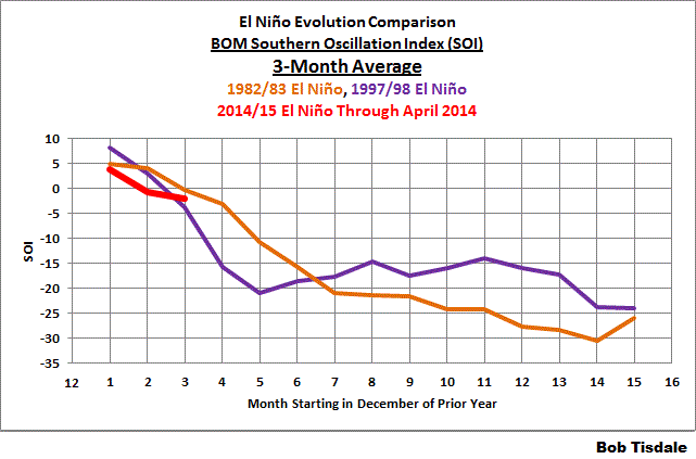
Figure 4
# # # # # #

Figure 5
But that still doesn’t help us with the fact that the reference points for the Southern Oscillation Index are off the equator while El Niño events are focused along the equator in the Pacific. Thus…
NOAA’S EQUATORIAL SOUTHERN OSCILLATION INDEX
In their Climate Prediction Center Equatorial Southern Oscillation Index (1949-present) webpage, NOAA describes the dataset as:
Abstract:
This is one of the CPC’s Monthly Atmospheric and SST Indices. It contains Equatorial Southern Oscillation Index (standardized sea level pressure differences between EPAC (5N-5S, 80W-130W) and INDO (5N-5S, 90E-140E)) for the period of 1949-present. The anomalies are departures from the 1981-2010 base period means.
Purpose:
This index is constructed for applications in climate monitoring, climate analysis and verifications of numerical models.
Please refer to Figure 1 again for the locations of the EPAC and INDO regions. Because they are comparatively large regions, they should be less susceptible to weather noise, and because they are located along the equator, they should better capture the equatorial trade winds. The Equatorial Southern Oscillation Index is calculated in a similar fashion. It represents the sea level pressure difference between the eastern equatorial Pacific (EPAC) and the sea level pressure of equatorial Indonesia (INDO)…with INDO subtracted from EPAC.
The Equatorial Southern Oscillation Index data are available from the NOAA Monthly Atmospheric & SST Indices webpage. The Indonesia (INDO) sea level pressure data (standardized) are here, the Eastern Equatorial Pacific (EPAC) sea level pressure data (standardized) are here, and the Equatorial Southern Oscillation Index data are here (and it appears the difference is then standardized as well.) NOAA also provides the Equatorial Southern Oscillation Index data as a 3-month running mean here. But there really doesn’t appear to be the same need to smooth the Equatorial Southern Oscillation Index data, as you shall see.
Figure 6 compares the Equatorial Southern Oscillation Index values so far this year to the values during the development of the 1982/83 and 1997/98 El Niño. The evolution this year falls in line with the two strong El Niños.

Figure 6
Compared to the other El Niño evolutions, Figure 7, this year appears to be the stronger (more negative) than normal at this stage.

Figure 7
And for those who would like to see the comparisons with the Equatorial Southern Oscillation Index data smoothed with the 3-month running means see Figures 8 and 9.

Figure 8
# # # # # #

Figure 9
COMPARISON OF THE TWO SOUTHERN OSCILLATION INDICES
Figure 10 compares the BOM Southern Oscillation Index data to the NOAA Equatorial Southern Oscillation Index data. The BOM also multiplies their SOI data by 10 after standardizing it, so for the comparison I scaled it back by dividing their data by that factor. The correlation between the two indices is not as good as one might suspect, with a correlation coefficient of 0.77.

Figure 10
And NOAA’s Equatorial Southern Oscillation Index data correlates better (-0.83) with NINO3.4 sea surface temperature anomalies (Kaplan SST) than does the BOM Equatorial Southern Oscillation Index data (-0.71).
CLOSING
The Southern Oscillation Index from BOM has been around for a long time. It is a commonly used ENSO index. It is noisy and, at times, does not appear to reflect what’s taking place along the equatorial Pacific. Then again, it is much studied with respect to its impact on weather in Australia and New Zealand.
It appears that NOAA’s Equatorial Southern Oscillation Index better reflects what’s taking place along the equator in the Pacific, where ENSO events take place, but it is not as popular as the BOM SOI.
EARLIER POSTS IN THIS SERIES
- The 2014/15 El Niño – Part 1 – The Initial Processes of the El Niño.
- The 2014/15 El Niño – Part 2 – The Alarmist Misinformation (BS) Begins
- The 2014/15 El Niño – Part 3 – Early Evolution – Comparison with 1982/83 & 1997/98 El Niño Events
- The 2014/15 El Niño – Part 4 – Early Evolution – Comparison with Other Satellite-Era El Niños
- The 2014/15 El Niño – Part 5 – The Relationship Between the PDO and ENSO
- The 2014/15 El Niño – Part 6 – What’s All The Hubbub About?…
- The 2014/15 El Niño – Part 7 – May 2014 Update and What Should Happen Next
And for additional introductory discussions of El Niño processes see:
- An Illustrated Introduction to the Basic Processes that Drive El Niño and La Niña Events
- El Niño and La Niña Basics: Introduction to the Pacific Trade Winds
- La Niñas Do NOT Suck Heat from the Atmosphere
- ENSO Basics: Westerly Wind Bursts Initiate an El Niño
FURTHER READING
My ebook Who Turned on the Heat? goes into a tremendous amount of detail to explain El Niño and La Niña processes and the long-term aftereffects of strong El Niño events. Who Turned on the Heat? weighs in at a whopping 550+ pages, about 110,000+ words. It contains somewhere in the neighborhood of 380 color illustrations. In pdf form, it’s about 23MB. It includes links to more than a dozen animations, which allow the reader to view ENSO processes and the interactions between variables.
I’ve lowered the price of Who Turned on the Heat? from U.S.$8.00 to U.S.$5.00. A free preview in pdf format is here. The preview includes the Table of Contents, the Introduction, the first half of section 1 (which was provided complete in the post here), a discussion of the cover, and the Closing. Take a run through the Table of Contents. It is a very-detailed and well-illustrated book—using data from the real world, not models of a virtual world. Who Turned on the Heat? is only available in pdf format…and will only be available in that format. Click here to purchase a copy. Thanks. Book sales and tips will hopefully allow me to return to blogging full-time once again.