INITIAL NOTE: This post includes a link to and title of a recent post by Tamino, in which he attempted sophomoric humor in an effort to amuse his audience. While I realize responding to it at the same base level would be fun for many, please do not lower yourselves to his depths on this thread.
INTRODUCTION
My post No Matter How the CMIP5 (IPCC AR5) Models Are Presented They Still Look Bad was a discussion of the IPCC’s model-data comparison of global temperature anomalies in their Figure 1-4 from their 5th Assessment Report. (Also see the cross post at WattsUpWithThat.) I added an update to it that read:
As quoted above, Dana Nuccitelli noted (my boldface):
At the time, 1990 was an especially hot year. Consequently, if the models and data were properly baselined, the 1990 data point would be located toward the high end of the range of model simulations.
“Especially hot?” Utter nonsense.
Dana appears to be parroting Tamino from Tamino’s blog post here.
The reality: 1990 was an ENSO-neutral year, according to NOAA’s Oceanic NINO Index. Therefore, “1990 was…” NOT “…an especially hot year”. It was simply warmer than previous years because surface temperatures were warming then. I’m not sure why that’s so hard a concept for warmists to grasp. The only reason it might appear warm is that the 1991-94 data were noticeably impacted by the eruption of Mount Pinatubo.
Tamino was simply playing games with data as Tamino likes to do, and Dana Nuccitelli bought it hook, line and sinker.
Or Dana Nuccitelli hasn’t yet learned that repeating bogus statements doesn’t make them any less bogus.
That was not well received by Tamino.
BACKSTORY
This all began last December. The original Figure 1-4 (my Figure 1) from the IPCC’s draft of AR5 was presented in the WattsUpWithThat post Dr. David Whitehouse on the AR5 figure 1.4.

Figure 1
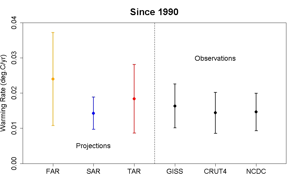
You’ll note that the data for 2011 is outside the ranges of all of the model generations, especially those from the 4th Assessment Report (AR4).
Tamino was not impressed with David Whitehouse’s post or with the IPCC’s original model-data comparison in their Figure 1-4. He expressed his displeasures in the post Fake skeptic draws fake picture of Global Temperature. Toward the end of that rebuttal post, Tamino suggested that the IPCC should shift the data up 0.1 deg C and then he presents his renditions of the IPCC’s model-data comparison (See My Figure 2):
When I offset the observations by 0.1 deg.C, we get more realistic comparison of observations to projections:

Figure 2
Some of you will note that the 4th generation (AR4) models are not included in Tamino’s model-data comparisons.
The topic was resurrected when the IPCC released the approved drafts of their 5th Assessment Report. In it, the IPCC changed their model-data comparison of global temperatures in Figure 1-4. (See my Figure 3.) Steve McIntyre reported on the change in his post IPCC: Fixing the Facts. Tamino’s post was referenced on that ClimateAudit thread numerous times.

Figure 3
Dana Nuccitelli presented his take in the SkepticalScience post IPCC model global warming projections have done much better than you think. Judith Curry discussed the switch in Figure 1-4 in her post Spinning the climate model – observation comparison: Part II. The switch in the IPCC’s Figure 1-4 was one of the topics in my post Questions the Media Should Be Asking the IPCC – The Hiatus in Warming, which was cross posted at JoNova. Dana Nuccitelli once again added to the discussion with Why Curry, McIntyre, and Co. are Still Wrong about IPCC Climate Model Accuracy at SkepticalScience.
Then Lucia commented on Tamino’s shift in the data in her post at TheBlackboard Tamino’s take on SOD AR5 Figure 1.4! See my Figure 4.

Figure 4
Lucia writes:
(Shifted projections in heavy black, observations dark red circles.)
I’m tempted to just let the figure speak for itself. But I think it’s better to always include text that describes what we see in the figure.
What we see is that if we followed Tamino’s suggests and the models had been absolutely perfect we would conclude the models tended to underestimate the observed temperature anomalies by roughly -.08 C and so were running “cool”. But in fact, our assessment would be deluded. The appearance of “running cool” arose entirely from using different baselines for “models” and “observations”: for the ‘projections’ we used the average over 1990 itself, for the second we used 1980-1990 itself. The shift arises because 1990 was “warm” in the models (and ‘projections’) compared to the average over the full 20 year period.
The same day, I published No Matter How the CMIP5 (IPCC AR5) Models Are Presented They Still Look Bad and Tamino took exception to my statement:
“1990 was…” NOT “…an especially hot year”.
There have been a number of additional posts on the subject of the IPCC’s Figure 1-4, including Steve McIntyre’s Fixing the Facts 2, but we’ll end the sequence there.
A CURIOSITY
My Figure 5 is Figure 1 from Rahmstorf et al. (2012) “Comparing climate projections to observations up to 2011”. Tamino (Grant Foster) was one of the authors.

Figure 5
And for those having trouble seeing the very light pink “unadjusted” data, see my Figure 6. I’ve highlighted the unadjusted data in black.

Figure 6
Could the IPCC have based their original Figure 1-4 on Figure 1 from Rahmstorf et al (2012)?
NOTE: We’ve discussed in numerous posts how the effects of El Niño and La Nina events cannot be removed from instrument temperature record using the methods of Rahmstorf et al. (2012). For an example, see the post Rahmstorf et al (2012) Insist on Prolonging a Myth about El Niño and La Niña. Also see the cross post at WattsUpWithThat.
Enough backstory.
TAMINO BELIEVES 1990 WAS ESPECIALLY HOT
As noted in the Introduction, Tamino didn’t like the update to my post No Matter How the CMIP5 (IPCC AR5) Models Are Presented They Still Look Bad.
Tamino’s response was his post Bob Tisdale pisses on leg, claims it’s raining, the title and text of which is are sophomoric at best.
In it, Tamino presented annual long-term GISS Land-Ocean Temperature Index (LOTI) data compared to an unspecified smoothed version (here). He subtracted the smoothed data from the raw data and presented the residuals (here). And in response to my note about the impacts of Mount Pinatubo in 1991, Tamino presented the annual GISS LOTI from 1975 to 1990 along with a linear trend line (here).
After my first scan his post, it occurred to me that Tamino elected not to use the adjusted data from Foster and Rahmstorf (2011) “Global temperature evolution 1979–2010”, but more on that later.
Tamino presented data as Tamino wanted to present data. That’s fine. But there are other ways to present data. Apparently, Tamino assumed that I made a statement that I could not back.
Rahmstorf et al. (2012), of which Tamino was co-author, recommended averaging the five global temperature datasets (GISS LOTI, HADCRUT, NCDC, RSS TLT, and UAH TLT):
…in order to avoid any discussion of what is ‘the best’ data set.
So we’ll use that as a reference in the following example. If we average the five global temperature datasets for the period of 1979 to 2012 and simply detrend them using a what Tamino calls a “simple linear trend”, Figure 7, we can see that the residual temperatures for 8 years exceeded the 1990 value and that two others were comparable. Based on my presentation of data, I will continue to say that 1990 was NOT especially hot.

Figure 7
NOTE: I enjoyed the comments on the thread of Tamino’s post. One of them even reminded me of the happy grammar school games of morphing people’s names: see the one by blogger Nick on October 5, 2013 at 8:39 pm. But typical of those who comment at Tamino’s, Nick missed something that was obvious, and it was obvious back then even to six-year-olds. He could have been even more clever and replaced “dale” with “pail”. That would have been much funnier, Nick…to a six-year-old. Then again, maybe Nick is a six-year-old.
WHY WOULD TAMINO AVOID USING HIS ENSO-, VOLCANO- AND SOLAR-ADJUSTED DATASET?
The answer should be obvious. The adjusted data did not provide the answer Tamino wanted to show.
I mentioned both ENSO and volcanoes in the update to my post No Matter How the CMIP5 (IPCC AR5) Models Are Presented They Still Look Bad, stating that “1990 was an ENSO-neutral year…” and “…that the 1991-94 data were noticeably impacted by the eruption of Mount Pinatubo”.
It would have been logical for Tamino to present his global temperature data that had been adjusted for ENSO, volcanic aerosols and solar variations from his paper Foster and Rahmstorf (2011). In fact, blogger WebHubTelescope’s October 7, 2013 at 3:55 am comment should have prompted Tamino to do so:
Since B-Tis leans on ENSO so much, why not correct the GISS using the SOI and throw it back in his face?
My Figure 8 is Figure 8 from Foster and Rahmstorf (2011). It’s easy to replicate using any number of methods. See my Figure 9. I simply used the x-y coordinate feature of MS Paint.

Figure 8
# # #

Figure 9
The 1990 value in Figure 9 does NOT look especially hot compared the linear trend. Let’s detrend the replicated adjusted data from Foster and Rahmstorf’s Figure 8 to see if that’s correct. See Figure 10.

Figure 10
The residual values for nine years were warmer than the not-hot-at-all 1990.
Note to WebHubTelescope: That’s why Tamino ignored you.
So what can we conclude from this exercise? Tamino presents data as Tamino wants to present it, using methods that can differ depending on his needs at any given time. But there are multiple ways to present data. Tamino came to one conclusion based on how he elected to present the data, while I came to a totally different conclusion based on how I presented them.
MORE MISDIRECTION FROM TAMINO…AND, IN TURN, SKEPTICALSCIENCE
Tamino presented a graph at the end of his two posts I’ve linked herein. (See the model-data trend comparison here.) It illustrates the observed trends versus the trends projected from the models used in the IPCC’s 1st, 2nd and 3rd Assessment Reports. Dana Nuccitelli must have believed that illustration was important, because he included it his post Why Curry, McIntyre, and Co. are Still Wrong about IPCC Climate Model Accuracy. Or just as likely, Dana Nuccitelli was using it as smoke and mirrors.
The 1st, 2nd and 3rd generation climate models used by the IPCC for their earlier assessment reports are obsolete…many times over. No one should care one iota about the outputs of the 1st, 2nd and 3rd generation models. The most important climate models are the most recent generation, those in the CMIP5 archive, which were prepared for the IPCC’s recently released 5th Assessment Report. Of second-tier importance are the CMIP3-archived models used for the IPCC’s 4th Assessment Report.
And what do we understand about the models used in the IPCC’s 4th and 5th Assessment Reports?
Von Storch, et al. (2013) addressed them in “Can Climate Models Explain the Recent Stagnation in Global Warming?” (my boldface):
However, for the 15-year trend interval corresponding to the latest observation period 1998-2012, only 2% of the 62 CMIP5 and less than 1% of the 189 CMIP3 trend computations are as low as or lower than the observed trend. Applying the standard 5% statistical critical value, we conclude that the model projections are inconsistent with the recent observed global warming over the period 1998- 2012.
Focusing on the CMIP5 models, there’s Fyfe et al. (2013) Overestimated global warming over the past 20 years. See Judith Curry’s post here. Fyfe et al. (2013) write:
The evidence, therefore, indicates that the current generation of climate models (when run as a group, with the CMIP5 prescribed forcings) do not reproduce the observed global warming over the past 20 years, or the slowdown in global warming over the past fifteen years.
THE CURRENT GENERATION OF CLIMATE MODELS USED BY THE IPCC BELONG IN THE TRASH BIN
I was going to ignore Tamino’s recent post, and I managed to do so for about 3 weeks. But I figured, in addition to confirming why I believed the data showed 1990 was not unusually hot, I could also use my reply to once again illustrate examples of the flaws in the current climate models used by the IPCC.
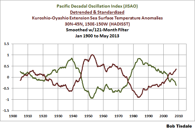
In the post Questions the Media Should Be Asking the IPCC – The Hiatus in Warming, I illustrated how the model mean of the climate models used by the IPCC did not simulate the Atlantic Multidecadal Oscillation (AMO). In that post, I used the method for presenting the AMO recommended by Trenberth and Shea (2006), which was to subtract global sea surface temperature anomalies (60S-60N) from sea surface temperature anomalies of the North Atlantic (0-60N, 80W-0). That model failing suggested that the observed Atlantic Multidecadal Oscillation was not a forced component of the models. See the left-hand cell of Figure 11. Similarly, we illustrated that the dominant source of multidecadal variations in the sea surface temperatures of the North Pacific (the sea surface temperatures of the Kuroshio-Oyashio Extension) were also not forced by manmade greenhouse gases, and that the models could not simulate those either. See the right-hand cell of Figure 11. (The sea surface temperature anomalies of the Kuroshio-Oyashio Extension are inversely related to the Pacific Decadal Oscillation. See the graph here.)

Figure 11
And in the post Open Letter to the Honorable John Kerry U.S. Secretary of State, we illustrated how the climate modelers had to double the rate of warming of global sea surface temperatures (left-hand cell of Figure 12) over the past 31+ years in order to get the modeled warming rate for land surface air temperatures (right-hand cell of Figure 12) close to the observations.

Figure 12
In the post IPCC Still Delusional about Carbon Dioxide, we illustrated and discussed how the climate models used by the IPCC do not support the hypothesis of human-induced global warming, and that many would say the models contradict it.
FURTHER READING
Over the past year, I’ve presented numerous failings exhibited by the latest generation of climate models. Those failings were collected in my book Climate Models Fail.
And as I’ve discussed in a multitude of blog posts here and at WattsUpWithThat for approaching 5 years, ocean heat content data and satellite-era sea surface temperature data both indicate the oceans warmed via naturally occurring, sunlight fueled, coupled ocean-atmosphere processes, primarily those associated with El Niño and La Niña events. See my illustrated essay “The Manmade Global Warming Challenge” (42mb) and, for much more information, see my book Who Turned on the Heat? Sales of my ebooks allow me to continue my research into human-induced and natural climate change and to continue to blog here at Climate Observations and at WattsUpWithThat.
CLOSING
Whenever someone, anyone, publishes a blog post that opposes Tamino’s beliefs in human-induced catastrophic global warming, he gets all excited and writes blog posts. Often times, Tamino attempts to belittle those with whom he disagrees. So far, Tamino has failed in his efforts to counter my blog posts that he objects to. In addition to what was discussed in this post, here are a few other examples:
Tamino expressed a complete lack of understanding of the Atlantic Multidecadal Oscillation in his post AMO. My reply to it is Comments On Tamino’s AMO Post.
Tamino objected a number of times to how I presented my model-data comparisons of ARGO-era ocean heat content data. See the example here from the post Is Ocean Heat Content Data All It’s Stacked Up to Be? As further discussed in that post:
See Tamino’s posts here and here, and my replies here and here. My replies were also cross posted at WattsUpWithThat here and here. Tamino didn’t like the point where I showed the model projections intersecting with the Ocean Heat Content data. Then RealClimate corrected their past model-data comparison posts. Refer to the RealClimate post OHC Model/Obs Comparison Errata. As a result, Gavin Schmidt then corrected the ocean heat content model-data comparison graphs in his earlier December 2009, May 2010, January 2011 and February 2012 posts. Refer also to my discussion of the RealClimate corrections here. Now the comparison in [Figure 1 from that post] , which has been updated through December 2012, appears overly generous to the models—that I should be shifting the model projection a little to the left.
And as a reminder, while it would be fun, please refrain from sophomoric humor on the thread. Most of the responses to Tamino are way too obvious anyway.
Regards
richardscourtney says: October 26, 2013 at 4:25 pm
Tamino aka Grant Foster is an academic…..
Grant Foster (s.c.Tamino) may be an academic, but it is of a very poor quality.
2-3 years ago I posted on the Gavin Schmidt’s blog ‘Real Climate’ this graph:
http://www.vukcevic.talktalk.net/CET-Jun.htm
GF crawled out from somewhere and said that I fabricated the data! My response was that he was talking nonsense. This was met by torrent of a vulgar abuse, Gavin confirmed that data was correct and removed all s.c tamino’s abusive comments. Apparently GF was not amused and for some months did not comment on the ‘RC’.
Grant Foster has actually written textbooks on time series analysis primarily dealing variable stars.
He knows what he is doing. Even though he is a math expert in astronomy, he still used an outdated, faulty dataset for the Sun’s total solar irradiance in his Foster Rhamstorf 2011 paper. Everyone knows this dataset is based on sensors which are suffering from degradation, yet Foster still used it despite being an expert on the data of stars and the peer reviewers let him use it.
He has shown what type of integrity he believes in.
Perhaps Tammy might point us to some climate models from 10 years ago, that forecast no warming till now?
Bill no one knows this stuff better than you.
The fact other blogs that highlight this one “cherry picked” one or two lines of your first comment speaks volumes of the mentality of the AGW cult.
They know they are done, when you present facts they run home to Mumma and hide them.
They are all the same as Foster, delusional and actually believe that GISTEMP is real…
Time to recreate the GISTEMP graph they hold so dearly using the current baseline…
Why does Grant’s blog give itself the highly misleading title of ‘open mind’?
Interesting anecdote vukcevic.
I remember Foster attacking methods used by McLean, de Freitas & Carter and then a few years later getting excited when he independently discovered the utility of the same methods in another context. What I remember is how abusive and wrong he had been about the methods. (Lucia was also seriously — even comically — wrong about the methods. That was when I stopped visiting her site, as it was crystal clear that she had no competency in aggregation fundamentals.)
Peter Miller says: “Why does Grant’s blog give itself the highly misleading title of ‘open mind’?”
Maybe it’s short for open mind, insert foot?
@Crispin in Waterloo
“What on earth will they say after 10 more years of cooling? I expect the more honourable among them, or shall I say the least dishonourable of them, to start tossing their wild-child point-men under the proverbial bus. They are on the road to scientific perdition. “
I agree. We should NOT be knocking them – we should be encouraging them to come up with ever more excessive propaganda. That will result in a larger and more rapid collapse….
Not being an expert on the academic peer review process, I am curious if it is anywhere near as vigorous as what happens on WUWT. One thing for sure, the WUWT review process is far more transparent and open.
I have often wondered why the academic peer review process has not evolved to be more open and transparent. In the world of the internet, the academic peer review process seems antiquated and outdated. If I were an academic climate scientist, I would consider reading WUWT required reading each day since there is so much debate occurring.
Grant Foster’s participation should be evaluated and reviewed as anyone else. The debate is yet another indication that the science is not settled. That is healthy. We need more academics participating in the open debate. It would strengthen academia.
Thanks Bob.
What is most interesting to me is that it is difficult for a human without instrumentation to discern a one degree temperature differential let alone a .1 degree or a .01 degree temperature difference. Then graphs a splattered with .01 degree temperature differences across decades and an industry is born. So much has been said about so little and so much money has been spent on events that no one can feel.
Thank you Bob. Excellent work again.
I think that running a trend line through the model mean since 1990 and running a trend line through the real data since 1990, then comparing the slope of the two is all that is needed to show how bad the IPCC models are. Adding trend rate error bars would show that the real data is also out of those error bars, and the baseline selected for the models would be unimportant. Since slope would be all that was being compared, the starting points for the trend lines should be the same.
Every time Bob Tisdale steps up to the plate his transparency is there for all to see. Workings, reasoning, objectivity and when appropriate, corrections. It’s an education all right. History will be generous to the likes of Bob – and WUWT for offering the platform for truth. Great work as ever, Bob.
Tamino? Another legacy entirely awaits you my friend.
Its called the ‘Foster’s post normal engineering method.’ Modify the data to fit the theory. This is standard practice in AGW pseudo-science.
Mr Foster’s method reminds me of all the desperate efforts by alarmists. Like that traitor hanging on tenaciously to Richard Burton’s boot on that cable car hundreds of metres above the ground in Alistair MacLean’s WWII movie and book ‘Where Eagles Dare’.
nicholas tesdorf says: October 27, 2013 at 12:26 am
It’s a shame to see good people being forced to work daily to refute this incessant flow of nonsensical drivel from the Warmista Camp, when there are real problems to be solved around the World.
_______________________
Right – energy poverty, clean water, pathogens, food. These idiots are driven by a hatred of the human race.
Why does everyone still use “Tamino” when you have the person’s real name?? It would appear that the greatest damage you could do to his reputation is to have his real name associated with his words and deeds. His name is Grant Foster. Let us start using his real name from now on. He’s earned it many times over!
Peter Miller says:
October 27, 2013 at 4:34 am
Why does Grant’s blog give itself the highly misleading title of ‘open mind’?
======
Same reason Real Climate uses the word “Real” in its name, or that “Climate Science” needs to add the name “Science” to its name, or various countries add the word “Democratic” to their names.
If you need to add words like Open, Real, Science, Democratic to a name, it is because you are not what you advertise, but you would like to pretend you are.
And now for something even more unbelievable. In the post, I referred to a comment on the thread at Tamino’s blog by the blogger who calls him/herself WebHubTelescope.
WebHubTelescope is now stating over at Judith Curry’s blog that I am in awe of his/her climate model:
http://judithcurry.com/2013/10/26/open-thread-weekend-38/#comment-404711
Naturally, I corrected WebHubTelescope in a later comment.
Standard type of trick used by governments who don’t like, say, unemployment figures. Change the way you define it. They often get away with it, too.
Bob Tisdale says:
October 27, 2013 at 10:33 am
————————————–
WebHubTelescope’s model gets it 60 year cyclical component by using the some of Length of Day index (I don’t know which one is used and the inverse of the common measure comes kind-of close to the 60 year cycle).
But I dare him to use the historical LOD data beyond 1880 in it. His CO2 coefficient will have to go strongly negative (instead of positive) because these are the official estimates back to 1632. LOD says 1623 should have been the hottest in Earth history (despite the Little Ice Age).
http://hpiers.obspm.fr/eop-pc/earthor/ut1lod/lod-1623.jpg
http://hpiers.obspm.fr/eop-pc/earthor/ut1lod/lod-1623.html
And what does the LOD have to do with the Earth’s Energy Balance? I don’t know, energy is energy and the rotation affects energy. But does faster rotation equal Earth warming up? That would answer the Faint Young Sun paradox but would not answer 1623’s coolness and Venus’ temperatures which rotates extremely slowly (and backwards) and I think technically, the slower the rotation the hotter the earth will get but that’s just me.
Richard,
yeah, I see your point about anomalies, they can be zeroed anywhere. Apparently the hindcasts are not tuned to trends pre-2000 (RealClimate), therefore a curve fitting exercise (ala Tamino) is not appropriate. The hindcasts are driven by radiative forcing. Zeroing at 1990 is basically the same as zeroing Pinatubo (coincidence?) and I suspect that was a consideration in the initial model “comparisons”.
I believe Tamino has made the mistake when shifting the trend, he has actually shifted the forcing, and that would be wrong if the model forcing is tuned to Pinatubo.
Bill Illis says:
October 27, 2013 at 1:36 pm
…….
It might come as a surprise to many that the 20% of the LOD change since 1880s is strongly correlated to the sunspot magnetic cycle:
http://www.vukcevic.talktalk.net/SSN-LOD.htm
Skimmed through Rahmstorf et al (2012). This could be worthwhile, hard to say with so little apparent detail about their statistical analysis. “Multivariate correlation analysis” is presumably just fitting a multiple linear regression to temperature using three explanatory variables. Big problem? – these time series are clearly highly autocorrelated. Well known (back to Yule(1926)) to lead to spurious correlations, in this case meaningless regression coefficients. Presumably, the regression residuals constitute the ‘adjusted temperatures’, so there is no goodness-of-fit analysis. The linear ‘model’ could be fitting everything or nothing? This really needs a fourth predictor variable, representing GCM temperatures, together with proper statistical analysis of how well an ARIMA or other model fits the temperature data. Then it will be possible to see the relative performance of the different predictor variables, climate models in particular.
My apologies if I am doing Rahmstorf etc a disservice here – the detail I saw was quite limited and I have filled in the blanks with my own guesswork.