INITIAL NOTE: This post includes a link to and title of a recent post by Tamino, in which he attempted sophomoric humor in an effort to amuse his audience. While I realize responding to it at the same base level would be fun for many, please do not lower yourselves to his depths on this thread.
INTRODUCTION
My post No Matter How the CMIP5 (IPCC AR5) Models Are Presented They Still Look Bad was a discussion of the IPCC’s model-data comparison of global temperature anomalies in their Figure 1-4 from their 5th Assessment Report. (Also see the cross post at WattsUpWithThat.) I added an update to it that read:
As quoted above, Dana Nuccitelli noted (my boldface):
At the time, 1990 was an especially hot year. Consequently, if the models and data were properly baselined, the 1990 data point would be located toward the high end of the range of model simulations.
“Especially hot?” Utter nonsense.
Dana appears to be parroting Tamino from Tamino’s blog post here.
The reality: 1990 was an ENSO-neutral year, according to NOAA’s Oceanic NINO Index. Therefore, “1990 was…” NOT “…an especially hot year”. It was simply warmer than previous years because surface temperatures were warming then. I’m not sure why that’s so hard a concept for warmists to grasp. The only reason it might appear warm is that the 1991-94 data were noticeably impacted by the eruption of Mount Pinatubo.
Tamino was simply playing games with data as Tamino likes to do, and Dana Nuccitelli bought it hook, line and sinker.
Or Dana Nuccitelli hasn’t yet learned that repeating bogus statements doesn’t make them any less bogus.
That was not well received by Tamino.
BACKSTORY
This all began last December. The original Figure 1-4 (my Figure 1) from the IPCC’s draft of AR5 was presented in the WattsUpWithThat post Dr. David Whitehouse on the AR5 figure 1.4.

Figure 1
You’ll note that the data for 2011 is outside the ranges of all of the model generations, especially those from the 4th Assessment Report (AR4).
Tamino was not impressed with David Whitehouse’s post or with the IPCC’s original model-data comparison in their Figure 1-4. He expressed his displeasures in the post Fake skeptic draws fake picture of Global Temperature. Toward the end of that rebuttal post, Tamino suggested that the IPCC should shift the data up 0.1 deg C and then he presents his renditions of the IPCC’s model-data comparison (See My Figure 2):
When I offset the observations by 0.1 deg.C, we get more realistic comparison of observations to projections:

Figure 2
Some of you will note that the 4th generation (AR4) models are not included in Tamino’s model-data comparisons.
The topic was resurrected when the IPCC released the approved drafts of their 5th Assessment Report. In it, the IPCC changed their model-data comparison of global temperatures in Figure 1-4. (See my Figure 3.) Steve McIntyre reported on the change in his post IPCC: Fixing the Facts. Tamino’s post was referenced on that ClimateAudit thread numerous times.

Figure 3
Dana Nuccitelli presented his take in the SkepticalScience post IPCC model global warming projections have done much better than you think. Judith Curry discussed the switch in Figure 1-4 in her post Spinning the climate model – observation comparison: Part II. The switch in the IPCC’s Figure 1-4 was one of the topics in my post Questions the Media Should Be Asking the IPCC – The Hiatus in Warming, which was cross posted at JoNova. Dana Nuccitelli once again added to the discussion with Why Curry, McIntyre, and Co. are Still Wrong about IPCC Climate Model Accuracy at SkepticalScience.
Then Lucia commented on Tamino’s shift in the data in her post at TheBlackboard Tamino’s take on SOD AR5 Figure 1.4! See my Figure 4.

Figure 4
Lucia writes:
(Shifted projections in heavy black, observations dark red circles.)
I’m tempted to just let the figure speak for itself. But I think it’s better to always include text that describes what we see in the figure.
What we see is that if we followed Tamino’s suggests and the models had been absolutely perfect we would conclude the models tended to underestimate the observed temperature anomalies by roughly -.08 C and so were running “cool”. But in fact, our assessment would be deluded. The appearance of “running cool” arose entirely from using different baselines for “models” and “observations”: for the ‘projections’ we used the average over 1990 itself, for the second we used 1980-1990 itself. The shift arises because 1990 was “warm” in the models (and ‘projections’) compared to the average over the full 20 year period.
The same day, I published No Matter How the CMIP5 (IPCC AR5) Models Are Presented They Still Look Bad and Tamino took exception to my statement:
“1990 was…” NOT “…an especially hot year”.
There have been a number of additional posts on the subject of the IPCC’s Figure 1-4, including Steve McIntyre’s Fixing the Facts 2, but we’ll end the sequence there.
A CURIOSITY
My Figure 5 is Figure 1 from Rahmstorf et al. (2012) “Comparing climate projections to observations up to 2011”. Tamino (Grant Foster) was one of the authors.

Figure 5
And for those having trouble seeing the very light pink “unadjusted” data, see my Figure 6. I’ve highlighted the unadjusted data in black.

Figure 6
Could the IPCC have based their original Figure 1-4 on Figure 1 from Rahmstorf et al (2012)?
NOTE: We’ve discussed in numerous posts how the effects of El Niño and La Nina events cannot be removed from instrument temperature record using the methods of Rahmstorf et al. (2012). For an example, see the post Rahmstorf et al (2012) Insist on Prolonging a Myth about El Niño and La Niña. Also see the cross post at WattsUpWithThat.
Enough backstory.
TAMINO BELIEVES 1990 WAS ESPECIALLY HOT
As noted in the Introduction, Tamino didn’t like the update to my post No Matter How the CMIP5 (IPCC AR5) Models Are Presented They Still Look Bad.
Tamino’s response was his post Bob Tisdale pisses on leg, claims it’s raining, the title and text of which is are sophomoric at best.
In it, Tamino presented annual long-term GISS Land-Ocean Temperature Index (LOTI) data compared to an unspecified smoothed version (here). He subtracted the smoothed data from the raw data and presented the residuals (here). And in response to my note about the impacts of Mount Pinatubo in 1991, Tamino presented the annual GISS LOTI from 1975 to 1990 along with a linear trend line (here).
After my first scan his post, it occurred to me that Tamino elected not to use the adjusted data from Foster and Rahmstorf (2011) “Global temperature evolution 1979–2010”, but more on that later.
Tamino presented data as Tamino wanted to present data. That’s fine. But there are other ways to present data. Apparently, Tamino assumed that I made a statement that I could not back.
Rahmstorf et al. (2012), of which Tamino was co-author, recommended averaging the five global temperature datasets (GISS LOTI, HADCRUT, NCDC, RSS TLT, and UAH TLT):
…in order to avoid any discussion of what is ‘the best’ data set.
So we’ll use that as a reference in the following example. If we average the five global temperature datasets for the period of 1979 to 2012 and simply detrend them using a what Tamino calls a “simple linear trend”, Figure 7, we can see that the residual temperatures for 8 years exceeded the 1990 value and that two others were comparable. Based on my presentation of data, I will continue to say that 1990 was NOT especially hot.

Figure 7
NOTE: I enjoyed the comments on the thread of Tamino’s post. One of them even reminded me of the happy grammar school games of morphing people’s names: see the one by blogger Nick on October 5, 2013 at 8:39 pm. But typical of those who comment at Tamino’s, Nick missed something that was obvious, and it was obvious back then even to six-year-olds. He could have been even more clever and replaced “dale” with “pail”. That would have been much funnier, Nick…to a six-year-old. Then again, maybe Nick is a six-year-old.
WHY WOULD TAMINO AVOID USING HIS ENSO-, VOLCANO- AND SOLAR-ADJUSTED DATASET?
The answer should be obvious. The adjusted data did not provide the answer Tamino wanted to show.
I mentioned both ENSO and volcanoes in the update to my post No Matter How the CMIP5 (IPCC AR5) Models Are Presented They Still Look Bad, stating that “1990 was an ENSO-neutral year…” and “…that the 1991-94 data were noticeably impacted by the eruption of Mount Pinatubo”.
It would have been logical for Tamino to present his global temperature data that had been adjusted for ENSO, volcanic aerosols and solar variations from his paper Foster and Rahmstorf (2011). In fact, blogger WebHubTelescope’s October 7, 2013 at 3:55 am comment should have prompted Tamino to do so:
Since B-Tis leans on ENSO so much, why not correct the GISS using the SOI and throw it back in his face?
My Figure 8 is Figure 8 from Foster and Rahmstorf (2011). It’s easy to replicate using any number of methods. See my Figure 9. I simply used the x-y coordinate feature of MS Paint.

Figure 8
# # #

Figure 9
The 1990 value in Figure 9 does NOT look especially hot compared the linear trend. Let’s detrend the replicated adjusted data from Foster and Rahmstorf’s Figure 8 to see if that’s correct. See Figure 10.

Figure 10
The residual values for nine years were warmer than the not-hot-at-all 1990.
Note to WebHubTelescope: That’s why Tamino ignored you.
So what can we conclude from this exercise? Tamino presents data as Tamino wants to present it, using methods that can differ depending on his needs at any given time. But there are multiple ways to present data. Tamino came to one conclusion based on how he elected to present the data, while I came to a totally different conclusion based on how I presented them.
MORE MISDIRECTION FROM TAMINO…AND, IN TURN, SKEPTICALSCIENCE
Tamino presented a graph at the end of his two posts I’ve linked herein. (See the model-data trend comparison here.) It illustrates the observed trends versus the trends projected from the models used in the IPCC’s 1st, 2nd and 3rd Assessment Reports. Dana Nuccitelli must have believed that illustration was important, because he included it his post Why Curry, McIntyre, and Co. are Still Wrong about IPCC Climate Model Accuracy. Or just as likely, Dana Nuccitelli was using it as smoke and mirrors.
The 1st, 2nd and 3rd generation climate models used by the IPCC for their earlier assessment reports are obsolete…many times over. No one should care one iota about the outputs of the 1st, 2nd and 3rd generation models. The most important climate models are the most recent generation, those in the CMIP5 archive, which were prepared for the IPCC’s recently released 5th Assessment Report. Of second-tier importance are the CMIP3-archived models used for the IPCC’s 4th Assessment Report.
And what do we understand about the models used in the IPCC’s 4th and 5th Assessment Reports?
Von Storch, et al. (2013) addressed them in “Can Climate Models Explain the Recent Stagnation in Global Warming?” (my boldface):
However, for the 15-year trend interval corresponding to the latest observation period 1998-2012, only 2% of the 62 CMIP5 and less than 1% of the 189 CMIP3 trend computations are as low as or lower than the observed trend. Applying the standard 5% statistical critical value, we conclude that the model projections are inconsistent with the recent observed global warming over the period 1998- 2012.
Focusing on the CMIP5 models, there’s Fyfe et al. (2013) Overestimated global warming over the past 20 years. See Judith Curry’s post here. Fyfe et al. (2013) write:
The evidence, therefore, indicates that the current generation of climate models (when run as a group, with the CMIP5 prescribed forcings) do not reproduce the observed global warming over the past 20 years, or the slowdown in global warming over the past fifteen years.
THE CURRENT GENERATION OF CLIMATE MODELS USED BY THE IPCC BELONG IN THE TRASH BIN
I was going to ignore Tamino’s recent post, and I managed to do so for about 3 weeks. But I figured, in addition to confirming why I believed the data showed 1990 was not unusually hot, I could also use my reply to once again illustrate examples of the flaws in the current climate models used by the IPCC.
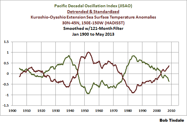
In the post Questions the Media Should Be Asking the IPCC – The Hiatus in Warming, I illustrated how the model mean of the climate models used by the IPCC did not simulate the Atlantic Multidecadal Oscillation (AMO). In that post, I used the method for presenting the AMO recommended by Trenberth and Shea (2006), which was to subtract global sea surface temperature anomalies (60S-60N) from sea surface temperature anomalies of the North Atlantic (0-60N, 80W-0). That model failing suggested that the observed Atlantic Multidecadal Oscillation was not a forced component of the models. See the left-hand cell of Figure 11. Similarly, we illustrated that the dominant source of multidecadal variations in the sea surface temperatures of the North Pacific (the sea surface temperatures of the Kuroshio-Oyashio Extension) were also not forced by manmade greenhouse gases, and that the models could not simulate those either. See the right-hand cell of Figure 11. (The sea surface temperature anomalies of the Kuroshio-Oyashio Extension are inversely related to the Pacific Decadal Oscillation. See the graph here.)

Figure 11
And in the post Open Letter to the Honorable John Kerry U.S. Secretary of State, we illustrated how the climate modelers had to double the rate of warming of global sea surface temperatures (left-hand cell of Figure 12) over the past 31+ years in order to get the modeled warming rate for land surface air temperatures (right-hand cell of Figure 12) close to the observations.

Figure 12
In the post IPCC Still Delusional about Carbon Dioxide, we illustrated and discussed how the climate models used by the IPCC do not support the hypothesis of human-induced global warming, and that many would say the models contradict it.
FURTHER READING
Over the past year, I’ve presented numerous failings exhibited by the latest generation of climate models. Those failings were collected in my book Climate Models Fail.
And as I’ve discussed in a multitude of blog posts here and at WattsUpWithThat for approaching 5 years, ocean heat content data and satellite-era sea surface temperature data both indicate the oceans warmed via naturally occurring, sunlight fueled, coupled ocean-atmosphere processes, primarily those associated with El Niño and La Niña events. See my illustrated essay “The Manmade Global Warming Challenge” (42mb) and, for much more information, see my book Who Turned on the Heat? Sales of my ebooks allow me to continue my research into human-induced and natural climate change and to continue to blog here at Climate Observations and at WattsUpWithThat.
CLOSING
Whenever someone, anyone, publishes a blog post that opposes Tamino’s beliefs in human-induced catastrophic global warming, he gets all excited and writes blog posts. Often times, Tamino attempts to belittle those with whom he disagrees. So far, Tamino has failed in his efforts to counter my blog posts that he objects to. In addition to what was discussed in this post, here are a few other examples:
Tamino expressed a complete lack of understanding of the Atlantic Multidecadal Oscillation in his post AMO. My reply to it is Comments On Tamino’s AMO Post.
Tamino objected a number of times to how I presented my model-data comparisons of ARGO-era ocean heat content data. See the example here from the post Is Ocean Heat Content Data All It’s Stacked Up to Be? As further discussed in that post:
See Tamino’s posts here and here, and my replies here and here. My replies were also cross posted at WattsUpWithThat here and here. Tamino didn’t like the point where I showed the model projections intersecting with the Ocean Heat Content data. Then RealClimate corrected their past model-data comparison posts. Refer to the RealClimate post OHC Model/Obs Comparison Errata. As a result, Gavin Schmidt then corrected the ocean heat content model-data comparison graphs in his earlier December 2009, May 2010, January 2011 and February 2012 posts. Refer also to my discussion of the RealClimate corrections here. Now the comparison in [Figure 1 from that post] , which has been updated through December 2012, appears overly generous to the models—that I should be shifting the model projection a little to the left.
And as a reminder, while it would be fun, please refrain from sophomoric humor on the thread. Most of the responses to Tamino are way too obvious anyway.
Regards
Just out of curiosity, where is the line between regular humor and sophomoric humor, I’ve been told at least twice not to cross it.
Comparing anomalies is ridiculous if you don’t align them to the same absolute starting conditions. It’s like taking a 100 volt signal and saying it matches a 1 volt signal because I can aline them on the oscilloscope. The only thing I can compare is the pattern of the two signals. The real values are not comparable by using anomalies. The only valid comparison here is the trends.
Great work, Mr. Tisdale. Thanks for keeping us up to date on what I will call Tamino’s childish efforts at misinformation.
wayne says:
October 26, 2013 at 5:54 pm
Has anyone here been brave enough or industrious enough to look at what the completely pre-adjusted data generally looks like? Even roughly is close enough. You might not be able to find that unadjusted data but the adjustments are published so roughly remove them and take a look at what remains. It is quite simple and it is quite an eye opener.
_________________________
Yes, the raw data has been tampered with, repeatedly. Those charged with maintaining the data integrity have engaged in criminal behavior, in my book. These days, that’s the way the US government operates and the world is worse for it.
Alan: “Those charged with maintaining the data integrity have engaged in criminal behavior, in my book. ”
Nah that’s the new normal of post-instrument science.
Has anyone here been brave enough or industrious enough to look at what the completely pre-adjusted data generally looks like? Even roughly is close enough.
Yes. in 2011 Zeke and I did a poster using around 25000 daily unadjusted stations.
The answer is the same as using any other dataset.
you could do the same thing with hourly stations. Answer? doesnt change.
On a global basis adjustments dont amount to much. In the US, well since we are one of the only nations to have change of observation time along with instrument changes, you will see changes after you correct the record
Grant Foster has quantitative skills that could actually be put to good use in climate data exploration. Frankly, his functional numeracy towers over that of most who comment here, at CE, & at the Talkshop, but he’s not trustworthy. He’s obsessed with distorting in support of his political beliefs. It’s so transparent, it undermines his cause. Under more favorable circumstances — and if he were honest — I would like to work with him.
–
Bob Tisdale wrote:
“THE CURRENT GENERATION OF CLIMATE MODELS USED BY THE IPCC BELONG IN THE TRASH BIN”
Bob has a gift for understatement.
Bob’s Figure 2 & particularly Figure 3 tell a most d*mning story that common folks plainly understand.
I’ve shown that comparison to people. They shake their head at the level of corruption they realize must be in play in order for a “revision” like that to have taken place.
Could one even succeed in engineering such a d*mning “revision” if they tried deliberately to do so?? It’s not clear if they could.
It’s like they wanted to undermine public confidence…
Well, “Tamino,” given your villainous fraud and nefarious tactics,…
(v. a v. “Tamino is the main character in Die Zauberflöte” — Dirk at 3:26pm today — good spot, Herr Dirk)
Conductor’s announcement before curtain rise for “The Magic Flute”: Ladies and gentlemen, there is an error in your program. The second “Tamino” is a misprint and should read, “Monostatos.”
Accuracy in labels is a scientific fundamental.
#(:))
Note to self: Don’t spell fr–awh-d in the normal way. Sigh.
We see from this Tsidale post that Grant feeds Nuccitelli talking points for his Guardian pieces. OK.
Grant’s attempt via Nuccitelli to undo the negative PR from AR5’s model failures gives skeptics an important insight into the weakness of AR5 support efforts.
There is no ‘A’ team defending the very public AR5 model failures.
John
Yes Steven Mosher, I would like to see how this basically linear sloped adjustments (http://i39.tinypic.com/1zfrn1l.png) were used to be superimposed over the averaged global temperature records. Doesn’t look like time of observation adjustments to me, wasn’t that change over a very short period of time or will that upward adkistment just keep on its track upward? I see no cease in the adjustments.
And if it was only US data that adjusted, why when viewing what appears to be a correct relation to history comes out when I remove those US only adjustments from a global scope anomaly chart?
Subtracting from HadCRUT4 which basically matches GISS (I averaged three such adjustment plots) I get something like this
http://i39.tinypic.com/1118rnl.png which doesn’t appear anything close to datasets shown today.
As for you and Zeke’s analysis, I would rather do it again personally as you suggest.
So do you have a link where untouched daily (and/or hourly) per station temperature records are located for download by the public? Tried BEST but that ‘raw’ station data is already touched and de-trended, isn’t that correct?
more misinformation & propaganda for the CAGW CAUSE which has dominated Australian MSM for nearly a week. starts on 21 Oct with CNN’s Goddess of Propaganda, Christine Amanpour. N.B. despite the “absolutely” headline, Figueres is not connecting the NSW bushfires to CAGW at all, but the whole piece is crafted to give that impression:
21 Oct: CNN VIDEO: Amanpour: ‘Absolutely’ a link between climate change and wildfires, U.N. climate chief Figueres tells Amanpour
There is “absolutely” a link between climate change and wildfires, U.N. Climate Chief Christiana Figueres told CNN’s Christiane Amanpour on Monday.
Wildfires are raging in a ring around Sydney, Australia, as that country experiences its hottest year on record.
“The World Meteorological Organization has not established a direct link between this wildfire and climate change – yet,” Figueres said. “But what is absolutely clear is the science is telling us that there are increasing heat waves in Asia, Europe, and Australia; that there these will continue; that they will continue in their intensity and in their frequency.”
http://amanpour.blogs.cnn.com/2013/10/21/un-climate-chief-absolutely-link-between-climate-change-and-wildfire
then, on 23 Oct, PM Abbott was SPECIFICALLY asked does climate change have anything to do with the NSW fires as Christiana Figueres stated. (MSM are the ones wittingly or unwittingly claiming Figueres made the connection). he says “these fires” are not related to CAGW. Listen to the video to hear the question he is asked. amusingly, SMH includes Figueres’ WMO comment:
23 Oct: SMH: UN official ‘talking out of her hat’ on bushfires and climate change, says Tony Abbott
VIDEO: Climate chief ‘talking through her hat’
United Nations says Australian bushfires and climate change are linked; Prime Minister Tony Abbott says that’s nonsense
Prime Minister Tony Abbott has dismissed the comments of a senior UN official who said there was a clear link between bushfires and climate change, arguing ”fire is a part of the Australian experience”…
She (Figueres) noted that the World Meteorological Organisation had not yet established a direct link between the NSW fires and climate change…
http://www.smh.com.au/environment/climate-change/un-official-talking-out-of-her-hat-on-bushfires-and-climate-change-says-tony-abbott-20131023-2w0mq.html
MSM is still obsessing over this fake story with Will Steffen weighing in today. Video, approx 12 minutes of Tim Lester interviewing Steffen & i warn it’s pretty SANCTIMONIUS stuff from both. yet even the headline is only about increasing PROBABILITY!
26 Oct: SMH: Heath Aston: Climate debate must stick to the science: professor
VIDEO: Bushfire risk increasing
Climate change increases the PROBABILITY of more bushfires, more intense fires and longer fire seasons, according to the Climate Council’s Professor Will Steffen…
Professor Will Steffen, who co-authored the soon-to-be-released bushfire report by the Climate Council, was responding to Mr Abbott’s assertion in a newspaper interview with leading climate sceptic Andrew Bolt that drawing a link between the savage fires now plaguing NSW and climate change was ”complete hogwash”…
(PAT – WATCH VIDEO: STEFFEN ACTUALLY SAYS “IF WE LOOK AT THE EMISSIONS TRAJECTORY)
He (Steffen) said IF the climate keeps warming at the current rate, the number of days of extreme fire danger each year will double by the middle of the century…
“We would certainly prefer that this debate be elevated to the real scientific facts as are reported in the scientific literature and as are assessed very competently by the IPCC, the CSIRO and the Bureau [of Meteorology] and the scientists we rely on,” Professor Steffen said.
”We’d like to see a debate in this country that gets beyond these futile arguments about the science, which have been settled for decades in the scientific literature, and get on with the real debate about what is really the best way forward with dealing with the problem…
http://www.smh.com.au/environment/climate-debate-must-stick-to-the-science-professor-20131025-2w76n.html
Mosher: “Yes. in 2011 Zeke and I did a poster using around 25000 daily unadjusted stations.”
How many angels can sit on the head of a pin? Let us take the assumption that the local temperatures, around the globe, are normally distributed around an average. Are the measurement sites also normally distributed? Nope. 3/4 of the planet is sea, 1/4 is land. And of the land there are numerous perverse and varied geographical features that contribute to, and sometime determine, the local climate. Mountain ranges, precipitation, cities, farm land, etc. And that’s not counting all the variations in trade winds and so on that occur over both land and sea.
The individual temperature stations, unfiddled with, can give you a trend for the local region. What they cannot do is back fill the empty kilometers between their immediate environment and another. There are unknown and unknowable non-linear variations in temp in all the places we’re not measuring. Even BEST found trends going every which way dependent on a variety of different local factors. (Assuming any credibility in BEST.)
So even if the temperatures are normally distributed, the local climates and features are not. And since we don’t have equidistant thermometers across the globe it’s not even an opener to the discussion. One cannot get from, I measured 3 automobiles and they had 4 lug nuts, to lug nuts are linearly distributed between cars. The only hope for global temperatures proper, and from there on to finding a legitimate trend is via satellites. Which seem to have a terrible habit of unexpected malfunctions. All the malfunctions occur with declining temperatures, so lots of room for conspiracy theories. But in the absence of conspiracy theories it means we have to wait for the eggheads to finally sort out how to put a reliable thermometer on a spacecraft.
Until that point, every thing is directly analogous to Anselm’s ontological proof of God. The conclusion might be right and might be wrong. But, as New Englanders say, “You can’t get there from here.”
I don’t want to sink too low, but I hope I can be forgiven a little harmless fun. I haven’t an inkling of where the pen name Tamino comes from, but Grant Foster sounds suspiciously like a reference to a means of making a living.
Grant (N): something granted, as a privilege or right, a sum of money, or a tract of land
Foster (Vt): to promote the growth or development of; further; encourage
From the above, we can coin the following neologism:
Grant Foster (Vt): to promote the growth of, further or encourage the granting of sums of money and/or other privileges; to indulge in glorified pan-handling
Nice work if you can get it.
Tim Groves @ur momisugly 10:19pm today — Nice work by your brain! Could be, could be.
Re: “Tamino,” he likely chose that from “The Magic Flute” as Dirk surmised — fancies himself the hero of the AGW drama. (gag)
I’m not able to follow your discussion
pat says:
October 26, 2013 at 9:45 pm
more misinformation & propaganda for the CAGW CAUSE which has dominated Australian MSM for nearly a week……..
=======================================================
Pat, I’ve been looking for some data covering the brush fires, as far as incidence and whatnot, but, can’t find it in nice ready form.
However, there is this…. http://suyts.wordpress.com/2013/10/23/about-those-global-warming-caused-fires-not-so-much-new-paper-debunks-stupidity-of-lunatics/
There certainly is no connection for the US or Canada. And, a paper says the fires in Europe at a low.
It’s a shame to see good people being forced to work daily to refute this incessant flow of nonsensical drivel from the Warmista Camp, when there are real problems to be solved around the World. In the Third World, no one is fretting about temperature variations of 0.1 degree-Centigrade. They are busy struggling to survive in the face of Energy and Technological poverty
Jquip:
Your post at October 26, 2013 at 4:50 pm says in total
MY FORMATTING WENT WRONG. THIS IS A – HOPEFULLY CORRECTED – REPOST
Jquip:
Your post at October 26, 2013 at 4:50 pm says in total
So what?
If you had bothered to read my post which you answered you would have seen that I explained why
Perhaps you have sorted through the blog which Foster uses as a rubbish bin, and you have found something Foster threw out by mistake. If so, then you don’t mention it.
There is much work from many people which merits time and effort to consider. So, when Foster has decided that of his ‘work’ which is rubbish and he has thrown it away then I see no reason to bother considering that.
Richard
SideShowBob:
Re your post at October 26, 2013 at 4:56 pm.
Repeating your inane error which has already been refuted only demonstrates your inanity.
Richard
X Anonymous:
At October 26, 2013 at 5:33 pm you ask
No. The projections are anomalies so can be “zeroed” to any value. And they are projections of reality or they have no meaning, so “Pinatubo response” is part of reality.
The first IPCC Report was published in 1990 and the IPCC has been providing projections since then. The most appropriate comparison is of
(a) the IPCC projections
to
(b) the reality which has evolved over the time the IPCC has been providing projections.
Richard
The models fail at the first calculation. CO2 is still rising yet head isn’t. The warmist alarmists are in denial as they are still convinced that there is warming.
@Bob T
You are really on top of this and I have concluded after reading all the above that we should each pick a corner to vigorously defend. I have no doubt that you are advancing not only our general understanding but forcing the junk science blogs to correct, confess and cavil in response to your analyses. Foster’s prevarications smack of desperation quite literally.
What on earth will they say after 10 more years of cooling? I expect the more honourable among them, or shall I say the least dishonourable of them, to start tossing their wild-child point-men under the proverbial bus. They are on the road to scientific perdition. Why push the cart? Is this a real career?
@Foster: Honesty is the foundation of all virtue. History books are being written. Turn your back on these alarmist clowns and use your talents to expose the junk science. It is not Bob Tisdale you should fear, it is the perspicacious pens of our grandchildren that will cause knees to quake and cheeks to blush. Get on the right side of history while you can.
BarryW says: “The only thing I can compare is the pattern of the two signals. The real values are not comparable by using anomalies. The only valid comparison here is the trends.”
Indeed!