INITIAL NOTE: This post includes a link to and title of a recent post by Tamino, in which he attempted sophomoric humor in an effort to amuse his audience. While I realize responding to it at the same base level would be fun for many, please do not lower yourselves to his depths on this thread.
INTRODUCTION
My post No Matter How the CMIP5 (IPCC AR5) Models Are Presented They Still Look Bad was a discussion of the IPCC’s model-data comparison of global temperature anomalies in their Figure 1-4 from their 5th Assessment Report. (Also see the cross post at WattsUpWithThat.) I added an update to it that read:
As quoted above, Dana Nuccitelli noted (my boldface):
At the time, 1990 was an especially hot year. Consequently, if the models and data were properly baselined, the 1990 data point would be located toward the high end of the range of model simulations.
“Especially hot?” Utter nonsense.
Dana appears to be parroting Tamino from Tamino’s blog post here.
The reality: 1990 was an ENSO-neutral year, according to NOAA’s Oceanic NINO Index. Therefore, “1990 was…” NOT “…an especially hot year”. It was simply warmer than previous years because surface temperatures were warming then. I’m not sure why that’s so hard a concept for warmists to grasp. The only reason it might appear warm is that the 1991-94 data were noticeably impacted by the eruption of Mount Pinatubo.
Tamino was simply playing games with data as Tamino likes to do, and Dana Nuccitelli bought it hook, line and sinker.
Or Dana Nuccitelli hasn’t yet learned that repeating bogus statements doesn’t make them any less bogus.
That was not well received by Tamino.
BACKSTORY
This all began last December. The original Figure 1-4 (my Figure 1) from the IPCC’s draft of AR5 was presented in the WattsUpWithThat post Dr. David Whitehouse on the AR5 figure 1.4.

Figure 1
You’ll note that the data for 2011 is outside the ranges of all of the model generations, especially those from the 4th Assessment Report (AR4).
Tamino was not impressed with David Whitehouse’s post or with the IPCC’s original model-data comparison in their Figure 1-4. He expressed his displeasures in the post Fake skeptic draws fake picture of Global Temperature. Toward the end of that rebuttal post, Tamino suggested that the IPCC should shift the data up 0.1 deg C and then he presents his renditions of the IPCC’s model-data comparison (See My Figure 2):
When I offset the observations by 0.1 deg.C, we get more realistic comparison of observations to projections:

Figure 2
Some of you will note that the 4th generation (AR4) models are not included in Tamino’s model-data comparisons.
The topic was resurrected when the IPCC released the approved drafts of their 5th Assessment Report. In it, the IPCC changed their model-data comparison of global temperatures in Figure 1-4. (See my Figure 3.) Steve McIntyre reported on the change in his post IPCC: Fixing the Facts. Tamino’s post was referenced on that ClimateAudit thread numerous times.

Figure 3
Dana Nuccitelli presented his take in the SkepticalScience post IPCC model global warming projections have done much better than you think. Judith Curry discussed the switch in Figure 1-4 in her post Spinning the climate model – observation comparison: Part II. The switch in the IPCC’s Figure 1-4 was one of the topics in my post Questions the Media Should Be Asking the IPCC – The Hiatus in Warming, which was cross posted at JoNova. Dana Nuccitelli once again added to the discussion with Why Curry, McIntyre, and Co. are Still Wrong about IPCC Climate Model Accuracy at SkepticalScience.
Then Lucia commented on Tamino’s shift in the data in her post at TheBlackboard Tamino’s take on SOD AR5 Figure 1.4! See my Figure 4.

Figure 4
Lucia writes:
(Shifted projections in heavy black, observations dark red circles.)
I’m tempted to just let the figure speak for itself. But I think it’s better to always include text that describes what we see in the figure.
What we see is that if we followed Tamino’s suggests and the models had been absolutely perfect we would conclude the models tended to underestimate the observed temperature anomalies by roughly -.08 C and so were running “cool”. But in fact, our assessment would be deluded. The appearance of “running cool” arose entirely from using different baselines for “models” and “observations”: for the ‘projections’ we used the average over 1990 itself, for the second we used 1980-1990 itself. The shift arises because 1990 was “warm” in the models (and ‘projections’) compared to the average over the full 20 year period.
The same day, I published No Matter How the CMIP5 (IPCC AR5) Models Are Presented They Still Look Bad and Tamino took exception to my statement:
“1990 was…” NOT “…an especially hot year”.
There have been a number of additional posts on the subject of the IPCC’s Figure 1-4, including Steve McIntyre’s Fixing the Facts 2, but we’ll end the sequence there.
A CURIOSITY
My Figure 5 is Figure 1 from Rahmstorf et al. (2012) “Comparing climate projections to observations up to 2011”. Tamino (Grant Foster) was one of the authors.

Figure 5
And for those having trouble seeing the very light pink “unadjusted” data, see my Figure 6. I’ve highlighted the unadjusted data in black.

Figure 6
Could the IPCC have based their original Figure 1-4 on Figure 1 from Rahmstorf et al (2012)?
NOTE: We’ve discussed in numerous posts how the effects of El Niño and La Nina events cannot be removed from instrument temperature record using the methods of Rahmstorf et al. (2012). For an example, see the post Rahmstorf et al (2012) Insist on Prolonging a Myth about El Niño and La Niña. Also see the cross post at WattsUpWithThat.
Enough backstory.
TAMINO BELIEVES 1990 WAS ESPECIALLY HOT
As noted in the Introduction, Tamino didn’t like the update to my post No Matter How the CMIP5 (IPCC AR5) Models Are Presented They Still Look Bad.
Tamino’s response was his post Bob Tisdale pisses on leg, claims it’s raining, the title and text of which is are sophomoric at best.
In it, Tamino presented annual long-term GISS Land-Ocean Temperature Index (LOTI) data compared to an unspecified smoothed version (here). He subtracted the smoothed data from the raw data and presented the residuals (here). And in response to my note about the impacts of Mount Pinatubo in 1991, Tamino presented the annual GISS LOTI from 1975 to 1990 along with a linear trend line (here).
After my first scan his post, it occurred to me that Tamino elected not to use the adjusted data from Foster and Rahmstorf (2011) “Global temperature evolution 1979–2010”, but more on that later.
Tamino presented data as Tamino wanted to present data. That’s fine. But there are other ways to present data. Apparently, Tamino assumed that I made a statement that I could not back.
Rahmstorf et al. (2012), of which Tamino was co-author, recommended averaging the five global temperature datasets (GISS LOTI, HADCRUT, NCDC, RSS TLT, and UAH TLT):
…in order to avoid any discussion of what is ‘the best’ data set.
So we’ll use that as a reference in the following example. If we average the five global temperature datasets for the period of 1979 to 2012 and simply detrend them using a what Tamino calls a “simple linear trend”, Figure 7, we can see that the residual temperatures for 8 years exceeded the 1990 value and that two others were comparable. Based on my presentation of data, I will continue to say that 1990 was NOT especially hot.

Figure 7
NOTE: I enjoyed the comments on the thread of Tamino’s post. One of them even reminded me of the happy grammar school games of morphing people’s names: see the one by blogger Nick on October 5, 2013 at 8:39 pm. But typical of those who comment at Tamino’s, Nick missed something that was obvious, and it was obvious back then even to six-year-olds. He could have been even more clever and replaced “dale” with “pail”. That would have been much funnier, Nick…to a six-year-old. Then again, maybe Nick is a six-year-old.
WHY WOULD TAMINO AVOID USING HIS ENSO-, VOLCANO- AND SOLAR-ADJUSTED DATASET?
The answer should be obvious. The adjusted data did not provide the answer Tamino wanted to show.
I mentioned both ENSO and volcanoes in the update to my post No Matter How the CMIP5 (IPCC AR5) Models Are Presented They Still Look Bad, stating that “1990 was an ENSO-neutral year…” and “…that the 1991-94 data were noticeably impacted by the eruption of Mount Pinatubo”.
It would have been logical for Tamino to present his global temperature data that had been adjusted for ENSO, volcanic aerosols and solar variations from his paper Foster and Rahmstorf (2011). In fact, blogger WebHubTelescope’s October 7, 2013 at 3:55 am comment should have prompted Tamino to do so:
Since B-Tis leans on ENSO so much, why not correct the GISS using the SOI and throw it back in his face?
My Figure 8 is Figure 8 from Foster and Rahmstorf (2011). It’s easy to replicate using any number of methods. See my Figure 9. I simply used the x-y coordinate feature of MS Paint.

Figure 8
# # #

Figure 9
The 1990 value in Figure 9 does NOT look especially hot compared the linear trend. Let’s detrend the replicated adjusted data from Foster and Rahmstorf’s Figure 8 to see if that’s correct. See Figure 10.

Figure 10
The residual values for nine years were warmer than the not-hot-at-all 1990.
Note to WebHubTelescope: That’s why Tamino ignored you.
So what can we conclude from this exercise? Tamino presents data as Tamino wants to present it, using methods that can differ depending on his needs at any given time. But there are multiple ways to present data. Tamino came to one conclusion based on how he elected to present the data, while I came to a totally different conclusion based on how I presented them.
MORE MISDIRECTION FROM TAMINO…AND, IN TURN, SKEPTICALSCIENCE
Tamino presented a graph at the end of his two posts I’ve linked herein. (See the model-data trend comparison here.) It illustrates the observed trends versus the trends projected from the models used in the IPCC’s 1st, 2nd and 3rd Assessment Reports. Dana Nuccitelli must have believed that illustration was important, because he included it his post Why Curry, McIntyre, and Co. are Still Wrong about IPCC Climate Model Accuracy. Or just as likely, Dana Nuccitelli was using it as smoke and mirrors.
The 1st, 2nd and 3rd generation climate models used by the IPCC for their earlier assessment reports are obsolete…many times over. No one should care one iota about the outputs of the 1st, 2nd and 3rd generation models. The most important climate models are the most recent generation, those in the CMIP5 archive, which were prepared for the IPCC’s recently released 5th Assessment Report. Of second-tier importance are the CMIP3-archived models used for the IPCC’s 4th Assessment Report.
And what do we understand about the models used in the IPCC’s 4th and 5th Assessment Reports?
Von Storch, et al. (2013) addressed them in “Can Climate Models Explain the Recent Stagnation in Global Warming?” (my boldface):
However, for the 15-year trend interval corresponding to the latest observation period 1998-2012, only 2% of the 62 CMIP5 and less than 1% of the 189 CMIP3 trend computations are as low as or lower than the observed trend. Applying the standard 5% statistical critical value, we conclude that the model projections are inconsistent with the recent observed global warming over the period 1998- 2012.
Focusing on the CMIP5 models, there’s Fyfe et al. (2013) Overestimated global warming over the past 20 years. See Judith Curry’s post here. Fyfe et al. (2013) write:
The evidence, therefore, indicates that the current generation of climate models (when run as a group, with the CMIP5 prescribed forcings) do not reproduce the observed global warming over the past 20 years, or the slowdown in global warming over the past fifteen years.
THE CURRENT GENERATION OF CLIMATE MODELS USED BY THE IPCC BELONG IN THE TRASH BIN
I was going to ignore Tamino’s recent post, and I managed to do so for about 3 weeks. But I figured, in addition to confirming why I believed the data showed 1990 was not unusually hot, I could also use my reply to once again illustrate examples of the flaws in the current climate models used by the IPCC.
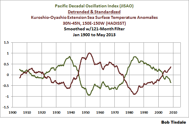
In the post Questions the Media Should Be Asking the IPCC – The Hiatus in Warming, I illustrated how the model mean of the climate models used by the IPCC did not simulate the Atlantic Multidecadal Oscillation (AMO). In that post, I used the method for presenting the AMO recommended by Trenberth and Shea (2006), which was to subtract global sea surface temperature anomalies (60S-60N) from sea surface temperature anomalies of the North Atlantic (0-60N, 80W-0). That model failing suggested that the observed Atlantic Multidecadal Oscillation was not a forced component of the models. See the left-hand cell of Figure 11. Similarly, we illustrated that the dominant source of multidecadal variations in the sea surface temperatures of the North Pacific (the sea surface temperatures of the Kuroshio-Oyashio Extension) were also not forced by manmade greenhouse gases, and that the models could not simulate those either. See the right-hand cell of Figure 11. (The sea surface temperature anomalies of the Kuroshio-Oyashio Extension are inversely related to the Pacific Decadal Oscillation. See the graph here.)

Figure 11
And in the post Open Letter to the Honorable John Kerry U.S. Secretary of State, we illustrated how the climate modelers had to double the rate of warming of global sea surface temperatures (left-hand cell of Figure 12) over the past 31+ years in order to get the modeled warming rate for land surface air temperatures (right-hand cell of Figure 12) close to the observations.

Figure 12
In the post IPCC Still Delusional about Carbon Dioxide, we illustrated and discussed how the climate models used by the IPCC do not support the hypothesis of human-induced global warming, and that many would say the models contradict it.
FURTHER READING
Over the past year, I’ve presented numerous failings exhibited by the latest generation of climate models. Those failings were collected in my book Climate Models Fail.
And as I’ve discussed in a multitude of blog posts here and at WattsUpWithThat for approaching 5 years, ocean heat content data and satellite-era sea surface temperature data both indicate the oceans warmed via naturally occurring, sunlight fueled, coupled ocean-atmosphere processes, primarily those associated with El Niño and La Niña events. See my illustrated essay “The Manmade Global Warming Challenge” (42mb) and, for much more information, see my book Who Turned on the Heat? Sales of my ebooks allow me to continue my research into human-induced and natural climate change and to continue to blog here at Climate Observations and at WattsUpWithThat.
CLOSING
Whenever someone, anyone, publishes a blog post that opposes Tamino’s beliefs in human-induced catastrophic global warming, he gets all excited and writes blog posts. Often times, Tamino attempts to belittle those with whom he disagrees. So far, Tamino has failed in his efforts to counter my blog posts that he objects to. In addition to what was discussed in this post, here are a few other examples:
Tamino expressed a complete lack of understanding of the Atlantic Multidecadal Oscillation in his post AMO. My reply to it is Comments On Tamino’s AMO Post.
Tamino objected a number of times to how I presented my model-data comparisons of ARGO-era ocean heat content data. See the example here from the post Is Ocean Heat Content Data All It’s Stacked Up to Be? As further discussed in that post:
See Tamino’s posts here and here, and my replies here and here. My replies were also cross posted at WattsUpWithThat here and here. Tamino didn’t like the point where I showed the model projections intersecting with the Ocean Heat Content data. Then RealClimate corrected their past model-data comparison posts. Refer to the RealClimate post OHC Model/Obs Comparison Errata. As a result, Gavin Schmidt then corrected the ocean heat content model-data comparison graphs in his earlier December 2009, May 2010, January 2011 and February 2012 posts. Refer also to my discussion of the RealClimate corrections here. Now the comparison in [Figure 1 from that post] , which has been updated through December 2012, appears overly generous to the models—that I should be shifting the model projection a little to the left.
And as a reminder, while it would be fun, please refrain from sophomoric humor on the thread. Most of the responses to Tamino are way too obvious anyway.
Regards
Don’t worry about it Bob. He who laughs last …
http://thepointman.wordpress.com/2013/10/25/the-climate-wars-and-agent-deep-woolabra-wonga/
Pointman
Tamino is the main character in Die Zauberflöte; and Zauber is magic; indeed a very appropriate description for the games the warmist computer programmers play. A kind of wink-wink-nudge-nudge by an insider.
What’s your true name, Tamino… is it
Horst?
Günther?
or maybe….
Rumpelstilzchen?
A few facts:
The climate models have failed.
The climate models have failed.
The climate models have failed.
Did I mention that the climate models have failed?
Politicians know nothing about spin. The Calamastrologists are now the experts in spin, misdirection, misinformation, fraud and lies. The IPCC is among the very best in this dark art.
Bob, el-nino year or not why use a hot year at all??? you’re only opening yourself to criticism and derision for trying to widen the gap between climate model predictions and reality
so we were told they were right…and knew what they were doing……until they were wrong
…and now there’s a new chart showing that ever though they were wrong all this time….now they are right again
I definitely specialized in the wrong field!
“When I offset the observations by 0.1 deg.C, we get more realistic comparison of observations to projections:”
If we had made predictions that we didn’t make, then the enterprise wouldn’t be falsified.
Nothing different from: If we didn’t have the thermometers we had, but the thermometers we wanted, then we would have temperatures we desire from places we aren’t.
SideShowBob:
Your post at October 26, 2013 at 3:51 pm says in total
You really, really have ‘lost the plot’.
He did not use a ‘hot year’. That was the main point of the post.
Richard
Averages of anomalies of averages of something which, when averaged, is physically meaningless. Boy, I can see how that would be useful.
Just in case it wasn’t obvious /SARC
@Bob Tisdale.
Don’t give this jerk “Tamino” the benefit of anonymity. His name is Grant Foster, he lives in Portland Maine.
Use his name when discussing his claims, if he stands behind his work, then he should have any problem with his name being applied to it.
“In the post Questions the Media Should Be Asking the IPCC – The Hiatus in Warming, I illustrated how the model mean of the climate models used by the IPCC did not simulate the Atlantic Multidecadal Oscillation (AMO).”
Indeed CAGW-movement models don’t. Of greater relevance is observing:
* The AMO index has overall a double-peak appearance over the past hundred years (as in, for instance, http://bobtisdale.files.wordpress.com/2013/10/figure-3.png including the 1930s being a particular high after warming during the early 20th century, the 1970s of the global cooling scare period being a low, and it going up again by the end of the 20th century).
* That double-peak appearance is very recognizable for being similar to the general pattern in both high northern latitude temperature history and actual global average temperatures meanwhile — if one is familar with actual temperature history, as opposed to how the CAGW movement rewrote prior data to change the latter towards a hockey stick (as illustrated in the next link).
* The above is unsurprising when considering that a definition of the AMO index, how it is calculated and derived, is temperature averaged over the North Atlantic minus global mean temperature. In every Holocene warm period (such as the Medieval Warm Period, the Holocene Climate Optimum, the Modern Warm Period, etc), both the arctic and high northern latitudes near the arctic warm more than the global average. It is no coincidence that the AMO index has a double peak appearance in the 20th century, like actual 20th century temperature history, for it is a form of temperature history by definition.
* The double-peak general appearance of 20th century temperature history and the AMO relates to the also double-peak general appearance of solar activity history meanwhile, as illustrated, for instance, in a block of 4 plots 1/3rd of the way down in http://img176.imagevenue.com/img.php?image=81829_expanded_overview_122_424lo.jpg
The AMO index, high northern latitude temperature, global temperature, and solar activity will all overall go down in the near future, with solar activity starting to plummet later this decade (for the current solar maximum is ending).
“Tamino to present his global temperature data that had been adjusted for ENSO, volcanic aerosols and solar variations”
Even that would be data untrue as usual for the CAGW movement, due to falsehoods including the global temperature history itself having been rewritten as previously noted (illustrations also in prior link), while his incorrect adjustment for solar variation would be their standard practice of ignoring how the overall effect of solar variation (with modulation of cosmic rays) is several times greater than variation in TSI alone.
I saw that name just today at that French store, kinda.
http://www.target.com/p/foster-grant-ironman-sunglasses-black/-/A-14115951?ref=tgt_adv_XSG10001&AFID=Google_PLA_df&LNM=%7C14115951&CPNG=Accessories&kpid=14115951&LID=PA&ci_src=17588969&ci_sku=14115951&gclid=COG1krzQtboCFUdk7AodI3MAng
Dear Host of WUWT:
At October 26, 2013 at 4:06 pm you say
Your post alludes to an issue I think important.
Tamino aka Grant Foster is an academic and, therefore, he benefits his career by increasing his publication score with every paper he publishes in the peer-reviewed literature.
Hence, anything Foster publishes as ‘Tamino’ on his blog is ‘work’ which he has done and which he considers is not worthy of publication because it is so poor that he refuses to put his own name to it. Simply, everything Foster posts on his blog under his fake name is ‘work’ which he has himself rejected as being rubbish.
I fail to understand why anybody takes any notice of any of the rubbish posted by Tamino except to point out how wrong it is (as Bob Tisdale does in his above essay).
Richard
It is worth remembering that Tamino (Grant Foster) has tangled with Tisdale before.
Why?
Because Tamino’s first line of defence is to disparage the opposition and, thus, imply that his opponents are not worth considering.
As the subject is complex this policy has effectiveness.
But Tamino (Grant Foster) has tangled with Tisdale before. And Tamino has not been able to brush Bob Tisdale away… Tisdale can keep standing up. He can say “Look”.
So Look!
Tamino needs a better defence than merely, “Don’t look over there, This is your card”.
Wonderfully entertaining, Bob. And so much work ….
Amazing how they never thought of disappearing the 1998 temperature peak in the early 2000s when the ENSO-induced warming trend suited their purpose.
Now that the 1998 peak belittles the recent temperatures, they attempt to make it go away by de-ENSOing it. Pathetic. So much deception.
Jimbo says:
October 26, 2013 at 3:38 pm
“A few facts:
[…]
Did I mention that the climate models have failed? […]”
I didn’t see where you broached the topic but I believe Bob Tisdale has mentioned it in passing.
The models… could use a little work. I’d start by deleting just the lines after the first comments and then tweaking the programs from there.
richardscourtney: “Hence, anything Foster publishes as ‘Tamino’ on his blog is …”
As valid as it is, no matter what name he uses.
richardscourtney says:
October 26, 2013 at 4:00 pm
Bob, el-nino year or not why use a hot year at all??? you’re only opening yourself to criticism and derision for trying to widen the gap between climate model predictions and reality
“He did not use a ‘hot year’. That was the main point of the post.”
Fine… let me rephrase it
Bob, el-nino year or not why use a warm year at all??? you’re only opening yourself to criticism and derision for trying to widen the gap between climate model predictions and reality
It probably bears mentioning… 1990 was selected as a start date not by skeptics, but by the UNFCCC.
I love Tamino’s take. “If I just adjust the data to fit….well it fits.”
What is reasoning for zeroing the models and observations at 1990 or any date for that matter? It seems to me that zeroing the data at a specific point makes the models appear to be closer to reality than they may possibly be.
1990 was the most neutral year one can get.
The average ENSO value (with a 3 month lag) was 0.03C (certainly Zero in ENSO terms with an impact on the global average temperature of 0.002C).
The average AMO index (which Tamino/Grant Foster always ignores since it has a 60 year cyclical impact on temperatures) was 0.01C with a global temperature impact of 0.006C.
There were no volcanoes (as Pinatubo did not occur until June 1991) and the solar cycle could have possibly had a +0.04C impact (if it has any).
All together, natural variables might have had a +0.05C impact on 1990 temperatures.
Hadcrut4 was 0.29C in 1990 (or maybe 0.24C adjusted for natural variables).
IPCC AR4 multi-model mean (under A1B) was 0.27C (bang on or close enough so that no adjustment is required).
IPCC AR5 multi-model mean (under RCP 6.0) was 0.32C (so maybe a 0.07C could be adjusted lower for it).
Fake Tamino/Grant Foster/Nuccitelli adjustments once again. The issue really is that many people believe when these two individuals just change the numbers to suit their purposes. Many human beings are gullible and fall for this garbage and there is nothing you can do about it (you as in anyone reading this).
Hi Bob,
if the Model hindcasts are determined by forcing rather than trends, shouldn’t the model ensemble (and therefore future projections) be tied to the observations using the Pinatubo response (clearly evident in both models and obs), rather than zeroing at 1990?
Aren’t the climate models supposed to simulate random variability to some degree? My understanding was that they included volcano and ENSO variables even though they can’t predict specifically when they will occur that way the models would be correct over a longer period.
There are two different universes here.
1) In Foster’s universe (cool sunglasses, by the way) we are all going to die tomorrow (or soon) because the (adjusted) charts indicate such.
2) In the REAL universe, temps oscillate back and forth on some seemingly random mission, yet to be fully understood, that only somewhat affects live on Earth.
No one can understand universe 1, but someday, maybe, we can understand universe 2.
Oh boy, Grant Foster, another layer of adjustments by ‘modelers’ and ‘climatologists’ over what has already had adjustment applied layered over adjustments. That everyone, and I mean everyone, seems to just be chasing adjustments… such from USHCN & NCDC that all global ‘datasets’ are built upon?
Did I mention the adjustments?
Has anyone here been brave enough or industrious enough to look at what the completely pre-adjusted data generally looks like? Even roughly is close enough. You might not be able to find that unadjusted data but the adjustments are published so roughly remove them and take a look at what remains. It is quite simple and it is quite an eye opener.
Brian R: ” It seems to me that zeroing the data at a specific point makes the models appear to be closer to reality than they may possibly be.”
In 1555, Nostradamus published his work The Prophecies. In the work he stated that his prophecies were good from then until 3797. And that they applied only to Europe, Africa, and parts of Asia. His prophecies have, at various times, been zeroed geographically to the United States and reinterpreted in light of 9/11, the Space Shuttle Challenger, and various other calamities and disasters. This then proves that Nostradamus correctly prophesied the future.
In 1990, an ensemble of IPCC climate models published their prophecies from then until 2047…