Guest Post by Willis Eschenbach
As Anthony discussed here at WUWT, we have yet another effort to re-animate the long-dead “hockeystick” of Michael Mann. This time, it’s Recent temperature extremes at high northern latitudes unprecedented in the past 600 years, by Martin P. Tingley and Peter Huybers (paywalled), hereinafter TH2013.
Here’s their claim from the abstract.
Here, using a hierarchical Bayesian analysis of instrumental, tree-ring, ice-core and lake-sediment records, we show that the magnitude and frequency of recent warm temperature extremes at high northern latitudes are unprecedented in the past 600 years. The summers of 2005, 2007, 2010 and 2011 were warmer than those of all prior years back to 1400 (probability P > 0.95), in terms of the spatial average. The summer of 2010 was the warmest in the previous 600 years in western Russia (P > 0.99) and probably the warmest in western Greenland and the Canadian Arctic as well (P > 0.90). These and other recent extremes greatly exceed those expected from a stationary climate, but can be understood as resulting from constant space–time variability about an increased mean temperature.
Now, Steve McIntyre has found some lovely problems with their claims over at ClimateAudit. I thought I’d take a look at their lake-sediment records. Here’s the raw data itself, before any analysis:
 Figure 1. All varve thickness records used in TH2013. Units vary, and are as reported by the original investigator. Click image to embiggen.
So what’s not to like? Well, a number of things.
To start with, there’s the infamous Korttajarvi record. Steve McIntyre describes this one well:
In keeping with the total and complete stubbornness of the paleoclimate community, they use the most famous series of Mann et al 2008: the contaminated Korttajarvi sediments, the problems with which are well known in skeptic blogs and which were reported in a comment at PNAS by Ross and I at the time. The original author, Mia Tiljander, warned against use of the modern portion of this data, as the sediments had been contaminated by modern bridgebuilding and farming. Although the defects of this series as a proxy are well known to readers of “skeptical” blogs, peer reviewers at Nature were obviously untroubled by the inclusion of this proxy in a temperature reconstruction.
Let me stop here a moment and talk about lake proxies. Down at the bottom of most every lake, a new layer of sediment is laid down every year. This sediment contains a very informative mix of whatever was washed into the lake during a given year. You can identify the changes in the local vegetation, for example, by changes in the plant pollens that are laid down as part of the sediment. There’s a lot of information that can be mined from the mud at the bottom of lakes.
One piece of information we can look at is the rate at which the sediment accumulates. This is called “varve thickness”, with a “varve” meaning a pair of thin layers of sediment, one for summer and one for winter, that comprise a single year’s sediment. Obviously, this thickness can vary quite a bit. And in some cases, it’s correlated in some sense with temperature.
However, in one important way lake proxies are unlike say ice core proxies. The daily activities of human beings don’t change the thickness of the layers of ice that get laid down. But everything from road construction to changes in farming methods can radically change the amount of sediment in the local watercourses and lakes. That’s the problem with Korttajarvi.
And in addition, changes in the surrounding natural landscape can also change the sediment levels. Many things, from burning of local vegetation to insect infestation to changes in local water flow can radically change the amount of sediment in a particular part of a particular lake.
Look, for example, at the Soper data in Figure 1. It is more than obvious that we are looking at some significant changes in the sedimentation rate during the first half of the 20th Century. After four centuries of one regime, something happened. We don’t know what, but it seems doubtful a gradual change in temperature would cause a sudden step change in the amount of sediment combined with a change in variability.
Now, let me stop right here and say that the inclusion of this proxy alone, ignoring the obvious madness of including Korttajarvi, this proxy alone should totally disqualify the whole paper. There is no justification for claiming that it is temperature related. Yes, I know it gets log transformed further on in the story, but get real. This is not a representation of temperature.
But Korttajarvi and Soper are not the only problem. Look at Iceberg, three separate records. It’s like one of those second grade quizzes—”Which of these three records is unlike the other two?” How can that possibly be considered a valid proxy?
How does one end up with this kind of garbage? Here’s the authors’ explanation:
All varve thickness records publicly available from the NOAA Paleolimnology Data Archive as of January 2012 are incorporated, provided they meet the following criteria:
• extend back at least 200 years,
• are at annual resolution,
• are reported in length units, and
• the original publication or other references indicate or argue for a positive association with summer temperature.
Well, that all sounds good, but these guys are so classic … take a look at Devon Lake in Figure 1, it’s DV09. Notice how far back it goes? 1843, which is 170 years ago … so much for their 200 year criteria.
Want to know the funny part? I might never have noticed, but when I read the criteria, I thought “Why a 200 year criteria”? It struck me as special pleading, so I looked more closely at the only one it applied to and said huh? Didn’t look like 200 years. So I checked the data here … 1843, not 200 years ago, only 170.
Man, the more I look, the more I find. In that regard, both Sawtooth and Murray have little short separate portions at the end of their main data. Perhaps by chance, both of them will add to whatever spurious hockeystick has been formed by Korttajarvi and Soper and the main players.
So that’s the first look, at the raw data. Now, let’s follow what they actually do with the data. From the paper:
As is common, varve thicknesses are logarithmically transformed before analysis, giving distributions that are more nearly normally distributed and in agreement with the assumptions characterizing our analysis (see subsequent section).
I’m not entirely at ease with this log transformation. I don’t understand the underlying justification or logic for doing that. If the varve thickness is proportional in some way to temperature, and it may well be, why would it be proportional to the logarithm of the thickness?
In any case, let’s see how much “more nearly normally distributed” we’re talking about. Here are the distributions of the same records, after log transformation and standardization. I use a “violin plot” to examine the shape of a distribution. The width at any point indicates the smoothed number of data points with that value. The white dot shows the median value of the data. The black box shows the interquartile range, which contains half of the data. The vertical “whiskers” extend 1.5 times the interquartile distance at top and bottom of the black box.
 Figure 2. Violin plots of the data shown in Figure 1, but after log transformation and standardization. Random normal distribution included at lower right for comparison.
Note the very large variation between the different varve thickness datasets. You can see the problems with the Soper dataset. Some datasets have a fairly normal distribution after the log transform, like Big Round and Donard. Others, like DV09 and Soper, are far from normal in distribution even after transformation. Many of them are strongly asymmetrical, with excursions of four standard deviations being common in the positive direction. By contrast, often they only vary by half of that in the negative direction, two standard deviations. When the underlying dataset is that far from normal, it’s always a good reason for further investigation in my world. And if you are going to include them, the differences in which way they swing from normal (excess positive over negative excursions) affects both the results and their uncertainty.
In any case, after the log transformation and standardization to a mean of zero and a standard deviation of one, the datasets and their average are shown in Figure 3.
 Figure 3. Varve thickness records after log transformation and standardization.
As you can see, the log transform doesn’t change the problems with e.g. the Soper or the Iceberg records. They still do not have internal consistency. As a result of the inclusion of these problematic records, all of which contain visible irregularities in the recent data, even a simple average shows an entirely spurious hockeystick.
In fact, the average shows a typical shape for this kind of spurious hockeystick. In the “shaft” part of the hockeystick, the random variations in the chosen proxies tend to cancel each other out. Then in the “blade”, the random proxies still cancel each other out, and all that’s left are the few proxies that show rises in the most recent section.
My conclusions, in no particular order, are:
• The authors are to be congratulated for being clear about the sources of their data. It makes for easy analysis of their work.
• They are also to be congratulated for the clear statement of the criteria for inclusion of the proxies.
• Sadly, they did not follow their own criteria.
•The main conclusion, however, is that clear, bright-line criteria of the type that they used are a necessary but not sufficient part of the process. There are more steps that need to be followed.
The second step is the use of the source documents and the literature to see if there are problems with using some parts of the data. For them to include Korttajarvi is a particularly egregious oversight. Michael Mann used it upside-down in his 2008 analysis. He subsequently argued it “didn’t matter”. It is used upside-down again here, and the original investigators said don’t use it after 1750 or so. It is absolutely pathetic that after all of the discussion in the literature and on the web, including a published letter to PNAS, that once again Korttajarvi is being used in a proxy reconstruction, and once again it is being used upside-down. That’s inexcusable.
The third part of the proxy selection process is the use of the Mark I eyeball to see if there are gaps, jumps in amplitude, changes in variability, or other signs of problems with the data.
The next part is to investigate the effect of the questionable data on the final result.
And the final part is to discuss the reasons for the inclusion or the exclusion of the questionable data, and its effects on the outcome of the study.
Unfortunately, they only did the first part, establishing the bright-line criteria.
Look, you can’t just grab a bunch of proxies and average them, no matter if you use Bayesian methods or not. The paleoproxy crowd has shown over and over that you can artfully construct a hockeystick by doing that, just pick the right proxies …
So what? All that proves is yes indeed, if you put garbage in, you will assuredly get garbage out. If you are careful when you pack the proxy selection process, you can get any results you want.
Man, I’m tired of rooting through this kind of garbage, faux studies by faux scientists.
w.
Franz-
I think it literally means upside down, they have changed the sign from positive to negative by “mistake.”
I worked in complex human genetics for a long time, and many people in that area around geneticists and not mathematicians so they screw up the math in papers all the time. To me it looks like climate science has the same issue, the datasets are too complex for the scientists to handle and thus many papers do not have the significance claimed.
Oh dear, once again, where is academic rigor?
You do not do a log transform unless you have reason to do so. Nature tends not to know what a logarithm is and I suspect there are few examples in Nature of logarithmic distributions of anything. More often, it is used to transform data into a look that satisfies the author and is not more than an arbitrary approximation. The logarithm function is often first recourse when a linear function has problems, but there are many mathematical transforms possible. The skew in the violin plot, especially the fat-tailed high of several, shows that caution should be used with these log transforms. I would not class these as statically valid for further analysis.
I have not read the article (paywall) so these comments might be refuted therein.
There is a further problem, shown by Ogac in the last figure. The lower values group into boxes at Y-axis values of -2, -1 etc (by eyeball, see the flat lines you can draw from left to right). These might be an artefact of carrying a small number of significant figures on the small numbers a log transform can create. This in turn feeds back on error estimate and in the general case broadens the bounds if done correctly. I do not know the specifics until I read the paper. So I refrain from calling it a cartoon level treatment for now.
Leonard Lane says:
April 13, 2013 at 10:46 pm
Thanks for the interesting thoughts, Leonard. One point in showing the distribution after the log-normal transformation was to point out that each distribution is different. Some are quite normal in distribution after the log-normal transformation. However, others are not. In such cases, if the objective is to end up with a generally normal distribution, a gamma or other distribution should be considered in addition to log.
My main point was, they claimed they wanted to get a more normal distribution, but in many cases they were not successful.
Finally, I agree that a change in precipitation or runoff would be the first consideration. Second for me would be to look at the location of the core in respect to the location of the inflow. In natural lakes, a delta often builds up around the inlet. If the incoming water cuts through to the other side off the delta, as happens occasionally, the amount of sediment can change drastically.
See the discussion of Iceberg Lake at ClimateAudit for an example of what I mean.
Best regards,
w.
Franz Dullaart says:
April 13, 2013 at 11:00 pm
Indeed, that’s exactly what it means. In addition, the same problem exists for the Iceberg Lake data. Here is the location, along with the nearest stations:
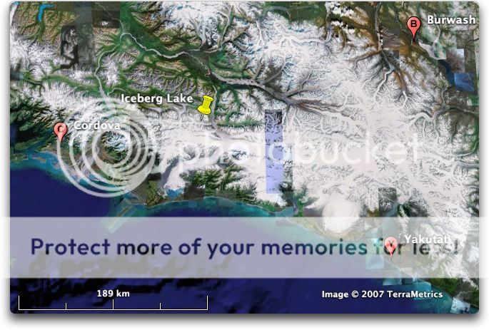
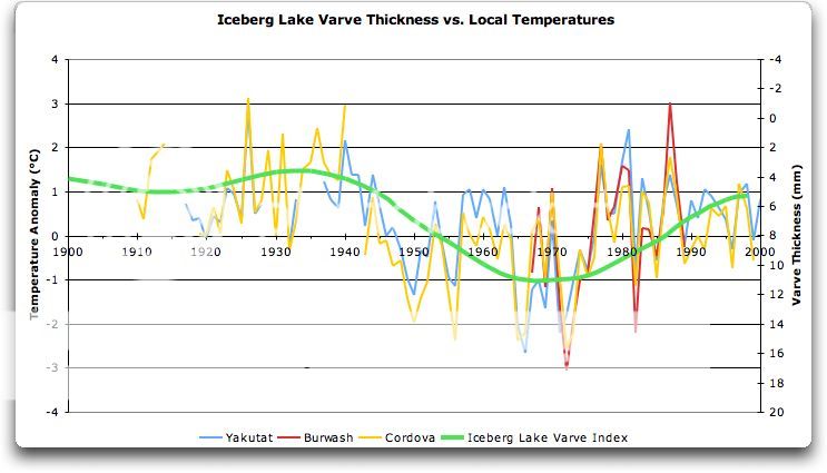
The three nearest temperature stations are shown on the map, along with the location of the lake. Iceberg Lake is only about 80 km (50 miles) from the coast of Southeast Alaska. Fortunately, the three nearest stations are not far from Iceberg Lake, and it’s in the middle of the three. Here’s the temperature record:
As you can see, the three stations are well correlated, particularly in the modern period when measurements are likely to be better. Burwash, being inland, has wider swings than the two coastal stations, but they all move together.
And as you can also see, in the last century the varve thickness of Iceberg Lake is a pretty good proxy for the temperature, with just one leetle, tiny problem. Note that the scale on the right is inverted … which means that when the temperature increases, the varve thickness decreases …
So Iceberg Lake (“Iceberg” in the figures above) is upside-down as well. I probably should add this to the head post.
w.
@Charles Gerard Nelson
“…it’s thirty percent feel, thirty percent gut instinct, thirty percent guesswork and thirty percent fabrication…it’s a farcical pursuit.”
I love your climatic mathematics. That is the point exactly with the disturbed sediments. The modern size of the disturbed sediments add up to more than 100% of the ‘temperature’ they encoded at some time in the past.
Let me have a go at it:
Korttajarvi is upside down – that is 100% wrong. Then the log-thing: 50% wrong. The inclusion of data that does not meet the criteria: 10% wrong. The inclusion of data sources and methods: 50% right. Spelling his name correctly on the paper: 10% bonus (that is a fixture from my high school days).
So it is 60% right and 160% wrong.
Final Mark:
(60+160) / 392 ppm CO2 = 0.561 or 56%
That’s a D-minus
How am I doing so far?
Korttajärvi is not a lake somewhere in pristine wilderness.It is a very small lake surrounded by agriculture, fields that slope towards it and possibly at least one pig farm or cattle farm.
In the fifties, those small farms got tractors an other power equipment, and fertilizers were introduced.As usual, if small amount of fertilizer seems to be good, more must be even better.
So the farmers soaked their fields with enermous amount of fertilizer.And used tractors to stir the survace.
Choosing the lake Korttajärvi is a deliberate trick to create an anomaly.
I have driven past Korttajärvi, it is near Jyväskylä, close to our summer cottage.
There are only two Korttajärvi:s here in Finland ,and the other one is called “Alvajärvi-Korttajärvi” because it is actually just Alvajärvi.It would be even worse option to study.
Best Regards
Timo Kuusela
berniel says:
April 13, 2013 at 11:22 pm
Thanks, Bernie. The association is not absurd … but as the example of Iceberg Lake shows, the relationship is also by no means obvious. My conclusion about Iceberg Lake was that when it is colder and the ice advances, you get more frost heave and “bulldozing” by advancing ice fronts. That makes for MORE sediment when it’s colder, and less sediment when it’s warmer, the opposite of the blanket assumption used in this study.
In other areas, the link may be between temperature –> rainfall –> increased river flow –> increased sediment. Theoretically, if a warmer climate in the area leads to more rain, we could see a positive correlation between temperature and varve thickness.
So it seems to me you’d have to do what I did, and compare the varve data to the local temperature, to try to understand what is going on.
w.
By the way Iceberg Lake is in the near proximity of Hubbard Glacier, the largest tidewater glacier in North America. Hubbard is gaining in mass and has been advancing since the late 1880s. Haven’t seen much reporting on that in SKS or Huffington Post or anywhere else.
Willis: “So what? All that proves is yes indeed, if you put garbage in, you will indeed get garbage out. If you are careful when you pack the proxy selection process, you can get any results you want.”
As a practical guy, I’m sure you know that if you search through garbage you can find what you need to make just about anything. Climate science is no different 😉
Perhaps this field should be classified as a sub-section of garbology. http://en.wikipedia.org/wiki/Garbology
W “Man, I’m tired of rooting through this kind of garbage, faux studies by faux scientists.”
There seems to be surge of more and more spurious work getting published recently.
Their whole story is falling apart and the public are losing interest. It seems like their last desperate attempt to keep boat afloat is to publish these spurious studies faster than the rest of the world can rebut them.
FWIW, I think the idea behind the log is that the mud compacts with time. The water being forced out as it settles. It would be interesting to ask how accurate that simplistic model is and how they account for the uncertainty of that process in their overall uncertainty calculations for the study.
Geoff Sherrington says:
April 13, 2013 at 11:33 pm
My point exactly, sir, and I thank you for articulating it so well.
Not that I can find. Their reference for the log-transform usage is Loso, M. Summer temperatures during the medieval warm period and little ice age inferred from varved proglacial lake sediments in southern Alaska. J. Paleolimnol. 41, 117–128 (2009), available here.
I suspect that it reflects the lower limits of resolution for the actual measurement of the varve thickness, rather than the number of significant figures. Here are the values before the log transform (cf. Figure 1):
You can see that a log transform of that would be stepped.
Thanks,
w.
An increase in the Varv thickness is a measure of the melting is increased, the more the temperature increases. And similar is due to a decrease in Varv the temperature drops.
The problem of the samples are being taken to places where Varv formation is beneficial in today. And thereforedata is lacking from the period from the year 800 to the year 1000 where the temperature increased.
“For if we are uncritical we shall always find what we want: we shall look for, and find, confirmations, and we shall look away from, and not see, whatever might be dangerous to our pet theories. In this way it is only too easy to obtain what appears to be overwhelming evidence in favor of a theory which, if approached critically, would have been refuted.” — Karl Popper, 1957, The Poverty of Historicism (London: Routledge), p. 124
To be fair to the authors there acting at a standard and in a way that is the norm for their area .
That the standards are so low and manner of working is such a joke within climate scince is another problem .
By the way, I must speak out in favor of log transforms. As a matter of fact, one could seriously consider that logs are Nature’s #1 way of counting, and that our use of integers just shows our local-mindedness. Example: black box radiation spectrum profile follows the normal curve on the log scale, but on the integer scale it shows a characteristic curve, see e.g. http://en.wikipedia.org/wiki/Planck's_law . So on the log scale it is symmetric — obviously a better scale. Another example: financial graphs would be better if plotted logarithmically, because then a doubling of the price is the same y-displacement wherever it goes. And so on. So I would not be quick to jump on the anti-logarithm bandwagon, no, not at all.
Excellent post Willis, as always. Thank you.
More worrying for me is that these varves patently are not a good proxy for temperature. I say this because the graphs shout out that they are contaminated in individual years. Just look at the sudden spikes in lots of them. No one seriously believes the temperature spiked by, in some cases 5 fold, for a single year or two. Even assuming a log relation to temperature doesn’t make those spikes credible. And the spikes are not consistent across the world, so they are patently not ‘real’ measures of anything – they are local conditions being reflected locally.
But the criteria Willis put up for proxy inclusion do not indicate any special processing of these spikes.
Let’s imagine that these really were ‘thermometers’. Would anyone get away with using this data? Of course not. Reviewers would be all over them, calling for a processing step that removed the obvious year of data when an apprentice reported in Fahrenheit instead of Celsius.
Interesting as always, Willis
I am wondering about the varve proxy approach in general:
i) So it seems probable varve thickness varies some way in synch with summer temperatures. But why would it be linear? Or, why would it be log-linear? What is the physics behind this assumption? And why would a lake in the Alaska show the same behavior as a lake in Finland?
ii) Assuming it has been established that a e.g. log-linear relationship has a physical justification, what is the inaccuracy of each individual temperature “measurement”? 0.1 degree, 1 degree, 2 degrees? 10 degrees? (My guess 1 or 2 degrees)
iii) In this case, there are 11 “thermometers” all measuring/sampling DIFFERENT signals, i.e. (indirect) temperatures in 11 different locations. How is then possible to determine some sort of northern average temperature with an accuracy of 0.1 or even 0.01 degree? (I assume this necessary in order to rank the years.)
Thanks,
/Johan
I should have added in response to Geoff Sherrington:
“More often, it is used to transform data into a look that satisfies the author and is not more than an arbitrary approximation”
This is what I was thinking – the log process compresses the spikes, and makes the processed data more ‘credible’ in the authors’ eyes.
As a general rule, if samples from presumed equivalent populations that mostly show a normal distribution, show skewdness or kurtosis, then those populations are subject to other effects than the normal distribution populations.
Combining them is poor science.
Personally, I’d replace faux by cr@p.
Willis! You have misinterpreted Korttajavi. It is not fixed to varve thickness. From Tilander 2003:
“It is now possible to interpret long varve records
with one year or seasonal resolution. Variation in the
relative X-ray density describes the structure of the
sediment and provides information about the sedimentary
environment. Varve thickness indicates the rate of
sediment accumulation, and magnetic measurements
have been used to provide information on the nature of
the accumulating mineral particles (e.g. Snowball et al.
1999, 2002).”
As I said above: I think the idea behind the log is that the mud compacts with time. The water being forced out as it settles. It would be interesting to ask how accurate that simplistic model is and how they account for the uncertainty of that process in their overall uncertainty calculations for the study.
The log is the inverse of the exponential , which is very common in natural processes. So taking the log could be justified. It may warrant further inspection, but I don’t think it’s grounds for shouting an yabooing without reading the paper.
No point in slinging mud a varvologists, they love the stuff.
This result looks very weak for the other reasons Willis has highlighted. I’d be inclined to concentrate of that rather than the log issue.
Just how often do you encounter a Google Map aerial wiev that is a nighttime wiev?
The Korttajärvi region “just happens” to be like that.Like a black hole in the middle of Finland.
Luckily there is an option:kansalaisen.karttapaikka.fi ,it is in black and white aerial photography, but much better than google map.Just choose “ilmakuva”- “aerial image” (you can choose english too)and you can watch closely any part of Finland.Korttajärvi is 10km/6 miles north of Jyväskylä, just south of Puuppola.You can see yourselves how good a lake is that to have such scientific importance.
My daughter wanted to know how on earth I can write the word “view” -“wiev”……
A facepalm….
Thanks for Figure 2 Willis. After enlargement, I’m going to add them to my UFO pics.
Thanks Willis.
But what does ”embiggen” mean? Does ”Enlarge” just about cover it?
“These and other recent extremes greatly exceed those expected from a stationary climate”
And there is your problem. You’re denying climate change. [snip] ~mod