Guest Post by Willis Eschenbach
Since we’ve been discussing smoothing in datasets, I thought I’d repost something that Steve McIntyre had graciously allowed me to post on his amazing blog ClimateAudit back in 2008.
—————————————————————————————–
Data Smoothing and Spurious Correlation
Allan Macrae has posted an interesting study at ICECAP. In the study he argues that the changes in temperature (tropospheric and surface) precede the changes in atmospheric CO2 by nine months. Thus, he says, CO2 cannot be the source of the changes in temperature, because it follows those changes.
Being a curious and generally disbelieving sort of fellow, I thought I’d take a look to see if his claims were true. I got the three datasets (CO2, tropospheric, and surface temperatures), and I have posted them up here. These show the actual data, not the month-to-month changes.
In the Macrae study, he used smoothed datasets (12 month average) of the month-to-month change in temperature (∆T) and CO2 (∆CO2) to establish the lag between the change in CO2 and temperature . Accordingly, I did the same. [My initial graph of the raw and smoothed data is shown above as Figure 1, I repeat it here with the original caption.]

Figure 1. Cross-correlations of raw and 12-month smoothed UAH MSU Lower Tropospheric Temperature change (∆T) and Mauna Loa CO2 change (∆CO2). Smoothing is done with a Gaussian average, with a “Full Width to Half Maximum” (FWHM) width of 12 months (brown line). Red line is correlation of raw unsmoothed data (referred to as a “0 month average”). Black circle shows peak correlation.
At first glance, this seemed to confirm his study. The smoothed datasets do indeed have a strong correlation of about 0.6 with a lag of nine months (indicated by the black circle). However, I didn’t like the looks of the averaged data. The cycle looked artificial. And more to the point, I didn’t see anything resembling a correlation at a lag of nine months in the unsmoothed data.
Normally, if there is indeed a correlation that involves a lag, the unsmoothed data will show that correlation, although it will usually be stronger when it is smoothed. In addition, there will be a correlation on either side of the peak which is somewhat smaller than at the peak. So if there is a peak at say 9 months in the unsmoothed data, there will be positive (but smaller) correlations at 8 and 10 months. However, in this case, with the unsmoothed data there is a negative correlation for 7, 8, and 9 months lag.
Now Steve McIntyre has posted somewhere about how averaging can actually create spurious correlations (although my google-fu was not strong enough to find it). I suspected that the correlation between these datasets was spurious, so I decided to look at different smoothing lengths. These look like this:

Figure 2. Cross-correlations of raw and smoothed UAH MSU Lower Tropospheric Temperature change (∆T) and Mauna Loa CO2 change (∆CO2). Smoothing is done with a Gaussian average, with a “Full Width to Half Maximum” (FWHM) width as given in the legend. Black circles shows peak correlation for various smoothing widths. As above, a “0 month” average shows the lagged correlations of the raw data itself.
Note what happens as the smoothing filter width is increased. What start out as separate tiny peaks at about 3-5 and 11-14 months end up being combined into a single large peak at around nine months. Note also how the lag of the peak correlation changes as the smoothing window is widened. It starts with a lag of about 4 months (purple and blue 2 month and 6 month smoothing lines). As the smoothing window increases, the lag increases as well, all the way up to 17 months for the 48 month smoothing. Which one is correct, if any?
To investigate what happens with random noise, I constructed a pair of series with similar autoregressions, and I looked at the lagged correlations. The original dataset is positively autocorrelated (sometimes called “red” noise). In general, the change (∆T or ∆CO2) in a positively autocorrelated dataset is negatively autocorrelated (sometimes called “blue noise”). Since the data under investigation is blue, I used blue random noise with the same negative autocorrelation for my test of random data. However, the exact choice is immaterial to the smoothing issue.
This was my first result using random data:

Figure 3. Cross-correlations of raw and smoothed random (blue noise) datasets. Smoothing is done with a Gaussian average, with a “Full Width to Half Maximum” (FWHM) width as given in the legend. Black circles show peak correlations for various smoothings.
Note that as the smoothing window increases in width, we see the same kind of changes we saw in the temperature/CO2 comparison. There appears to be a correlation between the smoothed random series, with a lag of about 7 months. In addition, as the smoothing window widens, the maximum point is pushed over, until it occurs at a lag which does not show any correlation in the raw data.
After making the first graph of the effect of smoothing width on random blue noise, I noticed that the curves were still rising on the right. So I graphed the correlations out to 60 months. This is the result:

Figure 4. Rescaling of Figure 3, showing the effect of lags out to 60 months.
Note how, once again, the smoothing (even for as short a period as six months, green line) converts a non-descript region (say lag +30 to +60, right part of the graph) into a high correlation region, by the lumping together of individual peaks. Remember, this was just random blue noise, none of these are represent real lagged relationships despite the high correlation.
My general conclusion from all of this is to avoid looking for lagged correlations in smoothed datasets, they’ll lie to you. I was surprised by the creation of apparent, but totally spurious, lagged correlations when the data is smoothed.
And for the $64,000 question … is the correlation found in the Macrae study valid, or spurious? I truly don’t know, although I strongly suspect that it is spurious. But how can we tell?
My best to everyone,
w.
Jon says:
March 30, 2013 at 9:08 pm
> Who let John Daly become suspended?
His wife was keeping the site up in his memory, but from what I can glean so far, apparently she died last year and stopped paying the account fees. The domain name was maintained by someone else, and he seems to have disappeared fairly recently. The domain is paid through this year.
I expect that his site will appear, but possibly at a different URL. I and others are on the issue.
Mike Jonas says:
March 31, 2013 at 1:10 am
That’s a fascinating chart, Mike, thanks for the link. It’s an interesting analysis I’m not sure what it means, but I like it.
My interpretation is somewhat different from yours. I wrote a piece a few months ago called “The Tao of El Nino” The peak you show above in the air temperature reflects the initial El Nino stage of the El Nino/La Nina pump.
Once the tropical ocean heats up, the pump kicks in and moves that warm tropical water first westward across the Pacific, and then polewards, both north and south.
Of course, this process takes some time … and I suspect that the lag you show above between CO2 and temperature is the result of that process, rather than some delayed cause-effect lag.
I take a somewhat more middle position on this question than does William Briggs, whose opinion I respect greatly.
I smooth stuff all the time. But as you quote me as advising above, it’s good to be very cautious.
In particular, as the good Briggs advises, don’t use smoothed series for anything but display—that is to say, don’t utilize them as input to other transformations like say a lagged correlation analysis, as McCrae did, and as I did above to illustrate the problem.
But yes, I do use smooths, just as I use averages … and I’m not fond of using averages either. You may have noticed that much of my results of say the TAO buoys or the like are displays of the actual raw data.
w.
Greg Goodman says:
March 31, 2013 at 2:21 am
OK, so in your world a smoother IS NOT a filter.
(And as an aside, since I was studying the effect of what McRae had done, I used what he used, duh …)
OK, so in your world a smoother IS a filter, just not a very good filter.
Come back when you make up your mind. Until then, such an opening invites me to stop reading, and I did. Why should I listen to a man who says a smoother is not a filter and then turns around and says it is a filter?
w.
Jeff L says:
March 31, 2013 at 8:40 am
Jeff, thanks for pointing out the obvious problems with Greg Goodman’s analysis before I got there.
I used a Gaussian filter, with the specified FWHM, as detailed in the captions. Why is there any question about this?
And as to your final point, whether the problem was square wave filtering, since the problem appears (above) with Gaussian filtering, it is clearly NOT a problem associated with square wave filtering (although square wave might give the same or similar results to Gaussian, I didn’t investigate that).
w.
John F. Hultquist says:
March 31, 2013 at 9:44 am
I agree with you, John, I thought his post included crap, but mainly because he failed to notice that I was using a Gaussian rather than a square-wave filter …
w.
Willis, two things that I want to thank you for in this marvelous post: 1) You showed yourself totally unbiased (your letting the chips fall where they may as one has come to expect of you) – many sceptics may have, perhaps liked to see proven that Temperature leads CO2 but you didn’t give them satisfaction. 2) The best part: your post generated a flurry of evaluation and insight into the whys of the spuriousness of the method from very savvy practitioners ( Jeff L says: March 30, 2013 at 8:58 pm; Donald L. Klipstein says:March 30, 2013 at 10:47 pm; Greg Goodman says: March 31, 2013 at 2:21 am [his “Now guess what? 12 / 1.3317 = 8.97 BINGO” is a thesis in itself]; Bill Illis says: March 31, 2013 at 4:04 am [ Bill shows us that numerical “data” itself is at least one step removed from data in its native habitat – a geologist’s way of looking at things is the raw “derivative” before integration.]; apologies for some I missed out; and of course links to Briggs and others on the subject of smoothing.
I’ve used statistics as a geologist and engineer over many decades but, from what I see here, I’ve operated at a very low level. I think this post should be an introduction to a series of posts by the scary guys I have listed above. It would also be particularly interesting to have a theme of the use and misuse of statistics in climate science (or maybe not – I’d like all climate scientists to read it, too). It should even be the theme of a special conference and publication for use of statistical methods by scientists and engineers. No wonder the “consensus” has found itself in troubled waters of late. Bravo all of you.
John Daly’s site MUST be maintained!
I would have thought that Heartland would want to investigate and rescue it, if no one else….
FrozenOut says:
March 31, 2013 at 10:20 am
I appreciate your comments and that you work in the field.
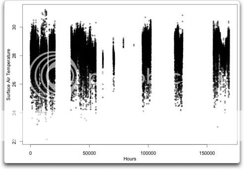
However, what I do is present BOTH the past data AND a smoothed version of the data. See the difference between Hansen’s and my presentations here for an example of what I mean.
And in those conditions, proper smoothing can have great value in allowing for and supporting the proper interpretation of the past data. I said “proper smoothing”, because Hansen’s smoothing is ridiculously improper.
If the data is noisy, or if there is a lot of data, it may not even be understandable without some kind of smoothing to make sense out of what is happening.
As to your claim that “the past data is the best presentation of the past data”, that assumes that data has some innate “presentation”. It has no such thing. We actively choose HOW to present that data. The presentation may involve separating it by time, as a time series. Or it may involve presenting it all as a “box and whiskers” plot or a “violin” plot of the shape of the distribution of the data. There is literally no end to the ways we can present past data.
I would say that the past data itself is the best INITIAL presentation of the past data, and that beyond that, there’s lots of other presentations (including smoothing and a variety of measurements of central tendency) that can further our understanding of that past data. Here’s an example. This is air temperature versus time for one of the TAO buoys:
I’d agree with you, Frozen, that that is the best initial presentation. And it is certainly the one that I always start with.
However, if that were overlaid, not replaced but overlaid with a smoothed version of the same data, I hold that the person reading the graph can learn more than just from the raw data itself.
All the best,
w.
Willis:
http://www.amazon.com/Handbook-Probability-Statistics-Richard-Burlington/dp/0070090300/ref=sr_1_1?s=books&ie=UTF8&qid=1364762591&sr=1-1&keywords=Handbook+of+Probability+and+Statistics+with+Tables
By this book! It is the most useful book on Statistics I’ve EVER come across. Gives you the REAL formulas, the applications, and the history/utility.
$3 and $5 shipping, USED…
Trust me, you are SO SHARP this will “complete your rapiere set” and you’ll cut the opposition (weak minded as they are) to ribbons with this!
Hello MODS, my comment seems to have become frozen between to Willis responses with the “awaiting moderation” still there.
Gary Pearse says:
Your comment is awaiting moderation.
March 31, 2013 at 1:11 pm
Willis says “[..] the El Nino/La Nina pump[..] moves that warm tropical water [..] this process takes some time … and I suspect that the lag you show above between CO2 and temperature is the result of that process, rather than some delayed cause-effect lag.” (http://wattsupwiththat.com/2013/03/30/the-pitfalls-of-data-smoothing/#comment-1262107)
Here’s my take: Before the warm water rises it contains just as much CO2 as the surface water. It can do this because it is at higher pressure. On reaching the surface, it releases CO2. That CO2 then travels across the planet giving the time delay shown in the graph. The air, with its CO2, travels faster than the ocean currents.
The connection between TLT tropical ocean temperature and CO2 is visible over the satellite period, not just at the 1998 El Nino, but there is quite a lot of noise and the delay isn’t constant (presumably because air currents vary).
This is elementary signal processing. irrespective of the computational language.
I would suggest that you study the underlting mathematics of filtering and correlation (see; Bendat & Piersiol ” Random Data” or Hayes “Statistical Signal Processing” ) rather than presenting empirical results.
John Daly’s site is back up and running.
http://www.john-daly.com/
Maybe someone should help the family keep the site open and even consider updating it to the present time?
Willis, look for a seasonal correlation between Mauna Loa and Northern hemisphere temperatures. CO2 rises through the winter, peaks in early spring, then declines though the summer. Here’s some Southern hemisphere CO2 data: http://www.esrl.noaa.gov/gmd/dv/data/index.php?site=smo
*sarc* So, you can see, increased CO2 leads to hemispheric warming in the spring.
Also, the decline in CO2 brings on winter.
/sarc
HI Willis,
I thought we settled this matter in my favour in 2008 – that dCO2/dt correlated with temperature, and CO2 lagged temperature by abut 9 months. I am looking for the correspondence – I recall the key points were on ClimateAudit.
As I recall, Matt Briggs avoided the alleged pitfales of “data smoothing” and still came up with a similar concousion, althouh the resolution using his methodology was no better than 12 months.
Incidentally, several parties have now “discovered” the same phenomenon (dCo2/dt, CO2 lags temperature), namely Murry Salby, among others.
Here is Murry Salby’s address to the Sydney Institute in 2011.
Here is a more recent presentation to the Sydney Institute by Salby:
Here is what I have found so far in emailsr.
From: Willis Eschenbach [mailto:willis@solomon.com.sb]
Sent: May-11-08 9:29 PM
To: Allan Macrae
Subject: Re: CARBON DIOXIDE IS NOT THE PRIMARY CAUSE OF GLOBAL WARMING: THE FUTURE CANNOT CAUSE THE PAST
Hey, Allan, good to hear from you.
The problem that I see with both your paper and the Kuo paper has to do with causation. Due to our “common sense” real world experience, we tend to assume that causation only goes one direction — the sun coming up causes the day to be light, but increasing light doesn’t cause the sun to rise.
But let’s look at another climate phenomenon, tropical cumulus clouds. The onset, type, and number of these is determined by (inter alia) the local surface temperature. But the local surface temperature, in turn, is determined by (inter alia again) the onset, type, and number of clouds. Clearly, causation in this cases is running in both directions. This situation is not uncommon in complex systems.
As a result, it may not be possible to say unequivocally that A causes B. This is particularly true when we may be dealing with different temporal scales. For example, it seems pretty clear that in the short term, increasing temperature causes the CO2 to increase. However, this does not prevent increasing CO2 from increasing temperature in the longer term. Both processes may be going on simultaneously at different time scales.
It is good, however, to find the Kuo et al. paper, which supports your claim that in the short term temperature leads CO2.
My best to you,
w.
PS – there is an interesting anecdote about causation which applies here. In a town, there are two clocks, we’ll call them by the imaginative names “Clock A” and “Clock B”. Clock B runs right on time, but Clock A is five minutes fast. So, every hour, Clock A strikes, and then five minutes later, Clock B strikes.
The question therefore arises … does Clock A cause Clock B to strike? I mean, every time Clock A strikes, five minutes later, Clock B strikes.
Or, to relate it to the subject under discussion … does the temperature rise cause the following CO2 rise? I mean, every time temperature rises, five months later the CO2 rises …
PPS – Kuo finds a five month lag, whereas you find a nine month lag. Have you determined why this difference exists, and what it means?
________________________________________
on 11/5/08 7:06 PM, Allan MacRae at firsst@shaw.ca wrote:
Hi Willis,
Please see the attached paper by Kuo et al.
Coherence established between atmospheric carbon dioxide and global temperature
ref. Kuo C, Lindberg C & Thomson DJ, Nature 343, 709 – 714 (22 February 1990)
Its summary says;
The hypothesis that the increase in atmospheric carbon dioxide is related to observable changes in the climate is tested using modern methods of time-series analysis. The results confirm that average global temperature is increasing, and that temperature and atmospheric carbon dioxide are significantly correlated over the past thirty years. Changes in carbon dioxide content lag those in temperature by five months.
I suggest that Kuo et al reaches similar conclusions to my paper published at:
http://icecap.us/index.php/go/joes-blog/carbon_dioxide_in_not_the_primary_cause_of_global_warming_the_future_can_no/
Best regards, Allan
Tuesday, February 05, 2008
Carbon Dioxide in Not the Primary Cause of Global Warming: The Future Can Not Cause the Past
Paper by Allan M.R. MacRae, Calgary Alberta Canada
Despite continuing increases in atmospheric CO2, no significant global warming occurred in the last decade, as confirmed by both Surface Temperature and satellite measurements in the Lower Troposphere. Contrary to IPCC fears of catastrophic anthropogenic global warming, Earth may now be entering another natural cooling trend. Earth Surface Temperature warmed approximately 0.7 degrees Celsius from ~1910 to ~1945, cooled ~0.4 C from ~1945 to ~1975, warmed ~0.6 C from ~1975 to 1997, and has not warmed significantly from 1997 to 2007.
CO2 emissions due to human activity rose gradually from the onset of the Industrial Revolution, reaching ~1 billion tonnes per year (expressed as carbon) by 1945, and then accelerated to ~9 billion tonnes per year by 2007. Since ~1945 when CO2 emissions accelerated, Earth experienced ~22 years of warming, and ~40 years of either cooling or absence of warming.
The IPCC’s position that increased CO2 is the primary cause of global warming is not supported by the temperature data. In fact, strong evidence exists that disproves the IPCC’s scientific position. This UPDATED paper and Excel spreadsheet show that variations in atmospheric CO2 concentration lag (occur after) variations in Earth’s Surface Temperature by ~9 months. The IPCC states that increasing atmospheric CO2 is the primary cause of global warming – in effect, the IPCC states that the future is causing the past. The IPCC’s core scientific conclusion is illogical and false.
There is strong correlation among three parameters: Surface Temperature (“ST”), Lower Troposphere Temperature (“LT”) and the rate of change with time of atmospheric CO2 (“dCO2/dt”). For the time period of this analysis, variations in ST lead (occur before) variations in both LT and dCO2/dt, by ~1 month. The integral of dCO2/dt is the atmospheric concentration of CO2 (“CO2”).
I figured out the content provider for john-daly.com and contacted them a stateside operation in New York. The support person stuck with working on Easter unsuspended the account while we figure what to do with it. I will refrain from saying http://john-daly.com/ has arisen. 🙂
REPLY: Excellent work Ric! – Anthony
REPLY: Let me add my congratulations as well, nicely done. The combined power of the WUWT folks is awesome. -w.
Still looking for the key correspondence. Sorry about all the typos in my previous message.
Also see Keeling et al (1995):
http://climateaudit.org/2008/02/12/data-smoothing-and-spurious-correlation/#comments
Allan MacRae
Posted May 12, 2008 at 5:57 PM
Interannual extremes in the rate of rise of atmospheric carbon dioxide since 1980
C. D. Keellng*, T. P. Whorf*, M. Wahlen* & J. van der Plicht†
* Scripps Institution of Oceanography, La Jolla, California 92093-0220, USA
† Center for Isotopic Research, University of Groningen, 9747 AG Groningen, The Netherlands
Nature, Vo. 375, 22 June 1995
OBSERVATIONS of atmospheric C02 concentrations at Mauna Loa, Hawaii, and at the South Pole over the past four decades show an approximate proportionality between the rising atmospheric concentrations and industrial C02 emissions. This proportionality, which is most apparent during the first 20 years of the records, was disturbed in the 1980s by a disproportionately high rate of rise of atmospheric CO2, followed after 1988 by a pronounced slowing down of the growth rate. To probe the causes of these changes, we examine here the changes expected from the variations in the rates of industrial CO2 emissions over this time, and also from influences of climate such as EI Niño events. We use the 13C/12Cratio of atmospheric CO2 to distinguish the effects of interannual variations in biospheric and oceanic sources and sinks of carbon. We propose that the recent disproportionate rise and fall in CO2 growth rate were caused mainly by interannual variations in global air temperature (which altered both the terrestrial biospheric and the oceanic carbon sinks), and possibly also by precipitation. We suggest that the anomalous climate-induced rise in CO2 was partially masked by a slowing down in the growth rate of fossil-fuel combustion, and that the latter then exaggerated the subsequent climate-induced fall.
An unexpected slowing in the rate of rise of atmospheric CO2 appeared recently in measurements of CO2 made at Mauna Loa Observatory, Hawaii and the South Pole…
In summary, the slowing down of the rate of rise of atmospheric CO2 from 1989 to 1993, seen in our data and confirmed by other measurements6,15, is partially explained (about 30% according to Fig. Ie) by the reduction in growth rate of industrial CO2 emissions that occurred after 1979. We further propose that arming of surface water in advance of this slowdown caused
an anomalous rise in atmospheric CO2, accentuating the subsequent slowdown, while the terrestrial biosphere, perhaps by sequestering carbon in a delayed response to the same warming, caused most of the slowdown itself…
… We point out, in closing, that the unprecedented steep decline in the atmospheric CO2 anomaly ended late in 1993 (see Fig. Ie). Neither the onset nor the termination was predictable. Environmental factors appear to have imposed larger changes on the rate of rise of atmospheric CO2 than did changes in fossil fuel combustion rates, suggesting uncertainty in projecting
future increases in atmospheric CO2 solely on the basis of anticipated rates of industrial activity.
Sorry – I’m tired of looking – Anyway, here is a note from Ken Gregory:
I really lost my intense interest in this subject several years ago since I have no time to pursue it.
http://climateaudit.org/2008/02/12/data-smoothing-and-spurious-correlation/#comments
Ken Gregory
Posted Feb 16, 2008 at 5:55 PM
The third paragraph of Willis Eschenbach original post of February 12 says:
“In the MacRae study, he used smoothed datasets (12 month average) of the month-to-month change in temperature (∆T) and CO2 (∆CO2) to establish the lag between the change in CO2 and temperature . Accordingly, I did the same.”
This is false. Allan MacRae never calculated any month-to-month change in either temperature or CO2 or ∆CO2.
The temperature curves are all 12 month averages of the detrended temperatures.
The CO2 curve is the 12 month average of the detrended CO2 concentration.
The ∆CO2/yr curve is the 12 month change of the 12 month average of the detrended CO2 concentration.
I suggest the original post should be corrected.
It seems that Willis confused detrending with taking a derivative. Note that all the temperature curves in the paper are labeled LT or ST, not delta LT and delta ST. Detrending temperature is just plotting the difference between temperature and the temperature trend line, effectively rotating the graph to change the best fit slope to zero, so the detrended best fit line is now horizontal at 0 Celsius.
In post number 125, Willis correctly says that Allan compared ∆CO2 to Temp, rather that ∆Temp.
Willis then says “I cannot say from this that there is any lead or lag. Which is what I would expect rather than a several month lag, the globe reacts quickly.”
Of course, Allan’s analysis also shows that there is no significant lag between ∆CO2 and Temp, so Willis and Allan agree on this point. But why does Wilis say “rather than a several month lag”? Nobody every suggested that there was a lag of ∆CO2 of several months!
Allan’s analysis shows a lag of 9 months of CO2 wrt temperature, but no significant lag of ∆CO2 to Temperature.
Here is a more recent paper (2012) that reaches similar conclusions. Please note the conclusion:
“Changes in global atmospheric CO2 are lagging about 9 months behind changes in global lower troposphere temperature.”
I thank Richard Courtney for drawing my attention to the Kuo and Keeling papers some months after I published on icecap.us
I did have the prior benefit of several (excellent imo) papers by Jan Veizer et al.
I recall I did considerable work on this question in 2008 and did not change my conclusion then, and see no reason to do so now.
However, I think this subject is a little more complicated than my frazzled brain can handle today.
Happy Easter everyone, and
Best to all, Allan
http://wattsupwiththat.com/2012/08/30/important-paper-strongly-suggests-man-made-co2-is-not-the-driver-of-global-warming/
Important paper strongly suggests man-made CO2 is not the driver of global warming
Posted on August 30, 2012 by Anthony Watts
Fig. 1. Monthly global atmospheric CO2 (NOOA; green), monthly global sea surface temperature (HadSST2; blue stippled) and monthly global surface air temperature (HadCRUT3; red), since January 1980. Last month shown is December 2011.
Reposted from the Hockey Schtick, as I’m out of time and on the road.- Anthony
An important new paper published today in Global and Planetary Changefinds that changes in CO2 follow rather than lead global air surface temperature and that “CO2 released from use of fossil fuels have little influence on the observed changes in the amount of atmospheric CO2” The paper finds the “overall global temperature change sequence of events appears to be from 1) the ocean surface to 2) the land surface to 3) the lower troposphere,” in other words, the opposite of claims by global warming alarmists that CO2 in the atmosphere drives land and ocean temperatures. Instead, just as in the ice cores, CO2 levels are found to be a lagging effect ocean warming, not significantly related to man-made emissions, and not the driver of warming. Prior research has shown infrared radiation from greenhouse gases is incapable of warming the oceans, only shortwave radiation from the Sun is capable of penetrating and heating the oceans and thereby driving global surface temperatures.
The highlights of the paper are:
► The overall global temperature change sequence of events appears to be from 1) the ocean surface to 2) the land surface to 3) the lower troposphere.
► Changes in global atmospheric CO2 are lagging about 11–12 months behind changes in global sea surface temperature.
► Changes in global atmospheric CO2 are lagging 9.5-10 months behind changes in global air surface temperature.
► Changes in global atmospheric CO2 are lagging about 9 months behind changes in global lower troposphere temperature.
► Changes in ocean temperatures appear to explain a substantial part of the observed changes in atmospheric CO2 since January 1980.
► CO2 released from use of fossil fuels have little influence on the observed changes in the amount of atmospheric CO2, and changes in atmospheric CO2 are not tracking changes in human emissions.
The paper:
The phase relation between atmospheric carbon dioxide and global temperature
Ole Humluma, b,
Kjell Stordahlc,
Jan-Erik Solheimd
a Department of Geosciences, University of Oslo, P.O. Box 1047 Blindern, N-0316 Oslo, Norway
b Department of Geology, University Centre in Svalbard (UNIS), P.O. Box 156, N-9171 Longyearbyen, Svalbard, Norway
c Telenor Norway, Finance, N-1331 Fornebu, Norway
d Department of Physics and Technology, University of Tromsø, N-9037 Tromsø, Norway
________________________________________
Abstract
Using data series on atmospheric carbon dioxide and global temperatures we investigate the phase relation (leads/lags) between these for the period January 1980 to December 2011. Ice cores show atmospheric CO2 variations to lag behind atmospheric temperature changes on a century to millennium scale, but modern temperature is expected to lag changes in atmospheric CO2, as the atmospheric temperature increase since about 1975 generally is assumed to be caused by the modern increase in CO2. In our analysis we use eight well-known datasets; 1) globally averaged well-mixed marine boundary layer CO2 data, 2) HadCRUT3 surface air temperature data, 3) GISS surface air temperature data, 4) NCDC surface air temperature data, 5) HadSST2 sea surface data, 6) UAH lower troposphere temperature data series, 7) CDIAC data on release of anthropogene CO2, and 8) GWP data on volcanic eruptions. Annual cycles are present in all datasets except 7) and 8), and to remove the influence of these we analyze 12-month averaged data. We find a high degree of co-variation between all data series except 7) and 8), but with changes in CO2 always lagging changes in temperature. The maximum positive correlation between CO2 and temperature is found for CO2 lagging 11–12 months in relation to global sea surface temperature, 9.5-10 months to global surface air temperature, and about 9 months to global lower troposphere temperature. The correlation between changes in ocean temperatures and atmospheric CO2 is high, but do not explain all observed changes.
Allan MacRae says:
March 31, 2013 at 5:59 pm
Hi, Allan, glad to hear from you. Thanks for posting the correspondence, I lost my old emails in a crash a while back. I don’t recall Brigg’s work in this regard, but that means little after this much time, lots of water under the bridge since then, so you may well be right that it was settled in your favor. I took no position on that question, either then or now.
Instead, my point in this posting was the issue of spurious trends introduced by smoothing, not the particulars of your analysis which (as you point out above) may well be correct.
For those interested, the earlier discussion is here on ClimateAudit. There is a bunch of good stuff from Allan there.
Regards,
w.
RCS says:
March 31, 2013 at 3:59 pm
Another man who is all hat and no cattle … we pay little attention to such pompous sanctimonious lectures here, RCS. If you think you can do better, then grab the dataset and demonstrate your method to us. What I have presented here is a method for empirical determination of the relative strength of various methods for a given natural dataset (which may be far from normally distributed).
You claim to have a better way for smoothing the end-points of a given block of non-normal data? Fine. Show us your results. So far all you are is another in a long list, one more random anonymous internet popup with a big mouth and grandiose unverifiable claims.
w.
I have no difficulty accessing http://www.john-daly.com/
I have noticed that many on RealScience cannot access some NASA sites – especially http://pubs.giss.nasa.gov/docs/1988/1988_Hansen_etal.pdf
Again I have no problem with this.
I’m in Australia and I suspect you may be having your IP addresses blocked/censored.
SkepticalScience block my IP address – an easy workaround is via a proxy server but I no longer bother as such childish censorship displays a lack of any real science.
It would be interesting to know if some form of IP blocking/censorship is occurring !
Allan MacRae quotes, from a paper by Humlum et al:- ““CO2 released from use of fossil fuels have little influence on the observed changes in the amount of atmospheric CO2”“.
I have worked on the data and am satisfied that the above statement is incorrect. I am working on getting my calcs up to publication standard, which will take a while.
As far as I can tell, Humlum et al in their paper have compared short(ish)-term CO2 fluctuations with temperature, and have found a good correlation, and then have assumed that other factors are minor. However, CO2 changes driven by temperature follow quite a strong pattern which is easily seen, but man-made CO2 is pumped out at a relatively steady rate and therefore does not show up very well in short-term fluctuations. Looking at the effect of CO2 on temperature, the ‘consensus’ science is that high concentrations of CO2 affect temperature fairly streadily over quite long periods of time, ie. the temperature changes driven by CO2 would show little variability, so they too would be difficult to pick up in a study such as that by Humlum et al.
Other possible problems with the paper are
(a) the use of annual change in temperature, when actual temperature would be more relevant. The point is that the rate of atmospheric CO2 absorption or emission by the ocean is driven by temperature, not by how much the temperature differs from last year’s temperature.
(b) the use of annual change in man-made CO2 emissions, when actual emissions would be more relevant. All of the man-made emissions enter the atmosphere and therefore contribute to the change in atmospheric CO2 – not just the amount of CO2 emission which is different to last year’s emission.
HI Willis,
Here is Matt Briggs work.
http://wmbriggs.com/blog/?p=122
Best, Allan
Thank you Ric – great work on John Daly’s site.
I cannot recall the person’s name, but when John died someone took over management of his site and deleted some (many?) published papers, including one of more of my own, because they were allegedly copyright by newspapers or journals.
I protested that I owned all of my published articles since I had never accepted payment for any of them, but to no avail.
In any case, you may find John’s site somewhat depleted.