
Image Credit: Jo Nova – David Lappi – GISP2
Your help is needed in building the new WUWT Paleoclimate Reference Page. Below I’ve posted all of the credible 3rd party paleoclimate graphs I’ve compiled thus far, but I am sure there are lots more. As such, please post links to any credible paleoclimate data sources below or in comments of the WUWT Paleoclimate Reference Page and we will review them for inclusion. Also, your thoughts on the provenance of the graphs included thus far, links to the papers they are based upon, and appropriate titles for each graph would be most appreciated.
In terms of additional graphs for potential inclusion, I struggled with shorter term reconstructions, as many of them are still a matter of controversy. As such, please post any pertinent information, including any credible graphs illustrating the last few millennia and the Medieval Warming Period. For reference, there are an array of less than ideal options available on the bottom of this NOAA NCDC page. From a cursory review, I found the summary for Overpeck et. al 1997 to be enlightening, e.g.;
“Together, they indicate that the Arctic has warmed up to 1.5°C since 1850 – the coolest interval of the Arctic “Little Ice Age.” Much of the recent Arctic warming took place between 1850 and 1920, most likely due to natural processes”
However, after Overpeck the “Team” went to work, i.e. Briffa et al., 1998, Jones et al., 1998, Mann et al., 1998, Pollack et al., 1998, Jones et al., 1998, Mann et al., 1999, Mann et al., 2000, Briffa et al., 2001, Esper et al., 2002 and Jones and Mann 2004, and paleoclimatology became a quite a sordid science. The IPCC’s 2007 contribution in AR4 section 6.6.1.1, brought things to a new low when they appear to have pasted a thick black HadCRUT2 line onto some kindergartner’s art project…:

Anyway, it is also interesting to note that the NOAA NCDC site doesn’t seem to include any reconstructions after 2006, while there has been much valuable paleoclimate research conducted since then, e.g.:
Ljungqvist, F. C., Krusic, P. J., Brattström, G., and Sundqvist, H. S (2012).: Northern Hemisphere temperature patterns in the last 12 centuries, Clim. Past, 8, 227-249, doi:10.5194/cp-8-227-2012, 2012. See JoNova, CO2Science and Abstract at Clim-Past.
Christiansen, B. and Ljungqvist F. C. (2012). The extra-tropical Northern Hemisphere temperature in the last two millennia: reconstructions of low-frequency variability. Climate of the Past JoNova 1, JoNova 2, Abstract at Clim-Past
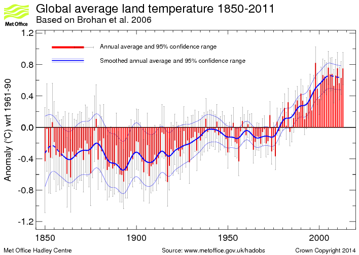
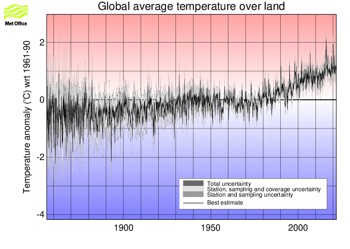
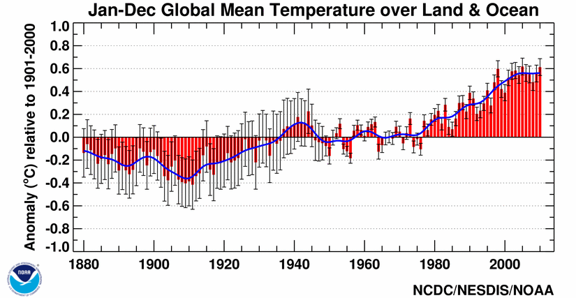
JoNova has a good article on some of these more recent reconstructions. Also, in addition to reconstructions, we have temperature records from the Met Office 1 and 2, as well as NOAA, but these surface temperature records are burdened with issues of questionable siting, changes in siting, changes in equipment, changes in the number of measurement locations, modeling to fill in gaps in measurement locations, corrections to account for missing, erroneous or biased measurements, and the urban heat island effect.
With that for background, the following are the graphs currently included in the WUWT Paleoclimate Reference Page:
600 Years Arctic Temperature

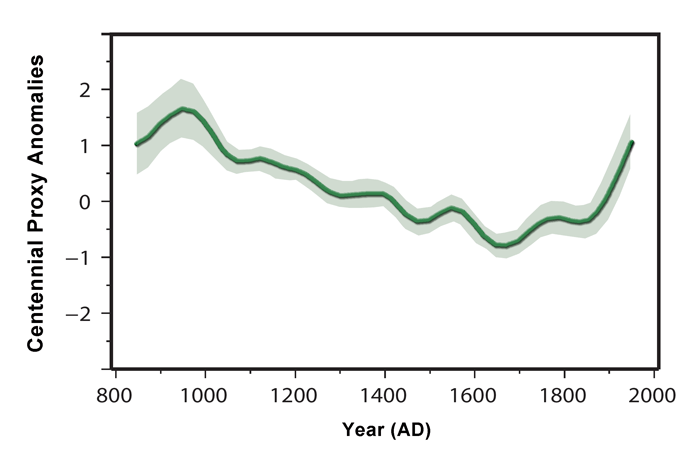
1,100 Years Ljungqvist et al

1,100 Years Ljungqvist et al

1,100 Years Kirkby 2007

2,000 Years – J. Esper et al.

2,000 Years Christiansen

2,000 Years Christiansen

10,000 Years GISP2 Ice Core
11,000 years GISP2 Temperature Since 10700 BP with CO2 from EPICA DomeC

120,000 Years

140,000 Years Antarctic/Vostok

150,000 years Taylor Dome -Ross, Antarctica E. J. Steig, et al 1999:

400,000 Years Antarctica/Vostok

450,000 Years Temperature Anomaly

750,000 Years Rate of Change of Ice Volume and June 65N Insolation

800,000 Years Orbital and Millennial Antarctic Climate Variability

800,000 Years Orbital and Millennial Antarctic Climate Variability

1,000,000 Years

5,500,000 Years Antarctica/Vostok Temperature

5,500,000 Years Antarctica/Vostok Temperature – Reversed

[Which version of the above two graphs do you prefer?}
65,000,000 Years

540,000,000 Years

543,000,000 Years Area of Continents Flooded, Concentration of CO2 and Temperature Fluctuations

600,000,000 Years – C. R. Scotese and R. A. Berner

(Please note that WUWT cannot vouch for the accuracy of the data/graphics within this article, nor influence the format or form of any of the graphics, as they are all linked from third party sources and WUWT is simply an aggregator. You can view each graphic at its source by simply clicking on it.)
Please post your thoughts, recommendations, graphs, links, research, suggested graph titles, etc., for the WUWT Paleoclimate Reference Page in comments. Thanks JTF
Koutsoyiannis, D., Hydrology and Change (Plenary lecture), IUGG 2011, Melbourne, International Union of Geodesy and Geophysics, 2011.
http://itia.ntua.gr/en/docinfo/1135/
Slide 20, 24 Nilometer
Slide 27 Co-evolution of climate with tectonics and life on Earth over the last half billion years
Slide 28 Temperature change on Earth based on observations and proxies
From Markonis and Koutsoyiannis (2011)
Slide 29 A combined climacogram of all 10 temperature observation sets and proxies
Shaviv and Veizer 2003 has a 500 million year climate reconstruction graph (figure 1) plotting temperature as derived from oxygen isotopes in shells. The same graph also plots ice rafting data and CO2 reconstructions so you’ll have to include the caption for people to make sense of it:
http://stephenschneider.stanford.edu/Publications/PDF_Papers/shaviv-veizer-03.pdf
Their figure 2 shows the same shell-based temperature data smoothed and plotted against the cosmic ray flux.
I have a little graph I use of 3000 years of surface temperature data from the Sargasso Sea
Figure 5 of a Science paper I only have a link to the abstract.
“The Little Ice Age and Medieval Warm Period in the Sargasso Sea”
http://www.sciencemag.org/content/274/5292/1503.abstract
It is described as from Keigwan 1996
Science 29 November 1996:
Vol. 274 no. 5292 pp. 1503-1508
DOI: 10.1126/science.274.5292.1503
abstract:
Sea surface temperature (SST), salinity, and flux of terrigenous material oscillated on millennial time scales in the Pleistocene North Atlantic, but there are few records of Holocene variability. Because of high rates of sediment accumulation, Holocene oscillations are well documented in the northern Sargasso Sea. Results from a radiocarbon-dated box core show that SST was ∼1°C cooler than today ∼400 years ago (the Little Ice Age) and 1700 years ago, and ∼1°C warmer than today 1000 years ago (the Medieval Warm Period). Thus, at least some of the warming since the Little Ice Age appears to be part of a natural oscillation.
Hope this is the sort of thing you had in mind
Pete Olson says: February 23, 2013 at 4:41 pm
< …these surface temperature records are burdened with issues of questionable sighting, changes in sighting…’ Is this supposed to refer to siting?
DaleC says: February 23, 2013 at 4:42 pm
A few typos:
there’ are -> there are
issues of questionable sighting, changes in sighting -> siting
Corrected, thank you both
Julian in Wales says on February 23, 2013 at 4:22 pm:
Is this data reliable?
= = = = = = =
You can bet your balls (christmas decorations) that this data – as you call them (or it) is and are as reliable as man kind can find – or retrieve them. – Going back 650 000 to 1 million years and ice-core research and other «palaeoclimatolical (ocean and lake sediment cores) research» do agree on all the main points which are that an interchange of warm and cold periods (during the past – close to – one million years of the Earth’s history) have been happening. – That however is not the problem that we face today. – What we now are faced with is a «gang» of sub-scientists who do «blatantly» disreguard data and instead reguard CO2 as the «main greenhouse gas» which therefore is responsible for what is called «The Greenhouse Effect» – They (the gang) are «Model Makers» and as long as they put CO2 into their models as being responsible for any earthly temperature rise, then it is quite correct for them to say that «All our models show that CO2 is responsible for the recent warming. —-
Well, that was back in the 1970ies, 80ies and 90ties. — But then the warming stopped. – Well, do not make the mistake of thinking that the climate cooled – it did not – But nor did it warm – and that is the whole kabbudle – The theory was «increase the CO2 GHG and the Earths temperatures will be forced to rise. – After all, we were supposed to fry on the top of the surface – and as a theory, that also is quite correct. –
Philip Bradley says:
February 23, 2013 at 4:40 pm
I’d like graphs from the Taylor Dome (Antarctica) included, as they are Greenland like, and show different timing of events like the YD to other Antarctic cores like Vostok.
The page below shows the Taylor O18 record, but unfortunately the link to the graph doesn’t work. I’ll try and find a direct link.
http://depts.washington.edu/isolab/taylor/
Agreement between the Antarctic Taylor dome and Greenland is very interesting. Some climate scientists are hitting on the idea of using an NH-SH antiphase alternation in climate as a way of wriggling out of the problem of CO2 lagging temperature in ice cores. But if Greenland and Taylor dome both confirm NH-SH synchrony and still display CO2 lagging (which I believe they do) then this kills this AGW attempt to get out of the lagging-CO2 problem.
justthefactswuwt says:
February 23, 2013 at 5:12 pm
Phil. says: February 23, 2013 at 3:58 pm
“The GISP2 graphs are incorrectly labelled, they actually end at 95 years before present (1950).”
I liked Werner’s math better than yours, but there does seem some basis for this, in that this 1992 paper indicates that the GISP2 data ended in 1950;
ftp://ftp.ncdc.noaa.gov/pub/data/paleo/icecore/greenland/summit/gisp2/depthage/gisp2age.txt
and David Lappi points out in his article;
http://joannenova.com.au/2010/02/the-big-picture-65-million-years-of-temperature-swings/
that GISP2 “data set is useful because it reports temperatures (measured by oxygen isotopes) every 10 to 60 years”.
However, Lappi also notes in his article that “the US government drilled the GISP 2 ice core in central Greenland over a five-year period, and the data is available here”:
http://www.ncdc.noaa.gov/paleo/metadata/noaa-icecore-2475.html
and the Alley, R.B. 2000 data he references ends in 2000 AD. In comment’s of the Lappi’s article someone raised the 1905 concern;
http://joannenova.com.au/2010/02/the-big-picture-65-million-years-of-temperature-swings/#comment-32179
and it did not seem to get addressed, so I cannot say with certainty as to when the Lappi GISP2 graph ends.
Even if it’s not the Alley data, there are an array of other GISP2 reconstructions that extend the record beyond 1950, including Kobashi et al. 2011 4000-Year Ar-N2 Isotope Temperature Reconstruction;
ftp://ftp.ncdc.noaa.gov/pub/data/paleo/icecore/greenland/summit/gisp2/isotopes/gisp2-temperature2011.txt
which extended the GISP2 record through 1993 using temperature data based on borehole temperature modeling, and there are an array of other studies that extend the GISP2 record;
http://www.ncdc.noaa.gov/paleo/icecore/greenland/greenland.html
With this noted, can anyone speak to the Lappi graph, the data set used and the end point for that data set?
Lappi used the Alley data he just screwed up and assumed that because the data was published in 2000 that ‘before present’ meant before 2000 which is not correct as it refers to before 1950 by convention with reference to C14 dating.
If you look at the 100,000 year figure (multi-coloured) showing precession, obliquity, eccentricity, solar activity and glacial phase, I noticed an apparent trend in the shape of the interglacial timecourse in relation to the magnitude of eccentricity.
Eccentricity shows a “wave within a wave” modulation, so that the oscillations have 100 kYr wavelength while the modulating wave has 400 kYr wavelength. So eccentricity has high amplitude and magnitude around 200 kYr, 600 kYrs and 1000 kYrs, and low amplitude and magnitude nodes around 800 kYrs, 400 kYrs and now.
Where the wave is at high peaks at 200, 600 and 1000 kYrs ago, the waveform of temperature and glacial / interglacial state shows a ragged form with multiple peaks – apparent instability. However at the nodes around 800 and 400 kYrs ago the interglacial peaks are “cleaner” showing a single well defined peak without accessory peaks, evidently a more stable switching between glacial and interglacial attractors. The same should apply to now. If this were a real trend it would mean that we can expect a clean sharp drop back to glaciation mirroring the sharp rise at the start of the Holocene.
BTW figure numbers would have been helpful 🙂
Keith says: February 23, 2013 at 4:32 pm J. Esper et al. – Johannes Gutenberg University Mainz (JGU) – Click the pic to view at source[/caption]
Research conducted by an international team using tree ring data from Finnish Lapland was published by the Johannes Gutenberg Universitat Mainz July 2012. They created a 2000-year temperature reconstruction for Northern Europe that matches most of the others from that time frame.
http://www.uni-mainz.de/eng/15491.php
The associated paper J. Esper et al., Orbital forcing of tree-ring data, Nature Climate Change, 8 July 2012, can be found here:
http://www.nature.com/nclimate/journal/v2/n12/full/nclimate1589.html
and the associated 2,000 year graph:
[caption id="" align="alignnone" width="542"]
now appears in this article and on the WUWT Paleoclimate page. Thank you very much for your contribution.
JTF – I can’t add anything to your excellent work, but I do have two suggestions for the final Paleo page:
1. Do include “Team” graphs. Like them or not, they are in the literature. But with any graph of dubious merit, “Team” or other, you could include links to why it is dubious. Apologies if you were planning to do this anyway.
2. Highlight whenever time runs Right-to-Left in a graph.
Incidentally, the quote you provide re the Arctic:
“Together, they indicate that the Arctic has warmed up to 1.5°C since 1850 – the coolest interval of the Arctic “Little Ice Age.” Much of the recent Arctic warming took place between 1850 and 1920, most likely due to natural processes”
is very well demonstrated by the retreat maps of Alaskan glaciers you provided years ago.
http://wattsupwiththat.com/2010/04/12/pilgrimage-to-montana/
Note: fullest extent around the time Captain Cook was looking for a NW passage and 100 kms of retreat before 1900. Fit that in with the global warming orthodoxy?
Is the chart from this source too flippant? Using media stories as a proxy for global temperature.
http://butnowyouknow.wordpress.com/those-who-fail-to-learn-from-history/climate-change-timeline/
I’m not sure whether these would be usable but each image is linked to the source material (I think that applies to them all).
http://pages.science-skeptical.de/MWP/MedievalWarmPeriod1024x768.html
Thanks D.B. Stealey for the link. Good chart, plus I checked out a file mentioned on the chart: ftp://ftp.ncdc.noaa.gov/pub/data/paleo/climate_forcing/trace_gases/phanerozoic_co2.txt
That file seems to be a good “raw data” source confirming the paleo-CO2 info (7000ppm+). But oddly it doesn’t show CO2 in ppm, but as a multiple of “todays” CO2 level (I think?), and the paper was written in 2002 it seems, so those numbers would be off now.
So, if anyone could help, I’m still in the market for more raw data sources and / or reference worthy analyses confirming past high levels of CO2, plus side by side comparisons of the paleo-CO2 levels to temperature. And anything about why these 7000ppm levels didn’t cause a runaway greenhouse effect.
This Wikipedia graph is helpful in seeing the big paleoclimatic picture; Wikipedia- Click the pic to view at source[/caption]
[caption id="" align="alignnone" width="578"]
unfortunately it appears erroneous due a complete ignorance of the Medieval Warm Period, and is thus deemed insufficiently credible for WUWT’s Reference Pages. Does anyone know of a comparable compilation of reconstructions we can use that gets the last couple mellennia right? If not,can anyone build one?
Mike Jonas says: February 23, 2013 at 5:55 pm
1. Do include “Team” graphs. Like them or not, they are in the literature. But with any graph of dubious merit, “Team” or other, you could include links to why it is dubious. Apologies if you were planning to do this anyway.
I was not planning to, but it is a good idea. My only concern is that it might create confusion. What if I create a section of graphs at the bottom under a header like Disputed Graphs, Suspect Graphs, etc.?
2. Highlight whenever time runs Right-to-Left in a graph.
Another good idea. Would inclusion of something like this ← or this → in the title work, or perhaps this;
5000 Years ← Present
centered above or below each graph?
Numerous paleoclimatology studies covering the globe are cited at NOAA’s paleoclimatology reference page. Several of these were cited above and there does not appear to be any attempt to screen out politically incorrect research papers. http://www.ncdc.noaa.gov/paleo/recons.html
The paleo perspective on global warming was written in 2009 based the “Team’s” views. http://www.ncdc.noaa.gov/paleo/globalwarming/home.html
Phil. says: February 23, 2013 at 5:48 pm Richard Alley – NOAA – NCDC – Click the pic to view at source[/caption]
Lappi used the Alley data he just screwed up and assumed that because the data was published in 2000 that ‘before present’ meant before 2000 which is not correct as it refers to before 1950 by convention with reference to C14 dating.
Richard Alley used “2000” as present on his graph;
[caption id="" align="alignnone" width="578"]
for his 2000 publication:
http://www.ncdc.noaa.gov/paleo/pubs/alley2000/alley2000.html
Are you suggesting that Richard Alley also “screwed up”?
Great Page says:
February 23, 2013 at 3:37 pm
On the charts out to 400,000 years and beyond, it looks like we have overstayed our welcome at the present warm period.
________________
Every time I examine (some of) these graphs, an audio loop of the word “Uh-Oh” starts playing in my head.
@justthefactswuwt
A fantastic resource and a great summation of the work undertaken by some of the leading Climate Scientists in response to Overpeck et al 1997.
I have already posted this in the February 23, 2013 Open Thread Weekend and at the risk of duplication (it is post 26) I would appreciate if you gave consideration to including some form of the following :-
Anthony,
James Delingpole has an interesting challenge that may interest your readers at http://bogpaper.com/2013/02/22/delingpole-on-friday-governments-cant-spend-their-way-out-of-a-recession-by-stimulating-demand/#comment-1251
The challenge is toward the end and it is,
“What we need to do is find a way of expressing, lucidly, entertainingly, persuasively, why it is that all those liberal-lefties who believe that it makes economic sense for government to go on spending at current levels are not just wrong but demonstrably wrong.
So that’s my challenge to you, Bogpaper readers. Especially those of an economic bent.”
And I urge folk to check out the comments by poster ‘dr’ and ‘david’.
Their posts certainly gave me food for thought!
http://www.nature.com/nature/journal/v483/n7390/full/nature10891.html
MIS-11
MIS-5
http://www.nature.com/nature/journal/v431/n7005/abs/nature02805.html
Excellent !
Mann et al., Jones et al, Overpeck et al., Hansen et al., are dead in the water and listing to port as their decks are awash. Let them go. Send in new dive bombers. Send in new ‘HellCats’. (SNIP – There’s no need for that, JTF) A very ignominious death in public. Popcorn a pop’n.
XD
An episode of NOVA dealt with this issue. The data is qualitative rather than quantitative, but may be easier for laymen to grasp. The URL is http://www.pbs.org/wgbh/nova/earth/cause-ice-age.html Here are a couple of interesting snippets, but the entire page is a worthwhile read.
> Climatic Cooling from 60 million years ago to present day
>
> Between 52 and 57 million years ago, the Earth was relatively
> warm. Tropical conditions actually extended all the way into the
> mid-latitudes (around northern Spain or the central United States
> for example), polar regions experienced temperate climates, and
> the difference in temperature between the equator and pole was much
> smaller than it is today. Indeed it was so warm that trees grew in
> both the Arctic and Antarctic, and alligators lived in Ellesmere
> Island at 78 degrees North.
[…snip…]
> The Earth was once more released from the grip of the big chill
> between 5 and 3 million years ago, when the sea was much warmer
> around North America and the Antarctic than it is today. Warm-weather
> plants grew in Northern Europe where today they cannot survive,
> and trees grew in Iceland, Greenland, and Canada as far north as 82
> degrees North.
And on a related topic, what about paleo ice-cover?
http://exhibits.museum.state.il.us/exhibits/larson/LP_extinction.html shows a couple of maps of glacial retreat in North America. 18,000 years ago, ice sheets up to 2 miles thick covered Canada and parts of the “northern-tier” US states. The point to make is that the macro trend has been one of shrinking ice-cover for the past 18,000 years, with a few speed-bumps along the way (Younger Dryas, Little Ice Age, etc, etc). Viewed in that context, the last 30 years of shrinking arctic sea ice cover is not alarming at all. It is merely the continuation of the macro trend during the current interglacial.
A related point is that when the retreat of the ice caps started,there were fewer than 1 million homo sapiens on the entire planet. They were hunter-gatherers, and no, they were not running around in CO2-spewing SUVs. This destroys the AGW alarmist theory that today’s industrial society is the only possible cause of the current ice cover retreat.
justthefactswuwt says:
February 23, 2013 at 5:34 pm
Pete Olson says: February 23, 2013 at 4:41 pm
there are
issues of questionable sighting, changes in sighting -> siting
Corrected, thank you both
Well…one corrected anyway – what about the other just before it?:
‘issues of questionable SIGHTING, changes in siting…’
Mod: You don’t have to publish this – just fix. Thx.
[Done. Thank you. Mod]