Guest post by Tom Fuller
The physics behind the theory of global warming are solid. CO2 is a greenhouse gas, we’re emitting industrial levels of it, with China now in the lead for emissions. A significant portion remains in the atmosphere for a fairly long time, though the residence time is widely disputed. This residence of CO2 retards the cooling of the Earth and temperatures warm as a result.
One of the few non-controversial datasets in climate change is the Keeling curve, the graph of the concentrations of CO2 in the atmosphere reproduced here:

We see concentrations rising steadily from 315 parts per million in 1960 to 395 ppm last year. It’s close to 400 ppm now.
Human emissions of CO2 caused by burning of fossil fuels and production of cement have risen similarly:

Emissions have climbed at an even higher rate than concentrations.
And the third data source to look at (for simplicity’s sake–we could actually look at dozens of data sources) is temperature changes. This chart shows the global average temperature change from a ‘normal’ 30-year range from 1950-1980. It comes from the Goddard Institute for Space Studies, led by scientist James Hansen.
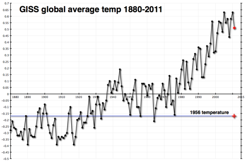
This shows a fairly constant rise in temperatures since 1978.
Once again, you don’t have to be a climate scientist to think that there seems to be a connection. The physical theory published first by Svante Arrhenius over 100 years ago and elaborated on by a century’s worth of scientists has observational evidence that tends to confirm it. I certainly believe in it.
In fact, I believe that global temperatures will probably rise by about 2 degrees Celsius over the course of this century. The difference in estimated temperature rises from different sources almost always comes from the differences in estimated atmospheric sensitivity to concentrations of CO2 in the atmosphere. Having extra CO2 in the atmosphere warms the atmosphere, which is presumed to produce more water vapor, which is also a greenhouse gas and would contribute more warming than the CO2 by itself. How much extra warming would ensue is pretty much the heart and soul of the debate over global warming.
Those who think that there isn’t much of an additional effect (that sensitivity of the atmosphere is low) have been chuckling very publicly because temperatures haven’t risen very much (if at all) since the big El Nino year of 1998. This is not hugely surprising, as the shape of the data is uneven, a sawtooth with ups and downs that can last a decade or longer. But it is happening at an inconvenient time politically for those who are worried that sensitivity is high. They are trying to get the world to prepare for warming of 4.5C or higher, without much success.
Here’s what temperatures look like more recently.

By itself, this chart doesn’t explain very much. As I said, it is not uncommon or unexpected for the temperature record to have flat or declining periods that last a decade or more.
However, I have a problem. The Carbon Dioxide Information Analysis Center (CDIAC) has estimates of how much CO2 humans have emitted since 1750. (Confusingly, they convert the CO2 to tons of carbon with a fixed formula.) That chart is the first one way up there at the top of the post. It rises dramatically
But looking at the data global.1751_2009 (3), one thing jumps out at me. CDIAC writes “Since 1751 approximately 356 billion metric tonnes of carbon have been released to the atmosphere from the consumption of fossil fuels and cement production.” And they helpfully provide an Excel spreadsheet showing their estimates by year.
And almost one-third of that number, 110 billion metric tonnes, have occurred since that time in 1998 when temperatures reached their temporary plateau.
| 1998 | 6644 |
| 1999 | 6611 |
| 2000 | 6766 |
| 2001 | 6929 |
| 2002 | 6998 |
| 2003 | 7421 |
| 2004 | 7812 |
| 2005 | 8106 |
| 2006 | 8372 |
| 2007 | 8572 |
| 2008 | 8769 |
| 2009 | 8738 |
Above: Table1, CO2 emissions by years, million metric tonnes – data CDIAC
Because heat moves somewhat sluggishly through the earth’s oceans, and because there is a lag factor in other earth systems, we do not expect a hair-trigger reaction to increases in CO2 emissions and concentrations.
But one-third of all human emissions of CO2 have occurred since 1998. And temperatures haven’t budged as a result.
This does not ‘disprove’ global warming–at all. I still believe that temperatures will climb this century, mostly as a result of the brute force effect of the 3,000 quads of energy we will burn every year starting in 2075–the reason I started this weblog.
However it makes it exceedingly difficult to use the past 15 years as evidence of a very high sensitivity of the atmosphere to CO2 concentrations. And it makes me feel more comfortable about my ‘lukewarm’ estimate of 2C temperature rises as opposed to the more alarming 4.5C rises put forward by some of those who are most active in the movement to reduce emissions drastically.
And it makes me wonder about why people don’t include relevant data when they discuss these issues. Is it really that politically incorrect to show real data, even if that data doesn’t advance your case?
Tom Fuller blogs at: 3000Quads and is co-author with Steve Mosher of the CRUTape Letters.
“This chart shows the global average temperature change from a ‘normal’ 30-year range from 1950-1980. It comes from the Goddard Institute for Space Studies, led by scientist James Hansen.”
It does NOT show anything of the sort.
What it does show is the “Hansen adjusted, urban consolidated and homogenised” temperature.
This is in NO WAY related to REAL global average temperatures, no matter what your definition of that ludicrous term is.
but the number of melting days was less.
“””””””””””””””””””
NOT. NOT less. I hate it when my fingers go on pause while my brain doesn’t.
[Reply: Fixed it for ya’… -ModE ]>/b>
Arthur, I strongly agree with your point that it is foolish to assume technology is stagnent and our energy sources will be the same in 2075 as today. Who would have thought several years ago that the US could become the worlds largest oil producer. http://www.latimes.com/business/la-fi-us-saudi-oil-20121113,0,5693478.story. A lot can happen in 62 years unless the Government continues to destroy initiative and technology development by deciding what is best. I am convinced that the energy source of the future is nothing that is being pushed today.
On the other hand the future of the electric car is looking more grim every day as the US and others squander tax dollars on battery development based on technology hand picked by Washington et al. The free market has spoken although governments are trying to force a vehicle on us that has limited use. Despite all the subsidies and grants we still do not have a suitable battery for anything except a special purpose vehicle. Indeed such a battery my never exist which will provide useable range to the electric car. It is stupid to spend money on demonstrating the car when an energy source is non existant. Intelligent resourcing would focus on the missing link. It has been perfectly clear for years that an electric car is viable if there is a suitable battery!
If you check out this article below, it is clear that because of government picking winners (actually mostly loosers) we are inhibiting the development of potential technologies that might actually provide future viable alternative energy sources.
http://www.altenergystocks.com/archives/2011/11/electric_vehicles_ineptitude_apathy_and_piles_of_taxpayer_money_1.html
@garymount:
Well, by inspection of the first chart in this posting:
http://chiefio.wordpress.com/2009/08/17/thermometer-years-by-latitude-warm-globe/
and adding up the thermometers in the traunches below the equator (and including the equator for good measure), I get the vast sum of….. 29 + 15 equator = 44
One could presume that half the equatorial thermometer were above the equator proper and end up at about 37 as more likely.
In 1839 the total was zero BTW, so those were pretty new thermometers. Don’t think they were in Stevenson Screens, nor meeting NOAA guidelines, though 😉
Eyeballing the chart N.H. looks like S.H. is about 1/10 the coverage. Oh, and that’s land thermometers… not like there’s much land in the Southern Hemisphere though… and what there is tends to be bunched up near the equator or smack dab on top of the South Pole…
@Steven Mosher says:
[…]
And how much more water is evaporated and falls as added rain (transporting that heat to the top of the air column to be radiated away) from 3.x W / meter^2?
(Yes, I know, it’s an almost unmeasurably small quantity, but do try…)
http://chiefio.wordpress.com/2011/04/03/perspective-on-rain-and-heat/
“Fully one half of all the heat delivered to this part of the planet is taken away by rain alone.”
For Puerto Rico. As that is ignoring clouds (and there are plenty of clouds blocking incoming sunshine) and as it is ignoring convection (that carries the other half, pretty much… and does it in HOURS, not days) there isn’t a whole lot left for IR to do …
http://chiefio.wordpress.com/2010/12/02/does-convection-dominate/
which references this paper showing transport “same day” via convection:
http://hal.archives-ouvertes.fr/docs/00/31/68/93/PDF/angeo-19-1001-2001.pdf
So I figure 3 W will ALMOST make the air rise enough faster to maybe measure it, if you work hard and have some really expensive equipment…
From Steven Mosher on December 6, 2012 at 9:00 pm:
Now quickly what was the difference in watts from the sun between the LIA and today?
Watts is Joules per second. So you’re asking what was the difference in the total amount of energy in Joules released from the Sun per second between the LIA and today. Which means jack. What should be asked is the difference in insolation, expressed as Watts per square meter. Which may require calculating the position of the Earth relative to the Sun both today and during the LIA, as well as knowing the solar output then and now. And also it matters how much insolation actually reached the surface, you’d have to know how global cloud cover then compared to cloud cover now. Best of luck finding those measurements.
Another hint. How many excess Watts does it take to melt greenland?
How many excess watts to melt all the artic ice?
Again, Watts is a rate. You could calculate how many Joules it’d take to melt the ice. But you’re asking about excess Joules per second. Well, once you’ve figured out how many J/s are shed by natural processes like convection and evaporative cooling of precipitation, then you might be able to figure the “excess” rate of energy building up in the ice that’ll lead to melting.
And at that point, anything excess is in theory enough to melt the ice. If all of the Greenland ice acquires just one extra Joule per second, theory says someday it’ll all melt. Sure it’ll take a long time, but as long as the rate is maintained then it will all go away.
So your questions are nonsense.
I think what you are saying Tom and Mosher is that even if there is compensation in the atmosphere for CO2 flux gain there is still a flux gain and the volume of carbon fuel consumed is adding not insignificant amount. So even if we are not sure about the exact effect we should be sure to consider possible effect. When considering your next century estimate did Issac Held influence you.I think he has influenced me but but I know little of the maths and can conceptually follow only.
“The physics behind the theory of global warming [is] solid.”
—————————————————
Which theory? There seem to be a number of them. When it gets hot, the warmunists trot out a theory that explains everything to the point of the science being settled – until it gets cold; then they pull another one outa their arses. Next there will be a global warming theory to explain why there has been none for well over a decade. Blah blah blah…
“This residence of CO2 retards the cooling of the Earth and temperatures warm as a result.”
—————————————————
“CO2 retards” – a good epithet for the AGW faithful.
[Reply: Not to pick on you, but in general… Can we tone down the “insults to the person” angle? It gets tiresome and isn’t productive… and I’ve noticed the thread trending that way. -ModE]
BTW, for anyone wanting to see a less biased view of the temperature data in GHCN (Global Historical Climate Network – i.e. land thermometers from NOAA data copies for the globe) this graphs is IMHO about as good as you can get:
It has both Version 1 and Version 3 data sets on it, so you can see how “adjusting” changes and how ‘thermometer inclusion – or not’ changes change the data over time. (Surprise! the warming ‘trend’ goes up…)
Basically it shows we climb out of the LIA in the late 1700s / early 1800s, then ‘dip’ again in the “Year without a summer” on some volcanic activity. That causes a dip. Things are low and more or less stable until about 1920 then we warm up to the warm 1930s; cool in the 1970s, and now have warmed up to about the same as the 1930s and 1822 or 1780.
This is based on a variation on the “First Differences” method. It does no adjusting and spans data dropouts (effectively interpolating trend over the dropout on a per thermometer basis, since you do have values at each side of the gap). Basically, no ‘data diddling’. Oh, and it calculates the anomaly FIRST, not after fudging around the temperatures as GIStemp does. (GIStemp keeps temperatures AS temperatures until the end where it makes a fictional ‘grid box’ anomaly by comparing ‘grid boxes’ that mostly don’t have any thermometers in them at all…. just hypothetical calculated values…) Details of how it works for anyone who wants to know are on my blog in the dT/dt category. A reasonable description is in this link:
http://chiefio.wordpress.com/2010/02/28/last-delta-t-an-experimental-approach/
that is ‘mid-development’ so includes tables of data and not graphs, but does describe what it does and why.
This is from a later step comparing it to classical FD and looking more at effects and less at ‘method’:
http://chiefio.wordpress.com/2012/06/26/wip-on-first-differences/
In short, this is about as “real” and “just the data” as you can get. (Though even this is a bit biased warm via ‘adjustments’ made at NOAA / NCDC as evidenced by how V1 is made warmer in V3 for “the same” data…)
“A problem: nearly one third of CO2 emissions occured since 1998, and it hasn’t warmed”
No spell checker? It’s “occurred”.
Note that between 1940 and 1980, CO2 concentration rose by 10% but global average temperature declined significantly.
With respect to the referenced graph showing a forcing of about 3.39 W m-2 for a doubling of CO2, shown here, I would like to mention the following:
From here:
Stoffel, et al. 2006 From the abstract:
From Figure 4:
From Figure 7 in 2006:
From Figure 9 in 2006:
From the Conclusions
Reda, et al. 2006
Reda, et al. 2008
Reda, et al. 2010
Original calibration procedures: Albrecht & Cox 1976
Thus, it seems that the forcing of 3.39 Wm-2 would appear to be about the same size as the measurement error for using the new and improved calibration method and about an order of magnitude smaller than historical measurement error (prior to 2006, or so). At first blush, one would be tempted to say that the forcing of 3.39 Wm-2 would statistically probably be indistinguishable from zero, but that depends on whether the Modtran calculations are based on actual measurements and on whether the two numbers are directly comparable. Clearly, if the instruments alone have an error of about 3 Wm-2, then the total measurement error would be larger, but how much larger I haven’t tried to estimate.
If you take the Mauna Loa C02 record since inception and the GISS temp record for the same period, you can work out the rate of change of C02 per year (dC/dt) and do the same for the rate of change of temp (dT/dt). If you then divide one by the other you will get the rate of change of C02 with temp (dC/dT), or vice versa. If you plot this out on a graph you get a blitz of data points and an R^2 of around 0.005 for linear, power or logarithmic data fits. If there were any relationship between the two I would have thought that the data would have trended so you could put a meaningful line through it, albeit with a degree of scatter about that line, but a line you would get a high R^2 value for. To account for thermal lag you can repeat but offset the d(temp) from the d(C02) by one year, two years etc, but you still get fundamentally the same picture. What that says to me is that the influence on temperature from C02 is small compared to something else.
Good to see a thoughtful look at all this, not the usual polarised yahboo arguments.
It is interesting to look at the same data as a log plot. Available as text here http://cdiac.ornl.gov/trends/emis/tre_glob_2009.html
A straight line in a log plot is an exponential growth , the steepest line shows the greatest _rate of growth_ (not to be confused with greatest quantity of emissions).
http://i50.tinypic.com/2n83l1d.png
The greatest rate of growth was not the 20th but 19th century (emissions were lower but growing fastest). The 20th can be characterised by three periods of roughly equal annual growth:
1910-1944
1944-1974
1974-2000
The rate of growth of the middle period was about three times greater than the other two. Yet ironically that was precisely the period when we see actual global cooling.
In fact if we had to simplify the temperature record in to two warming periods and an intermediate cooling the dates would be almost exactly those above.
Now to look at actual CO2 forcing we need to look at how much of those emissions stay in the atmosphere, a large proportion gets absorbed by plant life and oceans. But to look at this data and to look for a simplistic correlation without taking natural climate cycles into account (which is precisely what a lot of alarmists do) we would probably conclude that we should be INCREASING CO2 emissions to slow down global warming !!
I’m not suggesting that is the correct result but it shows pretty clearly that until we understand and account for natural cycles we will get totally spurious results that are not use for evaluating the effects of human emissions and NO WAY useful in determining policy.
How come C02 is always talked about in total? Should not C02 be separated into anthropogenic and natural.
“The physics behind the theory of global warming are solid.”
Wrong, the physics behind the hoax of global warming are rubbish. The pseudo scientists involved have calculated linear equations for radiative balance based on surface area. What is needed is three dimensional iterative calculations. A three dimensional atmosphere in a gravity field with a pressure gradient needs to be modelled to get the correct answer. Modelling conduction, convection and vertical movement of gasses within the atmosphere is vital to getting the correct answer.
The correct answer is that radiative gasses cool our atmosphere. Radiative gasses can intercept IR and either re emit it or conductively transfer the energy to molecules around them. Additionally radiative gasses can emit IR to space from energy they have acquired conductively from the surface or contact with non-radiative gasses in the atmosphere. Our atmosphere is primarily heated by conductive contact with the surface. It is primarily cooled by IR radiation to space at altitude.
The AGW pseudo scientists left out the most basic concept from their BS(blackboard scribbling), HOT AIR RISES. Without radiative gasses this air cannot cool and descend and convective circulation in the vertical dimension would stall. It is important to note that adiabatic cooling on ascent is irrelevant to convective circulation as it is matched by adiabatic heating on decent. The energy imbalance that drives convective circulation on this planet is caused by radiative cooling at altitude. Without radiative gases driving convective circulation, our atmosphere would heat to match the hottest point of conductive contact with the earth’s surface.
The importance of convective circulation to atmospheric temperature can be demonstrated with a very simple empirical experiment using two equal heating and cooling sources in two insulated test chambers filled with air. In one chamber place both the heating and cooling source at the base to model an atmosphere with no radiative gasses. In the other chamber place the heating source at the base and the cooling source at the top. Which chamber reaches the highest average air temperature?
The pseudo scientists you have put your blind faith in failed to model even the most basic features of our atmosphere, volume, conduction and convection are all missing from their rubbish equations. Radiative gasses cool our atmosphere. It is physically impossible for additional radiative gasses causing global warming is on this planet.
Why is it that supposedly smart people subscribe magical properties to an inert gas in an inert atmosphere? 390 PPM of CO2 equals 1 molecule to 2564 molecules of everything else. Meanwhile water is 1 molecule to 25 molecules of everything else.
No wonder the bible says, Rom 1:22 Claiming to be wise, they became fools,
(facepalm)
A question to anyone, how long does carbon dioxide stay in the atmosphere? Too many conflicting theories, as I have discovered. From 5 years to 200 years, which one is correct? Please be easy on me, I do not have a degree of any sort. I just want to learn new things, because of the conflicting theories of global warming, and now it’s called climate change? (Makes me think that the earth is going through menopause with all these new catchy titles they give the natural processes of this planet.)
“This does not ‘disprove’ global warming–at all.”
It seems no other warmist will answer this question which has been stated here often: “What WILL disprove global warming”?
For example, another n years of no warming with n = fill in the blank.
In big pharma, regulatory agencies make us state our criteria up front before testing, Then the results of tests are compared to those prospective statements. Doesn’t ever seem to be the case with the AGW crowd. Nothing but ad hoc explanations and infinite “wiggle room”.
Curiously I just made a plot of my average yearly salary as a function of time going back to 1975. I was amazed to find it has the same shape as the temperature data from GISS. And just like global mean temp, my salary has stagnated in recent years. I hope for higher temps in the future because that is obviously the primary driver of my salary since they are so well correlated, even better than the CO2 correlation with temp.
Unfortunately, the Aarhenius concept of the ‘GHG blanket’ breaches all the rules of standard radiative heat transfer physics.
Meteorology and by inheritance climate science teach that a pyrometer, e.g. a pyrgeometer, measures a real energy flux when in reality it is the assembly of Poynting Vectors in the viewing angle of the instrument.You can easily prove it – have two instruments back to back in zero temperature gradient and net signal is zero. Take one away and it jumps up to the temperature signal.
This is a basic physics’ failure of awesome importance because the same mistake is made in the 1906 Schwarzchild ‘two-stream’ approximation in the climate models. This makes them into a perpetual motion machine with imaginary warming and positive feedback.
In reality there can be no CO2-AGW because there’s no net IR to make it happen. The recent warming is from another mechanism involving aerosols decreasing low level cloud albedo, and it’s self limiting – this comes from correcting Sagan’s aerosol optical physics..
Basically, climate science has got most of the basic physics wrong and its refusal to admit this is a causing serious harm to science which has become political propaganda.
CDIAC reports ton of carbon emitted. And yes, there is a fixed formula tying carbon (atomic weight 12.011) to CO2 (molecular weight 44.01). Eventually all carbon based fossil fuel burned becomes CO2.
The data of CDIAC goes back to 1751, these are approximations, but probably not bad ones (who would have better ones?).
Interesting is:
– it took up to the year 1929 to emit 10% of all what has been emitted up to 2010.
But temperature increases, sea rises and glacier melting were taking place well before that date.
– since 1990 28% of all emitted carbon has been released (slightly less than one third as written in the article), without statistically significant temperature increase.
These are 40% since 1990, and 55% since 1980.
– CO2 atmospheric concentration rises by approx 2 ppm every year.
– Mass balance: out of the 365 billion tons emitted (total up to 2010) only 68% are found in the atmosphere (CO2 concentration rising from assumed pre-industrial 280 ppm to 388 ppm in 2010). The rest has been somehow absorbed by the seas, the ground and the biomass.
These facts should not be controversial.
If the current trend goes on (using a CAGR of 2.5% per annum, based over the past 10 years) the total emitted carbon would be approximately 3400 billion tons in 2100, 10 fold of what has been burned so far since the beginning of the industrial era.
I don’t know if there are enough fossil fuel reserves on earth to be burned!
The lack of clear correlation “Temperature vs. Carbon emitted” may have three causes:
a) lag time: this is improbable since the absorption of electromagnetic waves is almost instantaneous, and the mixing of CO2 into the atmosphere is made within a few months.
b) the system response “Forcing+Feedback to Forcing” to CO2 is not as high as certain models predict, in particular those used by IPCC. This is quite probable.
c) natural changes counteract the action of CO2, resulting in other temperature evolution than predicted by a monocausal model. This is also taking place.
The big questions are: what are the modulation factors? what dimensions have they? Who knows?
We have only one experiment going on and every opinion is based on extrapolation models, more or less wrong and sophisticated.
How much more? Can we say with 95% certainty that if this goes on for 15 years or more the climate models have got it wrong. Now take a look at the following:
http://landshape.org/enm/santer-climate-models-are-exaggerating-warming-we-dont-know-why/
The physics behind the theory of global warming are solid.
I quote and I question. Perhaps you could give me a link or two to what the theory of global warming actually is?
My current understanding of the Greenhouse Effect (which I understand underlies the theory of global warming) is that wavelength lengthened radiation from a notionally black body Earth is intercepted in part by GHGs and part of this is re-radiated in a downwards direction adding to solar input to the Earth’s surface.
My problem with this is that most energy from the Earth’s surface is picked up by the atmosphere by conduction, convection and latent heat of evaporation. It doesn’t just stay there of course this energy is re-radiated also and on every emission half goes in a downwards direction as the emissions are isotropic.
The difficulty I have is that the second mechanism is far more effective at producing “back radiation” (as I believe is the terminology). I do not mean this in the sense that the majority of energy leaves the Earth’s surface by the “thermal” mechanisms (although it does) I mean it in the sense that the second mechanism IS FAR MORE EFFICIENT at producing “back radiation” than is the former. This is simply because only certain, albeit broad, absorption lines in GHGs intercept outgoing radiation and most is left unhindered to leave the planet. On the other hand energy leaving the Earth’s surface by thermal mechanisms is in effect fully intercepted by atmospheric gasses.
If we try a little thought experiment and turn off the greenhouse effect by preventing outgoing radiation from the Earth’s surface so that only the thermal mechanisms are allowed what will happen? Obviously the amount of “back radiation” will increase! So if we turn off the greenhouse effect the surface warms.
If we add more CO2 to the Earth’s atmosphere we will have a slight increase in greenhouse “back radiation” (slight being due to the logarithmic saturation effect plus the inefficiency of the mechanism) but we will have a much greater increase in “back radiation” through the thermal mechanisms.
It seems to me that the global warming movement are missing a trick here and if they accepted a little basic physics they would be able to demonstrate that “back radiation” from GHGs is actually far higher than they originally believed it to be.
So please help me. What is the physics of global warming?
Stay cool!
Look in figure 4 of the following link and get the results for ftot=1
http://www.tech-know-group.com/papers/IR-absorption_updated.pdf
You see the value “mechanisms other than radiation”
That is the answer to your question
@Susan S.:
The short answer is “No.”
Nobody really knows. It’s all just guessing. What we do know is that the human contribution is nearly nothing compared to nature.
And that a forest or farmland or pond scum will suck out all the CO2 over and above it in just a few years (or even less…) if given the chance.
http://chiefio.wordpress.com/2010/10/10/got-wood/
And even that most of the CO2 is in the ocean and rocks, not in the air at all. Heck, we’ve got liquid blobs of the stuff coming up from the ocean bottom:
http://chiefio.wordpress.com/2011/12/10/liquid-co2-on-the-ocean-bottom/
There’s a load of it in soil, pulled out of surface waters (and still forming too):
http://chiefio.wordpress.com/2012/04/27/caliche-co2-feldspar-and-climate-dust/
(and breaking down). so no, we don’t really know ‘where CO2 goes’…
http://chiefio.wordpress.com/2010/10/17/where-co2-goes/
And, in fact, only recently figured out that many fish make “gut rocks” out of it and ‘poop’ it out onto the ocean floor.
http://chiefio.wordpress.com/2009/02/25/the-trouble-with-c12-c13-ratios/
In short, we’re swimming in the stuff from natural sources (haven’t even begun to mention natural plant rotting and volcanoes and subduction of ocean carbonates to decomposition in the crust and…) and the idea that PEOPLE matter to the geologic scale processes is really just silly.