UPDATE: Tamino weighs in, see the update at the end of this post. –
One of the great things about WUWT is that it attracts commenters with a wide range of skill sets, who can often contribute far and beyond what we even see from our government sources. I’ve lamented the lack of updates from the University of Colorado sea level website, and when I got no response to emails, I decided to make a rare phone call and ask why. The answer I got from Dr. R. Steven Nerem was:
“This new website design won’t work with our current format, so if you can just be patient and wait a couple of weeks we’ll have it online.”
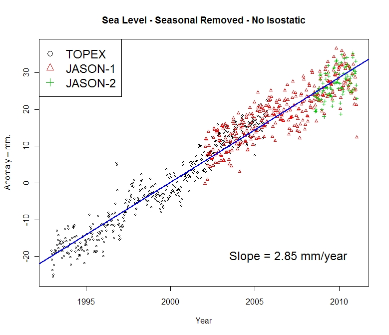
Not content to wait, and prodded by another commenter in an online tussle, CA and WUWT regular Roman M decided to find out himself. The results speak for themselves, quite a drop in the latest JASON-1 datapoint, with a general slight downturn in the JASON1-2 data since late 2009:

Here’s the dialog on how this came about, from RomanM’s comment here:
===============================================================
“… and am very curious to see what the most recent data looks like.”
So why not go and look at it?
Excellent suggestion. I did exactly that.
First, I went to the Aviso web site and found the place where one can generate sea level graphs. I generated the “Reference” version (“Reference” products are computed with the T/P-Jason-1-Jason-2 serie for the time series and with merged datasets for the maps) with the options: inverted barometer, seasonal removed and without isostatic adjustment. I got a graph with some points and a line drawn through it (which I have also saved at this location.

Quick-look of selected data. Click on “download the image”
to retrieve the image in high resolution
or on “download the data” to get the data.
Since it appeared that the “data” was rather sparse and since I enjoy playing with numbers, I chose to download the data. I assume that you didn’t try this, because to my surprise, I got the message:
550 /pub/oceano/AVISO/indicators/msl/MSL_Serie_MERGED_Global_IB_RWT_GIA_Adjust.txt: No such file or directory
Must be a glitch, I thought! After a period of time with the same type of message appearing EVERY time that I tried to download data for a variety of variables, I got the idea that perhaps (as you suggested in an earlier comment) “somebody forgot to update it, or has been busy with other things, or the person who originally did it has left and nobody else was interested” at Aviso as well. must be a lot of that going around in the climate science community, right? 😉
Anyway, not to be defeated so easily, I managed to actually locate some updated results (into January 2011) at NOAA in NetCDF format. I drew what was purportedly the same graph from that data and got something that was quite different.

I have other graphs, but I will just show one more using all of the satellites. This one used real data, not the processed results chosen by Aviso and not even shared by them.

=============================================================
Another curiosity:
The other reason things have gone quiet may be an unprecedented swing in the Jason 2 calibration curve.
http://sealevel.colorado.edu/calibration.php
I don’t know if they have published any findings on why it jumped by 10 mm at the end of 2009 but if it has skipped again maybe they are frantically trying to tidy things up before publishing data.
==============================================================
He has a point, have a look at this calibration curve published on the (CU sealevel website) for JASON1 and 2:

Compare that to the curve from the previous TOPEX A and B satellites:

Curiouser and curiouser.
To be fair, and to compare to what RomanM plotted I’ll also show the similar ensemble graph provided by NOAA, which uses smoothed data points:
 ================================================================
UPDATE:
Oh this is funny. Having been hilariously self pwned before for not reading what’s actually in a blog post, Grant Foster, aka “Tamino”, aka “Open Mind” writes a critique of this blog post complaining that because the post discussed the most recent data that still hasn’t been updated at the CU Sealevel website, and points out the dip at the end, that we are “pretending sea level rise doesn’t exist”. Here’s his graph to drive his point home.
 Here’s the funny part, above in my original post, you’ll count three graphs. One from Roman M., here and one from NOAA, here, both with trend lines for the full length of the data set, both clearly labeled with sea level rise rates of 2.85mm and 2.8mm per year respectively. Then there’s the one from AVISO/CNES/LEGOS, with the red smoothed average line and nice big blue linear trend line and 2.96mm per year rise rate labeled on it.
Gosh, how can anyone miss three graphs with positive trend lines and rates?
Mr. Foster doesn’t even have a sea level rise rate on his graph, ignores the graphs with trend lines and trend rates, and discussion on calibration of JASON 1-2, and yet we are the ones here “pretending (sea level rise) doesn’t exist”? Mr. Foster must be stuck in one of those “Smug Loops” that Steve McIntyre writes about today.
Too funny.
This reminds me of a previous incident where another “smug loop” type situation occurred, where I pointed out some outliers in sea ice satellite data and was told by NSIDC that it was “not worth blogging about“. Days later, they had to fess up to admitting they missed an equipment problem and took their whole dataset output offline to fix it.
@DeanL
I thought that it was an article of faith among ‘warmists’ that it was all (everything from rising ‘average global temperature’ [WTI*] to rising sea level) due to anything but the sun. Recanting?
*WTI = whatever that is
I don’t know why anyone would be surprised at the oceans dropping.
Obama said:
‘this was the moment when the rise of the oceans began to slow and our planet began to heal;’
http://www.huffingtonpost.com/2008/06/03/obamas-nomination-victory_n_105028.html
PDO seems to be another case of missing updates: http://cses.washington.edu/cig/pnwc/aboutpdo.shtml , not update since 2008.
It links to another page for “current state of the PDO.” Sadly the PDO plot is a broken link.
http://www.jisao.washington.edu/pdo/
The data is there and shows PDO consistantly in negative territory since the 2008 cut-off (with a +ve blip in late 2009)
I have to give you a back story on why Tamino even bothered to post that crap about you in his post,”Cherries Jubilee.”
After having read his original story called, “Jerk”, I thought I would comment about the difference between rising CO2 and not-so-rising sea levels.
After going at it a few rounds, Tamino decided to not even bother to publish or snip my comment. He just refused to respond to what I was debating with him.
Then, I imagine, knowing something was afoot, saw what you published about JASON and came up with that Cherry Jubilee crap.
Anyways, you can read about the whole back story that I just posted about here .
Somewhere I saw a graph today of satellite sealevel data with the seasonal changes still present. It was most interesting. From 2002 to present, I think. Can’t find it again. Anyway, what interested me was WHERE/WHEN the sealevel rose: it was not that sealevels rose each year, but that between October and January they DIDN’T FALL by the 2.0 mm/yr.
Now that may or may not be important, but it is interesting. One would think, in AGW meme, that the sealevel would rise consistently. But it looked to me that there was not a consistent rise, but a step-function involving not-falling from the NH Fall. What I recalled was that going into the southern summer was when the Earth was in an apogee poition. If not-falling were the case, then the timing of the not-falling event IS significant: it suggests that there is, indeed, a time-location causation event going on, not a global thing. In other, specific words, there is added insolation warming the world related to albedo with/without cloud changes, in the fourth quarter of each year, when the Earth is at apogee and insolation is not the average value, but its apogee value.
The apogee value is 350.8 W/m2 (January 4). The perigee value is 330.1 W/m2. The difference is due to the eccentricity of the Earth’s orbit of 1.03. The difference is significant IF there is a difference in albedo (from the long-term average) during the year. Since the alleged CO2 radiative forcing at doubling is only 3.75 W/m2, but there is 20.8 W/m2 difference between the apogee and the perigee position/time, the time-positional considerations seem to be of utmost importance.
Sometimes there is too much averaging. The devil is in the details, perhaps.
http://sealevel.colorado.edu/results.php
I don’t really see what you are refering to in this data except for 2005 in the no seasonal , no barometer case.
One interesting feature of data massaging is that the barometer adjustment gives a different long-term form to the data. +barom+seasonal shows a step drop in 2007 but equal rise before and after and does not show the down-turn.
-barom+seasonal shows post 2003 with a trend about half that of pre-2003.
The two are not necessarily contradictory due to the larger variations in the later so I don’t think there’s any “tricks” but it does show how adjustments can trick the eye. Warming is in the eye of the beholder.
Here is a quick plot of the data smoothed with gnuplots bezier curve smoothing. This is not a rigorous analysis since I have not looked into how that function works, the ticks at each end are obviously artefacts.
GMSL no seasonal, no barom, smoothed
However, the rounding off after 2002 seems clear. No “accelerating” sea rise there.
Tamino might be interested to know sea levels have been steadily rising since the end of the Little Ice Age.
What AGW skeptics claim doesn’t exist — correctly — is the acceleration in sea level rise that was predicted and has not materialized.
This is a mildly important point, given that AGW proponents are claiming we need to divert trillions of dollars to ameliorate AGW primarily because of the effects of sea level rise acceleration.
Another example of evidence tending to weaken the AGW case being suppressed or at least delayed. Maybe a formal procedure would help researchers maintain uniformity of approach……
NB
For the uninitiated, the ‘sub-routine’ (procedure) is written in what software geeks call pseudo-code, designed to be read as a dialect of English but easily translated to most computer languages. Italicised text is in explanation of the process.
SUB(MAINTAIN_FUNDING)
‘Heads I get the money, Tails I get the money
Acquire data
Analyse data
LOOP
IF
THEN
GOTO PUBLISH ‘Excellent – I’m right again
ELSE ‘Oh bother – data don’t fit. Shome mishtake
IF
THEN
Apply plausible manipulations
GOTO LOOP ‘See if that does it
ELSE ‘Big trouble – ran out of manipulations
Keep stumm
Obstruct FOIA requests for access to data
IF
THEN
Destroy offending data
Seek funding to repair gaps in data
EXITSUB
ENDIF
ENDIF
ENDIF
PUBLISH
Extrapolate to catastrophe
Submit to review by selected peers e.g. Greenpeace
Publish with terrifying commentary
Seek funding to avert catastrophe
ENDSUB
It don’t seem to matter how professional your comments are at Open Mind.
Even if you present credible information at that blog, censorship prevails.
Here is my latest comment provided to be posted, that now stands among 3 others he refused to post):
Maybe some of you other chaps might have better luck at getting through to the poor man.
I obviously do not rate on his care meter. Either that, or hes waiting for a more credible skeptic to blast.
I look forward to some of you taking him off of his ‘smug loop’.
Good Day !
Rise or fall, at these rates corals, snails and maybe even Al Gore can keep up.