UPDATE: Tamino weighs in, see the update at the end of this post. –
One of the great things about WUWT is that it attracts commenters with a wide range of skill sets, who can often contribute far and beyond what we even see from our government sources. I’ve lamented the lack of updates from the University of Colorado sea level website, and when I got no response to emails, I decided to make a rare phone call and ask why. The answer I got from Dr. R. Steven Nerem was:
“This new website design won’t work with our current format, so if you can just be patient and wait a couple of weeks we’ll have it online.”
Not content to wait, and prodded by another commenter in an online tussle, CA and WUWT regular Roman M decided to find out himself. The results speak for themselves, quite a drop in the latest JASON-1 datapoint, with a general slight downturn in the JASON1-2 data since late 2009:

Here’s the dialog on how this came about, from RomanM’s comment here:
===============================================================
“… and am very curious to see what the most recent data looks like.”
So why not go and look at it?
Excellent suggestion. I did exactly that.
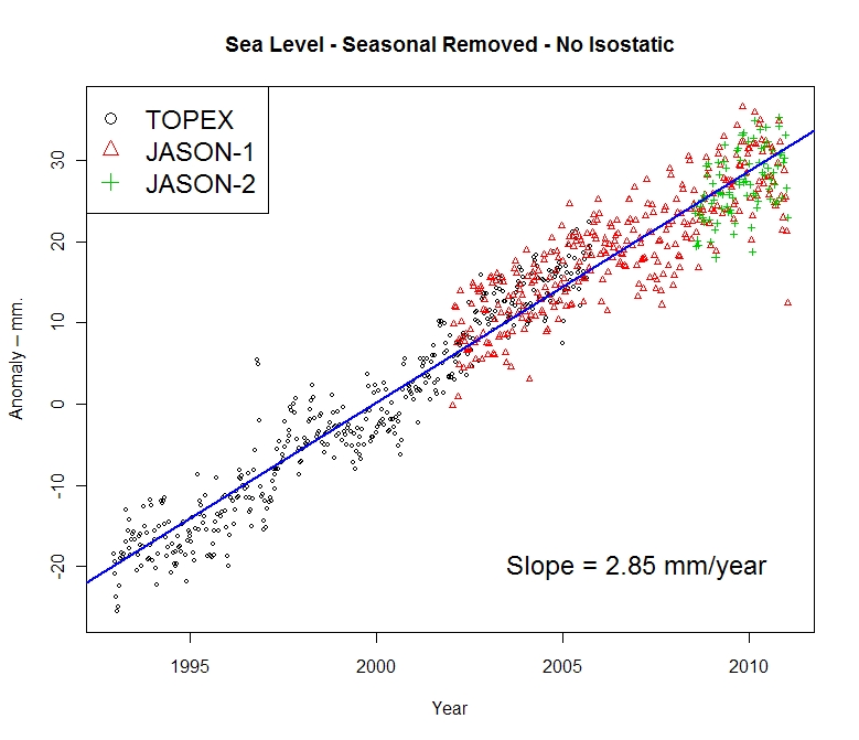
First, I went to the Aviso web site and found the place where one can generate sea level graphs. I generated the “Reference” version (“Reference” products are computed with the T/P-Jason-1-Jason-2 serie for the time series and with merged datasets for the maps) with the options: inverted barometer, seasonal removed and without isostatic adjustment. I got a graph with some points and a line drawn through it (which I have also saved at this location.

Quick-look of selected data. Click on “download the image”
to retrieve the image in high resolution
or on “download the data” to get the data.
Since it appeared that the “data” was rather sparse and since I enjoy playing with numbers, I chose to download the data. I assume that you didn’t try this, because to my surprise, I got the message:
550 /pub/oceano/AVISO/indicators/msl/MSL_Serie_MERGED_Global_IB_RWT_GIA_Adjust.txt: No such file or directory
Must be a glitch, I thought! After a period of time with the same type of message appearing EVERY time that I tried to download data for a variety of variables, I got the idea that perhaps (as you suggested in an earlier comment) “somebody forgot to update it, or has been busy with other things, or the person who originally did it has left and nobody else was interested” at Aviso as well. must be a lot of that going around in the climate science community, right? 😉
Anyway, not to be defeated so easily, I managed to actually locate some updated results (into January 2011) at NOAA in NetCDF format. I drew what was purportedly the same graph from that data and got something that was quite different.

I have other graphs, but I will just show one more using all of the satellites. This one used real data, not the processed results chosen by Aviso and not even shared by them.

=============================================================
Another curiosity:
The other reason things have gone quiet may be an unprecedented swing in the Jason 2 calibration curve.
http://sealevel.colorado.edu/calibration.php
I don’t know if they have published any findings on why it jumped by 10 mm at the end of 2009 but if it has skipped again maybe they are frantically trying to tidy things up before publishing data.
==============================================================
He has a point, have a look at this calibration curve published on the (CU sealevel website) for JASON1 and 2:

Compare that to the curve from the previous TOPEX A and B satellites:

Curiouser and curiouser.
To be fair, and to compare to what RomanM plotted I’ll also show the similar ensemble graph provided by NOAA, which uses smoothed data points:
 ================================================================
UPDATE:
Oh this is funny. Having been hilariously self pwned before for not reading what’s actually in a blog post, Grant Foster, aka “Tamino”, aka “Open Mind” writes a critique of this blog post complaining that because the post discussed the most recent data that still hasn’t been updated at the CU Sealevel website, and points out the dip at the end, that we are “pretending sea level rise doesn’t exist”. Here’s his graph to drive his point home.
 Here’s the funny part, above in my original post, you’ll count three graphs. One from Roman M., here and one from NOAA, here, both with trend lines for the full length of the data set, both clearly labeled with sea level rise rates of 2.85mm and 2.8mm per year respectively. Then there’s the one from AVISO/CNES/LEGOS, with the red smoothed average line and nice big blue linear trend line and 2.96mm per year rise rate labeled on it.
Gosh, how can anyone miss three graphs with positive trend lines and rates?
Mr. Foster doesn’t even have a sea level rise rate on his graph, ignores the graphs with trend lines and trend rates, and discussion on calibration of JASON 1-2, and yet we are the ones here “pretending (sea level rise) doesn’t exist”? Mr. Foster must be stuck in one of those “Smug Loops” that Steve McIntyre writes about today.
Too funny.
This reminds me of a previous incident where another “smug loop” type situation occurred, where I pointed out some outliers in sea ice satellite data and was told by NSIDC that it was “not worth blogging about“. Days later, they had to fess up to admitting they missed an equipment problem and took their whole dataset output offline to fix it.
Downscope. Dive planes at 15 degrees. Angle on the bow 40 degrees.
I have mentioned before that I believe all the sea level data is compromised. Even many Warmists say that the rise of 3.5mm for the last century is well below the thousand year trend. So where is the water? Antarctica seems to have taken up much of the Northern warming trend, 1990-2002. The rest of the so called warming appears to be exaggeration and falsified data. Initially precipitated by UHE, but then amplified by crazy politicians.
Robert of Ottawa says:
April 17, 2011 at 7:45 pm
That N. Hemisphere snowpack is above normal and not melting like it used to.
It is difficult to imagine that an altimetry instrument located 100 miles (plus or minus an uncertain orbital position) from the ocean surface can accurately determine sea level changes of a few millimeters per year.
A failure of your imagination then.
We measure the distance to the moon down to centimetres (it’s going 3.8 cm further away each year) despite it’s orbit being far from circular and it being far from flat.
We measure continental drift, isostatic rebound etc in centimetres per year, despite all the difficulties.
We measure the physical constants to 9 significant figures. Planck’s Constant, for example, is 6.62606896(33)×10^−34 Js. Do you imagine they are making that accuracy up too?
Hell, even mobile hand-held GPS can be accurate to metres.
So, frankly I don’t care what you imagine. If you have proof that the satellite measuring of sea height is inaccurate, bring it on. Otherwise be quiet.
Mooloo says:
April 17, 2011 at 9:07 pm
=======
I agree with you on all points,
but, the vertical (z) component has bad geometry for an accurate solution.
Let me reiterate, with slight modification, my point posted April 17, 2011 at 7:15 pm.
Since the sea surface is a water surface, it’s hard to imagine that the rising/falling long-term trend exhibits a very uneven regional distribution, as seen on the Colorado marine map.
The earth’s crust, or the seabed, may undoubtedly exhibit spatially non-uniform ups and downs, but a water surface may not…………
Berényi Péter says:
April 17, 2011 at 2:24 pm
“It’s simple as a wood wedge. All the water rushed into the Mediterranean lately, increasing its level by up to 20 cm and causing dramatic sea level drop elsewhere.”
Nope, just took the dog for a walk down to the harbour here in Cyprus and my boat is where its been moored to the same ring since the 60’s.
Look elsewhere Berenyi!
kadaka (KD Knoebel) says:>>>
I already knew how to draw it all up, I can even show someone how to do it in a couple of minutes with a couple of switches on a countertop. Not complicated as your sketches show.
Now about pulling wires through walls from the switches to the light…
That’s actually the hard part. And the guy who does it every day for a living? He has all the tools, can do it in 10% of the time I can and with 95% fewer swear words. and he knows which wires go where so he may as well do the last 120 seconds of the project and put the switches in too!
RomanM says:
April 17, 2011 at 1:07 pm
Files ending in “.nc” are NetCDF files which can be read by either the appropriate proprietary software or in R using one of the libraries ncdf or RNetCDF.
There is an Excel add-in called NETCDF4Excel_2007 that will read NetCDF files straight into Excel. I long since forgot where I downloaded it from but I’ve been using it for over a year and it is WAY less work than cutting and pasting from text etc.
The only downside is you find out real fast how memory efficient NetCDF is and how memory efficient Excel isn’t.
If you have proof that the satellite measuring of sea height is inaccurate, bring it on.
http://hockeyschtick.blogspot.com/2010/05/sea-level-expert-recent-sea-level.html
It must be very difficult, if not impossible, to measure global sea level to within 1mm, so a spike like that has to be equipment related. My guess is that the best you could hope for is a trend over 5 years or so but even then it would be difficult to support a claim of accelerating sea level rise using the published data.
tokyoboy says:
April 17, 2011 at 9:36 pm
Let me reiterate, with slight modification, my point posted April 17, 2011 at 7:15 pm.
Since the sea surface is a water surface, it’s hard to imagine that the rising/falling long-term trend exhibits a very uneven regional distribution, as seen on the Colorado marine map.
The earth’s crust, or the seabed, may undoubtedly exhibit spatially non-uniform ups and downs, but a water surface may not…………
The surface of the world’s oceans is not level. The Geoid from which sea level anomalies are computed varies by nearly 200 meters based on variations of the gravitational strength of the planet
http://en.wikipedia.org/wiki/Geoid
Pat says: April 17, 2011 at 8:58 pm
“…. Initially precipitated by UHE, but then amplified by crazy politicians.”
They’re not crazy, just opportunistic criminals.
In my opinion.
>>
ferd berple says:
April 17, 2011 at 10:32 pm
If you have proof that the satellite measuring of sea height is inaccurate, bring it on.
<<
The late John L. Daly already provided that: http://www.john-daly.com/altimetry/topex.htm.
Jim
u.k.(us) says:
April 17, 2011 at 4:44 pm
“Tell me what I’m missing;
A land surveyor with a stable GPS receiver on the ground, has a vertical confidence level of about 1-1.5 centimeters. (At best).
Yet, Sea Level is being measured to millimeters, also by satellites.”
A perfectly reasonable question. You’re probably missing two things:
1. You need to measure sea level in smaller units than the satellite position uncertainty. If you don’t, your results will be limited by the precision of the units you choose to use rather than the uncertainty in satellite position.
2. The satellite postion is determined by a system called DORIS which is sort of an “inverted GPS” which uses 50 or so fixed ground stations to transmit reference signals that the satellite can use much as a surveyor’s GPS uses satellite signals. I’m not an expert on DORIS. Claimed radial (“vertical”) accuracy is quoted in the 4-5cm range. It’s not clear if that is a maximum error, one sigma error, or typical error. I’m guessing that it is a maximum and that the average radial error from satellite position uncertainty over a number of observations is pretty low. The Jason-2 specs call for errors of 2.5cm, but again, it’s not clear if that is maximum, one sigma or something else. I’d also note that design goals in complex systems aren’t always met completely.
Greg Cavanagh says:
April 17, 2011 at 5:32 pm
“There is a section in the Jason-2 Handbook entitled 3.2.8 Data Editing Criteria. This appears to identify data to discard.”
If I read the Jason-2 Handbook correctly (and I may not have), they do not discard data. They flag data that they think that a sensible user of the data might want to discard — e.g. because they think there is ice present and have no idea exactly how much the ice reflections are adding to reported sea level.
What is the open mind going to do when it turns out that 2010 dropped off from 2009. Aside from the simple fact that ENSO has a fair amount of cause in that result (as it has in most warming and cooling), the linear regression in this is misleading to the point of meaningless.
The sea level rise has been decelerating for almost 10 years now. Doing a linear regression when the data clearly shows a significant second derivative is folly. I still project that the sea level will start to drop on a regular basis by 2025. A strong El Nino will still make it rise, but it is as meaningless as the warming associated with an El Nine.
http://theinconvenientskeptic.com/2011/02/determining-the-true-acceleration-of-sea-level-rise/
http://theinconvenientskeptic.com/2011/02/sea-level-deceleration-inverted-barometer/
Crispin in Johannesburg,
I wish you would write for The Wall Street Journal (the only newspaper I can read time to time)!
Unfortunately, an overwhelming majority of today’s professional journalists is unbelievably incompetent and/or stupid — and invariably, painfully boring.
Its worth noting here that the BBCs ‘nature inc’ series is still flogging the “climate refugee” fraud even now.
They are using deliberately misleading misinformation even as they know that there are in fact no “climate refugees fleeing rising sea levels” not least because sea levels are NOT rising. This amounts to telling lies, a national and indeed world broadcaster lying to the public. The BBC has been a major participant and player in the CAGW fraud with its gigantic unlimited funding from a Soviet style enforced taxation, complete with an army of strong arm thugs.
About 3mm of the sea evaporates each day, and of course around 3 mm of rain returns to the oceans each day as part of the hydrological cycle. So the daily varation can be up to 3 mm although over a month this will balance out unles there are significant additions or removals from the hydrological cycle with ice melting to water or vice-versa or land-based resoviors and auqifiers take up more.
What is unclear is why the recent sea level figures show a downturn. While it is a common event after/during La Nina episodes there dosen’t seem to be much agreement on whether it is a result of thermal contraction – unlikely given the large amount of thermal energy that would need to be lost for this magnitude of change – or just a shift in the balance of partioning of the water in the hydrological cycle with less in the oceans and more in land resovoirs and the atmosphere.
For those who see this sea level fall as clear evidence of the start of a cooling phase in the climate, perhaps you could explain what IS the cause of the fall and how it indicates a cooling ?
Although any such prediction seems more wishfull thinking than fact based judgement given the noise in the data and the consistancy of the recent data with the variations seen in the data in the past during El Nina events.
Just left a little comment for Tamino, times at 8.15am, pointing out that the three graphs with their c 2.8mm/yr rise captions are clearly present & labelled. Plus asking why, if we’re seeing increasing melt from glaciers & icecaps, why the RoR is decreasing, not increasing. I wonder if it will pass muster?
I’veen waiting for this moment, though indeed the measurements do need to be doubly checked.
Everyone’s talking about sea level rise but nobody has mentioned something that I suspect goes very closely hand-in-hand with sea levels. Carbon dioxide levels.
For goodness sake, if sea levels are really slowing right down, keep a watch on Mauna Loa’ s reports.
Heh. Another project here. Check the MLO smoothed figures against the known solar fluctuation in sealevel rise. Anyone?
@tokyoboy: You asked a reasonable question. I can see two mechanisms which might cause this kind of regional variation right off the top of my head.
1. Variations in the timings of tides and their interaction with seabed topography.
2. Weather, and in particular regional variations in average barometric pressure.
I thought that the reason the data was not being releases was because, quote: “sea levels don’t change very much”. Looks like they do…
Ralph, have you ever looked at noisy data?