UPDATE: Tamino weighs in, see the update at the end of this post. –
One of the great things about WUWT is that it attracts commenters with a wide range of skill sets, who can often contribute far and beyond what we even see from our government sources. I’ve lamented the lack of updates from the University of Colorado sea level website, and when I got no response to emails, I decided to make a rare phone call and ask why. The answer I got from Dr. R. Steven Nerem was:
“This new website design won’t work with our current format, so if you can just be patient and wait a couple of weeks we’ll have it online.”
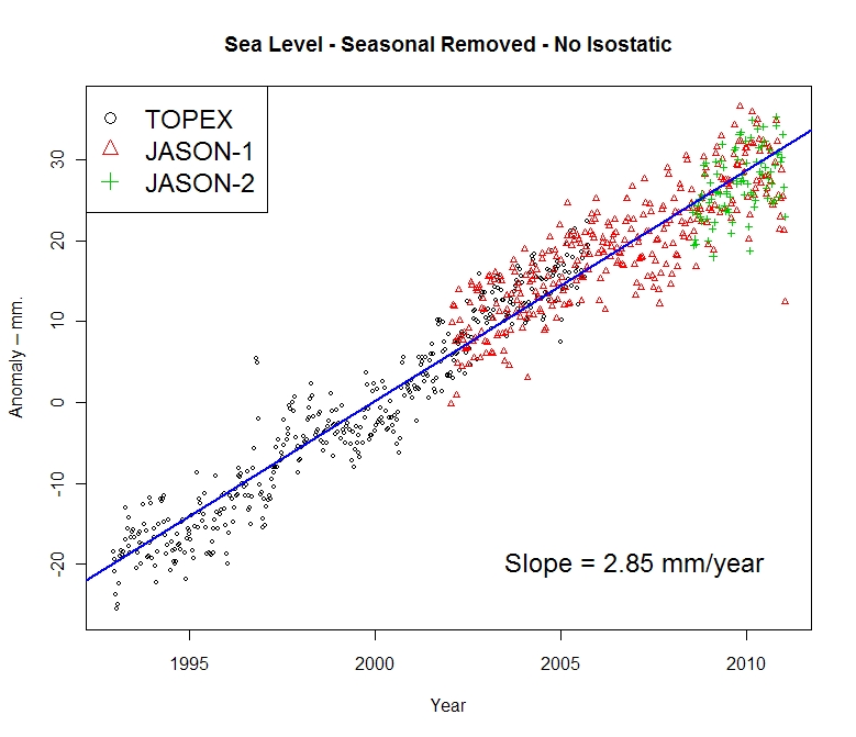
Not content to wait, and prodded by another commenter in an online tussle, CA and WUWT regular Roman M decided to find out himself. The results speak for themselves, quite a drop in the latest JASON-1 datapoint, with a general slight downturn in the JASON1-2 data since late 2009:

Here’s the dialog on how this came about, from RomanM’s comment here:
===============================================================
“… and am very curious to see what the most recent data looks like.”
So why not go and look at it?
Excellent suggestion. I did exactly that.
First, I went to the Aviso web site and found the place where one can generate sea level graphs. I generated the “Reference” version (“Reference” products are computed with the T/P-Jason-1-Jason-2 serie for the time series and with merged datasets for the maps) with the options: inverted barometer, seasonal removed and without isostatic adjustment. I got a graph with some points and a line drawn through it (which I have also saved at this location.

Quick-look of selected data. Click on “download the image”
to retrieve the image in high resolution
or on “download the data” to get the data.
Since it appeared that the “data” was rather sparse and since I enjoy playing with numbers, I chose to download the data. I assume that you didn’t try this, because to my surprise, I got the message:
550 /pub/oceano/AVISO/indicators/msl/MSL_Serie_MERGED_Global_IB_RWT_GIA_Adjust.txt: No such file or directory
Must be a glitch, I thought! After a period of time with the same type of message appearing EVERY time that I tried to download data for a variety of variables, I got the idea that perhaps (as you suggested in an earlier comment) “somebody forgot to update it, or has been busy with other things, or the person who originally did it has left and nobody else was interested” at Aviso as well. must be a lot of that going around in the climate science community, right? 😉
Anyway, not to be defeated so easily, I managed to actually locate some updated results (into January 2011) at NOAA in NetCDF format. I drew what was purportedly the same graph from that data and got something that was quite different.

I have other graphs, but I will just show one more using all of the satellites. This one used real data, not the processed results chosen by Aviso and not even shared by them.

=============================================================
Another curiosity:
The other reason things have gone quiet may be an unprecedented swing in the Jason 2 calibration curve.
http://sealevel.colorado.edu/calibration.php
I don’t know if they have published any findings on why it jumped by 10 mm at the end of 2009 but if it has skipped again maybe they are frantically trying to tidy things up before publishing data.
==============================================================
He has a point, have a look at this calibration curve published on the (CU sealevel website) for JASON1 and 2:

Compare that to the curve from the previous TOPEX A and B satellites:

Curiouser and curiouser.
To be fair, and to compare to what RomanM plotted I’ll also show the similar ensemble graph provided by NOAA, which uses smoothed data points:
 ================================================================
UPDATE:
Oh this is funny. Having been hilariously self pwned before for not reading what’s actually in a blog post, Grant Foster, aka “Tamino”, aka “Open Mind” writes a critique of this blog post complaining that because the post discussed the most recent data that still hasn’t been updated at the CU Sealevel website, and points out the dip at the end, that we are “pretending sea level rise doesn’t exist”. Here’s his graph to drive his point home.
 Here’s the funny part, above in my original post, you’ll count three graphs. One from Roman M., here and one from NOAA, here, both with trend lines for the full length of the data set, both clearly labeled with sea level rise rates of 2.85mm and 2.8mm per year respectively. Then there’s the one from AVISO/CNES/LEGOS, with the red smoothed average line and nice big blue linear trend line and 2.96mm per year rise rate labeled on it.
Gosh, how can anyone miss three graphs with positive trend lines and rates?
Mr. Foster doesn’t even have a sea level rise rate on his graph, ignores the graphs with trend lines and trend rates, and discussion on calibration of JASON 1-2, and yet we are the ones here “pretending (sea level rise) doesn’t exist”? Mr. Foster must be stuck in one of those “Smug Loops” that Steve McIntyre writes about today.
Too funny.
This reminds me of a previous incident where another “smug loop” type situation occurred, where I pointed out some outliers in sea ice satellite data and was told by NSIDC that it was “not worth blogging about“. Days later, they had to fess up to admitting they missed an equipment problem and took their whole dataset output offline to fix it.
Tom: ok . . . I’ll go with it . . . what are wind conditions? . . .where is the moon positioned? . . . ect . . . . in the end all be all about a maximum of 10 metres more or less. .
John A:
Try this Excel file. It has two pages.
Say thank you to the academic. 😉
Heheheheheheh. He only tends to jump into the warm Arctic. Observations trump theory every time.
The UC graph trend in the satellite era (1992-present) closely resembles that from our MET long-term observation:
http://www.data.kishou.go.jp/shindan/a_1/sl_trend/sl_trend.html
AW Lucias done a pretty damming analysis of real data trends v models. worth a look?
http://rankexploits.com/musings/2011/hadley-march-anomaly-0-318c-up/comment-page-1/#comment-73978
especially graph 2 its aklready been picked up by Andrew Bolt Australia
Where is the science in all of this, although I’m leaning toward LarryT. Reminds me of the weather is not climate but 1998 was the warmest year ever, only in reverse.
above correct link Lucias site apologies should have been
http://rankexploits.com/musings/2011/hadley-march-anomaly-0-318c-up/
AW Lucias done a pretty damming analysis of real data trends v models. worth a look?
especially graph 2, it’s already been picked up by Andrew Bolt Australia.
Laurie:
Buy the proper switches and the proper wire. The directions are with the switches! I have wired my share of them.
I dunno! They do have a warmcold theory already in place; just in case.
Winters maybe warmer [? – ?]
Winters maybe colder
Ian H says:
April 17, 2011 at 3:52 pm
If you scan across the graph there are many times at which the data behaved similarly before lurching up again.
========================================================
Ian, I’m having a hard time trying to envision something this small…
….as lurching
Tell me what I’m missing;
A land surveyor with a stable GPS receiver on the ground, has a vertical confidence level of about 1-1.5 centimeters. (At best).
Yet, Sea Level is being measured to millimeters, also by satellites.
This is what is giving them headaches. With all the glacier melt and ‘thermal expansion’ the rate of rise is just being plain difficult.
I want everyone to be very afraid of the rise in sea levels since the end of the last ice-age.
***************************
“It is essential that investigations continue to address why this worldwide-temperature increase has not produced acceleration of global sea level over the past 100 years, and indeed why global sea level has possibly decelerated for at least the last 80 years.”
http://www.jcronline.org/doi/pdf/10.2112/JCOASTRES-D-10-00157.1
Scary graph!
Bangladesh doomed!
Pacific islanders finished!
It’s much worse than I thought!
Dave Wendt says:
April 17, 2011 at 2:20 pm
There is a section in the Jason-2 Handbook entitled 3.2.8 Data Editing Criteria. This appears to identify data to discard. Quite amazing.
I can see that the satellite picks up any water anywhere, rivers, lakes, inland seas ect. But a lot of the data discarding parameters bother me. There is a lot of data being discarded.
Fascinating read anyway, thanks for the link.
I know what caused the drop in sea level. It was Godzilla getting out of the tub!
.
.
In my wildest moments of imagination, I sometimes picture an 8-inch diameter Earth surrounded with with its hair-strand-width of atmosphere. It is a useful sort of picture, particularly because it is easily visualized by folks as young as 30 or 40, maybe even 50.
Then I consider the parameters which could cause those 8 inches diameter to wander from any reported shape.
At a few miles up in the atmosphere it’s very cold; at a few miles depth in the Earth, it starts to get really hot. Farther down, it’s molten. Things that are hot near things that are cooler tend to move around a bit; they expand or contract, shift or slip, etc.
Gravitational-pull from the Earth’s position in the Solar System can change the “plastic” shape of the Earth by 10s of centimeters or so — says somewhere on the Internet.
Then of course, between ice-ages there are giant amounts of ice melting, so the localized weights supported by this “plastic” shell are changing.
Sea-level? What’s that? Does it correlate with Sister Earth’s “blood” pressure when she laughs — or when she cries?
My therapist thinks sea-level fever is a symptom of chronic model-deficiency syndrome (MDS).
.
.
u.k.(us) says:
April 17, 2011 at 4:44 pm
Tell me what I’m missing;
A land surveyor with a stable GPS receiver on the ground, has a vertical confidence level of about 1-1.5 centimeters. (At best). Yet, Sea Level is being measured to millimeters, also by satellites.
The satellite folks claim (personal communication from a scientist on the team at JPL analyzing the data) the large number of measurements smooth out the noise to allow the accuracy they claim. If that was true, why is it necessary to make a vast multitude of modeled “adjustments” to the data? It is difficult to imagine that an altimetry instrument located 100 miles (plus or minus an uncertain orbital position) from the ocean surface can accurately determine sea level changes of a few millimeters per year.
This is mentioned by a coastal engineer here:
http://hockeyschtick.blogspot.com/2010/05/sea-level-expert-recent-sea-level.html
Laurie Bowen said on April 17, 2011 at 3:53 pm
Nor would I expect it to. Of the two wires between the three way switches, only one at a time will be “hot” while the other would be not connected electrically, thus a light connected between them would never turn on. A light wired into one of those lines would turn on, but you wouldn’t wire the system up that way.
The switches used are Single Pole Double Throw (SPDT), where one line is switched between two contacts, with the two wires hooked onto those contacts. You can view the switch schematic here. The circuit can be seen here, you can verify your result, or look on the off chance you still can’t figure it out.
Now adding one or more four way switches, that’s a fun exercise…
Here is a link to a brief discussion of the normal variation in sea level rate of change. Looks like nothing new or different from historical norms is occurring today.
http://www.worldclimatereport.com/index.php/2011/04/07/sea-level-rise-still-slowing-down/
Eyeballing the Colorado Univ. sea level map:
http://sealevel.colorado.edu/current/sl_ib.jpg
I always wonder how the sea level rise/fall could exhibit such a drastic local distribution.
The viscosity of water may lead to temporal/regional difference, but I can’t figure out the physical causes that generate a long-term, conspicuous local difference.
Could someone in the know teach me on this issue please.
ftp://ftp.aviso.oceanobs.com/pub/oceano/AVISO/indicators/msl/
empty ftp dir.
Someone following Phil Jones’ advise about clearing out fpt directories in case anyone finds what’s in them?
Well…..as “I am THE ONE we have been waiting for” said: “this was the moment when the rise of the oceans began to slow and our planet began to heal”.
http://www.huffingtonpost.com/2008/06/03/obamas-nomination-victory_n_105028.html
Note the Royal WE: http://ndn.org/blog/2008/02/we-are-ones-weve-been-waiting
Or…….do I have “HE who’s MIDDLE NAME cannot be spoken” confused with Moses from the movie “Ten Commandments”. Or….is HE confused? (If I spoke HIS middle name, I would be stoned for being a racist bigot! Just like in the Old Testament-cool!)
It is difficult to know with these people where reality ends and satire begins. Or if they have a clue as to the difference.
Pray for our country!
Steamboat Jack (Jon Jewett’s evil twin)
OK Finally I understand. All that snow over the past two winters was caused by the global warming of ocenas, which created more water vapour in the atmosphere which, in winter, fell out of the atmosphere as snow. It’s self-consistent popy-cock.
The “sea level rising due to global warming” theory is based on two things: 1) Ice melting in Greenland and Antarctica and 2) thermal expansion of the oceans.
It appears sea levels are not rising exceptionally, therefore be prepared to hear a third “theory” of non-expansion – something like “the Earth’s crust is also warming and expanding, nullifying the ocean level rise”.
Kadaka
Thanks for the link. I’ve been wondering for a long time, how my living room switches can work without relays. Now if I can relate this to sea level….