UPDATE: Tamino weighs in, see the update at the end of this post. –
One of the great things about WUWT is that it attracts commenters with a wide range of skill sets, who can often contribute far and beyond what we even see from our government sources. I’ve lamented the lack of updates from the University of Colorado sea level website, and when I got no response to emails, I decided to make a rare phone call and ask why. The answer I got from Dr. R. Steven Nerem was:
“This new website design won’t work with our current format, so if you can just be patient and wait a couple of weeks we’ll have it online.”
Not content to wait, and prodded by another commenter in an online tussle, CA and WUWT regular Roman M decided to find out himself. The results speak for themselves, quite a drop in the latest JASON-1 datapoint, with a general slight downturn in the JASON1-2 data since late 2009:

Here’s the dialog on how this came about, from RomanM’s comment here:
===============================================================
“… and am very curious to see what the most recent data looks like.”
So why not go and look at it?
Excellent suggestion. I did exactly that.
First, I went to the Aviso web site and found the place where one can generate sea level graphs. I generated the “Reference” version (“Reference” products are computed with the T/P-Jason-1-Jason-2 serie for the time series and with merged datasets for the maps) with the options: inverted barometer, seasonal removed and without isostatic adjustment. I got a graph with some points and a line drawn through it (which I have also saved at this location.

Quick-look of selected data. Click on “download the image”
to retrieve the image in high resolution
or on “download the data” to get the data.
Since it appeared that the “data” was rather sparse and since I enjoy playing with numbers, I chose to download the data. I assume that you didn’t try this, because to my surprise, I got the message:
550 /pub/oceano/AVISO/indicators/msl/MSL_Serie_MERGED_Global_IB_RWT_GIA_Adjust.txt: No such file or directory
Must be a glitch, I thought! After a period of time with the same type of message appearing EVERY time that I tried to download data for a variety of variables, I got the idea that perhaps (as you suggested in an earlier comment) “somebody forgot to update it, or has been busy with other things, or the person who originally did it has left and nobody else was interested” at Aviso as well. must be a lot of that going around in the climate science community, right? 😉
Anyway, not to be defeated so easily, I managed to actually locate some updated results (into January 2011) at NOAA in NetCDF format. I drew what was purportedly the same graph from that data and got something that was quite different.

I have other graphs, but I will just show one more using all of the satellites. This one used real data, not the processed results chosen by Aviso and not even shared by them.

=============================================================
Another curiosity:
The other reason things have gone quiet may be an unprecedented swing in the Jason 2 calibration curve.
http://sealevel.colorado.edu/calibration.php
I don’t know if they have published any findings on why it jumped by 10 mm at the end of 2009 but if it has skipped again maybe they are frantically trying to tidy things up before publishing data.
==============================================================
He has a point, have a look at this calibration curve published on the (CU sealevel website) for JASON1 and 2:

Compare that to the curve from the previous TOPEX A and B satellites:

Curiouser and curiouser.
To be fair, and to compare to what RomanM plotted I’ll also show the similar ensemble graph provided by NOAA, which uses smoothed data points:
 ================================================================
UPDATE:
Oh this is funny. Having been hilariously self pwned before for not reading what’s actually in a blog post, Grant Foster, aka “Tamino”, aka “Open Mind” writes a critique of this blog post complaining that because the post discussed the most recent data that still hasn’t been updated at the CU Sealevel website, and points out the dip at the end, that we are “pretending sea level rise doesn’t exist”. Here’s his graph to drive his point home.
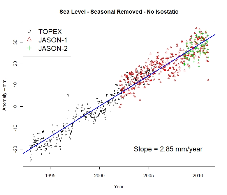
 Here’s the funny part, above in my original post, you’ll count three graphs. One from Roman M., here and one from NOAA, here, both with trend lines for the full length of the data set, both clearly labeled with sea level rise rates of 2.85mm and 2.8mm per year respectively. Then there’s the one from AVISO/CNES/LEGOS, with the red smoothed average line and nice big blue linear trend line and 2.96mm per year rise rate labeled on it.
Gosh, how can anyone miss three graphs with positive trend lines and rates?
Mr. Foster doesn’t even have a sea level rise rate on his graph, ignores the graphs with trend lines and trend rates, and discussion on calibration of JASON 1-2, and yet we are the ones here “pretending (sea level rise) doesn’t exist”? Mr. Foster must be stuck in one of those “Smug Loops” that Steve McIntyre writes about today.
Too funny.
This reminds me of a previous incident where another “smug loop” type situation occurred, where I pointed out some outliers in sea ice satellite data and was told by NSIDC that it was “not worth blogging about“. Days later, they had to fess up to admitting they missed an equipment problem and took their whole dataset output offline to fix it.
Now that IS an inconvenient truth! Sea level dropping 🙂
Sharp downtick???? . . . it’s mm . . . .mm’s!
temperatures going down, ocean heat index going down, thermal expansion going down….
….all the while China is trying their best to save us by pumping as much CO2 out as they can
God help them…………../snark
Lemmee guess — AGW is causing catastrophic evaporation of the oceans that will leave the ocean beds high and dry by the end of the century? 😉
The more they try to bend the figures, the more they tie themselves up in knots.
Good to see the data.
But not sure why Nullius rubbed Roman in such the wrong way.
If it’s the same Nullius I’ve seen on other blogs, he’s not exactly a goose-stepping warmer (did I just demonstrate Godwin’s Law?)
He just indicated that U. Col’s problem could be more related to funding than anything else.
Anyway, very informative, since I’ve always wondered why Aviso’s graphs always looked so…er…”neat”.
We’ve got to use the precautionary approach which clearly means that if there is the slightest hint of a doubt regarding the honesty or integrity of those involved producing such figures we should immediately assume the worst: that they are a bunch of lying scoundrels who couldn’t be trusted not to sell a chewed banana.
Or have I misunderstood the precautionary approach?
In Dr. Nerem’s paper at
http://www.imedea.uib.es/goifis/OTROS/VANIMEDAT/documentos/intranet/Bibliography/Nerem_et_al_Global_Planet_Change_2007.pdf
he mentions the many “adjustments” required for satellite altimetry data:
“Satellite altimetry is somewhat unique in that many adjustments must be made to the raw range measurements to account for atmospheric delays (ionosphere, troposphere), ocean tides, variations in wave height (which can bias how the altimeter measures sea level), and a variety of other effects. In addition, the sea level measurements can be affected by the method used to process the altimeter waveforms, and by the techniques and data used to compute the orbit of the satellite. Early releases of the satellite Geophysical Data Records (GDRs) often contain errors in the raw measurements, the measurement corrections, and the orbit estimates.” Nerem et al also mentions other major problems such as drift in the TOPEX microwave radiometer, a change from the original TOPEX altimeter to the back-up altimeter in 1999 “due to degradation in the original instrument” which had “different electronics” from the original resulting in divergent measurements which had to be “corrected.”
more on ex-post “adjustments” to altimetry data:
http://hockeyschtick.blogspot.com/2010/03/more-ex-post-adjustments-to-satellite.html
http://hockeyschtick.blogspot.com/2010/03/global-sea-level-change-redux.html
http://hockeyschtick.blogspot.com/2010/02/sea-levels-large-variances-between-tide.html
Great!
Could you perhaps add the other graphs at the AVISO site? The ones I had actually been talking about?
(I had suggested going to the site indicated and then clicking on ‘Time Series’ and ‘Jason-1’. ‘Jason-2’ and ‘Envisat’ are also interesting.)
Cheers.
And John M, thanks, it’s the same Nullius. I suspect RomanM may have just seen the first composite graph that comes up and liked it no better than I did. If it’s just a misunderstanding, I don’t have a problem with it.
News Headline for next month:
“Sea level fall due to global warming.”
I think I’ve got it, they are using models to predict sea levels over periods they “forgot” to record the data only they haven’t removed the CO2 “forcing” from the program. /sarc
Mike Haseler says:
April 17, 2011 at 11:55 am
[———————————————————————
Or have I misunderstood the precautionary approach?]
—————————————————–
Gosh Mike – nice turn of phrase there – having a bad day?
Cheers
Douglas
At first glance, it looks to be pretty much following the predicted course:
http://www.trevoole.co.uk/Questioning_Climate/userfiles/Will_Satellite_Mean_Sea_Levels_Continue_to_Rise.pdf
It’ll be interesting to see what the finally published version is like.
All of the data series files have been removed from ftp://ftp.aviso.oceanobs.com/pub/oceano/AVISO/indicators/msl/
That removes the temptation to plot them independently or wonder why Envisat produced a sea level rise of 1.2 mm/year http://www.aviso.oceanobs.com/fileadmin/images/news/indic/msl/MSL_Serie_EN_Global_IB_RWT_GIA_Adjust.png and JASON1-2 produces 3 times as high a rise for the same period http://www.aviso.oceanobs.com/fileadmin/images/news/indic/msl/MSL_Serie_MERGED_Global_IB_RWT_GIA_Adjust.png
I would also pay no attention to the sharp downtick at the end. All series like this have high frequency noise that means nothing.
The drift problems with the Jason 2 sat are rather interesting. Jason 2 supposedly includes a much more sophisticated tie-in to the GPS constellation of satellites, as well as Earth based reference stations, to improve the accuracy of the orbital ephemeris. I seem to recall that the onboard instrumentation for providing corrections for atmospheric factors was also upgraded. In fact, as one would expect, virtually every system involved was supposed to be an improvement over previous iterations. And yet the system performance seems to be even worse than the already poorly regarded Topex sats. The data products handbook for Jason2 indicates that they had a goal of initially achieving an accuracy of +/- 3.4 cm RMS but, given the rather dramatic drift swings, one has to wonder if even that loose standard is reasonably plausible, which is interesting be a +/- 3.4 cm error bar nicely covers the entire 20 yr range of supposed changes in MSL.
Also, though I’m not a big stat guy, the rather extreme range and variability of the drift values doesn’t really seem to be captured by the modest slopes of the trend lines shown. Using these trends to correct the sat data would seem to be fairly problematic.
Get ready for IF the rate of sea level increases then all coral island atolls are doomed. We have been waiting since 1980 and diddly.
Warmists must now be concerned about temperature and sea level rise. It’s not going according to plan.
If anyone is interested in downloading some of the data from NOAA themselves, the more direct option is to go straight to the data directory.
Files ending in “.nc” are NetCDF files which can be read by either the appropriate proprietary software or in R using one of the libraries ncdf or RNetCDF.
Data is also available as “.tar.gz”. These must be un-gzipped and un-tarred before use. I have been using the free program 7-zip File Manager for this purpose in Windows and it works well for me. The end product is simple text files from which the data can be cut-and-pasted to Excel or other programs.
The code to watch out for in the names of the files is “gbl” for global, “free” and “keep” for seasonal variation removed or not removed, “txj1j2” for only the TOPEX and the two JASONs or “all” for all of the satellites together.
Dave Wendt says:
April 17, 2011 at 12:41 pm
“In fact, as one would expect, virtually every system involved was supposed to be an improvement over previous iterations. And yet the system performance seems to be even worse than the already poorly regarded Topex sats.”
A highly likely robust explanation…
http://en.wikipedia.org/wiki/Jason_2
“Scientists consider the 15-plus-year climate data record that this mission will extend critical understanding how ocean circulation is linked to global climate change.”
It’s a climate change satellite, made to specifications by The Team that delivers the data pre-tortured, fit for publication in any esteemed climate change journal. 😉
John A,
A blinder well played.
😉
Bifurcated Realism Conveniently Explained
(Inconveniently absent) global warming increases the evaporation of sea water which cools the oceans (cooling, now inconveniently present) resulting in falling sea levels (also inconveniently present). Increasing carbon-dioxide in the atmosphere (conveniently present) should trap long wave radiation in a largely tropical hot spot (inconveniently missing) at 8-16 km altitude. This putative heat has been modelled to be transported by Hadley Cells away from the (inconveniently cooling) equator eventually raising the temperature of the whole atmosphere (which is inconveniently difficult to monitor accurately). The (conveniently present) carbon-dioxide should, by the mechanism of the lower relative humidity of the now warmer (but inconveniently cooler) air, drives additional moisture into the (hopefully warmer) air. The total atmospheric water vapour content (inconveniently decreasing at critical altitudes) traps additional long wave radiation and according to (conventient) circulation models will show a multiplying of the (inconveniently missing) heating effect for each additional molecule of carbon-dioxide. (Inconvenient positive) changes in cloud cover area caused by the extra evaporation at low altitudes reflects at least some (inconveniently large) amount of (inconveniently decreasing) direct sunlight. The modelled overall effect of these (conveniently simple to study) mechanisms is a projected rapid increase in the atmospheric temperature and sea level if all the outputs are multiplied by some arbitrary (and extraordinarily large) value of 1.
If the meaning of a ‘large value of 1’ is not clear, read on. It is (most conveniently) derived from the engineering term, “unity”. Unity normally means ‘1.0’ but if we all join hands and sing handy-clappy campfire songs together we get additional unity so the value of the arbitrary multiplier, ‘Unity’, (conveniently) increases more and more, ergo: larger values of 1. So much Unity has (conveniently) been created amongst thousands of (conveniently) compliant scientists who need money that the value of Unity has increased to 3.2! That is a (conveniently) very large value of 1, indeed!
Thus, is it explained that the cause of the stasis and/or drop in sea level is: (wait for it!) global warming! I’ll bet you knew that all along! Well done! Here, it’s hot. Have another cup of Kool-aid.
[Global warming is also the cause of the softening of the toe-claws of Gobi marmots but the mechanism is (inconveniently) somewhat less direct and would (conveniently) take too much time to explain adequately.]
Crispin (inconveniently) freezing in Johannesburg
“..this was the moment when the rise of the oceans began to slow…”
Barack Obama June 3, 2008 Nomination Acceptance Speech.
He should declare “mission accomplished” on that one.
Too funny 🙂
G
Correct me if I’m wrong….but should not the very raw data, with zero adjustments made for any reason, if in sufficient number, in and of itself supply a trend with zero bias?
That is, the introduction of any correction for any reason will introduce a bias. If there is a proper data set that is representative of a broad sampling frequency and proper time domain, the raw data itself should really show a trend that is fundamentally a parallel to the “corrected” trend.
The “actual” sea level numbers may be more accurate with the corrected data, but the trend, or rate, is what we’re really after, isn’t it?
AGW causes warming and cooling. Snow/ice and melting. It should be no surprise that it causes both sea level rise and dropping of the same sea level. It is all very indicative of AGW, oh and it’s worse than we thought.
R. Gates, where are youuuuuuu………………………
We need you to explain again how the hydrological cycle has been speeding up causing all this weather………………..