By Steve Goddard
Summer has come to a premature and frosty end at Santa’s workshop.
")
http://psc.apl.washington.edu/northpole/webphotos/noaa2.jpg
It has been the coldest summer on record north of 80N, and temperatures have dropped below freezing ahead of the average date.
")
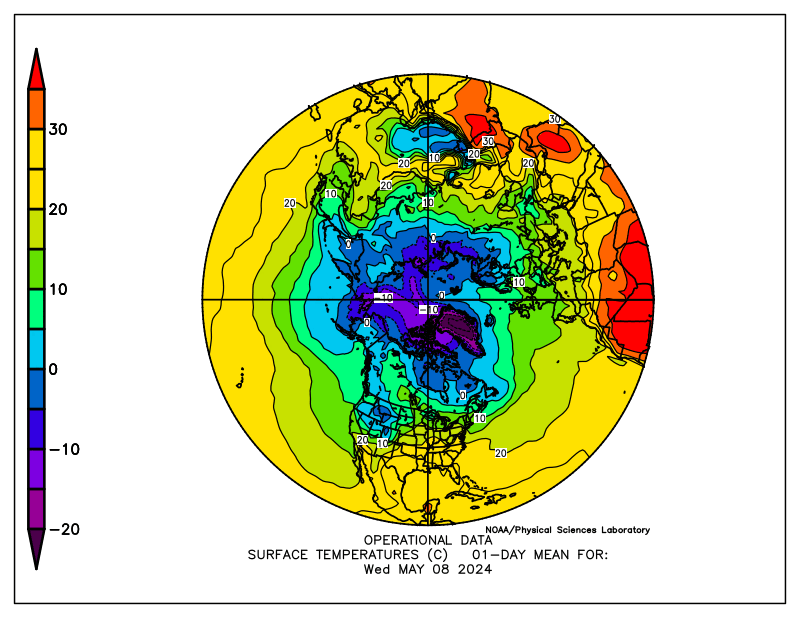
The entire ice covered region is now below freezing.
")
http://www.esrl.noaa.gov/psd/map/images/fnl/sfctmp_01.fnl.gif
It also appears that the summer melt season will be the shortest on record. The maximum was reached very late in March, and it appears likely that we are headed for an early minimum.
")
Mark Serreze at NSIDC has stated :
As the climate warms, the summer melt season lengthens …”
He was also reported as saying :
Mark Serreze of the center forecast the ice decline this year (2010) would even break 2007’s record.
Another interesting fact is that we are almost certain to see a large increase in the amount of multi-year ice (MYI) next year. The reason being that almost all of the 1-2 year old ice (turquoise) in the NSIDC map below will become classified as MYI next spring.
")
We have seen a remarkably rapid recovery from the 2008 low volume.
PIOMAS continues to report record low volumes of ice, despite all evidence to the contrary. The image below shows in red how far off the mark their August 15 forecast was. Their modeling error will get much worse over the next two weeks – because they model much of the thick multi-year ice in the Beaufort Sea and Arctic Basin as only a few tens of centimetres thick.

With the cold temperatures, ice area loss has almost stopped.

http://arctic-roos.org/observations/satellite-data/sea-ice/observation_images/ssmi1_ice_area.png
However, ice extent continues to drop – because the Arctic Oscillation has turned negative and winds are compacting the ice towards the pole. This bodes well for continued growth of ice in 2011.
")
http://www.ijis.iarc.uaf.edu/seaice/extent/AMSRE_Sea_Ice_Extent.png
PIPS shows average ice thickness increasing, due to the compression of the ice.
")
There has not been a lot of ice loss during August. The modified NSIDC image below shows in red, areas that have lost ice since August 1. Note that the Greenland Sea appears to have lost ice. This is due to the fact that there has been very little transport out of the Arctic Basin through the Fram Strait, which again bodes well for ice gain in 2011.

The modified NSIDC image below shows ice gain since 2007.

NSIDC maps continue to show more gain (16%) than their graphs (10%.) I have not been able to get a satisfactory explanation from them about the cause of that discrepancy. DMI shows a 25% gain in 30% concentration ice over 2007.
My forecast (dashed line below) minimum of 5.5 million (JAXA) continues to look conservative. It all comes down to what the winds do over the next few weeks. If the winds keep compressing the ice, the minimum may go a little below 5.5. If the winds quiesce, the minimum may come in a little above 5.5 – which is looking like a pretty good number right now. Some people at NSIDC started out with a 5.5 forecast this year, but seem to have backed away from it since.

Academic theories about the Northwest Passage becoming a commercial shipping opportunity appear pretty clueless.
“The plans that you make can change completely,” he says. This uncertainty, delay, liability, increased insurance and other costs of using the Northwest Passage are likely to deter commercial shipping here. A ship with a reinforced hull could possibly make it intact through the passage. But if it got stuck, it would cost thousands of dollars for an icebreaker like the Amundsen to come to the rescue. So even if the Northwest Passage is less ice-choked than before, the route may not become a shipping short-cut in the near future, as some have predicted.
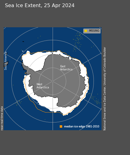
The South Pole will almost certainly set a record for most sea ice this season. It is almost there, and there are still several months of growth remaining.
")
http://www.iup.uni-bremen.de:8084/amsr/ice_ext_s.png

http://nsidc.org/data/seaice_index/images/daily_images/S_daily_extent.png
As seen below, the symmetry between the North and South Pole is impressive through the satellite record. They always seem to move opposite each other and produce an approximately constant amount of sea ice. It would be nice if the experts focused on solving this relationship rather than making up forced explanations like the “Ozone Hole” – which has just started forming for the year and will be gone before Christmas.

UIUC North/south anomalies overlaid on top of each other.
http://arctic.atmos.uiuc.edu/cryosphere/IMAGES/seaice.anomaly.arctic.png
http://arctic.atmos.uiuc.edu/cryosphere/IMAGES/seaice.anomaly.antarctic.png
(Note to posters and ice experts. Before you embarrass yourself making comments about how seasons are out phase at opposite poles, remember that this is normalised data and the period is in excess of 30 years.)
Conclusions:
The “long term trend” (30 years) in Arctic ice continues to be downwards, and would be even if the ice minimum was a record high this summer. But the three year trend shows strong growth of extent, thickness and age. Meanwhile, Antarctic ice is blowing away the record books. Yet the press continues to spread massive disinformation about the state of ice at both poles. Who could possibly be responsible for that?
Sponsored IT training links:
Get COG-112 materials along with 352-001 dumps to practice and pass 000-977 exam in timely and cost saving manners.
Julienne,
So why does NOAA say that melt normally starts in early June (around day 152?)
Steve, several approaches exist to determine timing of melt onset. There’s the passive microwave method, which relies on the differences in the dielectric properties of snow and ice, and therefore their emissivities, which change drastically with ice and snow wetness. When melt water forms at the surface, the emissivity increases to close to 1 causing the surface to appear as a blackbody at microwave wavelengths. Following this initial melt, the snow/ice will either increase in wetness or it will refreeze (most likely during the night), strongly affecting the temporal evolution of the microwave signature. If wetness increases, the snow will at one point approach the emissivity of open water (even before the development of melt ponds), whereas refreezing results in very large snow grains because of the polymorphic aggregation of snow grains under equitemperature metamorphosis. This causes increased scattering and therefore a reduction in brightness temperatures (TB).
Melt onset in the Arctic has also been determined from buoy data from the International Arctic Buoy Program / Polar Exchange at the Sea Surface IABP/POLES [Rigor et al., 2000]. Satellite observations of course have the advantage of covering the entire Arctic which the buoy data cannot. But passive microwave melt detection has another advantage and that is that the microwave emission is directly related to the melt signature of sea ice (or the overlying snow cover).
Now what I quoted with my numbers was the melt onset of continuous melt. So not the first date that melt was detected but the first date when the melt continues for the summer. A first melt event may be followed again by freezing and does not represent the true time-period of the melt season.n I believe NOAA is probably giving you the first day temperatures rose above freezing, but I’m not sure. Also when we compared with buoy data, we found that our continuous melt season occurred on average 8 days later than what the POLES buoy data would suggest. It should be noted, though, that the POLES temperatures are rather constant during the summer months so that small changes in the POLES threshold for determining melt conditions may significantly change the agreement between the two methods.
Steve,
Just guessing but probably the NOAA is referring to the date of onset of melt within some larger area than Julienne’s “central Arctic region “. Perhaps you ought to link to the specific statement by NOAA you have in mind so others could easily check up on what precisely they meant.
Alexej Buergin says:
August 16, 2010 at 11:05 am
Those are all forecasts, which is a projection into the future based on past information, it doesn’t matter if you use a model to estimate the minimum, or a statistical approach or a heuristic approach. The words prediction and forecast are not very different from each other, prediction tends to be more general term.
What I think you didn’t understand was the context of the sentence you pointed out. Skill has to do with how well the model (or method) forecasted or predicted the outcome.
Just The Facts said:
Impressive gibberish. Thank you for providing us with another example of why skeptics are winning this debate…
Mecago responded:
“Congratulate yourself all you want because, . . .”
Just The Facts, that statement about self congratulations was with reference to your declaring yourselves winners of this debate.
As for the statements that I made concerning yourself I believe I should have written “yourselves” instead. That would have been with reference to the whole Skeptic community that you stated was winning the debate, not necessarily with every individual.
Sorry for the typo, since I wasn’t thinking about you except for the self congratulations.
The selective amnesia and mockery is self evident on this thread and the site itself.
Julienne says:
August 16, 2010 at 12:35 pm
“What I think you didn’t understand was the context of the sentence you pointed out. Skill has to do with how well the model (or method) forecasted or predicted the outcome.”
IOW Mark Serreze has no skill..
Thanks
mecago says:
“The selective amnesia and mockery is self evident on this thread and the site itself.”
All of that gets corrected. Why? Because comments like yours are allowed here, even encouraged. But alarmist blogs are so frightened of the truth that they delete it before their readers are contaminated by it.
Please go tell your pals at realclimate that their tiny little echo chamber fails because of their policy of censoring comments that do not fit within their catastrophic global warming agenda.
Steve,
If I understand it right – you’re doing some kind of pixel counting on the NSIDC-produced images themselves to come up with your percent difference between 2007 and 2010. If I were trying to figure out where the discrepancy lies, the first thing I’d do is look for bugs in the code you are using to count the pixels.
“Julienne says:
August 16, 2010 at 12:35 pm
Those are all forecasts, which is a projection into the future based on past information, it doesn’t matter if you use a model to estimate the minimum, or a statistical approach or a heuristic approach. The words prediction and forecast are not very different from each other, prediction tends to be more general term.”
Well, the word “group” means something very different to a mathematician than to a sociologist. And “force” in the prayer is not “force” in physics. But we agree that a person doing a SEARCH outlook as a member of one of these groups is a forecaster. And we might agree that Dr. Meier is an original thinker.
Matt
There is nothing wrong with the code which does the pixel counting. I have done comparisons between NSIDC maps and graphs for two years, and normally they match fairly closely.
Anyone with even the most rudimentary estimation skills, can see that the growth since 2007 is considerably greater than 10%.
[youtube=http://www.youtube.com/watch?v=KlhZKosj4bI]
[REPLY – They’ll get that 10% number by averaging it throughout the year. Thing is that for most of the year there is almost no difference! It only really pops out during the peak of the melt season. During that period, the number is a HECK of a lot larger than 10%! ~ Evan]
mecago says: August 16, 2010 at 12:49 pm
“Congratulate yourself all you want because, . . .”
“Just The Facts, that statement about self congratulations was with reference to your declaring yourselves winners of this debate.”
I stated that “skeptics are winning this debate”. This is not self congratulations, but rather a statement of fact:
http://www.rasmussenreports.com/public_content/politics/current_events/environment_energy/energy_update
“Forty-five percent (45%) say global warming is primarily caused by long-term planetary trends. Thirty-four percent (34%) feel human activity is the main contributor. Eight percent (8%) think some other reason is chiefly to blame. Voters have been shifting away for well over a year from the idea that human activity is the primary cause of global warming. ”
Apparently a majority of the people can see through the empty rhetoric that you and your ilk tend to spout…
Evan,
The 10% number came from the NSIDC graph on the same date as the NSIDC maps.
Steve,
The eye is notoriously bad at estimating relative sizes and shapes. E.g. http://www.opticalillusion.net/optical-illusions/the-wonky-window-size-constancy/
In your comparison images, the eye would be easily fooled, since its comparing a relatively solid green area with scattered red areas. This is why we have computers. No need for sloppy estimates.
Now, on the subject of computers, since I have no idea what methods you’re using to reach your estimate of the difference between the two years, yet for the days I’ve compared I calculate exactly the difference suggested by the NSIDC graph, the only conclusion I can draw is that one of your methods is introducing error.
However, you can help clear this up – I believe this blog has frequently called for the scientific community to open their data and codes up for public scrutiny. So I ask you to do the same. Either post the ‘raw’ numbers your getting from your pixel counts, or post your code. Simple as that.
Re: Matt on August 16, 2010 at 1:29 pm
Response to “bugs in code” line.
BTW, if you think code can be allowed to progress this far without such a function being thoroughly tested and verified, you may be or have been a Microsoft programmer. 😉
Reply: Looks like the image you linked does not allow direct linking. ~ ctm
Just The Facts says:
I stated that “skeptics are winning this debate”. This is not self congratulations, but rather a statement of fact:
Congratulate yourself (Added correction. “yourselves”) all you want because, while you’re mocking others for supposedly making iron clad predictions, you seem to have selective amnesia for yours.
Besides, the ten years are not over yet.
Debates are not statements of facts, they are rhetorical combats played out in the minds of people. You would be the first to call people ‘stupid’; one moment, when a poll goes against your beliefs as you would call those same people ‘enlightened’, a split second later, when the polls turn your way.
I, on the other hand, go along with Dilbert (of cartoon fame) and say that “Everyone’s an idiot.” So there is nothing to win one way or another.
Also, as I keep saying, wait ten years and remember this moment. You could also take a poll then, if it will make you feel better. By the way, everyone that Scott Rasmussen was a consultant for the Bush administration. His polls seem to mysteriously lean right.
And, concerning the selective amnesia I keep mentioning; please always remember, and do never forget, that it was on this site that it was predicted that the Ice Extent would go back to 1979 levels. Ice thickness was supposed to recover in “a few years”.
Amazing, how 8, 9 and 10 year thick ice can recover in “a few years”.
Matt
There is no optical illusion. I can cover the 2007 ice with six of the current deltas. That is a 17% increase. 1 / 6 = 16.7%
[youtube=http://www.youtube.com/watch?v=keCMmJVl1Eg]
Julienne says:
August 16, 2010 at 11:38 am
from this data, there is a small trend towards earlier melt onset in the central Arctic at 2.5 days per decade.”
I guess it depends where you draw your trendline from but when your data set is such that one or two years unusual results can radically alter the trendline.
I can for example say that there has been no discernible trend either up or down over the past 18 years or I can say that since 1998 we’ve seen an upwards trend.
To: Charles the Moderator
Re: me on August 16, 2010 at 2:40 pm
Strange, Google image search found it here:
http://www.zgeek.com/forum/gallery/showimage.php?i=50905&catid=newimages
and right-click View Image brought it up with that URL:
http://www.zgeek.com/forum/gallery/files/1/0/8/polar-bear-face-palm_thumbnail1.jpg
I just pasted the URL in the address bar at a different browser tab and it worked.
But that URL doesn’t work from here.
Oh I see, it’s set up for “no blog use,” the “bad” URL is:
http://www.zgeek.com/noleech.jpg
Dang it, I’ve seen that one used here before. Maybe by smokey?
Oh well, here’s a TinyPic replacement URL:
http://i35.tinypic.com/4pyq02.jpg
Smokey says:
August 16, 2010 at 1:16 pm
mecago says:
“The selective amnesia and mockery is self evident on this thread and the site itself.”
All of that gets corrected. Why? Because comments like yours are allowed here, even encouraged. But alarmist blogs are so frightened of the truth that they delete it before their readers are contaminated by it.
Please go tell your pals at realclimate that their tiny little echo chamber fails because of their policy of censoring comments that do not fit within their catastrophic global warming agenda.
I have been to http://www.realclimate.org and seen your fellows comment there. More so on http://www.skepticalscience.com . On Skeptical Science your brethren comment very often and have a high level of acceptance without the name calling I so often times find here.
Also, it may interest those on this site to know that the Moderators at http://www.climateprogress.org have a policy on banning or carefully observing any negative mention of Lord Monckton. They must have his name in their computer censors, along with profanities.
At Skeptical Science, Lord Monckton dropped into their “Abraham responds to Lord Monckton” thread, with his usual rant. Not only was he not censored but a statement by someone apparently calling Lord Monckton a liar was edited.
http://www.skepticalscience.com/news.php?p=2&t=82&&n=218#16385
Matt
Today’s pixel count is :
27041 – 2007/2010 concurrent
6050 – 2010 only
1168 – 2007 only
That shows a 17% gain over 2007.
Today’s NSIDC graph also shows about 17% gain over 2007. As I mentioned earlier – today the graphs and maps match.
The problem occurred a few days ago, when the graph showed less than 10% and the maps were much higher.
Julienne, you give great educative answers, for which I thank and compliment you. If I may ask:
ECMWF is forecasting some big highs over Greenland and the Canadian Archipelago with depressions on the other side in the coming 7-10 days. What do you think it might do to the remaining ice, considering the state it seems to be in (ie thin and very mobile)?
mecago says: August 16, 2010 at 3:08 pm
“Debates are not statements of facts, they are rhetorical combats played out in the minds of people.”
Well I think we’ve identified a fundamental difference here, as us skeptics tend to think of facts as an intrinsic part of debate…
Matt says:
August 16, 2010 at 2:27 pm
Steve,
The eye is notoriously bad at estimating relative sizes and shapes. E.g. http://www.opticalillusion.net/optical-illusions/the-wonky-window-size-constancy/
Here’s another one that I like:
http://www.graphicdesignforums.co.uk/graphic-design-forum/608-adelson-checker-shadow-illusion.html
This could also possibly affect interpretation of some imagery.
mecago says:
August 16, 2010 at 3:43 pm
Interesting. A week or two back I made a fairly mild post pro-Judith Curry on Climate Progress, where she was being ritually lynched, and it vanished without trace.
mecago
Yes, I’ve noticed that tamino has cut back on his censorship recently too.