By Steven Goddard,
")
http://ocean.dmi.dk/arctic/meant80n.uk.php
Summer is rapidly winding down in the Arctic, and (based on DMI graphs) the region north of 80N appears set to finish the summer as the coldest on record. So far, there have only been a small handful of days which made it up to normal temperatures. The Arctic is one of many places described by climate scientists as “the fastest warming place on earth.”
Ice melt during July was the slowest in the JAXA record.

NCEP is forecasting below freezing temperatures for the next two weeks across much of the Arctic.

http://wxmaps.org/pix/temp2.html
Solar energy received in the Arctic is in rapid decline, as the sun drops towards the horizon.

http://earthobservatory.nasa.gov/Features/EnergyBalance/page3.php
As we forecast two weeks ago, PIPS average ice thickness has bottomed out between 2006 and 2009.
")
Ice thickness has increased by 25% since 2008, indicating that PIOMAS claims of record low volume are probably incorrect. PIOMAS models are often used as a “data” source by global warming activists as evidence that the Arctic is in a “death spiral.”

Below are the PIOMAS forecasts for the rest of summer. PIOMAS is expecting a big melt in August, because they believe that the ice is very thin.

Next week we will start visual comparisons of actual extent vs. PIOMAS forecasts.
Ice extent is tracking below 2006 and above 2009, just as the PIPS thickness data has indicated all summer. Evidence so far points towards PIPS being a very reliable data source.
")
http://ocean.dmi.dk/arctic/icecover.uk.php
The modified NSIDC image below shows how 2010 has diverged from 2007. Green areas have more ice than 2007, and red shows the opposite.

The modified NSIDC image below shows ice loss over the last week in red. As predicted in last week’s Sea Ice News #15, there has been substantial loss in the East Siberian and Chukchi Seas. Based on NCEP weather forecasts, this will continue for at least one more week.

The next modified NSIDC image below shows the differences between current Arctic ice and September, 2006. Areas in green indicate how far the ice will have to melt back to exceed the 2006 minimum. Areas in red show where ice loss has already exceeded the 2006 minimum.

Our PIPS based forecast of 5.5 million km² continues to be right on track.
Meanwhile down south, Antarctic ice continues near record highs.
")
http://nsidc.org/data/seaice_index/images/daily_images/S_stddev_timeseries.png
There has been much press this year about a “record polar melt” in the works. This information is incorrect, but it is seems extremely unlikely that the scientists behind those reports will make much of an effort to set the record straight.
The Arctic Oscillation is forecast to turn negative again, hinting at cooler weather in the Northern Hemisphere starting in about a week.

Much of Russia, Siberia and the former Soviet Republics are already seeing well below normal temperatures, but this is (of course) not being reported by the press.

http://www.esrl.noaa.gov/psd/map/ANIM/sfctmpmer_01a.fnl.30.gif
jakers
As you move away from 90N, the temperatures get warmer.
Djon
WUWT has a great link which takes you to JAXA and the rest of the data.
http://wattsupwiththat.com/sea-ice-page/
stevengoddard says:
August 2, 2010 at 10:13 am
R. Gates
Within two days, 30% concentration ice will be the highest since 2006.
But I appreciate your determination to melt the ice. Keep cranking that CO2 out of your computer!
There’s probably some heavy breathing going on making more co2 as everyone watches the graphs.
@jakers Anything you can see by eye from a sat image is open water, not melt ponding. The *highest* resolution satellite pictures are 250 m / pixel. You can see the size of melt ponds from the arctic webcam: from a few metres to a few tens of metres. It would be a very rare melt pond that occupied even a single pixel of a satellite image. On such images, melt ponding manifests as an overall darkening / “greying out” of the ice, rather than anything large enough to see as a distinct feature.
Why is the arctic already starting to re-freeze this year?
I thought this never occurred until September. Does anyone have any older references or data of this early of an occurrence this early?
My only guess is that due to the low angle of the sun of about 16 degrees now and the melt ponds being calm nearly totally reflect all radiation at that angle or lower. With zero degree air above even with the clouds you get a radiance-to-sky freezing. The satellites still see darker areas but they are looking nadir or straight down and not at this narrow angle.
Anyone else noticed this?
jakers,
In the UIUC animation you can see how flaky the microwave satellite data is. Areas of low concentration ice bounce around hundreds of miles, appear and disappear just about every day.
http://arctic.atmos.uiuc.edu/CT/animate.arctic.color.0.html
Unfortunately, UIUC appears to have taken their archive of more believable lower resolution images off line. I wonder what’s up with that?
http://igloo.atmos.uiuc.edu/cgi-bin/test/print.sh
http://arctic.atmos.uiuc.edu/cryosphere/IMAGES/ARCHIVE/
David W says:
August 2, 2010 at 2:54 pm
I’m still expecting a significant slowdown in melt within a week once most of the ice in the East Siberian and Chukchi Seas is gone. Were very shortly going to find out how “rotten” the ice is in the Arctic Basin.
Don’t forget the Beaufort Sea:
ftp://ftp-projects.zmaw.de/seaice/NEAR_REAL_TIME/201008/Arc/20100801.png
ftp://ftp-projects.zmaw.de/seaice/NEAR_REAL_TIME/201008/Arc/20100802.png
And yes, we’re going to find out many things in the next two months.
wayne
It is not unusual for the ice to stay frozen most of the summer at the pole. Behaviour varies a lot from year to year.
http://www.arctic.noaa.gov/detect/ice-npole.shtml
Anu
Here is my forecast. You will say in September that I just got lucky.
Slightly off topic, but why has “Cryosphere Today” changed the way it colors the ice? 90%, 85% and 80% concentrations all used to be shades of purple, but now 90% seems to be vivid red, 85% is vivid yellow, and 80% is a lime green.
In other words, where “Cryosphere Today” once showed vast areas of purple, one now sees an extraordinary patchwork of clashing hues.
The first day I clicked onto ” Cryosphere Today ” and witnessed this new color scheme, I had the sense some amazing calamity had overtaken the polar ice. Had the North Pole been nuked?
Anu says:
August 2, 2010 at 5:12 pm
Don’t forget the Beaufort Sea:
ftp://ftp-projects.zmaw.de/seaice/NEAR_REAL_TIME/201008/Arc/20100801.png
ftp://ftp-projects.zmaw.de/seaice/NEAR_REAL_TIME/201008/Arc/20100802.png
And yes, we’re going to find out many things in the next two months.”
According to Cryosphere Today, the Beaufort Sea ice is nearly all gone already and there hasnt been anything spectacular about the rate of loss for that area this season. As far as i can tell it hasnt been a major driver of this seasons variations and won’t be for the remainder of the melt season.
Caleb says:
August 2, 2010 at 6:52 pm
“Slightly off topic, but why has “Cryosphere Today” changed the way it colors the ice? 90%, 85% and 80% concentrations all used to be shades of purple, but now 90% seems to be vivid red, 85% is vivid yellow, and 80% is a lime green.
In other words, where “Cryosphere Today” once showed vast areas of purple, one now sees an extraordinary patchwork of clashing hues.”
The AGW block has such a culture of data manipulation that this sort of thing will continue its crescendo like a sky rocket until the final explosion of stars into darkness. Each is doing what he/she can in the short time available in the face of their failure to convince the public – 58% rejection and counting.
I think it’s clear Arctic ice is not in a death spiral. Everyone can agree. 😉
Arctic ice should be near minimum about the same time Brett Favre and the Vikings are getting some vengeance for their playoff loss to New Orleans.
My guess, posted at the end of June on The Blackboard along with about two dozen others’ guesses, was 5.1 million. My reason was that I figured this would be the most annoying to both sides.
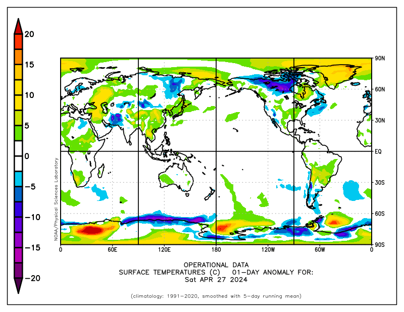
From: R. Gates on August 2, 2010 at 1:40 pm
The last part is my point. You threw up a link to an anomaly graph of unknown baseline while talking about how warm the waters were. At best, it shows temps relative to something, with most of the Arctic basin at some unknown temp somewhere between 0 and 1°C above something. Since the salt water of the basin can be below zero without freezing, by that anomaly map relative to something, for all one can tell that whole yellow area could be below the freshwater freezing point, while you are talking about the ice melting due to warm water.
Thus that anomaly graph is not data, as it is not known what it is referencing. It is garbage.
And since the baseline is unknown, it may well be showing that temps are below what is currently normal, although offhand since you threw up a simple link it likely is related to something current.
Backing up the URL, I found the originating page:
http://polar.ncep.noaa.gov/sst/ophi/Welcome.html
Which lead to this graph showing actual temperatures:
http://polar.ncep.noaa.gov/sst/ophi/color_sst_NPS_ophi0.png
Which clearly shows most of the Arctic basin is at least MINUS 1.5°C and colder. Good luck getting lots of sea ice melt at those “warm” sea surface temperatures.
R. Gates says:
August 2, 2010 at 2:14 pm
savethesharks says:
August 2, 2010 at 1:04 pm
Fuzzylogic19 says:
August 1, 2010 at 11:55 pm
savethesharks says:
August 1, 2010 at 10:59 pm
What fuzzylogic19 and RGates and many others can not seem to comprehend…(or don’t want to comprehend)….in regards to 30 years of satellite measurement of ice:
How many 30 year periods does it take to get 4.6 billion?
4.6 Billion / 30 = 153,000,000
***
And the relevance?
=====================================
Figure it out yourself.
Res Ipsa Loquiter
_________
Except for the fact that there were not humans around during 99.9% of that time dumping CO2 into the atmosphere are rates far beyond anything that the natural geological cycle would create. To argue that the last 30 years are not important because they are ONLY 30 years of a much longer history of earth is like saying that the 10 seconds that someone is having a heart attack ought to be ignored as a aberration if they enjoyed a lifetime of good health up to that point. Illogical…
================================
Assumptions. Assumptions. ASSumptions.
All you know how to do is make ASSumptions, R.
You can’t prove rates “far beyond the natural or geological record.”
You can’t make the link between anthropogenic pollution (no one will deny there is a problem there) and CO2 being a “pollutant” and CO2 rises in the atmosphere being largely anthropogenic in origin.
And don’t spin my argument and say that I said the last 30 years are not important.
I did NOT say that.
Also, thanks for the good laugh on the “heart attack” analogy.
The Earth is about to have a heart attack?
Well you can go on believing that.
I am glad though, that you ended your words with the word “illogical” because that is the pot calling the ole kettle black.
Chris
Norfolk, VA, USA
Amino Acids in Meteorites says:
August 2, 2010 at 8:09 pm
I think it’s clear Arctic ice is not in a death spiral. Everyone can agree. 😉
____________
Thanks for the comic relief.
David W says:
August 2, 2010 at 6:56 pm
According to Cryosphere Today, the Beaufort Sea ice is nearly all gone already and there hasnt been anything spectacular about the rate of loss for that area this season. As far as i can tell it hasnt been a major driver of this seasons variations and won’t be for the remainder of the melt season.
OK, fair enough – let me be more explicit:
Don’t forget the Beaufort Sea, and the Arctic Basin north of its boundary line. The Beaufort Sea has the warmest water closest to the sea ice:
http://ocean.dmi.dk/satellite/plots/satsst.arc.d-00.png
Cryosphere Today has useful graphs for the various Seas, but its mask of the regions is not too accurate:
http://arctic.atmos.uiuc.edu/cryosphere/IMAGES/region.mask.gif
The Beaufort, Chukchi and East Siberian Seas are defined differently outside of the Arctic Climate Research group at UIUC:
http://www.deepseawaters.com/image/Beaufort_Sea.jpg
http://www.worldatlas.com/aatlas/infopage/chucksea.gif
http://www.worldatlas.com/aatlas/infopage/esibsea.gif
As long as Cryosphere Today covers the entire Arctic, and is consistent year to year, it doesn’t really matter how they slice it up…
However the different organizations define the regions, the Beaufort, Chukchi, East Siberian, and Laptev Seas and the Arctic Basin north of them are the areas that will melt most in the next 6 or 7 weeks.
http://www.worldatlas.com/aatlas/infopage/laptvsea.gif
Looks like the ice is pretty thin already in many places:
ftp://ftp-projects.zmaw.de/seaice/NEAR_REAL_TIME/Arc_latest_large.png
stevengoddard says:
August 2, 2010 at 6:43 pm
Anu
Here is my forecast. You will say in September that I just got lucky.
That’s the spirit !
Don’t admit defeat until the bitter, bitter end.
That makes it more fun for me.
‘Striling English says:
August 1, 2010 at 10:43 pm
The UK soccer season is soon to start.
As everyone here seems to be so fascinated with making forecasts rather than seeing what actually happens..- much like the criticism rightly made of those who mistake climate model output for experiments – can anyone help me with my wee little flutters for the footie?
I need outright winners for the Premiership, Championship, Division1 and the FA Cup.
Thanks in advance.’
The Premiership will oscillate wildly until Christmas, as then the scottish journos can back and lay multiple horses and make money from them all through fluctuating odds. Then after Christmas the serious money will back one horse and the matches will be arranged accordingly. As the Arabs are the richest, they should not be disregarded.
Championship: I’d back Notts Forest as Billy D. didn’t want to get promoted last year as he got promoted too soon with Derby and lost his job as a result. And SAF wants another Scottish manager in the EPL: they’re always his friends.
League 1: Southampton.
FA Cup: not Arsenal as Wenger thinks it’s a diddly cup.
R. Gates says:
August 2, 2010 at 9:19 pm
Amino Acids in Meteorites says:
August 2, 2010 at 8:09 pm
I think it’s clear Arctic ice is not in a death spiral. Everyone can agree. 😉
____________
Thanks for the comic relief.
——————————————————————–
I knew there would be a few that didn’t agree.
Phil writes:
“What part of ‘surface’ don’t you understand?”
In most of the central Arctic there is no water surface to measure, because it is covered by ice. I just wondered how they manage to measure the water temperature there.
” Marcia, Marcia says:
August 2, 2010 at 2:39 pm
Could Arctic updates be twice a week instead of just once a week for these last 6 – 7 weeks? There is a long list of comments in this thread since yesterday”
Please not.
Unfortunately, it is just a few people writing the same thing over and over again. And while I agree that Goddard’s way of presenting things is very good, you can get the most “important” information yourself (see Sea Ice Page).
The “death spiral” of Dr. Mark Serreze:
Who said this:
“…probably too much was read into 2007, and (Serreze) would take some blame for that”
Yes, it was, and he did:
ttp://www.wired.com/wiredscience/2010/06/seaice_models/