By Steven Goddard,
")
http://ocean.dmi.dk/arctic/meant80n.uk.php
Summer is rapidly winding down in the Arctic, and (based on DMI graphs) the region north of 80N appears set to finish the summer as the coldest on record. So far, there have only been a small handful of days which made it up to normal temperatures. The Arctic is one of many places described by climate scientists as “the fastest warming place on earth.”
Ice melt during July was the slowest in the JAXA record.

NCEP is forecasting below freezing temperatures for the next two weeks across much of the Arctic.

http://wxmaps.org/pix/temp2.html
Solar energy received in the Arctic is in rapid decline, as the sun drops towards the horizon.

http://earthobservatory.nasa.gov/Features/EnergyBalance/page3.php
As we forecast two weeks ago, PIPS average ice thickness has bottomed out between 2006 and 2009.
")
Ice thickness has increased by 25% since 2008, indicating that PIOMAS claims of record low volume are probably incorrect. PIOMAS models are often used as a “data” source by global warming activists as evidence that the Arctic is in a “death spiral.”

Below are the PIOMAS forecasts for the rest of summer. PIOMAS is expecting a big melt in August, because they believe that the ice is very thin.

Next week we will start visual comparisons of actual extent vs. PIOMAS forecasts.
Ice extent is tracking below 2006 and above 2009, just as the PIPS thickness data has indicated all summer. Evidence so far points towards PIPS being a very reliable data source.
")
http://ocean.dmi.dk/arctic/icecover.uk.php
The modified NSIDC image below shows how 2010 has diverged from 2007. Green areas have more ice than 2007, and red shows the opposite.

The modified NSIDC image below shows ice loss over the last week in red. As predicted in last week’s Sea Ice News #15, there has been substantial loss in the East Siberian and Chukchi Seas. Based on NCEP weather forecasts, this will continue for at least one more week.

The next modified NSIDC image below shows the differences between current Arctic ice and September, 2006. Areas in green indicate how far the ice will have to melt back to exceed the 2006 minimum. Areas in red show where ice loss has already exceeded the 2006 minimum.

Our PIPS based forecast of 5.5 million km² continues to be right on track.
Meanwhile down south, Antarctic ice continues near record highs.
")
http://nsidc.org/data/seaice_index/images/daily_images/S_stddev_timeseries.png
There has been much press this year about a “record polar melt” in the works. This information is incorrect, but it is seems extremely unlikely that the scientists behind those reports will make much of an effort to set the record straight.
The Arctic Oscillation is forecast to turn negative again, hinting at cooler weather in the Northern Hemisphere starting in about a week.

Much of Russia, Siberia and the former Soviet Republics are already seeing well below normal temperatures, but this is (of course) not being reported by the press.

http://www.esrl.noaa.gov/psd/map/ANIM/sfctmpmer_01a.fnl.30.gif
Steve Goddard said
“AndyW
8806563 – 6922031 = 1884532
http://www.ijis.iarc.uaf.edu/seaice/extent/plot.csv”
As JAXA does the day before loss/gain shouldn’t that be from 8723594 to 6819531, ie from the measurement posted on the 2nd July to the measurement posted on the 1st of August? That would give you the loss or gain from 1st July to 31st July. That equals 1.987032. Your measurement is the total from the 30th June to 30th July.
Andy
Which is right?
Check out the ice to the north of Canada in this estimate
http://ice-glaces.ec.gc.ca/Ice_Can/CMMBCTCA.gif
touching the coast at the left. Now Bremen
http://www.iup.uni-bremen.de:8084/amsr/arctic_AMSRE_visual.png
Now I know that traditionally Bremen shows less than the Candian ice service, but I have never seen such a big difference. Any thoughts Steve or anyone?
Andy
R Gates how can a change that is taking place over the course of 50 years be rapid for the biosphere? In glasshouses (the best testbed for the greenhouse effect) they artificially increase CO2 levels to make plants grow faster. A crop takes a season to grow not 50 years. After 50 years we should be able to measure the impact if somebody was interested. What else but increased CO2 levels explains the greening of the Sahel? Pitty WUWT does not give satelite measures of this annually. I always hear that the worst affected are the poorest. Who is poorer then the people in the Sahel? The answer is easy, increased CO2 just like in glasshouses increases biomass. There is a video somewhere on the Internet where Freeman Dyson explains how the US could offset China’s industrial revolution by applying new land usage techniques. What is in the atmosphere is a fraction of the CO2. Clearly earth is reponding to increased CO2 levels with increased biomass. Please explain me where this is negative? How can increased biomass be negative for humans and animals alike? Personally I would be more interested in a weekly update of the greening then in an Artic Ice volume. I somehow think it matters more to mankind. This Artic Ice volume is an irrelavant side battle. I challenge Steven or anybody at WUWT to get me a similar measurement for Biomass. The Sahel is a great starting point as somehow the poor are precisely the people the AGW crowd claim to protect.
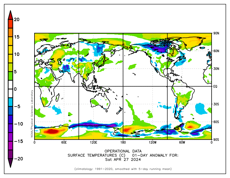
Yes, please look at how cold those SST’s are in the Arctic:
http://polar.ncep.noaa.gov/sst/ophi/color_anomaly_NPS_ophi0.png
Sarcasm off.
Hard for ice not to melt when the water is so warm all around it.
The north polar sea ice quantity seems to be rather low in 1987, judging from this photo of 3 submarines on the surface.
http://www.americanthinker.com/blog/2008/07/north_pole_ice_melting_fear_mo.html
The photo was taken on 18 May, long before the minimum extent for that year. Yet the web pages referenced by richcar 1225 above show extents higher than current. How am I reading this wrong?
LucVC says:
August 2, 2010 at 10:56 am
R Gates how can a change that is taking place over the course of 50 years be rapid for the biosphere? In glasshouses (the best testbed for the greenhouse effect) they artificially increase CO2 levels to make plants grow faster. A crop takes a season to grow not 50 years. After 50 years we should be able to measure the impact if somebody was interested. What else but increased CO2 levels explains the greening of the Sahel? Pitty WUWT does not give satelite measures of this annually. I always hear that the worst affected are the poorest. Who is poorer then the people in the Sahel? The answer is easy, increased CO2 just like in glasshouses increases biomass. There is a video somewhere on the Internet where Freeman Dyson explains how the US could offset China’s industrial revolution by applying new land usage techniques. What is in the atmosphere is a fraction of the CO2. Clearly earth is reponding to increased CO2 levels with increased biomass. Please explain me where this is negative? How can increased biomass be negative for humans and animals alike? Personally I would be more interested in a weekly update of the greening then in an Artic Ice volume. I somehow think it matters more to mankind. This Artic Ice volume is an irrelavant side battle. I challenge Steven or anybody at WUWT to get me a similar measurement for Biomass. The Sahel is a great starting point as somehow the poor are precisely the people the AGW crowd claim to protect.
__________
Outside of the obvious ones, like sea ice loss, ocean acidification, stratospheric cooling, and now apparently plankton decline, I haven’t studied the actual effects on the biosphere from increases in CO2. From a geological and climatological persepctive, the 40% increase in CO2 is very rapid, and it would be hard to imagine that natural systems would be in place that could accomdate this rapid change. Some species may benefit and some may not. If plankton are indeed declining, as some recent research suggests, this could be a negative effect for the chain of life in the sea, and also for land based plants, and potentially animals. I think it is far too simple a viewpoint to say that a 40% increase in CO2 will be overall beneficial for the biosphere. There are too many other variables to consider, and over the past 400,000 years at least, the web of life on earth has gotten used to a much lower level of CO2 than we are seeing now.
Dan in California says:
August 2, 2010 at 11:14 am
The north polar sea ice quantity seems to be rather low in 1987, judging from this photo of 3 submarines on the surface.
http://www.americanthinker.com/blog/2008/07/north_pole_ice_melting_fear_mo.html
The photo was taken on 18 May, long before the minimum extent for that year. Yet the web pages referenced by richcar 1225 above show extents higher than current. How am I reading this wrong?
____________
This is akin to looking at the weather. We have plenty of satellite data from 1987, and we know that there was pretty much HIGHER than normal Arctic Sea ice that entire year. See:
http://arctic.atmos.uiuc.edu/cryosphere/IMAGES/sea.ice.anomaly.timeseries.jpg
And scan to 1987.
It seems skeptics love to post these kinds of pics as proof that nothing unusual is happening with the Arctic, but thankfully, we’ve got hard data and we know that the long term trend is down and has been for decades. The picture is interesting though meaningless from a climate perspective.
Steve, if I look at rates of ice survivability for different ice age classes during the satellite record, I find that the last few years have shown lower survivability for MYI. Part of it appears to be a result of ice not surviving the transit through the Beaufort Gyre in summer like it used to, which could be a result of overall thinner MYI, warmer ocean and atmospheric temperatures, changes in the timing of melt onset and freeze up, etc.
A prediction based on ice age survivability unfortunately does not take into account how thick that ice is. I think statistics can be insightful but they have their limitations, and thus my prediction may give a ballpark estimate based on “typical” ice behavior but it then needs to evolve with additional information such as thickness, atmospheric/oceanic circulation, etc.
R Gates writes:
“It is obvious that you don’t understand what David Barber et. al. mean by “rotten ice” as pertaining to the Arctic Ice pack.”
Apparently I don’t, because I thought that it meant what it has always meant when dealing with sea-ice, i e ice in the last stage of melting. This is an universally accepted term that has been used and is used in ice reports (including the arctic) for decades.
Apparently the term now has some new and mysterious meaning when used by the climate science community.
Amino Acids, yes the positive AO state in the late 80s/early 90s is an important factor in the ice losses observed during this past decade. I don’t look at CO2 as causing that AO phase.
Yet the AO is just one part of it. Other changes in atmospheric and oceanic circulation that are bringing more heat into the Arctic (temperatures have been anomalously warm in all seasons in the Arctic since about 2001), the timing of melt onset/freeze-up, changes in summer wind patterns, etc. are all contributing to the continued ice losses in summer.
How much CO2 is contributing to these changes remains unclear, but it is only when you run climate models with the observed record of GHGs are you able to reproduce the decline in the summer ice cover (though not as quickly as what has been observed). Running the models with pre-industrial levels does not show the summer ice cover shrinking. I know climate models have lots of uncertainties, and strengths of feedbacks may not always be realistic, but they can be useful tools to help us better understand responses in the climate system.
R Gates writes:
“Yes, please look at how cold those SST’s are in the Arctic:
http://polar.ncep.noaa.gov/sst/ophi/color_anomaly_NPS_ophi0.png”
That is a pretty fascinating map. I wonder how they manage to measure the water temperature under the ice? And apparently they have been doing it long enough to have a standard period (30 years?) to compare it with too.
Incidentally the temperatures are rather badly off for the bay of Bothnia, which is colder than indicated on the map.
stevengoddard,
A suggestion – since your 5.5 million km² minimum extent prediction for this season isn’t based on the DMI extent graph but rather (I believe – correct me if I’m wrong and you prefer the NSIDC measure or some other one, not that you’re showing it either) on the published IARC-JAXA ice extent data, wouldn’t it be better to at least show the IARC-JAXA sea ice extent chart in each of these Sea Ice News posts? Sure people can go look at it themselves but how can you justify not showing the progress of the actual metric by which the success or failure of your prediction will be judged?
From: R. Gates on August 2, 2010 at 11:10 am
For an anomaly map without notation of what the baseline was nor how it was calculated, with -1 to 0°C on the edges where melt is expected and only 0 to 1°C for the majority of the area, looks rather average and not that bad for the Arctic basin. Heck, that could be just +0.1 above for most of the basin for a baseline with covers some very large sea ice extents, thus boding well for the 2010 minimum.
Fuzzylogic19 says:
August 1, 2010 at 11:55 pm
savethesharks says:
August 1, 2010 at 10:59 pm
What fuzzylogic19 and RGates and many others can not seem to comprehend…(or don’t want to comprehend)….in regards to 30 years of satellite measurement of ice:
How many 30 year periods does it take to get 4.6 billion?
4.6 Billion / 30 = 153,000,000
***
And the relevance?
=====================================
Figure it out yourself.
Res Ipsa Loquiter
From: AndyW on August 2, 2010 at 10:41 am
Bremen link is not working, neither is:
http://www.iup.uni-bremen.de:8084/
Page Load Error
Connection Interrupted
The connection to the server was reset while the page was loading.
I think you broke it.
🙂
Djon said:
August 2, 2010 at 12:53 pm
stevengoddard,
A suggestion – since your 5.5 million km² minimum extent prediction for this season isn’t based on the DMI extent graph but rather (I believe – correct me if I’m wrong and you prefer the NSIDC measure or some other one, not that you’re showing it either) on the published IARC-JAXA ice extent data, wouldn’t it be better to at least show the IARC-JAXA sea ice extent chart in each of these Sea Ice News posts? Sure people can go look at it themselves but how can you justify not showing the progress of the actual metric by which the success or failure of your prediction will be judged?
_____
For exactly the same reason Steve used to show the NSIDC graph for the Arctic when it was close to the mean value in March, but now it has gone well below he has swapped to the Antarctic version which is well above. When that goes below, and the trend is down, it will be forgotten too.
It’s all part of the big game, however, Steve’s posts here are very worthwhile daily reading and I am glad he and Anthony are concentrating on this fascinating subject since climateaudit sadly gave it up for more spurious matters such as the weather in East Anglia, England, even though we tend to disagree in the main. It would be very boring if we all did 🙂
Andy
Andy
kadaka (KD Knoebel) says:
August 2, 2010 at 12:59 pm
From: R. Gates on August 2, 2010 at 11:10 am
Yes, please look at how cold those SST’s are in the Arctic:
http://polar.ncep.noaa.gov/sst/ophi/color_anomaly_NPS_ophi0.png
For an anomaly map without notation of what the baseline was nor how it was calculated, with -1 to 0°C on the edges where melt is expected and only 0 to 1°C for the majority of the area, looks rather average and not that bad for the Arctic basin. Heck, that could be just +0.1 above for most of the basin for a baseline with covers some very large sea ice extents, thus boding well for the 2010 minimum.
________
Heck, with logic like that, you’ll convince yourself that we are seeing much colder SST’s in the Arctic than normal. The data is what it is. Wide ranging higher than normal SST’s in and around the Arctic. And I’m not sure what you mean by “boding well for the 2010 minimum. The minimum is tracking below 2008 & 2009 but slightly above 2007 right now, with lots of lower concentration ice melting rapidly, tracking pretty much where I thought it would be. 2010 is a continuation of the sharp drop in summer minimums we’ve been seeing the past few years…nothing surprising.
tty says:
August 2, 2010 at 12:29 pm
R Gates writes:
“Yes, please look at how cold those SST’s are in the Arctic:
http://polar.ncep.noaa.gov/sst/ophi/color_anomaly_NPS_ophi0.png”
That is a pretty fascinating map. I wonder how they manage to measure the water temperature under the ice?
What part of ‘surface’ don’t you understand?
savethesharks says:
August 2, 2010 at 1:04 pm
Fuzzylogic19 says:
August 1, 2010 at 11:55 pm
savethesharks says:
August 1, 2010 at 10:59 pm
What fuzzylogic19 and RGates and many others can not seem to comprehend…(or don’t want to comprehend)….in regards to 30 years of satellite measurement of ice:
How many 30 year periods does it take to get 4.6 billion?
4.6 Billion / 30 = 153,000,000
***
And the relevance?
=====================================
Figure it out yourself.
Res Ipsa Loquiter
_________
Except for the fact that there were not humans around during 99.9% of that time dumping CO2 into the atmosphere are rates far beyond anything that the natural geological cycle would create. To argue that the last 30 years are not important because they are ONLY 30 years of a much longer history of earth is like saying that the 10 seconds that someone is having a heart attack ought to be ignored as a aberration if they enjoyed a lifetime of good health up to that point. Illogical…
A request:
There is ~6 weeks left till minimum. This is getting interesting. Could Arctic updates be twice a week instead of just once a week for these last 6 – 7 weeks? Let’s say Wednesday and Sunday, or Thursday and Sunday, instead of just Sunday? There is a long list of comments in this thread since yesterday so I can see it’s not just me sitting on the edge of my seat waiting until minumum happens. Both sides, and those that are neutral, (if there are any of those), seem to be watching a good sporting event.
There could be enough change in Arctic ice during the week where a second update would be worth it.
This may have been answered before, but has anyone seen or know of an explanation of the continuing large discrepancy between the Arctic ice area numbers for CT and Nansen Arctic ROOS?
Dave says:
August 2, 2010 at 8:04 am
The past two days have had close to 100,000 melt each day. I refer to look at the numbers rather than the charts.
An average around 40, 000 for the rest of the melt season will approach 2007 lows.
Like I said , it will take an average under 30,000 per day to set a low of Steve’s predicted 5.5 million. Unless it slows quickly it should end up less than that.”
The thing is, an average of 40,000 per day during August is not out of line with what we’ve seen in recent years. After August you generally see another 200-300 sq km lost. If both these things occur then its going to be very close to Stephens prediction.
I’m still expecting a significant slowdown in melt within a week once most of the ice in the East Siberian and Chukchi Seas is gone. Were very shortly going to find out how “rotten” the ice is in the Arctic Basin.
Viv Evans says:
August 2, 2010 at 3:51 am
[Tenuc says, August 2, 2010 at 12:10 am:
“I think we are going to have an early start to the NH winter, as the first batch of swallows have already congregated on the telegraph poles and departed for warmer climes. This is 5 weeks earlier than normal here on the south coast of the UK and is not a good sign.”
“Is it possible that you have been seeing swifts, rather than swallows?
Swifts migrate back around the middle of August, swallos and house martins stay until September.
But even if you saw swifts rather than swallows – it is indeed a bit early for them to start leaving.”
No Viv, it was definitely swallows. I’ve not seen any swifts locally for the last three years only swallows and martins. This is why I was surprised and think we’re in for a very early winter.
Other SST anomaly site –
Peter Ellis says:
August 2, 2010 at 10:33 am
stevengoddard says:
Meltponds confusing the satellite data.
So the abnormally low concentration data is due to an abnormally high degree of melt ponding? Are these the same melt ponds you keep telling us are frozen over? Just for the record…
Too bad it’s been so dang cloudy up there that looking at the sat. images has been less fun. Still, are those melt ponds, or open water spaces that can be seen all over through the clouds?
http://ice-map.appspot.com/