By Steve Goddard

The Catlin Expedition is Now only 45 miles away from the North Pole. They have traveled 265 miles (as the crow flies) since March 3, for an average of about four miles per day. They only have a few days left on the ice and are caught in The Beaufort Gyre. They write:
Imagine being chilled to the very bone; where every step brings pain and discomfort; where there is no way of getting respite from a permanently aching back; where hauling a sledge twice your body weight is like dragging a car with the handbrake on; and where, despite trekking for over eight hours in the type of biting winds that feel like being relentlessly pecked at by invisible crows, you are getting nowhere. Literally nowhere. Caught on a polar treadmill that will happily drive you backwards if you stop your herculean efforts to…. Just. Keep. Going. Some 50-odd days into the expedition, and Ann, Charlie and Martin find themselves once again suffering from the powerful negative drift that persecuted them at the start of their mission. Aside from pressure ridges, open leads of water and large patches of thin ice, negative drift is one of the biggest factors affecting Arctic crossings. Psychologically, it is the most damaging of all.

Soon they can return home and report on the rapidly melting, highly acidic Arctic.
Temperatures in the Arctic are close to normal, and will be above freezing in about a month.

http://ocean.dmi.dk/arctic/meant80n.uk.php
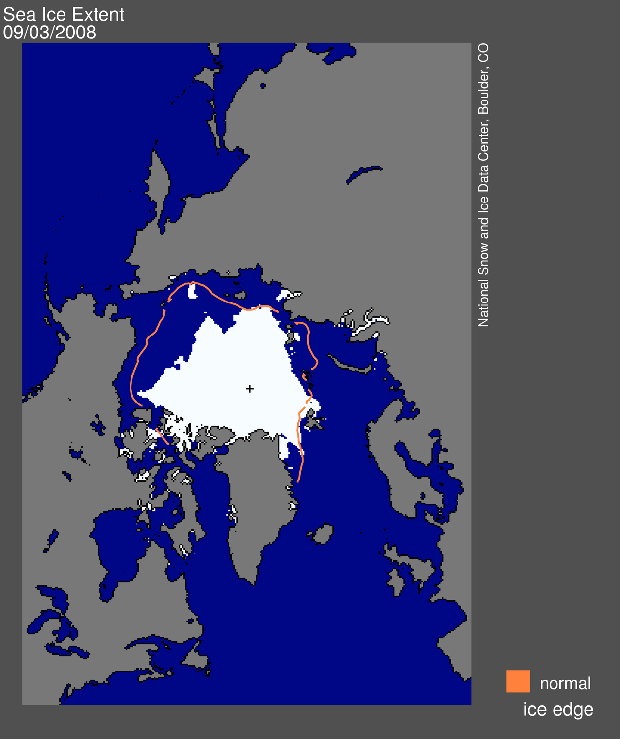
Arctic ice extent is also close to normal.

http://arctic-roos.org/observations/satellite-data/sea-ice/observation_images/ssmi1_ice_ext.png
The big story during the last few days is the divergence between the different data sources.

JAXA (green) is nearly half a million km2 lower than NORSEX (red.) DMI (fine dots) and NSIDC (purple) are half way in between. All are within one standard deviation of the mean (i.e. normal.) Unfortunately the NSIDC computer has been naughty and hasn’t updated any of their graphs or maps since Friday.
This time of year shows almost no year over year variation in extent or area. Ice extent has now declined by over one million km2 since the late March peak. The modified NSIDC map below shows in red, the total melt since early April.

The next modified NSIDC map shows where ice has melted during the last week.

The modified NSIDC map below shows where ice is above normal (green) and below normal (red.)

Ice continues to be above normal on the Pacific side where the waters are running very cold, and below normal on the Atlantic side where the waters are running warm.

http://weather.unisys.com/surface/sst_anom.html
The Pacific side of the Arctic is where the anomalies (red) have mainly been the last few summers, so things are shaping up for a nice recovery this summer.

Modified September 3, 2008 map from http://nsidc.org/images/arcticseaicenews/20080904_Figure1.png
Within a few weeks, ice in the central Arctic will quit thickening and start to melt. Stay tuned. The next few weeks will be slow news.
“”” barefootgirl says:
May 11, 2010 at 5:34 pm
George E. Smith says:
May 10, 2010 at 2:04 pm
George you are so way off base about most things you wrote, it’s laughable to me. And I’m not going to bother to educate you any longer as you are not worth it. Do yourself a favor and educate yourself about Arctic science. READ the hundreds of journal articles about the sea ice instead of trying to rely on application of your education background to a subject you obviously know nothing about. Better yet, analyze the data yourself. Download all of NSIDC SMMR, SSM/I AMSR brightness temperatures, run whatever sea ice algorithm you feel is best (or even better, run them all and then make comparisons with observations, visible imagery, etc. to determine the most accurate algorithm), then also apply melt onset and freeze-up algorithm to the TB time-series, download all the submarine sonar data, the GLAS laser altimeter measurements, the radar data, the ocean buoy data, the atmospheric data and start to do your own analysis. You seem to think you know more than the scientists who daily analyze all this data, develop the algorithms to convert raw satellite data to geophysical parameters, etc. etc etc. I know that you do not as you have made that clear with your posts here on this blog.
But go ahead and give it a try. Make your retirement something worthwhile. Have something to back up your continuously irrelevant statements with. “””
Well barefootgirl you have never caught me claiming to know anything about arctic science; let alone know more than the scientists who work in that field; because I have never made any such claims; or anything that could be construed as making any such claims.
I’ve simply made some simple comments that anyone could make, who simply clicks on the JAXA and DMI icons on the side of this page and looks at what is at least purported to be real scientific data, obtained by real working scientists, and presumably knowledgeable about Arctic science. If I have somehow read those graphs incorrectly, then yes there’s a problem. Of course they do have a habit of sometimes changing those graphs, so it is hard to keep up with.
But actually; I’m not too interested in Arctic science; it doesn’t seem to me to be an environment that humans are likely to want to live in; there are plenty of much more liveable places. But I don’t mind if other folks want to go there for whatever reason that motivates them.
I’m happy to learn that there is data that goes back to 1972 or even to April 1960 or hundreds of years ago. But it does seem funny to me, that then scientists would cherry pick the period from 1979 to 2000 to establish a “normal” Arctic condition; and then talk in horrified terms whenever anything changes from that arbitrarily selected “normal” climate condition.
The various discussions that appear here generally arise from the publication by the various media that communicate with the public of stories, warnings, predictions; excuse me, that’s projections, of future dire events that are communicated to those media from Scientists, such as that whole list of expertises that you cite.
The public has no way to know whether such reports are accurate, or exaggerated; or flat out untrue; so they are at the mercy of those scientists who communicated that “information” to the media. If it isn’t true; the onus is on those scientist who brought it up to correct it; if it is exaggerated they owe it to the public to present the truth about it. Either that or they should simply not intrude their “scientific” results, in to the public political process.
Oh I forgot; you all need to get the public; taxpayers if you will, to continue to fund your studies; so you have to either inspire them or scare them, into going along with your support.
Just like Jacque Cousteau used to routinely kill fish to feed to sharks to get them into a feeding frenzy, that he could film; so he could then tap Americans for funding for his global scuba diving treks. He even once described Sport Fishermen as the lowest form of life like the snakes that crawl on their bellies; who catch fish for the fun of it (he was doing it for science of course). Well he sure learned in a hurry, that a good percentage of the funding of his world travels was actually provided by those very same sports fiehermen he despised; including a lot of good people who put as much effort as he had into observing the world’s oceans and their resources; and caring for those.
So barefoot girl, I am not the one who is publishing graphs of “ice coverage” that is really 85% of open water, and only 15% of actual ice; those graphs are published by qualified expert (presumably) arctic scientists who know what they are talking about.
Now I can sure see why a shipping company, could be very interested in knowing that 15% of the water they were trying to navigate through was hazarded by floating sea ice chunks; but why such a threshold would be of interest to Arctic scientists or Climatologers; I certainly don’t get; but then as I said; it is not a subject I’m greatly interested in; and the only reason I pay any attention at all, is because of the very dire predictions ( well projections) that are made almost daily; by the very scientists you are describing.
Now where in all of the rubbish that I posted did you find that little snippet about my retirement ? It may come as a surprise to you to learn that there are actually people working at real profit making jobs; who pay taxes that go to support all of that research that you and a whole host of other incognito “expert scientists” do. And more and more of us are wondering just what we are really getting for our investment in people who are even ashamed to use their own name to back up their claims.
So get off your high horse barefootgirl; if you don’t want to be a part of the solution; at least stop being a part of the problem.
Espen says:
May 12, 2010 at 8:13 am
Going by the inverse essentially of a Heinrich event , 4627yrs astronomically,
starting at around -2650, you will see maximum 12;
http://www.geo.arizona.edu/palynology/geos462/holobib.html
Counting forwards in 1157yr steps maps out the warmer periods through the MWP to the present. Every 4th event cluster is warmer, the opposite of a Heinrich event.
Joe D`Aleo gave a presentation at Piers`s Climate Fools Day conference and discussed the c. 1150yr cycle, I`m sure many others are well aware of it too.
So you have a roughly 400yr span for either colder or warmer events within each 1157yr sub-cycle, and stronger at every 4th time, every 4627yrs. On the long term negative side, I would say that every 3rd Heinrich event is stronger. Such that 3 H periods back from the LIA, was the Older Dryas, so the return of the Younger Dryas is yet to come. Currently though, many decades centered 179yr would be particularly warm, and the equivalent of the warmest of the Bronze Age, not allowing for the slow march down into the distant next Ice Age.
Ulric Lyons says:
May 12, 2010 at 11:57 am
Also these sequences are sawtooth in shape like the larger Ice Age sequence, with the warmest periods appearing soon after the coldest episodes, which suggest to me that Milankovich was not right, and that the forcing is solar variation at all timescales, except for the influences of continental drift and the raising of mountain ranges.
I believe that if you search the archives for anything I have every written here about the Arctic ice; one thing you will discover is that at no time have I ever made any prediction as to what the future state of the arctic ocean ice is likely to be. I’ve commented on what data has been readily available from the JAXA icon there on the right, and DMI as well, and I’ve commented on what some processes going on up there might be.
I’ve never queried or challenged assertions by others, as to what the thickness of that ice up there may or may not be; or what it might be in the future. From time to time, Phil has interjected comments; usually with reference citations regarding other data sources often relating to that thickness. I always religiously follow up on any citations that Phil posts; specially to comments from me; What the hell is the point of being here; if we aren’t all trying to learn as much as we can about these phenomena; or in some cases try to teach; if our fields of expertise affords us that opportunity.
I typically do not try to back down the trolls; nor do I seek to jump on other folks who maybe don’t quite understand; well to be pedantic; folks who may seem to me to not understand. And I deliberately stay away from discussions where I know I clearly don’t understand. I have no idea or clue as to how El Nino or La Nina, or ENSO or PDO, or AMO or any of those other acronyms function; and I’m not going to even try to understand. Yes they are interesting; and I know that they certainly affect local weather; but I am sure that there are plenty of meteorologists or Climatologers who do understand that stuff, and can keep track of what is going on.
There’s only one issue that really appeals to me; and that I think is important to understand. And that issue is whether in any possible way, the emission of CO2 by humans from burning fossil fuels or non fossil fuels in the case of forest burning, can change the earth’s climate so as to move it out of the normal stable but varying comfortable range that it seems to have had for all of the time since we gave up on trying to survive on clean green free renewable abundant energy from clambering around in fig trees.
And on that issue, I am not the vaguest bit skeptical. I’m quite confident that the answer is no; we cannot alter the mean temperature of this planet, either up or down, from its normal natural variable range, even if we wanted to; and if we could, we are certainly nowhere near smart enough to know in which direction to move it.
And I believe that that will remain true so long as the oceans of the earth persist; and the outcome will have virtually nothing to do with the total atmospheric content of CO2; nor where that CO2 came from. The earth temperatuire range depends almost entirely on the physical , chemical, and likely biological properties of the H2O molecule in all three of its common phases, as are found permanently in the earth’s atmosphere.
And that does not mean that we are incapable of polluting our environment, to the point of endangering ourselves and other species. That is a separate issue; and nobody on this planet, is more interested in working to see that doesn’t happen, than I am.
But labelling CO2 a dangerous pollutant, that is a threat to humans and all life on this planet, is worse than silly; or destructive; it is criminally insane to make such a claim.
A couple of months ago there was a post here linking to a statement from NSIDC (I think) that they’d got ahold of the data from a military satellite from before 1979 and they were going to try to reconstruct coverage / extent curves from them.
Just for the record.
The JAXA “ice extent” icon on the side here shows (reading from graph) that 2007 “ice extent” was about 14.0 Msqukm at about March 27/8, and was minimum at about 4.4 Msqukm about sept 24/5 or so.
2008 min was about 4.8 Msqukm at about sep 12/13 or so, and in 2009 it was about 5.2Msqukm at about sep 15-16.
These data were read off the graphs which have truly lousy colors to try and see, and my eyes aren’t so good. Yes maybe you can find the actual numeric data there somewhere with the real numbers. I do know that at least the 2008 minimum and refreeze graph was revised some time after it was published and they moved theat refreeze part of the curve significantly reducing the gain that had previously been reported. And no I did not draw these graphs; so i presume they were drawn my competent fully credentialled Climatologers; or at least Arctic scientists; so I simply take their word for it since I’m not any sort of expert in that field.
And typically, Phil has often added to my comments on those points wih his citations (much appreciated) of other sources of data that relate to the ice thickness; or maybe to the “ice area” as distinct from JAXA’s “ice extent”.
I make no claim that I believe JAXA “ice extent” is the definitive source on this issue; it is simply one that is readily available to me just by clicking on the icon on the side there; so I have stayed with that purely for continuity, and consistency. And invariably when we have talked about this phenomenon; others have trotted out cryogenics or whatever who for some reason draw ice in purple or some other source that has a different idea and data; and there has been a lot of discussion as to whether JAXA knows what they are doing. But not from me; because I just believe that what they put out is their true belief in what they observe and that is good enough for me; well I am always amenable to being shown by true experts; that JAXA is all wet for some reason (that they can explain to lay persons)
And I’ve never made any predictions, projections, hopes or whatever as to where this is all going. I’m simply watching it happen as a lot of folks here do. If it all melts in five years as Gore and other Climatologers predict; then so be it.
But I do continue to be mystified as to why 1979 is considered such a pivotal year in all of this, and 1979 to 2000 to be the optimum period for determineing what is normal.
Consider this.
Suppose as we are now told, that the arctic ice coverage, extent, area, whatever data goes back to 1972, or April 1st 1960 when the first polar orbit satellite went up to start the data stream going; or even earlier when folks actually walked around up there and measured it all, just as the Catlin expedition is now doing. Then we have several possibilities. That pre 1979 data could show that there was much more ice in 1972 than in 1979 or 2007, and maybe there was even more in 1960. If that was the case (I have no idea) then surely the Climatologers or Arctic Scientists would cite those larger numbers to show how really bad it has gotten since; after all the more ice they can show has been lost; the more credible is their disaster scenario; not that anyone has shown that an ice free arctic would be a disaster.
The other possibility of course could be that the 1972 or 1960 data might show, that htere was somewhat less ice back then than in 1979; who knows it might have gotten to as little as 2007.
Oh well it simply wouldn’t do to tell anybody that melts like 2007 might happen quite often; and we have already heard that in fact in 2007, much of that ice was blown out of the arctic ocean so it melted somewhere else in warmer waters. Yes it still melted; but not because of a warmer Arctic.
So how come all this suppression of the 1960 to 1979 data; at least from popular exposure; or is it just embarrassing for the promoters of Arctic catastrophy to show data that might reveal it is just normal variability.
Yes I know we are still emerging from an ice age; so yes I know that long term the temperature should be tending up, as a result; but we have seen all of this data that seems to show global temperatures oscillating up and down on about a 60-66 year periodic cycle; and one which seems to have most recently peaked maybe around 1995. And not surprising, as is typical when you have a data set, that climbs in value, and reaches a peak, and then stops increasing; you natyurally expect to find a good amount of higher readings in the vicinity of that peak; that after all is why it is called a peak. And later on or earlier on, when the temperature reaches a local low, and starts warming up again; one would expect to find a lot of lower values collected about that trough; that’s why they call it a trough. You would not go down to the Dead sea of Death Valley, in search of some of the highest elevations on planet earth; most of those can be found up in the mountains.
So who among the experts has a link to all that 1960 to 1979 arctic ice data that seems to be kept hidden. What about that missing glacier up above Scandinavia that goes way back to the early 20th century; wasn’t a whole lot of ice around back then it seems.
So I don’t make predictions; especially about the future; I just watch what happens with some degree of fascination; and a lot of wondering about just why anyone would care if the ice fluctuates up and down over time.
I wonder if Dr Svend Hendriksen would like to move from Greenland to Hawaii; so he can get a better idea of just what is going on with the Arctic ice.
George E. Smith says:
May 12, 2010 at 5:35 pm
“But I do continue to be mystified as to why 1979 is considered such a pivotal year in all of this, and 1979 to 2000 to be the optimum period for determineing what is normal.”
1979 was the coldest spring/year since 1963 of course, start from there and you create an impression of a much steeper warming slope, simple.
Going up http://www.cpc.noaa.gov/products/precip/CWlink/daily_ao_index/ao.sprd2.gif this pretty much follows the temperature signal we have been getting in the UK, and also follows coronal hole activity http://www.solen.info/solar/coronal_holes.html
Ulric Lyons says:
May 12, 2010 at 6:40 pm
George E. Smith says:
May 12, 2010 at 5:35 pm
“But I do continue to be mystified as to why 1979 is considered such a pivotal year in all of this, and 1979 to 2000 to be the optimum period for determineing what is normal.”
1979 was the coldest spring/year since 1963 of course, start from there and you create an impression of a much steeper warming slope, simple.
If that were the case then surely they would have picked 1985!
http://www.drroyspencer.com/latest-global-temperatures/
Well I think I should offer my apology to Dr. barefootgirl for jumping on her like that; quite uncalled for.
I am sensitive to people reading what I said or wrote; and claiming I said something quite different..
My English is not all that bad, and I try to be careful with what words I use, to avoid misunderstanding.
I don’t even own a cellphone, or rasberry, or ipod or any of those things so I am not into texting. So all of that “NSIDC SMMR, SSM/I AMSR” buzzword stuff is Greek to me.
It is nice to know that Dr barefootgirl knows all that satellite stuff; and is actually responsible for all that data that is available. I make it a point of staying well away from satellite data; and specially any algorithms for processing it. I got into a heap of trouble doing that, a few years ago.
I was in the lab in the Radio-Physics Department; one lunchtime, recording some data download from an earth satellites; I had been recording it almost for 48 hours since launch.
Somebody called on the phone and asked me if I had any information; so I told him that I had a couple of days of data; but what he wanted to know was when he could see the satellite.
Without thinking, I just blurted out; “well just go outside tonight at 8Pm, and look up in the sky and you should see it.”
Well talk about getting myself in hot water; the guy on the phone was from the local evening newspaper; and just before I went home that evening, Professor Kreielsheimer; the Radio-Physics Department Prof, came storming into the lab with the early edition of the evening paper; and there right in the middle of the front page it said;- “The Radio-Physics Department has calculated that viewers should be able to look up and see this satellite tonight at 8 PM.”
What a mess; that evening, thousands of people came out in the streets, and hundreds drove up to the top of some local mountains to watch. The next morning, the other (morning) paper reported that everybody had seen the satellite go straight across the city right on schedule at 8 PM. Not me; I had already gone to bed. Did see it the next night though.
So that morning they had the entire Physics Department Staff at the department staff meeting, and I had to give an impromptu talk about how I figured out where this damn thing was.
So I stay away from satellites now, and I never talk to reporters any more.
Well it wasn’t a polar orbit satellite; or even a weather satellite; so it really wasn’t much use for doing real science. Something that the Russians had launched; I think they called it Sputnik; or maybe it was Sputnik-1 . I don’t really remember which. All it did was beep about once a second on a carrier frequency of 20.0 MHz, and that is what I recorded for 48 hours; with a cheap ham radio. Never ever listened to it again.
Not quite as fancy as looking through Arctic clouds with microwaves; or photographing the whole Arctic ocean with high resolution cameras; and I didn’t have any Cray computers to process the algorithms. Did it all with a pencil and paper, and a slide rule.
And It didn’t help me pass the RP exam for that one of the Majors for my BSc.
But none of that is of any use in trying to understand anything about climate, or the Arctic for that matter.
I did once predict that the Arctic ocean level should be falling as the ice melts. That was confirmed by a British Dutch team in mid 2006 using some European polar satellite. Their 10 years of measurments claimed that the sea was falling at 2 mm per year; but they didn’t know why. That was two years after I said that’s what it was supposed to do.
Well apparently I was wrong, because that was based on the assumption that the “heat” to melt the ice must come out of the surrounding sea water; but now I find out from Dr barefootgirl, that that is all nonsense, and the heat comes out of the atmosphere. Must be a lot of evaporation going on from that ice too, if the Arctic is mostly covered by clouds all the time, so you have to use microwaves to see through it.
Anyway my apologies Dr barefootgirl; I shouldn’t have jumped on your case like that; specially, since I only have a BSc; well plus 49 years as a practising Physicist in Industry.
News item about caitlin
http://link.brightcove.com/services/player/bcpid69900095001?bctid=83390968001
Ulric Lyons said:
On what basis do you make that claim? That would seem to be out of step with the length of the last few interglacials …
Phil. says:
May 13, 2010 at 8:29 am
1979 was the coldest spring/year since 1963 of course, start from there and you create an impression of a much steeper warming slope, simple.
If that were the case then surely they would have picked 1985!
================================================
Sorry I should have said after 1963.
But then there would be a deluge of complaints that the period from 1986 was too short to evaluate climatic change.
Richard Sharpe says:
May 13, 2010 at 7:10 pm
Ulric Lyons said:
The next Ice Age is roughly 85,000yrs ahead,
“On what basis do you make that claim? That would seem to be out of step with the length of the last few interglacials …”
++++++++++++++++++++++++++++++++++++++++++++
Well, if a glacial period is some 100kyr, and we are 11/12,000yrs down the slope, you work out the difference. Do bear in mind that each glacial period could be between 97 to 105 kyr long. Maybe I should have said “the worst of the next Ice Age is roughly 85,000yrs ahead, does that help? I was just pointing out that the next glacial period is not just round the corner yes? I mean just look at the comment I was replying to:
““What’s not to indicate that we are headed to the next (long overdue!) Ice Age due to increased reflection of ice from the Arctic, all the while that Antarctic ice is also increasing?” Its eyewash.