By Steve Goddard

The Catlin Expedition is Now only 45 miles away from the North Pole. They have traveled 265 miles (as the crow flies) since March 3, for an average of about four miles per day. They only have a few days left on the ice and are caught in The Beaufort Gyre. They write:
Imagine being chilled to the very bone; where every step brings pain and discomfort; where there is no way of getting respite from a permanently aching back; where hauling a sledge twice your body weight is like dragging a car with the handbrake on; and where, despite trekking for over eight hours in the type of biting winds that feel like being relentlessly pecked at by invisible crows, you are getting nowhere. Literally nowhere. Caught on a polar treadmill that will happily drive you backwards if you stop your herculean efforts to…. Just. Keep. Going. Some 50-odd days into the expedition, and Ann, Charlie and Martin find themselves once again suffering from the powerful negative drift that persecuted them at the start of their mission. Aside from pressure ridges, open leads of water and large patches of thin ice, negative drift is one of the biggest factors affecting Arctic crossings. Psychologically, it is the most damaging of all.

Soon they can return home and report on the rapidly melting, highly acidic Arctic.
Temperatures in the Arctic are close to normal, and will be above freezing in about a month.

http://ocean.dmi.dk/arctic/meant80n.uk.php
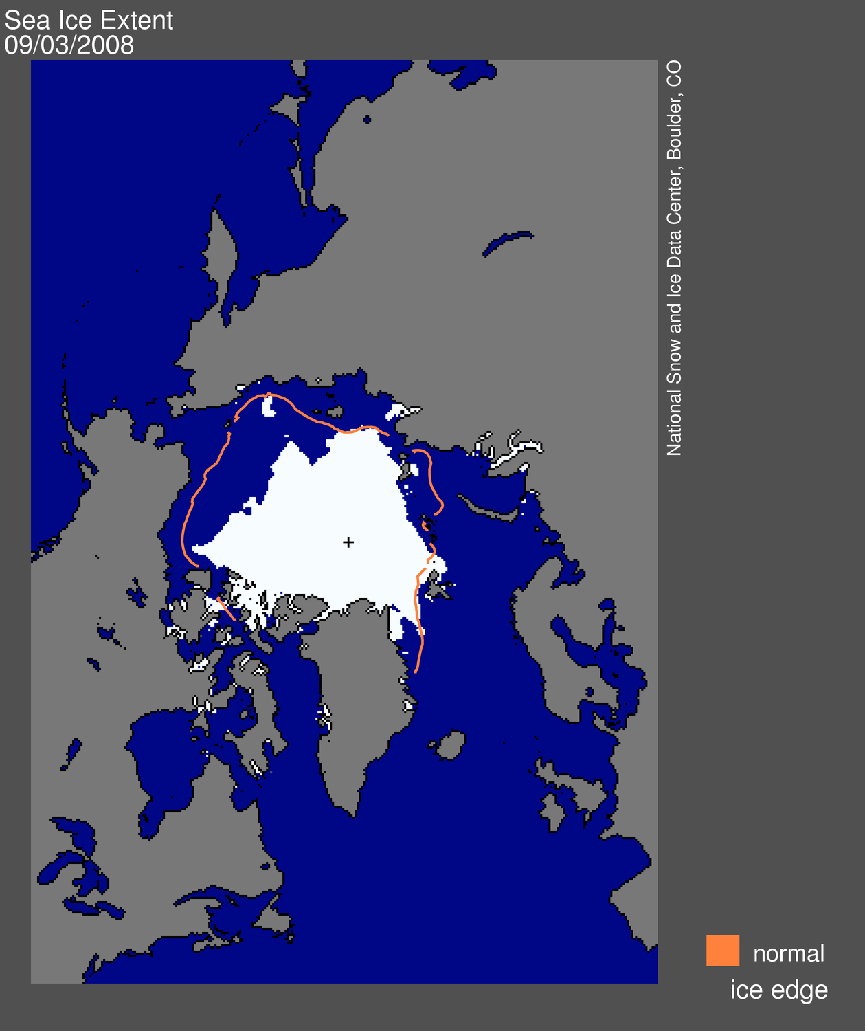
Arctic ice extent is also close to normal.

http://arctic-roos.org/observations/satellite-data/sea-ice/observation_images/ssmi1_ice_ext.png
The big story during the last few days is the divergence between the different data sources.

JAXA (green) is nearly half a million km2 lower than NORSEX (red.) DMI (fine dots) and NSIDC (purple) are half way in between. All are within one standard deviation of the mean (i.e. normal.) Unfortunately the NSIDC computer has been naughty and hasn’t updated any of their graphs or maps since Friday.
This time of year shows almost no year over year variation in extent or area. Ice extent has now declined by over one million km2 since the late March peak. The modified NSIDC map below shows in red, the total melt since early April.

The next modified NSIDC map shows where ice has melted during the last week.

The modified NSIDC map below shows where ice is above normal (green) and below normal (red.)

Ice continues to be above normal on the Pacific side where the waters are running very cold, and below normal on the Atlantic side where the waters are running warm.

http://weather.unisys.com/surface/sst_anom.html
The Pacific side of the Arctic is where the anomalies (red) have mainly been the last few summers, so things are shaping up for a nice recovery this summer.

Modified September 3, 2008 map from http://nsidc.org/images/arcticseaicenews/20080904_Figure1.png
Within a few weeks, ice in the central Arctic will quit thickening and start to melt. Stay tuned. The next few weeks will be slow news.
Wondering Aloud says:
May 9, 2010 at 1:02 pm
R. Gates says:
Umm… no it isn’t. One doubtful data set shows a bit below 09 the other doesn’t, still above 08 by a lot. What the heck are you lookin at?
Can we at least try to be a little bit fair here. The “doubtful” data (JAXA) is given as a link on the WUWT blog sidebar. R. Gates is correct. The current arctic ice extent for 2010 is below both 2009 and 2008 – accordint to JAXA. Steve Goddard refers to the Arctic -Roos site. Is there any reason why arctic-roos should be used in preference to JAXA. If so – can we know what it is?
R. Gates says:
May 9, 2010 at 9:44 am
As usual Steve, thanks for the report, but I continue to be baffled by statements you make such as this:
“Arctic ice extent is also close to normal.”
And then you use the shortest possible data range out there.
The data range is implied by the use of the word “is” – the present tense. Unlike the past tense which goes back several billion years, and the future tense which may stretch onwards forever, the present is a emphemeral instant of now-ness which is over before you can even measure it.
You can’t really get a much shorter data range.
Pamela Gray:
people seem to forget what AO, PDO, and AMO stand for. All of which affect the Arctic region of the globe. With another 70 years of accurate satellite data we might have and idea of natural range of ice in that region. Until then it is WAG!
Persecution complex.
By my lights, the extent data between May 1 and July 1 would have to have some really extraordinary outlier behavior before I’d be very interested in it one way or another. We’re in a traditional yearl choke point in “extent” in that period. In that period I’m much more interested in ice concentration in the “core”. By “core” I mean that portion of the arctic ice cap that one might reasonably expect to have a chance to survive to the yearly minimum based on the 1979-2010 records.
And that is looking very good indeed, so far.
In non-ice news, I’m considering a northern Iowa surfacestations trip next weekend to try to pick up 4 stations west-to-east across the northern tier. If the weather looks friendly-ish, I’ll probably do it.
S.G.:
Mr. Gates clearly does not understand what a standard deviation is, so we should just let him go. It seems like most of the fundamentalists, including the so-called “climate scientists” do not have a basic understanding of statistics. Boy, I would love to play poker with some of these guys!
OR, he does understand, and is a cynical FAGT (Feeder AT the Government Trough), who feels obligated to try to sow enough disinformation as long as the government cronies, oppressive AGW elitist professors, carbon traders, dangerous squiggly light bulb manufacturers, eco-terrorists, and the bird swatting industry (windmills) temporarily still have some money in the kitty.
One of the earlier commenters stated that the group was doing a 19th century style exploration mission in the twenty first century. It doesn’t seem to me that measurements along a single line would be properly representative of the Arctic as a whole. So I don’t know that what they’re doing is effective. I don’t know about the logistics of travel that far north, but it seems like they’re doing it the hard way.
So my questions are: What do they expect a single line’s measurements to show, why do they need to collect the data in the manner they’re collecting it, and what would be a more cost effective way to accomplish what they’re trying to do and cover the entire Arctic? Inquiring minds want to know….
I wonder what Al will buy next? CCX pays well.
This article is so ridiculous it makes me laugh. Hmmmm….SSTs are colder than normal exactly where the sea ice in the Bering and Okhotsk seas is higher than normal. That must really mean less ice loss in the Beaufort and Chukchi seas this summer. But of course!
Is that really all you could come up with this time around?
Instead of actually reading observational reports of thin ice and leads forming, of ice being thinner this year than last, of the change in slope during the last week showing the ice getting closer to the 2007 line, you completely ignore these facts and falsely state a relationship between SSTs outside of the Arctic Basin to this summer’s upcoming ice loss.
Sad, very sad.
Janama:- The Top Gear 4 WD trip to the ‘pole’ looked like it was only to 80N, well short, but far enough to pretend. A quick glance at his GPS, and it was very quick, you could see it was only 80N.
I have looked at sea ice area/extent for some time and have come to the conclusion that it is not as important as I once thought. The numbers we are given are assumed to be the actual sea ice area/extent. An assumption is made that the areas where there is less than 15% ice coverage, contribute little to total ice area. That is an assumption I question. The wind moves ice in and out of the 15 or 30% catchment area. What is happening outside the counted areas?
When the numbers shrink or rise it may not be because the ice has melted but because the wind moved it in or out of the catchment area.
The current “shrinking” of the Arctic sea ice is mostly in the Barents sea. Has the ice spead out enough that it no longer qualifies to be included? How much has actually melted and how much has run off to cool the North Atlantic? The numbers don’t tell us this because they ignore the 15/30%.
A cool water anomally has formed off the coast of Ice land that seems to be growing.
The idea that these numbers have some meaning as regards to planetary warming is way off the mark. The amount of ice that forms and is removed depends on many factors besides temperature.
In your first graph the red curve has been above the green curve almost every day this year.
In the second graph the red curve has been below the black curve most of this year and almost never above it. So, what is your point?
This graph probably gives the information in the most relevant form:
http://ocean.dmi.dk/arctic/icecover_30y.uk.php
“Since the 1970s the extent of sea ice has been measured from satellites. From these measurements we know that the sea ice extent today is significantly smaller than 30 years ago. During the past 10 years the melting of sea ice has accelerated, and especially during the ice extent minimum in September large changes are observed. The sea ice in the northern hemisphere have never been thinner and more vulnerable. ”
http://ocean.dmi.dk/arctic/index.uk.php
You used to use the graphs from this site:
http://nsidc.org/images/arcticseaicenews/20100504_Figure2.png
Why did you switch?
That the Arctic is warming is a fact. Whether this is a long term trend and whether it is apart of a global trend are questions one could debate. Many GCMs suggest there is a general warming. This is evidence but not proof. Do you have evidence that Arctic changes are purely cyclical? Have studied the ice volume? Do you – or anyone – have data on Arctic sea temperatures?
Z says:
May 9, 2010 at 4:33 pm
“The data range is implied by the use of the word “is” – the present tense. Unlike the past tense which goes back several billion years, and the future tense which may stretch onwards forever, the present is a emphemeral instant of now-ness which is over before you can even measure it.”
Bravo, Z! Now we finally know what “is” is!
barefootgirl,
Instead of looking at a snapshot of the current situation, let’s look at the historical temperature parameters since the last great Ice Age.
The natural variability shown far exceeds the current Goldilocks climate, which is not too hot, not too cold, but j-u-u-u-st right.
The null hypothesis is shown in this chart. Unless you or anyone else can falsify that hypothesis, then the climate is acting normally and naturally within its historical parameters. Mendaciously adding an extraneous entity like CO2 only muddies the waters, and does nothing to advance science; rather, it obfuscates the issue.
Here is a more up todate version of the first graph I linked to.
http://nsidc.org/images/arcticseaicenews/20100504_Figure3.png
Here is more info:
“During April, Arctic sea ice extent declined at a steady pace, remaining just below the 1979 to 2000 average. Ice extent for April 2010 was the largest for that month in the past decade. At the same time, changing wind patterns have caused older, thicker ice to move south along Greenland’s east coast, where it will likely melt during the summer. Temperatures in the Arctic remained above average.”
“Arctic air temperatures remained persistently warmer than average throughout the winter and early spring season. April temperatures were about 3 to 4 degrees Celsius (5 to 7 degrees Fahrenheit) above average across much of the Arctic Ocean, and up to 10 degrees Celsius (18 degrees Fahrenheit) above normal in northern Canada. Conditions in the Arctic were part of a trend of warmer temperatures worldwide in the past few months. An exception was the Sea of Okhotsk, where cool April conditions and northerly winds have slowed the rate of ice retreat.”
http://nsidc.org/arcticseaicenews/
barefootgirl says:
May 9, 2010 at 7:32 pm
Instead of actually reading observational reports of thin ice and leads forming, of ice being thinner this year than last, of the change in slope during the last week showing the ice getting closer to the 2007 line, you completely ignore these facts and falsely state a relationship between SSTs outside of the Arctic Basin to this summer’s upcoming ice loss.
Sad, very sad.
What, if not sad, declares ignorance of basic physics is that the air temperatures in the arctic basin are still much below the ice melting point. Have a look at what is displayed also in the sidebar : http://ocean.dmi.dk/arctic/meant80n.uk.php
Elementary knowledge of physics tells us that the ice cannot be thinning due to air temperatures, and elementary logic tells us that (ignoring volcanoes) ocean currents are melting the ice during this season, ocean circulation, because if there were no water circulation the water underneath the ice would keep the ice/water temperature point and there would be no thinning.
Therefore SSTs outside the arctic basin have a large role to play .
The next circulation pattern, winds, also play a role in compacting and in moving ice into warmer waters.
It is not temperatures at this time of the year that define ice extent.
I suggest that we should send the Caitlin team a commiserating (“Glad we’re not there.”) postcard with this rather apposite and, I think, what should be reassuring for them, picture on the front of it:
http://en.wikipedia.org/wiki/File:USS_Skate_(SSN-578)_surfaced_in_Arctic_-_1959.jpg
What it shows is the US submarine Skate surfaced at the North Pole on 17 March (i.e., during the season of greatest ice extent) in 1959. And what is pretty apparent from the picture is that, unless the US navy is in the habit of recruiting extremely tall submariners, the thickness of the ice that they have broken through to come to surface is nowhere near the two feet for current Arctic ice that the Caitlin team have claimed to have found and are bemoaning and bewailing over. In fact, it looks more to me like one foot, but, and simply to avoid a boring argument, I will maybe concede up to 18 inches. At any rate the Caitlin team should be reassured that since the Arctic ice didn’t disappear forever in a death spiral after 1959 it quite probably won’t do now either.
N.B. The following article confirms that the photograph was taken at the actual North Pole (not just somewhere in the Arctic):
http://en.wikipedia.org/wiki/North_Pole
Of all the -gates I’ve seen on this site from Climategate to now, the most entertaining one I’ve found so far is R. Gates. Truly the gift that keeps on giving.
Hurrah for R.!
Robert E. Phelan says:
May 9, 2010 at 9:53 am
I probably haven’t looked hard enough, but if anyone has any links to data about the extent of area broken up by icebreakers I’d love to see it.
——-
REPLY: Thanks, Robert, I’ve been wondering about that myself!
If the Arctic ice mass is so valuable to the planet, shouldn’t it be labeled “endangered ice” and left alone?
I can just envision ice-breakers full of climatologists, desperately seeking “rotten ice,” zooming back & forth the Arctic, making a hash of it.
No wonder the stuff gets blown by the winds, it can’t re-consolidate once disrupted.
You are being somewhat selective. Having spent several weeks highlighting that fact that the sea ice was near recent average levels you should really be letting people know all the indices have taken a small nosedive and are heading out of the 1 STD range. I’m not sure the divergence of the indices really is the big news.
My guess is the weekly sea ice news will be dropped in a few weeks. Sorry.
Pamela Gray said: (about R. Gates)
“You seem tied to wriggle matching the dance of a gnat’s behind instead of being interested at all in the larger context and interplay of sea ice behavior and the Arctic environments.”
————
Truly, the heart of a poet! But the other things you said…oh, how they hurt!
Ironically, I was asking Steve why he didn’t look at the longest data set available. (the larger context, as it were. It would seem (and is the case) that in all cases, I do like to refer back to the most data we have. Even more, I lile those handy charts, such as can be found here:
http://www.climate4you.com/index.htm
That show solar influences, global temps, ENSO, etc. all on the same graphs, so you can readily see the larger context. But Pamela, of all the things you said, this one really hurt:
“You seem data rich, and information poor.”
I actually take great pride in being a bit of a Renaissance Man, dabbling in many things, and seeing a larger context for many things. This skill is required of me in my profession, and I get paid quite nicely for it. Still, I fully admit to lacking all the information I need to come to more clear focus on this issue of AGW. Having admitted that I am 75/25 AGW believer (25% skeptic), I come to this amazing site to see what makes skeptics believe what they do. I appreciate your (and others) gentle nudging to look at information and to offer a different perspective, and when I find smart people like Steve cherry picking data by using a paultry 5 years when 30 is readily available, I do find it important to ask him why.
It’s possible to bet on whether JAXA’s September minimum ice extent this year will exceed last years here:
https://www.intrade.com
Massive snowstorm headed for Colorado on Wednesday, with 40 degree temperatures.
http://www.weatherstreet.com/data/SPC_075.jpg
Eight months of winter and still going strong.
Given the recent Winter low temps and snow, it’s a wonder that barefootgirl’s feet aren’t blue with the cold.
Espen says:
May 9, 2010 at 11:11 am
R. Gates, can you elaborate on your comment on the short data range? As you can see from Steve’s linked figure, Arctic Ice is close to the mean and within +/- 1 STD of the 1979-2006 period. How is that not normal?
—————–
The most complete data, and the best chart to use for Arctic Sea ice anomalies (which is what we really care about) is this well known one:
http://arctic.atmos.uiuc.edu/cryosphere/IMAGES/sea.ice.anomaly.timeseries.jpg
It doesn’t take a rocket scientist or statistics to simply see that arctic sea ice has not been even at the “normal” level since 2004, and if you take a look at the whole sequence, the long term trend is more than obvious.
Now Steve, et. al. have made specific predictions of where they think arctic sea ice extent is going to end up as a minimum this summer (though I am not sure which data set they are going by) Norsex is a different measurement than JAXA. Bottom line, I really don’t care, because I’m pretty convinced that we’ll end up with a lower minimum come September then we had in 2008 or 2009 and Steve says we’ll have more. By JAXA data, I’m putting it at 4.5 million sq. km. I base this on:
1. Warm temps in arctic this winter
2. Sea ice volume still low (thin ice) despite more multi-year ice staying around.
3. Warm temps continuing into the summer melt season
4. End of solar minimum with a higher global temps and warm water pushing into the arctic from the Atlantic (hence why the Barants Sea ice is melting so fast) See: http://arctic.atmos.uiuc.edu/cryosphere/IMAGES/recent365.anom.region.6.html
I think the so-called “recovery” of artic sea ice in 2008-2009 (not back to normal mind you, but improved from 2007) was directly related to the long and deep solar minimum, and now with the solar max coming up in a few years and the sun starting to wake up again, we’ve got warmer temps ahead, and lower summer minimums in arctic sea ice.