We’ve all seen that Arctic Sea ice area and extent has expanded and is back to normal. NANSEN Arctic ROOS just got their web page plots back online yesterday after an outage, and there’s a bit of a surprise when compared to NSIDC’s plot.

Sources:
http://arctic-roos.org/observations/satellite-data/sea-ice/observation_images/ssmi1_ice_ext.png
http://nsidc.org/data/seaice_index/images/daily_images/N_timeseries.png
Here’s a magnified view with the NANSEN graph zoomed and set to match the NSIDC scale, done with the help of my graphics program:

Both datasets use the SSMI satellite sensor, both datasets plot extent at 15%. Yet we have significant differences in the output which would seem to point to methodology. Note that in the magnified view, NANSEN has a peak “normal” of ~15.25 million square kilometers while NSIDC’s “normal” is higher at ~15.75 million square kilometers. You’d think there would be a standard for deciding what is the “normal” baseline wouldn’t you? [Note: The NSIDC average is for 1979-2000, NANSEN’s is for 1979-2006] Maybe the scientists can hammer this out at the next ice conference.
Regarding the plots above.
NANSEN says:
“Ice extent is the cumulative area of all polar grid cells of the Northern Hemisphere that have at least 15% sea ice concentration, using the NORSEX algorithm. Ice area is the sum of the grid cell areas multiplied by the ice concentration for all cells with ice concentrations of at least 15%. Ice extent and ice area are calculated for a grid resolution of 25 km.”
NSIDC says:
“Extent defines a region as “ice-covered” or “not ice-covered.” For each satellite data cell, the cell is said to either have ice or to have no ice, based on a threshold. The most common threshold (and the one NSIDC uses) is 15 percent, meaning that if the data cell has greater than 15 percent ice concentration, the cell is considered ice covered; less than that and it is said to be ice free.”
NSIDC also says:
“Other researchers and organizations monitor sea ice independently, using a variety of sensors and algorithms. While these sources agree broadly with NSIDC data, extent measurements differ because of variation in the formulas (algorithms) used for the calculation, the sensor used, the threshold method to determine whether a region is “ice-covered,” and processing methods. NSIDC’s methods are designed to be as internally consistent as possible to allow for tracking of trends and variability throughout our data record.”
Given that both NANSEN and NSIDC use the same SSMI sensor data, and calculate the extent based on 15% concentration, that half a million square kilometers difference in the “normal” sure seems significant in the context of the magnified extent view NSIDC presents. A half million here, a half million there, and pretty soon we are talking about real ice extent differences.
Another interesting difference is that NANSEN plots Arctic Sea ice area in addition to the extent. Here’s that graph:

Arctic Sea ice area is above the “normal” line as defined by NANSEN. As far as I know, NSIDC does not offer an equivalent plot. If I am in error and somebody knows where to find NSIDC’s area plot, please let me know and I will include it here.
One final thing to note about the difference between NANSEN and NSIDC. I don’t recall the director of NANSEN/Arctic ROOS ever coming out and saying something like “Arctic ice is in a death spiral” or making any sort of press announcements at all. They seem content to just present the data and let the consumer of the data decide.
In contrast, NSIDC has a whole section that addresses sea ice in the context of global warming. I haven’t found a comparable section on NANSEN Arctic ROOS.
Of course we know that NSIDC director Mark Serreze is very active with the press. Perhaps some of our media friends reading this should seek out someone at NANSEN for the next sea ice story so that there’s some balance.
The differences in the way each organization presents their data and views to the public might explain the differences in the way the output is calculated. One might take a “glass half full” approach while the other takes a “glass half empty” approach. Or it may have a basis in science that I’m not privy to yet. The point is that there are significant differences in the public presentation of sea ice data between the two organizations. One showed sea ice extent as normal, the other took sharp right turn just before it was expected to happen.
I welcome input from both of these organizations to explain the difference.
In related news, Steve Goddard writes:
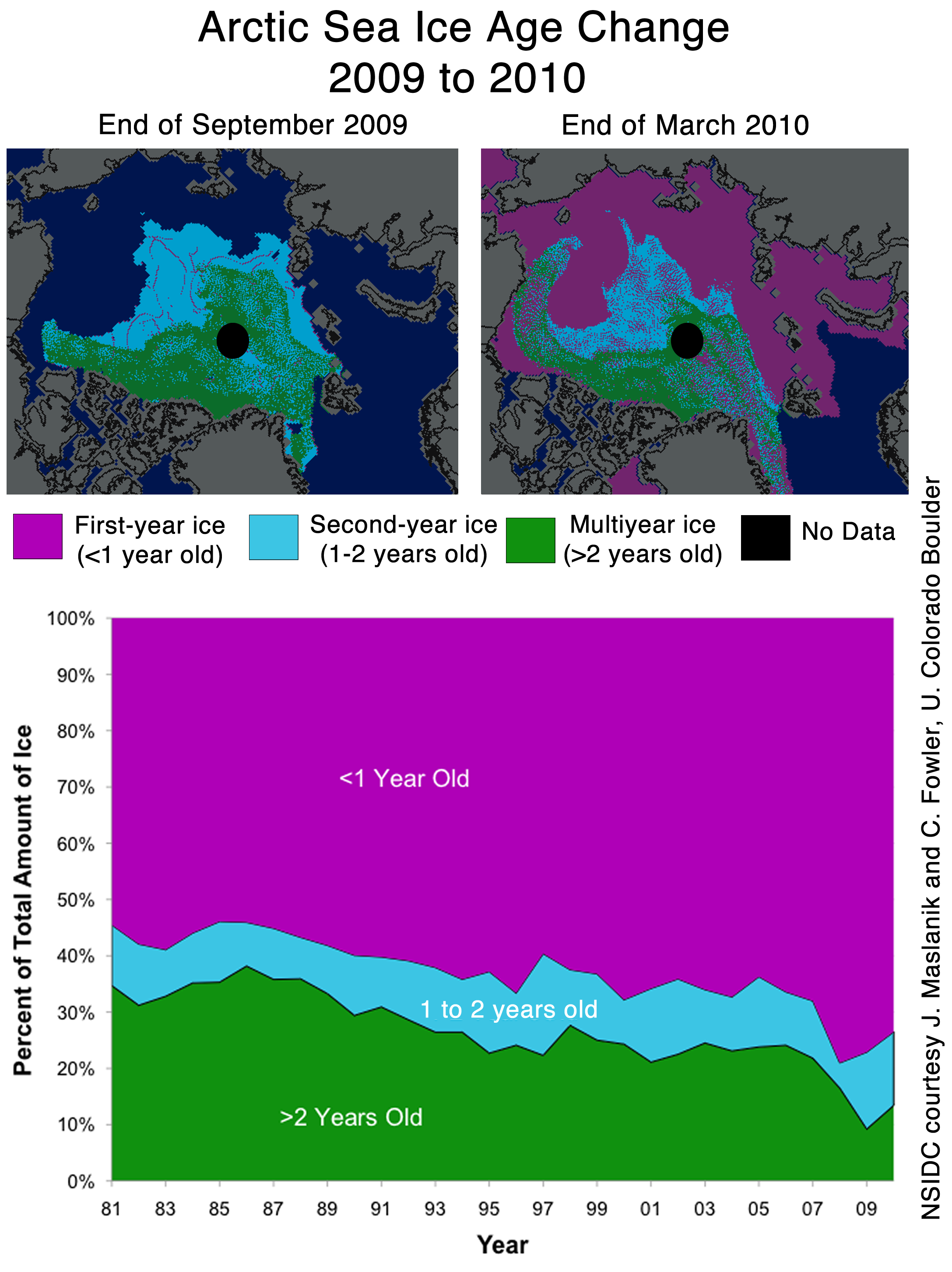
NSIDC seems to confirms the WUWT 12 Month Ice Forecast. Twelve months ago, WUWT forecast that 3 year old ice would increase during the next year, and explained why. NSIDC confirmed the accuracy of the forecast with their most recent Sea Ice News.

Source: http://nsidc.org/images/arcticseaicenews/20100406_Figure6.png
Note that 3+ (>2) year old ice has increased from 10% to about 14% during the past year, shown with the two black horizontal lines near the bottom. That shows an impressive growth of 40% relative to last year.
Ice older than one year has also increased by a substantial amount over 2008 and 2009. The implication being that ice thickness has been increasing for the last two years. Older ice is thicker ice.
So we will leave it up to the readers to do the math. Thickness has increased. Area has increased. What does that tell us about volume? What does that tell us about the “Arctic Death Spiral“?
Don’t be fooled though. “Decreasing ice is climate. Increasing ice is weather.”
[snip] Calling the host of this site dishonest, without any facts, is unacceptable. ~dbs, mod.
Jack Mildam,
I would not call the host of this site fully dishonest or that he is a dishonest person in general (Where did I say this?) and I do not think that. However, with respect to the aforementioned issue in my two comments (which has still yet to be addressed) the author insinuates that volume is increasing without illustrating the graphical evidence to support his claim. I merely pointed out that the graphical evidence exists and shows that volume continues to decrease. If you determine that to be “calling him dishonest” then so be it. Your criticism is noted and ignored.
I call that merely pointing out the flaw in someones argument. People can disagree you know! Furthermore, your response did not even address the issue. Rather than get all over-hyped over my post you could have easily discussed this issue in full, however you did nothing of the sort, rather you resorted to petty, baseless accusations.
Anthony says, “Note that 3+ (>2) year old ice has increased from 10% to about 14% during the past year, shown with the two black horizontal lines near the bottom. That shows an impressive growth of 40% relative to last year.”
1. How does >2 = 3+? What happened to 2.1? 2.5? Etc.?
2. 40% from one year to the next? How about that long climb from @ur momisugly 82 – 86? Or 90 -91? Or – wow! – the rise in the 97 – 98 time frame! But the trend keeps heading downward…
3. The 40%, btw, is only 10% of what has been lost over the time of the trend. Much less impressive, isn’t it?
4. It should be obvious to all that the ice extent **does not** equal total ice. But this is what Anthony says, ” The implication being that ice thickness has been increasing for the last two years. Older ice is thicker ice.”
Incorrect. **Some** ice has increased in thickness, not all ice. A simple thought experiment: If 1% of the total ice is 5+ meters thick and this is lost through the Fram Straight, melts, whatever, but 1.5% more ice is >2m, but <3m, what have you gained? Nothing. This is essentially what Anthony is calling a significant rebound.
Also, we know from measurements made last year that ice that is of very poor quality is being measured as multi-year ice. http://www.time.com/time/health/article/0,8599,1956932,00.html
Anthony, why isn't this included in your post? Because it's about extent? Fine. But why focus on extent at all? It just isn't the more important metric.
5. The winter maximum, which is what Anthony is calling a rebound, is not very important in measuring ice health. The summer minimum is the gold standard for understanding change of ice health in the Arctic. Making a big deal of winter extent is a bit like Casanova getting excited about making it to first base on his date with the town floozie.
6. The Discrepancy: The difference between the two methods is a constant, Anthony, not a cumulative difference, so the difference will always be about the same, as opposed to your implication it is cumulative, "A half million here, a half million there, and pretty soon we are talking about real ice extent differences."
No, Anthony, pretty soon you are talking about the same half-million.
As ever, the trend is the thing, and the trend is down.
REPLY:
“Anthony says, “Note that 3+ (>2) year old ice has increased from 10% to about 14% during the past year, shown with the two black horizontal lines near the bottom. That shows an impressive growth of 40% relative to last year.”
No K. Obrien, you really should learn to read before citing. Steve Goddard wrote that. Regardless how you spin it, we have two years of recovery -A