A couple of days ago I sent this email to Jeff Id of the Air vent, as he quite familiar with Antarctic surface temperature analysis, having outed the many problems with the Steig et al “Antarctica is Warming” paper, demonstrating poor statistical techniques used by Steig, with help from Michael Mann.
On Fri, Dec 11, 2009 at 3:11 PM, Anthony Watts wrote:
Subject: can you replicate this?
http://savecapitalism.wordpress.com/2009/12/11/ghcn-antarctica-careful-selection-of-data/
Best regards,Anthony Watts
Jeff replied yesterday with:
I can replicate it. The story behind this one is in the detail, which I’ve wasted a whole Saturday on.
Indeed the Devil is in the details, the details that few people, apparently including the scientists, bother to look at.
Jeff posted an excellent essay on the subject:
GHCN Antarctic, 8X Actual Trend – Uses Single Warmest Station
Excerpt:
The red circle is surrounding Rothera Point station.

So as we can see, of all the stations available in the antarctic, GHCN has chosen to use a single station on the Antarctic Peninsula to represent an entire continent of the earth for the past 17 years (red circle). But it’s not just any station, it’s a special one. Rothera Point has the single highest trend of any of the adjusted station data.
Notice that the station is on the Antarctic peninsula, I’ve always said that using stations here to represent trends on the main body of the Antarctic continent is plain wrong, becuase the peninsula is in a different climate zone. See my discussion here and Jeff Id’s proof of it here.
I’ve also said time and again that most manned stations in Antarctica would be “urban” compared to the surrounding area. There’s no small towns, farms, pastureland, woods, etc to compare to. Just millions of square miles of snow an ice. The research stations are the metropolises of Antarctica, each a warm pocket of humanity due to land use change and energy expended to keep warm.
For example, this picture on a postage stamp from Australia’s Mawson Station, celebrating the Australian Antarctic Territory in 1997, may help you visualize the issue. Note the Stevenson Screen near the “living pod” on the right.

Here is the larger photo of the first day of issue card, the Stevenson Screen is also just visible above the snowbank in the lower right. Rather close to human habitation I’d say. Looks like its near a small AHI (Antarctic Heat Island). More here

Click for larger image
I suspected similar problems might exist at Rothera, so I started looking around to understand what the measurement envirionment is like down there. First stop, Google Earth:

Looks cold, obviously taken in winter. But I also noticed something peculiar, that “tongue” that sticks out at the top of the photo. I showed my wife the photo without saying a word about it saying only “What does this look like to you?” Her one word answer: “airport”.
Yep and obviously not a naturally occurring one either. You can see that there has been infill between the point and Adelaide Island. I wondered what it looked like years ago? I found this photo in Google Earth’s Panoramio, circa 1976:

Looks rather sparse, few buildings, with no indication of a runway. Compare that to another Panoramio photo from a similar vantage point taken in 2007:

Obviously the photo above was taken in summer. Looks like there has been some growth and land use change since 1976, inlcuding adding the runway with locally available materials. Given the dark albedo, and the mostly volcanic history of the Antarctic peninsula, it seems likely that the “local materials” would be volcanic rock.
Here’s closer view of that rock, from “Claire of the Antarctic”

Here’s another photo from Panoramio, a large panorama, which shows the entire Rothera station and the full length of the runway from sometime in 2008 or early 2009, based on the upload date listed. I’ve corrected the extreme fisheye effect in the original image and cropped a closer view for better presentation here.

Here’s a link to the full sized lens corrected panoramic image. Warning quite large at 5463 × 709 and 0.6MB
So from the aerial and ground photos we can determine that:
- Rothera has seen land use change due to the infill for the runway and service areas.
- The albedo around the station has changed, due to the infill with that darker local materials.
- Rothera has seen growth in buildings, and presumably population since 1976.
- Rothera’s aviation fuel tanks seen above and here plus the new hanger indicate an increase in aviation traffic has likely been seen since 1976.
- There’s apparently pressure from the tourist trade also, enough that BAS has made the: Rothera Station_visitor_guidelines. How many ships and planes that now visit have anything to do with primary research? How much extra infrastructure was created to handle tourist traffic?
As an indication of an increasing tourist trade, there sure seems to be plenty of “tourist” type photos of Rothera Station on the web like this one:

According to a BBC reporter who visited Rothera Station, they even have a coffee house. Maybe a Starbucks even?

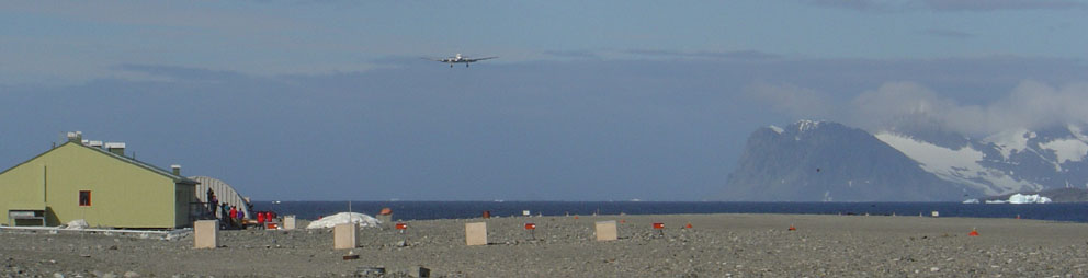
Here’s a DC-3 coming in for landing in January 2004. Research or tourists or both?

From the Wikipedia page where the improvements over time (and dates) to Rothera station have been listed) we find when the new runway was built:
With the commissioning of the gravel runway and hangar in 1991-92 air operations became more reliable and access to Rothera was greatly improved through a direct airlink from the Falkland Islands.
Just like airports wordwide, where many GHCN stations have been located, we see growth at the airport. Growth translates into UHI or in this case, AHI, since the next closest patch of humanity with a weather station is Base San Martin 75 kilometers away.
Here’s another take on the growth:
History: Built in 1975 on Adelaide Island, Rothera occupies a small rocky peninsula. A 3000′ (900m) crushed rock airstrip and hangar were added in 1990-91, making Rothera a peninsula region logistics center for British Antarctic Survey Operations.
Information: Rothera can accommodate 124 people and boasts one of the few aquariums in the Antarctic. The Bonner laboratory complex, completed in 1997, includes a recompression chamber, a wet lab and a terrestrial biology lab. A large new sleeping quarters building , which can house 88 people, is being constructed and should be completed by 2002.
So it is with little surprise, given the land use changes, the increased infrastructure, the new gravel runway, and an increased tourist trade that we see this sort of temperature plot from GISS:

Prior to 1985, it looks like recording temperature there wasn’t so important, as there is significant missing data. But with aviation growth comes a need for accurate weather information, and thus we don’t see any missing data since then.
Where do they actually measure the temperature at Rothera? That I don’t know yet, but given that the BAS puts hourly automated temperature reports on their website,and has a webcam it seems there is probably an automated weather station rather than a Stevenson Screen.

I’m guessing they have a readout for temperature in the comfort of the control tower:

For all I know the thermometer could be on the roof or side of the control tower. Not unheard of.
Regarding the GISS temperature plot. There’s a clear upwards trend. The question is: how much of it is caused by localized human influences and land use change?
Clearly, Rothera Station is no longer a “pristine” place to do science, it’s just another destination, a pocket of humanity with an airport, a coffee shop and the only heat for 75 kilometers.
Is Rothera a good place to measure a long term temperature trend to use for adjusting other Antarctic GHCN stations? Perhaps not.

Chris …
nobody thinks there is only one weather station … we are questioning why some folks choose NOT TO use more stations in their AGW work …
cherry picking maybe …
Can someone tell us where the undersea volcanoes are in relation to the location of Rothera on the Antarctica Peninsula? Could they affect the temps there?
If they plow or salt the runway then the biggest albedo effects would be at the beginning and the end of the summer, when they are turning snow into bare earth.
I can’t very well upload graphics into this comment section, but I did some slapdash work to get a map of Antartica on exactly the same scale as a map of North America, and then put them side by side…pretty ridiculous, I have to say. As far as I can tell, using Rothera for all of Antarctica is more or less similar to putting a single thermometer in the Catskills and thinking that that one single thermometer would give you all the information you needed about the average temperatures for everything between Port Jervis and Fairbanks, Alaska. Um…yeah, that’s a significant sample size right there, that is. Here is where I posted the pictures.
Sioned L (15:51:16),
There is an undersea volcano in the A sound on the tip,not really near Rothera. But here is an ice thickness image from NASA http://www.nasa.gov/images/content/382745main_sea_ice_concentration_lg.jpg is more revealing.
I would say that the lack of sea ice in the western peninsula relative to the east COULD indicate undersea warming.
Some GHCN temps, adjusted and unadjusted, from my area. Notice how older temps are all adjusted downward relative to newer temps. Also notice the GISS plot in the bottom right corner — it has an upward slope not evident even in the adjusted GHCN plot.
All plots from appinsys, except the GISS.
http://www.appinsys.com/GlobalWarming/climate.aspx
Oops, forgot the link:
http://www.freespokane.net/wp-content/uploads/2009/12/compos.jpg
An interesting comment and a reply for the new post, “Are the CRU data “suspect”? An objective assessment.” at RC.
http://www.realclimate.org/index.php/archives/2009/12/are-the-cru-data-suspect-an-objective-assessment/comment-page-1/#comment-149271
..hmm, maybe we really do have to reinvent the wheel, do we?
While I’m at it, does anyone have any clue what data would be the most common to use in global warming related studies? To me it would make sense to use the adjusted data, rather than raw. (there’s no reason not to.. atleast so far) So I was just thinking, if the adjusted data is actually as bad as it seems, what kind of an effect would it have to climate science in general? I’m asking this because I’ve seen a lot of comments, conclusions and such which say something like “..but this wouldn’t explain the rapid warming of the last XX years..”.
I hope I made my question clear enough!
hello.
i worked at rothera as a meteorological technician for more than 2 years from 2006 until 2009.
There are so many holes in what has been posted on here that it would take weeks to correct them.
It’s such a shame that the hard and honest work of so many people has to be seen as part of some global conspiracy – what exactly is to be gained for the hard working people of the British Antarctic Survey in falsifying numbers or doing a shoddy job?
Nacreous clouds are lit from below by the sun. They are PSCs (polar stratospheric clouds) which occur above the troposhere when the temperature there is below about -80 degrees C. They are important in understanding the natural destruction of ozone in the stratosphere.
Weather balloons are released usually 4 times per week all year, taking meteorological measurements up to about 30kms altitude.
The met data from rothera is recorded electronically now using very accurate sensors which are checked daily.
The runway is to connect to the outside world. Its covered in snow for more than half of the year. The weather station next to the runway is solely used for aircraft safety – we had a plane flipped over trying to land in bad weather a few years ago.
There is no “coffee house”. There are two coffee machines in the dining room.
They use generators which burn MGO (Marine Gas Oil). This is not ideal.
I was personally responsible for building and maintaining many automatic weather stations on the antarctic peninsula and further into the continent. The reason that there are not more of them is lack of money.
The runway will contribute in an extremely minimal way to the changes in temperature in the area.
The force of ignorance displayed on this page is staggering. And depressing.
Thats all.
This poor chap may be diligent but he is but a tollin a bent organiosation.
Rob W,
Relax, my friend, nobody is impugning your hard and honest work — for which we all thank you, or at least I do.
Nobody thinks you are part of a vast worldwide conspiracy. Nobody thinks that anybody at Rothera did anything wrong. We are aware that dedicated persons such as yourself have built many automated weather stations on the peninsula and further into the continent; indeed, that is most of the point of the post.
What the post argues is that certain people who have USED the data that diligent persons such as yourself provide, appear to have done so with gross dishonesty. Saying that a single thermometer located at Rothera represents a reliable picture of temperatures across Antarctica is approximately equivalent to saying that you can tell what’s going on in Fairbanks, Seattle, Calgary, Fargo, and Columbus all based on a single observation point in Port Jervis, New York. It is an absurd suggestion, and to double down and say that “the science” for Antarctica is “settled” beyond dispute based on that sole observation point, is to have left the realm of science and entered the world of megalomaniacal fantasy. And that would be true even if we did NOT have other observation stations against which we could gauge the Port Jervis thermometer, and even if the Port Jervis station were not the single observation station that most emphatically drew the picture one wished to present, and thus were not demonstrated by all — ALL — the other available evidence to be the outlierest of outliers, rather than a representative sample (if a sample size of 1 can ever under any circumstances be meaningfully considered a “sample” rather than mere anecdotal evidence).
The fact is that the Rothera station has showed more warming than any other station in all of Antarctica. The comments are full of speculation about what could have caused Rothera to be the outlier that it is, and you are welcome to provide whatever theory you wish to provide — indeed, with your specialized knowledge you can speak to groundless speculations such as “increased tourist traffic” and greatly improve the discussion. But nobody here is saying, “Rothera has an airport; so I bet it’s warmer than the other points.” We can tell it’s showed more warming than the other stations because we can read the data. People are indeed speculating in the comments about the cause of the unusual warming that unquestionably has taken place at Rothera, compared to every other station in Antarctica. “Maybe it’s warmer because they built an airport.” “Maybe it’s warmer because the generators are producing heat.” “Maybe it’s warmer because they get lots of tourists.” “Maybe it’s all that coffee the local Starbucks is brewing.” But that it’s warmer, is beyond dispute, because the data say so indisputably.
Thus the basic points, which are the following, are not in dispute so far as I can tell:
1. Rothera is the most extreme outlier in Antarctica.
2. It’s not hard to figure that out, if you just include the other available data for inspection.
3. But certain persons who are eager to trumpet the dangers of global warming and the urgent need to invest tremendous amounts of power into hands of politicians and bureaucrats, and concomitantly a tremendous amount of grant money into the hands of persons such as, conveniently, themselves…at least one such person has declared to the world that “all of Antarctica is warming” by using the Rothera outpost, and the Rothera outpost alone, as a proxy for all of Antarctica.
If those three facts are indeed true (and they may not be; I would be interested in any challenges that can be mounted in dispute of those three facts), then it seems very difficult to avoid the conclusion that some deliberate scientific fraud has been practiced.
But not by you, my friend. Not by you. Nobody thinks that at all, and I believe I probably speak for just about everybody here when I thank you for the dedication to science that has led you to spend years of your life doing the dirty work on which all science depends. I thank you and I salute you.
Interesting story … and reminiscent of something a friend of mine recently mentioned to me after watching a PBS documentary. One of the global CO2 gauges is located high on a mountain in Hawaii — which sounds really pristine, yes?
Well it is … umm, except for the fact that it’s in the same neighborhood as an active volcano that spews CO2 like Old Faithful spews H2O.
http://www.americanthinker.com/2009/12/greenhouse_gas_observatories_d.html
All of which suggests that there are always ways to cheat the system without literally cheating the system. You can gather perfectly accurate readings without having to pull any East Anglia-type “tricks” to “hide the decline” … as long as you have a working knowledge of the planet’s most abnormal places.
Speaking of Antarctica, here’s an excerpt from a story that you won’t likely see reprinted in America’s mainstream media. It was published in April 2009:
http://www.news.com.au/antarctic-ice-is-growing-not-melting-away/story-0-1225700043191
“ICE is expanding in much of Antarctica, contrary to the widespread public belief that global warming is melting the continental ice cap …
The Scientific Committee on Antarctic Research report prepared for last week’s meeting of Antarctic Treaty nations in Washington noted the South Pole had shown ‘significant cooling in recent decades.'”
Significant WHAT in recent WHAT? Quick, somebody alert Al Gore, East Anglia and the IPCC!
In a Norwegian blog I read I saw that this article was cited as a “proof” that the urban heat island (UHI) effect may influence temperature measurements even in Antarctica.
Your main point here, apparently based on a bit of googling, seems to be that man-made changes to the environment at Rothera Station, especially building a gravel runway from dark volcanic rock, decreases the albedo and thus increases the measured temperatures significantly.
I have a few comments and questions:
For three quarters of the year or so the landscape is completely covered in snow – runway, buildings and all. (The satellite photo from Google Earth, under which you commented “obviously taken in the winter”, is obviously NOT taken during the darkest months of the year, since the short shadows prove that the sun is far above the horizon.) The snow will blow off and melt first in exposed places, on and around the mountains, hills and rocks visible on the photos, and later in lower and flatter areas downwind, where it has collected in drifts. What is the albedo effect of man-made changes when they are covered under the snow?
Rothera lies south of the Antarctic Circle. Thus, for some weeks in the winter the sun doesn’t rise above the horizon at all. What is the albedo effect when there are no sunrays that can be reflected or absorbed?
Now let’s take a look at the landscape in late summer when the snow is (mostly) gone. Depending on the contrast in the photos, the dark volcanic rock you mention seems to range from dark grey to light grey. You point out yourself that this is the locally available material. The summer picture shows a grey runway in a grey, rocky and barren landscape. How does moving rocks and gravel a few meters and leveling it out decrease the albedo and increase the temperature?
Furthermore: The UHI effect is generally most apparent at night (i.e. for minimum temperatures), since materials like asphalt, concrete etc. stores the heat. The higher the difference is between day and night temperatures, the higher the UHI effect. This far south, however, where there is midnight sun in summer, and especially on an island with an archetypical coastal climate (mostly influenced by the sea temperature), there is little difference between day and night temperatures. What is the effect of heat storage then?
You have no clue where the measuring station actually is, you have no alternative measurements to prove your case, you have nothing except speculations. And measurements of sea temperatures in surrounding areas and in the Arctic show the same warming pattern. Have you tried googling for runways on the North Pole?
If the measured temperature rise at Rothera is most apparent in the middle of the winter (as it is in the Arctic), your speculations are completely irrelevant. For a large part you are basing your theories on an albedo effect you have found WHERE THE SUN DOESN’T SHINE. Well, there is NO albedo effect where the sun doesn’t shine. But as we know, it might be a suitable place to shove useless things.