A couple of days ago I sent this email to Jeff Id of the Air vent, as he quite familiar with Antarctic surface temperature analysis, having outed the many problems with the Steig et al “Antarctica is Warming” paper, demonstrating poor statistical techniques used by Steig, with help from Michael Mann.
On Fri, Dec 11, 2009 at 3:11 PM, Anthony Watts wrote:
Subject: can you replicate this?
http://savecapitalism.wordpress.com/2009/12/11/ghcn-antarctica-careful-selection-of-data/
Best regards,Anthony Watts
Jeff replied yesterday with:
I can replicate it. The story behind this one is in the detail, which I’ve wasted a whole Saturday on.
Indeed the Devil is in the details, the details that few people, apparently including the scientists, bother to look at.
Jeff posted an excellent essay on the subject:
GHCN Antarctic, 8X Actual Trend – Uses Single Warmest Station
Excerpt:
The red circle is surrounding Rothera Point station.

So as we can see, of all the stations available in the antarctic, GHCN has chosen to use a single station on the Antarctic Peninsula to represent an entire continent of the earth for the past 17 years (red circle). But it’s not just any station, it’s a special one. Rothera Point has the single highest trend of any of the adjusted station data.
Notice that the station is on the Antarctic peninsula, I’ve always said that using stations here to represent trends on the main body of the Antarctic continent is plain wrong, becuase the peninsula is in a different climate zone. See my discussion here and Jeff Id’s proof of it here.
I’ve also said time and again that most manned stations in Antarctica would be “urban” compared to the surrounding area. There’s no small towns, farms, pastureland, woods, etc to compare to. Just millions of square miles of snow an ice. The research stations are the metropolises of Antarctica, each a warm pocket of humanity due to land use change and energy expended to keep warm.
For example, this picture on a postage stamp from Australia’s Mawson Station, celebrating the Australian Antarctic Territory in 1997, may help you visualize the issue. Note the Stevenson Screen near the “living pod” on the right.

Here is the larger photo of the first day of issue card, the Stevenson Screen is also just visible above the snowbank in the lower right. Rather close to human habitation I’d say. Looks like its near a small AHI (Antarctic Heat Island). More here

Click for larger image
I suspected similar problems might exist at Rothera, so I started looking around to understand what the measurement envirionment is like down there. First stop, Google Earth:

Looks cold, obviously taken in winter. But I also noticed something peculiar, that “tongue” that sticks out at the top of the photo. I showed my wife the photo without saying a word about it saying only “What does this look like to you?” Her one word answer: “airport”.
Yep and obviously not a naturally occurring one either. You can see that there has been infill between the point and Adelaide Island. I wondered what it looked like years ago? I found this photo in Google Earth’s Panoramio, circa 1976:

Looks rather sparse, few buildings, with no indication of a runway. Compare that to another Panoramio photo from a similar vantage point taken in 2007:

Obviously the photo above was taken in summer. Looks like there has been some growth and land use change since 1976, inlcuding adding the runway with locally available materials. Given the dark albedo, and the mostly volcanic history of the Antarctic peninsula, it seems likely that the “local materials” would be volcanic rock.
Here’s closer view of that rock, from “Claire of the Antarctic”

Here’s another photo from Panoramio, a large panorama, which shows the entire Rothera station and the full length of the runway from sometime in 2008 or early 2009, based on the upload date listed. I’ve corrected the extreme fisheye effect in the original image and cropped a closer view for better presentation here.

Here’s a link to the full sized lens corrected panoramic image. Warning quite large at 5463 × 709 and 0.6MB
So from the aerial and ground photos we can determine that:
- Rothera has seen land use change due to the infill for the runway and service areas.
- The albedo around the station has changed, due to the infill with that darker local materials.
- Rothera has seen growth in buildings, and presumably population since 1976.
- Rothera’s aviation fuel tanks seen above and here plus the new hanger indicate an increase in aviation traffic has likely been seen since 1976.
- There’s apparently pressure from the tourist trade also, enough that BAS has made the: Rothera Station_visitor_guidelines. How many ships and planes that now visit have anything to do with primary research? How much extra infrastructure was created to handle tourist traffic?
As an indication of an increasing tourist trade, there sure seems to be plenty of “tourist” type photos of Rothera Station on the web like this one:

According to a BBC reporter who visited Rothera Station, they even have a coffee house. Maybe a Starbucks even?

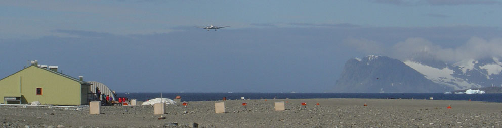
Here’s a DC-3 coming in for landing in January 2004. Research or tourists or both?

From the Wikipedia page where the improvements over time (and dates) to Rothera station have been listed) we find when the new runway was built:
With the commissioning of the gravel runway and hangar in 1991-92 air operations became more reliable and access to Rothera was greatly improved through a direct airlink from the Falkland Islands.
Just like airports wordwide, where many GHCN stations have been located, we see growth at the airport. Growth translates into UHI or in this case, AHI, since the next closest patch of humanity with a weather station is Base San Martin 75 kilometers away.
Here’s another take on the growth:
History: Built in 1975 on Adelaide Island, Rothera occupies a small rocky peninsula. A 3000′ (900m) crushed rock airstrip and hangar were added in 1990-91, making Rothera a peninsula region logistics center for British Antarctic Survey Operations.
Information: Rothera can accommodate 124 people and boasts one of the few aquariums in the Antarctic. The Bonner laboratory complex, completed in 1997, includes a recompression chamber, a wet lab and a terrestrial biology lab. A large new sleeping quarters building , which can house 88 people, is being constructed and should be completed by 2002.
So it is with little surprise, given the land use changes, the increased infrastructure, the new gravel runway, and an increased tourist trade that we see this sort of temperature plot from GISS:

Prior to 1985, it looks like recording temperature there wasn’t so important, as there is significant missing data. But with aviation growth comes a need for accurate weather information, and thus we don’t see any missing data since then.
Where do they actually measure the temperature at Rothera? That I don’t know yet, but given that the BAS puts hourly automated temperature reports on their website,and has a webcam it seems there is probably an automated weather station rather than a Stevenson Screen.

I’m guessing they have a readout for temperature in the comfort of the control tower:

For all I know the thermometer could be on the roof or side of the control tower. Not unheard of.
Regarding the GISS temperature plot. There’s a clear upwards trend. The question is: how much of it is caused by localized human influences and land use change?
Clearly, Rothera Station is no longer a “pristine” place to do science, it’s just another destination, a pocket of humanity with an airport, a coffee shop and the only heat for 75 kilometers.
Is Rothera a good place to measure a long term temperature trend to use for adjusting other Antarctic GHCN stations? Perhaps not.

This place is sitting on a peninsula in what I suspect is a very windy area.
If that’s the case, then the albedo effect of the runway and settlement may be significantly reduced, perhaps to a negligible level.
IOW, this may be essentially measuring ocean temps.
It would be interesting to know the amount of fuel used for heating at Rothera. Regardless of insulation, every bit of fuel used creates heat that eventually gets into the local environment. If you could track the increase in heating fuel over the years you might get a nice measure of the increase in local temperature caused by heating.
Regarding the GISS temperature plot. There’s a clear upwards trend. The question is: how much of it is caused by localized human influences and land use change?
I had posted a comment on the Air Vent earler ( http://noconsensus.wordpress.com/2009/12/13/ghcn-antarctic-warming-eight-times-actual/ ) – comment #4
Base Orcadas (60S) contributes to and is a modifying station for the GISS 64-90S zone.
This shows up well in the following graphs:
http://i33.tinypic.com/e0sop2.png
http://i34.tinypic.com/2f0aufk.png
http://i36.tinypic.com/akuxk5.png
One more photo – the Stevenson Screen is at upper right in daylight, sharp photo:
http://www.robertwebster.org/blog/21apr08/explosives.jpg
More automated station photos:
http://www.robertwebster.org/blog/11jan08/rob_site_8.jpg
http://www.robertwebster.org/blog/24dec07/butler%20aws.jpg
I’ve just realised part of this graph: http://i36.tinypic.com/akuxk5.png
is wrong, (the in the lower graph, the negative values have been added together in error) although it does not affect the overall conclusion of the role of Base Orcadas.
Have you looked up the amount of Rocksalt they use?
Do they by any chance attempt to keep the runway open by deicing it?
Jeff Id replied: “I can replicate it. The story behind this one is in the detail, which I’ve wasted a whole Saturday on.”
Wrong.
Not one second of this and all the work done by such people to try and bring back reality (also sanity) for the sake of the entire world is “wasted”.
Both the present and the future owes a huge debt to you all. There is no waste in what you do.
rbateman (16:38:52) :
Weather vary, always have, even in Antarctica.
I know that there is weather in Antartica. 🙂 The variation I pointed seems like a long-term effect – a decadal one. Just type in “South Pole temperature” into Wolfram and you’ll see. It’s the magnitude of variability that is so surprising – Wolfram is throwing up yearly means after all. And there should be no UHI to speak of in this region.
For the North Pole, Cylt airport data comes up. It shows a similar ‘spike’, but about 20 years earlier. It goes down in the same way and remained low.
You can check out any city this way. I’ve seen a few cities – the graphs seem to hold pretty steady. Only the poles/near poles seem to be showing this, IMO
There must be a comedian who could make his name out of this material? (Not Gore,I mean from the sceptical end).It’s ripe for satire.
On November 20 I posted that the CRU folks would immediately start justifying their claims by reason of the e-mails being taken out of context.
Here we have an honest attempt to put a temperature reading in context. It is influenced by the airport and human warming. I am told some of the airplane hangers on the North slope cost 500 dollars everytime the hanger door is opened and closed for a plane to go in and out. That is a lot of heat.
Ed (17:21:26) – This from your site:
Climate data today
Rothera research station
Jan Feb Mar Apr May Jun Jul Aug Sep Oct Nov Dec
temperature (°C) 0.8 0.4 -2.2 -4.0 -4.9 -11.7 -10.9 -9.9 -6.5 -3.2 -1.0 -1.2
windspeed (km/hr) 16.7 22.2 25.9 22.2 20.4 14.8 22.2 27.8 20.4 29.7 18.5 22.2
From that site : “1400s – The rise in sodium in the ice marks a time when seas were stormier, throwing up salt onto the ice. Some scientists think that these stormier times mark ‘the Little Ice Age’, a period of much cooler temperatures that lasted until the 1900s.”
Little Ice Age? (Recovery from the LIA???) – I thought the warmists claimed the LIA was only a local phenomenon? Now there is evidence it was global? What next? the MWP was global too?
Picture of Stevenson screen looking north northeast (IIRC) at http://www.robertwebster.org/blog.html then click on “July 2008” (1st photo). Second picture is of the base taken from the metereological tower from which one could presumably locate the Stevenson screen.
Picking the station with the highest warming trend = … clearest indication of the man made warming signal … = “Confirmation Bias”.
FWIW, I’ve put a link to this article from my arctic page here:
http://chiefio.wordpress.com/2009/11/02/ghcn-antarctica-ice-on-the-rocks/
That article has “The GIStemp Way” which in this odd case actually is a little bit better. GIStemp starts with the GHCN ‘unadjusted’ so has more stations to start with than make it to the GHCN Adjusted. Then it adds in a lot of antarctic data from SCAR. From the GIStemp Readme:
For Antarctica: SCAR – http://www.antarctica.ac.uk/met/READER/surface/stationpt.html
http://www.antarctica.ac.uk/met/READER/temperature.html
http://www.antarctica.ac.uk/met/READER/aws/awspt.html
Unfortunately, there is still a lot of the usual deletion of thermometers over time and then the UHI step that smears warmer perimeter temperatures (where it has more thermometers) into colder areas. So, at the end of the day, you end up with a similar “CookedBook Stew” but with different seasonings…
At any rate, this “GHCN Adjusted” article is just great! It also shows what you can do with the data once loaded into a simple real database. It’s not that much data and once it’s in and loaded, a lot of “what if” reports are real easy to produce.
It also shows how each time anything gets “adjusted” it magically gets warmer…
So, I guess the next step is a steady stream of “cooked data” stories printed out and sent to various senators? Can the OMB audit Nasa / NOAA / NCDC / GISS “climate books” too? Does it take more than one senator to ask for such an “audit”?
Just thinking…
Wow. Great work Anthony / Jeff.
I see no surfacestation is left untouched throughout the world, even on the 7th Continent!
Way to keep on top of it!!
Meanwhile…over in Vostok….
As the austral Summer Solstice is just days away, the current temp in Vostok is a balmy minus 36 F with blowing snow.
Cue Gershwin’s “Summertime”.
Chris
Norfolk, VA, USA
http://www.theglobeandmail.com/news/national/edmonton-goes-into-deep-freeze/article1398924/
Come protest in Edmonton: coldest record broken -46c (-59c with windchill)… we love global warming!
Apparently it is easier to find the thermometers on the web than on location. 🙂
Robert’s blog seems to speak of two sets of stations: One with 3, and one with 5 stations.
“three automatic weather stations along the length of the iceshelf, for a University of Colorado NSF project”
“5 Automatic Weather Stations that are run by our met department and which are scattered across the peninsula and ice-shelves”
What makes you assume that is the case?
At those temperatures heat island is very significant, you can feel the radiant heat of a car on your face when it is 10’s of feet away. If someone opens a door to a heated garage or home you can feel the radiant heat of the interior well away from the building.
If an interior building is heated to 72 deg F (22.2 deg C) and it is -40 F/C outside you have a temperature difference of 112 deg F (62.2 C) between the inside and outside temperatures.
If something in your home was that much warmer than the air temp, would notice the heat output as you walked past it. I don’t know about you, but I can feel the heat radiating from a pan of boiling stew when I am a considerable distance away from it, and the temperature difference is similar.
Temperature monitoring equipment can be effected by radiant heat warming at considerable distance from an object that is that much warmer than its surroundings. We are after all talking about skewing the measurement only a fraction of a degree C or so to totally screw up the value of the temperature record.
Larry
Can volcanos effect local temps? I mean, it just seems that if you superimpose a map of the known volcanos on top of the GHCN stations things get kinda busy….
http://vulcan.wr.usgs.gov/Imgs/Gif/Antarctica/Maps/map_antarctica_volcanoes.gif
…and that one doesn’t include Pine Island, or the other sub-sea volcanos all along that edge of Antarctica. The Larson, Ross, and Wilkins neighborhoods would, I’d expect, to be at least a tiny bit warmer than other parts down there. Maybe?
In any case, putting a thermometer next to a very hot, continuously variable, uncontrolled, and endlessly fueled heat source and expecting temps representitive of an entire continent doesn’t seem like good science.
Unless, of course, we’re using current volcano temps as proxies….which would seem to fit with everything else we’re seeing.
Anthony.
SEWAGE RUN-OFF & HIGH TEMP INCINERATION HEAT PLUMES.
Has anyone had a look at the Sewage & waste disposal issue at Rothera Station ?
There are two reasons for bringing this up.
First point (this may no longer be the case) is that the UV treated grey water is apparently dumped straight into the sea. 24/7-365 days a year. Does this plume of water effect local sea temperature. Is there a temperature effect due to any increase in microbial sea life ?
Secondly, it appears that Rothera Station now uses a Two stage Incinerator that uses very high temperatures to burn waste materials.
I cannot find any data with regards to how such a heat plume would be contained and not effect air temperature readings in the surroundings.
But this is an overview report.
http://www.state.gov/g/oes/rls/rpts/82039.htm
Aqua Fyre
Does anyone know ?
This might be of interest regarding UHI at Rothera, since the Stevenson screen does not appear to be close to any buildings or to the runway. From “The Urban Heat Island in Winter at Barrow, Alaska (Hinkel et. al. 2003) found at http://www.geography.uc.edu/~kenhinke/uhi/HinkelEA-IJOC-03.pdf .
I suppose the relevance of this reference would depend on the wind patterns at Rothera.
Of course, this would not mitigate the choice of Rothera to represent all of Antarctica.
Regarding the living pods: In order to contain every bit of heat there would have to be no exchange of stale air inside the pods with fresh air outside the pods. By morning the inhabitants would be gasping for breath, unless the pods were built for astronauts, complete with CO2-removing-systems.
The perfect pod would require the heat being turned up only for a brief moment, and then it could be turned off until morning. This doesn’t go very well with the statement, “Mawson uses 15,266L of fuel yearly for heating and ventilation. All that heat escapes.”
Very good point, about the amount of heat that escapes every time they open the doors to the hangers.
Regarding the idea that the site’s exposure makes it likely wind blows away all heat: It would only take a single calm night out of twenty to effect the average temperatures. It might only take a single hour, if you were measuring during a time when the sun never rises, and the mini Urban-Heat-pocket created the day’s “high” temperature. Supposing that high was “only” minus thirty rather than minus forty, then that ten degree difference, averaged out over twenty days, raises the average .5 degrees, even if it only lasted an hour. And then they take that number and use it over the entire continent of Antarctica???!!!
Truly, if you left the door of your pod open, near that Stevenson Screen, you would effect the temperature of the entire continent!
Remember the time Anthony drove through the desert city at night, watching the temperature read-out on the dashboard of his car? Imagine doing the same thing, driving some sort of electric golf cart through this base, on a calm winter night when the temperature all around the base was minus 40, and the wind was calm.
I’ll do the experiment myself, if you’ll fund my trip.
Caleb (19:50:40) :
I’ll do the experiment myself, if you’ll fund my trip.
Ahhh I see Caleb understands how academics work 😉
At a guess the weather recording instruments would be located on a building. Looking at the snow build up around the buildings, instruments would be buried or damaged during winter….