A couple of days ago I sent this email to Jeff Id of the Air vent, as he quite familiar with Antarctic surface temperature analysis, having outed the many problems with the Steig et al “Antarctica is Warming” paper, demonstrating poor statistical techniques used by Steig, with help from Michael Mann.
On Fri, Dec 11, 2009 at 3:11 PM, Anthony Watts wrote:
Subject: can you replicate this?
http://savecapitalism.wordpress.com/2009/12/11/ghcn-antarctica-careful-selection-of-data/
Best regards,Anthony Watts
Jeff replied yesterday with:
I can replicate it. The story behind this one is in the detail, which I’ve wasted a whole Saturday on.
Indeed the Devil is in the details, the details that few people, apparently including the scientists, bother to look at.
Jeff posted an excellent essay on the subject:
GHCN Antarctic, 8X Actual Trend – Uses Single Warmest Station
Excerpt:
The red circle is surrounding Rothera Point station.

So as we can see, of all the stations available in the antarctic, GHCN has chosen to use a single station on the Antarctic Peninsula to represent an entire continent of the earth for the past 17 years (red circle). But it’s not just any station, it’s a special one. Rothera Point has the single highest trend of any of the adjusted station data.
Notice that the station is on the Antarctic peninsula, I’ve always said that using stations here to represent trends on the main body of the Antarctic continent is plain wrong, becuase the peninsula is in a different climate zone. See my discussion here and Jeff Id’s proof of it here.
I’ve also said time and again that most manned stations in Antarctica would be “urban” compared to the surrounding area. There’s no small towns, farms, pastureland, woods, etc to compare to. Just millions of square miles of snow an ice. The research stations are the metropolises of Antarctica, each a warm pocket of humanity due to land use change and energy expended to keep warm.
For example, this picture on a postage stamp from Australia’s Mawson Station, celebrating the Australian Antarctic Territory in 1997, may help you visualize the issue. Note the Stevenson Screen near the “living pod” on the right.

Here is the larger photo of the first day of issue card, the Stevenson Screen is also just visible above the snowbank in the lower right. Rather close to human habitation I’d say. Looks like its near a small AHI (Antarctic Heat Island). More here

Click for larger image
I suspected similar problems might exist at Rothera, so I started looking around to understand what the measurement envirionment is like down there. First stop, Google Earth:

Looks cold, obviously taken in winter. But I also noticed something peculiar, that “tongue” that sticks out at the top of the photo. I showed my wife the photo without saying a word about it saying only “What does this look like to you?” Her one word answer: “airport”.
Yep and obviously not a naturally occurring one either. You can see that there has been infill between the point and Adelaide Island. I wondered what it looked like years ago? I found this photo in Google Earth’s Panoramio, circa 1976:

Looks rather sparse, few buildings, with no indication of a runway. Compare that to another Panoramio photo from a similar vantage point taken in 2007:

Obviously the photo above was taken in summer. Looks like there has been some growth and land use change since 1976, inlcuding adding the runway with locally available materials. Given the dark albedo, and the mostly volcanic history of the Antarctic peninsula, it seems likely that the “local materials” would be volcanic rock.
Here’s closer view of that rock, from “Claire of the Antarctic”

Here’s another photo from Panoramio, a large panorama, which shows the entire Rothera station and the full length of the runway from sometime in 2008 or early 2009, based on the upload date listed. I’ve corrected the extreme fisheye effect in the original image and cropped a closer view for better presentation here.

Here’s a link to the full sized lens corrected panoramic image. Warning quite large at 5463 × 709 and 0.6MB
So from the aerial and ground photos we can determine that:
- Rothera has seen land use change due to the infill for the runway and service areas.
- The albedo around the station has changed, due to the infill with that darker local materials.
- Rothera has seen growth in buildings, and presumably population since 1976.
- Rothera’s aviation fuel tanks seen above and here plus the new hanger indicate an increase in aviation traffic has likely been seen since 1976.
- There’s apparently pressure from the tourist trade also, enough that BAS has made the: Rothera Station_visitor_guidelines. How many ships and planes that now visit have anything to do with primary research? How much extra infrastructure was created to handle tourist traffic?
As an indication of an increasing tourist trade, there sure seems to be plenty of “tourist” type photos of Rothera Station on the web like this one:

According to a BBC reporter who visited Rothera Station, they even have a coffee house. Maybe a Starbucks even?

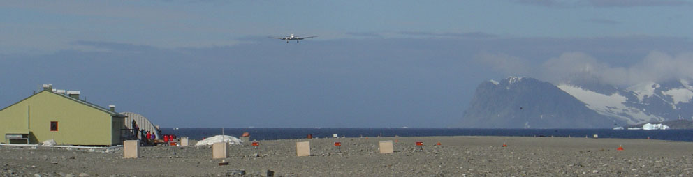
Here’s a DC-3 coming in for landing in January 2004. Research or tourists or both?

From the Wikipedia page where the improvements over time (and dates) to Rothera station have been listed) we find when the new runway was built:
With the commissioning of the gravel runway and hangar in 1991-92 air operations became more reliable and access to Rothera was greatly improved through a direct airlink from the Falkland Islands.
Just like airports wordwide, where many GHCN stations have been located, we see growth at the airport. Growth translates into UHI or in this case, AHI, since the next closest patch of humanity with a weather station is Base San Martin 75 kilometers away.
Here’s another take on the growth:
History: Built in 1975 on Adelaide Island, Rothera occupies a small rocky peninsula. A 3000′ (900m) crushed rock airstrip and hangar were added in 1990-91, making Rothera a peninsula region logistics center for British Antarctic Survey Operations.
Information: Rothera can accommodate 124 people and boasts one of the few aquariums in the Antarctic. The Bonner laboratory complex, completed in 1997, includes a recompression chamber, a wet lab and a terrestrial biology lab. A large new sleeping quarters building , which can house 88 people, is being constructed and should be completed by 2002.
So it is with little surprise, given the land use changes, the increased infrastructure, the new gravel runway, and an increased tourist trade that we see this sort of temperature plot from GISS:

Prior to 1985, it looks like recording temperature there wasn’t so important, as there is significant missing data. But with aviation growth comes a need for accurate weather information, and thus we don’t see any missing data since then.
Where do they actually measure the temperature at Rothera? That I don’t know yet, but given that the BAS puts hourly automated temperature reports on their website,and has a webcam it seems there is probably an automated weather station rather than a Stevenson Screen.

I’m guessing they have a readout for temperature in the comfort of the control tower:

For all I know the thermometer could be on the roof or side of the control tower. Not unheard of.
Regarding the GISS temperature plot. There’s a clear upwards trend. The question is: how much of it is caused by localized human influences and land use change?
Clearly, Rothera Station is no longer a “pristine” place to do science, it’s just another destination, a pocket of humanity with an airport, a coffee shop and the only heat for 75 kilometers.
Is Rothera a good place to measure a long term temperature trend to use for adjusting other Antarctic GHCN stations? Perhaps not.

“Is there a temperature data set that does not have serious problems that just happen to support AGW?”
Yes.
Mars, Luna, Venus, Io, and Pluto were all undergoing strong warming from 1990 to 2000. Wait-a-second.
As I said…the only factor here is the albedo of the runway in my book…I do not believe 100 humans smattered around in very air-tight containment pods amounts to a significant urban heat island. The albedo affect may be real…and I placed the significance of it around 0.3 C in the summer (meaning 0.15 or so for the whole year)…which is not negligible. I just don’t think it’s going to result in big changes to the overall shape of that graph.
That said…I think the most important point is that this station is not actually on Antarctica…it’s on a peninsula…Antarctica has very different weather and is always snow and ice covered. So I agree that the GHCN database should not be using that point to represent Antarctica at large.
One station determines the trend for the entire continent??
Why Not !!
One tree does it for the Northern Hemisphere !!!!!!
Has anyone built a list of the known weather station networks that make their info available? Specifically available in an automated online approach, with the data freely available for accessing?
I ask this, as I just remembered an automated network the fire services have. Its has 2,000+ automated weather stations, some of which are at extreme locations away from any known man placed heat sources. This network would make a beautiful tool to compensate for the UHI effect in locations like airports.
check out the automated results for some of these units in Oregon.
http://www.raws.dri.edu/orF.html
hourly, daily, monthly averages for pretty much anything you want to know about a location. year over year monthly averages show some interesting results already.
This network gives a great example of a comp for comparing like weather readings at the ASOS airport locations. Wilderness vs Airports in a data death match, with the wilderness having like equipment and life of site location’s point of view.
Best,
Jack
From what I understand the Rothera Station temperatures has also been affected by ocean currents, as it sits on a peninsula. I predict that in the future that a college class about the climate scam will be required for certain degree programs.
Climb every mountain, hide every decline, increase every incline.
I dont see anything wrong with their taking the station with the highest trend to represent the continent. After all the models predict that the warming will be greatest nearer the poles, and the evidence should match the predictions.
Would it be novel to suggest to these dolts that one measures a continental temperature from within the continent?
So now Australia is on the “Cook the Books” band wagon. What goes around, GW hide the decline, comes around, CO2 emissions “hide the increase”. Caught cheating! This things gets more twtisted every day!
http://www.abc.net.au/news/stories/2009/12/14/2770326.htm
I’m not exactly sure where this particular research platform is located in Antarctica, but it looks (to my untrained, non-scientist eyes) like there’s possibly a “non-standard” Stevenson screen perched right on top of the toasty researchers’ laboratory. I’m fully-open to correction and welcome any explanation as to what that little white thing with the dark (green?) roof might be. Also, here’s an excellent overhead view of the runway and facilities at Rothera. I wonder how many lawsuits you’d have to fight to make that kind of impact to a wetland/marine system to install a runway in the U.S.?
What they need in Antarctica is the ice continent equivalent to the Argo network, with an array of dropsondes scattered over the antarctic ice sheet designed to stay on the surface and not get buried in blowing snow (not an easy task I presume).
Then they report data to satellites periodically along with a condition code that indicates if they are indeed on the surface or drifted over and buried in snow.
That would of course cost money but would be a bunch cheaper then spending trillions of $$ on climate remediation that is not necessary.
Larry
The UHI of that camp goes straight into the temp sensor.
Meanwhile, the rest of Antarctica is unihabitable. Might as well be on Mars.
The only place Antarctica is truly warming is in the minds of those suffering from Climate Scratch Fever. This is not the 1st time such imaginary runaway heating has afflicted thinking.
I just looked up WolframAlpha for South Pole temperatures from 1960 to present date. There is increase in temperatures from about 1986 t0 1992 and then it falls back again. It seems a fairly dramatic increase: from a yearly mean of about -50 C to -30C.
Why did it happen?
I think the scientists are just too fat and lazy to trek to the out of the way places to check the temperature readings and service the equipment.
Anand Rajan KD (16:28:13) :
For the same reason that Scott and his team got caught by unexpectedly cold temps and perished. Read that account. Climate and Weather vary, always have, even in Antarctica.
A few days ago Gordon Brown the UK Labour PM said
“With only days to go before Copenhagen we mustn’t be distracted by the behind-the-times, anti-science, flat-earth climate sceptics. We know the science. We know what we must do.”
I’ve always voted Labour. I’ve always followed science. I’ve always been interested in the the forefront of new technology. No amount of political spin, fatuous personalised insults, will stop me following science and being sceptical.
When I read a topic like this (in addition to all the Climategate related exposures) where 1 station is used in the official figures to represent 17 years of temperature trends of a whole continent and, of the 27 available sites, it’s the one that shows the greatest warming trend of all, I’m not behind-the-times, I’m surfing the tidal wave that’s going to engulf the whole AGW scientific farce.
It seems Mr Brown knows as much about AGW science as Mr Blair knew about WMD. World leaders sure need to act. They need to sort this farce out. They can’t make valid policy decisions based on clearly bad data, when the magnitude of the failings of the climate science process is masked by deliberately prejudiced data and adjustments. Institutionalised prejudice is a phrase that comes to mind. And climate science appears to be riddled with it.
Station data from British Antarctic Survey: http://www.antarctica.ac.uk/met/READER/surface/stationpt.html
Isn’t this like estimating the temperature of North America from a single weather station in Miami?
REPLY: Bingo!
Yet another instance of faulty siting and selection bias. Does GHCN have a single weather station that we can trust?
http://www.examiner.com/x-28973-Essex-County-Conservative-Examiner~y2009m12d13-Antarctic-weather-station-data-found-flawed
Never forget Heisenberg’s Uncertainty Principle. When you measure something you inescapably affect the thing you are measuring. In the case of temperature, for example, avoid breathing on the thermometer at forty below, and site your met shelter as remotely as possible. From personal experience I can affirm that the Antarctic is a very tough place to make any kind of scientific observations. The workers there deserve the greatest respect, but remember the limitations of an extreme environment. By the way, to “Antarcticans” the Peninsula is considered the “banana belt”. It is atypical of either the adjacent, higher latitude, larger West Antarctic ice sheet, or the distant much higher, much colder, much larger East Antarctica, which contains the Polar Plateau. The Peninsula is to Antarctica, so to speak, what the Isthmus of Panama is to the North American continent.
Picture of Stevenson Screen at http://www.antarctica.ac.uk/living_and_working/diaries/rothera/2008/07/index.php about half-way down under “Rothera Diary — July 2008.”
Here is a photo of the weather station at Rothera (dusk or dawn – hard to see):
http://4.bp.blogspot.com/_jyPRdfUyjtI/RpPPv2t7rQI/AAAAAAAAAh0/gdhODDbXTg4/s1600-h/mettower.JPG
According to the notes on that blog, as of 2007, it used a Stevenson screen thermometer.
Described on this blog here – he was the station meteorologist in the BAS and might answer some questions if contacted through his blog:
http://rotherapoint.blogspot.com/
The photo of the “airport tower” in the WUWT post is actually the operations center – communications, ops planning, airport operations.
http://rotherapoint.blogspot.com/2007/02/some-of-what-and-where.html
Here is a beautiful photo of the Rothera Point Stevens Screen:
http://www.robertwebster.org/blog/14jul08/met_tower.jpg
There is also a nice photo of one of the automated weather stations that are located in the field (1 to 2 Otter flights away) on his newer blog site:
http://www.robertwebster.org/blog_december_2008.html
He built the weather station that is pictured.
Hmmm isn’t the blog research dynamic interesting?
After about 3 hours of comments and we have a file of pictures assembled, showing the local environment of the temperature recording station, lists of station data, history of changes, and a point of contact blog run by someone who was the station meteorologist. Not to mention that the story has already been picked up by a news outlet.
Next ! Now serving number 32 at the hide the decline debunking window. 😉
Larry
I think you haven’t grasped the physics at work here.
Heat flow depends upon temperature difference and the thermal conductivity of the material in the shell. Since the temp diff is HUGE, the materials are chosen to have absolutely minimal therm cond. But just as you don’t (and can’t) make your house a perfect insulator, neither can they (even less so). A HUGE temp diff times a tiny therm cond could give any value for heat transfer, depending on the exact values of the two factors. But even without looking up exact details, we know that there is absolutely no reason for them to make the heat transfer even less than it is with normal buildings in normal climates.
Lugging all that material to Antarctica costs money, getting even better insulators costs money. If the net result is around about the same heat transfer as for normal buildings elsewhere, they are doing very well and will require normal heating. No way are they going to expend even more money for even better insulators to get less heat transfer than we all commonly accept in normal buildings in normal cities. In fact I would wager that they are content with less, and use more heater fuel. All the heating must escape, or the building just gets hotter and hotter. The fact that the absolute outside temperature is really cold misleads our intuition, but the physical facts cannot be changed.
According to this page, Mawson uses 15,266L of fuel yearly for heating and ventilation. All that heat escapes. Do you know of a small group of buildings in a normal climate about the size of the ones shown above that use that much fuel for air conditioning?
The ‘Team’ always say that warm Greenland didn’t mean a warm globe, because it was local warming. In the same way, the thermometer actually reads the whole continental temperature and not the local one because they use algorithms (which is like magic but smarter).