It has been 10 years since the super El Niño of 1998 helped to spike global temperatures dramatically. Now since it appears we are in the opposite phase, I thought it would be interesting to look at the 10 year trend from January 1998 to January 2008.
Here’s a link to a 2-minute video called “The El Niño Factor”. Bob Tisdale points out to me this interesting graph: (slightly modified the key placement to fit the image in this blog)

Here’s the link to the Webpage that’s the source of the data for the above graph.
Now let me be clear that a 10 year trend period is not typical for climate analysis. Typically a 30 year period is used to establish a climate baseline. For example, NOAA publishes climate summaries for cities in the USA based on 30 year periods. I’m not trying to do anything to compare to the last 30 or even the last 100 years. I’m simply curious about what the trend looks like since the last big El Niño event in 1998 now that we are in a La Niña. Of course this may upset some folks, and I’ll probably get the usual invective hurled at me and furious scribblings on other blogs refuting this as “He’s doing it wrong”, but I think looking at what has happened globally between a large a large El Niño and La Niña is both interesting and useful.
To do this, I used the same global temperature anomaly datasets that I’ve used for the last few posts I made on the subject of global temperature anomalies. I created a new file, using all four global metrics, with only the last 10 years of data, which you can inspect here: 4metrics_temp_anomalies_1998-20081.txt
Here are the four charts of global temperature anomalies, note that there are links to each original organizations data source below each graph. Click each image to get a full sized one.
University of Alabama, Huntsville (UAH) Dr. John Christy:

Reference: UAH lower troposphere data
UAH shows a slightly positive anomaly trend of 0.028°C for the last ten years.
Remote Sensing Systems of Santa Rosa, CA (RSS):

Reference: RSS data here (RSS Data Version 3.1)
RSS shows a slight negative anomaly trend of -0.01°C for the 10 year period. This may have to do with the fact that RSS reported an anomaly for January 2008 that was twice the size than what UAH reported (-0.08 for RSS, -0.044 for UAH) owing to a different methodology of the satellite data preparation.
UK’s Hadley Climate Research Unit Temperature anomaly (HadCRUT) Dr. Phil Jones:

Reference: above data is HadCRUT3 column 2 which can be found here
description of the HadCRUT3 data file columns is here
The HadCRUT land-ocean global anomaly data shows a slight trend of 0.017°C for the last ten years. Surprisingly, it is lower than the trend of 0.028°C for the UAH satellite data.
NASA Goddard Institute for Space Studies (GISS) Dr. James Hansen:

Reference: GISS dataset temperature index data
And finally we have the NASA GISS land-ocean anomaly data showing a ten year trend of 0.151°C, which is about 5 times larger than the largest of the three metrics above, which is UAH at 0.028°C /ten years.
Given some of the recent issues Steve McIntyre has brought up with missing data at NASA GISS, it also makes me wonder if the GISS dataset is as globally representative as the other three.
UPDATE: The answer as to why the GISS data diverges so much may be found in the 2005 summary on the GISTEMP website, (h/t Barry H.) Here is a relevant excerpt:
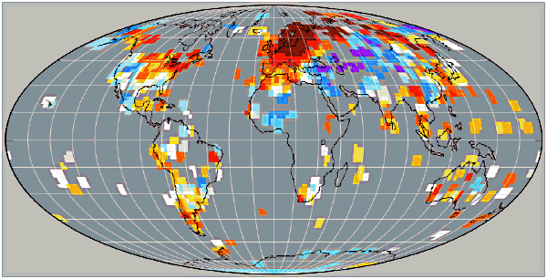
Our analysis differs from others by including estimated temperatures up to 1200 km from the nearest measurement station (7). The resulting spatial extrapolations and interpolations are accurate for temperature anomalies at seasonal and longer time scales at middle and high latitudes, where the spatial scale of anomalies is set by Rossby waves (7). Thus we believe that the remarkable Arctic warmth of 2005 is real, and the inclusion of estimated arctic temperatures is the primary reason for our rank of 2005 as the warmest year.
I’m not sure the “remarkable Arctic warmth” is real, especially since the disappearance of arctic sea ice during that time has been linked not to warmer temperatures, but to wind patterns by other researchers at NASA. The sea ice “melt” as proxy for increased arctic temperatures doesn’t seem to be connected. Further, a NASA satellite AVHRR image shows the high latitudes near the south pole getting colder, except in areas where volcanic activity is known to exist.
A recent comment from Carl Smith came with an animated graphic showing how that 1200 km spatial extrapolation looks when compared to a 250 km block, which is also used in GISS analysis. Carl writes “Bear in mind that the data in a 250km ‘block’ is in many cases from a single station, especially in remote areas, so is really just a minuscule dot on the map. Note how little real polar region data there is in the 250 km map, whereas in the 1200 km map the polar regions appear to be well covered.”
As a creator and purveyor of meteorological measurement technology I have never been a fan of “extrapolated” data. It is not a confidence builder to know that data for something so important has been either extrapolated or estimated, especially when there are so few stations in the high latitudes, as evidenced by the Historical Station Distribution study by John Goetz.
By treating the NASA GISS data as being an outlier due to that data confidence difference, and by taking a “3 out of 4 approach” in looking at the plotted trends, one could conclude that there has not been much of a trend in global temperature anomalies in the past ten years.
Jeff, I propose a contest to determine which one of us is the dumbest. And since you are so good at “fish” problems, I pose the following:
My son-in-law and I went ice fishing on my pond a couple weeks ago and caught a couple dozen Bluegills. We threw back all the ones under 8″. How many did we keep? As Anthony says, simple multiplication, right?
As an aside, (and in keeping with the nature of this blog), you can’t imagine what a treat it was to fry up a bunch of freshly caught Bluegill in the middle of one of the coldest and snowiest winters in recent memory.
Well, I wouldn’t say “dumb”, lol. Just took different paths in life from those math types 😉 I was more into history, did not bad in HS biology, was always good at geography. Astronomy always fascinated me too, until the math came into play…
Not enough information. What time did the train leave Chicago, and how many of the girls are under 5 feet tall?
Never did any ice fishing, but did plenty of summertime pond fishing in the Blue Ridge Mountains of Norhwestern Virginia as a boy. I usually threw back the bluegill in favor of largemouth bass.
Not enough information. What time did the train leave Chicago, and how many of the girls are under 5 feet tall?
Train? What train? ROTFLMAO!! My wife is just over 5 feet — does that count?
I have almost the exact same background as you do in terms of education. I did well in high school chemistry and biology, math — not so much. When I moved out in the country a decade ago, (I’m in northeastern Indiana) I bought a decent telescope, but ended up using it more for birds and wildlife than for astronomy. I have a BS in Business Administration with an unintentional minor in history, simply because history has always fascinated me.
BTW, I have Largemouth Bass in my pond too, and we caught several of them through the ice. In the summer, the Bass are more fun to catch, particularly on a fly rod, but not as tasty to eat. The two species do compliment each other in a small pond (mine’s 1/2 acre, about 16 feet at the deepest point, fed primarily by my open loop geothermal system, as well as draining a watershed of around 6-7 acres. Interestinglly, I’m 63, and the last time I fished through the ice was as a teenager.
“GISS attempts to correct for this by using the known spatial coherence of anomaly data to interpolate the missing grid cell measurements. ” I do hope that no-one is using these interpolations as if they were data i.e. measurements. Just as I hope that they do analyse measurements, rather than measurements “adjusted” by essentially arbitrary “corrections” – I’ve seen too much of that sort of rubbish over the years.
Hey Stan, would love to continue the conversation, but don’t want to hijack the thread any further. You can email me at jeff at jalberts dot net, if you like.
Dhogaza’
You don’t understand.
The point is how ridiculous the warmingists are, when they speak in the ‘present tense’ of Arctic ice melting, on a minus 50 deg day.
Having experienced such conditions many times, I am well aware of them, including that ice does not melt on a minus 50 deg day. Perhaps you are a warmingist who still thinks that temperatures in the Arctic are warmer than normal when the facts are that it has been below normal consistently for nearly six months now. The new Arctic ice will not be melting anytime soon. Don’t buy any tickets for an Arctic cruise next summer as the cruise lines are not making plans to have their ships converted into ice breakers.
[…] statistically significant warming 11 03 2008 Yesterday, in response to the thread on “3 of 4 global metrics show nearly flat temperature anomaly in the last decade” I got a short note from MIT’s Richard Lindzen along with a graph. I asked if I could […]
[…] period to try to discern a trend in global average temperature, there is no a priori reason why a period of 10 years could not yield meaningful insights. It all depends on the “skill” with which we look at the […]
Anthony: Here’s a link to “El Nino Factor III”–probably the last of the series.
It compares and illustrates the correlations of NINO3.4 data to TSI (Can’t Miss It!) and to standardized global temperature. It also illustrates the correlations of global temperature to the Oceanic Nino Index (ONI) and to the Global SST ENSO Index. It’s almost twice as long as the first two, but I cover more topics.
I’ll retract the comment I made earlier on this thread about it being only a coincidence. The cumulative effect is sensitive to the base period of the raw data.
If I do another one, it’ll be an attempt to illustrate what’s happening and why the Running Total works. Other than that, I’ve run out of El Nino indices to play with.
If you’d like, I can email a copy of the spreadsheet so you can play with the data. Please advise.
Regards
NOTE –
Somebody just made a comment here that I accidentally deleted. The delete and edit words links are right next to each other on the comment form, I went to hit edit, to add a reply, but missed the target, and unfortunately WP has no “are you sure” or recovery options for a deleted comment.
The comment was about the number of months in the 10 year trend. Whomever that was, feel free to repost. My sincere apology for the trouble.
Lee said:
“arctic ice as of today is still almost a half million km2 below 1978-2000 mean for this date.”
Correct. And the Antarctic sea ice extent is a full million square km ABOVE the 1979-2000 average, for this date.
http://arctic.atmos.uiuc.edu/cryosphere/
If either is relevant, both must be. The worldwide total anomaly is currently positive, not negative.
Anthony,
Mine was the comment you deleted. My comment was simply that the data that you link contains 121 months, so it is not a true 10 year analysis. To get 120 months you would need to drop either Jan98 or Jan08 from your analysis. The other 119 months would be the same under either scenario, but you would get different outcomes. For instance, the average monthly anomaly over jan98 to dec07 in the UAH data is .2458333 and from Feb98 to Jan 08, the average of all 120 anomalies is .24016667. While those numbers look small, that’s a change of over 2% by just dropping one number and adding another.
My point is first, you’re looking at 121 months, not 120, and second if changing1 number has that large an influence, I think your time frame is too short to have any meaning.
Lastly, I want to add I’m not a stat guy, so I don’t even know if the average of the anomalies has any significance anyway. I just used it to get a quick and dirty look at the impact of which set of data you use.
REPLY: thanks for reposting.
[…] Data for first analysis: Blog post at Watt’s and text […]
[…] reference the temperature records over the last 10 years from 4 different metrics presented over at Anthony Watt’s blog. Yes, it’s only a 10 year period, but I fail to see any noticeable short-term direct relationship […]
[…] decréscimo acentuado da temperatura global. Algumas fontes de medições climatéricas indicam que nos últimos 10 anos a temperatura global se manteve estatisticamente a mesma. O artigo da Nature, apesar de se basear em novas medições e numa nova estratégia de fazer as […]
This is really interesting — the four modelled results and the numerous interpretations, exceptions, etc. I wish the conversations had continued beyond May.
Frankly, I’ve been a skeptic from the day I saw the Time magazine cover for “Earth, Planet of the Year”.
Twenty years have proven the skeptics correct and incorrect. Global warming is not really about climate change, and it’s not about environmentalism. It’s about social experimentation; about creating the perception of a crisis and emplacing conditions and restrictions on who loses and who receives it, by writ of law. It’s the same game that man has played throughout our just-above-the-monkeys existence.
Hopefully, the data you observe and the models you build will give us a much clearer picture of what the futures holds. God speed.
I wonder if someone can check if the HadCRUT3 calculation has changed. I see on their website <a href= “http://hadobs.metoffice.com/hadcrut3/” here they comment:
“We have recently changed the way that the smoothed time series of data were calculated. Data for 2008 were being used in the smoothing process as if they represented an accurate esimate of the year as a whole. This is not the case and owing to the unusually cool global average temperature in January 2008, it looked as though smoothed global average temperatures had dropped markedly in recent years, which is misleading”.
[…] because temperatures have been flat if not cooler since 1998, the hottest year on record. 3 of 4 global metrics show nearly flat temperature anomaly in the last decade « Watts Up With That? You want to know by far the biggest deciding factor in the Earth’s climate? I’ll give you a hint, […]
[…] in as an aside the claim that the earth has actually cooled over the last decade anyway (which might be true). I ended up trying to explain, without being overly antagonistic, that most environmentalist […]
When using rolling averages, example, 30 year trend, one must place it in the center of the time period, i.e. about 1993 for 30 year average ending 2008. Using the 30 year trendline to represent the present rate of change is flat wrong.
[…] Gehöre ja zu dem Volk, das der Klimahysterie skeptisch gegenübersteht. Ich weiß nicht, ob der Klimawandel wirklich zum Großteil durch den Menschen verursacht wird. Bin mir noch nicht mal mehr sicher, ob er überhaut stattfindet. Immerhin ist’s seit zehn Jahren nicht mehr wärmer geworden. […]