Temporal & Spatial Thermal Response to Heat Input, Transfer & Retention in the Climate System

Richard Willoughby

Introduction

This article is based on analysis of trends in solar radiation with time and location over the globe.  Particular emphasis is placed on Net radiation absorption and release, which involves internal heat transfer as well as where heat is being retained and lost.  The thermal responses of different regions are analysed as a means to understand why spatial and temporal changes in ToA solar EMR drive temperature trends.

Solar Electro-Magnetic Radiation (EMR)

The vast majority of energy in Earth’s climate system has been and is being sourced from the sun.  The Solar Radiation and Climate Experiment (SORCE) Project was established to accurately measure the output of the sun using satellite based sensors.  Chart 1 exhibits the principal results of the project that operated for 16 years producing daily determinations for solar EMR.

Top of the Atmosphere (ToA) solar EMR has a distinctive annual cycle with slight changes from year-to-year.  The lowest recorded was 1315.872W/m^2 on July 4 2005 while the highest was 1408.573W/m^2 on January 9 2015 or an annual range up to 92W/m^2. The average over the recording period was 1361.1W/m^2.  The monthly anomaly over the project period has a range of less than 2W/m^2.  The orbital changes from year-to-year contribute a significant portion of the monthly anomaly.  The remainder of the anomaly is due to the variation in the solar “constant”, which was determined to range from a low of 1357.019W/m^2 on October 3 2003 to 1362.278W/m^2 on February 7 2015 at constant distance of one astronomical unit.  Most of the change in the solar constant is short duration spikes and troughs.

The SORCE Project confirmed the consistency of the so-called solar “constant” and the relatively large annual variation in ToA solar intensity due to Earth’s annual orbit of the sun.  The variation in the solar constant contributes approximately 1W/m^2 to the monthly solar anomaly in an annual range of 92W/m^2.  Hence the variation in solar constant is of the order of 1.1% of the annual variation in ToA solar intensity due to the orbital variation.

Earth’s ever changing orbit around the sun and daily rotation means there will never be any place on Earth that experiences identical orientation to the sun as it has in the past.  That means the energy input to the climate system is always changing.  Hence climate has always changed and always will. 

It is possible to calculate the ToA solar intensity anywhere over the globe using orbital ephemerides, planetary geometry and a selected value for the solar constant, which is not quite constant but changes less than 0.2% whereas the annual variation in ToA intensity is almost 7% range of the average.  Chart 2 is based on a solar constant of 1362W/m^2 for the 2022 orbit.   

December is still the month of highest average solar intensity while June is the month of lowest.  The ToA solar range is greatest at the poles with South Pole currently experiencing a range of 551W/m^2, which is somewhat greater than the 517W/m^2 at the North Pole.  Over the course of the next 9,000 years, this will reverse.  The equator receives the highest annual average solar EMR of 407W/m^2 but the lowest annual range.  The South Pole has a current annual average of 180W/m^2 while the North Pole annual average is 166W/m^2: the lowest average for any location.

Net Radiation Energy

Not all of the solar EMR available at the top of the atmosphere is thermalised within the climate system.  Some surfaces such as the polar snow covered land ice and sea ice as well as high level clouds are highly reflective.  These surfaces reflect some of the available ToA solar EMR so it is not thermalised thereby giving rise to short-wave reflected radiation (SWR).  Most of the solar EMR that is thermalised within the climate system is emitted back to space as long wave radiation commonly referred to as outgoing long-wave radiation (OLR).  The Net radiation is determined by subtracting the OLR and SWR from the available solar EMR.

The Cloud and Earth’s Radiant Energy System (CERES) project has been producing high resolution global ToA radiation data since 2001 using satellite based instruments.  The monthly average Net radiation ranges from typically minus 208W/m^2 up to 190W/m^2.  Image 1 provides a spatial perspective of the annual range for Net radiation in W/m^2 between the maximum and minimum for both hemispheres.

Net radiation is well correlated with the solar EMR across the regions but the dependence changes with the type of surface.  For example, regions with permanent ice cover such as Antarctica and Greenland have considerably lower range in Net radiation when compared with adjacent land or ocean.  The variation in Net radiation at the equator is very low indicative of the near constant solar EMR over the equator..

Ocean Heat Content

The Argo project has been producing relatively high resolution and consistent ocean temperature data from the surface to a depth of 2000m since 2005.  Image 2 depicts how the average temperature in Centigrade degrees of the top 2000m of the global oceans has changed from the start of the Argo project in 2005 to the end of 2023. 

The range in temperature is quite wide from minus 5.3C up to 6.2C with an average of 0.0897C.  The average temperature increase corresponds to additional heat of 243ZJ (ZettaJoules, 1E21) over the 19 year period or average annual increase of 12.9ZJ.  To put that in perspective, it corresponds 0.2% of the 5415ZJ of the ToA solar EMR available annually.

The change in ocean heat content (OHC) as displayed spatially in Image 2 does not have any particularly notable features.  Looking closely, it is apparent that the Gulf of Mexico and the Mediterranean Sea have retained more heat.  There are hot spots in the region of the Ferrel Cells in both hemispheres with the band of interspersed warmer and cooler regions across the Southern Hemisphere (SH) being more evident than across the Northern Hemisphere (NH).

It is worth noting that the Argo OHC data between 2005 and 2015 was used as a basis to calibrate the CERES radiation data because the radiation instruments and associated analysis lack the inherent accuracy to measure, in absolute terms, the small changes occurring in the global ToA radiation budget.  The retained heat in the oceans corresponds to a Net absorption of 0.8W/m^2.

Chart 3 compares the accumulated Net radiation and OHC by latitude for oceans in the Northern Hemisphere and Southern Hemisphere for the concurrent interval with the Argo measurements from December 2005 to December 2023.

The Net radiation peaks at 160ZJ/degree at the Equator; drops to zero at 37N and 37S then reaches minimums at 55S of minus 2ZJ/degree and at 72N at minus 1.2ZJ/degree.

The OHC has a peak at the Equator and distinct peaks in the region of the Ferrel Cells in both hemispheres.  Peak heat retention of 5ZJ/degree occurs at 45S and 3.8ZJ/degree at 37N.  These peaks in retained heat were not so obvious in Image 2 because the warmer zones are interspersed with cooler zones.  The Ferrel Cells are net condensing regions where increasing precipitation steepens the thermocline thereby retaining more heat in the deep ocean.  It is ocean heat retention in regions of increased precipitation rather than surface heat uptake across the entire ocean surface.

Chart 4 provides a temporal perspective on cumulative heat for the overlapping period of Argo and CERES data.

Over the 19 years of concurrent data, the oceans of the NH and the atmosphere above have absorbed 1337ZJ and retained 106ZJ or 7.9% of the absorbed radiation.  The SH has absorbed 618ZJ and retained 146ZJ or 23.6%. 

Land & Ocean Response to Solar EMR

Both land surfaces and ocean surface exhibit positive response to ToA solar EMR but there are noteworthy differences.  Land responds faster and with greater range than the ocean.  The NH land mass reaches its maximum temperature in July and minimum temperature in January.  The SH land mass is the reverse.  Image 3 displays the maximum to minimum range of temperature for the land surface over an annual cycle based on the Global Historic Climatology Network (GHCN) for global 2m air temperature over land (LST).  Note that GHCN does not provide coverage for Antarctica.

It is apparent that most of the land surface experiences a range greater than 15C.  The exception is the relatively small proportion in the tropics that has an annual range of less than 3C.

Ocean surfaces respond slower and over a smaller range than land; exhibiting widest range from February to August, thus lagging the peak range in solar EMR by two months.  Image 4 displays the spatial temperature range for the oceans using Reynolds OI sea surface temperature (SST).

It is apparent that the ocean adjacent to the NH land mass undergo a much wider temperature range than any region of the oceans in the SH.  Chart 5 presents the same data as the two Images 3 and 4 above but with temperature range plotted against latitude.

Land comprises 68% of the total surface area between 60N to 70N so the combined area averaged temperature response between those latitudes is dominated by the land response.  Antarctica aside, most land in the SH is in the lower latitudes but is only a small proportion of the total surface area.   Accordingly the temperature response of the SH is dominated by the response of the oceans, which has a narrower range than the land.

Temperature Trends Satellite Era

The satellite era improved the global coverage of surface temperature measurement particularly for the oceans.  The Reynolds (SST) combines satellite measurements over the oceans with surface measurements to produce accurate, high spatial resolution data.  Image 5 depicts the change in SST from August 1982 to August 2022.  Global SST has exhibited the largest monthly increase in August so Image 5 shows where the oceans are warming the most.

The average SST has increased by 0.474C over the period but some regions are up to 3.8C cooler with some areas along the coastline of the Arctic Ocean up to 13.1C warmer.

Global land has experienced the greatest monthly increase in January.  Image 6 displays how the LST has changed from January 1982 to January 2022 based on the GHCN LST data, which excludes Antarctica.

The average increase is 1.8C with some regions cooler by 6.4C and some warmer by 17.4C.  The average increase in LST is 3.8 times the average increase in SST.

Chart 6 examines the monthly temperature anomaly trends relative to latitude for surface measurements based on the Berkeley LST; the lower troposphere using UAH TLT and the Argo deep ocean temperature.

The three different sets have significantly different rates of change but there are similarities in the profiles.  All three data sets exhibit an increasing trend relative to latitude with the high northern latitudes having the greatest increase and high southern latitudes reaching negative trends south of 60S.  All three data sets exhibit distinctive humps in the region of the Ferrel Cells in both hemispheres.  The equatorial zone shows little to no increase.

Heat Transfer Ocean to Land

Oceans and their atmospheres are net absorbers of radiant heat on average while land and its atmosphere release heat back to space on average.  From 2001 to 2023, the total heat absorbed by the oceans was 2432ZJ while the land released 1903ZJ.  The heat transfer is primarily associated with transfer of atmospheric water from the oceans to land.  Solar EMR thermalised in the ocean and atmosphere above result in water evaporation from the ocean surface and then transported by air currents to the land where radiative cooling causes the water vapour to condense then precipitate as rain, snow or hail.  

The water transfer from ocean to land can be assessed by monitoring the runoff of water from land being returned to the ocean.  The Global Runoff Data Centre (GRDC) has been compiling runoff data for over a century and has global coverage at very high resolution.  Image 7 provides a snapshot of the data for May 2019.  May is the month of highest runoff typically averaging 1mm/day for the entire land mass totalling 1.47E14m^2 where runoff occurs.  The data does not include glacier calving or ice shelf loss.

The May runoff is relatively high in the mid to high northern latitudes following the annual melt.  There is also high runoff from land on and near the Equator, which is less seasonal.  For the 20 years to December 2019, the annual runoff averaged 292mm; equivalent to 43Gt of water per year. 

Chart 7 plots the Net heat absorbed for land and ocean as well as the calculated heat release from atmospheric water condensing to produce runoff; all for 2019.

Both ocean and land absorb heat in the tropics and both release heat at higher latitudes.  The ocean and its atmosphere have peak absorption of 8.5ZJ/degree at the Equator.  Land and its atmosphere absorb almost 2ZJ/degree at the Equator.  The heat release through water vapour solidifying peaks at 3.5ZJ/degree also at the Equator.  The heat release to produce the runoff is based on the heat of solidification for water.  Using that value results in heat loss associated with runoff of 119ZJ.  Some of the accumulation feeding the 2019 runoff would have occurred in 2018, so is not directly associated with the 108ZJ net absorption of the oceans and 81.8ZJ net release from land.  Most land along the Equator sustains enough moisture to establish powerful convective cells that are mid-level convergent zones but high level divergent zones that are net radiation absorbers due to atmospheric absorption and then sensible heat advection.  The tropical land and atmosphere above from 20S to 20N absorbed 50.5ZJ Net radiation in 2019. 

Changing Regional Solar EMR

Earth’s rotation and orbit of the sun are obvious drivers of daily and seasonal weather changes.  The ever changing orbit is also responsible for longer term trends observed as climate change.  The sun is a relatively stable source of radiation energy reaching the top of Earth’s atmosphere as outlined in the opening section.  

Chart 8 shows how ToA solar EMR over NH land has changed for the months of highest and lowest solar EMR relative to the corresponding monthly average from 1502 to 1533.  The accumulation of the anomaly for the two months is also displayed on the right-hand axis.  The asymmetry of the changes for the high and low month is a result of the distribution of land over the globe resulting in the average of the monthly accumulations being positive and totalling 20ZJ from 1500 to 2100.

The reference period for the anomaly was chosen because it coincided with the NH having experienced the lowest solar intensity in the current 23,000 year precession cycle.  In July 2022, Earth was some 40,000km closer to the sun than in 1509.  The orbit was at aphelion on July 4 in 2022 compared with June 17 in 1509.  In other words, compared with 1509, Earth was closer to the sun at its maximum distance from the sun in 2022 but 17 days later in the year due to a combination of orbital eccentricity and precession.  There are other less significant variables in the ephemerides such as obliquity of the axis which will change from 23.50327 degrees in 1501 to 23.4266 degrees in 2100.  The moon orbit of Earth also causes nutation of Earth’s axis over an 18 year cycle that can be observed in good temperature records but it is a very small change compared with the three larger changes in orbit.

The accumulation of energy over land is not simply a notional change.  There are observable consequences.  For example, 16ZJ from 1501 to present time going into melting land ice would result in a sea level rise of 120mm over 500 years or a change of 8ZJ in the past 100 years adding 0.6mm/year to sea level.  The resulting reduction of permanent ice reduces the albedo of the land so the land warms due to both loss of ice and increased solar absorption.  Alternatively 16ZJ could add 64Gt of biomass.  The presence of biomass will moderate temperature extremes by retaining surface moisture.  Observations over the past 500 years indicate that both permanent land ice has reduced and biomass has increased.  So these changes are, indeed, cumulative. 

From a spatial perspective, the range in solar EMR over land is increasing in the NH but reducing in the SH.  Chart 9 displays the anomaly for highest and lowest month as well as the average over all land surface by latitude. 

The observed latitudinal temperature trends shown in Chart 6 above are similar to the trend in solar EMR of Chart 9 but it is notable that land south of the Equator has been experiencing reducing sunlight range but still warming.  The reason becomes apparent once atmospheric water is considered per Image 8 using RSS total precipitable water (TPW) data.

The mean increase of 0.4mm/decade is significant because the average level in 1988 was 27mm.  So over the 35 years of the record, the average has increased by 5%.  The increase is more significant in the NH and there is already large regions in the SH with no trend or negative trend.

The increasing average solar intensity over the NH land will continue to drive the upward trend in TPW in the NH.  The area of NH ocean reaching the regulating limit of 30C is increasing at 2.5%/decade.  Ocean warm pools now cover 10% of the NH oceans in September and, on present trend, will reach 50% by 2200.  Chart 10 shows how SWR and OLR have changed across the latitudes from 2001 to 2023.

SWR has reduced at all latitudes, on average by 2.4W/m^2, apart from the region of the South Pole and from the Equator to 7N.  OLR has increased, on average by 1.3W/m^2, at all latitudes apart from the two regions where SWR reduced.  The region just north of the equator is the same location where TPW is rising the most and where more ocean surface is reaching the 30C regulating limit.  The increase in brightness and reduction in OLR are associated with the convective instability that sets the sustainable temperature limit to 30C.  Once the atmosphere is in cyclic equilibrium with the surface at 30C the increase in SWR is twice the reduction in OLR so a very powerful negative feedback.  The inverse relationship is evident in Chart 10 but the magnitude is not evident because no region sustains the 30C limit over an annual cycle.

The Energy Intensity of Forming Snow

Snow falling on land is an energy intensive process.  The energy requirement is far greater than just the latent heat of water vaporisation.  Table 1 provides the energy inherent in two atmospheric columns at conditions related to ocean warm pools and conditions conducive to forming snow over land. 

Water liberated from the ocean surface requires latent heat to vaporise but also requires sensible heat to expand the atmospheric column as the lower density water gas elevates the column.  For a 30C warm pool, the average enthalpy change in the column associated with increasing precipitable water is 6.26E6J/m^2/mm.  Note here that the enthalpy associated with the water vapour at the cooler conditions is almost twice that of the warm pool.  So evaporation at the higher temperature has lower sensible heat associated with it.  From a process perspective, the least energy cost to get water into the atmosphere is at the highest possible temperature, which is 30C. 

Air diverging at altitude from a warm pool and moving over land will lose moisture as it cools.  The water that ends up on land could precipitate and evaporate many times before it eventually reaches land that is below freezing.  The warm pool has TPW of 89.6mm for the typical conditions that has to be reduced to 6.7mm before the air reaches freezing land.  Each mm of water equivalent snow has an energy cost in the range 1.14E7 to 8.37E7J/m^2.  Accordingly, it would take from 4.2ZJ up to 31ZJ to lower the oceans by 1mm to produce 4mm of permanent ice on land north of 40N.  At the higher value, there would need to be considerable runoff associated with the initial water transfer from the ocean.  However, it is noted that runoff is trending down but precipitation over land is trending up.  Advection of water from ocean to land is reducing as the land warms up but the water cycle over land is speeding up due to increased atmospheric moisture.

Temporal Trends & Thermal Inertia

Historical records reveal that climate change is not something that started last century.  The central England temperature (CET) record is the longest continuous instrumented temperature record available.  Chart 11 provides the anomalous record relative to the first 33 years of the record with three 100 year trends and the last 70 years.  Each 100 year interval has a positive trend, albeit the second 100 years just positive, with last 70 years higher than any of the 100 year trends; indicating acceleration similar to the average of the highest and lowest accumulated solar EMR over land in Chart 8 above.. 

Earth’s climate system has thermal inertia.  Measured and visible changes lag the changing solar EMR.  Surface temperature over land has a phase shift of 4 weeks relative to the ToA solar EMR.  The NH oceans lag by 8 weeks and the SH oceans lag by 10 weeks.  Once the phase shifts are made, the thermal responses of the respective surfaces are highly correlated to the available ToA solar EMR over the particular surface as shown in Chart 12 for period 1982 to 2022.

The different slopes of the correlation curves indicate the relative response to solar EMR for the different surface.  The thermal response of global land is 8.7 times the response of the SH oceans.

Ocean surface circulations have periods of decades.  The meridional overturning of oceans is in the range of 300 to 400 years and the abyssal ventilation can take up to 2,000 years.  However these changes are relatively short compared with ice perched on land.  The Greenland ice sheet has ice as old as 400,000 years while the Antarctic ice cores have been dated as far back as 2.7Ma. 

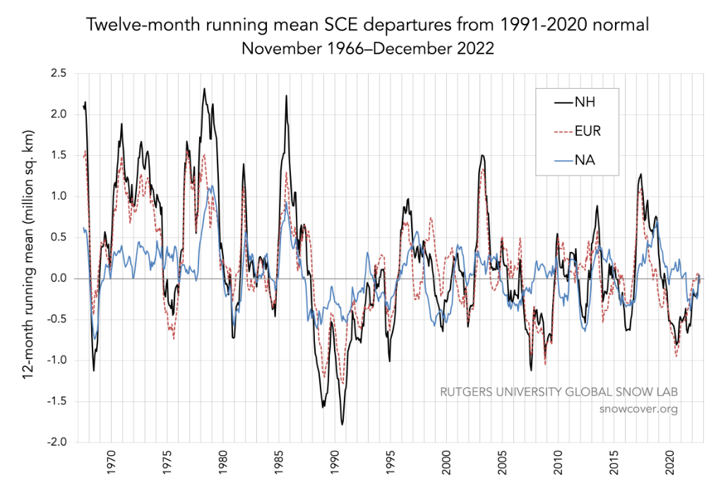
Greenland has retained most of its ice during the Holocene and it is now advancing again as displayed in Chart 13 based on Rutgers Snow Lab measurements.  The trend is toward 100% permanent cover before 2100.

The altitude of Greenland’s summit has recorded a decadal increase of 170mm

Conclusion

The key points from the above analysis are:

  • Peak solar intensity has been increasing in the Northern Hemisphere for 500 years.
  • The mid to high latitudes in the NH are dominated by land, which has a much higher response to solar intensity than oceans.
  • The minimum monthly solar intensity in the NH is declining but is low to zero in high latitudes so the decline is much smaller than the increase in the peak meaning the average is increasing.  The minimum from 67N is always zero so cannot decline.
  • The increase in average solar intensity has cumulative and compounding effects such as land ice melting reducing albedo and increase in woody biomass that increases thermal inertia.
  • The high temperature in the NH has a corresponding increase in TPW, particularly in September, giving rise to increasing snowfall.

Additional points below are:

  • Permafrost is continuing to retreat apart from Greenland where there is now an established upward trend in permanent cover.
  • Glaciation is an energy intensive process.  The cooling comes after the ice becomes permanent.  

Milankovitch was fundamentally correct about the cause of climate trends in his analysis of Earth’s orbit early last century but the data was not readily available to appreciate the details of key processes.  The process of glaciation in the NH is dominated by the precession cycle and the distribution of land over the globe.  Also glaciation is an energy intensive process.  For example, the Antarctic ice sheet would take 185,000 years to build from nothing to present level if the current annual ocean heat retention went entirely into evaporating water to produce snow over Antarctica.  Further, summer solstice solar intensity over the South Pole peaked at 566W/m^2 2,600 years ago but was not sufficient to melt the ice.  Once ice sheets form, they are difficult to melt due to the combination of albedo of the fresh snow; the low angle of incident sunlight at high latitudes and atmospheric temperature lapse rate maintaining frigid air over them.

The current increasing trend in NH peak solar intensity commenced around 500 years ago.  The Viking colonisation of Greenland failed around the time of lowest summer solstice sunshine in the NH.  Since the lowest peak intensity, the temperature of the NH has been trending upward with some cumulative thermal response being observed such as permanent ice loss and increased biomass as well as a corresponding increase in atmospheric water.  There is now a clear upward trend in early season snowfall per Chart 14 and a lesser upward trend in maximum extent normally set in December.  The permanent snow cover extent over NH land is still declining with most permafrost measurements showing permafrost still melting.

The NH land and oceans will continue to have a warming trend until the permafrost advances southward again.  Greenland provides the early indicator for advancing permanent ice due to its proximity to warming ocean water.  Permafrost will advance southward from the Arctic Ocean coastline and down from elevated ground; initially on north facing slopes.  The average temperature of the NH land will decline as the permanent ice advances but the oceans will remain warm.  The increase in elevation of the ice covered ground and reducing level of the oceans will create a greater temperature differential between ocean and land surfaces due to the lapse rate.  This will also accelerate snowfall and the ice advance.

The precession cycle has a typical period of 23,000 years.  Recent glacial episodes in the NH terminated after three or four precession cycles when the land reaches its limit of ice carrying capacity with glacier calving slowing down the water cycle.  During glaciation, each upswing in the NH peak solar intensity aligns with the sea level decline until the glacier calving slows down the water cycle.  The calving accelerates as sea level rises once the peak solar intensity in the NH is increasing.  Glacier calving becomes the switch that changes the rising sunlight from land ice accumulation to ice loss. 

During the Holocene, the maximum surface temperature, based on proxies, was achieved not long after the NH summer solstice solar EMR peaked and sea level was close to present level.  The last peak at 45N reached 526W/m^2 11,200 years ago.  The minimum of 483W/m^2 occurred 500 years ago.  The next peak of 505W/m^2 will be in 9,000 years.  By then, based on sea level reconstructions, the sea level will be 20m to 40m lower than present.

In the last two decades the Net radiation absorbed by the NH oceans and atmosphere has shown a strong upward trend per Chart 15.

The proportion being retained in the NH oceans is only 7.9% since 2005 and is declining as a proportion.  So the ocean heat input that drives the water cycle in the NH has a sustained upward trend.  This means the NH water cycle over land and ocean is increasing; consistent with strong upward trend in TPW in the northern latitudes; reaching 0.8mm/decade between 3N and 15N.  The global water runoff has declined over recent decades apart from the May runoff trending upward.  The overall decline in runoff means there is lower heat advection from ocean to land.  However precipitation has increased over most of the land in the NH consistent with increased water cycle over land. 

The Author

Richard Willoughby is a retired electrical engineer having worked in the Australian mining and mineral processing industry for 30 years with roles in large scale operations, corporate R&D and mine development.  A further ten years was spent in the global insurance industry as an engineering risk consultant where he developed an enduring interest in natural catastrophes and changing climate.

5 19 votes
Article Rating
Subscribe
Notify of
60 Comments
Oldest
Newest Most Voted
Inline Feedbacks
View all comments
April 25, 2024 2:45 pm

Nice post. Appreciated the combination of text supported by graphics.

Rud Istvan
April 25, 2024 3:37 pm

A lot to chew on in this new guest post.

I spotted one very interesting thing near the middle, got to thinking about it, and then did an hour plus of explanatory research. My result triangulates nicely. Post says NH retains ~ 8% of incoming energy, while SH retains ~ 24%. That is ~3x more for SH, or equivalently 2/3 less for NH. Why?

Upon reflection, the ‘reason’ is simple. The biggest ocean heat release mechanism is tropical storms. Hotter than normal Atlantic surface temperature is the main reason why Klotzbach and NHC are both predicting a particularly bad Atlantic hurricane season in 2024.
Per NOAA, 72% of tropical storms are in NH, 28% in SH. So NH should be losing 2.6x more heat from the named tropical storm mechanism alone (or equivalently, retaining 38% of SH).
But mere number of named tropical storms does not account for differences in hemispheric intensity—which actually governs total ocean energy release. Dr. Ryan Maue has calculated tropical storm ACE for the last ~30 years. NH annually averages 575, SH averages 205. Means NH tropical storms should be releasing 2.8x the heat of the SH (or equivalently, retaining 36% compared to SH).

And that explanatory physical mechanism for the posts observational hemispheric differential, as tropical storms are not the only hemispheric heat release/retention mechanism, just by far the largest.

It is WUWT real climate science when you can learn something observationally new and easily relate it to something already solidly known and quantified.

Richard Greene
Reply to  Rud Istvan
April 26, 2024 8:56 am

“Maue has calculated tropical storm ACE for the last ~30 years”

Data are corrupt before 2000 when many tropical storms were not named and/or not included in ACE

Fewer hurricanes are occurring globally and that the tropics are producing less Accumulated Cyclone Energy—a metric accounting for hurricane frequency, intensity, and duration. This decreasing trend has primarily been driven by a significant downturn in western North Pacific TC activity—the tropical basin that typically is the most active.

Short-lived named storms (TCs lasting ≤2 days) and the number of times that TCs quickly strengthen (≥50 kt in 24 hrs) have increased significantly in the 1990s. Identifying more short-lived named storms is likely due to improved sensors,

April 25, 2024 3:57 pm

Thanks for an interesting article.

The author is building a case for the onset of coming glaciations.

“The NH land and oceans will continue to have a warming trend until the permafrost advances southward again. Greenland provides the early indicator for advancing permanent ice due to its proximity to warming ocean water.”

I’m not convinced that ‘Greenland provides the early indicator for advancing permanent ice’, as the Greenland ice sheet (GIS) s highly elevated and has extremely dry air, and possibly temperature inversions.
Developments on GIS are connected to the polar vortex, and weather blocking patterns, that both have multi-decadal variations. Currently, the PV is in a weakening trend, and consequently atmospheric blockings are in an upwards trend, but this will change.
Blocking trends:

WGH-blockings
Scissor
Reply to  Gabriel Oxenstierna
April 25, 2024 4:28 pm

It seems like if we could, we would want to forestall, to the whatever extent possible, the coming glaciation.

Reply to  Scissor
April 25, 2024 4:41 pm

Unfortunately CO2 emission can’t do that.

The thing all “colder” countries, eg the northern EU, Canada, northern parts of the USA. etc etc should be striving for…

… is the absolute stability, reliability and robustness of their energy and electricity supply systems.

Wind and solar are the absolute opposite of stable, reliable and robust.

Scissor
Reply to  bnice2000
April 25, 2024 4:55 pm

Leftists would rather curse the darkness.

Reply to  Scissor
April 27, 2024 9:23 am

Of course. That is precisely how you “fight” climate change.

Bob Weber
April 25, 2024 4:44 pm

“Peak solar intensity has been increasing in the Northern Hemisphere for 500 years.”

Great post Rick. What is the amount of this 500yr intensity change? Is there a plot of the change?

Note the OHC asymmetry below where SORCE TSI is overlain on the Rathore etal Figure 1:

comment image

There was no way to know how potent the solar cycle TSI was to OHC until Argo and SORCE.

Now the challenge is to separate the long-term orbital influence from the solar cycle influence.

Scissor
Reply to  Bob Weber
April 25, 2024 5:00 pm

On a much shorter timescale, there is little warm water and no hot water, in my temporary accommodations here in Western Australia, until some time after the sun rises.

Solar water heating is fine for a vacationing lifestyle, but I prefer natural gas.

Reply to  Bob Weber
April 25, 2024 5:34 pm

Bob
I have stuck mostly to energy and energy accumulation.

For example, the accumulation over the entire land mass from 1900 to 2020 is about 8ZJ (from Chart 8). I point out that if this all went to melting ice, it would increase sea level by 0.6mm/yr throughout that period.

The ToA solar intensity at all northern latitudes are not synchronised changes for each latitude. This list is for summer solstice at 30N from 1500 to 2100:
1500  474.841094
 1600   474.896483
 1700   474.965070
 1800   475.046501
 1900   475.140435
 2100   475.246541

That is just using 1362W/m^2 solar constant in the IMCCE web calculator.
http://vo.imcce.fr/insola/earth/online/earth/online/index.php

The changes in solar intensity have cumulative effects. The most notable is gaining or losing ice. And land ice provides the longest memory of active climate states. Biomass contribute as well to the longer term climate memory.

Chart 1 has the total measured anomaly during the SORCE project and I also provide the orbital anomaly for the same period. The orbit accounts for about half the measured anomaly.

There are significant short duration swings in the calculated solar constant that could impact monthly temperatures but using the SORCE solar data to forecast the measured temperature anomaly does not get a much better result than a straight line fit.

All the trends are now well established and I would not be banking on any sustained cooling in coming decades apart from regions south of 50S. The precession cycle is strongly correlated to ice accumulation and then ice loss once calving dominates. The period of interglacials is linked to the precession cycle.

Bob Weber
Reply to  RickWill
April 25, 2024 6:09 pm

Thanx, but what is the missing number in your list for 2000? How did you derive the orbital anomaly in Chart 1, with ‘true TSI’?

Years 1500-1700 encompassed the Little Ice Age and Maunder Minimum. I’ve got solar activity producing the cumulative warming/cooling effects; so it’s sunspots vs Milankovitch. The two really must be mathematically reconciled in an integrated solar forcing model.

comment image

Reply to  Bob Weber
April 25, 2024 8:05 pm

what is the missing number in your list for 2000? How did you derive the orbital anomaly in Chart 1, with ‘true TSI’?

I jumped 2000 – corrected in this list:
 1500   474.841094
 1600   474.896483
 1700   474.965070
 1800   475.046501
 1900   475.140435
 2000   475.246541
2100   475.363751

The orbital anomaly is based on the average “constant”. of 1361.1W/m^2 and I used JPL horizon output for the orbit rather than Astropixel. JPL can be set at finer resolution than a year such as each month so is more accurate than my simplified calculation using yearly data without correcting for orbital speed.

The ocean heat is predominantly being retained in the region of the Ferrel Cells. That requires more ocean precipitation in mid latitudes in both hemispheres. A consequence of increased atmospheric moisture linked to warmer oceans.

Orbital precession drives the trends because it is the highest frequency component of sea level and temperature reconstructions. The other cycles modulate precession so also have signals in sea level and temperature..

But precession does not explain all the variation. For example, using the three regions and temperature datasets shown in Chart 12 I can produce temperature relationships for the ToA Solar EMR that can be used to forecast the temperature for the regions based on changing orbit. I get best fit to the HadCrut temperature with regression coefficient of 73%, which is not much better than a straight line fit. The interesting aspect with this is that I did not use HadCrut for the initial correlation.

It would be interesting to see if Sunspot Number can produce a better correlation to any of the temperature datasets. It is worth noting that RSS correlates well with UAH (75.6&) and HadCrut (84.7%) UAH to Hadcrut is 65.6% (I do better). Then all you need to do if the correlation is good is to accurately predict the Sunspot Number to forecast global temperature.

Bob Weber
Reply to  RickWill
April 25, 2024 8:58 pm

“It would be interesting to see if Sunspot Number can produce a better correlation to any of the temperature datasets.”

It does, only by aggregating both sunspot and SST data over long periods.

comment image

Reply to  Bob Weber
April 25, 2024 10:21 pm

From the Sunspot correlation, I gather you are forecasting a sustained cooling trend beginning around 2030.

I was aiming for a much more nuanced correlation than a 30 year average. I was hoping to be able to do better than a straight line extrapolation. I do get some acceleration rather than levelling off.

My precession driven trend indicates that we are only 500 years into a 9500 year rising trend in peak sunlight in the NH. The temperature will only level off then cool once the permafrost moves down and south.

So should be able to draw conclusions within 7 to 10 years on the Sunspot correlation.

Bob Weber
Reply to  RickWill
April 25, 2024 11:32 pm

Actually I’m not forecasting a sustained cooling trend, because this solar cycle has already surpassed the decadal warming threshold which foretells a net positive temperature change for this cycle, and then there’s the next cycle, which could be as big or bigger.

Of course there’s going to be cooling from the top of the El Niño.

And there will be some solar cooling after this cycle declines into the period just before the next cycle reaches the decadal warming threshold, analogous to the recent La Niñas, after which the cycle ocean warming begins again, analogous to the 2022-23 warming.

That solar minimum La Niña period isn’t what I’d call sustained cooling though, as the 109ya SN will still be quite high in 2030-40. Sustained cooling is a long way off.

It would take a decline like the Maunder Minimum. The Usoskin et al definition of a Grand Solar Minimum is a 30y average sunspot number of 32 (v2); it is 63.3 now. This means we are not in danger of a GSM like Dr. Zharkova says. She apparantly isn’t aware of this standard.

I ran your numbers exactly in the insolation form and got different numbers than you listed, but very close. Any ideas why?

      -0.500     474.837861
      -0.400     474.878214
      -0.300     474.933087
      -0.200     475.002156
      -0.100     475.085101
       0.000     475.181613
       0.100     475.290594

I used 1362W/m2, 100yrs step, 30N and 90° longitude for 21Jun.

In order to do the same kind of temperature analysis of the orbital influence that I did with the PMOD TSI model for the sunspot influence, I will have to compute an annual insolation number for the whole earth, not at a specific latitude. Any ideas for using that form to do that?

Reply to  Bob Weber
April 26, 2024 12:12 am

Any ideas for using that form to do that?

Bob
The whole Earth averages very close to 1/4 of the average solar constant over any year.

If you want to get more detail, the easiest way is to use the JPL horizon tool and set time division at months or week. It can give a distance to the sun so that you get monthly or weekly variations.

You will note that I divide Earth into three regions- Land excluding Antactic, NH oceans and SH oceans. Each has temperature highly correlated to ToA Solar EMR but each has very different responses. That is a key feature of this analysis. Different surface respond differently to Solar EMR.

I do a latitude by single degrees by month for all my analysis. I generated quite a large file for the original analysis that has 720 monthly columns and 180 latitudinal rows. I then use land and ocean mask to separate the regions. Land, excluding Antarctica, is mostly in the NH so there is no need to separate it into hemispheres to get good correlation. It takes my laptop about 1 hour to calculate this matrix from the monthly ephemerides.

Determing the latitudinal EMR involves quite complex geometry. I take the average day for each month and look at ToA solar at half hourly intervals for each latitude. Chart 2 shows the results for two months of one year.

ballynally
Reply to  RickWill
April 26, 2024 12:42 am

Indeed.

Reply to  Devils Tower
April 26, 2024 1:30 pm

The paper in the above link by the author of this post summarizes his view that the water cycle is what cools the earth in the end regulating its thermal balance. After reading the post and the paper, I am energized in pursuing my following intuitive view.

The level of the oceans over the extremes of the ice ages, through a say 30% increase in ocean area and the 400 meter rise in sea level with the corresponding decrease in sea-level pressure, increases the ocean evaporation rate and overall water cycle cooling the earth and increasing snow levels stating at high latitudes and Elevations. It seems this should set the limits aligning with the correct orbit parameters and other conditions to start an ice age.

The other limit will be set when the earth becomes a frozen dirty snowball with a low water cycle. One the ice surface loses its fresh albedo, the exit from the ice age will be quick as dirt accumulates on the ice surface super charging the exit from the depths of the iceage.

It seems to me the change in ocean area and sea-level/pressure have to be part of the equation.

Reply to  Devils Tower
April 26, 2024 3:33 pm

Just some added points for these ideas.

The land that accumulates new ice is about 25% of the ocean area. So oceans fall around 120m and land that has ice rise around 480m. So the difference is a 600m. The lapse rate in this low water vapour situation is 6C over that 600m. So the top of the ice is 6C cooler simply due to the lapse rate.

Given what we can observe right now with Antarctica and Greenland, I am confident that glacier calving is the switch that slows the water cycle sufficient to allow melt and calving to dominate over snowfall.

April 25, 2024 7:27 pm

For something like Image 3, especially, an equal area projection should be used rather than a cylindrical projection.

sherro01
April 25, 2024 7:29 pm

Rick,
Thank you for this advance in understanding that must have taken much time and effort, much appreciated. You have done a classical type of analysis using elements like geometry and energy flow in a field contaminated by beliefs more than data.

Nealy 10 years ago I produced the following graph, because I feared for the size of the corrections needed to adjust the various measurement biases of the satellite platforms.
comment image
I have added the yellow line at 1361.1 W/m^2 that is your estimate of present total solar irradiance. It is easy to see how large the adjustments need to be, when one seeks significance at a level of +/- 0.1 W/m^2 to assist in data interpretation. The starting points are nearly 15 W/m^2 apart, so the adjustments need to overcome large measurement uncertainty. The is a large literature about this, as you know. However, I remain sceptical of the adjustment ability when the signal:noise ratio is so large.

I will use your Fig 2, change in ocean heat content 2005 to 2023 – Argo Buoys as an example of one rough way to look at large data sets. This concerns ocean temperatures, not satellite TSI, but it serves. Maps created from such data need to hold together in ways that can be explained. If the uncertainty is too high, they can disintegrate into noise. You Fig 2, to me, seems to sit in between.Those orange blobs at 30 to 60 deg South might be real or they might be noise. Who can tell? Further, your image 4 shows measurement problems, with distinct breaks between N and S at the equator.

For the satellite TSI data, the frequent use of a net figure (Incoming-Outgoing) has the venerable problem of subtraction of two large nuumbers to get a residual of interest. Formal uncertainty analysis is needed, but it is hard to find in the literature. Readers with links appreciated.

Rick, these are not problems of your creation, but uncertainty can have a large effect on your conclusions. How confident are you in the numbers? Geoff S

Reply to  sherro01
April 25, 2024 8:46 pm

Geoff
With regard Image 4. It has a break that I created because it requires the difference of the two months in reverse for each hemisphere. Any of the images showing range have a break at the equator. Image 4 is more obvious.

As I noted in the article, the Argo OHC data was used to calibrate the CERES Net radiation for the period 2005 to 2015 (it is detailed in AR6). The error in the radiation data is of the order of 3W/m^2 but the retained ocean heat corresponds to 0.8W/m^2. So is within the error of the satellite instruments. This will present a dilemma for AR7 because the retained ocean heat is not increasing as fast as the Net radiation. Assumptions about energy conversion in the climate system may be proven wrong. My interest in using the Net is to see where things are changing with the knowledge that it could have quite a large absolute error.

The Ferrel Cells are the big players in ocean heat retention. That is the band where the warmer pools are noticeable in the South Pacific. These show up in the satellite temperature sets as well. The UAH has those neat bumps in the trends by latitude. The GISS climate model shows the bumps but there is not much similarity with measured data despite the models being trained with measured data.

sherro01
Reply to  RickWill
April 25, 2024 10:46 pm

Thank you, Rick, for taking the time to reply. Good points, but I still feel uneasy about the possibility of small but important errors in the TSI. Geoff S

Reply to  sherro01
April 26, 2024 12:32 am

Geoff
The article has a link to to the SORCE Project. There is a link below to a text file for the TSI on this page:
https://lasp.colorado.edu/sorce/data/tsi-data/
There are a few data gaps that I infilled for the ToA TSI to produce my Chart 1. There is also the calculated “constant” in that file with similar data gaps. I did not try to infill the gaps because it has some randomness.

When you look at the annual range in Solar EMR across latitudes and the way it changes with the precession cycle, the variation in the solar constant is noise. For example, 60N at summer solstice peaked at 523W/m^2 11,000 years ago. It is now down to 477W/m^2 and at the minimum of the cycle. So a drop of 46W/m^2. The reason it is warming now is that the oceans further south have been getting increasing sunlight for some centuries. The next peak is 493W/m^2 in 8,900 years.

Any movement in TSI is trivial compared to what the precession cycle does. And the precession cycle is enduring change not near random variation like the solar “constant”.

Bob Weber
Reply to  RickWill
April 26, 2024 6:52 am

“Any movement in TSI is trivial compared to what the precession cycle does. And the precession cycle is enduring change not near random variation like the solar “constant”.”

Rick, I’ve been trying to gently get you to realize that the application of the S-B Eqn using my PMOD SN-TSI model demonstrated that 10.2W more energy available from higher TSI over 120 years total (109 + 11y lag) was perfectly sufficient to explain the 30y HadSST3 temperature increase in that time of 0.47°C via solar activity.

Any higher TSI difference will be too much, a smaller difference, not enough.

Adding your orbital TSI changes to the sunspot induced TSI changes will be too much forcing, delivering a higher temperature change than occurred.

Where would that leave the influence of orbital changes over that time? Is Milankovitch’s theory even correct, or to what degree? Shocked!? Well, it’s like telling CO2 warmists CO2 didn’t cause warming; please don’t meltdown…

The simple fact is orbital changes were not enough during solar cycle 24 to cause the temperature change from 2008-2016. Your own diagram indicates SORCE TSI anomaly changes were greater than the SC24 orbital changes.

comment image

comment image

In 2015 I calculated a TSI-SST warming factor using SORCE 1au TSI, as a change in SST per year per watt of TSI annual change, of 0.507°C/W/yr, when solar activity is higher than my decadal warming threshold.

This 0.507 factor times the TSI changes for SC25 produce a SST change very close to the actual SST change in 2023, so at this point I have every reason to still think my solar activity based system works perfectly well, and that Milankovitch’s system doesn’t, or at least not the way JPL etal thinks it works.

This all says the actual real changes in the sun’s output >> orbital forcing.

btw I had these thoughts long before you came along with your orbital work, so it’s not personal. I admire your work, even if I don’t agree with it 100%. Your observations about the climactic responses to accumulated solar forcing, whether from sunspots or orbital, or a combination, are very insightful and prescient.

Reply to  Bob Weber
April 26, 2024 2:15 pm

Bob
I would like to be able to reproduce the observed temperature in a more nuanced way and it is evident that the orbit as we know it is not the only contributor.

However I am mainly interested in the trends and precession drives the trends. There is concrete evidence showing that the NH has upward trend in temperature since at least 1690. Likewise there is evidence that coastal Antarctica has been cooling for at least 1000 years.

The shift in peak solar energy at each latitude due to the precession cycle are massive over time compared to changes in TSI and are sustained over thousands of years. The upward trend in the NH started 500 years ago and is undergoing slight acceleration.

Precession ensures that upward trend in temperature in the NH will continue for a long time.

Bob Weber
Reply to  RickWill
April 26, 2024 6:43 pm

Rick, your’s is important work, but the net annual change in TSI from orbital variation over those 500 years is what I’ve been looking for, for the whole Earth, not just at one latitude, as it is data that can be used in my S-B equation calculus to determine the Earth’s blackbody temperature change like I showed in my graphic.

I realize the Milankovitch calculator doesn’t provide that form of answer.

Your points are well taken as important regional climate drivers, but shifting latitudes of solar energy don’t change the Earth’s total amount of energy received by the sun when the eccentricity change is tiny, but it can change the distribution of ocean heat content, which would tend to cool the larger southern ocean with respect to the northern ocean, which has been observed, as you pointed out.

Today I answered my own question about Milankovitch theory. The eccentricity of the Earth varies as such

“The eccentricity of Earth’s orbit is currently about 0.0167; its orbit is nearly circular. Venus and Neptune have even lower eccentricities. Over hundreds of thousands of years, the eccentricity of the Earth’s orbit varies from nearly 0.0034 to almost 0.058 as a result of gravitational attractions among the planets.” -wikipedia, Berger and Loutre

comment image

comment image

“This graph shows the variation in the eccentricity of the Earth’s orbit over the last 750,000 years. The blue line traces the eccentricity of the elliptical orbit as it varies from from circular (0.0).. The orange line shows today’s value for comparison. The data are from Berger and Loutre (1991).”

My system works because eccentricity is so small with little change during the data period. It will take >50K years to change dramatically.
I do see the orbital affect to warmer NH land and cooler SH over time.

Reply to  Bob Weber
April 26, 2024 9:23 pm

but shifting latitudes of solar energy don’t change the Earth’s total amount of energy received 

True and it would not matter if the entire planet was ocean surface or land surface or even constant ratio of land to ocean for every latitude but it’s not. There is a lot more land in northern latitudes and a lot more water in southern latitudes until you reach Antarctica, which is a massive block of ice.

The article makes little reference to orbital eccentricity it focuses on the precession cycle. You need to get a handle on precession. It is the high frequency component of orbital changes driving shifts in the peak solar change for each latitude. Eccentricity modulates the precession cycle. .

The attached shows sea surface level and peak solar intensity at 40N on the same time scale. You will observe that interglacials terminate with rising peak solar in the northern hemisphere. The current rise in intensity is similar to the rise 399k years ago that terminated that interglacial.

This article is about how different surfaces respond to solar input. The land mass (excluding Antarcia) responds 8 times more in terms of temperature than the oceans of the Southern Hemisphere for the same change in ToA solar input. So as the precession cycle shifts the solar intensity northward, it will increase the average global temperature. The whole of Earth is not warming. Regions south of 50S are cooling on average.

If you do Fourier analysis of reconstructed temperature and sea surface level over the past million years, there is a dominant peak at 23.3k years, which is the period of the precession cycle.

What frequency components would you expect to see in the temperature and sea level reconstruction if TSI was the sole driver?

Presentation2
Reply to  RickWill
April 27, 2024 2:48 am

If you do Fourier analysis of reconstructed temperature and sea surface level over the past million years, there is a dominant peak at 23.3k years, which is the period of the precession cycle.”

I am always amazed at how few in climate science ever publish anything outside of “averages” when looking at temperatures. Fourier analysis and wavelet analysis are valuable tools for looking at signals but climate science seems to make little use of them, in fact almost no use at all.

Your graph is very interesting. The solar portion appears to be a noisy base with a repetitive pulse and the beginning of the pulses lead the sea level peaks by a small amount. It is this kind of analysis that will help to identify the complete suite of factors that actually drive the temperature of the Earth rather than the religious dogma surrounding CO2.

Bob Weber
Reply to  RickWill
April 27, 2024 8:56 am

While I see the applicability of your logic over much longer timescales, I’m not convinced about the speed of the changes you say orbital is responsible for over the past few hundred years, during the period when you dismiss solar activity warming.

Here’s evidence that refutes your claim the northern ocean is getting warmer than the southern ocean. The latitudinal ERSSTv5, which shows that in one hundred years the thermal equator hasn’t moved and the southern tropics warmed more than the northern tropics.

Note the slight bulges in SST at 45S and 37N, they’re all your high solar absorption regions get for you at the surface.

comment image

I think you ought to expand your plots of TSI and orbital anomalies to include the TSI composites from PMOD, RMIB, VIRGO, and NASA, which go back to as far as 1980, 1984, 1996, and 2000, respectively.

ftp://ftp.pmodwrc.ch/pub/data/irradiance/virgo/TSI/TSI_composite/MergedPMOD_NobaselineScaleCycle23_JPM_March2024.txt

ftp://ftp.pmodwrc.ch/pub/data/Composite/RMIB_TSI_composite_latest_C2.txt

ftp://ftp.pmodwrc.ch/pub/data/irradiance/virgo/TSI/VIRGO_TSI_Daily_V8_20240310.txt

https://ceres.larc.nasa.gov/documents/TSIdata/CERES_EBAF_Ed2.8_DailyTSI.txt

If you make new anomaly plots for each composite compared to orbital anomalies, I’m sure you will find even more of TSI exceeding orbital than SC24 delivered, being it was the lowest cycle in 100 years.

Reply to  Bob Weber
April 27, 2024 2:55 pm

I think you ought to expand your plots of TSI and orbital anomalies to include the TSI composites from PMOD

I am interested to see if I can better replicate the measured temperature through the satellite era so I will take a look at PMOD.

I know that Nino34 region exhibits close correlation with TSI.

Bob
April 25, 2024 9:07 pm

That’s a lot of information. Looks like a lot of natural stuff going on.

Reply to  Bob
April 25, 2024 10:21 pm

Looks like a lot of natural stuff going on.

And the current trends in the NH are only 500 years into a 9,500 year warming cycle. A lot more natural stuff to come.

It is interesting that Antarctica and Southern Ocean at 60S has been getting less sunlight at summer solstice for 2100 years so is well into an established cooling trend. There is recent evidence of failed Penguin colonies in the Ross Sea a few thousand years ago that are now ice covered:
https://www.sciencedirect.com/science/article/abs/pii/S0277379123000392

Colony abandonment ∼1000 yr BP was accompanied by sea ice and glacier advance.

So parts of the globe are warming but it is not universal. And the hemispheres are not quite symmetrical with changes in sunlight. The summer solstice sunlight at 60N will bottom this century; some 2200 years after 60S peaked.

So orbital changes and water/land/ice distribution have complex interactions.

ballynally
April 26, 2024 12:30 am

“Conclusion
The key points from the above analysis are:

  • Peak solar intensity has been increasing in the Northern Hemisphere for 500 years.
  • The mid to high latitudes in the NH are dominated by land, which has a much higher response to solar intensity than oceans.
  • The minimum monthly solar intensity in the NH is declining but is low to zero in high latitudes so the decline is much smaller than the increase in the peak meaning the average is increasing. The minimum from 67N is always zero so cannot decline.
  • The increase in average solar intensity has cumulative and compounding effects such as land ice melting reducing albedo and increase in woody biomass that increases thermal inertia.
  • The high temperature in the NH has a corresponding increase in TPW, particularly in September, giving rise to increasing snowfall

My precession driven trend indicates that we are only 500 years into a 9500 year rising trend in peak sunlight in the NH. The temperature will only level off then cool once the permafrost moves down and south.
So should be able to draw conclusions within 7 to 10 years on the Sunspot correlation.”
______

Am i reading this correctly that we won’t get any cooling a la ‘little ice age’ during this 9500 year peak sunlight period or are you just giving a general trend? I presume the latter.

I also take it that increased precipitation and “woody biomass” ie greening will help with reducing the size of NH deserts or at least have a positive impact at the edges, coupled with increased Co2 levels.

The increase in ocean temperature leading to more tropical storms and general precipitation will mean more floods, right? I know that is not necessarily the case but it seems to me that it makes the occurence of those weather events more likely. And more rain in general might be good for the edge of deserts but how much will this impact the large agricultural landmass in the mid latitudes where food is produced and where the landmass is heating?
If we have a combination of warmer winters, more rain in spring and hotter summers (just ignoring the heat island effect) that would i take it impact crop yields.
Also, the article suggests the NH landmass IS heating up because of increased solar activity. That might not be as much if you remove the HIE of cities, but still would be a factor.Or are my conclusions wrong? In other words: are at least some of the worries about climate change not justified by this article?
Id really like to know..

ballynally
Reply to  ballynally
April 26, 2024 12:35 am

Edit: tropical storms AND atlantic hurricanes

Reply to  ballynally
April 26, 2024 1:45 am

In other words: are at least some of the worries about climate change not justified by this article?

Just a correction in your assessment. The NH is warming up because the peak solar intensity in the NH is increasing as a consequence of the precession cycle. It is orbit driven. So the relationship to the sun rather than changes in the sun. Earth will gradually expose more land to more intense sunlight than now rather than exposing mostly oceans to the peak intensity as it is now. Land warms more than water for any solar input so, on average, the change in orbit is causing warming.

If you do not comprehend the precession cycle then you are not alone.

The climate change that will occur will be mostly positive for a few centuries at least. The ocean warming will create more cyclones in the NH but they will not necessarily head for land because summer advection, ocean to land, is slowing down. The US south west coast (and Mexico), North Africa and the Arabian Peninsula are dry regions that will experience more tropical cyclones over coming decades

NH snowfall will continue to trend upward as winter advection increases due to warmer oceans. Coastal regions that stay warm enough in winter to avoid freezing will get more winter rain. Snowfall records will continue to be set particularly early season in higher latitudes and higher elevation.

Mid northern latitudes will get more rain but also more sunshine; both favouring better crop yields to complement the higher CO2. There is less water making it to land but the water on the land will cycle faster because atmospheric water has a strong upward trend.

The Sahara will continue to green and from the north as well as the south. Northern Australia is benefitting from increased atmospheric water but the water is not well managed so causes flooding issues.

The Mediterranean will spawn more cyclones because it will regularly reach the 30C limit where convective instability is sufficient to produce self-sustaining cyclones. They are more likely to head toward the dry land to the south than north. Spain will eventually get cyclones from the southeast but timing depends on how fast the surface temperature increases.

In the long term, with plenty of warning, land ice in the NH will increase again. Greenland is the first region to show this but a couple of northern slopes in Canada are also showing increase in permafrost. Most people will be surprised to see the permafrost retreat change to advancing.

The Amazon has increasing competition from the Gulf of Mexico for the convective storms that create the Hadley cell in that region. The Gulf of Mexico will get more of the action. Time will tell if this adversely affects runoff for the Amazon because it could be offset by the increasing atmospheric moisture across the Equatorial Atlantic..

The Indian Monsoon will start a little earlier over coming decades.

Growing seasons in the NH will start earlier providing any snow has melted and also end earlier.

The increasing atmospheric water is a significant factor for the climate and has a solid upward trend. It moderates temperature swings but the increased humidity may not be comfortable for some.

These changes are gradual and establish trends over time with the rare unprecedented weather event.

ballynally
Reply to  RickWill
April 26, 2024 2:19 am

Thanks for your detailed reply. Much appreciated..🙂

ballynally
Reply to  RickWill
April 26, 2024 2:35 am

I live in Ireland. We have had quite a few warm winters and increasing rainfall extending into spring which does impact crops like potatoes.
Ive read that winter temperatures are increasing. That’s great if you live in Canada but not great in a more moderate climate like we have here in Ireland where frost is uncommon, especially on low ground. More winter rain (as you stated) is terrible. Give me a nice frost anytime over a just above zero Celsius cold rain coupled w the usual strong atlantic winds.ive moved fr Holland to Ireland. The change is not subtle.
All in all location is very influencial..

Solomon Green
April 26, 2024 4:41 am

Thanks for a fascinating article leading to some very interesting comments. Much of which was above my head.
I am, however, slightly concerned that Chart 11 and the associated paragraph were included without a trigger warning. I had always understood that, since taking over from Manley,had adjusted earlier data the Met Office had adjusted earlier monthly data by as much +/- – 0.2C (Parker and Horton) and changed several thermometer locations.

Reply to  Solomon Green
April 26, 2024 3:40 pm

I am an engineer and leant long ago that once you get into arguing error margins you are wasting your time.

I am convinced the NH is warming and the higher latitudes of the SH are cooling. I wanted to know why. The article gives an engineers perspective on why the climate is changing the way it is at the present time.

As I noted, Milankovitch did not have the tools and data I have to make my assessment.

Solomon Green
Reply to  RickWill
April 27, 2024 7:19 am

Thanks for the reply. As an actuary, I wanted to point out that the post-1950 gradient in Chart 11 looks a little too significant and that there are reasons to believe that the data on which it is based are somewhat suspect. I do not believe, however, that it affects your conclusions and I was persuaded by your paper.

April 26, 2024 6:28 am
  • Article says:”Peak solar intensity has been increasing in the Northern Hemisphere for 500 years.”

The graph just prior to this bullet point says Greenland in NH is gaining ice during the time of increased solar intensity. Then bullet 4 says that increased solar intensity will cause land ice melting.

I am somewhat confused by which is correct or how they all could be correct.

Reply to  mkelly
April 26, 2024 2:36 pm

I am somewhat confused by which is correct or how they all could be correct.

Each fall in sea level at the termination of interglacials is associated with rising peak solar intensity in the NH. Recent deep cycles of glaciation have been 3 or 4 precession cycles. Recovery from glacial maximums also occurs during the rising peak solar intensity in the NH. So there is a trigger that shifts the some phase of the precession cycle from accumulating to melting land ice.

Given what we can now observe around glacier calving I deduce the trigger is extensive glacier calving cooling ocean surface such the water cycle slows down enough to allow melting of land ice to overtake accumulation. Once the sea level starts rising, the ice shelves are subjected to uplift and they also break away to form large icebergs. Some get grounded and then emerge once the sea level rises more and/or they lose some mass and float higher. There is evidence of iceberg scouring on seabed now 700m deep so some icebergs had draft in excess of 500m.

There are other theories on the trigger such as dust accumulation on the snow changing albedo. But the ocean cooling is observable now where glaciers are calving. The calving limits the ice carrying capacity of the land. The trigger for the ice to melt is indeed a tipping point.

Sparta Nova 4
April 26, 2024 6:58 am

So, it is safe to risk saying that the sun is involved in the climate, contrary to many who claim it is exclusively CO2.

Reply to  Sparta Nova 4
April 26, 2024 2:37 pm

The sun matters with regard climate. CO2 matters to nearly all living organisms on Earth.

Richard Greene
April 26, 2024 8:38 am

Another CO2 Does Nothing Nutter,
It’s All The Sun Nurter and
The Sunspots Tell All Nutter.
A Triple Nutter gets more attention than just a single Nutter.

The BS is not clear until the conclusion:

“Peak solar intensity has been increasing in the Northern Hemisphere for 500 years.
Author

Total BS
No accurate measurements of TOA TSI existed before the late 1970s. Those NASA satellite data proved sunspot counts were an incompetent proxy for TOA TSI, because they grossly overestimated what was actually measured.

The deception continued:

“The permanent snow cover extent over NH land is still declining”

Total BS
Rutgers Snow :Lab data for NH shows a steady snow cover extent since about 1995

comment image

Use of M-Cycles is irrelevant in a discussion of global warming in the short period since 1975

Use of CET’s three local English land weather stations, with perhaps 12 changes of equipment since the mid-1600s, is irrelevant for a discussion of the global average temperature.

“In the last two decades the Net radiation absorbed by the NH oceans and atmosphere has shown a strong upward trend”

How about this explanation?

More sunlight is reaching Earth’s surface because of declining SO2 air pollution since 1980 and a declining percentage of cloudiness in the past two decades? There’s no chance TOA TSI changes caused this because satellite data say there was a slight declining trend since the 1970s. Sunspot counts reflect a much larger declining TOA TSI trend

ballynally
Reply to  Richard Greene
April 26, 2024 9:13 am

Don’t be an asshole..

Reply to  Richard Greene
April 26, 2024 2:48 pm

No accurate measurements of TOA TSI existed before the late 1970s. 

If you are a person Richard Greene then take some time to understand the precession cycle so that you can contribute with insight rather than abuse.

There is no need to measure TS! to appreciate that the peak solar intensity is gradually changing at any location on the surface due the precession cycle.

More sunlight is reaching Earth’s surface because of declining SO2 air pollution since 1980 and a declining percentage of cloudiness in the past two decades?

So what is happening just north of the equator where sunlight is reducing as shown in Chart 10? How can your air pollution be reducing everywhere except just north of the Equator.

ballynally
Reply to  RickWill
April 26, 2024 9:41 pm

Indeed. I was going to quote your precession influence in answer to mr Greene, which he clearly missed. But i already called him an asshole for his abusive post and i did not wanted to dignify the man with a proper answer in the way you did. Given the extensive and detailed article by you, whether you were right or wrong, him calling you a 3 time nutter was just about as abusive an asshole can be..

Richard Greene
April 26, 2024 8:40 am

Repost after correcting an unfortunate spelling error of the word count that left out one vowel. Moderator please do not publish two nearly identical posts. Just one of my comments will get enough flak.

Another CO2 Does Nothing Nutter,
It’s All The Sun Nurter and
The Sunspots Tell All Nutter.
A Triple Nutter gets more attention than just a single Nutter.

The BS is not clear until the conclusion:

“Peak solar intensity has been increasing in the Northern Hemisphere for 500 years.
Author

Total BS
No accurate measurements of TOA TSI existed before the late 1970s. Those NASA satellite data proved sunspot counts were an incompetent proxy for TOA TSI, because they grossly overestimated what was actually measured.

The deception continued:

“The permanent snow cover extent over NH land is still declining”

Total BS
Rutgers Snow Lab data for NH shows a steady snow cover extent since about 1995

comment image

Use of M-Cycles is irrelevant in a discussion of global warming in the short period since 1975

Use of CET’s three local English land weather stations, with perhaps 12 changes of equipment since the mid-1600s, is irrelevant for a discussion of the global average temperature.

“In the last two decades the Net radiation absorbed by the NH oceans and atmosphere has shown a strong upward trend”

How about this explanation?

More sunlight is reaching Earth’s surface because of declining SO2 air pollution since 1980 and a declining percentage of cloudiness in the past two decades?
There’s no chance TOA TSI changes caused this because satellite data say there was a slight declining trend since the 1970s. Sunspot counts reflect a much larger declining TOA TSI trend

ballynally
Reply to  Richard Greene
April 26, 2024 9:09 am

Calling people ‘nutter’ and BS several times is not a great start of a comment. You do not agree with his paper. Fine. But dont be an asshole.

ballynally
Reply to  ballynally
April 26, 2024 9:11 am

Time for a moderator to step in..

Reply to  ballynally
April 27, 2024 6:50 am

Post authors are fair game. Abuse is prohibited commenter to commenter.

LT3
April 26, 2024 10:33 am

So which interglacial does the current more closely approximate as far as it’s duration?

Are we at the end or just halfway through it?

Vostok_TemperatureCO21
LT3
Reply to  LT3
April 26, 2024 11:06 am

Because if 22,000 years ago was max heating, but was not enough to reverse the glaciation, what did? Because 10,000 years after that, the Holocene interglacial began.

Reply to  LT3
April 26, 2024 3:21 pm

what did? 

Ice accumulation or loss on land is a balance between snowfall and ice melt plus calving. That is observable now on Greenland and Antarctica.

The land has a limited capacity to carry ice before the calving dominates. In recent cycles, that has occurred when the oceans fall 80m or so lower than present level. The following upswing in NH peak solar starts the melt and it accelerates as ice shelves break away and those grounded are uplifted as the sea level rise. All that ice cools the ocean surface and slows the water cycle so melt and calving dominate until most of the ice has gone.

The interglacial beginning at 410ka melted most of Greenland so the sea level was higher than the present interglacial and Greenland is already gaining ice extent albeit calving is still dominating but the summit is gaining altitude so it will eventually accumulate ice again.

A lot more of the ocean surface will hit the 30C limit. The extent of 30C warm pools is increasing at 2.5% per decade so by 2200, 50% of the NH oceans will reach 30C. A way more water in the atmosphere in September ready to dump massive amounts of snow on land in October and November.

As an aside, note the higher peaks in temperature on your chart corresponds with larger swings in the precession cycle due to higher orbital eccentricity.

Reply to  LT3
April 26, 2024 3:04 pm

The temperature has the precession cycle signal but you get better appreciation of the glacial and interglacials relationship to the precession cycle using sea level per attached.

The temperature peaks not long after the ice has gone, which is about 7,000 years before the sea level falls. The current NH warming trend marks the beginning of the coming glaciation.

I estimate that the permafrost reversal will be extensive by 2200 and sea levels will start declining within 1000 years.

In terms of similarity with past interglacial, the current upswing in peak solar in the NH is closest to 399ka on the attached chart.

Presentation2
April 29, 2024 5:36 am

Very interesting and intriguing post.

Why do you use precession instead of insolation? Insolation encompasses all of the orbital parameters; eccentricity, obliquity and precession.The precession cycle governs the seasonal insolation, but its impact depends on the degree of eccentricity of the orbit. In a circular orbit like now, the precession cycle has reduced impact, while in times of maximum eccentricity the precession cycle reaches maximum impact.