Paul Homewood notes: According to John Cook, Antarctic sea ice has been expanding because the Southern Ocean is getting warmer. He also claims that anyone thinking more ice is due to colder conditions is “ignorant”.
He forgets that some of us know how to check the data.
Bob Tisdale produces analyses of sea surface temperatures each month, and these have shown that the Southern Ocean has been getting considerable colder since 1981, and particularly in the last 8 years.
 http://bobtisdale.wordpress.com/2014/10/12/september-2014-sea-surface-temperature-sst-anomaly-update/
All of Bob’s data is sourced from the KNMI website here.
Now who looks “ignorant” Mr. Cook?
This is a *majorly* important fact. Climate scientists have been scratching their heads trying to figure out why sea ice is increasing around Antarctica while the southern ocean temperatures are “warming”. Well, the answer is they have not been warming.
Somehow AGW supporters have been so focused on supporting their theory they forgot to follow what the data was actually saying.
Bob Clark
“Somehow…” Seriously?
When did they EVER followed the data?
If they followed the data, their religion would have died out years ago.
Another pretty model confounded by a pesky fact.
You can use the GISS global maps and easily see the cooling trend, where it is happening. Much easier than climexp, and it has pretty colors.
More likely most “climate scientists” don’t say anything or chalk it up as a mystery. Ocean warming sounds more like a climate activist “explanation”.
Maybe they need to jump in a boat and sail on down there to check it out.
Oh, wait a minute…
They already tried that and damn near got killed.
Exactly Chip. CAGWists never check the data, they just parrot popular opinion from others that do the same. The blind leading the blind.
They deserve to look stupid and repay their rescue costs as they barely make a tenth into their “awareness” treks. Well, if anything they deserve to take themselves out of the gene pool for the good of Man – and the planet. Why does anyone bother rescuing them anymore?
AGW supporters have been so focused on supporting their theory, they forgot to adjust the data upwards. There, fixed it for you.
People who faithfully believe in Cook’s mythology based pre-science will agree with him even at the cost of the avoidance of reality.
John
Don’t these “warmists” get embarassed when they’re proven wrong nearly all the time?
They don’t come anywhere near thinking they wrong and have the gall to call us the d word.
They don’t come anywhere near thinking. Echoing what someone else said is not thinking.
Unfortunately they’ve drank way too much Kool-Aid
They’re not embarrassed because there’s no accountability.
They never see the retraction because the MSM prints it on the last page two months after the initial front page splash.
And it’s in small print too!
Embarrassment requires first that one has a developed sense of shame.
I used that exact chart to debunk a moron on another forum who claimed the increase southern ocean temp was what was melting Antarctic glaciers at a record pace.
What increased ocean temperature???
So John Cook thinks more sea ice is due to warming conditions – but only at the south pole, right? At the north pole, less sea ice is due to warming conditions. So warming means less, or more, sea ice, depending upon which pole one finds themself? I think that cognative dissonance is a problem though, even for a self-proclaimed climate scientist.
It’s sorta like the water in the drain spinning the other way…
Oh…wait.
Since northern sea ice seems to be increasing, does this mean that arctic temperatures are getting cooler?
Or is it all just weather?
Oldseadog, I doubt that Mr. John Cook could handle a question like that at the present time.
“Faith” and “fact” aren’t necessarily the same thing. It bothers me that the media will spew the faith but ignore the fact when presented.
It’s not about faith or fact, it’s about an agenda. And that agenda is to eliminate as much of the current world population as possible, and to insure that population can and will be controlled in the future. By pushing the climate change issue, their continuous telling of the big lie makes more people believe it, and will willingly do what is needed “to save humanity and Earth.” It is better to have us willingly die of hypothermia than to eliminate us otherwise. Costs less, and then they can even use the bodies for fuel. This is not about money, this is not about “faith,” this is about population being reduced to their believed ideal number, around 7 to 800 million, and “AGW” is the tool they are trying to use.
I think Tom is right. Google Agenda 21 and you will find the reasons behind the AGW scare. Also Google Maurice Strong and John Holdren. I was surprised when I read about Agenda 21 and its tie in to the AGW strategy.
Well Lew, sorry mate no one is biting. Try Prison planet. That is conspiracy central.
Not the only tool.
Thet are attacking on many fronts.
More to rebut Mr. Cook.
According to peer reviewed published studies looking at Antarctic sea ice trends in the context of Southern Ocean surface climate variations since 1950:
…”Apart from the Antarctic Peninsula and adjacent regions, sea surface temperatures and surface air temperatures decreased during 1979–2011, consistent with the expansion of Antarctic sea ice.”..
Geophysical Research Letters
April 2014
http://www.cgd.ucar.edu/staff/cdeser/docs/fan.antarctic_seaice_trends.grl14.pdf
OMG, you mean the record sea ice extent might be caused by cooling? Naah, couldn’t be.
Thanks for that. Perhaps NASA should be apprised of this fact since they are under the impression southern oceans temps are warming, so increased Antarctic sea ice remains a “puzzle”.
Bob Clark
Where did Cook get the data thT he used on the SS website to try to counter Steve Gorham? Was it cooked up?
Warming water leading to more ice is quite possible the most ignorant statement I can think of in this situation.
But… But… Bob you don’t understand…
But… But… Bob you are not comprehending our adjustments in the correct light….
But… But… Bob the real facts are… uh,,, uh
Oh shoot! Well THE OCEANS ARE BECOMING ACID or maybe JUST LOOK OVER THERE!!
/sarc off
Thanks for all you do, especially for those of us who are educationally challenged.
Common sense is another quality totally lacking in the warm-mongering classes.
There is something wrong with that diagram. Is it turned upside down?
That doesn’t affect to outcome…just ask Mikie Mann.
My eyeballs are squilly. I see a negative trend in the temperature graph above.
“I see a negative trend in the temperature graph above.”
But is it peer reviewed?
Sorry, but you should know the rules by now; only data showing warming can be presented without review.
Paul
Or with review.
My wife and went on a Lindblad/National Geographic cruise to Antarctica’s West Peninsula, and on the cruise was James Balog of “Chasing Ice” fame and a very personable scientist who had returned to Antarctica for seventeen summers, primarily researching Pine Island Glacier movement. James Balog, with the assistance of National Geographic, was placing time-lapse cameras near several glaciers, and spoke to us (the paying passengers) in evening presentations that often featured “Chasing Ice.” Neither he nor the knowledgable scientist ever mentioned that the Jokobshavn glacier he featured in his alarmist movie was one of the fastest moving in the world, and had done over 90% of its retreat 1850-1964 and had changed only slightly and sporadically since. When I questioned them publicly, they invited me to discuss it over dinner privately, then avoided the issues, the same thing the scientist did when I brought up that the Pine Island Glacier had retreated in similar fashion during the Holocene Climate Optimum 8,000 to 6,000 years ago. I also showed them the map of Glacier Bay glacier retreat 1790 to present, showing almost all the retreat occurred prior to 1903, and the scientist answered, “That was different,” but did not elaborate the difference. The impression they gave was that they knew something we didn’t that made what we said obviously wrong, but let their posit\ion stand in place of an explanation.
The bottom line is that they feel no shame because the ignorant public will believe the prominent presenter rather than a presentation of facts. That’s how Al Gore continues to convince audiences of CAWG with stories of the retreating snows of Kilimanjaro, and scientists listening nod and admit: “he’s got the science right” even when they know differently.
majormike1,
I trust that will be your last NatGeo sponsored trip — or if you do take another one, that you come very well prepared with charts & graphs. Enough to pass out, too.
Don’t let ’em off the hook! You’re a paying passenger, and you demand respect! [that’s hard to argue with in public].
Anyway, good job. The alarmist cult never has the facts to support their arguments. Holding their feet to the fire in public is beneficial — and fun!
I also took a cruise there, tho not a NatGeo cruise.
On mine, as I’m sure was the case on yours, 9.99999 out of every 10 passengers was there to “tsk-tsk” at all of the misinformation the “naturalists” were delivering in their daily spiels regarding how we were destroying the planet, as anyone could plainly see.
While gazing out on the wonderous beauty of all that Antarctica has to offer…I said to a fellow passenger “If we discovered tomorrow that Ice was bad, do you think we posses ANY technology that would enable us to melt all of this ice if we NEEDED to?”
Crickets.
Everything in the Southern Hemisphere is upside-down. This is common knowledge.
Roman M, that’s not true!
Proof:
http://pds2.egloos.com/pds/1/200608/30/46/c0022246_18341475.jpg
Nice! I had seen a map like that when I was on a sabbatical at UNSW in 1991. That upsidedowness really struck home one day when I was walking down a street one evening and looked up at the moon. The lunar surface was recognizably inverted from what I could see in the Northern Hemisphere.
Real belly laugh at that.
Thanks.
DBStealey!
I’m shocked! Truly shocked that you did NOT properly trim and align that map.
See, if it were Aussie-inverted (that is, with the bottom of the bottle (er, map) held by the top, and the open top at the bottom) then you would need to ALSO do the following:
Cut off ALL Arctic and Canadian and the Siberia land north of 63 degrees.
You get to keep the south tip of Greenland, but kill Iceland.
Leave 1/2 of Norway, 1/2 of Sweden, 1/4 of Finland, and 1/2 of Russia – cut off all of Siberia over past the Kamchatka Peninsula.
Kill 1/2 of Alaska, and keep cutting off north Canada.
THEN, you have to expand Antarctica to show all of it up to the 82 latitude! (After all, all “northo-centric “proper” maps” include that part of Greenland, don’t they?
Antarctica, by itself, has more than half the entire land mass that is south of the equator. And 98% of it is ice-covered.
And, just to keep the Aussies in perspective, just the “EXCESS” Antarctic sea ice in June this year covered an area equal to the size of Greenland. At the same latitude as the middle of Greenland. And that was just the “anomaly” – the regular Antarctic sea ice covered much more than that!
DBS, a map for the ages. I had to go to a real computer to download and save. God knows why, but I feel certain he will enlighten me soon. Regards from an ‘upside down’ counterclockwise Coreolis force fellow traveller.
… and it (the moon) travels the wrong way!
[sarc on] Is that why El Ninos are downward spikes in the Southern Oscillation Index? [sarc off]
No Bob.
It’s because the AC current in Australia runs backwards half the time, but it’s OK. They use a cosine wave instead of the more conventional sine wave, and so the British TV’s still pick up the BBC improperly the other half of the time that it is going forward back towards the power plant ….
And apparently the polarities are all reversed.
It looks as if it is for the southern summer months, Dec-Jan. For the year as a whole the SST increased
What are you talking about? Bob’s chart listed here is a 13-month running average.
van Loon and MattN are both incorrect. The graph…
http://bobtisdale.wordpress.com/2014/10/12/september-2014-sea-surface-temperature-sst-anomaly-update/
…presents monthly sea surface temperature anomalies for the latitudes of 90S-60S, from November 1981 to September 2014, and a curve overlaid of the data smoothed with a 13-month running-average filter.
Sorry van Loon and MattN. I misread your comments The annual sea surface temperatures for the Southern Ocean show a cooling trend since the start of the Reynolds OI.v2 dataset: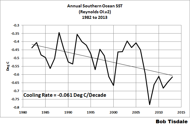
No, no, no!!
John Cook is right, the southern oceans have been warming for the last eight months – it’s clear on the chart. It’s just not been warming over the past 1, 2, 5, 10, 15, 20 and 25 years.
Cook’s comment: “The most common misconception regarding Antarctic sea ice is that sea ice is increasing because it’s cooling around Antarctica”, is climatespeak at its very best.
But what does research say?
Did you notice something “Surface Air Temperature” was from “reanalysis/analysis datasets” i. e, modeled, not measured temperatures. Sure, they were “verified” by 11 ground stations (that is about 0.5 datapoints per million square kilometers) of which only one (Orcadas) is in a relevant place, i., e. where there is sea-ice.
On the other hand the Reynolds Ol.v.2 dataset is direct measurements of SST by AVHRR, which is just about the most reliable temperature measurements that exist.
Then I have to report that warmer sea surface temperatures leads to an increase in Antarctic sea ice extent. CONTRARY to the IPCC modelled projections. However you push this baby, it has failed to exit. Keep on pushing, I hope all is well with you in Lala Land of the perpetually dazed.
http://www.climatechange2013.org/images/report/WG1AR5_SPM_FINAL.pdf
But once Cook has got his message out there and reported by the msm, he will have achieved his aim. For sure the msm , having pushed the lie, won’t be making any effort to correct the record.
OR, if they do, it will appear on the equivalent of page 53 at the bottom of the page in 3 pixel font.
A global change can have different regional expressions, obviously. But a global change should be seen globally BEFORE it is said to be global.
Except for the atmosphere all is regional. If the warming atmosphere is the “problem”, i.e. CO2, you want to make sure the warming is not regional but made to appear global mathematically.
I’m seeing mathematic simplifications confusing regional energy redistribition with adfitional global energy retention. The change outside of normal variability is only visible with sophisticated statistics. The strongest evidence to this is that the signal of AGW grows greater with the more work on the subject. I’ve seen this many times before. The higher something goes up the corporate or bureaucrstic ladder, the more certain it becomes.
CAGW is a construct directly resulting from an obsession with the abacus at this point. The lack of advance in predictability since 1988 should tell all that the premise is not based on science or engineering but on an unproved hypothesis or unprovable theory.
Would anything count as falsifying the theory that the warming is hiding somewhere?
I think what John means is that warming anywhere leads to more Antarctic ice. I as sure that it is all related somehow…naturally…
The heat is hiding in the cold.
And let’s not forget the recent post about the ARGO-era subsurface temperatures to depths of 2000 meters…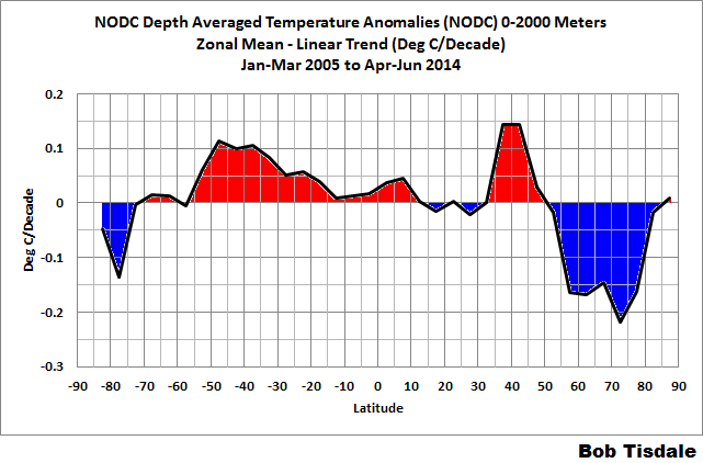
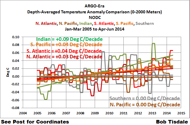
http://bobtisdale.wordpress.com/2014/10/17/there-is-a-wide-range-in-the-argo-era-warming-and-cooling-rates-of-the-oceans-to-depths-of-2000-meters/
….which also showed cooling at high latitudes of the Southern Ocean surrounding Antarctica…
…and a flat trend for the entire Southern Ocean (90S-60S):
Cheers
This year and next are going to be brutal for the Warmists because of all their erroneous prognostications coming due.
You, Anthony, get to reap the “I told ya so rewards” for all your hard work over the past few years.
They have had erroneous prognostications that have come and gone ever since this nonsense began – no one holds them accountable – I doubt they will start now. They will simply fudge their new numbers and the cycle will continue. Hopefully one day it will mean something to be completely wrong… all the time.
I am in correspondence with Prof Wadhams of the UK who said the Arctic would be ice-free by 2015. I asked him if he stood by his prediction in light of the data that is showing this prediction to be nonsense. Here was his response to me; “Dear Mr Skinner, I think you should wait until September 2015 before you assert that I’m wrong, since that remains my prediction. Yours sincerely, Peter Wadhams”
I am anxiously awaiting next year…this’ll be fun!!
tom s,
Please note that Wadhams is confused. He DID predict the Arctic to be ‘ice-free’ in 2015. He also DID predict the Arctic to be ‘ice-free’ in 2016.
See the Wadham’s predictions in quotes HERE.
AtTheRealNews transcript dated 29 May 2014, Wadhams reasserts 2015 for an ‘ice-free’ Arctic.
Keep an image capture of his email to you. Please note that he can and will fall back on the 2016 prediction. Then as 2016 draws near he is likely to make a new prediction while not admitting he was wrong. I hope in 2016 we can do a joint post with your email image and my list of quotes. It will be a fun time indeed.
Warming water leading to more ice is quite possible the most ignorant statement I can think of in this situation.
What you guys need to understand is that it does not matter how ignorant the statement is. If it is uttered by people that they trust, they will believe it, and ridicule you for laughing at them. I went through this for five years on a certain far left website that I was a contributor to.
AGW has nothing to do with science anymore, it is a faith proposition, the secular apocalypse, that they in their beneficent wisdom are the only one that can save us from it, even if they have to imprison us, torture us, and kill us, for our own good of course.
AGW has nothing to do with science anymore,…
In truth, Dennis, I don’t think it ever did. To my eye, it always was a politically driven agenda, veiled and masquerading as climate science.