Guest Post by Kip Hansen
There are a lot of good, in-depth technical discussions of Cowtan and Way 2013, Coverage bias in the HadCRUT4 temperature series and its impact on recent temperature trends. This is not one of them. In this post, I only hope to demonstrate a trick I learned when a young man, when I was a semi-professional performing magician. It is meant to be fun even though is makes a very valid and necessary point. I will use C&W 2013’s results graphic from their Media Summary:

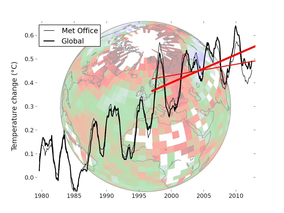
Caption: “Temperature data from the Met Office (thin lines) compared to the optimal Cowtan and Way (2013) global reconstruction (thick lines). The straight red lines indicate the trend over the past 16 years in the respective data. The background image illustrates the coverage of the Met Office data, with colours indicating geographical temperature trends. The Arctic is warming much faster than the rest of the planet.”
It is followed by the statement:
“The temperature change for any individual year is not very large (and less than the Met Office uncertainty estimates), but together they make a significant difference to recent temperature trends. This highlights the danger of drawing conclusions from trends calculated over short periods.”
As in all good performances of the Magician’s Art – you may have failed to notice that the trick has already taken place. You can read the amazement in the MSM and on the climate blogs – they are all agog at the marvelousness of it. Even their detractors [for the most part, there are exceptions] and the skeptical, see clearly that a low bias in determining missing surface temperature values in the Arctic has caused Global Temperatures to be understated.
Now, please, I make no claims as to the intentions of Cowtan and Way. I only claim to illustrate a simple little point using their recent paper’s abstract and their kindly provided background materials.
It is considered worse-than-poor-form to show how a magic trick is done, either before or after it is performed. But in this case I must – it is the point of this essay.
C&W state explicitly above “This highlights the danger of drawing conclusions from trends calculated over short periods.” Well, of course it does. In the world of performing magic, in the old style, patter, the words spoken by the performer, supplied a great deal of the distraction and misdirection required to make the magic acts work. This bit, used by C&W, is “the denial” — in which the performer formally and explicitly denies that he is going to do something to trick the audience, even at the very moment that he does that exact thing.
If I were performing a similar trick, as a stage magician, you would have heard me say something along the lines of
“Dear friends, you all know that the acts of magic I perform are all tricks – many of you don’t really believe in Magic. You may think I’ll attempt to distract you while fooling you in some way. Rest assured, this is not so….I invite you to watch closely my every move. You may find there is magic after all. Look, there is nothing up my sleeve, nothing in my hat. [Carefully exaggeratedly displaying sleeve and hat] Now, look at this beautiful silk scarf [magician spreads it for all to see, then tosses the three foot square of brilliant red silk high into the air, following with his eyes]. Nothing in there either.”
Note: The manual for this card trick calls for the Magician to switch the deck of cards that has been previously inspected by the dupe, by this method: While displaying the scarf, the magician sweeps the inspected deck of cards into the hidden black well built into the table with the left hand and dropping in its place a new deck, palmed from wherever is convenient. All of this while pointing at the red scarf with the right hand, following the path of the flying scarf with his eyes and an exaggerated tilt of his head. The new deck, of course, contains cards in the carefully pre-arranged order required by the magician for the trick at hand.
Some magicians call this move “the follow”, others simply “the distraction”. The audience’s eyes will follow the scarf, look where the magician points, and look where he looks. I have never had even the most skeptical audience (not even ‘tweenage boys) catch me at this.
Having read a half-dozen or more blog posts on C&W 2013, and hoping to understand it better, I followed links to their Background materials. The instant I saw the graph above, I exclaimed out loud to my wife “Look, they’ve used the old ‘Look at the red scarf’ trick!” (I repeat, I have no information or opinion on whether or not they have done this intentionally.)
Here’s the graphic without the “red scarves”:

Now what do you see?
What we don’t see is what C&W claim: “Temperature data from the Met Office (thin lines) compared to the optimal Cowtan and Way (2013) global reconstruction (thick lines). The straight red lines indicate the trend over the past 16 years in the respective data.”
Quite honestly, you don’t see such a trend or differences in such trends because there is no reason to look at this graph in that particular way and their claim honestly is not clearly demonstrated by their graphic or their work. The two trend lines are the red scarves. Both trend lines are the same trick, in reality, but for their desired effect, the one they want you to focus on is thicker and bolder, to highlight the difference in slope over 16 years. Yet, their whole work is a new calculation of global temperatures using their new technique for evaluating missing data points in spatial coverage of the Arctic, over a 33 year period. They have caused you too look at the red scarves (supplied trend lines) and not the whole graphically presented data set.
And, that, my friends, is the trick using The Red Scarf Follow, C&W got us to see something that without the trick, we would not have seen at all and to not see the rest of what they have done.
[That’s it, Magic Fans….the rest is a bit of commentary on what shows in the graph without the red scarves.]
Here’s what I see in their findings, you may see something different:

[***Image modified 26 Nov 2013 adding in starred blue box: h/t comment from Bill_W ]
From 1979 to around 2005 or 2006, the new technique does not produce anything different than what we already had. Sometimes their data is a few hundredths of a degree higher, sometimes a few hundredths of a degree lower. If it had been any closer a match, I, for one, would have called foul….it would have been suspicious that a major change in the method would produce exactly the same results. There are no signs of a long-term bias—warm or cool—in the Met Office data compared to their new Global.
In 2005, 2006, and the first part of 2007 there seems to be some discernible differences, still in the one or two hundredths of a degree range, which disappear for a year or more beginning what looks like mid-2007 and lasts until 2009 (the right edge of the yellow box). There is something definitely different in the last few years of the data.
What that difference is, I don’t know, nor do I have any idea why it is different and only in those last few years……but it seems highly unlikely to me that a long-standing cool-biasing methodological error (regarding infilling or not of Arctic data) at the MET OFFICE becomes visible only in the last few years of a 33 year data set.
# # # # #
Moderation Note: This is not a technical thread, and has almost nothing to do with Global Warming, Climate Change, or Arctic temperatures, in-filled, ‘kriged’ or not. It is simply an observation and follows from my recent essays on trends in general. I will follow comments and answer questions on amateur magicianship but not on climate issues. I would like to see your thoughts on what you see in the graph, sans trend lines.
=============================================================
*** Addendum (26 Nov 2013): Moved up from comment by Bill_W: “There should be another box around the 1998-2001 region [added in blue in image above – kh]. There the new data is lower while in the more recent data it is higher. So the slope changes due to changes at each end in the 16 year time frame. The 16 year period also starts around the year 1998. This is ironic given how often that argument has been used to minimize the pause.” My reply was “Very perceptive ==> That is a good point and I did miss it. Their finding a ‘Met Office warm bias’ in the 1998-2002 period brings the [left]-hand side of their bold trend line down, increasing the slope to the raised ‘Met Office cool biased’ end years.” The combination of the two creates the oft-seen Climate Science graphical “trick” == The Pivot == cool the past and warm the present to make a rising temperature trend. ***
================================================================
Related articles
- Curry on the Cowtan & Way ‘pausebuster’: ‘Is there anything useful [in it]?” (wattsupwiththat.com)
- Cowtan & Way off course (wattsupwiththat.com)
- Cotwan and Way 2013 (climateaudit.org)
- Could the Perspectives of Cowtan and Way Negate RSS’s 17 Year Pause? (Now Includes all October Data except Hadcrut) (wattsupwiththat.com)
- Curry on the Cowtan & Wray ‘pausebuster’: ‘Is there anything useful [in it]?” (wattsupwiththat.com)
- Why The Global Warming ‘Pause’ Hasn’t Gone Away (wattsupwiththat.com)
Nicely done.
And here I thought it was all about not showing Antarctica.
Typo in the first paragraph–“mean” should be “meant”:
[Fixed, thanks. — mod.]
I’m not really sure what the point is here. If you take away the red lines, you see a thick curve which really doesn’t look as if it is pausing. Trend lines help to quantify that. Without the red lines, they probably would have used a contrasting color for the thin line (current HADCRUT). Then you’d see the contrasting pause pattern.
Is your point that the divergence is recent? Bob Tisdale and Steve McIntyre have noted that. But Arctic Winter Warming is strongly linked to melting sea ice. And there has been a lot of melting since 2005.
Repeating a comment I made on another Cowtan and Way thread:
“And that, boys and girls, is why Santa Claus lives at the North Pole.”
******************************************************************************
Thanks for the fun, Mr. Hansen. Now, don’t go trying to make the clothes you’d prefer not to put away “disappear” under the bed — your wife will find them. Try sending them to the deep oceans — that’s what Trenberth does.d #(:))
Hey, look! They decreased the warming in the 18-year 1980-1998 period! It’s not as bad as they thought, but there’s no reason to draw trends over such short periods!
Oh, Mister Stooookkkkkesss — yoo hoo…. .
Bless your heart, you forgot something!
Now, go back outside, hop on your bamboo bicycle (surely, you don’t drive a fossil-fuel burning vehicle,…. do you?!) and go home and fetch your…. SENSE OF HUMOR. Then, come on back and have FUN.
#(:))
Janice
[The moderator admits he, too, is unable to translate a #(:)) emoticon. Mod]
Chuckle. That almost sounds like an invitation to use some strong language…but I won’t. 🙂
I keep hoping that somebody is going to produce an update of that most excellent little book “How to Lie with Statistics”, by Darrell Huff. I think an author might actually be able to sell a tidy number of books, and it’s not as if there isn’t plenty of modern material to work with. I think your point could be improved by coloring the lines before and after the dates where the effect is apparent.
http://en.wikipedia.org/wiki/How_to_Lie_with_Statistics
Were you a prestidigitator or a thaumaturge?
Now we know why climate scientists consult with a magician before submitting papers.
Michael Mann uses David Copperfield (:
Where is the anthropogenic footprint?
For twenty some years, Met Office and C&W march in lockstep and suddenly they depart.
You drew this reader in with:
“There are a lot of good, in-depth technical discussions of Cowtan and Way 2013, Coverage bias in the HadCRUT4 temperature series and its impact on recent temperature trends. This is not one of them.”……..
=============
Now I’ll read 🙂
Nick Stokes says “And there has been a lot of melting since 2005.”
What about the melting since 1997 Nick. Why didn’t it apply then, and what about the stable trend in Arctic sea ice since 2007/2008. Why is it supposed to have continued when the sea ice trend is stable. 2005 to 2007/2008? Talk about straw clutching.
Stokes: “If you take away the red lines, you see a thick curve which really doesn’t look as if it is pausing. ”
So are you saying he’s waving a scarf about the cherry picked range for linear trends?
Yes, Bob and Steve have pointed out the slope change in 2005. What I find interesting with Kip’s presentation is that a significant change is not there except for the post-2009 divergence. Why does the whole difference show up in only three years?
Also, because melting ice absorbs heat in a phase change which doesn’t change the temperature, shouldn’t one expect there to be a lower air temperature anomaly in the Arctic in years when ice is lost. Extending land and higher atmosphere measurements over an area where ice is melting should not be expected to work correctly. This gets into the whole heat vs. temperature argument, but if global temperature anomaly average is one’s goal, then one can’t just waive away the effect generated by pouring heat into a non-temperature changing sink and expect the extrapolation to be physically sound.
Well, I got it wrong. When I saw “This highlights the danger of drawing conclusions from trends calculated over short periods.” I thought I had spotted the trick – say you weren’t doing something, in this case drawing conclusions from short term trends, and then do it. Well, maybe I wasn’t so wrong .. that is exactly what they did in a way, the red scarf was the short term trend. It’s just that I thought that seeing the short term trend was the main objective, but as Kip Hansen so entertainingly points out, the real objective was to take our attention away from the fact that their “new” data didn’t change the somewhat more meaningful longer term trend one iota. Clever.
Aren’t C & W cherry picking? If I understand correctly, there have been a significant number of temperature measurement stations dropped from the average over the last few decades, without any accounting for how that altered the trend at all. Many of those stations that were dropped were from colder regions, so would that not have caused the global trend to rise? Why did they not focus on that issue along with whatever coverage is missing from the Arctic?
Come on Stokes – when even the f-kin pseudoscience is 4th or 5th rate, isn’t it time to give up ?
Nick Stokes says:
November 20, 2013 at 7:55 pm
But, SUMMER temperatures at 80 north (all days between 150 and 250 when the summer sun is actually shining) have been declining (according to the daily DMI reports) since 1959.
And, as of the beginning of November this year, 2013 had more Arctic sea ice extents area than any year displayed since 2002. (In the two weeks since, 2013 has slipped a bit behind a few other years. )
And, since Arctic sea ice is at most only 5 years old, any trend since 2008 is, well, meaningless with respect to “long term” sea ice.
And, Antarctic sea ice has now set an all-time high, and is on track to block the Straits of Magellan and Cape Horn in 8-10 years. (If Antarctic sea continues to expand at today’s rate of the past three years.)
I would certainly expect that if there was some kind of long-running observational bias that such a bias would suddenly exaggerate by 3 or 400% in the last few years.
Sort of like if I slouch down with my head by the window I won’t get a good reading on my car’s speedometer, & since my car gets wider over time, I would expect the divergence to increase towards the end of the observational period.
philincalifornia: “Come on Stokes – when even the f-kin pseudoscience is 4th or 5th rate, isn’t it time to give up ?”
But that’s the scarf! Look, we’re talking about 0.103C per decade being the doom of mankind. But have you ever put that on a human scale? To get that temperature increase, on average, right now: Simply walk south from Croke Park to the Ranelagh neighborhood in Dublin, Ireland. It’s about 4km. Terrible hard to put the speed in scale at something this dreadful slow. But it means a common garden snail can make that distance in 50 days. 3600 days before the 0.103C of global warming does. It’s scarves all the way down.
Wow, I sure showed up at the wrong party (again, sigh). I mistakenly (oops — blush) thought this was a thread for mostly cracking jokes and being silly. From all the serious science discussion above, I see that I was mistaken. I beg your pardon, Mr. Stokes…….. Mr. Stokes?………. MISTER STOKES! You can come back, now!!!! (at the rate he pedals his bike, he’ll be back in about 3 days……. with his copy of the Cult of Climastrology bible to read from Presdidigitations, chapter 5. Oh, boy that should be edifying — NOT.
************************************
@ur momisugly Phil in California — lol. Bingo.
******************************
Dear Mod,
(Re: 8:02pm.) Ahem, that little face turned on its side:
#(:))
OR
((:)#
is supposed to be a girl with a bow on her head… . Representing, oh, hm, I just wonder? (smile)
Thanks for letting me know it appeared to be a meaningless string of chars.
And thanks, so much for all you do to make WUWT a great place to come learn (and crack jokes, er, sometimes….)
Gratefully yours,
Janice
ColdinOz says: November 20, 2013 at 8:49 pm
“What about the melting since 1997 Nick. Why didn’t it apply then, and what about the stable trend in Arctic sea ice since 2007/2008.”
Well, here is the WUWT plot. Yes, Arctic ice has been steadily declining. But for the minimum, 2005 was a dip, and it really dropped after 2006.
RACookPE1978 says: November 20, 2013 at 9:21 pm
“And, as of the beginning of November this year, 2013 had more Arctic sea ice extents area than any year displayed since 2002.”
Their analysis ended in 2012.
RACookPE1978 says:
November 20, 2013 at 9:21 pm
And, Antarctic sea ice has now set an all-time high, and is on track to block the Straits of Magellan and Cape Horn in 8-10 years. (If Antarctic sea continues to expand at today’s rate of the past three years.)
You’d better believe that if they ever find a location for the Iranians to test their new nukes safely, this could be it. The Antarctic ice will simply NEVER be allowed to reach MSM sniffing distance of S.America.
I tried to replicate the “trick” here in my small flat on the edge of hospital complex,
it works really well….
the problem I now have is what to do with all these stupid bunny rabbits and the 2 white doves, though I have to admit the the flowers came in handy.