Earths Missing Energy: Trenberth’s Plot Proves My Point
By Dr. Roy Spencer

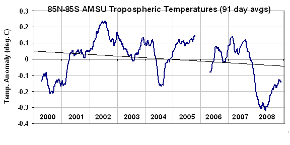
The plot that is included in Kevin Trenberth’s most recent post on Roger Pielke, Sr.’s blog actually proves the point I have been making: The trend in the imbalance in the Earth’s radiation budget as measured by the CERES instrument of NASA’s Terra satellite that has been building since about 2000 is primarily in the reflected solar (shortwave, or SW, or RSW) component, not the emitted infrared (longwave, or LW) component.
To demonstrate that, the following is the chart from Trenberth’s most recent post, upon which I have overlaid the 2000-2008 trend lines from MY plots of CERES data, and which we have computed from the official NASA-blessed ES-4 Edition 2 global gridpoint dataset.

The plots I provided in my previous post have greater resolution in the vertical axis.
For those who are following this mini-debate, please see that post, not Roger’s version of my post, which was a draft version of my post and was incomplete.
And, again I point out, the most recent dip in the LW curve (above) is consistent with cooling of the global average troposphere seen in our plot of AMSU5 data. UPDATE, 1:45 p.m. CDT: small correction to above figure.

So, collectively, “we” don’t know didlesqwat (About this)! Right?
Thank you! I have been wondering about this whole thing for the longest time and am often confused by the colors used in global graphs. Does red mean Earth is warming or cooling under that color? Are we talking incoming? Outgoing? Shortwave? Longwave? Anomaly? Adjusted for season? It is all very confusing. This post helps.
Congratulations, Dr. Spencer! Just read your book too.
Very nice work you are doing.
I feel a bit sorry for the warmers. (Just kidding!)
They dont know much about control loops, I’m afraid.
OK – I don’t follow this every day so I’m not hip to all of the acronyms and abbreviations. What is OLR? I assume the vertical axis is delta troposphere temperature. Is it degrees F or C? BTUs? Calories? What do the different background color bands on the graph signify? Why is the Net value shown as equal to negative OLR minus RSW (Net = -OLR-RSW)? Why is OLR negative in the “NET” calculation and graph but shown as a positive value plot in the upper graph?
Inquiring minds need to know…..
So far AGW has failed to reproduce or predict climatic history, such as
– the temperature record of the last 20 years
– the missing hot spot in the tropical troposphere
– the lack of cooling in the stratosphere over the past 15 years
– the multidecadal sea ice oszillation in the arctic
– increasing antarctic sea oce
– the medieval warm period
– the little ice age
etc.
…that means AGW proponents could not prove their theory.
Do these new direct measurements actually mean that AGW (based on positive feedback) can now be disproven ?
As someone (probably like many here) who merely dip in and out when time allows, and who isn’t up on the science of all of this…what does this mean? Can someone kindly just add a line of explanation as I don’t have the time to read the previous post on this?
So…no bailout needed?
Where oh where has all the heat gone?
Oh where oh where can it be?
Our models crunch numbers we instantly lose,
And clouds are ignored constantly!
TO: Patrick Davis (May 11, 2010 at 11:04 am)
I believe the correct units of complete climate ignorance are diddlysqwatts per square meter.
Of course, the erudite Dr. Spencer is far removed from that realm.
Can we now torpedo the windmills off the cape once they build them?
Correct me if I’m wrong, but I believe the missing heat is based on models of AGW heat that SHOULD be building somewhere based on calculations of greenhouse gas capability and the amount of increasing CO2 we are putting into the air outside of natural sources. It is not based on the direct measures of incoming, outgoing, and net heating energy. If the models say heat should be building but we can’t detect it or find it, I would think a reasonable scientist would question the model as the first step to solving the puzzle.
Still we may expect up to 8 degrees warmer weather east of Svalbard within 90 years…
http://translate.google.co.uk/translate?prev=no&hl=en&u=http://www.aftenposten.no/klima/article3646095.ece
site doesnt seem to working, I am only getting headers and comments, no content?
all good now!
A, I’m getting all the post titles, dates, by who and the comments but not the body of the post itself. Did “we” make another change and I’m not clicking on the right thing – – or is there a problem?
I have an I-mac w/latest OS and my browser is Safari
opps, just like that it’s back. what the H was that glitch??
Patrick Davis says:
So, collectively, “we” don’t know didlesqwat (About this)! Right?
I believe it’s Didlisq-watt, which is ~0W 😉
Maybe I’m just tired – but how come this article can’t be seen on the main page?
Anyway, what I find baffling is that anyone can watch the curves for outgoing radiation that Kevin Trenberth has provided, and not see that it’s the SW radiation that has a trend since 2000 and not the LW!?
Which of course should tell anyone who whatches these curves that there is no proof for any imbalance due to diminished outgoing IR/LW at all. Which in turn tells us that there is no observational proof at all for GW through GHG:s. Or what am I missing here?
Maybe the problem with the article is that the URL is misspelled? It says “enery” when it maybe should say “energy” to be loaded properly on the main page?
Or… Maybe I’m just tired. 🙂
Or is the logic on Kevins behalf that the downward trend in RSW should be seen in OLW also, and if it isn’t, then there must be an imbalance of energy?
And that’s why the OLR-RSW calculation is interresting?
Well, that seems a tad simplistic. What’s to say that an imbalance due to GHG:s can be proven this way at all?
You need to disprove all other possibilities first, like changes in cloud cover, as Roy keeps saying, for example. Increased cloud cover will surely block some LW radiation, but that’s hardly the end of the world.
Has Kevin proved that this (and other) possibilities are not to be counted on?
I think not.
In the 1990s reflected shortwave radiation was lower than the previous norm due to earlier high latitude spring snow melts. I believe I’ve read that these haven’t been as early in the last few years. Seven years of data doesn’t go back far enough to detect this change. Given the known problems with the models at high latitudes Andreas Roesch conducted a diagnostic sub-project on the issue. It was the most significant paper I saw during the Fourth Assessment Report draft review, because it reported that ALL of the models had a correlated positive surface albedo bias, and was able to provide a globally and annually averaged figure for the discrepancy.
“The mean annual surface albedo of the 15 AR4 models amounts to 0.140 with a standard deviation of 0.013. All AR4 models are slightly above the mean of PINKER (0.124) and ISCCP-FD (0.121).”
When the corresponding downwelling radiation reaching the surface of 198 W/m^2 is applied, the energy is over 3 W/m^2 globally and annually averaged. This is much larger than Hansen’s energy imbalance of under 0.8W/m^2 and is comparable to the AGW CO2 forcing.
It should be noted that the earlier spring snow melt is a positive feedback that is not missing, but is under-represented in all the models. Somehow the models manage to “match” the 20th century climate warming despite missing this energy. Perhaps they “match” it with with increased sensitivity to CO2 forcing elsewhere in the climate, or as Wentz documented, by under-representing the negative feedback from precipitation in the water cycle.
What is particularly pernicious about this model under-representation of the positive feedback to earlier snow melts is that the models do exhibit earlier snow melts in response to warming. What this means is that during climate sensitivity runs and climate projections they eventually catch up with the actual climate response. The earlier snow melts are self limiting, because there are diminishing returns earlier in the season due to the lower solar angle. So the model projections and sensitivity runs have over 3W/m^2 extra energy added to increase their climate warming, in addition to the errors that their false “matches” of the 20th century climate introduce.
The working group I authors buried this result, and obviously didn’t adjust the 21st century projections or levels of confidence for this diagnostic result that was larger than the whole energy imbalance phenomenon of interest. Of course cloud errors are probably a magnitude or two larger, but the significance of this was that it was correlated error, not random error, that one could HOPE might be canceled by combining “independent” model results into ensembles.
Roesch, A. (2006).
“Evaluation of surface albedo and snow cover in AR4 coupled climate models”.
J. Geophys. Res.. DOI:10.1029/2005JD006473.
Here are a couple more quotes from the article:
“The annual mean surface albedo of the AR4 models is 0.140 with a standard deviation of 0.013. All climate models are slightly above the average derived from the PINKER and ISCCP climatology. The participating models all capture the large-scale seasonal cycle of the surface albedo quite well. However, pronounced systematic biases are predicted in some areas. Highest differences between the models are found over snow-covered forested regions. The winter surface albedo of CNRM-CM3, averaged over the latitude zone from 50N-70N, is nearly 0.3 lower than in MIROC3.2 and INM-CM3.0. Comparisons with ground-based and remote-sensed data reveal that most AR4 models predict positive biases over primarily forested areas during the snow period. These substantial deviations are still far too high to meet the required accuracy of surface albedos in GCMs.”
“These substantial deviations are still far too high to meet the required accuracy of surface albedos in GCMs.”
From K. Trenberth’s presentation:
“The main energy reservoir is the ocean, and the exchange of energy between the atmosphere and ocean is ubiquitous, so that heat once sequestered can resurface at a later time to affect weather and climate on a global scale.”
An admission that the LIA and the MWP could be local manifestations of a global event?
Methinks the rot(ten ice) has spread from the state of Den(ial)mark to pretty much everywhere the models look…..
From the same source:
The sea level has risen (IPCC?) by 50 mm (2 in.) in the last 30 years…..MAN THE LIFEBOATS!
Based on the “curves” provided, looks like that “rise” will become a “fluctuation” shortly as it comes back down a bit. The Catastrophic has been tossed and the Anthropogenic is next in line….can Warming be far behind?
“Martin Lewitt says:
[…]
The working group I authors buried this result […]”
Wasn’t WG I lead by a certain Kevin Trenberth?
Thanks, Martin, most enlightening!
I’m a bit puzzled about how trend lines are computed.
Looking at the blue graph with its blue trend line and the pink “recent trend” line; I can not imagine what algorith, would yield that blue line. I’m comfortable with the pink line for the region it is in; but If I was driving the blue line, I would raise its right hand end almost to the pink line; but not quite; and the left end of the blue line I would drop, pretty much all the way down to where the blue squiggle comes in from the left.
Now that position is calculated from my Eyeball Statistical Probablity algorithm; often simply referred to as ESP.
The general principle behind ESP is that the squiggly blue curve, is NOT noise; it is essentially all signal. So the ESP algorithm says drop that line so that the squiggly area above the line is equal to the squggly area below the line.
Now if the squiggles was just noise; then I could see doing an RMS error summation to place the trend line; but not if it is infact real data that we simply want to average.
So I don’t quite get that blue trend line at all.