From NOT A LOT OF PEOPLE KNOW THAT
By Paul Homewood

https://www.climate4you.com/images/EQUATOR%20202607%20vs%20last%2010yr%201200km%20AIRSv6.gif

While Britain and parts of NW Europe have baked in recent weeks, large regions of the world have experienced extreme cold.
In particular, all of those areas surrounding Britain and France were affected by temperatures well below normal in July.
Does not look like global warming to me!
In fact, globally, it was the warmest July recorded. Here is the table ofmonthly average anomalies, ordered:
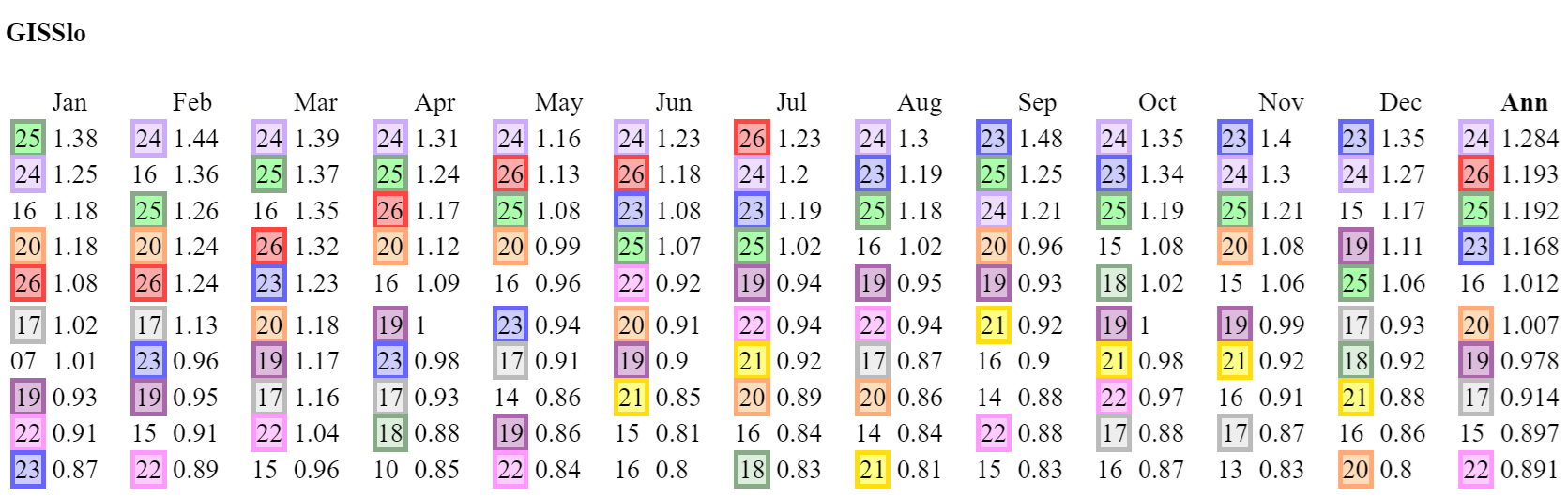
Source?
GISS https://data.giss.nasa.gov/gistemp/tabledata_v4/GLB.Ts+dSST.txt
“using elimination of outliers and homogeneity adjustment”
Just gotta love adjustments.
I’m curious how they define “outliers” and which way the outliers tended to go that were eliminated.
Before GISS performs spatial interpolation, the raw land data undergoes comprehensive homogenization handled by NOAA’s Pairwise Homogenization Algorithm (PHA). This process removes non-climatic shifts caused by station relocations, instrument swaps, or changes in observation times.
Homogenization increases spatial and temporal correlation of the temperatures. This decreases the effective quantity of data in the dataset thus making the uncertainty of the average much wider.
How does GISS handle this? I can’t find it anywhere.
Two things need to be true for this to be true.
The Pairwise Homogenization Algorithm assumes nearby station temperatures are accurate. This is illogical as NOAA acknowledges that even ASOS stations have an accuracy uncertainty of ±1.8°F. LIG thermometers are have at least that same uncertainty.
Unless the changes due to station relocations, instrument swaps, or changes in observation times exceed these uncertainty quantities, there is no way to scientifically know what the adjustment should be.
Let’s be honest, if PHA was done for isolated days due to quality control, there would be little disagreement. However, when years of recorded data are adjusted there can be only one reason, to create homogeneous long term data series that can be touted to be scientifically correct.
Eliminating bias, which is the term used as the reason for making adjustments, is a word game climate science uses to make an accepted term mean something different. Bias in a device can only be determined by physical calibration that determines a corrective value. Fat chance of that happening.
The Gormans,
Here are some new discoveries about the validity of fundamental historic temperatures data for Australia, described by our official BOM as raw, unadjusted and the same as was recorded by original observers.
Our report shows extensive adjustments. Please do some similar exercises for other countries.
Note that this adjusted data set is further adjusted in Australia with the BOM invention named ACORN-SAT. It is this double-dip adjusted data that is sent to bodies like GISS and UK Met Office, who assemble global warming estimates used by politicians who are making laws with very expensive economic consequences.
Geoff S
https://www.geoffstuff.com/V14_fullBOM.pdf
Geoff,
I would love to do some of this for the U.S. but I lack the time to do everything. I am working on trying to develop a view of how insolation and land interface to create outgoing IR that drives CO2 warming (if any).
I’ll be honest, looking at USCRN Tmax, there has been little change from 2005 until the last few months. More time will need to pass to tell what the warming in the recent time will do. The fact that CO2 has had a consistent growth over that time with little to no change in Tmax should cause pause to the warmists.
Tmax has three main limiting boundary conditions: sun insolation, orbital mechanics, and T^4. Tmin has none of these. It’s not surprising to see Tmax not varying much.
So, to tell a lie you went to liars. Got it.
Yes, they are liars … just like all the other Global Met agencies. (sarc)
And we have a typical bonkers swerve to maintain cognitive dissonance.
Again, no-one has been able to show where they measured nearly all the ocean, and much of the land, back in say 1920.
It is just a fabrication. !!
When you “alter” historical data to advance your political agenda you are a liar.
” GLOBAL Land-Ocean Temperature Index in 0.01 degrees Celsius base period: 1951-1980
”
picked the coldest period to compare with the present . 1951 to 1980.
That shows your bias .
GISS uses that period because it started calculating in the 1980’s. But changing the period just moves the whole data set up or down a bit. It doesn’t change which was warmest, or by how much. And of course it makes no difference when you use a specified difference, as here (last ten years).
And to you, also, when you “alter” historical data to advance your political agenda you are a liar.
While Wikipedia should never, ever, appear in the final “References” section of any blog comment that purports to present a “serious” logical argument, I have often found it useful as a starting point for either “dry facts” or “basic technical / scientific / mathematical definitions”.
The first paragraph of their “Data dredging” page (which came top when looking up “p-hacking definition”) :
NB : Wikipedia uses the word “significant” here in the sense “statistically significant”.
“Significant” is not (always / strictly) equivalent to “first in a sorted list of values”.
[ Enter “mildly exaggerate” mode” … ]
January and February 2026, 5th warmest on record … [ silence ] …
March 2026, 4th warmest on record … [ tumble-weed ] …
April 2026, 3rd warmest on record … [ rien, nichts, nada ] …
May and June 2026, 2nd warmest on record … [ some murmurings / a minor disturbance in The Force ] …
July 2026, warmest on record …
Oh my $DEITY we’re all gonna diiiiiiiiiie … and all life on Earth is going to go completely extinct by next Thursday ! ! !
[ Exit “mildly exaggerate” mode” … ]
Indeed it was.
So what ?
.
Points where I agree with you (and “MrGrimNasty” and “Anthony Banton”).
1) Just because “they” are guilty of p-hacking doesn’t mean that “we” should do it as well.
2) Paul Homewood shouldn’t just throw out there a highly selective “Surface air temperature” plot without specifying which (combination of ?) dataset(s) he used to generate it.
Using a … decidedly non-standard, 1991-2020 is the latest WMO-compliant 30-year period … “base / reference period” of “the last 10 Julys (/ years)” doesn’t make reproduction / replication efforts any easier.
.
PS : I will, sporadically and not always successfully, use Paul Homewood’s posts as a way of (attempting to) “keep myself honest”.
The starting point is “Can I work out what he’s not including this time around ?”.
A personal reaction which isn’t limited to “Not a lot of people know that” (re-)posts …
There is no redeeming reason to use a 30 year baseline. How about a 100 year baseline? That has a benefit of approaching some ice core time resolutions as well.
“Data dredging,”
This is a typical WUWT comment sequence. WUWT posts an article about July 2026, saying that “large regions of the world have experienced extreme cold”. I point out that the numbers are wrong. So the cry goes up – so what? Why are you talking about July. Data-dredging!
So the entire globe went from ~15°C (59°F) to 16.23°C (61°F)! Call me unimpressed.
And half the world’s population misses out on the big 16.23C scare when February’s “hottest evah” 13.54 constructs are declared.
What’s up with that?
Discrimination, I say!
In your table, the five warmest Februarys are all since 2015.
and?
Half the world doesn’t get affected by the 16.3C July GAT construct.
They’re freezing their knackers off.
And when the GAT construct for Feb says 13.54C, again half the world doesn’t get affected by it.
They’re suffering in their jocks.
Why can’t we all just live in Nice, I say 🙂
(“All we are saying
Is give Nice a chance . . .”)
Perhaps the world is returning to normal after the little ice age. Warmer = better.
So, using a data set that is generally unsuitable for the purpose, even if it were not compiled by persons with an agenda, we find that it may be slightly warmer than when it was colder. Yawn.
“ generally unsuitable for the purpose”
In fact, WUWT posts a data map where no-one has a clue about what the data is, or how it was measured. But GISS, based on actual thermometer readings, is “unsuitable for purpose”.
if you say so Nick.
Whatever GISS is based upon, it is entirely unsuitable for measuring or comparing surface data to the past. Given the numerous periodic adjustments, it is not even suitable for comparing itself to itself.
I chuckle at “actual thermometer readings” since data holes are infilled from questionable measurements hundreds of kilometers away. It is a pile of assumptions heaped upon estimations glued together with assertions.
I do agree with you about the map included with this article, but using it as a strawman to defend the indefensible NASACRAPA remains pathetic.
Climate science insists on using the SEM = σ/sqrt(n) as the measurement uncertainty of its “averages”.
The issue is that every time a piece of data is “infilled” or “homogenized” the “n” factor actually gets smaller instead of larger. By infilling and homogenizing climate science ADDS uncertainty by making the SEM larger.
The same thing applies to data that is “adjusted”. This is no different that “infilling” a different temperature based on the readings from another sensor.
“n” is not actually the number of data entries, it should be “n_eff” < n. How much less should be based on how much adjusting, infilling, and homogenization is done.
In addition, the uncertainty in the meaning of the SEM itself can be estimated by the ratio of n/N where N is the number of *possible* data points. If you break the earth’s surface into 1km x 1km that’s a possible 510 x 10^6 possible data entries. GHCN has about 30 x 10^3 stations. That’s a ratio of about 0.00005. Pretty damn small.
Conclusion?
Only if you average. Nonsense.
LOL,
You are missing the point of the post badly.
Nick,
Before you trust Australian temperatures calculated by others, the “trust, but verify” guideline raises a question.
Have you verified that the temperature measurement apparatus such as LIG thermometers in big Stevenson screens used in 1910 or thereabouts gave results that can be directly compared with apparatus used today, such as electronic probes in small screens?
I have searched for and failed to find any relevant reports. Some are merely unsupported claims that the new gear is fine. IIRC, Dr Jennifer Marohasy also failed in this verification quest when she requested BOM overall data with new and old apparatus run in parallel for long terms.
Traditionally in Science, a new apparatus has been tested against the old, sometimes for years, before adoption.
Do you have any links to BOM or other such thermometry testing that you can share?
Geoff S
Geoff
In this recent paper, section 3.4.2 is specifically on the change of screen sizes in Australia, and checks on how they affect measurements.
Do they still use “expert judgment”? 😉
Geoff, I read thru the paper that Nick referenced. It is similar to others that promote homogenization.
You’ll notice throughout that there is no discussion at all about the accuracy of past measurements, only moves, breakpoints, etc.
The goal is not accuracy but instead to develop a method to create a LONG TERM record that appears to be a completely joined series.
Differences arisng from entirely accurate measurements by different devices are attributed to ‘biased’ devices. This basically puts connected series as more important than the accuracy of the measurements.
The technical definition of bias as inaccurate measurements being changed to only being apparently different with no evidence is not scientific. It is creating a fiction to justify obtaining a goal of long records.
I don’t believe the map shown of July anomaly vs the mean of the last 10 Julys. Here is my version, mostly greater than average, agreeing with the overall average diffrence:
I can’t tell what Climate4you is plotting there. They say the data is from AIRS – ie satellite, but not even the lower troposphere. Just somewhere up there. It’s true that any people there would be experiencing extreme cold, but down here it was warmer than usual.
Yes, I looked up their data source (NASA GISS) and used their plot … came out like yours and nothing like what is on climate4you’s…….
N Canada was warmer as was N Africa FI, as was most of S America.
And: “While Britain and parts of NW Europe have baked in recent weeks, large regions of the world have experienced extreme cold. !!??
Yes, I hadn’t thought of using the GISS interactive, which saves a lot of time.. But I think the base period should be 2016-2025, which gives
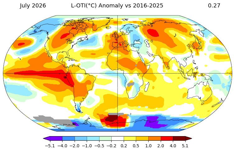
Is the problem with the AIRS v6 data? Using the GISS map and selecting AIRS6 I get this
which looks similar to the one in this article, apart from the weird colour scheme they use. And this puts July as -0.23°C compared with the last 10 years.
This seems odd compared when UAH is showing 2026 as the third warmest July on record, and 0.15°C above the 2016-2025 average.
Yes, the problem is with AIRS. C4U is using surface radiance data measured by the AQUA satellite, which no-one else would use for this purpose. The problems are:
_1. Measurement of the radiance is blocked by clouds, and even affected by humidity.
_2. Converting to temperature requires knowledge of local emissivity, which varies unpredictably in time and space – grass greening and browning, crops growing, then ploughing, snow etc.
So many things are blocked by clouds.
The problem with the cloud blocking theory in extremely simple terms is surely this: whatever heat fails to be reflected by clouds by day, is surely compensated for by cloud cover restricting heat loss during the night?
Maybe, but that doesn’t help. You have a satellite up there, trying to estimate temperature from the IR emitted by the surface. If that IR doesn’t get to the satellite, the measurement fails.
You just destroyed UAH and RSS accuracy.
No, the reason why they rely on a rather weak microwave signal is that those frequencies are little affected by cloud. There are plenty of other problems.
Have you ever done microwave attenuation studies for communication links? I can assure you that H2O in all forms can attenuate microwave emissions.
Has a more blatantly dishonest article ever been posted at WUWT? The competition is strong, I know.
But a temperature map from somewhere high up in the atmosphere, probably grabbing data from the cooling stratosphere, is passed off as representative of the global average temperature experienced in July at the surface.
I mean, WUWT have already posted the UAH_TLT July global update, showing that it was the second-warmest July on record.
That same update said that July 2026 was the warmest July on record for the US (CONUS). The temperature chart in this article says July 2026 was colder than the average CONUS July over the past 10-years!
Both things can’t be true.
We have now reached the stage where WUWT is prepared to post two articles within the same couple of weeks that directly contradict one another!
Third warmest July on record, excuse me.
Which only goes back to 1979.
WUWT does not necessarily agree with nor endorse everything that is posted. It is quite reasonable for WUWT to publish contradictory papers.
Or do you think they should only allow one point of view?
I would expect some editorial control over blatant misrepresentation!
Nope, that is up to the posters!
And the commenters, to discuss it.
Very cold in Australia’s lower south, the Upper Great Southern.
That’s where I am. A remarkably mild winter.
Mean max in Melbourne in July was 15.7°C. Average is 13.5°C
when I lived in Melbourne, “Mean Max” was an enforcer for the Painters & Dockers Union 🙂
Nothing “average” about Max at all 🙁
That Max is now at the bottom of the harbour.
Alongside Billy “the Texan” Longley.
Aaahh what an exciting world it was before we were all being bored shitless by endless “global warming” stories, hey?
You are not in WA, which shows yellow in your post. 😉
In UAH, Australia had a negative temperature anomaly in July.
equal 26th warmest July in 48 years.
“Here is my version” And you say sh*t like this with a straight face.
And he is not even graphing the same time period or the same thing…. D’OH !!
And he is using manically mal-adjusted surface data from GISS.
Nick’s second graph is the 10yr period 2015-2025 as the Climate4you website says ….
“Starting from 2015, the past 10 years are used as reference level.”
How about doing some validation on the stuff you reflexively admire.
You know like true sceptics do?
“And he is using manically mal-adjusted surface data from GISS.”
Correction: No, if anything over-adjusted, as the USCRN series for the last 21 years shows.
PS: “manically”.
Err, I’d suggest you need to look to yourself to find that behaviour
Yes, yes, we know – it’s all a massive scam. (sarc)
(Hence you “manically” saying it is ).
So he still isn’t graphing the same thing….
… you need to lear to read and comprehend what is actually being graphed.
“anomaly vs the mean”……
gotta move the goalposts !
Pretty much the same picture as in the article, except for your colour scale that shifts straight to orange and red above 0,5 degrees.
And I guess the big red blobs in northern Siberia and on the coast of Antarctica are single weather stations, smeared out thanks to the projection.
No. Both maps use white for zero difference. The WUWT map is then mostly on the cool side. Reality is on the warm side. No color scheme change is going to alter that.
You are using a base period of the coldest period over the last 100 years. How about a base period of 1921 to 1951.
Secondly, the Pacific shows a large warm area due to El Nino. This is not current warming due to current absorption of heat in the globe. It is due to previous warming and accumulation of heat that “temperature” fails to capture. In other words, the globe hasn’t warmed, the accumulated heat, think zettajoules, has just been spread over a larger area.
Temperature is a poor proxy for thermodynamic heat especially when dealing with H2O that has a very large specific heat.
I’m a CAGW skeptic but this type of article is just an embarrassment to us all.
Well it is from Homewood.
So… from a much more reliable source than say, the Met office, CRU, GISS etc.
Ah, the predictable dig at the MetO for want of anything pertinent, or indeed sensible to say.
Have you seen the woeful condition and maintenance of what the MO try to use as “climate” sites !
They have one major thing to do, get a reasonably accurate measure of the UK’s temperature….. at that, they have FAILED MISERABLY
Very pertinent to reliability. In the Met-Office’s case.. basically .. NIL !
Go on then Anthony, explain this
https://talkshop.blog/2025/12/29/killowen-dcnn9220-the-explanation-for-its-excessive-rise-in-mean-minima-why-cant-the-met-office-see-this/
Even if it was a warm July…… SO WHAT.
According to UAH, Australia had its 27th warmest July
Current temperatures are well below what they have been for most of the last 10,000 years.
Cold kill 10x as many people as heat.
Warm weather promotes crop growth, as does CO2, and longer growing seasons.
Recent warming comes from an increase in absorbed solar radiation…
… and is nothing to do with CO2.
ps.. UAH shows July 2026 as the third warmest July in 48 years..
So how do you account for the temperature map in the above article?
Can you explain why, if July 2026 was the third warmest July in the UAH global record, it was simultaneously also colder than the average July over the past 10 years?
UAH has July 2026 as the 33rd highest monthly anomaly in 47 years.
In 47 years there are 564 months.
Yeah but if you construct an average of the years by the number of ‘J’ months in those years, and the extra days in each of the 12 Leap Years in that 47-year span, you could make the case that . . .
(anyone who is so captured by such “averaging” exercises of meaningless constructs ought to “get a life”? And GAT so fits this characterization.)
I’m not sure how you can claim anywhere has experienced “extreme cold” based on a comparison with he last 10 years, given that the last 10 years have been some of the warmest on record.
Here’s what the comparison looks like for UAH.
UAH has July 2026 as 0.15°C warmer than the 2016-2025 average.
And here’s what it looks like compared to the 1991-2020 average.
So the globe has warmed from ~15C to maybe 15.5C degrees. I think I’m likely to have a heat stroke!
The best that most citizens all around the world can manage by way of reaction is –
So why go to such lengths to deny it?
The whole AGW scam is based on starting at the very COLDEST period in the last 10,000 years. !
UAH starts at the COLDEST period since 1900
btw… Neither of your pics is what is being shown by climate4you.
UAH has July 2026 as 0.15°C warmer than the 2016-2025 average.
Indeed. UAH has July 2026 the warmest July in its entire record for CONUS (US48). As do NOAA, as do BEST.
So what data is the chart in the headline article referring to?
We are not told.
No one here even asks, because …?
The map posted with the article shows much of Texas to be on the cool side–possibly it was for the first few weeks of July, but where I am, the highs have been 100 + every day for weeks now, and the last rain was July 17th. Of course, it is summer.
Where I live (Colorado), we’ve been dominated by high pressure since I moved here in the 1990s. Sure, we occasionally have periods of troughing, but it seems like anomalously high pressure with heat and drought is the new baseline in this part of the country.
My part of Texas has been experiencing drought conditions for the last 3-4 years. I keep a rainfall record. 5 years ago I had over 40 inches–the most in the 15 years I’ve been here. This year we had over 15 inches during May, June, and mid July after a fairly average 7 inches for the first 4 months. Overall, a much better year so far than the less than 20 inches total for last year, and only about 15 the previous year. Live essentially on the edge of the Sonoran desert, so water in the dirt tanks this time of year is very welcomed. But the level has been dropping fast since the sky stopped crying mid July. Might take a good old hurricane hitting the gulf coast in the right spot to bring some more rain this way. Fingers crossed.
It’s always this way.
During the summer a high pressure system sets up in the center of the country and brings high heat and very little moisture.
We in the U.S. are now at the point where the temperatures start to cool and the rains come.
We could use a nice tropical storm drifting up this way from the Gulf.
According to the temperature anomaly map in the title image, the US had a cooler than average year compared to the average of the past 10 years.
According to UAH, which this site traditionally fawns upon, the US had its warmest July on record.
Ditto NOAA. Ditto BEST.
Something is badly amiss with the temperature map shown in the headline article. It is deliberately misleading.
This is the page Homewood got his data from
https://www.climate4you.com/GlobalTemperatures.htm#Monthly%20surface%20air%20temperature%20anomalies%20versus%20average%201998-2006%20in%20areas%20between%20%2072oN%20and%2060oN
The heading is Monthly surface air temperature anomalies versus average 1998-2006 in areas between 72oN and 60oS
and they explain why they use the 1998-2006 base period.
Look forward to gradually seeing if 1998-2006 represented a peak period, or if modern temperatures will go higher.
Except you can’t because as they say under the maps “Starting from 2015, the past 10 years are used as reference level.”.
If you look through their tableau, they use a variety of comparison periods. They start with 1998-2005, and most of it is 1998-2006, but a few years ago they switched to “last ten years”. It seems the text hasn’t caught up.