by Dr. Alan Welch FBIS FRAS — 4 September 2024
Having used Excel for the last 7 years to study Sea Levels I have discovered various pit falls, techniques and useful functions. I wish to share these with the wider WUWT community. To some it may be like teaching your Granny to suck eggs (as we say in the UK) but hopefully some may pick up a few useful facts or ideas.
To illustrate findings, I have used the New York Battery data as recently discussed by Kip Hansen (1). These cover the period 1856 to 2024 but due to the hiatus in data between 1878 and 1893 only the period 1893 to 2023 will be considered as 131 continuous years. Note there were a few months missing in 1920, but this has little impact.
To reduce the quantity of data and remove any seasonal effects, each year will be averaged producing 131 yearly data values. Feeding these data into Excel and producing a standard presentation results in the graph shown in Figure 1.

Figure 1
Trend Line Equations
As values the coefficients of the Trend Line Equations are accurate to the precision given and usable as such. The problem arises if the equations, especially the quadratic coefficients, are used in subsequent analyses such as graph plotting and, although not recommended, extrapolation. The problems in plotting are illustrated below where the trend line equations are subjected to “Trend Line Formatting” increasing the significant decimal places to 5 and 6 respectively. With the standard Excel presentation there is a consistent error of nearly 200 mm. This comes about because the date values are squared and when multiplied by a coefficient with only 4 decimal places result in the calculated sea levels becoming basically the difference between two large numbers. Even with 5 decimal places there is a general error of about 15 mm. It is only with 6 decimal places that the error reduces to less than 1 mm.
If Cubic or higher polynomial curves are involved this problem is further exacerbated. These higher polynomial curves are not generally recommended but, on some occasions, can point to other behaviour such as would occur with decadal oscillations although using a moving average trend line would probably be more suitable. Extrapolation of these higher polynomial curves is even a more “no-no” as the highest-powered term soon dominates the calculation.
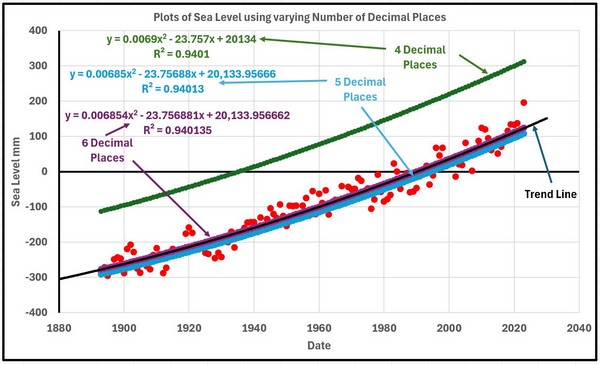
Figure 2
There are several ways the above problem can be overcome in most cases.
1. Reduce the date values by deducting a suitable figure such as 1900 so the dates now only vary from -7 to 123.
2. Generally show more decimal places.
3. The surest way is to make use of the “LINEST” function in EXCEL. This function is generally described as returning the parameters of a linear trend and has the form, assuming the year and sea level data are stored in columns A and B and rows 1 to 131
The 2 coefficients will then appear in the cell where the function was entered and the adjacent cell.
It is not well known that the LINEST function can be extended to solve a much wider range of regression analyses including cubic, quartic etc curves.
To solve for a quadratic the function is entered as
= LINEST(A1:A131,B1:B131^{1,2})
And for a cubic
= LINEST(A1:A131,B1:B131^{1,2,3})
In these cases, the coefficients will appear in 3 or 4 adjacent cells.
Having obtained values for the 2, 3 or 4 coefficients they can be captured as named values in subsequent calculations by using the “Name Box” and then use Formulas>Defined Names>Define Name. In my work I called the values LINEAR1 and LINEAR such that
Sea Level = LINEAR1 * year + LINEAR
Sea Level = QUAD2 * year2 + QUAD1 * year + QUAD
or for cubic curve
Sea Level = CUBIC3 * year3 + CUBIC2 * year2 + CUBIC1 * year + CUBIC
These formulae will then produce accurate values for the sea levels.
Curve Fitting 1
The quadratic curve may be one of many other equally well-fitting curves. In this instance another class of curve could be long term sinusoidal variation and the following shows how a series of sinusoidal curves can be generated and compared.
A general sinusoidal curve can take the form (in Excel Format)
=CONST+AMP*SIN(((SHIFT+2*A1)/PERIOD)*PI())
where CONST is a constant mean sea level (mm)
AMP is a +/- amplitude variation (mm)
SHIFT is a phase shift (years)
And PERIOD is a period of a complete oscillation (years)
How can these four values be derived. Not knowing any mathematical process to home in on the four values that give the “best fit” the following method was used. The question of what constitutes a best fit is not clear at this stage so will be addressed as the process progresses.
Stage 1 was to choose PERIOD, say 1000 years.
Stage 2 was to set CONST at zero.
That leaves AMP and SHIFT. Choose a value of AMP such as 1000mm and any value of SHIFT and plot the result of applying all 4 values over the total period covered by the data. It will probably be totally wrong so modify SHIFT until the portion of the sinusoidal curve roughly resembles the data/quadratic curve in form.
Adjust SHIFT and AMP until the portion of the sinusoidal curve looks approximately “parallel” to the quadratic curve at which stage a value of CONST can be added to make the 2 curves roughly coincide. Final tuning of CONST, AMP and SHIFT can be carried out either visually or by introducing some “best fit” criteria. In this instant the visual inspection was considered sufficient but later with a different case the question of best fit will be addressed.
After much blood, sweat and toil the following parameters were homed in on.
CONST = 223 mm AMP = 600 mm SHIFT = -300 years PERIOD = 1000 years
A second curve based on a period of 1500 years was then more easily found giving
CONST = 695 mm AMP = 1090 mm SHIFT = -510 years PERIOD = 1500 years
Using interpolation and some small fine tuning 3 other curves were found
CONST = 342 mm AMP = 722 mm SHIFT = -355 years PERIOD = 1125 years
CONST = 462 mm AMP = 845 mm SHIFT = -410 years PERIOD = 1250 years
CONST = 578 mm AMP = 968 mm SHIFT = -469 years PERIOD = 1175 years
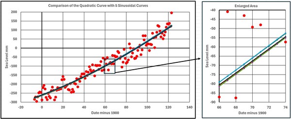
Figure 3
Figure 3 shows the Quadratic Curve and the 5 Sinusoidal Curves. They all lie within about 3 mm of each other which is minimal considering the range of the basic data.
The following statement occurred to me, but I am not sure if it is profound or naive.
“There is one Quadratic Curve and a multitude of Sinusoidal Curves. Why would Nature choose the Quadratic Curve?”
Figures 4 and 5 show the 1st and 2nd derivatives for the 6 curves. The 2nd derivatives all vary greatly from the Quadratic as would be expected as the time scale covered is a sizeable portion of the periods involved.
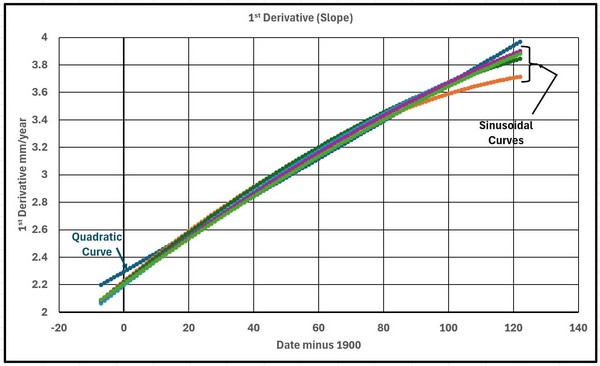
Figure 4

Figure 5
Figure 6 shows the 6 curves extrapolated over 2000 years. You pays your money and takes your choice.

Figure 6
Moving Averages
Excel plots Moving Averages in a strange way when presenting engineering or scientific data. It plots the average curve right shifted whereas a more informative form would have the average values plotted a mid-point of the range used when averaging. It is very simple to produce your own averages and plot to be more useful.
Figure 7 shows the data plotted with both forms of presentation.
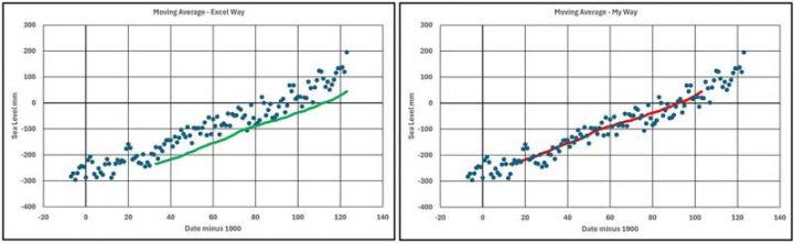
Figure 7
As “Ol’ Blue Eyes” said I will continue to do it “My Way”.
Curve Fitting 2
In the previous section on Curve Fitting long term (around 1000 year) periods were considered but now short term (few decades) will be discussed these possibly occurring due to decadal oscillations in climate behaviour.
With the data being used this variation will first be found by estimating how much the fitted curve varies from the actual readings. Values calculated on the fitted curve are subtracted from the data and this set of values forms a set of residuals as shown in Figure 8.
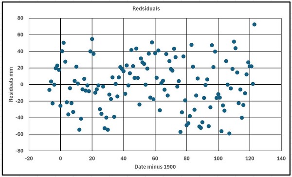
Figure 8
The target equation will have the same form as shown above but this method could be used more generally unless only a part of a cycle exists.
The 21 year moving averages were calculated as shown in Figure 9.

Figure 9
A first estimation for the equation used
CONST = 0 mm AMP = 15 mm SHIFT = 50 years PERIOD = 65 years
Figure 10 shows the data with the fitted curve.
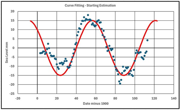
Figure 10
The judgement criteria chosen, C, was the square root of the sum of the squares of the errors which for the starting estimation was 49.6. A convergence strategy involved recalculating the value of C using each of the parameters in turn changed by +1 and -1. The parameter change that reduced C the greatest was retained, and the process repeated until no further reduction in C occurred. This resulted in
CONST = 1 mm AMP = 13 mm SHIFT = 54 years PERIOD = 67 years
with C reducing to 43.2.
A second convergence sequence was carried out with the parameters now changed by +0.5 and -0.5 resulting in
CONST = 1 mm AMP = 13.5 mm SHIFT = 55.5 years PERIOD = 67.5 years
and a C value of 42.4. This final curve is shown in figure 11.
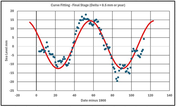
Figure 11
In carrying out this convergence process it was very useful to make use of “named” variables for the parameters and the incremental changes in this form.
=CONST+AMP*SIN(((SHIFT+2*A13)/PERIOD)*PI()) for the basic central value
=(CONST-DCONST)+AMP*SIN(((SHIFT+2*A13)/PERIOD)*PI())
for the incremental reduction in CONST
And so on for the remaining 7 incremental changes up to
=CONST+AMP*SIN(((SHIFT+2*A13)/(PERIOD+DPERIOD))*PI())
for the incremental increase in PERIOD.
From previous experience in using this technique in engineering the final solution is not guaranteed to be the true optimum as false minimums can be reached which the process is not capable of getting away from or the process can be stuck in a “valley”. The existence of such dips and valleys is difficult to visualize with four variables as the results would form a 4-dimensional graph. An extra check may be to start with a completely different set of starting parameters.
Another technique was to change to diagonal increments which with 4 dimensions involves 16 combinations of changes followed by alternate use of both approaches. The process stops when both processes cease changes in the value of the judgement criteria, C.
This had little effect the final values being
CONST = 1.5 mm AMP = 14 mm SHIFT = 57.5 years PERIOD = 68.5 years
and a value of C of 41.95 as shown in figure 12.
The final graph shows improvements but strangely the value of CONST=1.5mm is difficult to explain but averaged data only cover a range of 111 years which is only 1.62 periods .

Figure 12
R Squared
R Squared was a term I was not familiar with but can appear along with the trend line equation as a measure of the fit. I tried to make use of it as a measure of the accuracy between 2 sets of numbers during the previous convergence process using the function as follows
RSQ( a1:a131,b1;b131)
but it is only measuring the “the proportion of variance in the dependent variable that can be explained by the independent variable” and not the accuracy between 2 sets of numbers so I abandoned it. I.e. if the above function gave 0.8 and all b values were doubled or had 10 added the RSQ function would still give 0.8.
Googling R Squared does produce some negative remarks about it.
In conclusion it is hoped that some of the above topics may be found useful.
In a comment to one of my previous papers I was called a “Cyclomaniac”. Not sure if this was a compliment or a criticism. Interesting to see if this comment keeps getting repeated!!
References
1. https://wattsupwiththat.com/2024/08/11/variation-of-50-year-relative-sea-level-trends-northeast-united-states/
# # # # #
Note: As usual, I have facilitated Dr. Welch in preparing this essay for publication here at WUWT. The content and ideas expressed are entirely those of Dr. Welch. I do this in the spirit that all scientific opinions deserve an airing and that you, the readers, have the right to read and comment on these opinions. As I have said previously in reference to Dr. Welch’s work, I am not a fan of curve fitting. That should not affect your view of his excellent work on sea level and the possibility that sea level is accelerating or has accelerated or your opinion on his insight in using MS Excel functions to analyze the data. He does good work. — Kip Hansen
# # # # #
Fantastic! I use the [Display Equation on chart] function for the 2nd order polynomial i.e., the quadratic. Mr. Excel.com comes up empty when asked how to put that formula into a cell or three cells. So I’ve been copying the formula manually for all the stuff I do. I’ll be saving this post to see if I can easily plot out running acceleration curves and other fun stuff.
Relatively, my math abilities suck. But I do not believe one can get one millimeter accuracy out of a tide gauge. And the yearly change is of the same rough estimate as the accuracy of the gauge. Detecting a signal over several years works, but with a lot of noise. If there were multiple tide gauges at the same place, averaging out might be valid, but different places with different subsidence? There are only so many real significant digits.
Looking at the Sydney tide data..
Looks like it is recorded to nearest centimetre up until the end of 1995 (metres to 2 dp)
Then changes to nearest mm.
Would have to look at the history to see if they actually changed the equipment, but as Fremantle and Brisbane both change to 3dp at the same time, I doubt it.
Looks to me like a “pretend” change in accuracy.
It is like other discussions on this site about accuracy v precision, and people confusing multiple measurements of the same thing with multiple measurements of different things, and claiming an increase in accuracy for both.
Anyone that thinks you need anything “more accurate” in its calculations than Excel, for “climate trends” etc.. is not paying any attention, and is just fooling themselves.
people using excel, have lost the right to have a meaningful discussion about data , methods or estimation theory
Mosh wouldn’t have a clue about data , methods or anything to do with science..
His expertise is in Eng-Lit….oh wait…. roflmao !!
Funny that major statistical products exist as add-ons to Excel, hey mosh..
For use by.. wait for it…….. Statisticians
You have yet again shown you are nothing but a nil-informed ignorant twerp.
While this is the usual Moshness, he does have a point.
For years I used Excel for all of my calculations. And I can assure you, I was REALLY good at Excel.
I mean good like writing hundreds of my own special-purpose functions.
I mean good like writing hooks so I could call C code from a cell in Excel, and it would run the C code and put the answer in the cell.
So I resisted greatly when Steve McIntyre told me over and over to learn R. Now, at that point twenty years ago, I could read and write code in the following languages:
C/C++
Mathematica (3 languages)
Datacom
Algol
Fortran
Logo
Lisp
Hypertalk
Basic
VectorScript
Pascal
Visual Basic for Applications
And you know what?
I didn’t want to learn yet another language.
But to my great fortune, Steve persevered, I learned R, and Steve was right. I was wasting my time using Excel for climate data. It’s a wonderful tool … but it’s not up to the task.
For example, R easily and quickly handles a 3-d array of 100 years of monthly 1° latitude x 1° longitude temperature data.
That’s 180 latitude x 360 longitude x 1200 months = 77,760,000 data points. Try doing that in Excel. R handles it routinely. And that’s just a tiny bit of the advantages of using R over Excel.
So in some sense, Mosh is right. If you are using Excel to try to analyze climate data, you’re restricting yourself to a very small subset of what you can study.
Best to all, and Mosh, always glad to see your name come up in a thread. You’re a curmudgeon, but a valuable one. Stay well, my friend.
w.
Yeah, after rushing my #1 post through to beat you to it. I went back to look at the illustrations with umptybump decimal places for various curves and just rolled my eyes.
A while back, I got into it a bit with Kip about posting accelerations of 0.01 mm/yr² on a chart. His point was that 0.01mm/yr² is essentially nothing. He is correct, but then my chart shows a very tight distribution around that 0.01mm/yr².
Steve, your result is the same as that of Hogarth (2014) which reported, “Sea level acceleration from extended tide gauge data converges on 0.01 mm/yr²”
That much acceleration, if it were to continue for 150 years, would add about 4½ inches to sea-level:
https://www.google.com/search?q=%28+0.01+%2F+2%29+*+%28150%5E2%29++%2F+25.4+%3D
Thanks for that confirmation (-:
Meanwhile:
The University of Colorado’s
Sea Level Research Group
Continues to say
Acceleration: 0.083 ± 0.025/y²
and people believe them.
The problem with the University of Colorado (and many others) is they calculate the quadratic curve, take the quadratic coefficient, double it and label it acceleration. It is a perceived acceleration resulting from the method of calculation coupled with a short time scale and the starting date. They should wait until about 2060 and then make some better judgements.
Exactly what I do. Using Excel’s [Display equation on chart] function, I double the x² value and come up with the acceleration. See my chart above. And for your NY data example that comes up as:
y = 0.007x² + 2.1904x + 6780.6
so acceleration becomes 0.014mm/yr² and rounds to 0.01mm/yr²
Copying the formula
=LINEST(A1:A131,B1:B131)
into a cell yields #VALUE!
And = LINEST(A1:A131,B1:B131^{1,2})
Yields 4.376E-05
Which doubled doesn’t lead anywhere near 0.014mm/yr²
The good old 1962 12th grade physics formula
(v2-v1)/t=a
does round to 0.01mm/yr² and agrees with my chart. But people snicker at me for using something so simple. But um do we need better than 2 place precision for sea level rise measured in mm?
So I’m missing something. I’ll trot off to Mr.Excel to see if they can sort it out.
nobody is claiming that accuracy.
In the section labeled “Trend Line Equations”, he uses multiple significant digits. So if those numbers are real, he is.
Not sure if this is at all related to the problem at hand, but I’ve seen the effect of cumulative precision errors caused by use of floating point when using Excel defaults.
Those nice smooth graphs don’t come out of nowhere…
“The problems in plotting are illustrated below where the trend line equations are subjected to “Trend Line Formatting” increasing the significant decimal places to 5 and 6 respectively. “
Of course most scientists would recognise the difference between decimal places and significant figures. In the example here the leading zeros in the coefficients are not significant. Which is why scientists use scientific notation to avoid this problem.
Plus there is the fact that the author does not appear to know about least squares fitting. Trying to fit a sine curve by eye to a set of data is hardly scientific. There exists well established techniques to do this. See for example:
https://www.nature.com/articles/nprot.2009.182
Of course most active researchers in academia do not use excel for precisely these reasons. It is not designed to for research or for analysing numerical data.
So what do climate scientists use to calculate the critical numeric effects of clouds for future climate states, ECS etc?
Fortran. What else.
The source code for the GISS model can be found at
https://simplex.giss.nasa.gov/snapshots/
for example and you can find other the source code to other climate models
elsewhere.
OK what do they use to arrive at the input values that Fortran is then used to compute results?
Probably lots of different programs but I am willing to bet that excel isn’t one of them. Spreadsheets are great for lots of things but not for numerical analysis. You need to choose the right tools for the job.
I don’t think Izzy has the remotest clue what scientists and engineers use…
… do you, Izzy !
What do they use to compute results? Depends on what’s customary in the field of study I think. People tend to use what they know. My impression is that R is pretty widely used. But a lot of basic tools in some fields were coded many decades ago in Fortran which does a perfectly OK job of numeric computing and is therefore still around. And nowadays Python is many students first and often only computer language. Mostly, it does OK with math and statistics as well.
Fortran is a legacy language. Your claim is the same as suggesting COBOL is the language of choice for business applications. Laughable at best.
“researchers in academia do not use excel”
LOL..
The first reference in Izzy’s link is to… wait for it….
De Levie, R. Advanced Excel for Scientific Data Analysis 2nd edn. (Oxford University Press, New York, 2008).
Excel is also the topic of several other references…
Have to laugh. !! 🙂
Readers should know the paper referred to by Izaak Walton is titled “Nonlinear least-squares data fitting in Excel spreadsheets”
If you really want to do more complex statistics than the included stats models add-ins in Excel can do,
… then just get the XLSTAT add-in.
Here is a link to the “14-days for free” version.
XLSTAT Free – 14 essential data analysis & statistical features in Excel
Please don’t use quadratic polynomials, extrapolation will give misleading results. A proper statistical analysis of the New York Battery data can be found at https://tamino.wordpress.com/2024/03/15/sea-level-in-new-york-city/ and https://tamino.wordpress.com/2024/03/19/sea-level-in-new-york-city-part-2/
Tamino ? ? ? He’s right in there with Skeptical Science He might be right in this case, but I’d use Wikipedia before I’d use him. Engineering tool Box or some similar site would be better still
Tamino’s publication history is 41 refereed papers plus a statistics text book.
We have seen tamino’s work . It is highly tainted with klimate kool-aide.
He is foremost, a PROPAGANDIST.
My statistician colleague used to paraphrase Mark Twain, “there are liars, damned liars and then there are statisticians.”
The chance of tamino doing an unbiased proper statistical analysis is basically zero.
His post is rife with cherry-picking and preposterous assumptions.
Here is the 30 year linear trends graph.. Notice anything…
Looks fairly similar to Tamino’s plot.
We also have the subsidence issue to consider, which itself has major measurement issues.
To think that anyone can make any judgement about the future tides at Battery Park is just mathematical NONSENSE.
There is ZERO sea level rise attributable to human causation.. period.
“We also have the subsidence issue to consider”.
Indeed.
I should also mention that the spike in tide level at Battery from October 2023 to May 2024..
(February max was 0.347m)..
… had already dropped right back down to 0.113m in June.
Also, if we look at the data from 1893 (avoiding the data before that big gap, and do an Excel quadratic fit we get an x2 term of 8 x 10⁻⁶.
Does anyone really want to attach any importance to that. !!
ie. long term tide change data at Battery Point is about 3mm/year and basically linear with lots of noise.
There’s something wrong there. I did a quadratic regression and found a result similar to that of Dr. Welch. The x² coefficient is 0.00767, which is 3 orders of magnitude larger than yours.
Did you use meters instead of millimeters?
Yes it is in meters, same as the data from NOAA tides.
8 x 10⁻⁶ m is still absolutely meaningless.
Beware of disinformation from Tamino (Grant Foster).
His blog is very heavily censored to suppress dissent, and especially to prevent correction of his own errors. I write from personal experience. Here is my discussion 11 years ago, of some examples:
https://wattsupwiththat.com/2013/04/01/mcintyre-charges-grant-foster-aka-tamino-with-plagiarism-in-a-dot-earth-discussion/comment-page-3/#comment-1008320
Tamino even censors responses from targets of his own attacks. E.g., he let me post ONE comment on an article which he wrote criticizing my work, and he then deleted ALL my subsequent comments, leaving no indication that I’d ever posted them.
He does that sort of thing to keep his errors from being corrected, some of which are egregious. E.g., here’s my illustration of how he cherry-picked a starting point, to exaggerate a trend:
Here’s Tamino’s version (or here):
Really, unless you like be misled, I suggest that you avoid Tamino’s blog. Here are some better choices (from both sides of the climate fence):
https://sealevel.info/learnmore.html#blogs
He censored me too.
At this LINK My graph about 7 images down (Just search on my name) was attacked, and my response was removed and my ability to post gone.
There’s a word for people like him.
Kip, Dr Welch,
Useful info, thanks.
Maybe the Excel exercises most needed by WUWT readers are about errors and uncertainty.
For example, if these Battery numbers are so full of errors that they are merely swimming in the sea of uncertainty, then the exercise you show is problematic.
There are Excel functions like Standard Deviation in several degrees of complexity that, IMO, are not used properly or enough – if at all.
An article that allows readers at a minimum to see if a group of numbers have adequate uncertainty might be valuable.
sherrio01 ==> The whole topic is rife with uncertainty and original measurement error, as you and I well know. Tide gauges, even the the best and latest, come from the factory with a built in uncertainty of 2 cm per measurement. The Battery Tide graph is monthly averages and still jittery — all over the places. 1/3 to 1/2 of the “rise’ is subsidence.
The Tide Gauge data for The Battery is shows the common excessive variability, and the Sun/Moon thing of the last few months has jacked the present end of the graph up allowing the foolish to think it is a new trend.
And, of course, this is why I am not a fan of curve fitting — the fitting curves, trends to bits and pieces of long-term graphs of data about dynamical systems.
With data that variable in system that is so dynamic about a topic that literally changes in geological time or at least century-scale time, picking at these little changes, as Tamino does, is unscientific.
Kip,
Thanks for your response.
If I interpret correctly, the comments to your article reflect readers with various levels of experience with statistics in general. Some have a toe in the water with Excel, not many seem to have explored it deeply like Dr Welch has done for this example. I am wondering if there is a barrier to those who wish to dig deeper before they write an article and that barrier might be measurement uncertainty.
I, for one, would like to see an article with a stepwise menu for treating temperature/time series, but includes the practical estimation of measurement errors and maybe the resultant uncertainty.
Of course, it is so easy for folk like me to request ever more from busy people like you, so please pardon my pushiness.
Geoff
For quadratic evals, another way is to simply linest y values, but have 2 columns of x values, time, and time^2.
My question is how you correlate the distributed trend and acceleration values to draw a proper uncertainty envelope around the expected quadratic trend? I see those envelopes, but don’t know, and haven’t found, how they are made. I think the answer is in this paper.
Evaluating the Uncertainty
of Polynomial Regression Models Using Excel
Sheldon M. Jeter
The George W. Woodruff School of Mechanical Engineering
Georgia Institute of Technology
“R Squared was a term I was not familiar with …”
I’m not sure what is implied here.
This is called the coefficient of determination, denoted R² or r².
I suspect this is now known to most high school math/science students,
although I likely did not encounter it until early college, say 1962.
“r^2” is usually used to assess the utility of a regression on x-y pairs, as its usual interpretation is the percentage of variance that is explained or predicted by the regression line. That is, if one has proxy measurements of temperature and actual measured temperatures from calibration experiments, and a linear regression is performed, with the real temperatures used as the independent variable and the derived temperatures from the calibrated proxy (such as the width of tree rings or the diameter of stomata), the r^2 term will tell one if the proxy is reliable. That is, with an r^2 > 0.9, more than 90% of the variance in the calculated temperature is explained by the actual temperature. On the other hand, if r^2 < 0.5, then less than 50% of the variance is explained by, or accurately predicted by, the actual temperature. If one is dealing with low r^2 values, it is probably time to look at multiple regression of several possible proxies, or just look for a new proxy. If one is using Excel, there is a function to generate a co-correlation table, where one can dump all the numeric data and look for variables that correlate highly with whatever one wants to predict that is not easily measured by itself.
Having graduated in 1958 I had never come across R Squared until I started using Excel. I appreciated its use in regression analysis but made the mistake of using the RSQ function on any two sets of numbers to judge the accuracy. It only measured the variance (if that is the right term) so didn’t perform the function I wanted.
Thanks for your reply – sorry for late answering as release of paper was about 2 am in UK.
Excel was introduced in 1987, 20 years after an instructor had us do a 30 item problem by hand. Prior to that, at a different school, we used these:
Friden Model STW-10 Electro-Mechanical Calculator (oldcalculatormuseum.com)
and were — with instruction in FORTRAN — upgraded to using an IBM 1620.
🤠
Brings back fond memories of the Friden March that we were introduced to by the Friden repairman. It couldn’t dance, but it could sure do beat out rhythm.
I have only two minor quibbles.
Rud ==> isostatic rebound: even being on the hinge-point, The Battery still shows >1 mm/per year subsidence in long-term CORS measurements (Snay), performed at the site. Boretti 2020 found -2.151 mm/yr.
Detailed analysis of one tide gauge is called data mining
The lack of any discussion of data accuracy and likely margins of error is bad science
This is disappointing from someone who usually has the best articles on sea level.
Sea level rise is probably sightly faster when there is global warming than when there is global cooling. That may not be visible i ay tide gauge chart.
Most of Antarctica ice can not melt due to a negative greenhouse effect caused by a permanent temperature inversion.
All this math about sea level rise and not one mention about when we should start building arks to save ourselves!
Um, in case you lacked comprehension..
The post is about “HOW TO” do certain Excel calculations.
Perhaps you could learn something… but I doubt your capability.. !
A bit late answering as post came out 2am UK time.
Post not about any Sea Level in particular but about what I had come across during my studies of sea levels when using Excel – its pit falls, features etc.
Nice to be able to share this experience.
Richard ==> The author of the essay is Alan Welch. It is about using MS Excel to analyze NOAA Tides and Currents Sea Level Trends data.
“There is one Quadratic Curve and a multitude of Sinusoidal Curves. Why would Nature choose the Quadratic Curve?”
Again this is trivial. All of the sin curves have the same Taylor series expansion about the origin.
Consider y=A sin(b*x) then near the origin it has a Taylor series expansion of
y=Ab*x
so clearly you can always fit a straight line y=m*x with an infinite number of different sin waves
as long as the product of the period and the amplitude remains constant.
Alternatively trying to fit a sin wave with a 1000 year period to one hundred year’s worth of data
is meaningless. You would need at least 500 years of data before such a fit would even being to make sense.
So you fit a quadratic and think it actually means something… how droll !!
My point was that most sea level presentations use a quadratic curve but there are many other just as good a fit alternatives. Not saying what is the true one (if any) but because Excel makes it easy to do quadratic curve fitting use it only as a smoothing process to help the eye judge the data and not as the true physical process.Also the danger of the Excel quoted regression formula needing (at times) much more accuracy to make them usable.
I tried a 1000 year curve based on only 100 years worth of data as we have other none numerical knowledge of long periods climate change such as warm and cold periods over thousands of years.
You would fit a quadratic simply because it represents the first two terms of a Taylor series expansion. So if you don’t know what function to use and you have limited data a quadratic makes more sense than any other.
Fitting any curve is useful in smoothing and visualizing the data but using the “E” word (Extrapolation) is my big concern especially when statements are made based on that extrapolation and the BBC. Guardian etc make Headlines out of it.
Look, it is not difficult to remove longer-term cycles from a dataset.
I regularly PAST from the University of Oslo to model cycles in data, then examine residuals. Excel cannot do that, Therefore aside from fitting polynomials that may be due to artifacts in the data, Excel is not useful for timeseries analysis.
How can it be verified that ‘trend’ in sea-level at The Battery, or at Fort Denison in Sydney Harbour is not due to changes in the methods used to measure sea level?
Yours sincerely,
Dr Bill Johnston
http://www.bomwatch.com.au
“then examine residuals. Excel cannot do that,”
As I showed below… yes… Excel can do that.
Personally I find spreadsheets clumsy and slow.
Like me, you could try Python. It has extensive fast numeric and scientific libraries. What you show would be generated with few lines of code. It is also easy to automate processes with direct access of data sources.
So ok you’d have a learning curve, but months not 7 years.
Does anyone else here use Python? I’ve never seen it referenced.
Corky
I mainly used ForTran when I was doing research. (20 years +)
Thought about learning Python, and “R” which some of my younger colleagues used, but I knew I was not going to work for much longer, so didn’t see the point. … a bit lazy 😉
Matlab had its uses too, mainly data extraction from net.cdf files… also grid based graphics, contour maps etc.
Even used macros in Excel, at times, for small tasks.. but Excel is a LOT slower to do its calculations, and somewhat limited in that regard.
Even use simple BASIC at times, since Applesoft Basic was the first “language” I learnt (1980s?)
ps.. Some of the guys also used C++, Pascal or similar.
And a thing called LaTex for setting out publications.
Yes, used Python with Pandas, NumPY, and SciPy for many years. Recommended. I’ve not used on climate data, but on other data sets related to my work and dabbling in analysing energy data and costs. Excel only for “munging” badly structured data* into a structure that allows analysis.
Note*: often times data presented in Excel is structured to be “pretty” at the expense of data structure. Not using Excel “tables”, empty rows and columns for spacing, et. al. are clues that work required to structure the data propertly.
Thanks for your reference to Python. Not sure if I could face a learning process (however short) at 86 and just had a stroke. I think it is about using Excel sensibly and making reasonable judgements, predictions etc with the equations generated.
There is reference to Fortran below which I used all my working life from 1960 onward and wish I had tried to mount it on my PCs.
@Corky. Yes, I use Python. I was looking for a capable scripting language a couple of decades ago and settled on Python as being more readable and maintainable than Perl. I don’t find the actual Python code for math to be much different than other mainstream languages like Fortran. If one is going to do a LOT of math, R might be a bit better. But if the interpreter doesn’t like your code, Python tells you what line of code it dislikes as well as just why it’s unhappy. R doesn’t seem to.
I don’t care much for spreadsheets except as a data entry tool. Too easy to make mistakes and way too hard to realize you’ve made them. They might be OK for generating plots. Willis gets impressive results with Excel(?) but he does the math with R. Personally I use gnuplot for the few graphs I do. Very capable. And fast. But finicky.
Here’s sea-level measured at The Battery, January 1893 through July 2024, using monthly data, showing both linear and quadratic regressions shown (linear in red, quadratic in orange):
https://sealevel.info/MSL_graph.php?id=battery&quadratic=1&g_date=1880/1-2029/12&c_date=1890/1-2024/12&s_date=1880/1-2024/12&quad_ci=0&lin_ci=0&co2=0&boxcar=1&boxwidth=3&thick
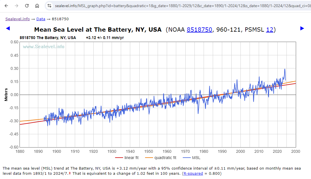
The slope and the quadratic coefficients are similar to the coefficients which you found using annual data: 3.115 and 0.00767, respectively. (The acceleration is twice the quadratic coefficient.)
The Battery is one of a minority of tide gauges which currently shows a statistically significant acceleration in mean sea-level trend:
linear trend = 3.115 ±0.111 mm/yr (which is 12.26 inches per century)
acceleration = 0.01535 ±0.00646 mm/yr²
The acceleration of 0.01535 achieves statistical significance, but it is of little practical significance. That much acceleration, if it were to continue for 150 years, would add another 173 mm (6.8 inches) to sea-level at The Battery.
About half of the linear trend at The Battery is due to subsidence, and the other half is global sea-level trend.
Good to have a response from you although my paper was not about any particular set of measurements but used the New York Battery as an example as Kip had used it recently.
Steve Case further back had shown the cluster of “accelerations” around 0.01 mm/year2 an the NY case is easily accommodated in that grouping. As usual I have put acceleration in quotes to qualify how it was derived and the limitation in using it long term.
Dave ==> Thanks for weighing in. As Geoff points out, and I concur, the physical reality of statistical acceleration is so small that even if it is physically actual is is not physically significant.
On subsidence, Snay 2007 found ~1.35 mm/yr, but more recently Boretti 2020 found
>2.5 mm/yr.>2.15 mm/yr. (MY CORRECTION – kh ) My point here is that we don’t even know if that tiny statistical acceleration is rising sea or accelerating subsidence.It is quite possible that subsidence is also not constant…
…. which would make the SL data even more suspect.
Question , Dave.
If you remove the recent spike from 2022, does the acceleration still exist..
and is it still statistically “significant”
Dear Dave,
I analysed monthly data for The Battery and wrote it up (but not published it in August 2013.
Here are some snippets and a graph:
A true assessment of sea level trends at New York can’t be resolved as an oceanographic problem. It involves catchment hydrology and urban and water supply engineering as well. If everything, including broad-scale climate shifts, were taken into account, sea level rise may be the smallest contributor to water levels measured by the gauge.
All the best,
Bill Johnston
Kip, you could suggest Python or R to Dr Welch. Both free, powerful, oriented to this kind of thing, and with lively user communities.
The problem with Excel is often that it is being used as a programming language by people who don’t even realize that what they are doing is writing programs. So they produce unauditable spaghetti. Not their fault, Excel encourages this, and they know no better and think they are using the industry standard tool. Adding VBA to Excel years ago made the problem worse.
michel ==> I’m only a hacker with R and Perl, a little bit of various Basic in several dialects.
I agree totally, MS Excel is not a programming language and I don’t use it for anything but the crudest quick-peeks at a data set.
Your comment about VBA+MS Excel is spot on, but indicative of the entire Microsoft nuttiness.
I had some really ugly “monte-carlo” type macro scripts using done in VBA .
What took an hour to calculate in Excel, took only a minute or so in FORTRAN.
But the results usually turned out pretty close to each other.
My advice is to not use Excel for time series analysis.
My first step is ALWAYS to fit a linear regression then look at residuals. While it does the first bit, Excel does not auto-calculate residuals for the dataset (has to be done manually). Excel graphs are also crude, complicated and hard to customise.
My second point is that unless one knows how to do a first (or more) order lag, Excel cannot evaluate if data are autocorrelated – how much of the variation explained (crude Pearsons^2) is due to memory of the previous value. Also, Excel does not calculate an R^2 value adjusted for terms or numbers of data pairs in a dataset.
Third, there is ample evidence that with enough datasets, Excel is regularly used for data-shopping. Do you want a trend with that? how much? For timeseries analysis Excel is the most misused tool in the universe. Analytics are more important than an Excel polynomial trend line, and this post does not provide guidance.
My endnote is to avoid Excel as a tool for timeseries analysis.
Yours sincerely,
Dr Bill Johnston
http://www.bomwatch.com.au
“Excel does not auto-calculate residuals for the dataset (has to be done manually).”
Sorry, but you can get Excel to calculate and plot residuals, automatically.
Attached is a residual plot, took 1 minute including copy-paste to get a png, for Battery Park from 2000-endofdata
You do need to install the “Data analysis” package as an extra, first though.
Dear Bnice2000,
Nice. But what do those residuals tell you? Are any of the original data outliers? Are there other signals in there? Are residuals autocorrelated? Did you do a lag-1 plot? Are residuals normally distributed with equal variance? If not, what do you do next?
Have you tried a CUSUM graph that may identify extraneous factors – say a site relocation, a change in instrument or gauge type; did you check metadata (data about the data) …, Is there really a trend there or is it spuriously related to something else?
This kind of analysis cannot be done as a 5-second exercise using Excel, just because you can.
So aside from being probably not much, what does the original analysis of the data tell you?
Yours sincerely,
Dr Bill Johnston
http://www.bomwatch.com.au
Bill, your comment was..
““Excel does not auto-calculate residuals for the dataset (has to be done manually).””
I just showed that Excel could auto-calculate residuals…
You can also get a table of the residuals and can get normal probability plots.
Cumulatives sums.. just another formula
Want to do lags.. use the “OFFSET” function.
Now you want to do more.. that requires a lot more information than we are given… what you refer to as metadata..
Maybe have a look at what XLSTAT Excel add-in has to offer.
The point is that basically everyone has access to Excel.
What are you using ?
Bill ==> “Microsoft Excel enables users to format, organize and calculate data in a spreadsheet.”
Definitionally, Excel is not a data analysis tool. It is a spreadsheet application.
It is one thing to look at a company’s production vs expenses data (suitable for Excel) and another to attempt real analysis of measurements of a physical dynamical systems as complex, complicated, and chaotic-by-nature as sea levels and tide gauge data.
I wouldn’t use Excel for scientific data analysis either.
But, what Dr. Welch is doing, in my opinion, and I hope he is not insulted by this, is really more on the level of “Let’s take a quick, deeper peek into the Tide Gauge data and see what we see. Is there any cycle there? Is it accelerating? ‘decelerating’? etc” . So, I don’t fault him.
I also don’t hold with the entire practice of curve fitting — tacking trends to highly variable data about dynamical systems. I tend to be a “take a longer view” and “where are the true uncertainty bars?” type of guy.
Kip, Excel does have a somewhat rudimentary “data analysis” add-on that many people are unaware of.
As I showed above, residuals, very easy to find and graph.
And if you want more stats ability than the Excel “Data Analysis” add-on gives.
Just get the XLSTAT free stats add-on.. or pay for the full version.
Most of what I have said has been ignored.
I use excel all the time, mainly to construct lookup tables using data that I have already processed using R. I have developed a set-piece, protocols-based approach to analysing climate (sea level, sea surface temperature) data, which I have explained over and over at http://www.bomwatch.com,au. My tools are strictly statistical (PAST for exploratory analysis and R for the heavy stuff) and I have a collection of scripts, which depending on the data, I use over and over. I also use a graphics package, and if I have a few days to kill (and enough hair left to pull out), ggplot2 (R).
I am not saying R is particularly user-friendly, in fact it is thoroughly frustrating, but for straight-down-the-line analysis (not multi-factor), and for those interested in learning a bit about stats, I recommend PAST – it has a great manual too, and it is free.
https://www.nhm.uio.no/english/research/resources/past/
PAST is an application, does not need to be installed (stick it in a directory and provide a link to the taskbar), read the manual and away you go. PAST works simply by copy and paste from Excel – copy the data, paste it in, do your stuff, check residuals by copying them back to its spreadsheet and copy and paste the results back to Excel.
Yes, Excel will toss data against the wall to see what sticks, but Pearsons r^2 is a crude measure of variation explained, especially for autocorrelated data, Excel cannot extract cycles, and it does not do post hoc analysis.
So I’m not saying you can’t use Excel’s Datapak or whatever, or produce a graph of residuals, I’m saying it is an inferior tool for statistical analysis. (PAST by the way also uses Pearsons, which is why I use R’s lm for serious analysis. PAST also will not do categorical (factor) linear regression).
All the best,
Dr Bill Johnston
http://www.bomwatch.com.au
Bill ==> Not quite sure if you are complaining about my comments of Dr. Welch’s essay.
Dear Kip,
A bit of both my experience with data, and your comment, but no complaint intended.
It is too easy using Excel to come to the wrong conclusion.
As I explained here: https://wattsupwiththat.com/2024/09/03/sea-levels-and-excel/#comment-3964263, there is much more to consider when analysing historic data, than raw trend.
A quick look using a few polynomials really does not cut the mustard. Especially if one wishes to argue the case that sea level is rising linearly, or accelerating (quadratic), or whatever, or not at all. About the only use of fitting a trend line to raw data is to closely examine residuals. Unless assumptions can be verified, the trend itself is meaningless.
In reality, Kip, it takes a lot of effort to do a proper job. A proper job is when sources of variation in the data have been fully explained, so that residuals embed no other signals; i.e., they are homogeneous, independent, normally distributed, with equal variance and no outliers (see: https://www.ncl.ac.uk/webtemplate/ask-assets/external/maths-resources/statistics/regression-and-correlation/assumptions-of-regression-analysis.html).
All the best,
Bill
“I’m saying it is an inferior tool for statistical analysis. “
I think I used the word “rudimentary” earlier 😉
If I could be bothered, I’d look at the XLSTAT add-on.. built for statistical work.
A sinusoid with very similar period can be fitted in the same way to the glacial retreat data.
I see a lot of folks here and elsewhere trying to use quadratics and other polynomials for purposes for which I strongly suspect they are quite inappropriate. There are “legitimate” uses for quadratics and polynomials in general. I’m aware of two of those, First of course is when the underlying phenomenon is actually quadratic. e.g. You’re tracking artillery shells or volcano ejecta. The second is when you need a computationally efficient way to describe an arbitrary curve (so long as you don’t try to extrapolate outside the range of values you’ve found or been given.) So sure, if you need to put a line on a chart for a presentation or you’re trying to describe a complex curve to an embedded computer chip controlling a something or other, a quadratic or other polynomial may be a good choice. So long as you don’t try to extrapolate beyond the values you somehow know.
Just don’t kid yourself into thinking that quadratics/polynomials can tell you much about (most) data sets. And in particular don’t expect them to be able to predict the future or the past any more accurately than dartboard, a gypsy fortune teller or the current crop of climate models. And I wouldn’t put much faith in the “accelerations” derived from them. The dimensions will be right for an acceleration. But that’s most likely the only thing that will be right.
You are correct. I’m sorry but curve fitting to data is not analysis, it is art. It is what we used to do with French Curves. If one thinks that data is cyclic, i.e. periodic, there are scientific methods to deduce the underlying frequencies. Does anyone here know anything about Fourier Analysis or wavelet analysis? How about using filters to isolate underlying frequencies that make up a periodic function?
r² values are meaningless in time series. This is used to predict how well an independent variable predicts a dependent variable. Unless tides have a time dependency, all one is doing is trying to decode what will happen in the future. Curve fitting, as you say is like going to a fortune teller.
I was hoping someone would mention Fourier Analysis.
Don ==> Me and you both, sir…..
“In a comment to one of my previous papers I was called a “Cyclomaniac”. Not sure if this was a compliment or a criticism. Interesting to see if this comment keeps getting repeated!!”
See Keeling and Whorf 2000 PNAS about the apparent effect of ocean tides on climate trends.
https://www.pnas.org/doi/epdf/10.1073/pnas.070047197
Dibbell ==> THAT’S a lot of cycles!….
No.. this is a lot of cycles.. 😉
The original purpose of regression lines was to analyze the relationship between an independent variable and a dependent variable. Was it linear or some other exponent. The coefficients of slope and intercept could be useful in defining a functional relationship.
Regression in this article is being used to curve fit to a time series of data. Unless time is a significant factor in a functional relationship for determining tide level, the regressions are only useful for examining the data you know, but not in making future predictions.
Differencing is used in time series to remove seasonality, not simply averaging over a years time.
As to the coefficients in the regressions, these are not useful for determine anything about measurements. They require very small values with 5 or 6 decimals because of the use of large values of the independent variable, i.e., years. As such measurement uncertainty and significant digits are useless.
Extending a nonlinear fit beyond its data range will always generate bogus results. Any extrapolation needs to be linear beyond the data range using the curve fit slopes at the end of the range.
fansome ==> “Extending a ANY fit beyond its data range” is highly questionable. Extending a trend line beyond one’s known measured data, is a prediction. There are a lot of rules for determining when a prediction is likely to be valid, and an extended trend is not one of them.
Concur.
Sort of like plotting a portion of a sine wave from -1 to zero, then doing a linear extrapolation based on the slope at 0.
Aside from violating Nyquist sampling, it misrepresents a sine wave as an exponential.
What do you think the calculated linear trend of this curve is…
Can you provide a link so others can download this data?
joel ==> Which data do you wish to download? Basic Sea Level Trends data for The Battery is downloadable here (csv) or here (txt file).
Maybe Dr. Welch can provide some of the Excel sheets, but you’ll have to be specific.
Thanks I got the data.
How did you find it? The link you gave me appears to be a deep link of some sort.
https://tidesandcurrents.noaa.gov/sltrends/data/8518750_meantrend.csv
This link:
https://tidesandcurrents.noaa.gov/sltrends/data
returns 404.
joel ==> The link needs to be formatted as follows:
https://tidesandcurrents.noaa.gov/sltrends/data/8518750_meantrend.csv
https://tidesandcurrents.noaa.gov/sltrends/data/8518750_meantrend.txt
sltrends is Sea Level trends; data is data; the Station ID Number underscore meantrend dot cvs or txt
These links are found under the graphs on the Sea Level Trends pages for the stations as
Excel tricks.
Back in the early ’90s a coworker, using just Excel 4.0 and it’s draw function, figured out how to make a a little stick figure run across the bottom of his spreadsheet.
I suppose for sea level rise, you could show a comparison of Tamino’s claims and real life using a city sinking at different rates. 😎
(But there’s probably a simpler and easier way to do that now.)
PS I said Excel 4.0. It might have been an earlier version.
But it was the one after the option to combine different spreadsheet into a “Workbook” became the default AND Macros were added.
one day my son called me into the garage to explain the finer details of driving a screw with a hammer.
data analysis with excel?
now ask yourself what tools do you learn to use when you study statistics?
One day you will learn how to write properly punctuated English.
You have apparently never learnt English.. or statistics.
I’m sorry that you find Excel so difficult to use. !
To be fair, it’s possible that Mosh is using one of those voice to text type things or has another type of physical handicap.
That could explain why his comment seem worse than mine used to be before “spellcheck” was added to WUWT!
Certainly seems to have a mental handicap. !
Having used Excel for the last 7 years to study Sea Levels I have discovered various pit falls, techniques and useful functions. I wish to share these with the wider WUWT community. To some it may be like teaching your Granny to suck eggs (as we say in the UK) but hopefully some may pick up a few useful facts or ideas.
rules for data analysis.
hopefully some may pick up a few useful facts or ideas.
more likely by watching someone drive screws with hammers you just learn bad habits
wait for the end
https://www.youtube.com/shorts/ItRTwh68zz4
skeptic pedagogy.
watch me do this in a totally unprofessional way.
hopefully you might find something useful
https://www.youtube.com/shorts/KNlY1invtcQ
It would b much better if you osted a warning.
“dont try this at home
Mosher ==> The correct procedure to use with your son was to show him how you thought a screw was intended to be used. However, on the other hand, it is quite possible that he did not actually wish to just “make the screw go into the wood”. He may have been trying to attach two wooden objects together, either permanently or temporarily. Depending on his purpose, the screw might not even have been the correct fastener to use — maybe he would have been better off using a lag bolt or a finishing nail.
In many cases, what the academy calls “statistics” is not the proper tool to use for considering what’s happening with dynamical systems at all.
There may better ways to do it, but if all you have is a screw and a hammer, you can still attach one board to another. 😎
Back in 2007, I found the list of daily record highs and lows for my little spot on the globe and copy/pasted them into Excel. (I was prompted by Al Gore’s “Truth” thing.)
Using Excel, I just sorted them by year.
I found it odd, that with all the GAGW hype, most of the record highs were before 1950 and most of the record lows were after 1950.
I did it again in 2012 and compared the record highs and lows. (This list included ties.)
I noticed another odd thing.
A number of new record highs for a date in 2012 were lower than the date’s record high 2007.
The same for record lows.
Sometimes if the year for a date the record high or low was set 2007 and the same year was in the 2012 list, the value had been “adjusted”. (The record high was lower or the record low was raised.)
The data was corrupted.
(I latter used The WayBackMachine to get the 2002 list. No changes from the 2007 list.)
Excel was enough to show the data can’t be trusted.
PS The various lists came from NOAA via The National Weather Service.
What an irrelevant and VERY IGNORANT comment.
Written in mosh’s usual anti-English.
Poor muppet studied Eng-Lit.. and is absolutely clueless about writing English.
There is ZERO chance of him having even a basic comprehension of statistics.
The chances of him working at more than a junior high school level with Excel, is non-existent.
“hopefully some may pick up a few useful facts or ideas.”
Certainly NEVER from any comment mosh makes.
All anyone could “learn” from mosh is how to be an incompetent ass.
Note also that the only part that is actually coherent is the first paragraph which mosh copy-pasted from Alan…. without using quotes.
That’s shows just how INEPT mosh really is.
Nice discussion.
In regards to getting more accurate coefficients, i.e., the y-intercept, I think “centering” the data is best. Subtract the lowest year from the year data. Otherwise the y intercept will be a meaningless number since you will be extrapolating way beyond your data to year zero.
Won’t give you more “accuracy” in the trend.. which is what we are interested in.
The constant term (y axis) will still be meaningless because it will be based on an arbitrary zero.