Is it really the hottest in 125,000 years, and if so, what does that imply?
By Chris Hall
The motivation for this article came from claims that this summer was the hottest in 125,000 years and the breathless fear surrounding this. Just skimming the news reports suggested to me that this was based on two main points: the assumption that climate is very stable and has not varied before recent anthropogenic forcing, and that the present deviation above normal temperature was many standard deviations (sigma) above what is expected that it could not possibly have be matched or exceeded for 125,000 years.
The first assumption aligns with a “Hockey Stick” style paleotemperature reconstruction, where there is tiny natural temperature variability for the last millennium. There are several reconstructions like this, e.g. some of the flatter Temp12k records, along with the classic Hockey Stick (Figs. 1 and 2). The second assumption is based on the faith that the statistical properties of the paleoclimate temperature record have not changed at all for a very protracted time period.


Although I will not argue one way or the other on any particular paleotemperature reconstruction, I will point out that the 125,000 years mentioned for our record breaking temperatures comes from a little bit of sleight of hand. If you look at the Vostok ice core temperature record that is on the paleoclimate page of wattsupwiththat (Fig. 3), as soon as you go back about 12,000 years to the beginning of the Holocene, the temperature drops sharply into the depths of a severe glacial period, and you only get back to “normal” after you travel back in time roughly 125,000 years until you get to the toasty Eeemian. So, in reality, it’s not much of an achievement being hotter than the vast canyon of the glacial freeze. Saying that, the question becomes, was 2023 the hottest year, and was August of 2023 the hottest month, in 12,000 years?

For the rest of this article, I will assume the unlikely case that for the Holocene, temperature was extremely stable. Then, what statistical properties does the present day instrumental temperature record possess, and what does this imply for claims of record temperatures? This led me into looking at what this implies for feedback mechanisms for the climate, so stay tuned.
HadCRUT5 Global Monthly Temperature Anomalies: It’s what we have
I decided to look at what the official temperature record from a century of instrumental data that precedes the bulk of the rise in CO2 from anthropogenic sources, i.e., 1850 to 1950. For this, the HadCRUT5 global monthly analyzed record seemed a reasonable pick. There are others out there, but they are highly correlated with each other and they are based on the same raw data, such as it is. This data set is plotted in Fig. 4.
The mean of this part of the record is -0.3078 C, which is expressed as an anomaly with respect to a later part of the record, and the standard deviation is 0.2066. The maximum temperature of the entire global monthly record is from August of 2023 with an anomaly value of 1.3520, so it turns out that August was over 8 sigma above my 1850 to 1950 mean baseline. Wow! I’m guessing that a simple-minded extrapolation back in time would suggest that we would not have exceeded this scorching temperature during the Holocene.

SARIMA Land
This next section gets a bit heavy and can be skipped by anyone not wanting to get into the weeds of how I created simulated temperature records based on the statistical properties of the existing 1850-1950 temperature record. It fits a model that assumes autocorrelation within the record. The techniques used are popular with stock traders and most of the machinery used is in the R library “forecast”. If this sort of thing isn’t very interesting, skip to the next section.
I wanted to see how autocorrelated my baseline temperature is by using a Seasonal Auto Regressive Integrated Moving Average model (SARIMA). The parameters for this type of model are usually given as (p,d,q) x (P,D,Q)m. Here p is the number of previous points in the series that a given data point is “regressed” to (i.e., correlated to), d is number of differences to take to try to make the series resemble white noise (trust me, this is where the integrated part comes in), q is the number of previous model deviations (i.e., errors) to average and m is the seasonal spacing, in this case 12 months. The capital letters are the same things but for points shifted by seasons, rather than single data points. There are some very cool routines in R that let you find optimal factors that can be used to generate synthetic models, where one can either manually or automatically do the fitting.
One might be tempted to ask why a so-called global temperature record might have a seasonal component. Isn’t summer in the Northern Hemisphere winter in the Southern Hemisphere? Shouldn’t these cancel out any seasonality? I can think of at least two reasons why the two hemispheres don’t exactly cancel. First, the Northern Hemisphere has a lot more land than the Southern, meaning that it has a much larger seasonal temperature variation. Second, the Earth’s orbit is slightly elliptical and in fact, Northern Hemisphere summer occurs during aphelion (farthest from the Sun) and winter occurs during perihelion (closest to the Sun). This configuration is one of the main reasons why we are currently in an interglacial, because due some quirkiness of orbital mechanics, Northern Hemisphere summers are actually of longer duration than winters.

An important tool to tease out the amount and type of autocorrelation exists in a time series is the Partial Auto Correlation Function (PACF). The HadCRUT5 PACF plot is in Fig. 5a and it shows that there is significant autocorrelation, along with a seasonal signal. The whole business of making a SARIMA model is to find factors for (p,d,q)x(PDQ)m that allow you to extract the model from the original signal, where the residual that is left over is just an uncorrelated series of “white noise”. I played around with manually fitting the SARIMA parameters, but wound up using an automated fitting procedure for two different cases. In Fig. 5b is the PACF plot of the residual for the case where the “d” parameter was constrained to be zero, and the automated routine came up with (2,0,0)x(2,0,0). The standard deviation of the residual with this model was 0.128 degrees C. A slightly better fit was achieved when “d” was not constrained and its residual standard deviation was 0.126 degrees C (Fig. 5c). Both models give residuals that reasonably mimic white noise.
Control Knobs: to “d” or not to “d”, that is the question

The white noise residuals that result from modeling the temperature times series are the random, chaotic background noise of the climate. They are likely the result of volcanoes, oceanic eddies, solar activity, rice paddy belches, and the chaotic flapping of manic butterflies. Whatever you do, it seems that the Earth’s temperature record chaotically bounces up and down by roughly 1/8 of a degree Celsius each month, and that variability is not autocorrelated and does not depend on the season. The important thing is how do the two statistical models derived above behave over a protracted period of time?
In Fig. 6, I show the results of two simulations that run for 1,000 years. In the case of the model shown in Fig. 5c, we have a classic version of a “random walk” times series. For a random walk, the series is not tied to a specific “set point” (SP), and it can blithely wander, up or down or oscillate back and forth. This sort of behavior is very closely related to the physical process of diffusion, and the average distance from the original starting point, here assumed to be a temperature anomaly of zero, increases as the square root of time. In essence, this kind of time series lacks any sort of negative feedback that tethers the temperature to a particular SP. Now this behavior is incompatible with proxy temperature records that purport to show that there is no significant change in temperature for centuries or millennia.
The model shown in Fig 5b, however, is perfect for those who claim that the global temperature has not varied significantly for a protracted period of time. In this case, although the temperature oscillates about zero, its average deviation from that SP does not increase with time. This indicates that there is a built-in set of negative feedbacks that keeps the series close to the SP. It is this type of time series that I will examine in more detail.

SARIMAPID: why look at temperature feedback?

I know what you’re saying: but Steve, why look at temperature feedback? Surely all the important feedbacks will be operating on the myriad number of control knobs controlling the climate and not directly from temperature. And you’d be right, except for one very important control knob, CO2. In the case of carbon dioxide, the direct climate sensitivity to a doubling of its concentration in the atmosphere is somewhere in the vicinity of 1.5°C. However, the truly scary consequences of driving your SUV only come about when you add in the assumed positive feedback of increased water vapor in the atmosphere, and that positive feedback is via the mechanism of temperature itself. Increase temperature and you get more water vapor, leading to higher temperature. Cool down and you get lower water vapor, which makes things cooler still. Since the feedback mechanism is temperature itself, any perturbation of temperature, whether it’s from bovine flatulence or butterfly wings should exhibit this feedback.
To examine the effect of feedback on a simulated temperature record, I tacked a simulated Proportional Integral Differential (PID) controller onto the end of the SARIMA simulation. I’ve worked with PID controllers for many decades while trying to set laboratory sample temperatures to a particular SP, for temperatures ranging from 10°K to 1700°K. Although these thermal regimes often exhibit non-linear behaviors, and one might think that an inherently linear control system would not work, in practice, one chops up the temperature regions into smaller, nearly linear regions, where the controller works quite well. Here, I’m assuming that temperature offsets within a few degrees of a global temperature of roughly 288°K is “linear enough” for a PID controller.
The “P” value is a negative feedback amount that linearly scales the response based on the current offset from the desire SP. The “I” is used to wipe out small errors by integrating the difference between the actual temperature and the SP over time. The “D” parameter is used to damp out large overshoots by looking at the derivative of the approach to the SP. Since temperature derivatives are often noisy, for many well-behaved systems, the D parameter is frequently not needed. Positive values for P and I indicate negative feedback. If any of you have a high end wood pellet grill, then you too probably have a PID controller.
For the purposes of this article, I just implemented P, or proportional control and left the I and D parameters as zero. Specifically, I implemented:
Ti = TSARIMA – P x (Ti-1 -SP)
Note that the SARIMA model that progresses from this point onward also includes all the previous steps derived from the SARIMA model plus any feedback.
Just for fun, I wanted to see how much negative feedback would be needed to force the random walk model of Fig. 5c to become tethered to a SP of zero. It turns out that a value of only about 1×10⁻³ degrees per month for P is enough to tame the randomly wandering beast. However, some negative feedback is necessary to prevent the deviation from an initial value of zero to increase monotonically with time.
The model of Fig. 5b is much more closely anchored to the SP of a zero degree temperature anomaly, and therefore we should expect that it takes much more feedback to move this kind of time series away from the case of no PID control. This is because there is already a lot of negative feedback built into this model. I show the results of exploring the effects of additional proportional feedback in Fig. 7, which plots the maximal deviation from zero for a range of 1,000 year simulations. The deviations are scaled in terms of standard deviations (sigma), where the zero feedback standard deviation is about 0.1748 degrees. When P is positive, you have negative feedback and when it is negative, you have positive feedback. For the zero feedback case, one can expect about a 4 sigma maximal deviation for the 12,000 months of the simulation. As negative feedback increases in magnitude, the maximal deviation decreases down to about 3 sigma.

However, Fig. 7 also illustrates something that your mother probably taught you: too much of anything can be bad. When you get extreme negative feedback, you see the onset of a phenomenon often referred to as “hunting”, where the extreme feedback starts over correcting, which leads to larger and larger oscillations. This kind of behavior kicks in even sooner when you have positive feedback, where any perturbation of the system gets magnified. In fact, the system completely blows up for a -P value exceeding0.19.
Conclusion
What this tells me is that there cannot be very high positive temperature feedback within the climate system if the “normal” or pre-industrial temperature record is totally flat. It is possible that there is a delayed impact of water vapor increase due to a rise in temperature, but this could be accounted for using the “I” parameter of a PID controller. This parameter can introduce instabilities just as easily as the P parameter. On top of that, if the atmosphere above the oceans rises by an average of a few tenths of a degree, why would it take more than a month for the percentage of water vapor in the atmosphere to rise? Basically, my point is that if there is a rise of 1°K due to a rise in CO2, and that actually causes a 2°K rise in temperature because of positive feedback, then any perturbation of temperature for any reason should also be magnified due to positive feedback.
Of course, some, or possibly most, of the “noise” in our existing temperature record may be due to measurement or instrumental noise. If that’s the case, then all that changes in this story is the magnitude of the white noise component. General temperature feedback still needs to be considered in any climate model if one, at the same time, wants to increase the equilibrium climate sensitivity of carbon dioxide via the mechanism of positive temperature feedback.
Reference
Kaufman, D., McKay, N., Routson, C., Erb, M., Davis, B., Heiri, O., Jaccard, S., Tierney, J., Dätwyler, C., Axford, Y. and Brussel, T., 2020. A global database of Holocene paleotemperature records. Scientific data, 7(1), p.115.
_____________________________________________________________
A little while back on these pages I got beat up for a similar statement.
The goalposts have been known to shift…
That too.
Probably because he doesn’t say the most important part, i.e., “ALL OTHER THINGS HELD EQUAL.”
Which they gave never been, are not now, and never will be.
Might as well just drop the E.
“Is it really the hottest in 125,000 years”
Who cares, it’s a scary headline, is it not, and with a big number, too.
Just skimming the [propaganda] news reports ...
“”Analysis of ocean surface temperatures shows human-driven climate change has put the world in “uncharted territory”, the scientists say. The planet may even be at its warmest for 125,000 years, although data on that far back is less certain.
…
The world may be hotter now than any time since about 125,000 years ago, which was the last warm period between ice ages. However, scientists cannot be certain as there is less data relating to that time.””
https://www.theguardian.com/environment/2021/jan/27/climate-crisis-world-now-at-its-hottest-for-12000-years
“”…scientists have made a bolder claim: It may well be warmer than any time in the last 125,000 years.
…
because the planet was so much closer to the sun during the Northern Hemisphere summer, Thorne said. That makes some paleoclimatologists reluctant to say for sure that this week produced the hottest single days in more than 100,000 years.
That conclusion is “certainly plausible,” said Michael Mann, [a butch character from Transsexual Pennsylvania].
https://www.washingtonpost.com/weather/2023/07/08/earth-hottest-years-thousands-climate/
Pick your cycle, pick your time period, make your outlandish claim…..
I hold hope for Pennsylvania as evidenced by John Fetterman displaying conservative/libertarian tendencies after his release from the psych ward.
You mean he resigned from the Senate!? Oh, the other kind!
No, I meant that he is gaining some semblance of rational thought. Whatever psychological treatment he had, helped him. Perhaps psychological treatment of all Democrats is needed and would be a good thing.
Proof that electroshock treatments can fix woke progessive disease.. I think this is why the left has worked so hard to close down the system of insane asylums.
Hope? Oh yes, I remember that!
Fetterman has started sounding more like a conservative after his recovery from his stroke. I don’t know how he sounded before his stroke.
Now, if he’ll just start voting with the Republicans. That’s probably too much to ask.
One could argue that a rational Dem is better than a crazy liberal, but you’re right that ultimately it’s the vote that counts.
The claim is nonsense. Every previous warm period during the current epoch was warmer than today all the way back to The Holocene Climate OPTIMUM.
And the Holocene is less that TWELVE thousand years, so much for 125,000. Another blatant attempt to erase inconvenient history.
As someone mentioned Hannibal couldn’t take his elephants through the Alps today.
Only trouble with all the paleo temp speculation is there are lots of witnesses that the Holocene was at least 3-4°C warmer. Here’s an unimpeachable witness who won’t bend tp Principal Components torture.
The Tuk tree is on the Canadian far NW Arctic coast, 100km north of the treeline and over 200km N of white spruce (same species) of this size. Tuck tree lived under 6°-8°C warmer than now. With Arctic Enhancement ~ double the global anomaly, the global T was over 3° warmer than now. And the Holocene high stand was likely a degree or so warmer still.
Climate Alarmists hate this photo.
Warming in an ice age is good, not bad!
Outside of the tropics, it is much too cold to live outside year-round without protection from the cold.
The Earth is still in an ice age named the Quaternary Glaciation, in a cold Interglacial Period named the Holocene between very cold Glacial Periods.
https://en.wikipedia.org/wiki/Quaternary_glaciation
Periods of warming and cooling during both ice ages and interglacials is the way the climate works. If the climate wasn’t always changing, it would be broken, moreover, the RMS change in long term averages extracted from the ice cores is about the same as the change in short term averages we can measure today. In addition, the ice cores tell us that the average temperature will go in the same direction for many centuries in a row which tells me that there’s nothing at all unusual about the current measured rate of change even when derived from cherry picked data targeted to exaggerate trends.
I am quite comfortable, thank you. Please don’t touch any of those dials on the wall, and lets plan on a little country excersion this weekend in our reasonably priced SUV that gets us 25/mpgallon(ie gallon as in combustible fuel). We can do the Blue Ridge or the beach in less than 4 hours your choice. Live in the moment because that is all you have.
“reasonably priced SUV”
Did you know [in Europe at least] they are the new target? The new cash cow. You might have heard of London’s ‘popular’ ULEZ – ultra low emissions zone – scheme. Now, SUVs are in the eco-crosshairs…
“”Anne Hidalgo, the mayor of Paris, has said she wants to push SUVs out of the city and limit emissions and air pollution. Announcing the policy in December, she declared: “It is a form of social justice.” Paris will hold a referendum on Sunday asking residents to vote for or against a specific parking tariff for heavy, large and polluting SUVs.””
https://www.theguardian.com/environment/2024/feb/02/london-could-introduce-suv-parking-charge-sadiq-khan-indicates
Annie got a slim majority and so…..
“”[Sadiq] Khan welcomed Hidalgo’s plan and said he would watch it closely. Khan said he knew SUVs were a particular problem that needed to be tackled: “SUVs take up more space and we know there’s issues around road safety, we know there’s issues around carbon emissions and so forth. We know some councils in London are taking bold policies in relation to parking fees, in relation to your tickets and so forth. It’s really good to work with those councils.””
He means Labour councils… But once Sadiq was going to give the green light to legalising weed, even though he can’t
“”Sadiq Khan launches commission to examine cannabis legality””
https://www.theguardian.com/society/2022/may/12/sadiq-khan-launches-commission-to-examine-cannabis-legality
“”No 10 says mayor of London’s cannabis review a ‘waste of time'””
https://www.theguardian.com/uk-news/2021/apr/06/no-10-says-mayor-of-londons-cannabis-review-a-waste-of-time
“”A spokesperson for Khan later told the Guardian that the mayor does not currently have the power to implement parking levies on SUVs and has no plans to do so.””
Quelle surprise. What an utter weasel of a man. All talk.
In rural U.S., SUVs and PU trucks dominate. There is a trend toward hybrids that makes sense from fuel economy aspects. Politicians targeting these vehicles will not be treated kindly.
Personally, for my next vehicle, I’m waiting for reintroduction of the Subaru Baja/Brat PU crossover that will perform great in snow and on offroad terrain. ICE for me. I also hope to snag a used Porsche convertible (Boxster most likely) with manual transmission for fun summer driving around here and mountain roads.
Our streets are small and they’ve seen an opportunity…
He thinks he’s the President of London, and acts like it, despite being repeatedly told to knock it off.
Chris,
Are your calculations like those for Fig5 robust for different units? Just the same if you use Kelvin? Geoff S
For PACF, the means don’t really enter into it, so it could be C, K, F, or even Rankin. The units are correlation coefficients, which are dimensionless.
Let’s not forget that for a large part, HadCrud5 is heavily manipulated, and urban data which creates a totally unrealistic picture of past and present temperature.
You have forgotten to account for the massive UHI effect of ancient Atlantis, and the excess heat and particulates from all the ceremonial pyres for human sacrifice! When those are factored in to the equation, one should reach the conclusion that this all fantasy, or perhaps swords and sorcery!
Seriously, we are living on the third of nine planets (yes, I still believe in you, Pluto) orbiting a rather ordinary star, out in the boondocks of one arm of one of countless galaxies; and you want me to worry about a trace gas increasing from 0.03 to 0.04% of our atmosphere!? Seriously!?
You haven’t perchance noticed that the people who are pushing Climate Catastrophism are the very same people who have been pushing for every failed system that led to increased human suffering and impoverishment, while loudly claiming to be doing just the opposite! Seriously!
This time, they will do it right, er, correctly.
The people who are pushing so-called “Climate Change” (which is only 30 years now according to the WMO0) are the rich who own the media, control the politicians with their campaign contributions, and the universities with their grants.
They are hoping to make trillions off of the $US200 trillion in spending Bloomberg estimates it will cost to stop warming.
Trying to learn anything using a bastardized temperature record is a fool’s errand.
The written, historic regional surface temperature charts from around the world show that it was just as warm or warmer in the Early Twentieth Century as it is today. We don’t have to go back 125,000 years, we only have to go back less than 100 years and examine the written temperature records of the time.
The bogus, bastardized Hockey Stick charts like HadCRUT5 were created specifically to erase any warm periods in the past to enable climate alarmists to claim we are living in the hottest times in human history, because CO2. HadCRUT5 is just climate alarmist propaganda in chart form.
Here is the U.S. regional surface temperature chart (Hansen 1999). It shows it was warmer in the United States than it is today.
And here are about 600 more regional charts from around the world that show the same temperature profile as the U.S. surface temperature chart. No Hockey Stick chart “hotter and hotter and hotter” temperature profiles among them.
https://notrickszone.com/600-non-warming-graphs-1/
The Hockey Stick is a lie created in a computer to fool people into being afraid of CO2, a benign gas, essential for life on Earth.
The Hockey Stick lie is the only thing climate alarmists have as “evidence” CO2 is doing anything, and it’s all a BIG LIE. The BIG LIE of alarmist climate science.
And this LIE is destroying the Western world.
Even if you assume that this is the “best” version of the US temperature dataset, and more recent versions are worse, you’re left with the problem that “today” is 2024, not 1999. You’re missing the last quarter-century of data. So any claim that this record shows it being warmer in the recent past in the US than the present day is patently false. Your record doesn’t show the present day.
How on earth do you try to reconcile this issue, in your own thinking? You lot bandy this graph about all the time, but never address the elephant in the room.
We do have the USCRN, which is showing no trend. There are still anomalies that go well below the baseline, and the large positive anomalies stay healthily below the 2006 & 2012 high points. If you reply, I can already anticipate you applying a linear fit to the data, which is inappropriate. Instead, I’d encourage you to do a residuals vs. fit plot and see for yourself that the data points are just oscillating around the apparent cycle.
USCRN doesn’t go back to the 1930s, so the claim that the mid-20th century is warmer than present day for CONUS is still baseless.
You do realize that these are not real temperatures, right?
You are looking at ΔT’s, and to compare them, the baseline temps should be the same.
No, it’s not. Look at Tom’s post. That’s the raw data. To be fair, due to the fact that electronic thermometers didn’t exist back then, it’s probably unfair to compare recorded temperatures in that era to now. Though there is some weaker anecdotal evidence I could point to (1, 2, 3).
But it shows that the sole reason for the higher temperatures today is due to adjustments. That’s significant by itself; you’re taking real-world data and changing it. We can’t go back and take the measurement again, so the adjustment can basically be characterized as ‘what we think it should be.’ They base their efficacy for how the adjustments should work on synthetic data, if I recall Vose 2012 correctly.
It doesn’t show the temperatures up to today, it shows the temperatures up to 1999. Who’s to say that if this “raw” data graph you prize so highly were carried up until present day, it wouldn’t show even higher values than the “adjusted” datasets you so loathe?
We can’t confirm that. The only point I’m making is that the claim of the early 21st century being warmer than the early-mid 20th century is based on artificial tampering.
The USCRN shows that under the most homogeneous, standardized conditions possible, there is no trend. If CO2 and its feedback loops are accelerating warming, then there should be more and more warming as time passes. As such, it’s not unreasonable to suggest that the USCRN index serves as an indicator for past stable temperatures or warming or cooling temperature trends expected under normal variation.
Right, because, well, the graph ends in 1999. So when I said that you can’t use a graph ending in 1999 to claim that it shows the 1930s being warmer than today, would you say I was totally, unequivocally, inarguably correct? Or would you say I was absolutely, indisputably correct? Your choice.
The USCRN shows a positive trend. It shows a positive trend that has a larger slope than the trend for the globe. But it starts in 2005. So it cannot possibly tell us anything about whether the US today is warmer than in the 1930s.
I would, but not in the misleading way you are putting it out to be. You should see the rest of my reply.
No, it shows a 5-year or so oscillating pattern, with the data points oscillating around the sine wave. I said that earlier. In sinusoidal data, you get any trend you want, depending on the chosen start date.
There is nothing even remotely misleading about my position. Claim: this graph from 1999 shows that it was warmer in the 1930s than the present day. Rebuttal: the graph does not show the present day, ergo it cannot possibly show that it was warmer in the 1930s than the present day.
This is just… inarguably correct.
That is not correct, the start date will determine the trend only over short time spans. If there is an underlying trend then given a long enough span of observations, the trend will be insensitive to the start date. At best, you can argue that the USCRN record is too short to say for certain what the long term trend is, but that it exhibits a positive trend is beyond dispute.
That positive trend come ONLY from the effect of the 2015/16 the 2020 El Nino which caused a slight bulge in the latter half of the data.
You are being a “monkey-with-a-ruler” again, just plonking a linear trend without looking at what is actually happening.
UAH USA data matches USCRN very well over that time period (unlike ClimDiv which is adjusted so it matches)
It shows slight linear trend, but it also comes from El Ninos.
Between those El Ninos zero trend or cooling.
Absolutely no evidence of any human causation at all in either USCRN or UAH USA48 data.
Oh dear, you are really scraping the bottom of the sewer now, aren’t you
FAKE data used to produce a FAKE silly cartoon
So childishly ANTI-SCIENCE.
You can do a similar thing with UAH data; numerous short periods of cooling can be cherry-picked out of a long-term warming trend.
Monckton made a career of it right here. (Where is he now, by the way? He tends to take a sabbatical when the numbers aren’t going in his favour.)
Why don’t you address the real factor CMoB was proving, that CO2 does not have a functional relationship with temperature!
Making straw man arguments and then knocking them down wins you nothing!
I was responding to b-nasty; I didn’t mention CO2.
So you ADMIT that CO2 has no effect.
THANKS. !
El Ninos are REAL, they don’t have to be cherry-picked.
Lord Monckton did not cherry pick anything.
You are obviously totally ignorant of the process, just as you are totally ignorant of basically everything to do with science, maths, climate. etc etc etc.
Wow! I didn’t know 2016 was 0.4 degrees warmer than 1998 not the 0.1 you see in the UAH data set. Well you learn something every day…
Back to reality……, So when are you going to stop the bullshit?
But USCRN is warming faster than ClimDiv over their joint measurement period.
As of Jan 2024 the warming rate in ClimDiv is +0.93F per decade; in USCRN it’s +1.14F per decade.
Are you suggesting that the ClimDiv adjustments are cooling the data?
That’s a real conspiracy theory for you, not a fake one!
Monkey with a ruler. time again, hey idiot.
There is absolutely no significant difference for a start, you have been shown that several times but are TOO PIG- IGNORANT to understand it.
ClimDiv started above USCRN, and they have been gradually honing their
No, the data itself is not linear. Do you understand the meaning of non-linear? Surely, if you did, you wouldn’t endorse averaging or adjustments. In the case of the USCRN, the start date is 2005. There is nothing extraordinary about the year 2005. If it started in 2004, 2003, 2002, etc., it’s possible you could get a more stable, warming, or cooling trend. I have looked at some data here and there in my own state and have found some very warm months in the late 1990s and early 2000s. If you were to start from a very cold year in USCRN, like 2009, you get an even faster trend. How do you feel about the fact that I could explain this to a monkey, and it would grasp it better?
The data exhibit quasi-sinusoidal variability on sub-decadal timescales, but they also exhibit long term behavior, and that long term behavior is a gradual increase in temperature that is well modeled by a linear function. I agree that the longer the period of observation, the better. So do climate scientists, that’s why they usually prescribe a period of 30 years as necessary to identify climate change. If you want to argue that the USCRN data are simply to noisy to identify any underlying long time behavior, that’s all fine and well (but you need to present a statistical argument). What you cannot do is deny that the calculated trend is strongly positive, more positive than the trend for the whole globe over the same period.
You have no way and neither do climate scientists to make this claim. We have an instrument record that is 150 years old at best. Much of it should be declared unfit for use in scientific studies yet climate scientists believe they know a better way to “adjust” data.
I look at the Maunder Minimum and the Little Ice Age and recognize that there are long, long cycles at play in the earth’s climate. We have had interglacial periods and long glacial periods. No one can examine 150 years of data and predict what will occur in the future especially when using linear trends of temperature.
If you and climate scientists really knew what is happening you could here and now tell us what the best CO2 concentration is and what the best temperature of the globe should be – in concrete absolute values.
Tell us and how you determined it.
See above, and stop being a climate history DENIER.
Yes, and relevant history omission is just as dishonest as history denial, erasure or deceptive alteration.
Back in 1896, nature inflicted the most devastating heat-wave on settled Australia that has ever been observed or recorded there.
But BoM chooses to start its temps trends from 1910. Go figure.
Check out the details as recorded from the Australian government Trove archives –
https://www.dailymail.co.uk/news/article-4221366/Heatwave-January-1896-hit-49-degrees-killed-437-people.html
No, it shows a warming trend.
In fact, the supposedly ‘pristine’ USCRN is warming fractionally faster that the supposedly ‘contaminated’ ClimDiv data for the US over their joint period of measurement.
How does that work? Why is this fact studiously avoided at this site?
Because they’re adjusted together. I can’t see any other logical conclusion. A messy, unstandardized and hugely inhomogenous record matching remarkably well with its polar opposite – it just does not add up.
The USCRN data is not adjusted. The network is designed to be pristine and free of any biases.
nClimDiv is being adjusted to match CRN. My other reasoning for that conclusion is due to the fact that they won’t throw it out and just report from CRN. nClimDiv provides no use whatsoever. The measurements, undoubtedly, matter more for analytical purposes than the calculated averages. UHI & station-siting bias can be responsible for record highs.
Then why is USCRN showing a cooler trend than ClimDiv?
Given that the conspirators are supposedly trying to make things look warmer, and all that?
This whole nonsense is falling apart, isn’t it?
Right in front of your eyes.
TFN,
Please re-read what I wrote.
Excuse me, why is USCRN showing a warmer trend (not cooler) than ClimDiv?
The ‘pristine’ data set is warmer than the ‘adjusted’ one; the one that uses ‘contaminated’ sources (hence the adjustments).
WRONG again, because you are either gr\ossly ignorant or don’t understand data.
ClimDiv starts a bit higher, and the “adjustments” have been gradually bring their fabricated value closer to USCRN.
Mathematic understanding is not something you care capable of , is it !
Well, nClimDiv is being adjusted following standard procedures to remove systematic bias fro the network. That these adjustments bring it in line with the reference series just proves that they work. The adjustments are not arbitrary manipulations to move the series to be in line with the reference.
The CRN only goes back to 2005, and we want to know about temperature change as far back as we can go, so the nClimDiv network is still needed, unless you’ve invented time travel.
Yes, and they have been “adjusting™” that adjustment algorithm to gradually get a closer match to USCRN.
USCRN is controlling the FABRICATION of ClimDiv.
It is NOT science.
it is malpractice.
And your evidence of this is… ?
Nothing before 2005 can have any meaning whatsoever.
The controlling factor of an uncorrupted measuring system was not available.
Yes, they are. Any correction applied universally to all physical measurements in a time series can definitely be considered arbitrary, at best.
Exactly! They are adjustments to meet a goal and are not based on scientific correction of wrongly recorded temperatures.
Tell us how they adjust Tmax and Tmin individually before computing a mean.
I have to agree with Walter. Any “adjustment” over a long period of time to many stations is not scientific. The data should be declared unfit for purpose.
You just admitted that the data is not being corrected because it is wrong but because it needs to match another series. That is not scientific and would not be allowed in any other field of science.
Use the data as is or don’t use it at all.
It is certainly scientific, and who would “declare” such a thing, and to what end? The data we have are the data we have, and we have to work with them.
The data are not being adjusted because they are “wrong,” this is a common misconception seen round these parts. The data are adjusted because the network contains spurious non-climate related signals that need to be removed to use it as a climate monitoring network.
For example, if a station is moved from one location to another, the temperature values it measured at both sites were correct, the station move just introduced a discontinuity in the series. There are no incorrect values, you just have to account for the station move.
And the adjustments aren’t merely random trend tweaks to move the network into line with the reference series, they are adjustments based on careful analyses of the sources of systematic bias designed specifically to address that bias. Removing these biases simply has the effect of making the network look like a network unaffected by systematic bias, i.e. the reference network. This notion that the NOAA is performing baseless data modification merely to make the two series match up is just a dumb WUWT myth, spread via ignorance and mutual delusion.
Bull pucky. Data are being adjusted because it doesn’t fit with what is wanted. Can you give me the stations that have adjustments and why. Can you delineate the reasons for each and every station and each and every day where an adjustment is made? If you can’t then the changes are to accomplish a goal, and not to do corrections based upon facts.
This is a made-up conspiracy, no basis in reality. The literature describes what adjustments are made, why, and how.
This study from Feb. 2022 analyzed the effects of PHA on the homogenized series over a period of 10 years through thousands of downloaded updated versions, and they found huge inconsistencies. The algorithm is not only doing its job but is possibly doing something behind the scenes. It’s quite funny how the algorithm is capable of generating a hockey stick curve despite this flaw.
They didn’t find huge inconsistencies, they found minor inconsistencies around undocumented breakpoints that the algorithm identified differently between versions of the dataset (which is expected, the data are updated every day and there are frequent updates to the various historic values from met organizations who supply them). Nothing in the paper suggests that the results of these inconsistencies are materially different.
Wrong.
I. On 2013-01-07 at 1500 UTC, USCRN began reporting corrected surface temperature measurements for some stations. These changes impact previous users of the data because the corrected values differ from uncorrected values. To distinguish between uncorrected (raw) and corrected surface temperature measurements, a surface temperature type field was added to the monthly01 product. The possible values of the this field are “R” to denote raw surface temperature measurements, “C” to denote corrected surface temperature measurements, and “U” for unknown/missing.
https://www.ncei.noaa.gov/pub/data/uscrn/products/monthly01/readme.txt
This is referring to the surface skin temperature sensors pointed at the ground(SUR_TEMP_MONTHLY), not the near-surface air temperature measurements (T_MONTHLY).
Also free of any maintenance, which is why the maintenance and upkeep budgets have been slashed, staff reassigned and it’s being left to decay.
You’re just saying stuff.
So USCRN isn’t ‘pristine’ after all!? It’s also been ‘adjusted’.
Poor b-nasty (and Anthony) who put so much faith in USCRN.
Certainly more “pristine” than the utter garbage that makes up the GHCN and ClimDiv network.
Good thing USCRN got installed , the USA would be several degrees warmer than it currently is, otherwise. !
USCRN stopped the USA from warming. ! 😉
USCRN is controlling the fabrication of ClimDiv.
Are you so incredibly DUMB that you can’t see that .
ClimDiv started a bit higher and they have been gradually honing their “adjustment algorithm™” to get them closer together.
The difference is basically linear with a random +/- content.
If you had any mathematical or statistical training whatsoever, you would see that straight away.
But you haven’t, so you are destined to remain a monkey with a ruler.
TFN,
Please re-read what I wrote.
OK, what are you saying?
We have USCRN showing an even warmer trend that ClimDiv, over their joint period of measurement.
Yet we have you saying that UHCRN shows ‘no trend’, when a blind man on a galloping horse can see that it has a warming trend.
What have I got wrong here? How have I misrepresented you?
Point it out and I’ll apologise, if I got it wrong.
I’m saying a linear fit is poor logic; it assumes constant variance, and a more complex model is needed. That’s why I suggested a residuals vs. fit plot. I recall AlanJ performing a residuals vs. fit exercise a while back when asked previously, and seeing the data points just oscillating around an apparent 5-year or so cycle. No warming, just a cycle. Jim pointed out below how a temperature time series is just cycles upon cycles upon cycles too.
And then, for USCRN matching ClimDiv, I’m saying for them to be legitimately matching defies all logic simply due to the fact that one is unstandardized while the other is not – an astronomical difference in data collecting methods.
A residuals plot by definition removes the long term behavior from the series, so all you are left with are those oscillations. Subtract the warming and of course you will not see any warming.
If there’s an upward or downward pattern in the residuals as you move along the fitted values, it show the presence of the linear trend.
Fit a linear model to a series containing periodic behavior, and subtract the linear model from the series (residuals), and you have de facto removed the long term behavior of the series (the trend). You will therefore be left with a series exhibiting the periodic behavior, but no long term trend. Here is an illustration, I created a series with a sin function superimposed atop a linear increase:
Then subtracted the least squares fit from the series to generate residuals:
Effectively retreading the series and yielding only the periodic behavior.
Retreading should say detrending
Dude, how many drifting periodic cycles are involved in climate? One simple non-varying in both frequency and phase sine wave proves nothing. Try doing multiple periodic functions like we EE’s have learned to do and what climate has.
Detrending is valid.
Rescaling isn’t.
There is absolutely no significant difference (as shown many times before, but still totally ignored by you)
ClimDiv started slightly higher and they have gradually adjusted their “adjustment” procedure to get it closer to USCRN
Anyone but a incompetent monkey-with-a-ruler can see that the slight trend in USCRN comes ONLY from the 2015/16 El Nino bulge.
Monkey with a ruler… at it again.
The slight trend comes purely from the 2015/16 El Nino bulge.
Pity your mathematical understanding is so very limited that you are totally unaware of that fact.
Looks remarkably flat to me…
AJ,
It’s a good graph to ‘bandy about’ because:
You haven’t addressed my point. How can you claim the present day is not as warm as the past in the CONUS when your graph doesn’t include the present day?
Good! I’m glad we can at least agree on my three points, above. As to your point re. updating the graph through today, if I was trying to convince someone that large-scale warming was occurring, I’d find every station, or at least a sufficiently large sample of the stations, that is common to both the above graph and USCRN and just plot the data.
Well, go do that, then. Then you can try to make your case. Just remember that USCRN was installed in 2005, so finding that overlap might be tricky, and you’ll need to cover that 6 year gap.
‘Well, go do that, then.’
Actually, I think you, or someone else like you who believes that CO2 poses such a risk to the environment that we need to overturn how we produce energy, should be leading the charge on this. (Extraordinary claims requiring extraordinary proof, or something like that).
By the way, are you sure that there are no overlapping stations among those included in the original graphic and USCRN? I’m not an experimental scientist, but that would seem to be a pretty big goof not to be able to make side-by-side comparisons, at least it would be in any scientific discipline outside of climate.
The evidence proving that the planet is warmer now than in the mid-20th century is overwhelming. There is nothing more to provide. Being the outliers claiming they can prove the contrary, the onus is on the contrarian set to substantiate the claims they make.
USCRN was designed from the ground up as a state of the art climate monitoring network, with carefully chosen sites and modern equipment. The first station was installed in 2000, and so there is no question that there is no overlap between the USCRN and the stations in the 1999 graph.
‘The evidence proving that the planet is warmer now than in the mid-20th century is overwhelming.’
No, because as has been repeatedly pointed out to you, the US instrument record has been tampered with since at least 1999. I say ‘at least’ because who knows what Hansen et al might have been up to before then.
‘USCRN was designed from the ground up as a state of the art climate monitoring network, with carefully chosen sites and modern equipment. The first station was installed in 2000, and so there is no question that there is no overlap between the USCRN and the stations in the 1999 graph.’
If there are no overlapping records, i.e., concurrent readings from both the existing and ‘modern’ equipment at any of the ‘carefully chosen sites’, then USCRN is useless as an indicator of anthropogenic climate change for at least the period of time it takes to establish a baseline independent of naturally occurring cycles.
That leaves us with the graph you don’t like as the only long-term, extensive and non-tampered instrument record we have. QED.
So give us your untampered record showing that the planet isn’t warming, describe the methods you used to produce it.
This is just conjecture – you aren’t making an argument here. Why would this make the USCRN useless? It provides a pristinely cited reference network against which the full network can be evaluated, this is true independent of whether some of the historic sites in the full network sit in the same spot as one of the USCRN sites.
Several untampered graphs above end in or around 2005.. continue no warming from 2005 . The high peak is still the 1930,40s
Even NOAA concur that the very hot days had a huge peak during that period.
This graph doesn’t show temperature on the y-axis, it shows “number of very hot days.”
The number of very hot days would undoubtedly affect the daily, monthly, and yearly averages, AlanJ.
I did not say that it wouldn’t, walter.
And from somewhere else, essentially the same thing
oops forgot image
That’s a dumb graph because the number and location of USHCN stations is not constant through time.
idiot ! that graph uses the continuously operating sites, and it is a fraction.
Your DENIAL is getting DESPERATE.
None of these sites have moved? And you can confirm that how?
And can you confirm that no changes in observing practices or instrumentation are recorded at these sites?
Look at the state records of temperatures. They will confirm this.
If there have been then throw-em away! It shouldn’t affect anything if you do. If it *does* have an impact then your sampling protocol is garbage!
A large proportion of very hot temperatures were in the 1940s.
Petty denial of real data, shows just how desperate you are
Around 1960, the US NWS asked volunteers to start making observations in the morning rather than in the afternoon. This was in an effort to minimize the amount of evaporation affecting precipitation readings. This change in observing times is documented:
(from Menne et al, 2009). In addition to this change, observing stations had equipment changes from liquid in gas thermometers to MMTs instruments.
In the first case, moving from afternoon to morning observing times means a shift from resetting the instrument near the hottest point of the day to resetting it near the coolest. This means a tendency to overcount hot days gradually shifted to a tendency to overcount cool days. Thus, when you are looking at statistics considering purely counts of hot/cool days, it is imperative that you take this bias into account. Has it been done for the graph you’ve posted?
You are grasping at straws. Do you really think that the HOT afternoon temp changed when read in the morning? The reason was not to change the temperature values of Tmax or Tmin, but to better correlate when they occurred. Tavg is a joke anyway, it uncertainty is so high that it is meaningless.
Yes, of course it does. If you reset the instrument in the afternoon of a hot day, where the maximum temp of the following day is actually lower, then the instrument will stick on the same max temperature for both days. You will have double-counted the hot day. The same in reverse. If you reset the instrument in the morning of a cold day, where the following day’s low is warmer, you’ll double count the cold day. This is a very well known and documented bias in the US historic temperature network.
Data shows trend are unaffected.
You can’t test for TOBs this way. Stations reading in the morning on July, 1936 might have started reading in the afternoon in August, 1936, or vice versa. You have to perform analysis of how the time of observation changed over time to understand how it impacts trends.
Your whole argument applies to LIG Min-Max thermometers only. To analyze temperature problems associated with TOBS you need to know what the temperature should have been. The variations in microclimates of nearby stations really doesn’t allow determining the correct temperature to use.
TOBS hasn’t been a problem after 1980 when MMTS automated stations were implemented. If you are worried about stations before that, just remember, anomalies should have a resolution no better than what was recorded.
The HIGH value should still be recorded even if the observation time was changed. If it was 100F at 3pm yesterday then at 9am the next morning the high temp indicator should still read 100F!
The time-of-observation bias is not adjustable. You have to take into account the fact that in the 30s, 40s, 50s & 60s, electronic thermometers did not exist; that time was dominated by mercury thermometers which required the observer to be present at each station to record the temperature at each hourly interval. Picture a scenario in North Dakota where the observer is going outside to record the reading. In the winter months, the observer is going to be more reluctant to go outside and record; they may end up just not doing it at all. Or they might postpone or rush the reading time due to a harsh snowstorm in a different way than in the summer time where the weather is pleasant and there is much more leeway. If certain times of the day in certain seasons are avoided due to harsh weather, that can surely leave room for systematic bias (like TOBS) to occur.
If I were an observer, I wouldn’t want to take measurements in the winter mornings, which could lead to a warmer minimum temperature observation.
You in fact certainly can adjust for it, and that is precisely what scientists do. You can read a general overview of how the process works here:
https://judithcurry.com/2015/02/22/understanding-time-of-observation-bias/
If you want to argue that the adjustment doesn’t work, feel free, but you must present a substantive argument, backed by evidence.
The adjustment does exactly what it is intended to do…
INTRODUCE A FAKED TREND.
Same criticism as above.
Yep. Any adjustments to a time series should be very carefully scrutinized. If an adjustment has a substantial impact on the overall trend, you really have to understand and justify the adjustment. That means asking all possible questions and making sure literally everything is being accounted for. The TOBS adjustment literally changes the direction of the line, and it has significant real world consequences.
Also, before 1950 or so, the United States had a disproportionately representative number of US stations, so changing the data has a significant impact on the global temperature index for that time period. The last thing people should be saying is ‘the science is settled.’ Yet, people defend it without question. It’s bizarre and unsettling.
That’s why every single adjustment is described in minute, painstaking detail in the peer reviewed scientific literature.
The TOBs adjustment has a large impact on the US network, but negligible impact on the global trend. As noted elsewhere in this thread, the raw, unadjusted global average (black line) is almost indistinguishable from the adjusted average:
https://imgur.com/TbtHeLB
For the globe as a whole, the adjustments reduce the overall historical warming trend:
Your argument is a smokescreen. That’s why I said earlier:
The data are area-weighted gridded averages, so there is no possibility of oversampling US temperatures in the global mean.
Before 1950?
Correct, the same methodology is applied at every point in the series. I showed elsewhere the results of an analysis I performed:
https://imgur.com/TbtHeLB
I estimate the global temperature by downloading the raw (unadjusted) GHCN data, gridding the station anomalies, and area-weighting each grid square, then taking a simple average. In my simplistic approach, grid spaces without stations are empty (i.e. they assume the value of the global mean), whereas more sophisticated efforts interpolate data for empty grid spaces using nearby stations (the old version of CRUTEM I show actually similarly ignores empty grid spaces, and consequently is most similar to mine).
That’s problematic if the number of stations contributing to the dataset varies across different time periods. If the United States had a disproportionately large number of weather stations compared to the globe before 1950, there is uneven spatial coverage. You’re not going to capture global variability accurately in that case; it means that the Time of Observation Bias (TOBS) adjustment to US temperature data in the 1930s and 40s is going to affect the global estimate of that time period. The issue with spatial interpolation is that it assumes a certain level of spatial continuity. We know that, in complex areas, this is not the case; temperature varies significantly.
This is the problem that gridding the data solves.
More bull crap. Look at this image. What is the correct average to use?
You dismiss the uncertainty caused by different microclimates at individual stations when gridding. Worse you don’t carry the uncertainty forward when infilling grids with few to no stations.
Assume the image is one grid, what uncertainty do you calculate for this grid?
How do you propagate that uncertainty to following calculations?
Why don’t you tell me how you would calculate the uncertainty for this grid square? If you are considering the image to be a single grid cell, the appropriate average is the average of the samples from within the cell.
First you need to create an uncertainty component list.
To make a simple list, let’s assume the variance of the data encompasses both systematic and measurement uncertainty. This similar to TN 1900 which I will use this for the calculation. It is noteable that in analytic chemistry that the uncertainty interval would use the Standard Deviation because the measurements are independent and suffer from non-ideal repeatability.
We’ll use the following:
63, 71, 61, 66, 61, 64, 65, 68, 65, 63, 64, 62, 68.
And, we get
Count = 13
Sum = 841
Mean -> μ = 64,7
Variance -> σ² = 8.7
Standard Deviation -> σ = 3.0
SD of Measurements = 3.0 / √13 = 0.82
Students T factor @ur momisugly 95% and DOF = 12 -> 2.179
Expanded SDOM = 0.82 • 2.179 = 1.8 -> 2
Measurement Uncertainty Interval -> [63 – 67] @ur momisugly 95%
Now I’ve done the calculation. It is up to you to explain how this means and uncertainty interval is propagated into the next calculation.
Could you redo the uncertainty calculation assuming we had 52 more observations (65 total)? Just curious. Assume the same mean and variance.
Your question itself tells me you have no idea about measurement uncertainty. You are obviously wanting to divide by the square root of a larger number so you can claim less uncertainty.
The only uncertainty you will reduce is what value the mean is. In other words, you the estimated mean will better represent the population mean. Beyond a point, the expanded SDOM no longer represents the dispersion of measured values that surround the mean. This is part of learning about metrology which you obviously know little about.
No, I’m just asking you to repeat the uncertainty determination. The uncertainty will be what it is.
Why don’t you do something concrete and show your own calculations? It is up to you to refute what I have shown.
I’ll be waiting for your calculations and your assumptions and reasons that go along with it.
With gridding, the assumption is that Earth’s grid network accurately mirrors temperature variation within those geographical areas. The grid cells act as barriers and do not capture the local geographic weather variations effectively. A single grid covering distinct topography with mountains, beaches, and forests, for example, is just going to be the average of those variations, despite the fact that they are all distinct from each other. The same thing goes for area-weighing. The logic is that larger areas are assigned higher weights, but if there is complex terrain within that grid, the method will oversimplify the contribution of different regions to the global average.
It assumes that the samples within the grid accurately represent the range of variability of climate change within the grid cell, which is a valid assumption because anomalies correlate over distances of 1000+km. It does not assume that the samples within the grid represent the full range of possible temperatures within that grid cell (this isn’t the thing being tracked).
The area being weighted is simply the 2-dimensional area of the grid cell, because grid cells nearer the poles are smaller than grid cells near the equator. This is completely necessary to do and completely independent of the variance of terrain within the cell.
Temperature anomalies correlate over distances of 1000 kilometers or more only due to broader atmospheric circulation patterns, such as pressure systems or specific weather events entering large areas. If you examine individual monthly anomalies, you will notice that numerically, they can deviate significantly from one station to the next. That’s increased variance.
The correlation of anomalies over long distances does not extend to the specific variations that determine individual measurements, including geography, microclimate, and other local factors. You can’t lose the signal of these variables, especially when studying regional and global climates. After all, variance increases as you extend your study across the globe.
The issue being emphasized is the mathematical construct itself. The mathematical construct of grid cells doesn’t align with the climate’s natural processes. The poles play significant important roles in determining Earth’s temperature (albedo, thermal regulation, sea ice extent and ocean circulation, etc.).
A given anomaly value can have substantial variance, the sustained trend in anomalies over time (climate change) is quite consistent. This is, after all, the thing we want to measure.
If you want to study local or regional temperature variability, you need a dataset that provides a continuous surface temperature field, such as reanalysis data. But for the purpose of the global/hemispheric/continental temperature trends, the anomaly is an adequate metric.
Well, of course, the grid cells are arbitrary in the same way that the pixels in a jpeg don’t align with the actual colors of the image being captured, but often they are more than good enough.
Oh look !.
TWO FAKE GRAPHS. !!
Zeke is one of the most slimey climate con-men around.
But only the most GULLIBLE of FOOLS stills falls for his crap. (that would be low-end cultists like you)
The black line is still using the massive adjustments of the GHCN data fakery. Raw data looks absolutely nothing like that.
TOBS is a total fallacy, as are all the other FAKE adjustments made to the US once-was-data
The problem occurs when using min-max thermometer sets. The max reading from yesterday can be higher than today and result in an incorrect reading if not reset prior to today’s high temperature. It results in yesterday’s high being attached to today’s low.
It probably a good idea to reset them in the morning in order to obtain the “best” readings. But, remember, they are still recorded to the nearest integer temperature and with auto-correlation, probably aren’t too far off.
One must also remember what walterrh03 said, not all thermometers were min-max for a long part of the 19th and 20th century. There was only one thermometer used and it required regular readings throughout the day.
All you are really doing is highlighting the increase of uncertainty as you go back in time. At some point, you need to admit that uncertainty prior to 1980 far exceeds the millikelvin anomalies being graphed.
But the practice was to reset them in the afternoon for much of the early 20th century, and then it switched to resetting them in the morning. Going to from overcounting warm days to over counting cool days inarguably introduces a spurious cooling trend into the network.
AlanJ,
I read your link, and my stance remains the same. I think the correction overlooks the nuanced nature of weather observations. Hausfather’s method relies on the assumption of unrealistically strict observation schedules (12:00 AM – 12:00 PM, 1:00 AM – 1:00 PM, etc.), and that fails to consider variations in observers’ diligence, mood, and external factors. Each observer brings their own set of biases, habits, and idiosyncrasies to the observation process; some are meticulous and detail-oriented while others might take a more casual approach.
During an extreme weather event, the observer might feel a heightened sense of urgency, which can affect the speed and accuracy of data collection. A hot summer day is capable of impacting the observer’s cognitive ability and focus at the time of recording, especially if they are elderly. The time of recording, such as recordings during the day vs during the night, will do the same, as it’s easy to take readings when the day is at its brightest.
I can think of 100+ more possibilities, and the list of them just goes on and on with each recording and with each station in a unique geographic location. There is no doubt that these can compound over time and significantly influence what the time series looks like.
These factors only affect individual readings. What we care about are changes in the aggregate behavior over time. That is what introduces spurious trend artifacts. With 1200 stations taking daily readings we have 438,000 readings per year going into an annual average. A few misreadings here or there are quite negligible. But if there’s a gradual change in the practices of all those 438,000 annual readings over several years, that can have a measurable impact.
As I mentioned above, these time schedules are unrealistic and cannot be consistently followed by every observer every time. Most of the time, the timing of the recording will be off the set schedule period due to these variable deviations. As such, these cannot be dismissed as individual readings; they are systematic biases that are inseparable from the measurements. Their errors will compound over time. A correction that is universally applied to all measurements is clearly illogical and incapable of solving that problem.
Unless all observers follow the same offset schedules and persistently change the way in which they follow that schedule, the bias will be random, not systematic. Importantly, observation times are recorded, so if there were a sustained and persistent modification to observing times across the network, we would know about it. That’s how we know about TOBs.
Thank goodness that isn’t what’s happening, then.
The main issue isn’t merely the act of missing the set observation time; it’s the variability of temperature itself within such short time intervals. Temperature can change dramatically within a few minutes or even seconds—a characteristic you want to capture in an analytical study. If you are consistently missing the set observation time, even by a few minutes, you end up with a skewed observation; the readings won’t be representative of the true conditions intended for a specific time. The issues I raised earlier (mood, diligence, external factors, etc.) just contribute to these inconsistencies. The issue also extends to when you average the hourly measurements together; if the measurements are being averaged, then these asymmetrical errors are skewing the averages, and the more you average, the more these skewed results compound.
The classic climate science meme suggests that all error is random and, therefore, cancels out. There is a lot of uncertainty surrounding this particular assumption; I remind you that we can never know the true measurement. You get one chance to record the correct value in a time series, and then that chance is gone forever. To truly correct for these errors would require a time machine and would have to be done on an hour-by-hour basis at each individual station on each individual day. To argue that these are random errors would undoubtedly require extraordinary evidence. It’s extremely likely that the errors are asymmetrical, especially as you expand your methodology to multiple stations.
Climate science thus far has refused to move into the 21st century. We have had automated stations since around 1980 that have sufficient data to integrate and obtain “temp•day” and “temp•night”. HVAC engineers are using this to design their system. What is climate science waiting for?
They want to maintain “long records” that can be manipulated!
Yep. Isn’t it amazing seeing ordinary folks steadfastly support such flawed methodology?
We don’t care about minute-by-minute changes when considering long term climate change, all we care about are sustained shifts in the climatology occurring over decades. Thus, some random inconsistencies in the observation time do not materially affect the estimate of change. What can affect the estimate or widespread, systematic shifts, like changes to Time of observation across the network.
They only compound if the exact same pattern is repeating in a systematic way across the network. Scattered measurement errors, that might be in any direction, have little effect over the long term because they are simply drowned out by the sheer volume of observations.
This isn’t a climate science meme, it’s a goofy myth that some unserious contrarians on this particular website go around repeating. No climate scientist thinks that all error is random and cancels, that is precisely why climate scientists spend such painstaking effort sussing out all sources of systematic bias in the network and developing methods of adjusting for it.
To perfectly correct all possible sources of systematic bias would indeed require a time machine, but we don’t have a time machine and we don’t need perfect, we just need very good, which we can achieve.
You keep revealing your ignorance of measurement uncertainty. Climate science does assume all error is random and cancels. That is how climate science can justify one-hundredths values and one-thousandths uncertainty from 1900 temperatures read and recorded to integer values.
Eliminating systematic bias does not affect random error. Your use of error is not only outdated but not satisfactory when discussing measurements of temperature.
The GUM defines error as:
How does one determine error without also knowing the true value of what is being measured?
There is no way to determine the error involved since you don’t know the true value. This is why climate science and obviously you also assume error is random, Gaussian, and cancels.
Read NIST TN 1900 Example 2 and tell us how you know monthly mean temperatures within the expanded uncertainty interval of ±1.8°C.
I am certain I’ve never encountered someone who has managed to so deeply and thoroughly confuse themself the way you Gorman twins have. Nobody said that eliminating systematic bias reduces random error, or vice versa. Eliminating systematic bias reduces systematic bias, eliminating random error reduces random error.
Your understanding of this passage implies that it is impossible to measure anything. We can never know the true value of any thing that we measure, otherwise we wouldn’t need to measure it.
A straw man argument of no import. Your very attitude displays your ignorance and inexperience in making physical measurements and analyzing them.
GUM
0.1 When reporting the result of a measurement of a physical quantity, it is obligatory that some quantitative indication of the quality of the result be given so that those who use it can assess its reliability. Without such an indication, measurement results cannot be compared, either among themselves or with reference values given in a specification or standard. It is therefore necessary that there be a readily implemented, easily understood, and generally accepted procedure for characterizing the quality of a result of a measurement, that is, for evaluating and expressing its uncertainty.
0.2 The concept of uncertainty as a quantifiable attribute is relatively new in the history of measurement, although error and error analysis have long been a part of the practice of measurement science or metrology. It is now widely recognized that, when all of the known or suspected components of error have been evaluated and the appropriate corrections have been applied, there still remains an uncertainty about the correctness of the stated result, that is, a doubt about how well the result of the measurement represents the value of the quantity being measured.
NIST TN 1900
You can’t dismiss minute-by-minute changes as random error because, to classify these as random error, their influence would have to be equally positive or negative in their scatter around the true value. We don’t know the true value. The observation at a given time is the observation at a given time. The true temperature value (substitute as ‘X’) would be the value at the station at 12:00 PM; if one is late and records the temperature value (substitute as ‘A’) at 12:04 PM, A’s value can deviate significantly from X’s value or be very close to the value; I explained that above when talking about temperature variability. This is problematic, especially in the case of recording peak or minimum temperatures; something you do NOT want to miss. It complicates further when we don’t understand the reason behind that inconsistent measurement.
If you want to argue that this doesn’t matter, you are breaching the requirement of repeatability and consistency in your observational analysis. They’re very important because if they’re not followed, the inconsistency makes it much harder to derive the variable you are attempting to isolate from the measurements.
Another issue is that the recorded observations can deviate further than a few minutes from the set observation time. If there’s a 14-day heatwave in the summer and the observer decides to delay or advance the recording due to unpleasant heat, that’s going to introduce a systematic bias within those 14 days. The exact opposite can happen in the winter months during a severe cold wave. You may think they’ll cancel out, but that is unproven, given how variable temperature is and the fact that you don’t know the true value.
You can’t dismiss minute-by-minute changes as random error because, to classify these as random error, their influence would have to be equally positive or negative in their scatter around the true value. We don’t know the true value because we get one chance to record the observation. The observation at a given time is the observation at a given time. The true temperature value (substitute as ‘X’) would be the value at the station at 12:00 PM; if one is late and records the temperature value (substitute as ‘A’) at 12:04 PM, A’s value can deviate significantly from X’s value or be very close to the value; I explained that above when talking about temperature variability. This is problematic, especially in the case of recording peak or minimum temperatures; something you do NOT want to miss. It complicates further when we don’t understand the reason behind that inconsistent measurement.
If you want to argue that this doesn’t matter, you are breaching the requirement of repeatability and consistency in your observational analysis. They’re very important because if they’re not followed, the inconsistency makes it much harder to derive the variable you are attempting to isolate from the measurements.
Another issue is that the recorded observations can deviate further than a few minutes from the set observation time. If there’s a 14-day heatwave in the summer and the observer decides to delay or advance the recording due to unpleasant heat, that’s going to introduce a systematic bias within those 14 days. The exact opposite can happen in the winter months during a severe cold wave. You may think they’ll cancel out, but that is unproven, given how variable temperature is and the fact that you don’t know the true value.
Again, the time of observation is recorded. If there are systematic biases resulting from the time of observation, they will be identifiable as systematic patterns in the observing times. The only significant bias evident in the observing times is that arising from the change in the time of observation from afternoon to morning. This was a network-wide effect.
You can try to argue that there might be hypothetical undiscovered systematic biases related to observing behavior that there is no sign or evidence of, but that’s just unsubstantiated conjecture, it isn’t a useful scientific argument. This notion that we have to absolutely positively certain that the data are completely absolutely perfect before we can use them for anything is just unrealistic fantasy. Scientists work very, very, very hard to identify and understand sources of bias in the network and to account for them, but the data will always carry some uncertainty. That’s the nature of real-world observational data.
If you want to claim there is some other systematic bias that scientists have failed to consider, prove it. Show your data, describe your methods. Publish the paper.
That is an appeal to authority. You are arguing that we should trust the very adjustments being criticized here. What I am saying does not go beyond the bounds of reason, AlanJ; all that I am saying is backed up by the science of metrology. It is not what you claim is an unsubstantiated conjecture. You perceive my case as a proposition for only using absolutely perfect measurements; that’s not at all my position. These measurements deviate very far from perfection; it’s a stretch to classify them as even decent. You are the one defending using data from an unstandardized, messy network and comparing it with present data with more standardized procedures. That is a far more outlandish position than mine.
It very much is. In science, you work only with what you have evidence of. You don’t say, “we can’t rule out the possibility that we might discover this issue at some later date ergo we must assume that the issue exists.” If and when you have evidence that the issue is present, then you figure out the impact it has. It’s akin to saying, “we can’t rule out that the world is run by mole people, ergo we must assume that the world is run by mole people.” Show the evidence of the mole people first, then we worry about what to do about them.
Because that’s the data we have – we don’t have time machines. The answer to the problem of dealing with messy data simply cannot be to throw our hands in the air and declare that we give up. If that were the case, scientists could never use real-world data for anything. I always find that the contrarian case around this topic boils down to, “it’s complicated and I don’t understand it therefore nobody else could possibly understand it and we must all give up trying.”
No, in science you declare data unfit for purpose and research ways to obtain better data that will confirm your hypothesis. Changing data to what you think it should be is not scientific. The act of changing it only adds to the uncertainty of conclusions. You can’t argue the additional uncertainty because you have no way to estimate what the true value should have been.
Let me point out that climate science and you make the claim that a 1°C @ur momisugly -10°C anomaly and a 1°@ur momisugly 25°C anomaly can be averaged together to obtain an average anomaly.
That obviates the need to change temperatures in order for the absolute temperatures to match so you can claim a long record for trending.
No, that’s what the Gorman twins do. Scientists recognize that we don’t have time machines, so the historic data we have is all we are ever going to get.
Performing data analysis is scientific. That you fail to comprehend the difference between performing an analysis of a dataset and altering the dataset is a you problem.
Yes, of course. You only need to understand what anomalies are to see that this is a valid approach.
You think it’s an unsubstantiated conjecture because you don’t understand the concept of uncertainty; that’s exactly what I’m describing to you.
You’re not averaging hourly intervals as intended; you’re averaging a 54-minute interval with a 1 hr. 28-minute interval or some other uneven temporal interval most of the time. Your measurements are not going to be reflective of temperature variability. If you are measuring temperature in a city with these inconsistent observations, you can definitely overlook temperature variations. Urbanized areas absorb and retain heat, while green spaces have cooler temperatures. That’s going to make it difficult to study the effects of the UHI bias over time.
You’re just saying things. This goes back to my point that you think the mere possibility of some hypothetical unknown means we have to consider the unknown as a factual reality. “Officer, we don’t know what’s behind that door, but it could be a dead body, so this is now a crime scene.” That’s not how this works. If you want to claim that there is some source of systematic bias imparted by lazy coop volunteers, that is something you need to actually demonstrate via analysis of the data, you can’t simply declare it into existence.
Scientists analyze the data, identify sources of systematic bias, and work out techniques for dealing with it. This process increases our confidence in the robustness of our analyses. It does not, as you insist, decrease our confidence.
You’ve never had a job where measurements were an integral part of your work have you.
The fact that you never mention uncertainty in all measurements is indicative of your inexperience in the subject. There is always uncertainty.
Tell us why NOAA specifys a ±1.8 uncertainty for ASOS stations. How is this “systematic bias” dealt with in your scientific analysis, LOL?
“Identifying” sources of systematic bias is only part of a scientists job. Let’s list some items that will be systematic in nature.
Tell us how these are analyzed and correction factors calculated. From what I’ve seen, these adjustments are treated as if they make the new temperatures 100% accurate with no uncertainty at all!
This is not a systematic bias, I’m concerned that you don’t know what this term means.
Most of these are quite insignificant in the context of the full network, but they are dealt with using the same kinds of homogenization algorithms as other undocumented break points. New construction near a station will introduce a jump discontinuity, for instance, that is easily identified and dealt with via pairwise homogenization.
How do you know their influences are insignificant? Many of these issues don’t manifest abruptly in a time series; their influence can be there from the start of the record. That is an unsubstantiated conjecture, AlanJ. If a shelter is painted with low-quality, dark-colored paint, it’s going to absorb more sunlight, leading to higher temperatures than what would otherwise be.
Instrumental drift typically happens over time as the instrument wears and tears, and its accuracy will deviate from the standard.
These errors won’t be picked up by PHA because their influence is gradual, not abrupt.
I think you can understand why this does not create a trend bias.
PHA detects gradual trend inhomogeneities, from the abstract of Menne, et al., 2009:
“The pairwise algorithm is shown to be robust and efficient at detecting undocumented step changes under a variety of simulated scenarios with step- and trend-type inhomogeneities.”
Your own ignorance is not a valid rebuttal of the science.
From an uncertainty standpoint, combining readings from different devices adds uncertainty.
The use of the √n to “reduce” uncertainty requires measuring the same thing with the same device multiple times. This does not happen with temperatures. They are one shot measurements of different things.
Here are the GUM repeatability requirements.
It is important to know and understand the difference between the “standard deviation” and the “standard deviation of the mean”.
The standard deviation describes the dispersion of the measured values that can be attributed to the measurements made of the measurand.
The standard deviation of the mean describes the dispersion of values that can be attributed to the mean.
Too many statisticians/mathematicians/scientists are drilled to expect the sample means distribution of temperatures to provide a statistic that tells one how accurate the estimated mean temperature has been calculated. They then say that is the uncertainty of measurement. It is not.
The spread of temperatures around the estimated mean is not a descriptor of the spread of measured temperatures of a measurand.
AlanJ,
Suppose the temperature at one station at 12:00 PM (denoted as ‘x’) is 90.3°F, and at 1:00 PM (denoted as ‘y’), the temperature is 91.7°F.
Now, consider an alternate scenario: suppose the observer recorded the measurement at 12:03 PM. The temperature at that time was 91.0°F, but the observer, not being very detail-oriented due to a medical condition combined with the draining effects on one’s body from the hot conditions.
The observer goes back to record the station’s measurement for 1:00 PM at 1:07 PM. The temperature recorded at 1:07 PM is 92.6°F. The same conditions (the combined health effects from the observer’s individual health conditions and the heat) affect the data collection method.
Had he perfectly adhered to his set observation schedule, he would have calculated an average of 91°F. Instead, he ended up with a skewed average of 91.8°F. Furthermore, the measurements calculated weren’t even authentic due to the observer’s poor health at the time.
The observer can’t know ‘x’ and ‘y’ (the intended captures) because he wasn’t there at the time of the measurements.
This kind of error is well within the daily variation in temperature at any location, so is largely irrelevant in the context of long term change. It is certainly the case that observers make errors in recording observations – sometimes they might simply forget to check an instrument for days or weeks at a time, and go “fill in” the values with what they think were reasonable numbers. It’s a volunteer-run observation network. Sometimes, it’s possible to identify these situations (GHCN looks for long strings of repeated identical observations, for instance), but not always.
Again, the point is not whether such events might occur, it’s whether the occurrence of such events imparts a systematic bias in the long term network trends. If you want to claim that they do, you can’t just present various hypothetical scenarios, you have to show, via careful analysis, that the bias actually exists, and if it does, how you can correct for it. This is what the actual scientists who study these issues and develop solutions spend their time doing.
You have forgotten that all those measurements were rounded to the nearest integer value. This is one reason that the MINIMUM measurement uncertainty is ±0.5. It is another reason why temperatures recorded as integers should not be averaged and to two or three decimal places. No lab I ever took in physics, chemistry, or electrical ever allowed measurements to be stated with a resolution better than what was measured.
From:
jhu_significant_figures.pdf (chem21labs.com)
This is from a lab class at Washington University in St. Louis and is no longer online. It does express succinctly what I was taught, lo these many years ago.
Significant Figures: The number of digits used to express a measured or calculated quantity.
Climate science ignores this daily.
This is illogical. It assumes you can recognize a difference between what was recorded and what it should have been. You don’t know and no way to find what it should have been!
You can’t even use neighboring stations because their microclimates are different so temps will vary considerably within a short distance. See the image.
To determine a correction factor you need a calibrated source to determine the true value. You don’t have that. Any adjustment, except for deleting obvious mechanical mistakes, one hundred years later is done only to make it what you think it should be. That adds an unidentified uncertainty and from a scientific basis should not be done because you final result will also have an unidentified uncertainty.
You speak of uncertainty but you have no evidence of it being accounted for. Talk is cheap.
Tell us what the uncertainty value of adjusted data is and how is it is propagated throughout the calculations. We need some actual values here. Pick a place that has adjusted temperatures and show how the resulting uncertainty has been accounted for.
Exactly. He’ll never understand that.
Refer to the relevant literature. You’re acting as though nobody has ever thought of these things and you’re the very first. It’s a bit conceited.
The adjustments aren’t corrections to errors in the underlying data – corrections are only applied when an error is definitively discovered (e.g. GHCN looks for entries that were recorded outside of the bounds of known temperatures on earth, like 9999). The adjustments do not remove error, they remove systematic bias arising from the transient nature of the station network composition. Thios is a concept you need to wrestle with until it clicks for you, or you’ll always be strugglign to keep up.
What word salad with no meaning.
In other words we need to change recorded data in order to create long records resulting from moves and changes. That is not a good reason and has nothing to do with “correcting” temperatures.
As I’ve said to you before, that just creates additional uncertainty. Why do you never address the uncertainty that arises from adjustments.
You talk about systemic bias. That can only occur if there is siting or equipment FAILURE. What you are calling bias is nothing more than using a different device. That is a reason for stopping a series and beginning a new series. Sorry if that ruins your pursuit for a “long record”, but that is an issue scientists and engineers deal with every day as newer and better measuring devices are put on line. Show us evidence where they change old data when that occurs.
It certainly is a good reason, but you are right that it has nothing to do with “correcting” temperatures. The recorded temperatures are not assumed to be wrong (unless there is evidence suggesting that this is the case, i.e. a recording of a temperature of 900 degrees Fahrenheit). What is assumed is that there are documented and undocumented changes in the network composition over time. The adjustments are intended to homogenize the network composition, so that time A is as congruous with time B as possible.
Again, this seems to be the great mental hurdle you can’t seem to overcome. You think the adjustments are intended to improve individual measurements at individual stations, but they are intended to ensure that there are no non-climatic effects in large scale trends. This is a different goal entirely.
Not at all. A parking lot might be installed near a station, a station might be moved from a hilltop to a valley, the instruments at the station might be swapped out, it might get a fresh coat of paint, the time of observation might change, and so on. None of these things is an equipment failure, they just potentially impart a non-climatic trend into the long term station record.
This is an arbitrary convention you want to enact, it doesn’t actually change a single thing about what needs to be done to ensure coherency in long term trends.
Nice word salad with nothing concrete at all. You are doing nothing but rationalizing why you think this is ok..
Why don’t you discuss the uncertainty this directly introduces and how that uncertainty is propagated and show some calculations.
I did exactly as you asked and provided concrete evidence by doing the calculations on the image I provided. Why have you not addressed the problems you have with my uncertainty and how you would propagate it.
It does not introduce uncertainty, it increases our confidence in the estimate of the long term trend. You can see by comparison with the USCRN that adjustments to the full station network remove systematic bias:
So we have tangible evidence that the adjustments do exactly what they are supposed to do.
You want to have these esoteric arguments about the uncertainty of individual station readings, but it’s quite irrelevant to the problem at hand because the error on an individual station reading is vastly smaller than the actual daily variance in temperature.
I don’t have any problem with your uncertainty estimate. It seems like we have a solid estimate of the mean temperature for your bounded region above. Would be even better if we had more observations.
All I see is tangible evidence that adjustments make the data show what you wish.
This very statement illustrates that you have no desire to learn or understand measurement uncertainty. The only confidence is circular logic.
If you can not address mathematically how uncertainty is decreased, then you have no business making unsupported claims.
So far you have given no one any reason to believe any of the assertions you are making!
What we wish is that the network not contain systematic bias, so, if the adjustments are removing systematic bias, which they are based on the agreement with the reference series, then yes indeed, they are making the data show what we wish. And that’s a good thing.
Uncertainty encompasses both accuracy and precision. Reducing systematic bias improves accuracy, thereby reducing uncertainty.
You are making an assumption here without evidence. I know you would like for random to be assumed because “errors” can then be assumed to cancel.
Tough luck dude. As soon as you average Tmax and Tmin you have spoiled that. The errors are baked in. All you have is the variance of the random variable Tavg. Averaging with another day(s) only increases the uncertainty.
We do have evidence, because the observers record the time at which they made each observation. We can analyze those records to determine if there are systematic biases present that might affect the network, which scientists do. Hence, we identified and have an adjustment for TOBs.
I truly think you lot believe that every thought popping into your heads is completely novel and never before thought of by science.
It has been shown by comparison of trends that TOB adjustment is just another ANTI-SCIENCE scam.
So horrendous is that scam that it accounts for a large proportion of the data-tampering.
You have a data set that is a SAMPLE of a parent distribution. A few more or a few less data entries in your sample should *NOT* affect the statistical descriptors, i.e. average/variance. If it does then your sampling protocol is garbage anyway – which is what everyone is trying to tell you. Either the data sets are fit-for-purpose or they aren’t. If a few less or a few more data entries upset the apple cart then the data sets aren’t fit-for-purpose. They are telling you garbage. And it’s even worse if the data values have been “adjusted”!
It’s not about the number of samples – the sample size is far more than adequate for purpose. It’s about the transient nature of the network itself. It contains systematic biases arising from changes in observing practices, instrumentation, station moves, etc. If you trying to perform statistical analysis of this network, you must address these systematic biases.
I think you Gorman twins are constantly shouting that sampling alone can’t remove systematic bias, so this should be something you fully endorse.
I think AnalJ is just shouting meaningless junk. !
Twisting and slithering like a slimy little eel. !
The point is that climate science does not address them at all.
LIG data from the first half+ of the 20th century simply can not be mined to achieve the anomalies in the one-hundredths digit. Resolution uncertainty from the recorded data far outweighs those millikelvin values. Systematic uncertainty is not used when homogenizing temperatures which does nothing but spread the uncertainty and increase it.
If you want to make everyone believe that you agree and understand measurement uncertainty, then quote what you have found it to be!
See if you can justify the increases shown by anomalies that lie in the uncertainty interval.
More sampling with inconsistent measurements significantly increases the chance of introducing systematic bias, for which its error compounds with each average. That is why repeatability is so important, as Jim highlights below.
The sample size IS NOT adequate! The sample size is “n=1”. If you were a measurement connoisseur, you would understand that sampling in measurements means multiple measurements of the same thing!
From:
3.2. Mean, standard deviation and standard uncertainty | MOOC: Estimation of measurement uncertainty in chemical analysis (analytical chemistry) course (ut.ee)
u = uncertainty
V = the repeated experimental measurements
REP = repeatability
s(V) = standard deviation of V measurements
The sample size here is “n=1” just like temperatures. Pipet repeats are different each time.
Haw haw haw,
as usual you miss the point which is that GISS made that chart in 1999 showing it was hotter in the mid 1930’s than in 1998 but later US based GISS charts shows a lot of data tampering when they made 1998 warmer than any year in the 1930’s and over time, they also erased 95% of the well-known and observed cooling trend for the 1940’s to the late 1970’s.
You ignored this too since it exposes the LIE of the stupid Land area only Northern Hemisphere “Holy Shit” paper posted by Fraudmaster Dr. Mann.
You are one very dumb warmist/alarmist.
The chart doesn’t show any data tampering. It’s just a chart showing one version of NASA’s US temp dataset, that ends in 1999. It certainly doesn’t show that the 1930s were warmer than present day, even if it shows 1998 not being as warm, because the graph ends before the present day. I swear the contrarian memes got stuck around the year 2000 and they’ve forgotten to update them.
Oh dear, you really mustn’t tell such lies:
How can anyone take you seriously when you spout such egregious falsehoods?
“How can anyone take you seriously when you spout such egregious falsehoods?”
Were you looking in the mirror when you typed that?
A bit of introspection needed little climate denier.
DENIAL that GISS has manifested altered the data and uses manufactured LIES to create their fake graphs.
GISS shows nearly 2 degrees of warming since 1979.
UAH USA48 shows about 0.8C, and only at El Ninos
GISS IS A LIE, and I am sure you are well aware of that fact.
You are badly ignorant of the well-known GISS temperature changes as well exposed where he stated the following:
Data Tampering At USHCN/GISS
LINK
It clearly shows that PISS changed it to make 1998 warmer than any year since 1880 when it was not in the 1999 version.
The Cooling slope in the 1999 version was reduced by over 40% in the 2012 version and more in the recent versions.
The data tampering has been exposed for years now and YOU still don’t know…… LOL.
You must be a teenager to be so out of date.
You mean the history of changes that GISS publishes on their public website?
https://data.giss.nasa.gov/gistemp/history/
These changes?
Of course, the main thing to change was not the methodology at all. I’ve shown through my own analysis that the raw data yield almost exactly the same result as the adjusted data:
https://imgur.com/TbtHeLB
The main thing that changed in GISTEMP is a huge increase in the number of stations available for the analysis:
Links are posted showing what GISS posted in my link too bad you ignored them which is a common trait of people like you.
All based on the same TOTALLY FAKED, URBAN-WARMED and MAL-ADJUSTED GHCN data
But you knew that, didn’t you
Just another PATHETIC attempt.
FAIL !
I ignored that because it’s extremely stupid and I’m not sure how to respond to it in a way that exhibits grace towards the poster’s intellect. You can’t post a scattershot list of studies showing that it may or may not have been warmer than some interval near the 20th century at some single location on the earth at some time in the past and use that to claim that it was warmer in the 1930s US than it is today. That’s the dumbest way to present a climate reconstruction I can conceive of.
Now you show what a putz you are since you just ignored 600 papers showing no Holy shit in them that is far more substantive in data coverage and from all over the world while Dr. Mannfraud falsely using the Bristlecone tree ring data which was for CO2 fertilization effects not temperature and from a niche spot in the Southwest from a rare pine tree species thus not a credible representative sample of the western USA area at all.
This was well explained years ago but putz like you continue with the lie because you are a climate cultist.
LINK
NONE of the 600 papers show a HS in them at all that is what you fight against the published papers that doesn’t support a fraud paper which uses false statistical method and pretends the tree ring data is for temperature reconstruction.
You support the “Holy Shit” bogus paper because you support a bogus scientist without question even when it destroys your credibility in the process.
Man, you are one stupid climate cultist.
================
You also lied since I never said anything about today’s temperature it was between the mid 1930’s to 1998 as I stated clearly:
Asinine. It’s as though you show someone a pile of ingredients on the counter and insist you’ve made a beef wellington better than they ever could. It’s 600 random papers, some of which contain temperature proxies, no indication that the combined effect of all of the records in all of these papers is to show warmer temperatures globally than the present day.
Who cares if you don’t like Mann’s reconstruction? Take all the proxy records and put together your own reconstruction, share your methods, prove that it’s better. Don’t just slap a list of them on the counter in front of us and declare yourself a chef.
Not a single one of the papers is a global or hemispheric climate reconstruction of the past 1-2 millennia.
BWAHAHAHAHAHA!!!
The “Holy shit” paper has very little data real or not in them and covers only land area of Northern Hemisphere of around 20% of the planet and uses a Bristlecone tree ring dataset from a niche area in western America in a rare climate zone which are NOT temperature data at all man you are one truly stupid teenager!
I know this might shock you, but the year is 2024, MBH98 was published a quarter of a century ago. There are other reconstructions (none of which, I’ll note, has been prepared by the contrarians, who have sat impotently on the sidelines). You can dislike MBH98 all you want, but you cannot escape the hockey stick.
Why? You, personally, discredited the methodology of the hockey stick with your posts on this very thread. It works both ways – the arguments you used to pick apart some of the data here destroys the hockey stick. Congratulations.
CONDONE SCIENTIFIC MALPRACTICE.
The AlanJ way.
Basically everywhere in the NH and many places in the SH show the 1940’s peak higher than 2000…
… then the AGW-cult data fakery started in earnest.
Cooling the past, warming the present and the future. Getting rid of the 1930/40 peak to create a fantasy fictional fabrication designed to match the rise in atmospheric CO2
It has been one of the greatest CONS in history..
… and gormless gullible twits STILL keep falling for it !!
Plenty of other uncorrupted US series exist which all show the 1930s,40s peak
Add no warming from USCRN and that is still the high point
and
And they all follow your habit of leaving out the last decade or so!
and also
This is US ClimDiv max temperature for a single month. Here is the minimum:
But hey, if you want to say US ClimDiv is perfect uncorrupted US temperature data, that’s great! Here’s the annual mean values:
Here’s the max:
Here’s the min:
Just don’t forget, you’re the one saying it’s pristine and uncorrupted.
OMG , you really are stupid.
Since USCRN, US warming has essentially stopped. ClimDiv is being specifically adjusted to match it.
Absolutely NOTHING before USCRN can be considered uncorrupted by deliberate manipulation.
Note the deliberate removal of the 1930s,40s peak which was, in all uncorrupted data, warmer than now.
Thanks for further highlighting the absolute maleficence of NOAA’s data corruption and tampering.
Hmm, so why did you post a graph of ClimDiv going back to ca. 1890? Are you trying to corrupt everyone?
No, USCRN is warming and at a faster rate that ClimDiv. No matter how many times you try to deny it, it’s still true.
Thanks for posting this series of graphs that clearly shows that CO2 is not a control knob for the climate. Unless you’d like to share with us not in the climate crazy camp how a ‘control knob’ can idly sit around for roughly 100 years & then decide “oops I’m not doing my job better warm this place up a bit”…O…I SEE it now…this is just the US right? So clearly all the warming from 1895 to 1995 (give or take) occurred someone OTHER then in the US…yeah that’s the ticket…see I might get my membership in the climate crazy camp yet…
The series of graphs I’ve provided unequivocally show strong warming trends.
No, they don’t. Sorry.
Yes they do, sorry.
Oh, but they all do. Although I can see how it might be difficult to tell when you’re trying to willfully delude yourself, so I’ve plotted one of them with the trend line for you:
Over what period are you claiming that? And you know your domain doesn’t end at the edge of your paper right? Perhaps lets go back a few tens of thousands of years or so, see if there’s still a ‘strong warming trend’ on that graph.
But of course your just being a knuckle dragging climate crazy. You know very well that the graphs as shown unequivocally demolish any claim that CO2 is somehow impacting the global temperature. There’s no way it can have no effect for almost 100 years & then suddenly turn itself on like a light switch. So it doesn’t matter what amount of evidence your provided you simply won’t allow anything to demolish your world view. I suspect you must be making money off the biggest scam ever perpetrated on the human population.
The warming trend being discussed is the trend that began following the industrial period, over the past 150 years or so, driven primarily by human emissions of greenhouse gases. No one is claiming that there has been a persistent warming trend in the contiguous US since the beginning of time.
The graph doesn’t suggest anything whatsoever about the causes of the observed temperature change, it merely charts the change itself. We have to employ physics to understand what is driving the trend.
“The warming trend being discussed…driven primarily by human emissions of greenhouse gases.”
“The graph doesn’t suggest anything whatsoever about the causes of the observed temperature change.”
WOW… such hypocrisy in the same post…
Your total lack of intellectual honesty is telling. You demonstrate clear psychopathic tendencies. You have absolutely no empathy for the millions that will die at the hands of your crazy beliefs if they are allowed to continue to influence policy.
Drawing a straight line between 2 points on a graph is easy, it doesn’t make a trend. But you already know that.
And history doesn’t start at 1895 just because that’s where you’d like the comparison to begin. 1700 or 1750 are equally valid starting points but the temperature rise out of the LIA would also destroy blaming any current rise in temperature on “human emissions of greenhouse gases”.
But again I trust you know all this but your intellectual dishonesty and psychopathic tendencies simply will not allow you to admit the truth.
No hypocrisy, just your inability to read. The first statement does not relate to the second, nowhere do I say the graph proves that CO2 is the cause.
Oh, for sure I know that, that’s why I didn’t do it. You need to read up on basic regression analysis.
Ah I see, so the first statement was entirely superfluous, unnecessary and unsupported by any facts. Not really surprising for a psychotic as nothing a psychotic says can be trusted.
As to the line, I didn’t say whether it was or wasn’t a ‘regression line’ but neither did you. It’s still just a line between 2 points on a graph. And again as I’m sure you know a regression line depends greatly on the selection of the start & end points. So why not start at 1750? O MY GOD! The WARMING! It’s deadly! But of course it also demonstrates that humans are not the cause of any warming trend.
CO2 is the gas of life. Without it there’s no life. Plant life on this planet evolved in much, much higher levels of CO2 in the atmosphere. There’s a significant greening of the planet going on now. Food production of all staples is going up. Deaths due to extreme weather events has declined about 95% since the ’60s (1960’s). Life expectancy since 1895 has nearly doubled.
The warming since the 1700’s has been nothing but beneficial and not caused by human emissions of green house gases. Warming is not a problem, cooling is! I know I won’t live long enough but when the next ice age hits it’ll be all over but the crying.
I’m saying it: it is a regression line. That should be obvious from basic inspection.
Of course you can have different trends depending on the time period under consideration, but we are considering the modern era, the trend is one of warming.
“Of course you can have different trends depending on the time period under consideration, but we are considering the modern era, the trend is one of warming.”
So you admit to cherry picking. Quite an admission for a psychotic. There may be hope for you yet.
Why the ‘modern era’? What is so special about that when the planet is billions of years old? Why is 1895 your starting point of your ‘modern era’? Why not 1700 or 1750?
Cherry picking is not the act of choosing a period of record, it is the act of omitting contra-evidence to your hypothesis. The claim is that the globe has been warming for the past 150 years, and this is not changed by choosing the year 1700 as a starting point.
That’s when the warming trend started.
Why should an AT thru-hiker care about falling off of Mt. Katahdin when they’ve been up and down mountains for six months?
“That’s when the warming trend started.”
Ok. So that’s your definition of the ‘modern era’. According to the record the warming started some time in the 1700’s.
I trust we can now agree that the ‘modern era’ starts some time in the 1700’s (let’s call it 1750 just for kicks). After all you don’t want to be accused of “…omitting contra-evidence to your hypothesis..” now would you?
The study being cited in the article says that warming began in the 1860s, not year 1700. The author of the WUWT article just doesn’t understand basic linear regression, the same issue you’ve been struggling with. From the paper’s abstract:
and again
Oops, that ends in 2000. Trying bringing it up to present day 😉
No warming since 2000 except the 2015 bulge..
But you knew that didn’t you.
No warming except the warming that makes it warmer? Got it.
No warming except for the warming!
lol!
This site is priceless.
‘If it wasn’t for that pesky warming there’d be no warming….’ (head-palm).
It’s hard to deny the existence of cyclical climate change. Outside temperature data, there’s the Arctic sea ice. After several years of speculation from all of us about the end of the decline in ice, our speculation is looking more like the real situation as more time passes.
This is the reanalysis dataset you are calling uncorrupted, expanded to the whole globe:
Would you like to go on record as proclaiming that this reanalysis data is the gold standard by which global temperature datasets should be held?
There is a very good reason for calling it CORRUPTED, based on massive urban warming, and sparse data that is didn’t even exist in the 1900’s
BECAUSE IT IS !!
You know it is based on data from highly corrupted and manipulated GHCN sources.
Your petty efforts are getting very juvenile. !
Bnice, I’m showing the very exact same dataset that you showed, the very same dataset you claimed was “uncorrupted.” Do you usually have difficulty following the thread of discussion?
You also need to show us where all the measurements for most of continental Africa came from
Where they came from for most of the South American continent
Where they came from for most of Russia and Asia.
Where they came from for most of the oceans of the southern hemisphere, and much of the northern hemisphere
Until you can show good coverage for those regions back to 1900…
… the whole “global” temperature FABRICATION is just pure GARBAGE.
This is a reanalysis dataset. It is the same reanalysis dataset you cited above, claiming it was “uncorrupted.” Are you saying it is actually corrupted? If so, why did you post it?
NO, it is NOT the same.
USA has a huge number of stations..
It is noted that you cowardly slithered away from the rest of the post.
—
Show us where all the measurements for most of continental Africa came from for the whole period.
Where they came from for most of the South American continent
Where they came from for most of Russia and Asia.
Where they came from for most of the oceans of the southern hemisphere, and much of the northern hemisphere
Until you can show good coverage for those regions back to 1900…
… the whole “global” temperature FABRICATION is just pure GARBAGE.
It’s reanalysis data, Bnice, using climate models. You said it was perfect and uncorrupted above, now you’re changing your tune. What gives?
And it very, very much is the exact same data, just expanded for the globe instead of isolated to the approximate boxed region of CONUS. You should probably try to understand the graphs you’re posting better.
“using climate models. “
ROFLMAO !!!
You didn’t seriously type that with a rational mind, did you ??
Yes it is the corrupted GHNC data, that looks nothing like any individual data from anywhere in the USA.
Noted that you yet again duck and weave
—
Show us where all the measurements for most of continental Africa came from for the whole period.
Where they came from for most of the South American continent
Where they came from for most of Russia and Asia.
Where they came from for most of the oceans of the southern hemisphere, and much of the northern hemisphere
Until you can show good coverage for those regions back to 1900…
… the whole “global” temperature FABRICATION is just pure GARBAGE.
Yes, Climate Models. AnalJ is forced to admit it at last!
Top marks to bnice2000!
Forced to admit that reanalysis data uses models in concert with observational data?
I reject the whole idea of Global Average Temperature, let alone reanalysis of it.
You’ll want to share that strong opinion with your friend Bnice, who has recently called reanalysis data “uncorrupted” and hails it as being the best data for assessing global climate trends.
You posted the data, Bnice. Why are you posted climate model reanalysis data?
These are all questions for you to answer, since you posted the dataset. I’m just sharing more of the same dataset that you posted.
Kindly take your fatuous, risible “Global Average Temperature” elsewhere. It’s meaningless, unphysical nonsense.
Again, there is a warming trend in USCRN and what’s more, it’s faster than the warming trend in ClimDiv, so….?
By the way, your first chart stops 14 years ago.
You need to update your charts; but you won’t.
You have the same little pink elephant in your cranial cavity as fungal does, do you.
Would explain why there in no room for a functional brain.
“How on earth do you try to reconcile this issue, in your own thinking?”
Well, as I’ve explained before, the Hansen 1999 chart goes through 1998, and the UAH chart starts in 1979 and goes through 1998 to 2024, and so when Hansen says 1934 is 0.5C warmer than 1998, and the year 1998, on the UAH chart is 0.1C cooler than 2016, that makes 1934 0.4C warmer than 2016, and the spike in warmth in 2023 (Hunga-Tonga possibly) is 0.3C warmer than 1998, which makes 2023 0.2C cooler than 1934. So 1934 is still warmer than any subsequent year in the United States.
Your task is to find out the temperature reading for 1998 on the Hansen 1999, chart and the temperature reading for 1998 on the UAH chart and compare them.
The UAH satellite chart:
The year 1934 would be right at the top of this chart if it were shown on the UAH chart.
That UAH chart is ‘global’, not US.
No temperature data set shows the 1930s to be warmer than the past few recent decades, on a global scale.
Also, that UAH chart shows the lower troposphere, land an ocean, not the land surface of the USA.
I mean….what??
There are MANY temperature series from all around the world that show the 1930s/40s was warmer.
All so-called “Global” data sets have all been put together using manically adjusted data in the name of the AGW scam agenda.
They are not global either, they have become increasingly URBAN and AIRPORT data smeared over vast areas that are not urban areas or airports by the anti-science of the homogenisation routines.
They are as FAKE as FAKE can get !!
And yes, UAH global shows that the ONLY atmospheric warming in 45 years has come from El Nino events.
“Trying to learn anything using a bastardized temperature record is a fool’s errand.”
That is essentially what I was saying. 🙂
I can’t see a rational reason for using GISS, HadCrud etc etc in any form of “scientific” evaluation, when they are known to be totally corrupted by urban warming bad sites, over-active thermometers, and massive data manipulation…
… making them totally unrepresentative of actual global temperatures past present and future.
Sorry Tom. I don’t know why you insist on walking into this wall, but your “tell all” graph is 25 years out of date. I know you seem like a nice man, but this level of honesty is a worry…..

Using FAKED and CORRUPTED data… the simpleton way. !!
Thanks for highlighting GISS/NOAA’s data corruption. !
Simpleton seems like a very DISHONEST AGW-cultist..
Using data that he must know by now is deliberately mal-adjusted..
… is extremely DISHONEST.
Now, apart from urban, airport and data manipulation that GISS e al represent…
… have you got any evidence at all of human causation for the slight but highly beneficial warming out of the LIA ??
The post refined the issue into the question, Is it warmer in 2023 than any time in the last 12,000 years (Holocene)? And many here are skeptical of HadCrut5 data. So we can answer the question by looking at Alpine glaciers:
For sure it was warmer when Hannibal crossed over with elephants, and other pre-industrial times as well.
Kindness and tolerance story tip
“”[Roger] Hallam has said that Keir Starmer will be hanged for ‘genocide’ in the near future, because of his apparently insufficiently alarmist response to climate change.
On Saturday, Hallam published a piece on his website entitled, ‘A small matter of treason: Starmer and the “climate”’. Furious with the Labour leader’s decision to drop a proposed £28-billion-a-year climate-investment fund, Hallam argues that the next generation will take ‘him to trial for genocide at some point in the 2030s’.””
https://www.spiked-online.com/2024/02/12/why-is-roger-hallam-talking-about-keir-starmer-being-hanged/
Apparently, Keir Starmer is the new Adolf Eichmann.
Hallam is completely demented. He needs psychiatric help.
Is it almost an incitement? Planting a seed…
If future generations learn how to wade through the propaganda swamp to reach the remaining Islands of Truth, Hallam and his ilk may find themselves on the receiving end such a trial!
Imagine how annoyed the kiddies will be if they ever realize that their lives and their countries’ economies were destroyed because most politicians couldn’t distinguish the real scientists from the circus hucksters and carnival barkers!
It’s amazing that Hallam recognizes one or two scams but perhaps the biggest evades his senses. He needs another jab with a side of Midazolam.
The climate change scam has given Hallam a girlfriend younger than his daughter, followers, a free flat, food and money – all through being a cult leader, he’s never had it so good. Why on earth would he kill the golden goose?
Nothing will happen to Starmer because there is no climate crisis and CO2 is not going to do what climate alarmists think it is going to do.
The only real damage from CO2 is the efforts of idiots to try to control it. In doing so, they are destroying their ecomonies and societies. And for no good reason because there is no evidence that CO2 is anything other than a benign gas, and there’s no evidence it needs to be controlled or curtailed.
That’s how stupid this whole mess is.
How long until the usual suspects declare that we shouldn’t be talking about things like this, because none of the officially recognized climate scientists have ever said that global warming is going to do catastrophic things?
The irony is that if there is anyone who will be put on trial for genocide over the “climate” bullshit, it will be those rabidly pushing the “net zero” madness, which will kill infinitely more than all the “climate change” humans will experience over generations – unless they are the ones who are unfortunate enough to be around for the descent into the next glaciation.
Lots of math, but not a big surprise to anyone who has worked with analog electronics (as I have for over 50 years). It is common to use an S-plane (Laplace) representation to determine stability of a circuit, damped systems on the left, purely balanced systems (like oscillators) running up the Y (imaginary) axis and underdamped (unstable) ones on the right.
The whole trick of analog design is to stay on the left side or use some tricks to sit right on the Y axis (if you need a stable oscillator). The right side is simply unpredictable and annoying. We used to say that amplifiers tend to oscillate and oscillators tend to amplify, another version of Murphy’s Law. That’s why you often see integrating capacitors sprinkled around the feedback loops. A little vitamin C calms things down.
Digital design, which is what we are all using now to communicate, is all on the right side. If there are bounds to an unstable system, it rapidly runs into the top or bottom bound. If you model a digital system, say an inverter, as an analog one just for kicks, with an input below the active range the output is forced high. As we cruelly increase the input gradually, the circuit eventually goes into an insanely unstable state near the threshold. Then you rise above the threshold and the output is forced low.
So of course we almost never use analog signals in digital circuits, everything is at a one or a zero all the time. Jammed into the bounds. The exception being the oscillator or “clock” that runs the whole show.
No planet is really like that, certainly not Earth. If there were high-gain tipping points, we would have tripped them long ago and we’d still be in hot-house or ice-ball Earth.
Yes, there is no evidence for a CO2 tipping point in Earth’s history, even when CO2 levels were much higher than now (7,000ppm verses 425ppm today).
It’s all a scam. Climate alarmists trying to make something out of nothing.
I work with analog sampling of physical data, which is converted to digital in a PLC to do analysis and control system process management, then back to analog for control of other physical components. The A-D and D-A conversion errors have to be included in the PLC code or it all goes to bovine effluent. I obtained a “C” in my 400 level Control Systems class, and was glad I managed to pass. Sparse matrices of partial differential equations + Laplace transforms, OMG. Before MathCAD…
125k years coming out of ice age… what everyone should really look at is sea level over last 5k. Hope image post. Sea-level from a geologist, not a climate smuck. 9 ft higher
Can post text isbn if desired?
That’s a good plot but it’s difficult to read, nevertheless, it makes your point.
Gosh, that looks like a damped step function!
There is plenty of evidence from coastal structures all around the globe that around 2-3 thousand years ago, sea levels were 1.5-2m higher than now.
And just 5k years before that (10,000 years ago) it was at least 30 m, or almost 100 feet, lower.
It is nice to see the tools of time series analysis brought to bare on climate data. I wish I had more free time as there is a wealth of information yet to be exploited in the CRN network.
Why climate research has chosen to use “anomalies calculated from taking an average over some random period base line instead of deseasonalizing is beyond me.
The whole MBH98 approach of using PC analysis is flawed. Once tree rings are transformed into temperature, you have all you needed to do a cross sectional time series analysis of temperatures at the site where the tree rings were taken. Of course Mann wanted a world temperature proxy that showed a hockey stock so he played around with whick proxies to use and which statistical analysis to use.
The whole area of climate science is an island divorced from mainstream physic and rigorous statistical analysis.
‘The whole MBH98 approach of using PC analysis is flawed. Once tree rings are transformed into temperature…’
It’s flawed because there’s no theoretically justified method to transform tree ring widths into temperature.
Especially when the people who collected the Bristlecone Tree ring data didn’t use them for temperature at all.
LINK
Strictly speaking, due to the Earth’s position in orbit around the sun, the oceans in the northern hemisphere can absorb more solar energy. Only they can store energy. Land in winter loses energy quickly because of the very thin troposphere. Above the Arctic Circle, the troposphere has only an average of 6 km.
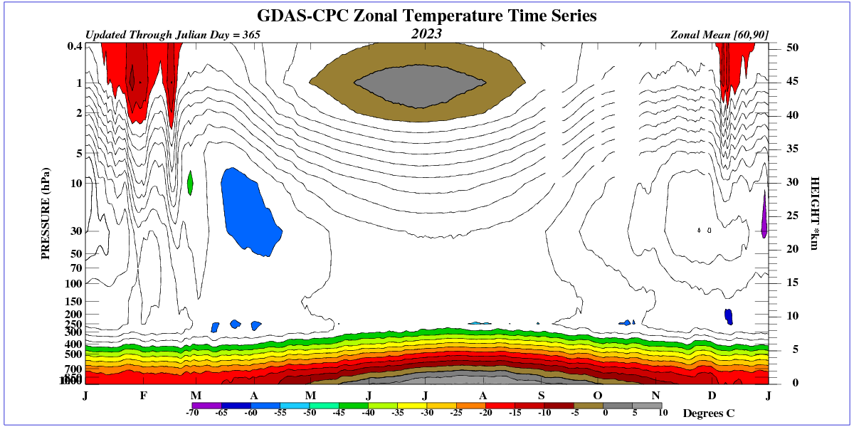
Let’s not forget what we are dealing with here, that is, ΔT values. These are NOT absolute temperatures you can use to measure absolute warmth at any time. They are only useful to determine possible rates of change at sometime in the distant past.
For example, what if the absolute temperature was 13.5°C just prior to the Roman Warm Period or 14°C just before the MWP? A 2°C change at the RWP would give an absolute temperature of 15.5°C, about where we are now. A 2°C change at the MWP would give 16°C, probably warmer than now.
Do we have a clue what the absolute temperature was in the depth of the LIA? Without knowing these temperatures, one can not make a scientific judgement on what a rate of change truly tells us as to whether the current warmth is good or bad.
Basically, comparing ΔT’s only tell you about the changes in ΔT at some point in time. Joining them together may be useful to determine if the current ΔT is out of line, but that is all. Look at figure 2. All that is being compared is the rate of change, not what the actual temperature was or became.
My point here is that equating ΔT to temperature is leaving out a large part of climate.
Looking at the current state of the ice in the Arctic, I think that 12,000 years ago the temperature must have been much higher for decades to melt huge amounts of ice in the north.

I note that the arctic ice extent for 2024 has already exceeded the maximum from 1974 and 2024 probably hasn’t yet reached its maximum.
But Al Gore told us the Arctic would be ice-free by 2014!
When you look at proxy tree rings or pond pollen, you are comparing to known growth at an actual absolute temperature. Conversion to an “anomaly” temperature adds an additional potential error into your analysis. That error involves what all the other proxies say their average is. There is no firm footing until thermometers were invented in 1714, were standardized and put into general use about 1850, and peculiarly show increasing temperatures since then….almost as if the proxy analysis of previous epochs might be incorrect…..
I agree that when you compare similar proxies, i.e., tree rings from the same location, you can develop a ΔT for that location. Tree rings from another location far removed may be problematic because of different microclimates.
The problems arise when one begins to treat anomalies as actual temperatures. They are not. The impact on the global climate is different if you are assessing a ΔT of 1°C @ur momisugly 13°C versus 1°C @ur momisugly 15°C
I find it difficult to take people seriously when they say that the temperature threshold for a glacial maximum on Earth is -5°C or whatever.
I take nobody who talks about using tree rings as temperature proxies seriously. Until they move on to something that actually makes sense.
‘I agree that when you compare similar proxies, i.e., tree rings from the same location, you can develop a ΔT for that location.’
I don’t. My local utility has been cutting down old oak trees with a vengeance this year. I’m willing to bet that ring widths measured along different axes of the same tree are not consistent. Tree-to-tree or town-to-town? Fuggedaboutit!
I didn’t mean to imply that it wouldn’t be very, very uncertain. But you could find an average ΔT with what would be a large variance. The big problem is trying to discern at what absolute temperature and I think that would be impossible inside a range of several degrees.
Wasting your time when you talk about tree rings. Might as well heave chicken entrails into the dirt and “read” the temperature from those, lol.
Sorry but tree rings are NOT good proxies for temperature. Which is why Michael “Tricky” Mann is so enamored with the (but only the ones and in the time frames that tell the right “story”).
If we look at the combination of stratospheric and tropospheric circulation in winter, we can see how thin the troposphere is in winter.

Article says:” In the case of carbon dioxide, the direct climate sensitivity to a doubling of its concentration in the atmosphere is somewhere in the vicinity of 1.5°C.”
The word “assumed” is used the discuss WV feedback but CO2 climate sensitivity is stated as fact.
There is no sensitivity to CO2 causing an increased temperature. CO2 increases mass requiring more energy just to maintain same temperature. WV has a Cp of about 4 requiring more energy to maintain same temperature. Both are coolants.
You can run UChicago Modtran, double CO2, fixed water VP and you get 3.33 watts, which is about .7 degrees of warming per doubling of CO2. Then run at fixed relative humidity and you get 1.2 degrees of warming as the surface temp “offset”. These are “tropical clear sky” numbers. You get less warming with clouds and temperate zones. Modtran is very good on IR, and matches actual satellite readings quite well so its other parameterizations must be accurate enough for trend prediction.
Global Circulation Models’s worldwide integrations that predict higher ECS numbers than Modtran, Happer and van Wijngaarden, or Harde’s 2016 radiation papers [https://www.hindawi.com/journals/ijas/2017/9251034/] can be considered, at very least, to be in serious doubt.
that’s all we know from lab spectroscopy and it does not support predictions of CAGW — the imaginary climate emergency — which have been wrong since 1979
What you need to remember when talking about Modtran is that the implicit, foundational assumption “all other things held equal” still applies.
Modern does not include the negative, offsetting feedbacks of the climate system, which render all such hypothetical effects meaningless.
All those hypothetical calculations do is set an upper bar on the “potential,” AND completely hypothetical, effect of increasing CO2.
And comparing whatever “climate sensitivity” that comes out of such hypothetical calculations constitutes an ASSUMPTION that all of the supposed temperature change is caused by the supposed atmospheric CO2 change.
The usual house of cards, in other words. With some sanity placed on the *potential* upper bounds, but otherwise still suspect.
The UK’s fleet of AGR reactors are cooled by CO2 though most have now ceased production.
a ton of mathematical and statistical massaging using a dataset that is a joke … these are all WAG’s based on proxies from 1 or 2 locations in the world … the massive assumptions about a “global” average temperature based on any proxy are useless as exercise in science … sure, its a fun exercise in statistical analysis of a dataset … but thats it …classic GIGO …
Ahh, but people actually believe these things. I was trying to put limits on how belief “A” that temperature was constant, with belief “B” that there is large positive temperature feedback. It turns out that you can’t have a lot of “B” while strictly maintaining “A”.
I think we need to liven up climate science with a contest. Something a lot more interesting than this tedious article that served no purpose.
Three chances to win:
(1) Guess the ECS of CO2
(2) Guess the global average absolute temperature in 1850
(3) Guess the global average absolute temperature in 2123
The correct answer to all three is
“we do not know”. But no one is happy with that answer, especially from a scientist . So we need a contest to pick a winner.
For (1)
The author selects 1.5 degrees C. That is roughly double the effect of CO2 alone from lab spectroscopy in HITRAN and MODTRAN.
I assume a doubling of that 0,7 is from a water vapor positive feedback which we can determine by studying the global average water vapor over time. Unfortunately, no such data exist, so the WV feedback is just a theory: Assume a large WV feedback and you are a Climate Howler. Assume a small WV feedback and you are a Climate Realist
For (2)
The author uses HadCRUT, but there are only sparse NH data used to wild guess a global average temperature. By an organization that can ONLY be trusted to create warming out of thin air (using adjustments and infilling).
There is no accurate global average temperature for 1850, or 1900, and possibly not even for 1950 too. Any author using pre-1900 average temperature numbers gets a Bronx cheer from me and I stop reading. (I read this whole article anyway because it’s not fair to comment without doing that)
For (3)
Everyone knows the climate in 2123 will be warmer, unless it is colder. And that’s all we know.
I’ve seen estimates for ECS that are all over the map. I wouldn’t be shocked if it was 0.7C.
There are no “good” temperature series that go for 100 years before we really started pumping out CO2. But alarmists pretend that there is, so I used what’s available. The logical problem they have is that on the one hand, they need a rock steady temperature record for at least a millennium, and they also have to have positive feedback via a temperature feedback mechanism to get the unprecedented (adjusted) rise in the 2nd half of the 20th century. I just wanted to see how much positive feedback you could stuff in without completely upsetting the apple cart.
“ I wouldn’t be shocked if it was 0.7C.”
There is no scientific evidence saying it is anything measurably different from 0ºC
Yup. Observations Trump theory.
Chris
Enjoyed your approach and article.
It looks like the alarmists have embarrassed themselves again.
You might be interested in this paper.
SSRN-id4485014 (3).pdf
It looked at the latest hockey stick in AR6 and noticed that the period prior to 1000AD had a higher average temperature than the calibration period from 1850 to 2012.
The hockey stick shape was, therefore, an artifact of the data resolution.
My understanding, anyway.
Don’t know why the down-votes.
For a change ,nearly everything you said is correct and mostly rational.
Even now, surface data is greatly lacking from large regions of the land surface, and what is there is often too corrupted by urban expansion and densification to be of any use at all, not to mention the deliberate mal-adjustments..
And given that HadCru is part of the fabricated not-really-data…
… any ECS guess based on it, especially one that ignores all other causes of warming…
… is bound to be a massive over-estimate.
“Don’t know why the down-votes.”
A WUWT tradition.
If you did not give me a few down votes for every comment, I have to wonder if you are feeling okay?
It was extremely unusual that you didn’t slide off into some science unsupportable BS like CO2 warming or some consensus rant……
That is at least a small start.
Poor dickie, doesn’t like being encouraged for not being an idiot.
So gives red thumb.
Really sad.
Climate models incorporate temperature feedbacks which, while plausible, are all just assumptions that could be wrong in the absolute, or to some degree, or even in direction. It has always been my contention that if these feedbacks existed in the real as they do in the models, something would already have triggered them.
Warmest in 125,000 years?
That would be good news: Most of those years were too cold.
2023 was the warmest year since 1979, for the UAH record.
And that is VERY good news.
Here in SE Michigan our winters are warmer than at any time since the 1970s and there is less snow shoveling than ever.
In the late 1970s snow shoveling was required almost every week of winter. In the past two winters just three times each winter, or once a month. So far this winter just once, and only at the foot of the driveway where the village snow plow truck driving by piled up some snow. The rest of our 100 foot driveway has not needed shoveling so far this winter. This is from global warming and we love it
Greenhouse caused warming is mainly warmer winters in colder climates such as Michigan
Can you provide evidence for CO2-forced warming, Richard? A laboratory experiment cannot possibly emulate Earth’s atmosphere.
No, that is natural variability; a brutally cold winter, similar to ’13-’14, will surely strike CONUS soon, probably within this decade.
“Can you provide evidence for CO2-forced warming, Richard?
Now that is something that dickie will be running from forever.
Calling to consensus, blathering away with this and that…
But producing nothing.
Yiu arer resistant to the work of nearly 100% of climate scientists in the past century. A man with a fixed mind … that needs major repairs. An AGW denier. Stage IV.
Poor dickie-bot.
All you have is a nonsense of consensus.
That really is so sadly pathetic.!
And thanks yet again for proving me correct.
“By producing nothing.” 🙂
Grate to have you backing me up the whole way. ! 🙂
The claim that 2023 was the hottest year on record completely contradicts NOAA’s records. Such a claim can be accepted only by those who haven’t been paying close attention.
As an example, NOAA claimed 2023 to have a global mean temperature (GMT) of 15.08C. However, NOAA also claimed a GMT of 16.83 C in 1995 and a GMT of 16.92 C in 1997!
So what is this “the warmest year on record” crap?
Dave, you got a link for that? Cuz the following is what they say today. Has something been fudged ? The anomaly applied to different model “data” trick ?
I saw that temp trend recently paired with CO2 then again using the statistical autocorrelation function and it came up with this.
I second the request for info on how to find this.
NOAA couldn’t LIE straight. even if strapped to a plank !
No it doesn’t. You are probably mixing up US, or some other regional data, with global data. Do keep up.
Numbers are REALLY hard for you to comprehend, aren’t they, fungal the dumbat !
If we discounted for all the urban heating, and homogenisation and other FAKED mal-adjustments, you would find that the 1940’s was actually warmer in many parts of the world.
Much data still exists that shows that to be the case.
There are three kinds of data that show very clearly that the “warmest in 125,000 years” claim is bogus and the proxy reconstructions on which it is based are wrong.
There is no way around this information. The Holocene has been warmer than the present. I wrote a chapter about it in this book:
The Frozen Climate Views of the IPCC: An Analysis of AR6https://www.amazon.com/Frozen-Climate-Views-IPCC-Analysis-ebook/dp/B0C6HZ43GC/
Biodata shows the Arctic sea ice as being absent during summer for much of the Holocene optimum, and much lower than now, through the MWP, right up until the beginning of the LIA.
There are a large number of studies from all around the world showing the Holocene Optimum being a few to several degrees warmer than now.
“There is no way around this information. The Holocene has been warmer than the present.\
There were two periods in the 4000 years of the HCO that were probably warmer than 2023 … but we can not be certain what the global average temperature really was in that whole 4000 year period.
The important point that most people miss:
At least one degree warmer than today in the past was called a climate optimum (good news).
The warm period IN THE PAST was called a climate optimum, meaning good news. Perhaps it was only +1 degree warmer than 2023, as a conservative guess for the whole 4000 years (5000 to 9000 years ago)
At least one degree warmer than today in the FUTURE is called a climate emergency by the IPCC (bad news)
When the climate was warmer in the past it was called good news but if it is equally warm in the future that would be called bad news?
The IPCC contradicts themselves. They will have to make the Holocene Climate Optimum “disappear”. Maybe using Mann’s next Hockey Stink Chart?
Proxy data exists from many areas that shows the Holocene Optimum between 3ºC and as high as 7ºC or 8ºC warmer than now.
The planet is still here, animals and humans are still here.
There was no tipping point.
In fact, the planet COOLED to a nasty cold period call the Little Ice Age.
The word “optimum” for the climate was introduced in the scientific literature by Scandinavian botanists and palynologists, i.e. researchers from high latitudes. It implies a human opinion on what is better or worse that should be absent from science. Any change brings losers and winners.
Have to disagree there, Javier. Warmer climate is better. More arable land, longer growing seasons, more life.
And since the climate warming occurs in the main as warmer poles and higher latitudes, milder winters and nights that don’t get as cold, just exactly what is the “bad news” supposed to be?
Sea level rise is about the only concern, and that can be dealt with at the rate it occurs.
That’s a lot of maths to conclude that the tropical hotspot (AR3 cover image) does not exist.
“In the case of carbon dioxide, the direct climate sensitivity to a doubling of its concentration in the atmosphere is” unknown.
Radiation physics is not a valid theory of climate.
I’ve said this for years. If the Eco-Nazis’ imaginary “positive feedback loop” of water vapor functioned as their fever dreams suggest, we wouldn’t need any CO2 to produce their “runaway global warming” fantasies; anything that warmed the climate a bit would start the snowball moving down the mountain.
But that doesn’t happen, BECAUSE THEY’RE WRONG.
There can’t be any feedback loop to CO2 warming..
… as there is no signal from CO2 warming.
Red thumb , admits I am correct, just can’t counter the fact. !
Thanks 🙂
“What this tells me is that there cannot be very high positive temperature feedback within the climate system if the “normal” or pre-industrial temperature record is totally flat.”
You can’t say that. You don’t have enough information. You don’t know the input signal, so you can’t estimate the gain.
CO2 was stable, so there is no signal there.
There is no CO2 warming signal now, either.
You are making a pointless point.. again!!
CO2 was stable at barely plant subsistence levels.
Be EXTREMELY GRATEFUL there is now at least enough for plant to make a go at decent growth.
“There is no CO2 warming signal now, either.”
There is lots of evidence of an increasing greenhouse effect except to those who are deaf, dumb and blind, like you.
You still haven’t produce anything but bluster to cover for you total lack of any evidence of CO2 warming.
Sorry, but unlike you, I don’t consider mindless zero-science ranting to be evidence of anything.
We are waiting !! I we will be for a VERY long time.
Stop being an AGW-shill and start to look at actual reality.
Now.. can we have another “consensus” tantrum, please.. They are funny !.
is that you giving red-thumb dickie-bot ?
Again admit you have no evidence ?
Or is t one of your fellow AGW-cultists.. fungal, AJ, the simpleton. etc.
Actually, what I was addressing was the effects of positive temperature feedback from any source, CO2 or not. There’s enough noise in the system (1/8C each month in HadCRUT5 1850-1950) to create oscillations if positive temperature feedback is to0 strong.
There was no signal when CO2 levels were far higher. And CO2 was not stable, that’s based on “crap for data” that assumes air bubbles trapped in glacial ice to be a closed system.
And during the era when we have modern instruments measuring both CO2 and temperatures, temperatures were first falling, then rising, then flattening. All while CO2 levels were rising. So your “signal” is “every possible outcome has occurred while CO2 was rising.” Lol.
‘However, the truly scary consequences of driving your SUV only come about when you add in the assumed positive feedback of increased water vapor in the atmosphere, and that positive feedback is via the mechanism of temperature itself.’
If water vapor is a positive feedback mechanism, than an increase in temperature, causes an increase in water vapor in the atmosphere, which in turn causes an increase in temperature, which causes a further increase in water vapor, etc. in a run-away positive feed-back loop, until the earth burns up. Or until some negative feed-back mechanism kicks in to stop this virtuous cycle.
Since the earth hasn’t burnt up yet, in spite of having numerous opportunities to do so in its 4 billion year history, there must be some some negative feed-back mechanism at play. So what is it?
Thus we see that the high latent heat of evaporation causes water evaporation to be a negative temperature feedback mechanism, which is increasingly powerful as temperatures increase. This is why it is virtually impossible for tropical ocean temperatures to exceed 28 C. Given that tropical ocean temperatures are shown to be connected to the ocean temperatures of other latitudes through ocean currents, the limiting of tropical ocean temperatures also limits the possible temperature rise of all of the oceans.
Also when one considers the magnitude of heat transfer from the oceans to the atmosphere via water evaporation, compared to the much much smaller magnitude of heat transfer that is possible from the atmosphere to the ocean via the mechanisms of conduction and infra-red radiation, one must conclude that ocean temperatures lead atmospheric temperatures, and not vice-versa. The fact that ocean temperatures lead atmospheric temperatures is clearly seen by the effect of ENSO on global atmospheric temperatures, with a lag of about 4 months.
The correct way to envision the heat balance of the oceans, is that energy is input to the oceans is via direct sunlight, while energy exits the oceans via the process of water evaporation. All other heat transfer mechanisms are negligible. The fact that energy input and output mechanisms are differentiated both mechanistically and geographically (mechanistically -high energy solar radiation penetrates deep into the oceans, while evaporation is a surface phenomenon, geographically – evaporation is primarily in the tropical oceans, while radiation is much more dispersed around the globe) leads to a long time lag (years, decades, centuries) between the time the energy enters the oceans and the time it exits in the form of latent heat of evaporation, with the difference in timing accounted for in energy accumulation, i.e. variations in ocean temperatures over time.
To summarize, the way to envision the earth’s climate system, is that the oceans are an intermediary between the sun and the atmosphere. Atmospheric temperatures follow ocean temperatures. There is a natural, and very powerful, negative feed-back mechanism, water evaporation, that limits variations in ocean temperatures, and thus atmospheric temperatures. There is a very long lag time between any changes in solar input and the resulting effects seen in atmospheric temperatures. In this climate system the role of tiny changes in the rate of energy transfer by infra-red radiation (i.e. via CO2) is negligible to non-existent.
An Occam’s Razor simple theory would be that clouds increase as atmospheric humidity increases, acting as a negative feedback to the water vapor positive feedback.
Something must limit that WV positive feedback and a very simple possible answer is changes in cloudiness.
Or that WV is a negative feedback that helps bring everything into balance under the gas laws.
DENIAL of facts again dickie-bot ??
dh
While I agree that atmospheric feedback has likely been overstated and quite possibly for the reasons you state.
“Since the earth hasn’t burnt up yet, in spite of having numerous opportunities to do so in its 4 billion year history, there must be some negative feed-back mechanism at play. So what is it?”
The Plank feedback is a huge negative feedback that dominates any possible atmospheric positive feedback. The IPCC’s position is that the negative plank feedback of -3.22 W/M2/K is stronger than their positive atmospheric feedback of about 2.1 W/M2/K.
Everybody, including the IPCC, agrees that negative feedback dominates on earth.
Doesn’t make them right about their almost impossibly strong positive atmospheric feedback.
‘The Plank feedback is a huge negative feedback that dominates any possible atmospheric positive feedback. The IPCC’s position is that the negative plank feedback of -3.22 W/M2/K is stronger than their positive atmospheric feedback of about 2.1 W/M2/K.’
Heat loss from the oceans by evaporation, as presented in most earth energy budgets, is of the order of 80 W/M2. The vapor pressure of water doubles for every 10 C. Therefore we can estimate, based uniquely on the effect of vapor pressure, that the negative feedback due to water evaporation would be 8 W/M2/K (i.e. a doubling of 80 W/M2 divided by 10 C). But this ignores the very substantial effect of increased water vapor content in the air on wind speeds, and thus mass transfer coefficients. Taking this into account, a conservative estimate of the negative feedback of water evaporation would be a minimum of 10 W/M2/K, on average over the earth’s surface.
The fact that the temperature of tropical oceans is in practice limited to 28 C shows that, the negative feedback increases substantially with increasing temperature.
In other words, the negative feedback due to water evaporation from the oceans is several times larger than the negative Planck feedback, at current temperatures, and increases exponentially with increasing temperatures
Isn’t this just stating the obvious?
If the climate had a positive feedback mechanism it would have spiralled out of control many millions of years ago.
It obviously didn’t, so it most probably has a slight negative feedback to keep things fairly stable here on earth!
The energy transfer in the atmosphere is actually controlled by the gas laws.
This is proven by the analysis of balloon data which shows thermal equilibrium at all heights, with an absolutely linear vertical energy gradient (R² = .998) with respect to molecular density.
This done by a chaotic mix of conduction, convection, radiation, and the biggie…. bulk air movement.
The only thing that can affect this equilibrium is H2O because of its atmospheric phase changes.
All other gases are just part of the atmosphere controlled by the gas laws.
Total BS by a CO2 denier
Say dickie presenting absolutely ZERO evidence.
This is his normal way of DENYING the facts… Manic bluster. !
Are you DENYING the Gas Laws now….. really ??
Do you think that human CO2 can somehow act contrary to them ? Really.?
Please explain how! (this will be hilarious)
Every part of what I said is provable true.
You have FAILED yet again, dickie,
You are still an AGW CO2-warming cultist.
We now expect another tantrum about consensus or some other zero-science garbage.
A minor error. I typed R² = .998 from memory…
It should be R² = 0.9997