David Archibald
It is now seven years since the global lower atmosphere temperature, as measured by UAH, peaked in 2016. As it is energy from the Sun that stops the Earth from looking like Pluto, what has solar activity done? There are lags involved so the relationship is not clear cut. And then there is the interaction with a long-cycle terrestrial system that complicates it a bit further. But when that turns the rate of cooling will accelerate.

Figure 1: F10.7 Flux 1948 – 2023
This is the index of solar activity that the solar professionals use, not sunspot number. The solar cycle is driven by the orbital period of Jupiter of 11.86 years, modulated by Saturn and Uranus.

Figure 2: Sunspot Area 1874 – 2023
F10.7 flux correlates closely with sunspot area. This graph of sunspot area by solar hemisphere shows the abrupt jump in solar activity at the start of the Modern Warm Period. What is significant is that the hemispheres have different levels of activity and that trends in activity can last three solar cycles, approximating the orbital period of Saturn.

Figure 3: Ap Index 1032 – 2023
The Ap Index is a geomagnetic index that was adopted in 1932 as an improvement on the aa Index. The 1970s Cooling Period in the middle of the Modern Warm Period is reflected in lower activity of the Ap Index. The first sign that the Modern Warm Period was over was when the Ap Index fell abruptly in 2006, confirmed in June 2008 by it breaking through the floor of activity established in Modern Warm Period. That break has been followed by a change in the character of activity with much lower amplitudes. From that it follows that there has been a big change in the Sun.

Figure 4: aa Index 1868 – 2023
This is the first instrumental record of solar activity. The Sun was more active in the second half of the 20th century than it had been in the previous 11,000 years. And as it is the level of solar activity that determines the Earth’s surface temperature, the Earth had a mild and much appreciated temperature increase as the system sought a new equilibrium.

Figure 5: Cumulative aa Index 1868 – 2022
What this figure does is take the information underlying Figure 4 and add the difference between the annual figure and the average over the 154 years of the record. This methodology is good for revealing changes in trend. What it shows is that the aa Index had a higher level of activity from 1993 so this is the start of the Modern Warm Period.

Figure 6: Interplanetary Magnetic Field 1966 – 2023
The 1970s Cooling Period stands out as an interval of lower activity that departs from the F10.7 flux of Solar Cycle 20. And as we approach the peak of Solar Cycle 25, the Interplanetary Magnetic Field is near the highs reached in Solar Cycle 23 and higher than in the 1970s Cooling Period.

Figure 7: F10.7 Flux and Oulu Neutron Count
This is where the bulk of the rubber hits the road in terms of the solar effect on climate. Through the Modern Warm Period the inverted Oulu neutron count closely tracked the F10.7 flux. Variation in the neutron count is caused by the magnetic flux of the Sun, carried on the solar wind, pushing galactic cosmic rays away from the inner planets of the Solar System. The galactic cosmic rays hit oxygen and nitrogen atoms in the atmosphere, causing a show of neutrons that reach the Earth’s surface. They act as nuclei for cloud droplet formation in the lower atmosphere. The increased cloud cover increases the Earth’s albedo and more sunlight is reflected back into space, making the planet cooler.
The graph shows that the two series parted company in 2006 at the beginning of the New Cold Period and have maintained that gap. The peak in the Earth’s temperature as measured by the UAH series was ten years later in 2016, consistent with the theory that there is an 11 year lag in the Earth’s climate from changes in solar activity.

Figure 8: Solar wind flow pressure 1967 – 2023
The solar wind flow pressure was lower during the 1970s Cold Period suggesting that it is a variable that affects climate. But otherwise it has a weak to non-existent correlation with other solar parameters and the Earth’s climate.

Figure 9: Solar EUV
The University of Bremen records the Sun’s ultraviolet emissions at 280 nm and produces the data in the graph above. Solar Cycle 25 is tracking later than the cycles of the Modern Warm Period but has reached their amplitude.

Figure 10: Alpha particle/proton density ratio
This is another solar parameter that is different from any other. Once again, it was flat during the 1970s Cooling Period and then responded to the solar cycle, but in a declining trend for the last 45 years.

Figure 11: North America Ex-Greenland monthly snow cover 1971 – 2023
If the Earth was warming, or cooling, you might expect to see that reflected in snow cover at the height of Summer. But that hasn’t changed detectably for nigh on the last 50 years. North America did warm as the 1970s progressed and this is reflected in the significant decrease in snow cover.

Figure 12: Pacific Decadal Oscillation 1890 – 2023
It may be that the Earth’s climate does not slavishly follow solar activity because there is another major driver of climate which has its own cycle. The graph above, from Professor Humlum’s site, is the HadCRUT temperature record plotted as a cumulative change from the average of the period of the record, in the manner of Figure 5. It shows that there are multidecadal trends in the HadCRUT temperature record. As per the annotation, these roughly correspond to the changes in the Pacific Decadal Oscillation (PDO) from positive to negative and back again. HadCRUT has been in uptrend for nearly 50 years and the PDO has been positive for slightly longer.
So we can interpret this all to mean that, even though solar activity fell out of bed in 2006, the reason why snow cover at the height of summer hasn’t increased yet is because the solar-climate nexus has been over-ridden, so far, by the continued positive phase of the PDO. But is the PDO still positive after 50 years?

Figure 13: North Pacific commercial salmon catch 1925 – 2021
As it happens there is a real world parameter which says that the PDO is still in a positive phase. We can thank the North Pacific Anadromous Fish Commission for the graph above which shows the annual salmon catch in thousands of metric tonnes for the six countries around the North Pacific. The salmon catch moves north to Alaska in the positive phase of the PDO and then that reverses in the negative phase. It looks like the fish are heading north still with the Canadian catch in decline from 1990 and the Japanese catch down to 20% of what it was 20 years ago.
It follows that there is a scary conjecture from this interpretation of the data. When the PDO finally turns negative it will hyper-accelerate the solar-driven cooling evident from 2016. The warming that took all of the second half of the 20th century to achieve will be wiped out in what will feel like just an instant and we will be back to the Little Ice Age conditions of the 19th century.
David Archibald is the author of The Anticancer Garden in Australia.
Can’t help but feel excited. The cooling will be manageable. We are far better equipped to adapt to it than back in the LIA.
Who is this “We” that is better equipped? I used to be be able to afford winter heating. I suspect I am not alone in this. Plus, the general situation of the western societies seems to be widely deteriorating rapidly..
With energy supply systems that have been devastated by the “climate” agenda.. ?
Nope, we are not better equipped !!
“Can’t help but feel excited. The cooling will be manageable.”
The La Niña cooling is now over with, thanks to solar-ocean warming from solar cycle #25.
If you didn’t know, D. Archibald has been predicting cooling forever now, and he’s been wrong.
His Figure 7 saying “New Cold Period” is thus misleading, it’s certainly not constantly cooling.
‘Global Warming’ is going to continue as SC25 is now clearly above SC24, and the ocean has warmed as expected after the sun reached high enough irradiance more than a year ago.
Realize the global ocean warmed under solar cycle 24. It’s happening again, this time we’re going to break the mythical 1.5°C ‘limit’ because of higher solar activity in solar cycle 25:
If you or anyone else thinks it’s going to cool during this solar maximum you’re vastly under-appreciating how super-sensitive the equatorial upper ocean layer is to solar activity over time.
The top image in this set below hasn’t updated since May 8, so this is a bit dated, however the warming continues basin-wide as sunspot activity remains high above the 95 threshold (red line, bottom plot) and TSI remains above the TSIS 1362.11 W/m^2 decadal warming threshold (white line, TSI plot):
The global SST has been rising steadily since February under higher solar activity ≥95 SN:
There’s no reason to get excited about any cooling until sunspot activity falls below 95 and then TSI drops off below it’s threshold and both descend into the next solar minimum while the ENSO eventually transitions from future El Niño into the following La Niña as it did last time.
Yes folks, solarattributionsdotcom is coming soon, after I get married this month; after I change that unused coolclimateinfo page into ongoing sun-climate stuff.
First, I like to thank the good Lord for people like David Archibald, a guiding light truly able to see the forest for the trees.This article deserves the TRUTH PRICE
This article blows out the water a lot of BS “climate science”, in fact, just about all of it!!
That faux “climate science” has been driven for decades by a western-world elites’, greedy grabbing of ever-increasing subsidies for environmentally destructive, expensive wind and solar systems, that produce expensive electricity that cannot be fed into the grid, unless a large fleet of quick-reacting power plants counteracts the ups and downs of wind/solar outputs, on a minute by minute basis, 24/7/365, year after year.
Adding highly subsidized huge-capacity battery systems will make all of it much more expensive
Almost all the $TRILLION costs are imposed onto household ratepayers, taxpayers and added to government debts.
As a result, Germany, the UK, etc., have become economic basket cases, and all of the EU is in near-zero, real-growth mode, concurrent with high inflation and high interest rates.
guessing you missed the news about the Texas blackouts in the ’21 Valentine day freeze – wind & solar were providing over 45% of Texas energy production and that % went to <8% during the freeze causing massive blackouts for the whole state that lasted for about a week – our continuing reliance on unreliable sources for power do not make us more able to handle the cold
Broadly agreed save that in my humble opinion the global cloud variations caused by solar variations are due to changes in jet stream behaviour and not by cosmic rays creating more condensation nuclei.
I have previously suggested a mechanism whereby changes in the composition of solar particles and wavelengths alter the balance of ozone creation/ destruction in the stratosphere differently above equator and poles so as to change the gradient of tropopause height between equator and poles.
That change in gradient is what governs the degree of jet stream meridionality/ zonality.
Longer lines of air mass mixing with wavy or more equatorward jet stream tracks create more clouds for less energy into the oceans and a cooling world.
Changes in cloudiness mimic changes in distance from the sun by altering the proportion of solar energy able to enter the climate system via changes in global albedo.
“The warming that took all of the second half of the 20th century to achieve will be wiped out in what will feel like just an instant and we will be back to the Little Ice Age conditions of the 19th century.”
He’s been telling us this for a while now. Here is a DA submission to the Australian Senate in 2008:
“2008 is the tenth anniversary of the recent peak on global temperature in 1998. The world has been cooling at 0.06 degrees per annum since then. My prediction is that this rate of cooling will accelerate to 0.2 degrees per annum following the month of solar minimum sometime in 2009.”
On that basis we are now well through the LIA and towards glaciation.
David has now incorporated the thermal inertia effect of the oceans which is an Issue I flagged up as long ago as 2007 or thereabouts.
He does seem to over emphasise the amount and speed of cooling, though.
The process is slow and spread over multiple decades and several solar cycles.
“The process is slow and spread over multiple decades and several solar cycles.”
Your statement has been confirmed.
Stephen I think you generally understand how things work, as your idea was borne out in my own research into solar and ground irradiance, and tropospheric ozone/UV index.
I found it takes 11 solar cycles (109 years +11 year lag) to control the 30 year climate as represented by the HadSST3 30y average. The usual auto-correlation argument is overblown and not relevant as the physics is exact.
The actual climate change between 1890-2010 was exactly computed, below, using James Hansen’s planetary effective temperature equation, and changes in TSI modelled by a simple SN-TSI model made from v2 SN and PMODv1709:
This means that aside from the normal GHG warmth above the black-body temperature, changes in GHGs from man-made emissions were not important at all in warming compared to the cumulative effect of higher TSI over multiple solar cycles.
Yes, but the factor that was not taken into account was the PDO.
It’s not as though the climate catastrophists ever get anything wrong is it, Nick?
At least David learns from his mistakes, whilst the modellers just lie
religions can’t learn and evolve
Nick is right for once. This article has the squelchy sound of a long-dead horse being flogged.
Agreed. The old predictions of impending cooling from the 2000s look silly now. And Archibald is still unable to learn that the Little Ice Age ended in 1850, despite being told repeatedly over the years.
“On that basis we are well through the LIA…..”
Well Nick, judging by the current temperatures here in central UK, that may be correct. I have just put the central heating back on 7.30 am here. It has been wonderfully sunny for the past couple of weeks but very cold out of the sun, due to cold Northerlies. No rain either which is unusual for us.
Despite this actual cold, we are apparently in a heat wave according to many media advisors?
Actually it may just be weather variation, We will have a better idea in about thirty years time.
Yup. Posted above noting the same. And we had our wood burner fired up late afternoon all through May.
Very oddly, Glasgow has been the warmest place in Britain for the last week. Glasgow seems to be right in the centre of a high pressure area. For Glaswegians, 20 degrees centigrade is a heatwave. I have never seen so many tanned Glaswegians in my life. Our usual colour is blue from the cold.
I didn’t think Celts could get tanned. Those I know here in Woke-achusetts just get more pink then burned. Better watch out- I know some who’ve gotten skin cancer. Personally, I almost instantly get tanned with a few hours of sun since all my grandparents came from The Boot. 🙂
Possibly due to the red hair is more common in Scotland than anywhere else in the world. 50 per cent more redheads north of Gretna than in the south of England.
The pale skin means that what little sun is available is more readily converted into vitamin D giving a genetic advantage.
Red hair is celebrated in Scotland especially amongst football supporters, whereas in England not so much
It is bitterly cold in Cape Town right now and has been for a few days. I live on the Peninsula which has its temperature moderated by the ocean on both sides. It is 16 deg while the air is 13 deg. Summer wasn’t much either.
Keithe
The difference between us is Summer and Winter. We are currently coming up to midsummers day you are reaching the exact opposite. Our temperatures are virtually the same. This morning we were at 11 deg. C it has now risen to 14 deg. C as we approach midday. We are being told the coming days will bring warmer and maybe wetter air. We live ever hopeful that is the case.
If we carry on like this it will go down as the summer without any warmth..
It is just after noon in Dublin. The outside temperature is 13ºC out of the wind but with wind chill 9ºC. We have not had much summer this year but despite more sunshine the past week it is cold outside.
I notice your dams are 72.2% full. This is the sixth year in a row with high water levels in the dams.
See how wrong the predictions have been:
• In March 2018 CNN has a dramatic article Day Zero deferred, but Cape Town’s water crisis is far from over
• National Geographic headline Why Cape Town Is Running Out of Water, and Who’s Next
Good reason not to trust the climate alarmism of mainstream media. We need to adapt and store surplus water in the good years. For this we need more engineers and less politicians.
Here in Derby we haven’t seen much sun for the last 8 days, as a result temperatures haven’t got to 20C, just the high teens. There’s been a cold East/North East wind keeping temperatures depressed. I’ve got three layers on today.
What is really irritating is even local weather forecasters saying tomorrow will be warmer, then in a few days we’ll be frying.
I think the hyping of hot days to come is all part of the Climate Catastrope propaganda. Based on the fact if you repeat a lie often enough it becomes the truth.
A few days ago, in Vermont, USA, it was 40F on my porch, which reads high, and I switched my heat pump from cooling back to heat, and turned on my electric blanket to take off the chill.
Remind me how many events of the earths imminent demise have been predicted by innumerable alarmist’s since, say, the 1970’s?
Probably only a degree or so above the coldest period in 10,000 years.
How is that NOT still part of the LIA !!
makes sense- much of the landscape of this planet is still tundra!
Isn’t the case that year round ice at both poles is not the normal situation on Earth. I think I read that somewhere
Nick,
You can continue to ignore this UAH graph:
Or, you can comment in its implications.
Geoff S
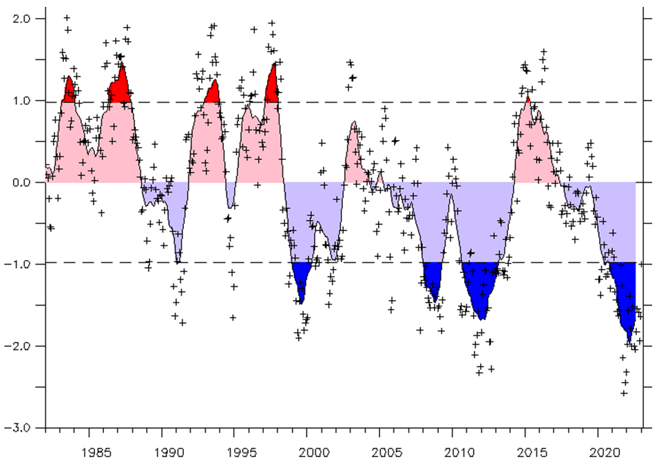
Why does this PDO (climate4you.com) graph show cooling instead of warming?
Does that chart indicate temperature?
NOAA says yes … https://www.ncei.noaa.gov/access/monitoring/pdo/
John, you obviously did not read the webpage you linked.
The PDO does not represent temperature. See my comment below.
Regards,
Bob
What matters is not the PDO itself but the net balance between the El Niño and La Niña phases. I contend that changes in global cloudiness will affect that balance.
The climate glitterati PRAY for El Nino..
They know that El Ninos are what has caused the slight warming we have been fortunate enough to have experience out of the coldest period in 10,000 years.
They KNOW that warming was NOT CAUSED BY CO2.
There were El Ninos in the 1940s, 1950s and 1960s that didn’t cause a multidecadal warming trend. And, random noise filtered and having an added slope to be similar to UAH v6 TLT has 77 years of being over 90% covered by pauses: https://woodfortrees.org/plot/noise/mean:15/mean:5/scale:1.8/detrend:-1.334/from:1922.24/to:2000.01/plot/noise/mean:15/mean:5/scale:1.8/detrend:-1.334/from:1922.74/to:1938.01/trend/plot/noise/mean:15/mean:5/scale:1.8/detrend:-1.334/from:1941.24/to:1962.42/trend/plot/noise/mean:15/mean:5/scale:1.8/detrend:-1.334/from:1971.92/to:1985.01/trend/plot/noise/mean:15/mean:5/scale:1.8/detrend:-1.334/from:1987.74/to:2000.01/trend/plot/noise/mean:15/mean:5/scale:1.8/detrend:-1.334/from:1962.16/to:1971.51/trend
No but the graph itself notes that the changes in PDO are “roughly in line” with global temperatures, does it not?
If it doesn’t represent temperature, why do they call the ‘blue’ regions the cold phase … such as the attached image and this video … https://www.youtube.com/watch?v=Sc3tOEcM0YE
Which one is right.
The chart you posted ends in 2021, before 2022.
Archibald’s chart includes 2022.
You are missing a year of temperature increase.
PDO is an index that essentially reflects the long-term balance between Niños and Niñas. It is negative because we’ve had more Niñas than Niños since 1998 with the exception of the 2014-16 period, when a long strong Niño made the index positive.
PDO, AMO, and ENSO are indices that reflect how heat is moving within the climate system from one place to another. Their warm phases indicate heat is accumulating in mid-latitudes (aka global warming), while their cold phases indicate heat is making it to the Arctic (aka Arctic amplification).
Thank you.
Interestingly, the cumulative ENSO index shows some of the climate shifts.
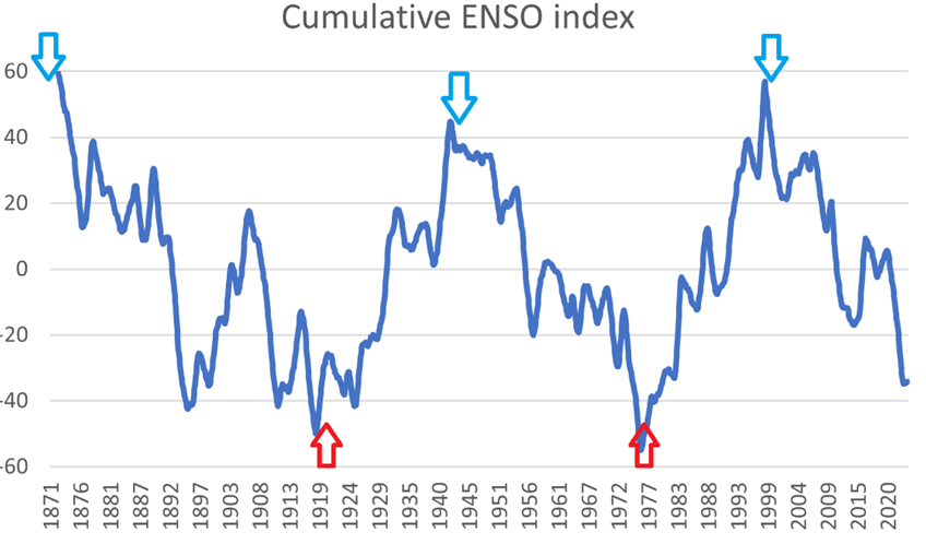
De-trended, cumulative total of the MEI ENSO index from 1871–2023.
From my article here:
https://notrickszone.com/2023/04/19/are-enso-regime-changes-connected-to-major-climate-shifts-are-we-tipping-to-cooling/
Exactly. Cumulative trends show very clearly when the index turns from being in one direction to the opposite. 1976 was the year global warming started, and 1998 was the year the Pause and Arctic amplification started. Scientists cannot explain why the climate presents these different climate regimes separated by quite abrupt shifts. The root of the problem is that climate models do not understand poleward heat transport, the most important climate variable that cannot be properly measured.
The AMO will soon join the PDO, and for about 10 years we will have moderate cooling to everybody’s surprise, until everything changes again. After 2035 Arctic sea ice will start growing and scientists will be even more surprised, as they say it should disappear between 2030-2050.
Climate changes naturally. CO2 contributes but it is not the main driver.
Arctic amplification started a lot before 1998. It was known for several years before that. And, it’s now known that Arctic (and near-Arctic) temperature varied more than global temperature did and these mostly had good positive correlation with each other through the past few hundred thousand years.
Can you read the date in this graph when Arctic amplification started?
It is from the Danish Meteorological Institute. I trust they know about the Arctic.
https://ocean.dmi.dk/arctic/meant80n_anomaly.uk.php
@Don
The winter and annual trends started upwards ~1963 with a flattish spot ~1980-2000, while the summer has no trend.
The winter and annual trends grew at a faster rate after 1995, all just inversely following the trend in NH sea ice extent:
It should be evident from these next four plots that NH sea ice extent is largely controlled by the NH SST, and the Arctic jra55N T is largely controlled by, and anti-correlated to NH sea ice extent, so indirectly the ocean warmth from the solar modern maximum eventually melted the ice and warmed the Arctic.
Arctic ‘amplification(s)’ are downstream effects of ocean warming.
David writes in the post (my boldface): “HadCRUT has been in uptrend for nearly 50 years and the PDO has been positive for slightly longer.”
Problem 1: The PDO data from the NOAA NCEI website contradicts that the PDO has been positive over the past 50 years:
https://www.ncei.noaa.gov/access/monitoring/pdo/
Problem 2: The PDO does NOT represent the sea surface temperatures of the North Pacific, north of 20N. The PDO DOES represent the spatial pattern of sea surface temperature anomalies in that region.
Pacific Decadal Oscillation (PDO) (washington.edu)
Therefore, the PDO does not and cannot cause global temperatures to rise or fall.
Regards,
Bob
PS: For more info on what the PDO is and isn’t see the post at my blog here…
The 2014/15 El Niño – Part 5 – The Relationship Between the PDO and ENSO | Bob Tisdale – Climate Observations (wordpress.com)
…which was also cross posted at WUWT here:
The 2014/15 El Niño – Part 5 – The Relationship Between the PDO and ENSO • Watts Up With That?
Thanks, Bob. Its always good to hear from you. Missed you during your dry period.
PDO already negative also according to NOAA/ESRL
So it’s voodoo?
Maybe you could take this opportunity to explain what this PDO temperature chart is referring to.
http://climate4you.com/images/PDO%20MonthlyIndexSince1979%20With37monthRunningAverage.gif
PDO has good positive correlation with global temperature: Positive means warming (or more warming), negative means cooling (or less warming). It looks like one side of the North Pacific affects global temperature more than the other. However, it is true that PDO has not been anywhere near constantly positive even since its 1977 uptick. PDO had a substantial mostly negative time for several years centered around 2010-2011 and it has been negative since January 2023 (during notable global warming pauses).
Excellent!!
PDO is not positive!
Well, at the moment in the UK, whilst we are having nice June weather some days, I cannot recall morning as cold as this as we head towards Midsummer. Am usually out walking the dog by 7am; at this time of year, in shorts and a t-shirt. Now? Jeans, a sweatshirt and a jacket, to combat the freezing East wind.
This is perhaps the only significant change in seasonal weather I have encountered in my 71 years. Give me global warming now, please.
Like me, Jeremy, you must live on the eastern side of our island. Relatives who live on the western side – less than 150 miles away – say it’s recently been delightfully sunny and warm where they are! Proof, if it were needed, that this is weather in action, not climate.
There’s a poor understanding of how solar activity affects climate, and wishful thinking leads to consistently wrong predictions.
All those predictions about a solar grand minimum and a new little ice age were wrong. SC25 has slightly more activity than SC24 at the same distance from its cycle start, and it is likely to be slightly more active, as a few of us predicted years ago.
The effect of low solar activity is this:
Arctic winter warming and an increased frequency of cold winters in the Northern Hemisphere mid-latitudes.
The Sun is the main climate change driver on the centennial scale. On the decadal scale, it is a secondary factor. So far, low solar activity is resulting in a reduced rate of warming, excluding the Arctic. We will see some cooling when the AMO starts decreasing. My current prediction for that is 2025.
Thank you, and I agree about the “wishful thinking” of many. The data does not show a coming GSM like that seen in the LIA.
When a system involves coupled oscillators, it’s difficult to predict the future summed status of the system based on knowledge of the current or expected status of only a few of the individual oscillators involved.
Systems of coupled oscillators have a wide range of possible solutions/behaviors depending on critical values and perturbations.
Yes, and there are a lot of them.
Makes you wonder what the chances are of some canceling out the effects of others.
Why compare temperatures with 2016? If the solar cycle is 11 years long why not look at the trend since 2012? Or if as figure 5 claimed cooling started in 2006, why not look at how much cooling UAH shows since 2006?
It couldn’t have anything to do with UAH showing a warming rate of over 0.2°C / decade since then, could it?
Only warming at El Nino events.
But you knew that didn’t you…
It is all you can hope for… pray for… to keep your scam going !
If it’s a scam to point out the warming rate since 2006 because some of that warming was caused by an El Niño, what does that make starting a cooling trend at the El Niño peak?
The fact is the only cooling events in recent history are the results of El Niño events.
Comparing solar activity and global temperatures is a losing proposition. But you would be very mistaken if you think it means solar activity does not have a huge impact on climate. It is the main climate driver on centennial timescales and is largely responsible for 20th-century warming through the effect of the modern solar maximum. The appreciated help from CO2 has been hugely overestimated.
When the PDO finally turns negative it will hyper-accelerate the solar-driven cooling evident from 2016. The warming that took all of the second half of the 20th century to achieve will be wiped out in what will feel like just an instant and we will be back to the Little Ice Age conditions of the 19th century.
Umm…yeah, call me skeptical. I’m with Nick Stokes on this one. I’ll believe it when I see it. For now I’m going with predictions of warming as ENSO transitions from neutral to an El Niño phase (90%) this year that NOAA scientists and others anticipate based on satellite data.
It shouldn’t be a surprise if we stay warm for a while, like hundreds or thousands of years. We’re still a long way from the global glacial minimum and peak sea levels (+6 meters) of the last interglacial 125,000 years ago. No one knows if we’ll reach those levels before the next glacial period but we do know that the modest warming since the end of the Little Ice Age is nothing to get worked up about. In fact it’s been a great blessing.
I am with you. Being a skeptic (the greatest duty of a scientist) means being skeptical of everybody, not only of the people with opposing views to yours.
There’s not going to be substantial cooling in hundreds of years. We are still at the peak of a millennial solar cycle similar to the medieval one. No little ice age for at least 300 years. Archibald’s fans are in for a very long wait.
Meanwhile, let’s enjoy the warm weather, instead of being all worked up about a little warming.
What warm weather?
Frost Advisory issued June 7 at 3:44AM EDT until June 8 at 8:00AM EDT by NWS Marquette MI
* WHAT…Temperatures as low as 33 will result in frost formation. * WHERE… Dickinson and Southern Houghton and Iron counties and interior portions of Ontonagon, Baraga, Gogebic counties. * WHEN…From 2 AM EDT /1 AM CDT/ to 8 AM EDT /7 AM CDT/ Thursday. * IMPACTS…Frost could kill sensitive outdoor vegetation if left uncovered.
The solar activity parameters mentioned in this article have had a downward trend since the solar maximum of ~1991. For that matter, So when’s the cooling going to start? (The article author did say it has been cooling since 2016, which had one of the two greatest El Nino spikes in global temperature since the one of 1878. This cooling trend is expected to end soon, like the many other similar ones that cover most of times of the modern warming, in a way I have replicated with random noise added to an upward slope.)
Regarding positive PDO during 1977-now: I just went to images.google.com for graphs of PDO index. That was a substantial negative period of quite a few years centered around 2010-2011, and it’s been negative since January 2020.
It appears David is using a different measure of the PDO (North Pacific salmon catch) than we are accustomed to. Several people have displayed the NOAA index. Here’s a graph of the JMA index:
Which is right? Well, that’s a good question and one that should be discussed instead of simply saying David is wrong. The question I have is what would be the underlying physical factors that lead to the different results? What is driving David’s view of the PDO? Maybe he should call it something different as well.
Good to see David is finally starting to incorporate ocean cycles into his thinking. One of the reasons I’ve ignored his previous claims is they were completely based on solar factors. The change we are seeing here is a good sign, but he is still missing the AMO influence.
The AMO went positive from 1995-1997. The previous phase changes were in 1932 and 1962. It does appear to have a ~30 year phase duration. This would indicate a possible change in 2025 or slightly thereafter.
Here are a few of the Sun-only predictions.
In 2006 you predicted a 1.5 C decline in global temperature through 2020.
In 2007 you predicted a 1-2 C decline in global temperature through solar cycle 24.
In 2009 you predicted a 2.2 C decline in mid-latitude temperature through solar cycle 24.
In 2013 Monckton predicted a 0.5 C decline by 2020.
In 2008 Easterbrook predicted a 0.1-1.0 C decline from 2000 to 2023.
In 2014 Easterbrook predicted a 0.5-1.0 C decline from 1998 to 2023.
These Sun-only predictions are terrible.
I agree. My system is much better. We will soon experience exceeding the 1.5°C ‘limit’ due to solar cycle 25 TSI ocean warming, as I had said here earlier today and as far back as last year.
To my downvoter who likes to compare apples to oranges:
No one on this earth has come close to my sun-climate prediction accomplishments. My successful prediction track record began 9 years ago this month; since then I have correctly
(1) predicted the dependence of the 2015/16 El Niño on sunspot activity (in June 2014)
(2) predicted the temperature fall in 2015 to within the HadSST3 margin of error using sunspots
(3) predicted the cooling period from 2016 through the solar minimum using sunspots
(4) predicted an increase in polar sea ice due to this solar cooling period
(5) predicted the refill of US western water reservoirs last year using sunspot activity
(6) predicted the drought breaking in the US last year using sunspot activity
(7) predicted the recent ocean warming via sunspot activity above my decadal threshold
(8) predicted the solar conditions for the upcoming El Niño using sunspot numbers
I also predict people will fight me to the very end, when all objections collapse into nothing.
My predictions were all published in AGU and Sun-Climate Symposium posters.
How many of you have put your money where your mouth is and spent thousands of dollars and untold hours working science and preparing information for professional scientists, that counter the narrative? How many of you have lifted a finger to help me instead of giving me the finger?
My sun-only predictions are awesome. Get used to it.
I’m surprised to find the LIA (Little Ice Age) extended to 1940 in figures 4 & 5.
It was my understanding the LIA ended in 1863.
Thanks for the Solar update and interesting analysis. I don’t see Leif posting in this discussion?
Ice is nice accept in Alberta in August and May and many of the other Northern Hemisphere Northern tier bread baskets. Warm would be better. A bad multi-decade old snap will not help the conservative political movement nor anyone else on the planet. Fear mongering the next mini -ice age won’t fix the political situation.
After the deep minimum of the 23rd cycle 2007-2009, we had the statistical pause in global warming and much talk about the return of the mini-ice age. The radical environmentalist narrative strategists simply renamed the radical environmental political movement, “Global Warming” to “Climate Change” by 2011. The label “Climate Change” to signified the inevitable process set in motion by human civilization and “Global Warming” becoming one of many possible bad outcomes.
The narrative was strategically adjusted keep the movement going forward even through a bad cold snap. Since then, anything that could or does go wrong is misattributed to climate change. This means that an impervious closed narrative loop was created that has created a self perpetuating false reality loop of fallacious misattribution of all bad phenomena to climate change.. So much for science! Science has become of label…a tool of propagandist…. science no longer matters unless it supports a the correct narrative or generates R&D leading to big bucks.
S
David Archibald – now there’s a blast from the past!
Still predicting imminent cooling, despite all his past failures.
Having read through much of the article and comments/arguments/counter-arguments/’you’re wrong, I am right’, I cannot understand how anyone can claim that the causes of climate change are well understood and that we should listen to the ‘experts’.
There appear to be many persons commenting on this blog who have extensive and in-depth knowledge of all manner of scientific disciplines and there is much disagreement on cause/effect.
It’s a good job we have politicians who can pick the wheat from the chaff to lead us to Nirvana
(Implied /sarc for the last sentence)
Count me as a skeptic on the long-predicted, never-materializing near-term rapid cooling.
I used to think that such an event would finally knock some sense into the fools running things, but experience has shown that no matter how deep the snow that children won’t know nor how wet the permanent drought, liars gonna lie. Facts alone will not change the new religion’s doctrine.
Predicting cooling that never comes is also unfortunate in that it tends to discredit the correct message which should be that slightly milder weather is no climate emergency.
So I hope Archibald is wrong and we continue to enjoy mild winters through my sunset years. I don’t particularly want to freeze in the dark with the consolation that I was right about global warming.
The chart shows the beginning of the solar poles shift. Now is the peak of solar activity. This cycle will be shorter than the previous one.

Solar polar fields
(last text update: 2023.05.29)
An increase in temperature is evident in the equatorial Pacific, but easterly winds persist in the central Pacific. This circulation should continue as the southeast Pacific cools with the progression of winter in the southern hemisphere.
http://tropic.ssec.wisc.edu/real-time/mtpw2/product.php?color_type=tpw_nrl_colors&prod=global2×pan=24hrs&anim=html5
It is apparent that El Niño is struggling to expand to full scale. There is a warm return current under the equator, but the eastern Pacific remains cool, except in the Niño 1.2 region.
http://www.bom.gov.au/archive/oceanography/ocean_anals/IDYOC006/IDYOC006.202306.gif
Figure 12
“The graph above, from Professor Humlum’s site, is the HadCRUT temperature record plotted as a cumulative change from the average of the period of the record, in the manner of Figure 5”
That is not what the graph is showing. It’s a graph of rolling 50 year trends. It tells you that on the title and y-axis.
The fact it’s at the highest point at present means the last 50 years have been the quickest rising 50 year trend on record.
Just for fun, here’s what the data looks like using the method of figure 5.
Not, it’s inevitable that the end will be the same as the beginning, just because we are using the average over the entire period.
The same, but with the claimed positive and negative PDO phases marked.