By Christopher Monckton of Brenchley
As the third successive year of la Niña settles into its stride, the New Pause has lengthened by another month (and very nearly by two months). There has been no trend in the UAH global mean lower-troposphere temperature anomalies since September 2014: 8 years 5 months and counting.

As always, the New Pause is not a prediction: it is a measurement. It represents the farthest back one can go using the world’s most reliable global mean temperature dataset without finding a warming trend.
The sheer frequency and length of these Pauses provide a graphic demonstration, readily understandable to all, that It’s Not Worse Than We Thought – that global warming is slow, small, harmless and, on the evidence to date at any rate, strongly net-beneficial.
Again as always, here is the full UAH monthly-anomalies dataset since it began in December 1978. The uptrend remains steady at 0.134 K decade–1.

The gentle warming of recent decades, during which nearly all of our influence on global temperature has arisen, is a very long way below what was originally predicted – and still is predicted.
In IPCC (1990), on the business-as-usual Scenario A emissions scenario that is far closer to outturn than B, C or D, predicted warming to 2100 was 0.3 [0.2, 0.5] K decade–1, implying 3 [2, 5] K ECS, just as IPCC (2021) predicts. Yet in the 33 years since 1990 the real-world warming rate has been only 0.137 K decade–1, showing practically no acceleration compared with the 0.134 K decade–1 over the whole 44-year period since 1978.

IPCC’s midrange decadal-warming prediction was thus excessive by 0.16 [0.06, 0.36] K decade–1, or 120% [50%, 260%].
Why, then, the mounting hysteria – in Western nations only – about the imagined and (so far, at any rate) imaginary threat of global warming rapid enough to be catastrophic?
Discover more from Watts Up With That?
Subscribe to get the latest posts sent to your email.
And, given that I live in rural Australia, loving it. We haven’t had a 40° day for over three years.
The Niño 3.4 index is very stable. The SOI is rising again, after a brief decline.

I thought the oceans were boiling?
Let’s hope they don’t freeze. A detached part of the polar vortex over eastern Canada. Temperature in C.

More snowfall in California’s mountains.
s always, the New Pause is not a prediction: it is a measurement. It represents the farthest back one can go using the world’s most reliable global mean temperature dataset without finding a warming trend.
data dont have trends. models fit to data have trend terms. you fit a model to data.
using a linear model for temperature is a physical.
Is Mr Mosher seriously suggesting that the UAH satellites are not measuring anything?
Don’t be silly.
I’m going to have to disagree with you here. A trend can be measured. According to the GUM a measurement is a “process of experimentally obtaining one or more quantity values that can reasonably be attributed to a quantity” where quantity is “attribute of a phenomenon, body or substance that may be distinguished qualitatively and determined quantitatively”. The linear regression slope is an attribute of a phenomenon and its value can be obtained via the measurement model Y = f(X:{1 to N}) = slope(X:{1 to N}). Therefore it is a measurement.
Irony alert, bgwxyz is lecturing about the GUM again.
The problem is that you are not trending a temperature. You are trending an anomaly that is the difference between two temperatures that have been determined by averaging. Those averages have an uncertainty that needs to be carried into the difference.
Var(x+y) = Var(x) + Var(y), and
Var(x-y) = Var(x) + Var(y), which is what an anomaly is.
Why don’t you tell us what the values of the variance and standard deviations are for the absolute temperatures used to calculate the anomalies.
It doesn’t matter what the baseline is when considering the slope. It’s just subtracting a constant. Do you think there should be a difference between the trend for UAH now they are using the 1991-2020 period than when they used 1981-2010?
“It doesn’t matter what the baseline is when considering the slope.”
You just can’t address the issue of the variances, can you? It’s like garlic to a vampire for you I guess.
He certainly outed his true orientation here: subtracting a “constant” that has zero error.
I didn’t say the baseline has zero error. It’s just it’s errors are constant. Any error will not change the slope.
Error is *NOT* uncertainty. After two years you simply can’t get the difference straight!
The baseline has UNCERTAINTY. That means you don’t know and can never know what the true value actually is. If you don’t know the true value then you can’t know and can never know the actual slope of the trend line.
This just always circles back around to you assuming that all uncertainty is random and that it cancels so you can pretend the stated values are 100% accurate and the only uncertainty you will encounter is the best-fit result for the trend line.
It was Karl M who was talking about zero error. It doesn’t matter how much uncertainty the base line has. There is only one base line, you only have one instant of that value, whatever the uncertainty it can only have one error, and that error is constant.
“If you don’t know the true value then you can’t know and can never know the actual slope of the trend line.”
You still don’t get this point. It doesn’t matter if you know how true or not the baseline is. It’s effect is just to provide a constant linear adjustment to all the temperature readings. The slope does not change.
Q: Then why bother with the subtraction?
A: Enables easy expansion of the y-axis so tiny, meaningless changes look scary.
That’s all it is. The use of anomaly is supposed to even out the comparisons on a monthly basis but they do a *very* poor job of it. I’ve shown with my August examination of local temps for 2018-2022 that the uncertainty of the anomalies is far larger than the anomaly itself. So how do you tell what the actual anomaly is?
I’ve not yet finished my Jan analysis for 2018-2022 but initial results show the variance of Jan temps is far greater than for August. So how does averaging Jan temps with August temps get handled with respect to the different variances? I can’t find where *any* adjustments are made, just a straight averaging.
That same difference in variance most likely carries over to averaging winter temps in the SH with summer temps in the NH. The variances are going to be different so how is that allowed for? I can’t find anything on it in the literature.
The variances should add but no one ever gives the variance associated with the average! That’s probably because added variances lead to the conclusion that the average is less certain than any of the components.
Every time I’ve brought up the hidden and dropped variances in the UAH data, it’s either ignored or just downvoted. They have no clue of the significance.
I would also have to add:
A2: To make it easy to stitch different, unrelated proxies onto each other.
Do the anomalies carry the uncertainties of the random variables used to create them?
You have Var(X-Y) = Var(X) + Var(Y)
Yes. But –
“what in Pete’s name are you talking about?”
Things that obviously go right over your head.
“The uncertainty of the baseline *IS* important in determining whether the anomaly is meaningful or not!”
Not if you are only interested in the trend.
“Anomalies do *NOT* remove the differences in variance between cold and warm months.”
Of course they do. If a summer month has a mean of 15°C and a winter month one of 5°C there’s a lot of variance, and if you were to be such an idiot as to try to base a SEM calculation on that variance you would get an excessively large value. But with anomalies you might find that the summer month was -1°C, and the winter month +2.2°C, much less variance, much smaller SEM.
“You *still* have the same uncertainty contribution each and every time you use the baseline!”
Yes. But once again, you are trying to get your ±7°C uncertainty, not as I suggested by propagating the uncertainties for each month, but by treating the variance in absolute monthly values as if they were random variability. That’s where I think looking at the anomalies rather than the absolute values would help you. (It still wouldn’t be correct, but it would be better).
I did mention there would be small monthly variations when UAH changed it’s base line, but it doesn’t in any serious way change the trend.
And here we circle back once again. You assuming the stated values are 100% accurate because all uncertainty is random and cancels. Thus you can assume that the monthly variations only impact the best-fit residuals and is the measure of uncertainty for the trend line.
The trend line can be ANYTHING within the uncertainty interval. Positive, negative, or zero. Something you just can’t seem to get through your head.
The usual lies. Try arguing with what I say and not what you want me to say.
Poor bellcurvewhinerman, doesn’t get the respect he demands.
The global sea surface temperature appears to be falling.
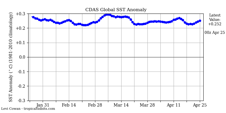
Remarkable since most of it is in the SH.
The basis for understanding weather is that the Earth’s troposphere is very thin, although it protects the surface from extreme temperature spikes. In winter, the height of the troposphere at mid-latitudes can drop to about 6 km, so the stratospheric vortex can interfere with winter circulation.


It was also the warmest 101 months in the UAH record, meaning that long-term temperatures have continued to rise over the duration of the New Pause.
The full warming in UAH TLT up to Aug 2014, the month before the onset of the pause, was +0.39C. After 101 months of ‘pause’, it now stands at +0.59C. An increase of +0.20C during the New Pause.
This is also reflected in the warming rates. Up to Aug 2014 the full warming rate in UAH was +0.11C/dec. It now stands at +0.13C/dec. Funny old ‘pause’.
And because of this we all need to be forced into driving battery cars?
Get real.
You as usual completely missed the point of the article how did you miss the obvious so well?
You forgot to mention that CERES has already explained the warming since 2014. It was caused by solar energy. In fact, the warming was reduced by increases in OLR which was supposed to be going down in your imaginary world.
Richard M said: “You forgot to mention that CERES has already explained the warming since 2014. It was caused by solar energy.”
I think you are referring to Loeb et al 2021 which says:
Note that nearly all of the ASR increase comes from clouds and albedo (figure 2) which the authors say is a response to the warming. In other words, they are confirming the positive feedback effect that has been hypothesized since the late 1800’s.
Loeb also said that it is undeniable that anthropogenic effects are contributing to the EEI and that the Raghuraman et al 2021 study which concluded there is less than 1% chance the EEI is the result of natural internal variability was consistent with his own research.
BTW…I’m not sure Loeb is somewhere the WUWT audience is going to resonate with. Most on here would consider him an alarmist since he has said before that everything you see in the news like fires and droughts are going to get worse if the Earth keeps retaining more and more energy.
You quote an author who spews that kind of nonsensical word salad? When I read the paper I pretty much assumed it was written for morons. No else would do anything but laugh at a paper that use “guesses” as part of their analysis.
Since the clouds have now returned you probably believe that was also “a response to warming”.
No, I was referring to Dubal/Vahrenholt 2021. And the point is that the warming had nothing to do with CO2 despite the idiotic claims from Loeb.
Thank you for your update!
Instead of all the nicky pigging about statistical methods, it would be much appreciated if both Nick and Willis could provide us insight in the “ever increasing?” correlation between the actual Keeling curve and the UAH dataset.
Kind regards
SteenR
In reply to Steenr, correlation does not necessarily imply causation, though absence of correlation generally implies absence of causation. In reality, the divergence between the rate of warming originally predicted and still predicted by IPCC and the observed rate of warming continues to widen.
The pauses tell us that climate sensitivity is on the low end. They show us that there aren’t substantial positive feedbacks.
Aaron is correct. At the temperature equilibrium in 1990 (there was no global warming trend for 80 years thereafter), the absolute feedback strength was 0.22 W/m^2/K. On the basis of the current 0.13 K/decade observed warming trend, the absolute feedback strength remains at 0.22 W/m^2/K. There has been little or no change in the feedback regime since 1850.
Of course, even a very small increase in feedback strength – say, to 0.24 W/m^2/K – would be enough to yield IPCC’s midrange 3 K ECS, or 3 K 21st-century warming (the forcings for these two being about the same). But at current warming rates of little more than 1.3 K/century, there is nothing for anyone to worry about.
Ahh, it’s the Pause that refreshes. But as we all know, the Climate Cacklers, Cluckers, and Caterwaulers have moved on to “Extreme Weather” now because evidently, in addition to CO2’s other powers, it has the remarkable ability to directly affect the weather, and of course, in negative ways.
The Trendology Clown Car Circus cannot abide anything that casts a bad light on CAGW.
Mount Washington (New Hampshire) has reported one of the lowest wind chill temperature ever seen in the United States. A wind chill temperature dropped to -77 °C / -106 °F.
 ?_nc_cat=109&ccb=1-7&_nc_sid=730e14&_nc_ohc=KlJF63sPLHQAX8DKaLb&tn=7LQrPxQelJSA5gda&_nc_ht=scontent-frx5-1.xx&oh=00_AfAzlZUCnitB227v6x67tjU0hDl4GXF99vPs97d34LqGhw&oe=63E44857
Mount Washington (New Hampshire) has reported one of the lowest wind chill temperature ever seen in the United States. A wind chill temperature dropped to -77 °C / -106 °F.
https://www.ventusky.com/?p=44.5;-71.0;5&l=feel&t=20230203/23
CMoB said: “The sheer frequency and length of these Pauses provide a graphic demonstration, readily understandable to all, that It’s Not Worse Than We Thought”
I download the CMIP model prediction data from the KNMI Explorer just now. According to models we should expect to be in a pause lasting 101 months about 18% of the time so the pause we are experiencing now is neither unexpected or nor noteworthy. Interestingly, using a multi-dataset composite (so as not to prefer one over the other) of RATPAC, UAH, RSS, BEST, GISTEMP, NOAAGlobalTemp, HadCRUT, and ERA we see that we have only been a pause lasting that long 15% of the time. So maybe it is worse than we thought. I don’t know.
Exactly how do you extract “pauses” from the CHIMPS spaghetti messes?
More importantly, why do you ascribe any meaning to them?
https://twitter.com/i/status/1614991656583041024
During La Niña, the gobal temperature drops, rather than being constant.
bdgwx February 4, 2023 2:01 pm
Suppose we have two different-sized containers filled with liquid. One liquid has a density of 0.92 kg/l. The other has a density of 1.08 kg/l.
We take them and pour them into a single container. What is the density of the combined liquids?
w.
It is indeterminant given the information. We cannot even always use 1/[(Xa/Da) + (Xb/Db)] because of the microphysical geometry of the substances. Think mixing a vessel of water with a vessel of marbles.
Examples that are deterministic are the Stefan-Boltzmann Law, hypsometric equation, virtual temperature equation, equivalent potential temperature equation, convective available potential energy equation, quasi-geostrophic height tendency equation. the various heat transfer questions, heating/cooling degree day calculations, etc. Obviously statistical metrics like a mean, variance, standard deviation, linear regression, auto regression, durability tests, uncertainty analysis, etc. are examples too.
So you agree that my example shows that it is not valid to perform arithmetic operations on intensive properties?
w.
Absolutely not. Your example only shows that it is invalid in THAT scenario and nothing more.
Do you think the scenarios I listed are invalid?
And BTW…I’m gobsmacked right now because you of all people should know that not only is it possible to perform arithmetic on intensive properties like temperature but it can provide useful, meaningful, and actionable metrics. The SB Law? The analysis you do with CERES data and W/m2 values? The statistics you posted in this very article?
bdg, yes, in certain circumstances you can do arithmetical operations on temperature.
The difference between intensive and extensive variables is that extensive variables vary based on the extent of what is being measured.
Mass, for example, is extensive. If you have twice the volume of a given substance, for example, it will have twice the mass. But temperature is intensive—if you have twice the volume of a given substance, it does not have twice the temperature.
Now, if the extents do not change, then they cancel out of both sides of the equation. This allows us to say, for example, that if we have a liter of a liquid with a density of 0.92 kg/liter and a liter of a liquid with a density of 1.08 kg/liter, when we mix them together we get two liters of a liquid with a density of 1 kg/liter.
The same is true regarding the variation in time of an intensive variable of a given object. Because the extent of the object doesn’t change, it cancels out in the equation and the arithmetic can be performed. So if we measure the temperature of a block of steel over time, we can do the usual arithmetic operations on the time series.
HOWEVER, and it’s a big however, in general my example is true—absent those special situations, you can’t do arithmetic operations on intensive variables.
Best regards,
w.
Strictly speaking, in your example, you won’t necessarily end up with exactly 2 liters.
That is correct. But that was the whole point. Think 1 liter of water mixed with 1 liter of marbles.
I’ll remind you that arithmetic on extensive properties can be abused as well. That doesn’t mean you can’t use arithmetic on extensive properties. Similarly, just because arithmetic on intensive properties can be abused doesn’t mean you can’t use arithmetic on intensive properties.
What I find most disturbing about this is that those who have advocated for the position that arithmetic cannot be performed on intensive properties have performed arithmetic on intensive properties themselves. And when I call them out on it I get a mix of silence, ad-hominems, bizarre rationalizations, incredulity, and/or the mentality “it’s okay for me and my buddies to do it, but no one else is allowed to.”
You miss the point as usual.
First, there is a large difference between using temperature at a single location to determine an average temperature for that location and using geographically separated temperatures to determine average temperatures. Lots of uncertainty when you do that. Station humidities, station environment, station calibration, etc.
Secondly, to use temps as a proxy for heat, one must assume equal humidities, exactly the same station environments, similarly maintained screens, exactly calibrated thermometers, etc.
Averaging disparate stations can only increase uncertainty, it can’t reduce it. It is like control limits in quality assurance. Each separate piece of a product will have a variance from the expected value. One has to take into account individual variances in order to determine the control limits and confidence intervals.
They will refuse to acknowledge that the GAT is not climate until the Moon escapes orbit.
If temperature is an intensive property then the GAT should be the temperature *everywhere*. In essence the GAT is a statistical descriptor which doesn’t describe any reality.
It’ like the average of a 6′ board and an 8′ board being 7′. Where do you go to measure that “average” 7′ board? Does it describe *any* physical reality? Does it help you build a 7′ tall stud wall?
The point they refuse to acknowledge, there is no 7′ board—so bellcurvewhinerman has been reduced to whining about “lumps of wood”.
If the GAT increases/decreases by 0.1 K in a single month, is there a single person on Earth who can notice?
TG said: “If temperature is an intensive property then the GAT should be the temperature *everywhere*.”
I’ll add that to my absurd argument list. I’ll word it as…The average of an intensive property means that it (the average) should be the same value everywhere.
And just so we’re clear I unequivocally think that is an absurd argument. Note that the average of a sample given by Σ[X_i, 1, N] / N does not imply homogeneity or Σ[(X_i – X_avg)^2, 1, N] / (N – 1) = 0.
You forgot to haul out your “contrarian” epithet.
HTH
I assume you agree that temperature is an intensive property, right?
If I average 100F in Phoenix and 100F in Miami and get 100F, then where does that average apply?
Intensive properties are not mass or volume dependent, If you take a 1lb block of steel at 10C and cut it in half, each half will measure 10C.
So if I get an average of 100F above shouldn’t that imply that everywhere between Phoenix and Miami should be 100F? As an intensive property I should be able to cut up the atmosphere between Phoenix and Miami into smaller chunks and find 100F in each chunk.
You keep trying to justify that you can average temperatures just like they are extensive properties.
Do math with intensive properties is perfectly legitimate, e.g. using (t0 – t1), e.g. q = m * C * ΔT.
Saying the average temp of bucket1 of water (10C) and bucket2 of water (6C) is 8C is *not* legitimate. First, you don’t know the amount of water in each (think humidity and temp) so you can’t even accurately determine an average temp if you mixed them. Second, if you don’t mix them then where in between the two buckets can you measure the 6C? If that point doesn’t exist then does it carry any meaning at all?
You certainly don’t get *silence* when you assert things. And you only get ad hominems when you continually assert things that you ‘ve be shown are incorrect. You always cast physical science as “bizarre” when it contradicts what you think are statistical truths that don’t describe reality.
Stop whining.
Not “indeterminant” – indeterminate.
Maybe it is better to say indeterminable?
Jim Gorman February 5, 2023 8:48 am
I truly don’t understand people’s objections to the use of anomalies. An “anomaly” is just the same measurement made with a different baseline.
For example, consider the anomaly measurement that we call the “Celsius temperature”. Celsius temperature is nothing more than an anomaly measurement of Kelvin temperature, with a new baseline set at 0°Celsius = 273.15 Kelvins.
On what planet is this a problem?
w.
The issue is that the baseline, however it is determined via averaging, has its own measurement uncertainty. Subtracting the baseline does not decrease the uncertainty of the original data, it increases it.
What is the uncertainty of the baseline of the Celsius anomaly?
I suggest you’re not talking about an anomaly. I think you might be referring to removing seasonal variations, which is a very different question.
Regards,
w.
Apparently the offset changed by 0.01K in 2019.
According to Wikipedia (so it must be correct)
The uncertainty is determined by “defined as exactly” – there is no uncertainty by definition.
The 273.15K (or 0.16) is an exact value, established by international agreement, it has zero uncertainty. Not unlike how the speed of light now has zero uncertainty, it is exact because of how the meter and second are defined.
The UAH baseline is seasonal because it is composed twelve individual baseline averages, one for each month of the year.
They are an average of 30 years of MSU temperature measurements (in K), and each monthly value clearly has a non-zero uncertainty.
As I said, you’re conflating an anomaly with removing seasonal variations. When you remove seasonal variations you undeniably have uncertainty.
w.
I don’t think I understand the point you are making.
An anomaly is a measurement minus a baseline value. Removing a seasonal variation also requires a subtraction, does it not? Either way, the subtracted value has its own uncertainty that must be treated separately from the measured value.
(The entire UAH processing sequence is much more complex than just one simple subtraction.)
Showing anomalies with accuracy out to the hundredths digit when the underlying components have uncertainties in the tenths digit is just committing measurement fraud.
See the attached graph. It shows most of the anomalies from the models and the satellite records. Most of the values are in the range of 0C to <1C. If the uncertainty of the baseline is +/- 0.5C (which would be the average uncertainty of the baseline components) and the uncertainty of the measurements is +/- 0.3C (probably larger than this) then those uncertainties add for the anomaly. That means that most of the graph should be blacked out since we really don’t know what the actual values are that should be graphed!
It is graphs like this that show the usual narrative from the climate alarm advocates actually is “all uncertainties cancel when doing averages”. “Average values are 100% accurate!”.”
The issue isn’t the use of anomalies. The issue is ignoring what goes along with the use of an anomaly, If there is uncertainty in the baseline value (and there is) and if there is uncertainty in the absolute value being used in the subtraction used to form the anomaly (and there is) then those uncertainties ADD even though you are doing a subtraction.
Anomalies always have higher uncertainties than the components of the anomaly calculation.
It has nothing to do with seasonality (other than the variance of winter temps is higher than that of summer temps implying a greater uncertainty for winter temp data sets).
Averaging doesn’t decrease uncertainty. If adding temperatures into the data set causes the range of values to go up (which means the variance goes up) then the uncertainty of the average goes up as well. Finding an “average uncertainty” only works to spread the total uncertainty evenly across all of the data components, it doesn’t really decrease the uncertainty of the average at all. At the very best, the uncertainty of the average will be that of the data set component that has the highest uncertainty.
That means that the baseline used to calculate an anomaly carries with it the uncertainty of the underlying data components. That uncertainty of the baseline adds to the uncertainty of the anomaly, it doesn’t decrease it.
Monthly anomaly baselines may be useful in removing seasonality effects but they do *NOT* make the results any less uncertain. Anomalies simply don’t give you hundredths digit accuracy if the underlying components of the anomalies have tenths digit uncertainty.
The most absurd aspect of this “climate change” hysteria is the notion that carbon dioxide is a “greenhouse gas” that somehow threatens life on earth. It’s difficult to imagine a greater scientific absurdity. Consider the following:
So, as a professional in time series data analysis who is preparing to give a short course on deterministic and probabilistic models which are intended to characterize and then predict the performance of natural systems I can confidently say something that most of you may already know: it is very important to assess where you start the trend analysis of the data set. As you can see from 1980 to now you would draw an upward trend, from 2015 to now you have a flat or from my point of view somewhat decreasing trend from 2020 on to today. What does that all mean is the real question and to answer that you need a comprehensive understanding of the climate system. Going off on tangents and arguments about the linear regression will get us nowhere. We need valid and verifiable climate models and from my point of view what we have now are nothing more than analytical fantasy.
Excellent. Trends of temperature do nothing but confuse what is going on in the climate. You can not recognize any of the multitude of factors that make up climate.
Climate science has failed much like Chicken Little failed. Temps are rising, temps are rising, we are going to die. The sky is falling, the sky is falling, we are going to die!
We have had over 50 years for science to push for more and better instrumentation of the necessary factors to measure energy, precipitation, various clouds, etc. at different points on the globe. Yet, here we are arguing about the same old thing, temperature! We can’t even get accurate emission measurements of various products.
Willis has given attention to analyzing various parts of the Earth’s climate but when have you seen a paper that tries to gather them under an overarching hypothesis?
It is like everyone is frightened to dig deep for fear of being ran out of town for being a sceptic.
Note that “the full UAH monthly-anomalies dataset since it began in December 1978” reflects global warming only since 1978. Before that year the mean global temperature trend had been downward, which is why several climate alarmists during the 1970s published reports and articles warning about global cooling and a new Ice Age that might be about to start.
dikranmarsupial says at ATTP
February 4, 2023 at 4:53 pm
” Monckton has an algorithm for cherry picking the start point, but it is still cherry picking. His algorithm is selecting the start point that maximises the strength of his argument (at least for a lay audience that doesn’t understand the pitfalls).”
–
DM this is not correct.
ATTP and Willis have used algorithms for most but one of their pauses but Monckton never has.
–
The algorithms incorporating trends are specific to the charts and data used.
One can cherry pick the length of which one of the steps one wants to use,
but, importantly one cannot rig a flat trend.
–
Because Monckton uses a pause, a new pause, this can only go to the end point of the current date and changes from the new date.
Thus he has never selected start point that maximizes the strength of his argument.
The fact that the pause can lengthen or shorten means he has never cherry picked a starting point.
–
Willis, unlike ATTP shows part of a truly long pause from 1997 to 2012.
ATTP breaks it down to two different pauses by incorporating different start and end dates.
Interesting.
I see Monkton has run out of arguments after being shown to be a liar with everything else he’s got to offer.
So this is his 11th hour plea then.
Another cast member of the Trendology Clown Car Circus appears – /yawn/
I couldn’t find anything resembling your claim or data so I went to the source and found this:
https://www.climate.gov/news-features/understanding-climate/climate-change-global-temperature
Earth’s temperature has risen by an average of 0.14° Fahrenheit (0.08° Celsius) per decade since 1880, or about 2° F in total.
The rate of warming since 1981 is more than twice as fast: 0.32° F (0.18° C) per decade.
2022 was the sixth-warmest year on record based on NOAA’s temperature data.
The 2022 surface temperature was 1.55 °F (0.86 °Celsius) warmer than the 20th-century average of 57.0 °F (13.9 °C) and 1.90 ˚F (1.06 ˚C) warmer than the pre-industrial period (1880-1900).
The 10 warmest years in the historical record have all occurred since 2010
If you can send me the actual source of your claim I’d be happy to post that along side the above Actual words from NOAA at climate.gov