Are they driven primarily by global climate change?
by E. Calvin Beisner
Want to know whether this summer’s heat waves in the United States are extraordinary—nay, even unprecedented—due to manmade global warming?
Where should you go for solid, objective data?
Obviously, to the authoritative source, the Environmental Protection Agency. So you go to its page titled “Climate Change Indicators: Heat Waves.” Immediately when the page opens up, this is what you see:

There you have it: decade by decade, everything goes up. Frequency? Tripled over the six decades. Length of heat-wave season? Also tripled. Average length of individual heat wave? Up by about a third. Average heat-wave intensity? Up by about a fourth.
Case closed. U.S. heat waves are a clear indicator of “climate change,” and what they indicate is that things are getting worse—much worse.
More than First Meets the Eye
Many visitors, perhaps most, won’t read the text on the page—that graphic by itself tells the whole story, everything they need to know. And few will notice that it’s labeled “Figure 1.” They’ll just look at the pictures, the first pictures to appear before them, and conclude, “I don’t need to see anything more.” Because that’s what our image-driven society has been trained to do. Never mind “In the beginning was the Word.” Nope, images are all we need.
But some will read the discussion below the image. Not the mere caption, but the “Key Points.” Here’s what they’ll learn from the first five:
- “Heat waves are occurring more often than they used to ….”
- “In recent years, the average heat wave … has been about … a day longer than the average heat wave in the 1960s.”
- “The average heat wave season … is 47 days longer ….”
- “Heat waves have become more intense over time.”
- “Heat wave duration has increased significantly ….”
Because America’s educational system has so failed to teach true critical thinking—not just getting offended by something but digging into the underlying evidence and reasoning—that’s about all that will really come across.
I confess that when I first read through this page, that’s about all I really retained.
But then I slowed down and read more carefully and noticed some significant qualifiers, point by point:
- “Heat waves are occurring more often than they used to in major cities ….”
- “In recent years, the average heat wave in major U.S. urban areas ….”
- “The average heat wave season across the 50 cities ….”
- “During the 1960s, the average heat wave across the 50 cities ….”
- “Of the 50 metropolitan areas in this indicator, 46 experienced a statistically significant increase in heat wave frequency between the 1960s and 2010s. Heat wave duration has increased significantly in 26 of these locations, the length of the heat wave season in 44, and intensity in 16 ….”
Huh. The labels in the graphs didn’t say anything about “major cities,” “urban areas,” “metropolitan areas.” They appeared to depict what happened for the whole United States. What gives?
And then I came to point 6, which partially but only by implication, not explicitly, revealed the deception:
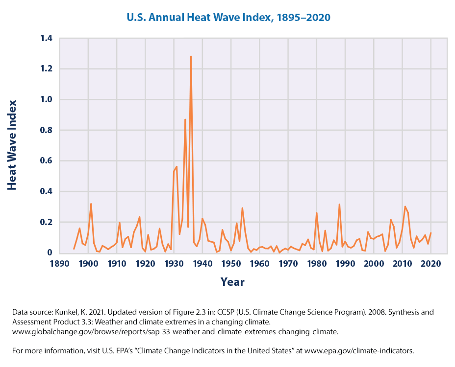
- Longer-term records show that heat waves in the 1930s remain the most severe in recorded U.S. history (see Figure 3). The spike in Figure 3 [Figure 3? What’s that?] reflects extreme, persistent heat waves in the Great Plains region during a period known as the “Dust Bowl.” Poor land use practices and many years of intense drought contributed to these heat waves by depleting soil moisture and reducing the moderating effects of evaporation.
The Great Rural-to-Urban Migration
Question: How many of America’s “major urban areas” were, in the 1930s, in the “Great Plains region”? I haven’t been able to answer that question for the top 50, but I have for the top 10, enough from which to draw some strong lessons. Of them, none were in the Great Plains region. By the way, only one, Baltimore.—in the northernmost of “Southern” states—was in the “Southern region,” none was in the Desert Southwest region, and only one in the entire Southwest. But the South and Southwest are the hottest regions of the country.
What about the 1960s? Only 1 of our 10 largest cities was in the “Great Plains region,” in its southernmost state, and 1 was in the Southwest, specifically, southern California. The rest, not.
How about the 2010s? Because the Great Plains region includes Texas, 3 of our top 10 cities were in that region. One was in the Desert Southwest, but 3 were in southern California—which, apart from irrigation, is also desert, and it’s definitely in the southwest, so it ought to be included in the “Desert Southwest.” So 7 of our 10 largest cities were in the southern Great Plains region, the Desert Southwest, or the desert of southern California.
So by the 2010s, clearly, the average location of our 10 largest cities had shifted heavily from the Northeast to the south and southwest. Might that have anything to do with average temperature readings in our major urban areas?
Ponder this for a minute: in the 1930s, almost no home, office, or factory had air conditioning; by the 2010s, almost every home, office, and factory did—at least outside of our northernmost, coolest states. Might that have contributed to the shift in population?
So, how much of the apparent increase in heat-wave frequency, heat-wave duration, length of heat-wave season, and heat-wave intensity from the 1960s could be attributed to where our most populous cities were? I can’t give you a specific quantity, but I guarantee it’s not zero.
Urban Heat Island Effect
But the location of these cities isn’t the only relevant factor. The very fact that they’re cities matters—as does their size. That’s because of the “urban heat island effect” (UHI).
According to the EPA, this “results in daytime temperatures in urban areas about 1–7°F higher than temperatures in outlying areas and nighttime temperatures about 2–5°F higher.” Further, “Humid regions (primarily in the eastern United States) and cities with larger and denser populations experience the greatest temperature differences.”
In the 1930s and 1960s, only 5 of our top 10 cities had populations over 1 million; in the 2010s, 9 did. In those first two decades, average population of our top 10 cities was 1.90 and 2.18 and million respectively; in the 2010s, 2.45 million. Average size in the 2010s was 13% higher than in the 1960s and 29% higher than in the 1930s. Take New York, with more than double the population of the second largest city in each decade, out of the picture to eliminate its skew, and the averages are 1.35, 1.55, and 1.81 million respectively, and the average size in the 2010s was 17% higher than the 1960s and 35% higher than the 1930s.
In short, our cities have grown in population. No surprise about that. In 1930, 56% of Americans lived in urban areas; in 1960, 70%; in 2010, 81%. But granted what EPA says about UHI, that it can result in temperatures 1–7°F higher than outlying areas, it is simply stunning that it relies on heat-wave data for urban areas for its first five “key points.”
If you’re really curious about how the UHI works and just how much it can affect a city’s temperature, read John Christy’s Is It Getting Hotter in Fresno … or Not? Christy demonstrates, through intricate data analysis comparing temperature readings inside, near, and remote from Fresno over more than a century, that the vast majority, perhaps all, of the upward trend in temperature in Fresno was driven by UHI, while the surrounding non-urban region experienced little or no warming. And Fresno is a relatively small city; larger cities experience even greater UHI effect.
So, as America’s most populous cities have (a) grown in population and (b) shifted in location to hotter and more humid areas, we should expect them to have experienced more frequent, intense, and long-lasting heat waves and longer heat-wave seasons—utterly independent of any global-scale warming.
All of this should make us highly suspicious that the EPA’s Figure 1 on its page “Climate Change Indicators: Heat Waves,” shown above, could be grossly misleading.
What Was America’s Hottest Decade?
One more consideration drives the nail in Figure 1’s coffin. Recall the start of EPA’s sixth “Key Point”: “Longer-term records show that heat waves in the 1930s remain the most severe in recorded U.S. history (see Figure 3).” Well, there’s a small, faint image on the page that links to Figure 3, but most readers will likely miss it (as I did at first) or ignore it. If they click on it, though, this is what they’ll see:

So, the EPA had the data shown here in Figure 3. Why then did it truncate the data in Figure 1, starting with the 1960s instead of the 1890s or 1900s? The answer veritably shouts at us: Because the 1960s heat-wave index was the lowest of the entire 125-year period, and while the index rose in fits and starts afterward, it never came close to what it was in the 1930s.
There are two terms for the EPA’s tactic: cherry-picking data (to include only those consistent with your theory) and its more precise subset, end-point fallacy (starting or ending your data at dates that exclude data that would conflict with your theory). Both are scientific no-noes.
Now, back to our opening question: Are this summer’s heat waves in the United States extraordinary—nay, even unprecedented—due to manmade global warming? And one other question: Can we trust the EPA’s communications about global warming/climate change to be transparent and objective?
What do you think?
E. Calvin Beisner, Ph.D., is President of the Cornwall Alliance for the Stewardship of Creation.
What if you compared the 1930’s heat waves to the USCRN? Then what has happened? Obviously the USCRN did not exist in the 1930’s. But the cities of today and the amount of pavement keeps increasing. I went back to Indiana, and the gravel roads I remembered fifty years ago are asphalt today.
Observing the global climate is not the EPA’s job. Are there no sites in the US that could not stand a cleanup? What a bunch of creeps.
Compared to last century? Yes, extraordinary.
For this century? Increasingly not.
See also exceptional rain events and flooding…
”Compared to last century? Yes, extraordinary.”
No. And not for the one before that either.
Towns and Cities are bigger than last century, how extraordinary!
Indeed, the Grifter doesn’t like historic meteorological facts.
1868 is like garlic to a vampire.
The Times (UK) in July 1868. “The incessant heat, the breathless air, and more than all, the extreme exhaustion attending every labour has proved beyond question that it is possible to have tropical weather even in our misty climate.”
No he does not ….Griff is a memory holer . I can just picture him in blue overalls incinerating newspaper clippings and conjuring up Comrade Ogilvy’s in the Ministry of Truth …….Hey Griff – ” Choco rations up “! ……………Here is another series of archival and paleo-climatic facts pertaining to the searing heat and drought of 1540 far worse than 1808 , 1911 1976 2003 and three hot England days in July 2022 courtesy of Swiss historian Christian Pfister : ” For eleven months there was practically no rain , temperatures were 5-7C above the normal values for the 20th century , in many places summer temperatures would have exceeded 40C [ 104F ] …..forests in Europe went up in flames ,choking smoke darkened the sun ….Water was already scarce in May , wells and springs dried up , mills stood still , people starved ,animals were slaughtered. Estimates are that in 1540 half a million people died ………….Everthing began in northern Italy with a winter that felt like a July …..July brought such ember like heat that churches made prayers while the Rhine Elbe and Seine could be crossed on a dry foot …Where there was still water the warm broth acquired a green color …..Water levels in Lake Constance sunk to record levels . Lindau actually became connected to the mainland .Soon the surface water had completely evaporated ,soils broke up , some dry crack were so wide that a foot could fill into them ……..In Alsace fruit trees bloomed twice , in Lindau it was actually enough for a second cherry harvest ” …………..So entertain us Griff : were any rivers in the United Kingdom and Europe passable on foot this year ? …Any secondary stone fruit harvests ? ….. All that happened in July this year over England was a brief spell of hot Saharan air wafting over the English channel – a stretch of water so narrow it did not cool the hot air currents ….. Spain , Sicily and Naples closer to the Sahara have sweltered under these hot summer sirocco breezes for centuries .
Maybe griff can tell us how 7 out of the top 11 highest temperatures recorded in the UK during the heatwave just happened to be at airports/aerodromes? Obviously these are places where meteorological stations are going to be sited, but 7 out of 11 is statistically significant compared to the overall number of weather stations in the UK. In simple terms this means their results are must be down to something different.
Well, griff, what might it be that differentiates airports and aerodromes from other weather stations? It’s unbelievable that the Met Office and BBC can talk about such records while completely ignoring what is very clearly happening here. Propaganda and fraud come to mind, not honesty or transparency.
And yet that wasn’t the case when the previous record was set, yet all those weather stations were in the same locations. As demonstrated by Nick if the temperatures recorded at the airport sites are reduced by 0.1º then their distribution within the record list becomes more uniform. So maybe siting at an airport makes a difference of 0.1º, frankly when you’re talking about temperatures exceeding 40º that’s not really relevant. When you exceed the previous record at about 40 locations something very unusual has happened.
“When you exceed the previous record at about 40 locations something very unusual has happened.”
There’s nothing unusual about a high-pressure system warming things up.
The National Weather Service is likewise complicit. Few people realize that record temps are usually at the airport. Where I live some ten miles away from SLC International the temperature is about 5 degrees cooler, and it is still relatively urbanized here.
Great points, which I often make to friends who accuse me of confusing weather with climate change. Live in Regina Saskatchewan, this summer has been hot, like most summers, but we have not broken any records which were all set in the 1930s
Our wonderful Federal government has pulled the same trick with forest fire data by simply eliminating all data prior to 1983 because the pre-1983 data was not gathered by the modern methods as the post-1983 data. All forest fire data is and was gathered by the same “scientific” method – an eyeball or two, a pen and paper and a yardstick or mile-stick of some kind. When all data is considered, forest fires during the first half or so of the 20th century were manifold times greater than recent forest fires.
One wonders when crap like this will end.
Thank-you for the clarification. Our government is corrupt.
The US EPA needs to be abolished. It may have done some good in its first decade or two, but clearly it has done more harm than good since then.
Northern California has endured a week long heatwave. Today it is raining, and temps are in the low 80s F which is 20 degrees cooler than the heatwave produced just several days ago. CO2 be damned.
Another example of solving the “divergence” problem by “hiding the decline.”
The U.S. balloon data sets are reliable considering that the surface record is contaminated by urbanization effects, GHCN especially. Even the USHCN suffers from contamination (more suburban sites than rural). Higher positive trend in TMIN is evidence of urbanization effects. Just a small change in land use (forest to agriculture) is enough to disrupt decoupling of the nocturnal boundary layer.
The USCRN is a step in the correct direction. Balloon data and USCRN represent the best available observational evidence. Derived products from UAH have been carefully constructed and represent another reliable source for ground truth. Otherwise the surface record is highly questionable.
The legacy media asserted the the current drought in the Southwestern U.S. is the worst in 1200 years (see Journal of Nature Climate Change). I posted a link on Facebook for a NOAA site that contains a complete monthly archive of the Palmer Drought Severity Index, January 1900 – June 2022. Clearly in the U.S., 1934 and 1954 were the most extreme droughts.
https://www.ncei.noaa.gov/access/monitoring/historical-palmers/
The Monsoon Season is beginning to put a dent in the current “megadrought.” The alarmists will be disappointed. Go figure.
BTW, When I clicked on the link I posted on Facebook it came back with 404, page not found.
I downloaded the EPA 1895-2021 Heatwave index from their site. I then looked for the 30 year average index trends (you know, climate vs. weather). The results:
· Highest 30 year average period was 1925 – 1955 with an average index value of .200. There was a 138% increase in heatwave index over that period.
· The lowest 30 year average period was 1957 – 1987 with an average index value of .043. There was a 78% decline in heatwave index over that period.
· The last 30 year average index was .100. There was a 76% increase in the 30 year average index over the period.
These trends don’t align well with CO2 increases. Hmmmmm!
The next 30-year cycle (2017-2047) could be lower again. Solar cycle 24 was the weakest in 100 years and Cycle 25 looks weak too (the double dynamo theory, 180 degrees out-of-phase). Well done on the data analysis.