Guest Post by Willis Eschenbach [Painting above, “Uneasy Sea” by Gennady Vytor]
It is not the sea that sinks and shelves,
SOURCE
But ourselves
That rock and rise
With endless and uneasy motion,
Now touching the very skies.
For the last forty years or so we’ve been treated to endless scary claims that the rate of sea-level rise is increasing and coastal cities are all going to drown. I’ve shown that part of this hysteria is due to improper splicing of the four sequential satellite records of the sea level. Here are the four records, along with their respective trendlines.

Figure 1. Four satellite sea level records and their linear trends.
As you can see, the first two satellites (Topex and Jason-1) agree, as do the second two satellites (Jason-2 and Jason-3). However, the satellite pairs greatly disagree with each other.
In response to this disagreement between satellites, the “scientists” have just spliced the four records together, ignored the disagreement of the trends of the earlier and later satellites, and declared that the sea level rise is accelerating. Here’s that bit of scientific malfeasance.

Figure 2. The University of Colorado’s improper splicing of the satellite records, claiming acceleration of sea level rise. SOURCE
In the past, I looked at the question of sea level acceleration in a different way. I took the main three global sea level estimates (Jevrejeva, Church & White, and Ray & Douglas), and I looked at the 30-year trailing acceleration. By “trailing acceleration” I mean pick a point in time and look at the acceleration (or deceleration) over the previous 30 years. I repeated this procedure for each year of the record. Here’s that result.

Figure 3. Thirty year trailing acceleration, three global sea level estimates.
This shows something quite curious. Rather than either steadily accelerating or decelerating, the rate of sea-level rise has markedly sped up and slowed down a couple of times over the period of record.
Today I realized that there’s another way I could approach this. To explain it, first let me make a small diversion.
The underlying problem with determining the rate of sea level rise is that the tide gauge sea-level records are not corrected for the rising and falling of the land. Here are some examples:

Figure 4. Sample of longer (75-year plus) sea level records. Colors indicate that I don’t think science should be in boring black-and-white.
Hmmm … you can see the challenge. In some areas, like the region around the North Sea (e.g. first 4 records, left column), the land has been relieved of a huge burden of ice since the last glaciation. As a result, it is rebounding upwards faster than the sea level is rising. And that means that the relative sea level is falling. And along the east coast of the US, the reverse is happening—the land is sinking, so the relative sea-level rise is exaggerated. Finally, in a number of areas, removing either oil or water from underneath the land is causing subsidence. As a result … you can’t trust the tide gauges. All they can give you is the relative sea-level change, not the absolute change.
The second challenge is that most sea-level records are fairly short. Here’s a histogram of the records by length (total years of observations).

Figure 5. Histogram of lengths of all sea level records. Colors as in Figure 4.
My insight today was that I could first detrend all of the long sea-level records. Then I could calculate the 30-year trailing trends, and from those, I could calculate the 30-year trailing acceleration.
So that’s what I did. Out of a total of 1,544 extant tide-gauge records, only 135 of them have records of 75 years or longer. I took those, detrended them, and calculated the average 30-year trailing trends.

Figure 6. Average 30-year trailing trend, 135 detrended 75-year or longer sea level records.
As you can see, the trends have gone up and down, but there’s no apparent overall increase. The largest rate of rise was around 1915.
Finally, as a check on my calculations of the trailing trend, I used the LOWESS smooth to calculate the 30-year trailing acceleration and added it to Figure 3 above.

Figure 7. As in Figure 3, but including the acceleration calculated from the trends shown in Figure 6.
Given that I’m only using a small subset of less than 10% the 1,544 records, I’m quite happy with that result.
A few notes. First, all of those results show that there is no steady acceleration of the rate of sea-level rise that for years we’ve been sternly warned was coming soonest. The rise of the sea level has been quite uneven, accelerating in some decades and decelerating in other decades.
Next, given that we have only sparse information on the rate of vertical land rise or fall at the individual locations of the 1,544 tide stations, determining a global absolute (not relative to land) sea-level rise is somewhat of a guessing game. As evidence of this, here are the rates of sea-level rise from the three global records shown above, those of Jevrejeva, Church and White, and Ray and Douglas.

Figure 8. Average sea-level rise rates, 1900 – 1990. I have used the data only up to 1990 to avoid the scientists’ nasty habit of splicing the corrupt satellite record (see Figure 1) onto the end of the tide gauge records.
My conclusion? Comrade Obama’s two seaside estates, one in Hawaii and one in Martha’s Vineyard, as well as Bill Gates’ $43 megabuck seaside estate in San Diego seen below …

… are in no danger of being submerged, no matter how loudly they scream about the so-called “CLIMATE EMERGENCY”.
Protip: Regarding the climate, you can relax and enjoy life until the day somewhere in the misty future when the people aggressively lecturing you about your “carbon footprint” stop buying beachfront estates and flying private jets.
And for me, I’m going out now, back up the ladder to continue pressure-washing the walls. When will it be done? I can’t think of it that way, doesn’t work for me. Instead, every day when I finish up and stow the tools, I just tell myself “Another tile in the mosaic” and keep going … if I looked at the whole job I might just walk away, but this way I’m always walking toward the fire.
My very best to everyone,
w.
As Is My Custom: I ask that when you comment you quote the exact words you are referring to. This helps avoid many of the misunderstandings that plague the intarwebs.
Further Info: Given that the ocean looks like the painting at the head of the post, how can we measure sea level accurately? The answer is the “stilling well”, used for hundreds of years. It’s a vertical pipe with only a tiny hole at the bottom for the water to enter and leave. As the name suggests, it “stills” the vertical motions and gives us an accurate sea level at any instant. Heres NOAA on the subject.

The question not asked is what holds the oceans up? How do we know this force is constant? Without fluctuation?
Because without the heat of the earths core the oceans would have long ago drained deep into the earth.
And today the oceans extend far below the ocean basins, under the continents as well, until they reach the boiling point of water at pressure.
And it is this layer of superheated steam that balances the force of gravity on the water column above, that prevents the oceans from sinking deeper.
Without data for that layer we are really only guessing what is going on at the surface.
Pellucidar!
Hi Willis,
The overlap period between Jason 1 and Jason 2 (about 5 years of data) might show if the two are really generating different slopes. I mean, if the best estimates of slope for the two satellites are statistically different (with non-overlapping uncertainties), that would be strong evidence that the change in satellite at least partially explains the apparent ‘acceleration’.
Thanks, Steve. Figure 1 shows the ~ 5-year overlap you ask about … and the legend lists the trends of each satellite and their associated uncertainties.
w.
Hi Willis,
I guess I wasn’t clear. I mean the trends for ONLY the 5 year overlap period. The two trends and uncertainties you list include all earlier years in the Jason 1 trend and all later years in the Jason 2 trend. To be sure there wasn’t a real change in trend that happened right around the time of the change in satellites, I think you have to compare the trends during the overlap period alone. If the two trends during only the overlap period differ significantly, then I think that is very strong evidence the change in satellites caused the change in trends, rather than acceleration in the sea level rise.
Hi Willis,
I split out the 5 year overlap period for Jason 1 and Jason 2, and calculated the slope and its uncertainty for each satellite during that period.
For Jason 1: Slope = 3.1127+/- 0.4088 mm/yr
(that is, +/- 2 standard error)
For Jason 2: Slope = 3.3567 +/- 0.3697 mm/yr
The slopes do differ by about 8%, but the uncertainties in the estimated slopes are far too large to say that the two satellites are really different from each other.
There were several gaps in the data where one satellite or the other was not recording data…. which is puzzling.
Hi Again Willis,
I messed up transcription of the Jason 2 numbers. Correct is:
Jason 2: Slope = 3.4427 +/- 0.3439
So the slopes differ by about 10%, but the uncertainties are still to high to draw any conclusions about whether the two satellites are actually different from each other.
Thanks, Steve. Here’s the problem. I simply cannot think of ANY conceivable mechanism whereby the rate of global sea-level rise, in five years or less, can go from around 2.5 mm/year to 4 mm/year. In addition, we have two different satellites agreeing on both sides of the purported change in trend. Where would the additional 5.5E+14 liters of water suddenly appear from?
And I didn’t look at just the overlap because I knew what I’d find, which is what you found—uncertainty far too large to conclude anything in that short a time span.
In closing, let me say I do admire a man who picks up the ball and runs the numbers himself … well done, that man.
w.
Hello Willis,
The difference between the two satellites during the overlap is larger than I thought, even though not statistically significant. While not statistically significant, the difference is not terribly far from significant. A change in satellite certainly could have been at least in part responsible for the perceived acceleration. But in spite of the relatively wide uncertainty, the slopes for both satellites during the overlap period do appear to be statistically different from the longer term trends for each individual satellite, which suggests to me that there is more going on than just a change in satellite.
It has been a while since I looked closely at what drives sea level away from its longer term trend in the short/medium term, but my recollection is that the biggest factor is variation in land storage of water, caused mostly by rainfall shifts, with land water storage increased somewhat during the la Nina phase.
I would not suggest that the underlying trend undergoes a big change in 5 years, but depending on the timing of ENSO, the true shape of the underlying long term trend may be obscured over a considerable time. If I remember correctly, ENSO has a ‘natural period’ which varies somewhat, but averages near 48 months. It may be informative to generate a 49 month centered rolling average of satellite sea level to average out some of the ENSO driven variation, or to use an ENSO index (probably lagged somewhat) as an independent predictor of sea level variation (eg a two factor linear regression: time and ENSO state against satellite sea level). The Akaike Information Criterion can be used to determine how much adding a second independent variable reduces the determinative power of the regression. Accounting for the influence of ENSO in the satellite data may clarify the longer term background trend in sea level.
I’ll take a look at those in the next day or two.
The late Tom Wysmuller had frequently spoke about the message told from tectonically stable tide gage stations, such as that at Slipshaven, Denmark: The harbor of Nyborg, Denmark, is Slipshavn; it is located at a tectonically stable site with no rebound uplift or subsidence. Slipshavn’s relative sea level trend is 1.07 mm/year with a 95% confidence interval of +/- 0.14 mm/year based on monthly mean sea level data from 1896 to 2017 which is equivalent to a change of 0.35 feet in 100 years. So, in an area with no uplift and no subsidence, there is a methodical linear and relatively unchanging trend with no accelerating CO2 signal visible within that trend.
Tom’s unpublished conclusions in a paper he was preparing for the ICCC14:
1: Long-term Tide Gauges reporting sea level trends all over in the world show generally straight-line linear trends. 2: Local tectonics are the major factor underlying the upward or downward direction of reported shoreline sea level. 3: Satellite altimeter readings since 1993 show generally straight-line linear trends, but in an upward direction two and a half times greater than the upward trend observed in tide gauges located in tectonically inert zones.
Hi Willis,
Thanks for all you do. This is off-topic so please excuse this, but it is some thing I wanted to pass to you to see if you have come across any work on this or looked at or might want to look at yourself. It perhaps sits alongside your thoughts and work on ocean evaporation and cloud formation acting as a natural thermostat.
We know from satellite observation that increased CO2 levels have resulted in significant increases in global vegetation of ~15% – 20%. Measured from increased rates of arboreal growth.
That increase relies on solar energy being converted through photosynthesis into tree and plant tissue and so (presumably?) is removing that energy from atmosphere in and thus altering the global energy balance and thus (presumably?) altering temperature. What amount of energy might that remove from the system if the increase amounts to perhaps billions of tonnes of increased vegetation and what might be the resultant temperature change ?
I wonder if this suggests that increased CO2 levels create a further thermostatic effect to control / reduce temperatures through vegetative response removing energy from the atmosphere.
I wonder if others have any knowledge or thoughts on this?
Apologies if this seems naive …..
kindest regards
Old England
Thanks Willis
Always good analyses .
Confirmation of the result shown in the records here (mostly all records show periodic change in change):
https://tidesandcurrents.noaa.gov/sltrends/sltrends_station.shtml?plot=50yr&id=9414290
But what causes this periodic trend?
Willis have helped me before.
Periodicity is hard to understand.
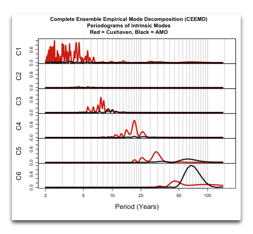
This is an analyse of periodicity in sea levels with Cuxhafen as example compared to AMO:
Prof. Cliff Mass jumps into the fray (again) with his hometown newspaper.
https://cliffmass.blogspot.com/2022/03/misinformation-about-sea-level-rise.html
Deaths from cold outweigh deaths from heat roughly 10:1, so doing anything to stop warming ( if it’s even possible) is criminal.
Follow the science: protect those around you, drive an suv, heat your house with gas as warm as you like, don’t vote for anyone talking woke.