By Andy May
In my last post I plotted the NASA CO2 and the HadCRUT5 records from 1850 to 2020 and compared them. This was in response to a plot posted on twitter by Robert Rohde implying they correlated well. The two records appear to correlate because the resulting R2 is 0.87. The least square’s function used made the global temperature anomaly a function of the logarithm to the base 2 of the CO2 concentration (or ‘log2CO2‘). This means the temperature change was assumed to be linear with the doubling of the CO2 concentration, a common assumption. The least squares (or ‘LS’) methodology assumes there is no error in the measurements of the CO2 concentration and all error resulting from the correlation (the residuals) resides in the HadCRUT5 global average surface temperature estimates.
In the comments to the previous post, it became clear that some readers understood the computed R2 (often called the coefficient of determination), from LS, was artificially inflated because both X (log2CO2) and Y (HadCRUT5) were autocorrelated and increased with time. But a few did not understand this vital point. As most investors, engineers, and geoscientists know, two time series that are both autocorrelated and increase with time will almost always have an inflated R2. This is one type of “spurious correlation.” In other words, the high R2 does not necessarily mean the variables are related to one another. Autocorrelation is a big deal in time series analysis and in climate science, but too frequently ignored. To judge any correlation between CO2 and HadCRUT5 we must look for autocorrelation effects. The most tool used is the Durbin-Watson statistic.
The Durbin-Watson statistic tests the null hypothesis that the residuals from a LS regression are not autocorrelated against the alternative that they are. The statistic is a number between 0 and 4, a value of 2 indicates non-autocorrelation and a value < 2 suggests positive autocorrelation and a value >2 suggests negative autocorrelation. Since the computation of R2 assumes that each observation is independent of the others, we hope that we get a value of 2, that way the R2 is valid. If the regression residuals are autocorrelated and not random—that is normally distributed about the mean—the R2 is invalid and too high. In the statistical program R, this is done—using a linear fit—with only one statement, as shown below:

This R program reads in the HadCRUT5 anomalies and the log2CO2 values from 1850-2020 plotted in Figure 1, then loads the R library that contains the durbinWatsonTest function and runs the function. I only supply the function with one argument, the output from the R linear regression function lm. In this case we ask lm to compute a linear fit of HadCRUT5, as a function of log2CO2. The Durbin-Watson (DW) function reads the lm output and computes the DW statistic of 0.8 from the residuals of the linear fit by comparing them to themselves with a lag of one year.
The DW statistic is significantly less than 2 suggesting positive autocorrelation. The p value is zero, which means the null hypothesis that the HadCRUT5-log2CO2 linear fit residuals are not autocorrelated is false. That is, they are likely autocorrelated. R makes it easy to do the calculation, but it is unsatisfying since we don’t get much understanding from running it or from the output. So, let’s do the same calculation with Excel and go through all the gory details.
The Gory Details
The basic data used is shown in Figure 1, it is the same as Figure 2 in the previous post.

Strictly speaking, autocorrelation refers to how a time series correlates with itself with a time lag. Visually we can see that both curves in Figure 1 are autocorrelated, like most times series. What this means is that a large part of each value is determined by its preceding value. Thus, the log2CO2 value in 1980 is very dependent upon the value in 1979, and this is also true of the 1980 and 1979 values of HadCRUT5. This a critical point since all LS fits assume that the observations used are independent and that the residuals between the observations and the predicted values are random and normally distributed. R2 is not valid if the observations are not independent, a lack of independence will be visible in the regression residuals. Below is a table of autocorrelation coefficients for the curves in Figure 1 for time lags of one to eight years.

The autocorrelation values in Table 1 are computed with the Excel formula found here. The autocorrelation coefficients shown, like conventional correlation coefficients, vary from -1 (negative correlation) to +1 (positive correlation). As you can see in the Table both HadCRUT5 and log2CO2 are strongly positively autocorrelated, that is they are monotonically increasing, as we can confirm with a glance at Figure 1. The autocorrelation decreases with increasing lag, which is normally the case. All that means is that this year’s average temperature is more closely related to last year’s temperature than the year before and so on.
Row number one of Table 1 tells us that about 76% of each HadCRUT5 temperature and over 90% of each NASA CO2 concentration are dependent upon the previous year’s value. Thus, in both cases, each yearly value is not independent.
While the numbers given above apply to the individual curves in Figure 1, autocorrelation can clearly affect the regression statistics when the temperature and CO2 curves are regressed against one another. This bivariate autocorrelation is usually examined using the Durbin-Watson statistic mentioned above, and named for James Durbin and Geoffrey Watson.
Linear fit
As I did in the R program above, traditionally the Durbin-Watson calculation is performed on a linear regression of the two variables of interest. Figure 2 is like Figure 1, but we have fit LS lines to both HadCRUT5 and Log2CO2.

In Figure 2, orange is log2CO2 and blue is HadCRUT5. The residuals are shown in Figure 3, notice they are not random and appear to autocorrelate as we would expect from the statistics given in Table 1. They are autocorrelated and have the same shape, which is worrying.

The next step in the DW process is to derive a LS fit to the residuals shown in Figure 3, this is done in Figure 4.

Just as we feared, the residuals correlate and have a positive slope. Doing the DW calculations in this fashion, we get a DW statistic of 0.84, close to the value computed in R, but not exactly the same. I suspect that this is because the multiple sum-of-squares computations over 170 years of data leads to the subtle difference of 0.04. We can confirm this by performing the R calculation using the Excel residuals:

This confirms that both calculations match, but there were differences in the sum-of-squares calculations due to the different computer floating-point precision used in Excel and R. So, with a linear fit to both HadCRUT5 and log2CO2, there are serious autocorrelation problems. But both are concave upwards patterns, what if we used an LS fit that is more appropriate that a line? The plots look like a second order polynomial, let’s try that.
Polynomial Fit
Figure 5 shows the same data as in Figure 1, but we have fit 2nd order polynomials to each of the curves. The CO2 and HadCRUT5 data curve upward, so this is a big improvement over the linear fits above.

I should mention that I did not use the equations on the plot for the calculations, I did a separate fit to decades. The decades were calculated using 1850 as zero and 1850 to 1860 as decimal decades and so on to 2020 so that the X variable in the calculation had smaller values in the sum of squares calculations. This is to get around the Excel computer floating-point precision problem already mentioned.
The next step in the process is to subtract the predicted or trend value for each year from the actual value to create residuals. This is done for both curves, the residuals are plotted in Figure 6.

Figure 6 shows us that the residuals of the polynomial fits to HadCRUT5 and log2CO2 still have structure and the structure visually correlates, not a good sign. This is the portion of the correlation left, after the 2nd order fit is removed. In Figure 7 I fit a linear trend to the residuals. The R2 is less than in Figure 4

There is still a signal in the data. It is positive, suggesting that if the autocorrelation were truly removed with the 2nd order fit (we cannot say that statistically, but “what if”), there is still a small positive change in temperature, as CO2 increases. Remember, autocorrelation doesn’t say there is no correlation, it just invalidates the correlation statistics. If temperature is mostly dependent upon the previous year’s temperature, and we can successfully remove that influence, what remains is the real dependency of temperature on CO2. Unfortunately, we can never be sure we removed the autocorrelation and can only speculate that Figure 7 may be the true dependency between temperature and CO2.
The Durbin-Watson statistic
Now the calculations to compute the Durbin-Watson joint autocorrelation are done, but this time we used a 2nd order polynomial regression. Below is a table showing the Durbin-Watson statistic between HadCRUT5 and log2CO2 for a lag of one year. The calculations were done using the procedure described here.

The Durbin-Watson value of 0.9, for a one-year lag, confirms what we saw visually in Figures 5 and 6. The residuals are still autocorrelated, even after removing the second order trend. The remaining correlation is positive, as we would expect, presumably meaning that CO2 has some small influence on temperature. We can confirm this calculation in R:

Discussion
The R2 that results from a LS fit of CO2 concentration and global average temperatures is artificially inflated because both CO2 and temperature are autocorrelated time series that increase with time. Thus, in this case, R2 is an inappropriate statistic. R2 assumes that each observation is independent and we find that 76% of each year’s average global temperature is determined by the previous year’s temperature, leaving little to be influenced by CO2. Further, 90% of each year’s CO2 measurement is determined by the previous year’s value.
I concluded that the best function for removing the autocorrelation was a 2nd order polynomial, but even when this trend is removed, the residuals are still autocorrelated and the null hypothesis that they were not had to be rejected. It is disappointing that Robert Rohde, a PhD, would send out a plot of a correlation of CO2 and global average temperature implying that the correlation between them was meaningful without further explanation (as we showed in Figure 1 of the previous post) but he did.
Jamal Munshi did a similar analysis to ours in a paper in 2018 (Munshi, 2018). He notes that the consensus idea that increasing emissions of CO2 cause warming, and that the warming is linear with the doubling of CO2 (Log base 2) is a testable hypothesis. This hypothesis has not tested well because the uncertainty in the estimate of the warming due to CO2 (climate sensitivity) has remained stubbornly large for over forty years, basically ±50%. This has caused the consensus to try and move away from climate sensitivity toward comparisons of warming to aggregate carbon dioxide emissions, thinking they can get a narrower and more valid correlation with warming. Munshi continues:
“This state of affairs in climate sensitivity research is likely the result of insufficient statistical rigor in the research methodologies applied. This work demonstrates spurious proportionalities in time series data that may yield climate sensitivities that have no interpretation. … [Munshi’s] results imply that the large number of climate sensitivities reported in the literature are likely to be mostly spurious. … Sufficient statistical discipline is likely to settle the … climate sensitivity issue one way or the other, either to determine its hitherto elusive value or to demonstrate that the assumed relationships do not exist in the data.”
(Munshi, 2018)
While we used CO2 concentration in this post, many in the “consensus” are now using total fossil fuel emissions in their work, thinking that it is a more statistically valid quantity to compare to temperature. It isn’t, the problems remain, and in some ways are worse, as explained by Munshi in a separate paper (Munshi, 2018b). I agree with Munshi that statistical rigor is sorely lacking in the climate community. The community all too often use statistics to obscure their lack of data and statistical significance, rather than to inform.
The R code and Excel spreadsheet used to perform all the calculations in this post can be downloaded here.
Key words: Durbin-Watson, R, autocorrelation, spurious correlation
Works Cited
Munshi, J. (2018). The Charney Sensitivity of Homicides to Atmospheric CO2: A Parody. SSRN. Retrieved from https://papers.ssrn.com/sol3/papers.cfm?abstract_id=3162520
Munshi, J. (2018b). From Equilibrium Climate Sensitivity to Carbon Climate Response. SSRN. Retrieved from https://papers.ssrn.com/sol3/papers.cfm?abstract_id=3142525
Andy here is a suggestion. Contact Jim Hamilton at UCSD. Jim is an expert in time series analysis. He is also a nice guy. I haven’t had contact with him since my PhD days at Virginia. His Time Series book is a classic. So much of data analysis in climate lacks rigor. I would really like to see what Jim would say about the monthly data from UAH, Hadcrut5, and CO2 from 79 forward.
I noticed decades ago that the early Global Warmmongers seemed to know no statistics. Alas, the people who joined the field later imported not higher statistical competence but lower standards of morality. In other words crooks were replacing duds.
The adjustments made to HadCrut and GISS have a shockingly high correlation to CO2. Would be fun to have someone put that through a rigorous statistical examination. No reason for those variables to correlate, but they do. Almost perfectly. That seems a forensic smoking gun of malfeasance.
Sorry Mary, I wrote my comment above before noticing your comment. I agree totally. David
I wouldn’t trust the source data sets. NOAA; NASA; HADCRUD; Berkley Earth etc. all are coordinated and aligned. They all include measurement sites that have been contaminated by progressive urbanisation warming the signal. All the datasets have also been processed by algorithms and statistical techniques to ensure a strong correlation. A number of peopled have looked at raw NOAA data measurements and excluded the sites that have had urbanisation related warming; analysis of the raw temperature readings also show a much more noisy signal with periods in the past much warmer than the graphs provided in this post (base on ‘homogenised’ and ‘standardised’ NOAA data would suggest). You will find that these agencies have taken the raw dataset and done curve fitting to the CO2 trend and done Gaussian denoising functions too… so your analysis of R2 on data that has already been adjusted to give an artificial fit doesn’t inform us very much of the underlying climate system or underlying Earth temperature record and its relationship to atmospheric CO2 concentrations.
See work by Tony Heller
https://realclimatescience.com/2021/03/noaa-temperature-adjustments-are-doing-exactly-what-theyre-supposed-to/
Tony Heller also goes through the topics of adjustments to the historical temperature records in quite some depth on this YouTube channel; and verifies the historical climate and weather of bygone eras with the historical newspaper records of events of many decades ago. He shows that the 1920s and 1930s were as warm if not warmer than today with more extreme weather (not indicated by these deceptive graphs from government agencies)
I also recommend you look at paper by Dr Willy Soon et al. who have also removed ‘dirty’ data from the surface dataset historical record and then look for correlations with solar activity or other variables and external forcings.
https://arxiv.org/abs/2105.12126
“See work by Tony Heller”
And then if you are at all sceptical of sceptics (sarc)
Go here, that explains why the man is, err, misguided (Including comments to that effect from our host Mr Watts, Bob Tisdale Steven Mosher and Nick Stokes)
http://rankexploits.com/musings/2014/how-not-to-calculate-temperature/
http://rankexploits.com/musings/2014/how-not-to-calculate-temperatures-part-2/
http://rankexploits.com/musings/2014/how-not-to-calculate-temperatures-part-3/
In short anomalies and spatial interpolation are required. You cant just average out the mean of all station’s absolute mean temps available x years ago and progressively forward to today and call that the trend.
You cant and it’s not.
Try being sceptical of sceptics …. especially ones that appeal to your conspiracy ideation.
There isn’t one.
Eg: From Nick Stokes …
“There is a very simple way to show that Goddard’s approach can produce bogus outcomes.”
“SG’s fundamental error is that he takes an average of a set of final readings, and subtracts the average of a different set of raw readings, and says that the difference is adjustment. But it likely isn’t. The final readings may have included more warm stations, or more readings in warmer months. And since seasonal and latitude differences are much greater than adjustments, they are likely to dominate. The result just reflects that the station/months are warmer (or cooler).
That was the reason for his 2014 spike. He subtracted an average raw of what were mostly wintrier readings than final. And so there is an easy way to demonstrate it, Just repeat the same arithmetic using not actual monthly readings, but raw station longterm averages for that month. You find you get much the same result, though there is no information about adjustments, or even weather.
I did that here. What SG adds, in effect, is a multiple of the difference of average of finals with interpolation from average of finals without, and says that shows the effect of adjustment. But you get the same if you do the same arithmetic with longterm averages. All it tells you is whether the interpolated station/months were for warmer seasons/locations.
The increase in vegetation appears to be the cause of the increase in CO2 level. Why does this correlation receive no attention
The problem with anomalies is that they are being misused.
The use of significant digits is totally ignored. The precision of the anomalies far exceeds the precision of the measurements. It is unscientific to portray measurements to higher precision than actually measured. The way they are being portrayed borders on fraud.
The variance of anomalies is not portrayed properly when graphing them against each other. It makes the growth factors look two orders of magnitude greater than temperature changes actually are. For example:
0.1 -> 0.3 [(0.3 – 0.1) / 0.1] • 100 = 200%.
15.1 -> 15.3 [(15.3 – 15.1) / 15.1] • 100 = 1.3%.
All of the variations that you describe such as seasons, latitudes, altitudes, and such are all factors that should be included in a global temperature. This is one reason you can not relate anomalies to any given temperature let alone any regional temperature.
To my way of thinking, you can take an average global real temperature and create anomalies annually if you so wish. This would allow just as accurate a determination of warming or cooling and it would let you easily relate it to a calculated temperature, although regional temps would still be unknowable.
Regional and local temps are the real issue anyway. A global temp fosters the belief that everywhere is warming the same. We know that is not the case. But, how many studies have we seen with the same old statement that global warming is affecting a local condition? You would think scientists would be smart enough to know that an AVERAGE automatically implies some above and some below. That should prompt them to avoid the generalization that their specific region is warming as least as much as the average.
On another thread someone said the variance associated with the GAT is 1.05 °C That makes the standard deviation ± 1.02. who believes in an anomaly of 0.15 ± 1.02 °C? If I was a machinist trying to peddle this I would be laughed out of the room!
Anthony,
I am most definitely in the extreme sceptics camp and do believe that data and findings are politically driven.
I am not convinced that the temperature anomalies in the surface temperature record can be trusted nor that they really tell us anything about local, regional or global temperature trends. I agree with arguments that some sites are prone to problems due to urban heat island effects; time of measurement changes; instrument changes; location of station changes (similar to changing the environment and urbanising around the station)… all impact the values recorded at a given site…. we see that rather than excluding sites with bad or dubious data (ie that have urbanised, moved or material changes in instrumentation used or method of recording temperature) these are used in weighted averages to drown out the few stations that can be trusted in the long-term contiguous record. Furthermore when calculating regional averages this homogenisation over broad areas creates further issues when northerly sites are decommissioned over time and biases towards southerly latitudes start to appear; and as the majority of the recording grid goes through significant change in terms of land use and urbanisation around the few square KM around a site or worse the site itself becomes completely compromised.
Living in South Eastern, England, UK – I can say that I have noticed a general decrease in periods of extreme cold (fewer blocking anticyclones dragging cold winter air from the continent) in the past two or three decades – but the 30 year standard for climate averages is far too short given the multidecadal nature of many natural phenomena governing decades long weather/climate. Further the broader increase in temperature in the Central England trace appears just to be a rebound from the little ice age. As for the slight reduction in overnight lows and extreme cold, that is surely to be celebrated… and brings about fewer cold deaths…
If you take the effort to look for some good sites in the raw NOAA data history of surface temperature recordings you will yourself see and recognise that all the warming is exaggerated and what warming there is could quite easily be natural in origins and is certainly not harmful.
Whilst Steven Goddard or Tony Heller aims his YouTube videos and blogs at a non-technical audience, I feel his work answers the broader questions around is warming happening, is it harmful, unusual or unnatural and unprecedented.
Warming — yes, but very slight, and in line with cyclical patterns going back through instrumental history as well as beyond into human recorded history (news about conditions) and paleoclimate history
Unusual or unprecedented – no extreme weather events had much more catastrophic impact on humans and nature in the past; the climate was warmer at many points in human history and much warmer in the periods when plants and animals evolved. The climate also warmed faster during previous warming events.
Write to your politicians as I do to tell them that this whole Green New Deal/Great Reset/Net Zero nonsense to ban fossil fuels is all about rent-seeking scoundrels and those that want to reshape the economic fortunes and geo-politics of the planet (to the detriment of most people, plants and animals that inhabit it).
Going back to Tony Heller data plots:
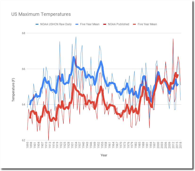
https://realclimatescience.com/understanding-noaa-us-temperature-fraud/
https://www.ncdc.noaa.gov/cag/national/time-series/110/tmax/12/12/1895-2019?base_prd=true&firstbaseyear=1901&lastbaseyear=2000
After all for the last couple of decades we have the U.S. Climate Reference Network (USCRN) – Quality Controlled Datasets which show little warming too
https://www.drought.gov/data-maps-tools/us-climate-reference-network-uscrn-quality-controlled-datasets
And if we are going to look at global variations in temperature we should perhaps look to satellite data, which also shows little warming of the troposphere:
https://www.drroyspencer.com/
I studied and worked as an atmospheric researcher and meteorologist in the 1990s; since the late 1990s I have worked on power-systems engineering; energy policy and market rules and regulation and so have a rather sceptical view of all of what the mainstream claim to be happening, what the politicians claim needs doing and what the rent-seekers and doing to our energy systems and economy in order to get rich themselves.
Is not HadCRUT5 a biased series to use to start with, urban heat island effect etc? Maybe use organic food consumption per capita as dependent variable. Why use just CO2? Can easily do multivariate and put in things like variations in sunlight hitting earth, cloud cover, look at CO2 significance not R2, too much spurious correlation with left out variables.