What is normal weather?
One doesn’t spend much time learning about climatology before coming across a marvelous sound bite: “Climate is what you expect, weather is what you get.” The catch is it’s not clear how to measure what you expect. We’re a lot better at measuring weather.
The whole topic of measuring expectations deserves its own web page, as does the problem that we humans are pretty terrible at remembering weather, even extreme weather, and sometimes even recognizing extreme weather.
One way we define “normal” is that every ten years climatologists collect and average the previous thirty years of weather data, then release that as the “new normals.” While that has a lot of shortcomings, and some are mentioned below, it all works out pretty well when comparing the “current normals” to the “current weather.” However, when new normals are released, and are different than the old normals, confusion reigns for a while until the new normals get accepted. It’s natural for people to compare the old with the new, but it’s not as simple as it sounds. It may not even be a good idea.
What does it mean to compare our “old” normals from 1981-2010 to the “new” normals from 1991-2020? This table helps show a fundamental problem:
| Decade | old normal | new normal | Effect on comparison |
|---|---|---|---|
| 1981-1990 | Included | Removed | |
| 1991-2000 | Included | Included | None |
| 2001-2010 | Included | Included | None |
| 2011-2020 | Included | Added |
So when we compare these two 30 year periods, we’re really just comparing the decade that started 40 years ago with the decade that started 10 years ago. While we can justify saying things like “over the last 30 years,” that implies looking at a trend that covers a longer period. While that’s often valid, it’s not why we have 30 year normals. Perhaps it makes sense to compare the most recent decade with the one that started 40 years ago, but gee, that’s not comparing two 30 year periods.
I conclude that a 30 year normal period is best used to compare to the weather we’ll have over the next ten years.
Comparing the old and normals at Mt Washington, New Hampshire
Mt Washington in New Hampshire’s White mountains is an interesting place. The important thing for us is that it is the tallest mountain in the northeast, several storm tracks pass near it, and it has a weather observatory on top. It is reachable by foot trails, a cog railway, and an automobile road. The last also sets aside separate days of racing for runners, bicyclists, and automobiles. All entrants are crazy.
It is claimed that Mt. Washington has the world’s worst weather, in part because of recording a surface wind of 231 mph (372 km/h) on April 12, 1934. That was a global record until broken by an automated weather station in a typhoon near Australia in 1996. While “the world’s worst weather” has a bit or hype, suffice it to say you can park at Pinkham Notch on a fine fall day, take a 7.4 mile (11.9 km) hiking trail to the peak, and die of exposure above tree line before reaching the top.
Like I said, the release of new normals naturally invites a comparison to the old normals, and that’s what the folks at the Mount Washington Observatory did. They teamed up with NH State Climatologist Mary Stampone and put on the webinar Science in the Mountains: The New Normal: Understanding the Newly Released 1991-2020 Climate Normals.
If you have time, it’s worth watching. Dr. Stampone describes some of the trends around the state and refers to the very long and useful weather record from Concord NH (KCON). They look at the data from atop Mt. Washington (6288′, 1916 m) above sea level and arguably home of the world’s worst weather, the Pinkham Notch trailhead (2025′, 617 m) and home to much more benign weather), and a long time NWS Co-op site in North Conway (522′, 159 m) that is operated by people tied to MWO.
I was very pleased to see, and not very surprised, that the North Conway site had much more warming than the others, but that’s a topic for another web page. So are site locations. The North Conway site has had three moves, but apparently all three are close together. The Concord site is currently at the airport which certainly was not the case early on because there were no airports. I haven’t bothered to hunt down the “metadata” for KCON, I don’t think the changes are very significant.
During the presentation, I raised the issue about the comparison being really the first and last decades.
A few days later I wrote Email to them pointing out more problems with their comparison of 30 year intervals. The most significant one is that while there was mention of increased tropical system activity in 2011-2020, there was no mention of the effect of removing the 1981-1990 activity, so they offered no comparison between the two decades. I remedied that and went into much more detail in my Email.
Ultimately, I received no replies. That was not a surprise, as I asked no questions. The real test will be to see what people say in any future comparison of normals.
Email about the presentation
  Date: Thu, 12 Aug 2021 13:17:16 -0400
  Subject: More comments on "The New Normal: Understanding the Newly Released
     1991-2020 Climate Normals"
  From: Ric Werme
  To: education@mountwashington.org, Mary Stampone
Hi,
I have a couple followup notes about the recent presentation on the 1981-2010 vs 1991-2020 “normals.”
Comparing normal periods
As I noted during the presentation, the comparison of the two periods is really the comparison of 1981-1990 and 2011-2020. I am extremely disappointed that I was the one to note that, but it does give me confidence that a retired software engineer can have a decent understanding of climatology.
I heard a couple of references to Hurricane/Superstorm/extratropical Sandy regarding the higher October rainfall between the normals. That bothered me a lot at the time. Besides the forecasting and procedural issues with Sandy, a blocking high helped push Sandy westward, ultimately bringing upto 36″ of wet snow to West Virgina and North Carolina.
Some storm summaries have rainfall maps that don’t even show NH! E.g. this retrospective:
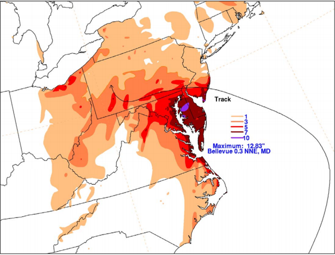
However, my Davis VP weather station in Boscawen saw rain in that period:
  mysql> select dt, lo_temp, hi_temp, rain from daily where dt >= '2012-10-28' and dt <= '2012-11-1';
  +------------+---------+---------+------+
  | dt         | lo_temp | hi_temp | rain |
  +------------+---------+---------+------+
  | 2012-10-28 |    47.4 |    55.7 | 0.00 |
  | 2012-10-29 |    51.0 |    60.4 | 1.10 |
  | 2012-10-30 |    52.2 |    67.4 | 0.97 |
  | 2012-10-31 |    46.8 |    56.7 | 0.02 |
  | 2012-11-01 |    42.9 |    52.9 | 0.00 |
  +------------+---------+---------+------+
www.mountwashington.org/uploads/forms/2012/10.pdf does report 5.76″ from the event, partially estimated due to high winds on the 29th.
The rain we got may have been from an extratropical feeder band being forced over the blocking high:

So, I guess “Superstorm Sandy” counts for skewing the average, but let’s note it was one weird storm and not indicative of a trend. Overall, I think the emphasis should be on nor’easters instead of tropical systems, as we have a lot more nor’easters and they impact a much larger area than the typical tropical cyclone.
Sticking with tropical storms a bit longer, some important ones for us in 2011-2020 include Irene, Isaias, and Zeta. Wikipdia’s List of New England hurricanes lists twelve storms for that period.
There was no reference in the presentation to the the impact of losing the tropical storms of 1981-1990. That is just as important as those we gained in 2011-2020! The former period was during a negative phase AMO [Atlantic Multidecadal Oscillation]. Many people, starting with Bill Gray and his thermohaline circulation studies, note that there are fewer Atlantic tropical systems during the negative phase than during the positive phase. We entered the current positive phase in 1995 – a very busy tropical storm year. We are likely close to a flip back to the next negative phase. That may come with a repeat of our 1950s hurricanes. If so, I’m sure they’ll be blamed on climate change and driving SUVs instead of history.
What did we lose from 1981-1990? That Wikipedia page lists only one storm, Hurricane Gloria in 1985. I was pretty close to it in Milford NH. Rain, blown down tree, lost power. The two nor’easters 7 1/2 years before were much more memorable.
My second note is much briefer
It’s my understanding that the 30-year climate normals are meant to be used to compare current conditions to “normal” weather. Given the pitfalls apparent in this presentation, I think that is about the only thing they are good for.
Of course, it’s important to look at long term climatology, and that’s one of the great things about KCON’s long record. It’s also important to realize that a 30 year period is actually the worst length when there are effects from the approximately 60 year cycles in the AMO and PDO [Pacific Decadal Oscillation]. Longer cycles like one and two century solar-related cycles also need “respect” but are too long to compare against non-cyclic things like anthropogenic effects.
And then there’s the 1930s. Dust Bowl, [Big Wind of 1934], Hurricanes of 1935 and 1938, February 1934 (and repeated in February 2015 – record cold in Portland ME and KCON, and record warmth in Portland OR). It’s no wonder that many longish term comparisons start in 1950!
-Ric Werme
I would disagree with truncating the record at 30 years to call it “climate”. I would prefer to use the whole record, and note the extreme values, as well as trends and simple statistics like a running standard deviation.
My personal preference is that large data sets be displayed as a graph, and given electronic displays, the old factor of needing a separate plate to print such a graph has not existed in this century.
Holding it to 30 years made a bit of sense back when all calculations had to be done by hand.
That’s not a problem anymore.
Once (or twice) upon a time I read a claim that 30 years was chosen because that fit into the largest ledger sheets folks had available. I’ve tried to find that assertion on the web a couple of times but so far have come up empty.
Graphs are nice, but they really suck when you have a repetitive task to do, e.g. UAH’s monthly update to global climate anomalies. Then, good old fashioned numbers stashed on a computerized database are the only reasonable medium.
I’ve only found that the discussions prior to accepting the 30-year period was that an adult would find the comparisons with the day’s current weather reasonable. Such information would be in the newspapers of the time – late 1930s onward. Radio existed earlier but was not universal.
I did some searching on the topic 10 or 12 years ago, but never saw a reference to the ledger sheets. Interesting, if true.
The 30 year period had nothing to do with climate, nor does it now.
The period chosen should be coincident with identified, long cycles, not chosen arbitrarily because the number of years have a zero in the units position.
The period must include many of the long cycles since they vary in intensity and duration.
When I first started reading around here I noticed that many people started their proposals on how they perceived some aspect of the climate within a time frame that started and ended with a zero year. Almost everyone did that, or so it seemed to me. The thought that came to my mind about that was “How does a period such as from 1930 to 1970,1950 to 1980, or any other dated period which begins and ends with a zero correlate with what nature shows is occurring over time?”
That thought led me to eventually reach the conclusion that the shift point of climate trends could be seen in the longer term temp graphs. Those points are situated around a trend lasting around 30+ years apart. Over the years though it also looks like there is a 22y and 44 yr pattern on some graphs. I have yet to look deeper into that idea though.
It doesn’t correlate! Mother Nature is unfamiliar with our decimal numbering system and is unaware of the event that we call the zeroth year. That is, our decades are an artifact that have no control over natural cycles such as the AMO. What if we all counted in binary?
I had always assumed that 30 years was chosen because 30 is about the number of measurements required before the normal distribution becomes a good approximation to other distributions, such as the t, that would otherwise be needed. And before computers it was handy to have such a thing.
Taking over a budget department in the late 80s, I locked up ledger books used by the employees.
My original assignment was to move the employees from paper to electronic devices and reduce errors.
Employees who spent years filling ledgers with numbers do not transition easily. There is comfort in their seeing written numbers filling a page. So, I locked up the ledgers one night and every mechanical adding machine.
I refused to return any of them until an employee demonstrated real need for their work. A near impossibility as I could almost always prove that electronic records were more accurate and easier to use.
I relinquished one mechanical adding machine for front desk use, mainly because the front desk was preparing receipts and the mechanical machine and paper tape was quicker in those days.
The ledgers never saw light again. After a couple of years, I sent them back to procurement for credit.
At that point in time, the paper ledgers did not have a reason for official usage. Every official record then was electronic and the majority of errors in that Budget Office’s work were founded in transcribing numbers from paper to paper to electronic.
It was at that time, I learned that under government procurement sources, ledgers as wide as a desk could be ordered. I know, I had a cabinet shelf full of them.
Most common ledger pads around the office were approximately thirty data columns, if one ignored how the columns were meant to be used. The pads had larger entry squares than the books. Each sheet was removable and meant to be punched for inclusion in a ring binder. Yes, we had a paper page punch that punched something like seven holes along the top.
It is not dependent upon the size of possible ledgers. Through procurement processes one could order as big a one as one needs… The easiest to procure, though were bog standard ledger pads. By easiest, many agencies used standard ordering forms with names and product code for office use. They did not list all or even most items available.
The greatest problem with paper accounts is the wear and tear on the paper. A year’s worth of accounting periods still results in tattered pages.
Ten years worth of entries means a page worn thin with smudge marks, creases, folds, spills, ink and tears.
Thirty years of entries is nigh impossible. It would require the owning office to
refresh the page by transcribing all entries to a new page as needed.
Summary:
A standard ledger paper can have thirty data columns across, but they are unwieldy for data entry. Larger ledgers are available.
The least expensive entry method, one logbook with a date/month line entry and yearly columns. It also means a tattered often illegible logbook.
All too common in accounting/budget offices.
For analysis:
Logbooks can be laid side by side allowing sixty or eighty or even 160 entries easily visible for analysis. Tables provide the work surface.
Simply stated, the logbook is not the constraint, except for the expectation that a logbook can survive daily use by clerical staff for thirty years.
Ledger page
Please note; this ledger page has thirteen main data columns.
There are 13 accounting periods of 28 days each, in a year.
Or one could view the thirteenth column as the summary column for a year of months.
For what it’s worth, both NASA and NOAA define “climate” as weather averaged over a specified geographic area for an interval of 30 years or longer.
“Climate is the average weather conditions in a place over 30 years or more.”
—source https://climatekids.nasa.gov/menu/weather-and-climate/
“Scientists traditionally define a Climate Normal as an average over a recent 30-year period. . . Why 30 years? Close to a century ago, the International Meteorological Organization—now known as the World Metrological Organization—instructed member nations to calculate Climate Normals using 30-year periods, beginning with 1901–1930. Also, a general rule in statistics says that you need at least 30 numbers to get a reliable estimate of their mean or average. So, our scientists have traditionally defined Normals as averages over 30 years simply because that is the accepted convention—not because a 30-year average is the only logical or ‘right’ way to define a Climate Normal.”
— source https://www.ncdc.noaa.gov/news/defining-climate-normals-new-ways
The average human has one breast, one testicle, and half a griff. If you ever found a person like that you wouldn’t call that person normal.
?
I was not aware that there are male climates and female climates.
Is this a new meme that you are wanting to introduce to complicate climate “averages”?
There are winter season climates, summer climates, monsoon seasons (in some places), hurricane seasons, etc. It’s completely wrong to assume that a single average temperature defines what is “normal”. It’s like the man who has one hand in a pot of boiling water and the other in ice water. On average, his hands feel fine.
Well then, I guess physicists will have to redefine what they mean by “the normal boiling point” of water.
The climate normals are not a single number for each place. Please watch the video.
It makes sense to consider limited period of time if you are interested in whether the climate is changing or not.
If there is a cycle, and very little in nature is not cyclic or it wouldn’t be continuing, using a period less than that cycle length would be seriously misleading. Given that at least one cycle (of many) certainly appears to be about 60 years in length, using a 30 year period is akin to starting temperature measurements at midnight, and by noon concluding that within a week we will all boil.
That is actually a pretty accurate description of Climate Scientology.
Sure, but the utility of using segments of the record remains if you are confirming that the numbers are cyclic. How else do you identify the quadrants in a sinusoidal curve?
Can you define a cyclic phenomenon using only one quadrant?
You can try but you’ll have a hard time even convincing people that it is actually a quadrant of a larger sinusoidal pattern.
Ultimately, I think we need different intervals depending on what you want to study. Or, of course, what bogus claim either side wants to push. 🙁
I remember someone calculated took 17 years to be climatically significant….until the “pause” hit 17 years, and the magic number vanished (or at least someone extended “weather”).
You’re thinking of Ben Santer.
Correct. And despite the negative votes that was my intended communication.
Oh: changing the parameters, now the 30 year periods start to show real evidence of climate change…
If I had a dollar for every comment on here saying its only weather, you have to look at a thirty year period…
What evidence?
Let’s see it, griff…..
AR6, chapter 1.4.1, “Baselines, reference periods and anomalies”, page 1-54 :
OK, let’s “follow the experts / The Science” …
1) 20-year averages or trends of GMST are a valid, if very crude, measure of “the climate”.
2) Using a “sliding window” technique allows us to explore how “the climate” changes over time.
3) CMIP5 (RCP) model runs used a common set of “Historical Data” up to (December) 2005 while CMIP6 (SSP) ones extended this to (December) 2014.
Comparing instrumental datasets against the “hindcast” outputs from models (= “real evidence of climate change” ???) allows us to evaluate the models (in-)validity.
From the OP :
Instead of “the data and the trends” let’s just look at “the (20-year, trailing) trends” for the “proxy” variable that is most often used for “the climate” — GMST — and how it “changes” over time.
Wow ! Check out that “perfect match” between the hind-casts of the computer models and the measured data, especially from 1935 to 1965 and since the beginning of the millennium.
[ Now, where’s the button for the “sarcasm” HTML tag again ? … ]
If one uses normal statistical reasoning, that is, learning just how much variability there is in a system, extreme values do count in calculating a standard deviation.
The February Texas freeze hit a point not seen since 1913, but it was in the range of what had happened before. So claims that some new phenomenon was responsible are fatuous, unless one can calculate just how common such events are, and what the rate of occurrence is doing.
Truncated data sets commonly imply that the researcher is following an agenda, not trying to find reality.
Once again, griff has to lie about what others have been saying.
I don’t know a single person who has claimed that you have to look only at the 30 year period. What they all have said is that you need to look at the longer record, of which 30 years is one of the periods of interest. There are many others.
I’ll give you a dollar for every comment you can document on WUWT that says, “you have to look at a 30 year average.”
This 30-year approach is going to be a problem when things start cooling off again. But alarmist will just move the goal posts. “The climate is variable, but It’s still warmer than it was 60 years ago!”
They’ve already been doing that. When a “pause” in increasing “average” temperature can be shown, the reaction is “the long term trend” (measured from the Little Ice Age) is “still up.”
When I hear this, I can’t help but think of a roller coaster heading down the first hill after being released at the top; at any point before it hits the bottom at/near the height where it started, one could argue that the “long term trend” (measured from its low-as-it-gets starting point) is “still up,” even as the coaster is going down. Guaranteed they will be arguing along these lines even when we have a significant downward temperature trend, to keep the propaganda propped up as long as they can.
It isn’t Climate Change because so far one climate region in our US hasn’t flipped to another climate. Differences in 30 year comparisons, oddities or anomalies can be given a percentage, but then you enter into philosophy or plain old dogma by assuring the world that 100% of the variations are caused by humans using oil, coal and natural gas. Prposterous. What is much more likely is that it is a product of “homogenizations and adjustments”, UHI, albedo and plain old kinetics.
Thanks Griff !!!
You just explained why climafraudists use 30 year periods.
“It makes their case”
If it didn’t, they wouldn’t use it.
I contend that there is no such thing as a “climate normal”. Back in 2007, NASA found “clear links between the sun’s activity and climate variations. The Nile water levels and aurora records had two somewhat regularly occurring variations in common – one with a period of about 88 years and the second with a period of about 200 years.”.
Those aren’t the only cyclical events in the climate of course, but they make a mockery of the idea that there is a 30-year “climate normal”. The reality is that the climate keeps on changing in its own way and in its own time, and 30 years is just the blink of an eye. Take a look at the Milankovitch climate cycles, and you will see periods of thousands of years in which the temperature just kept on changing in mostly one direction, ending up several deg C away from where it started. A 30-year period early in one of those would be totally unrepresentative of the climate for tens of thousands of years – a long wait for a “climate normal” to re-appear.
Apologies, I should have given the link: https://www.nasa.gov/vision/earth/lookingatearth/nilef-20070319.html
I can say with little fear of contradiction that the climate in Resolute Bay is quite a bit colder than that in Miami. How about, Miami is quite a bit more humid than Minot.
When you talk about the climate, you should apply some seriously large error bars. Something like: The climate of Palliser’s Triangle is typified by long periods of drought during which agriculture is impractical. In that light, the “climate” observed during any random thirty year period is likely to be very misleading.
The climate metric I have found to be useful is what I have always called growing zones but which seem to be more properly called plant hardiness zones. You can say useful things about the climate as long as you paint with a broad enough brush.
Here’s a link to the Wiki page for Mt. Washington.
It’s interesting that all kinds of activities, commercial and otherwise, take place on the mountain. Of course, the environment keeps things down to a dull roar. 🙂
In other jurisdictions, the mountain would be declared a sacred aboriginal site and made off-limits to everyone else.
Thanks for the link. I have fond memories of Mt Washington. When I was younger and went to Gordon Conferences, getting to the summit was something you could do between the morning and evening sessions.
In other news, we won’t need to worry about the length of the climate metric, because our betters are going to stabilise it.
(Yes I used the English spelling deliberately because they are ahead of the curve on this)
In the lore of an ancient civilization came this story of The Great Carbuncle and the fate of those who chose to own it. In other words, Nathaniel Hawthorne wrote a short story about a mythical gem high up on what obviously is Mt Washington that blazed in summer sunlight as though it were the last snow patch on the south side.
https://www.livrosgratis.com.br/ler-livro-online-147415/the-great-carbuncle
Shouldn’t “normal” be a range?
Summer months at a location has a “normal” or “typical” feel. If you lived all your life in one location you could tell someone moving in what summers and winters are like and how it was different when you were young and all.*
30 years seems so short. Nevertheless a better chart might be to have each day’s point being the average for the last 30 years.
I sort of prefer the100 year average with outliers removed or given little weight. The outliers are not representative of climate by definition. A smoothed moving daily average.
*My grandfather would tell me about the weather when he was a kid in 1875. And I can tell you what it was like when I was a kid in 1948.
Nice catch. What I was hoping for was to learn the climate of Mount Washington.
Such things as what the temperature, rainfall, wind and cloud cover highs, lows and averages are for each month.
Now if you have those figures (and maybe a few more like the number of hurricanes) you can have a reasonable discussion about what it is like to live in that location and whether the climate is changing there..
Weather Zone provides a bare bones version for the town of Maleny in South Eastern Queensland here https://www.weatherzone.com.au/climate/station.jsp?lt=site&lc=40121
Some of that information is at https://www.mountwashington.org/experience-the-weather/mount-washington-weather-archives/default.aspx.aspx . More is at the NCEI, but it’s frustrating to get to.
See also https://oz4caster.wordpress.com/2016/02/16/mount-washington-temperature-trend/ (“oz” as in ozone, not Australia). I almost used one of his graphs showing three separate temperature trends, but it only went to 2015.
Thanks Ric but a quick scan of the oz4caster page gives no seasonal figures. I see little point in stripping out seasonal information if you want to know about the climate.
A global temperature rise of 2 °C is going to kill the plant, but the average daily temperature in Maleny in December can vary by 15 °C. Everyone in Maleny must already be dead.
The only thing to said is normal climate is the global climate which has been an icehouse climate for 34 million years. Anything which has been going on for millions of years, you can call normal.
And the normal aspect of this icehouse climate is that over the millions of years, it’s been getting colder, with our last couple million years being the coldest.
And what seems normal for humans, is the humans living in coldest regions, whine about the possibility, it might get a bit warmer in the future. But during the warmest time of year they vacation further away from the polar regions {where it’s warmer}. Though anytime they vacation, a prefer location is some tropical island.
In which I guess they imagine involves isolation, but it’s always crowded.
I’m not convinced of the value of calculating a global climate. Unless you want to say that in January temperatures on the planet range from +100C to -70C (or whatever the figures are).
Brilliant comment. Think globally, die locally; as Mt. Washington clearly demonstrates, although death rates per mountain are heavily influenced by some demographic factors.
Not in the Whitsundays. I can take boat out to a completely uninhabited tropical island and have a fine time. You have no mod cons except what you take with you, but that’s what camping is anyway.
Imagine camping without any mod cons for the next decade regardless of the weather
That’s where the climate moaners are taking us
Except now human CO2 added a new, additional climate driver and changed that historic norm…
No it didn’t, griff. Do stop fibbing, nanny will be cross.
Why is it that so many WUWT readers cannot learn “Do not feed the trolls?” Please don’t reply to anyone unless you are adding to the discussion.
I heard about six Charlies in search of an author
Or maybe that was an authoritarian censor.
Is your express approval required? Really?
Watts That All About Then?
Some people perversely enjoy taunting the animal in the mental cage. It is more stimulating than watching the mediocre TV programs that pass for entertainment.
Some people perversely enjoy
Ah, so you’re a Mormon.
Got any evidence to support your beliefs?
I have been saying for years if co2 is to blame for climate change and these folks do manage to find the control knob where will they set the date at.
I have long suspected that they will set it at the best summer they ever had, when they were in middle school.
which would be different for all 7 billion of us
There is no date setting, the reduction is aimed at keeping the global average increase at under 1.5 C
The reduction is aimed at a notional figure they pulled out of a hat.
Unless you can tell us what equilibrium climate sensitivity actually is. Can you? Because they haven’t done better than Charney did over 40 years ago.
So what is it?
IIRC, at the time one guy had ECS at 2 and another (Hansen?) at 4. Being good bureaucrats, they substracted 0.5 from the low and added 0.5 to the high to account for “uncertainty.”
Empirical observation shows the Earth’s temperature to essentially be indifferent to atmospheric CO2 levels, so the ECS is indistinguishable from ZERO.
Why should we panic over temperatures getting back to where they were during the Medieval Warm Period?
When we’re not even there yet…and when it and prior, even warmer periods were referred to as “climate optimums.”
Thereby implying that the climate was some sort of “ideal” during the Little Ice Age, the coldest period during modern human civilization and which was typified by killing frosts, abbreviated crop growing seasons, crop failures, famine, disease and death (and that with human population far smaller than today’s). And an assumption that a warmer climate is worse, which is 180 degrees opposite of reality.
Meanwhile, previous warm periods, which were warmer than now, have long been referred to as “Climate Optimums.”
Presumably because the weather was so awful (/sarc).
And the “reduction” (of CO2 emissions) will not “prevent” anything, because CO2 has never, does not, and will never “drive” the Earth’s climate. “Belief” that CO2 drives the climate is irrelevant.
Climate = weather conditions prevailing in an area in general over a long period.
Weather conditions are not just monthly mean max/min and monthly rainfall.
Daily, hourly and even five mins rainfall are important.
So are, wind speed, wind direction, snowfall, and frost
A big one is cloudiness.
My claim – the total mix of these weather conditions are both coupled and forever changing. Additionally, we don’t have historic data for many.
All that information is tracked at Mt Washington and some of the older information is being digitized.
When climatologists started the 30 year normals much of that information was not available, nor were computer facilities to compute things like standard deviation. While one could get along with adding such information to future climate normals, it’s important to keep an unbroken record computed the same way. Yes, there are problems, going back to the original Surface Stations question about the effect of paint type on instrument shelters.
Now that the satellite record is longer than 40 years, it might be feasible to start a new kind of 30 year normals based on remote sensing of cloud cover, temperature, snow cover, etc.
The whole notion of assigning some kind of statistical grab bag of variables averaged over any period of this planet’s history is absurd. Averaging averages of other averages and calling it ‘Our Climate’ makes no sense at all. No wonder no one can make a coherent statement about “climate change”. The idea is intentionally ambiguous. I doubt there is a climate on the planet with a period as short as 30 years and a few exceed 1000s of years. How does anyone sensibly ‘average’ that? Vast areas of the planet have no temperature records at all. Large parts of “climate science” wouldn’t be out of place on Tick-Tock.
I’ve been saying this for years, probably decades
Me too … 🙂
Taking an average loses data. You lose track of the overall temperature profile, rainfall profile, etc. And it is the overall profiles that determine climate. All kinds of different climates can result in the same mid-range value for temperature. And mid-range values are *not* averages at all.
Yup … and the obvious solution to that is to simply reimagine the definition of data.
The Worlds Meteorological Organisation (WMO) still uses the arbitrary 1961 – 1990 thirty year period ‘for the purposes of historical comparison and climate change monitoring’.
The Australian Bureau of Meteorology (BoM) also used 1961 – 1990 which exaggerates the scale of the scary red columns on their time-series graphs.
The WMO states that;
‘… For the purpose of Paris Agreement on climate change and its temperature targets, WMO also uses the pre-industrial era as the baseline for tracking global temperature increase in its annual State of the Global Climate report. Thus, the average global temperature in 2020 was about 1.2 °C above the pre-industrial (1850-1900) level…’.
As if the The Little Ice Age (LIA ~1450–1850) were the normal (standard; usual, typical, or expected – Oxford) climate.
Why not use the estimated Holocene (10,000 – P) average so far?
The UK Met Office compares current 30 years with prev thirty year periods and thus can tell you UK 6% wetter in current over previous period (which it ascribes to climate change)
The UKMO is alarmist central and they get their hottest evah years from the North runway at Heathrow.
Note to your scriptwriter – you’ve done the 6% nonsense already and that was toasted.
GRIFFIE IS A COMPLETE WASTE OF TIME….LEFTIES DESCRIBE EVERY BAD WEATHER EVENT AS MANMADE CLIMATE CHANGE….DEMAD THAT THEY STATE THE IDEAL CO2 AND TEMP
So is every idiot who feeds the trolls. Get a life. And a keyboard that supports lower case.
1) Weather records lack sufficient precision to support a claim of a 6% change.
2) Even if true, meaningless
3) Even if true, probably is just measuring one phase of the AMO vs the other.
“Thus, the average global temperature in 2020 was about 1.2 °C above the pre-industrial (1850-1900) level…’.”
Well, then that means that currently, in the year 2021, the Earth is now cooler than that, at 0.8C above the pre-industrial level.
The UAH satellite chart:
CO2 is UP! Temperatures are Down!
It’s not looking good for the climate change alarmist argument.
As an (hopefully) interesting aside on this matter, where I used to live in the mountains in the south of France, they used to have a race on those mountain roads every year. The stupid thing was they didn’t close the roads to normal traffic. Racers would race around blind corners and come face to face with a farmer driving a tractor for example. Those farmers weren’t going to stop farming just because of some loonies from the city wanting to be stupid.
Every year, people died. Fortunately, since most tractors are way heavier than suped up rally cars, those were always racers, who deserved it.
This wasn’t an illegal thing, btw, but apparently was officially sanctioned. My only explanation was that the French are a bit crazy. We made money selling beer to spectators.
You’d probably have made more money selling beers to the drivers
I saw a picture of that race this year obstructed by Llamas (yes, the S American quadrapeds!) and thick fog… !
They do have winters in the Southern hemisphere, you know.
I could be wrong, but I don’t believe France is in the Southern Hemisphere.
Evidently in meteorology “normal” doesn’t mean normal; it means average. It’s important to note that the average is a mathematical construct and as such does not occur in nature. The weather is never average. Never. Therefore it is never “normal”. The use of the word “normal” in reference to weather (or climate) is one of the greatest (and most annoying) abortions of the English language.
The average cannot occur. The temperature is never exactly the average, except only for a minute as it changes from above to below or below to above the average (for that date, week, season, year). Ditto wind speed, rainfall, etc.
A much better way to express past weather would be the historical range of variation (HRV). One could even use quantiles, deciles, or percentiles of the HRV, as in “today’s weather is within 90% plus or minus of the historical range of variation for this date”.
It’s a pipe dream, I know. For TV weather drones to drop “normal” in favor of HRV would be such a paradigm shift their heads would explode, on screen, with much splattering of gore. Maybe they could ease into it, just say “average” when they mean average. Is that too much to ask? Then after an adjustment period of a year or so, they could look the camera straight in the lens and say “it’s within the range of what has happened before” without collapsing into a coma.
Ah well. As Donovan sang, “Might as well try and catch the wind”.
Expecting tomorrow’s weather to be average is like expecting the next person you meet to have average IQ or average height. Though, I will say it has become much more likely that the next person you meet might be of average sex.
Well weather this summer has been hugely above average in the N hemisphere, setting multiple new records way, way over previous highest… rain in Cologne beat prev record by 50%, rain in Central park double previous record, years rain in 3 days in China…
Utter rubbish
Still hoping for the heatwave that never was?
So a few high temperature records proves that the entire northern hemisphere is over heating?
Pathetic, even by your low standards.
“rain in Central park double previous record”
How often does a hurricane remnant pass over New York’s Central Park?
If a hurricane remnant does pass over Central Park, it would not be unusual to see large amounts of rain falling there and in the vicinity.
Yes, and all the children born this year were above average too!
Until you can provide the standard deviation for a 1,000 year period at a particular location, you really don’t know what the range of average weather is. Citing particular examples that you have cherry picked, to defend a belief, is not science.
Great post. But if they changed to “within the historic range of variability” they would not be able to hype ever storm. 🙂
Trying to assign precise numbers to climate or even weather is a fool’s errand. The best that can be said is that it is normal to be hot in the Summer, and cold in the Winter, where most people live. Results may vary with location.
I’ve said this many times – the use of the word “normal” to describe what essentially is a relatively meaningless 30-year average is a misuse of words at best, and deceptive at worst.
There IS NO “normal” weather, and any departure from the “long term average” is not “anomalous” in any way whatsoever.
The weather in New York wasn’t ‘normal’ – it was a record extreme event, caused by climate change.
The weather in Germany, affecting also Netherlands and Belgium wasn’t ‘normal’ – it was an extreme, record rain event, caused by climate change.
The weather in China wasn’t ‘normal’ – it was a record extreme rain event, caused by climate change.
The heatwave and record temperatures and fires across Mediterranean states weren’t ‘normal’ – they were extrem events caused by cliamte change.
..and there have been 6 heatwaves in US (one setting a new record), heatwave in Lapland (new record temp), heatwave in E Europe and Russia (producing a tornado), heatwaves and fires in Siberia, heatwave in Iran, extreme rain intensifying the Monsoon in the Western ghats, extreme rain in Japan’s rainy season.
and a hurricane equaling historic record in Louisiana.
Record, extreme weather right across the N hemisphere summer, exactly as predicted by climate change.
The weather in New York wasn’t ‘normal’
Really?
1950: Hurricane Able struck Nova Scotia
1953: Hurricane Carol struck the New Brunswick/Nova Scotia border
1954: Hurricane Hazel moved into Ontario
1958: Hurricane Helene struck Newfoundland
1959: Escuminac Hurricane hits Nova Scotia
You get the idea right, griff?
No: you “get the right idea”
Hurricanes degenerate into extra-tropical storms and take on baroclinic features as they move north and engage the PJS.
A list of them striking the NE States going back to 1950 doesn’t prove anything.
What Griff means ( I think) is the weight of rainfall from them.
The Upper air circulating the Ida storm originated over the GoM and went over a deep-water patch at 31C.
An extra 7% more WV is evaporable per 1C of extra warmth.
You know what Griff means?
O…. k
The fact that Canada gets hurricanes – which will obviously degenerate – shows just how run of the mill Ida was.
Still, I bet you enjoyed trying to big it up.
Does that equate to 7% more precipitable water in the same amount of time or over the same area with a moving low pressure area? Your number is a non sequitur unless you can demonstrate that precipitation per unit of time, or unit of area, is increased proportionately, which you provide no evidence for. The only thing your number relates to directly is the amount of water evaporated from the water surface and the amount of heat and water transferred to the air.
What you need to provide is empirical evidence that global rain is occurring more frequently or at increased rates, instead of just being distributed over a larger area. Anecdotal evidence such as griff routinely provides is only useful for arguing in the pub, not for scientific analysis.
The rain NY got from Ida was not duplicated in Massechusetts. Yet the same weather fronts, warm front from Ida meeting a cold front from Canada, happened in both locations.
There is far more to what happened with Ida than just climate change.
A feature such as an extra-tropical storm is a self evident example of the Clausius–Clapeyron relation. It’s an everyday forecastable. The warmer the saturated air in it’s circulation the more will precipitate out. The only question therefor is how long the storm takes to traverse a given area of land.
Given that, if anything, storm trajectory speeds are slowing (and even if they are not), then again it is any everyday forecastable that more intense rainfall will occur.
https://www.climatecentral.org/news/report-pouring-it-on-climate-change-intensifies-heavy-rain-events
https://phys.org/news/2021-09-hurricane-ida-record-shattering-rainfall-nyc.html
For starters, floods are not new. Nor are great floods new. Most cultures have legends comparable to the Noachian flood of Mesopotamian lore.
Whatever the reason for climate change, it has warmed for about the last 20,000 years, compared to the last glaciation. Some models predict that dry areas will get dryer. If that is true, then wet areas would have to get wetter. Some models contradict other models with respect to regional precipitation. Personally, I don’t think that the models are worth the ink it takes to print the output.
Your graphs show a 30-50% increase in “downpours” for a maximum temperature increase of less than 1 deg C, and, therefore, a maximum increase of WV of about 7%. That doesn’t seem reasonable. Consider that if the surface is warming, and the lapse rate is staying the same, then all the additional WV isn’t going to become saturated and precipitate out. It isn’t analogous to opening the bomb bay doors on a bomber and dropping the entire load. What happens is a very complex interaction between temperatures at altitude, the presence of nuclei for ice crystals, and the role of airborne bacteria affecting the temperature at which the water actually freezes. This is further impacted by updrafts in stratocumulus clouds that can cycle hail until it becomes too large to be lifted, and then falls and melts. With higher temperatures, the atmosphere is able to retain more residual WV after purging the excess.
Cities are a whole different situation because of the large increase in impervious surfaces compared to natural surfaces. Flooding, per se, is not a good proxy for actual precipitation per unit of time.
I think that your source is taking an overly simplistic view of the mechanism, and just might be a little biased in the interpretations.
Poor, delusional Griffie-poo, continually blathering on about “extreme weather and calling it “climate change”. Some things will never change.
We can always hope he gets a better scriptwriter
He’s just too easy to ridicule.
Northern hemisphere summer, 3rd of September … NH summer, September the 3rd …
Aren’t we coming up to the annual “Arctic sea-ice minimum” date ?
I wonder why nobody (important / famous / charismatic / …) is banging on about the upcoming “new record low” in that regard ?
https://nsidc.org/arcticseaicenews/charctic-interactive-sea-ice-graph/
Ah … OK, my bad …
– – – – –
PS
1) I stubbed my toe on the pavement 2 days ago.
2) “Stubbing your toe” is just one example of what is known scientifically as “A Bad Thing”.
3) Therefore me stubbing my toe was [ definitely, certainly, unequivocally, without a shadow of either question or doubt, … ] not just “caused by (anthropogenic) climate change”, but that particular “event” could only have happened because of ACC.
You have no clue about what you are talking about! “Normal” is basically an average or mean calculation from a distribution. In order to adequately express what the “mean” represents you also need to display the standard deviation, i.e., 1 sigma would encompass about 68% of the values and 2 sigma would encompass about 95% of the values.
Those standard deviation intervals define “normal”. It is a sign of scientific ignorance when the standard deviation is not used. Climate scientists, TV weather people, and journalists are the normal ignorant propaganda proponents. Sad to say, but you are included in that same bunch!
It would be nice if griff could demonstrate that the meteorological parameters even have a ‘normal’ (Gaussian) distribution. Alas, I suspect his only talents relate to reading the alarmist news outlets, intended to ‘sell newspapers,’ and regurgitate them as if they have some meaning.
Exactly how much extra water will air be able to hold when it’s 1C warmer?
That’s all the warming even the IPCC is claiming, and most of that wasn’t caused by CO2.
“..and there have been 6 heatwaves in US”
It’s called Summer, Griff.
You remember that heatwave that was going on in Arizona not long ago that you were fretting about? Well, it’s been raining there for weeks since that time.
And then there was a real heatwave in the Northwest this year, caused by a confluence of events, none of which had anything to do with CO2.
That’s two. Where are the other four you are referring to?
It’s getting hot here in the south-central U.S., but that’s just normal weather for this time of year around here. That would make three if you are including this one. But where are the rest you mention?
I remember someone suggesting to me that the SW monsoons were a thing of the past. Funny how those who imply that they possess infallible crystal balls lose their marbles when the claims don’t come to pass.
They also conveniently lose their memories of their own past predictions that show them to be know-nothings and alarmists.
You are making claims about events without defining what you mean by “normal.” It is just hand waving.
Climate is average weather over an identified time period. How can average weather cause an extreme event? CliSciFi has so screwed up the language that it is impossible to communicate intelligibly. Well, it makes it easier to lie to people.
Flat lie, grifter.
The record high in Lapland was set in 1914.
The one record high set in the US (Pacific NW) was shown to be NOT caused by “global warming” by Dr. Cliff Mass, the famous meterologist. It was caused primarily by highly unusual weather conditions. This conclusion has been upheld by the fact that the Pacific NW, other than the 3 days in June when the record was set, has not seen an unusually warm summer. In fact, where I live in the Pacific NW we’ve had an unusually cool summer. My garden is weeks behind normal.
Hurricane Ida didn’t make the top 10 list by the central eye pressure and did NOWHERE near as much damage as hurricane Katrina (actually proving that hurricane damage is more a function of preparadness than anything else).
“Record, extreme weather right across the N hemisphere summer, exactly as predicted by climate change.”
People who push AGW (now called Climate Change) predict everything – so how can they ever be wrong? Predicting everything is as useful as predicting nothing correctly. Heatwaves are natural and natural variation and warming accounts for them – you don’t need “anthropogenic climate change” at all. Extreme weather events are natural, and they do tend to come in cycles. Nothing you mention requires contributions by man to have occurred.
When griff’s mask slips….
Record, extreme weather right across the N hemisphere summer, exactly as predicted by climate change.
Predicted by climate change?
The climate might change, griff, but it never puts out any predictions.
Could that be the (XR approved) Ayahuasca???
Well, when you have a construct like “climate change,” which supposedly causes anything and everything bad, the occurrence of any of which supposedly “confirms” it is “real” but the absence of such things, or presence of the opposite things, does not change the construct one iota, what you’re talking about is non-falsifiable bullshit, not anything to do with science.
So there’s that…
Long term changes in weather is a useless metric to determine the climate … Its all just political science used to control the population … Period … We will always have weather extremes in te transition between ice ball earth and no ice earth … Its all a game of stats and anyone telling you they can determine the climate change “direction” (hot to cold or cold to hot) is selling you something … Like the guy at the race track who says he can tell you the winner of the next horse race … pure naval gazing bs dressed up as science and selling you some policy perscription …
“It’s no wonder that many longish term comparisons start in 1950!”
Time to recycle an old joke: Americans think a 100 years is a long time (and the British think a hundred miles is a long way).
After a few billioni years the ‘climate’ was finally perfect in March of 1952.
I thought that the claim was that the climate was perfect in 1850, right after the 1846-47 Winter snows trapped the Donner Party in the Sierra Nevada.
The WMO defines climate normals as “Period averages computed for a uniform and relatively long period comprising at least three consecutive ten-year periods.” This has been their convention for a century, before ‘climate change’ became a thing (the first climate normal was 1901-1930). It is probably based on the general statistical rule of thumb that says you need at least 30 numbers to get a reliable estimate of their mean or average.
For referencing by decision-makers in climate-sensitive sectors like water management, energy, agriculture, viticulture, etc WMO recommend using the most-recent 30-year period finishing in a year ending with ‘0’ (1991-2020 is current). This ensures decisions aren’t being based on possibly out of date information.
However, WMO retains 1961-1990 as its historical ‘base period’ for long-term climate change assessments “for the sake of public and scientific understanding about the rate of climate change.”
Constantly updating the base period has the effect of minimizing the size of of the numbers presented as global temperature anomaly values. For example, the latest UAH monthly global anomaly value (+0.17C, August 2021) is based on the period 1991-2020. If it was based on the first full 3 decades available in the UAH data period, 1981-2010, then August 2021 was +0.31C warmer than ‘average’. This is because the 30 years between 1991-2020 were considerably warmer than the 30 years between 1981-2010 – even in UAH.
“The WMO defines climate normals as “Period averages computed for a uniform and relatively long period comprising at least three consecutive ten-year periods.”
We have temperature records that go back much further than 30 years. We should use those records to determine our current situation.
We should use the actual unmodified temperature data to determine our situation, not the computer-generated garbage that passes for climate data today in alarmist circles.
Using the unmodified temperature data, we should conclude that we are not currently experiencing unprecedented warming, as the alarmists claim, but rather, we are no warmer today than in the recent past, such as the Early Twentieth Century, and this should tell us that CO2 is such a minor player with regard to the Earth’s temperature control knob, that we have no reason to worry about it, or regulate it.
So what? The total period trend would still be 0.13 C/decade. Since CAGW is supposed to start and be the largest in the atmosphere, what is there to be concerned about? Lies, damned lies and CliSciFi.
Does anyone ever ask why we are using the coldest 30 years of the last century as the base period of climate? Perhaps that is the outlier and shouldn’t be used. Or since we have more than 30 years of data we should use a larger selection
You left off some important information about obtaining a reliable mean. A SAMPLE SIZE of 30 provides a good estimate of a SAMPLE MEAN. What you left out was the need for taking a multitude of samples (say 1000) in order to achieve a sample means distribution that will adequately predict an unknown population mean. A single sample of 30 provides nothing of value other than a mean that may have some random error canceled. It is NOT a valid predictor of any population.
If you would take 100 samples of thirty years each (but not consecutive years, only random chosen years) out of the last 300 – 400 years, you might get an idea what the earth’s “climate” is during the chosen long period of time. This is just one area of statistics where climate scientists have no expertise and continually refuse to meet all of the statistical assumptions for using a specific tool.
From the article: “So, I guess “Superstorm Sandy” counts for skewing the average, but let’s note it was one weird storm and not indicative of a trend. Overall, I think the emphasis should be on nor’easters instead of tropical systems, as we have a lot more nor’easters and they impact a much larger area than the typical tropical cyclone.”
Superstorm Sandy was a combination of Sandy and a nor’easter coming together over the East Coast.
So Superstorm Sandy was actually two very powerful storms combining to wreak havoc.
Aka weather, not climate.
For what it’s worth, both NASA and NOAA define “climate” as weather averaged over a specified geographic area for an interval of 30 years or longer.
“Climate is the average weather conditions in a place over 30 years or more.”
—source https://climatekids.nasa.gov/menu/weather-and-climate/
“Scientists traditionally define a Climate Normal as an average over a recent 30-year period. . . Why 30 years? Close to a century ago, the International Meteorological Organization—now known as the World Metrological Organization—instructed member nations to calculate Climate Normals using 30-year periods, beginning with 1901–1930. Also, a general rule in statistics says that you need at least 30 numbers to get a reliable estimate of their mean or average. So, our scientists have traditionally defined Normals as averages over 30 years simply because that is the accepted convention—not because a 30-year average is the only logical or “right” way to define a Climate Normal.”
— source https://www.ncdc.noaa.gov/news/defining-climate-normals-new-ways
Actually, depending on the source and application, statisticians recommend a minimum of 20-30 samples to provide unbiased statistical parameters, thereby providing confidence in the statistical significance.
Thus, drawing conclusions from two core samples, or one set of tree rings, is a poor sampling protocol.
“Thus, drawing conclusions from two core samples, or one set of tree rings, is a poor sampling protocol.”
Demonstrably true.
And that applies to the likes of the GISP2 ice-core data from Greenland.
Hardly.
There are currently nine (9) GISP2 ice cores available for research (see https://icecores.org/inventory/gisp2 ).
I could not find information on the number of separate analyses that have been performed to-date on each of these ice cores. However, I suspect that tens to hundreds of additional analyses will be conducted on these cores that are being carefully preserved for future research.
But all made at the exact same location ….
72.5833333, N -38.466667 E
So not a proxy for the entire Globe – which was my point.
It’s this sort of shenanigans I mean ….
https://www.carbonbrief.org/factcheck-what-greenland-ice-cores-say-about-past-and-present-climate-change
However, we are primarily interested in what is characterized as a “well-mixed” gas. Therefore, multiple analyses at the same location is preferable to a single analysis of a highly variable metric from the same location.
You’re right . . . how absolutely careless of me to think that one location in Greenland could be a proxy (for the entire globe) for capturing atmospheric gas concentrations when there must be numerous peer-reviewed scientific papers that clearly show the troposphere of Earth is NOT well-mixed areally over century timescales.
Uhhh, I do have that last part right, don’t I . . . you know, about science showing the lack of mixing of CO2 and other atmospheric gases around the planet over timespans of hundreds of years?
I terms of shenanigans: /sarc now off.
For what it’s worth plus a nickel used to get you a subway ride in NYC in the 1950s.
And different IQ’s value different things differently.
“One way we define “normal” is that every ten years climatologists collect and average the previous thirty years of weather data, then release that as the “new normals.””
This is useful if one wants to understand the near term change, but absolutely useless if one is trying to discern a anthropogenic component from natural ones. Many natural cycles have a period more than 30 years.
30 years *might* have been the best they could do 50 years ago, but we now have more data and so climate should be redefined as the average weather over at least 60 years. This would include enough time to catch many natural cycles within it.
But first and foremost is we *HAVE* to get control over the quality of the data being gathered. It is tampered with so much and so much bias added in that it becomes unusable. We should select a number of stations that are in rural areas least impacted by UHI effects (that or get a much better understanding of the UHI effects in each city). All other station data is for local use only and not part of the climate change monitoring. We need to be including changes to humidity (which affects temperature), and with so much emphasis on CO2, would should be monitoring it’s level at each station.
There is an older post about the global temperature´s reference period, but still relevant today:
https://www.climate-lab-book.ac.uk/2015/connecting-projections-real-world/
http://blogs.reading.ac.uk/climate-lab-book/files/2015/12/anim_small.gif
The AMO envelope is important, but we need to look back to the previous centennial solar minimum in the 1870-1890’s for many equivalent extremes. Such as Atlantic hurricane intensity, extremes of rainfall and drought, super El Nino, Saharan plumes into NW Europe, NE Pacific warm blobs, etc, etc.