By Christopher Monckton of Brenchley
The latest UAH temperature anomalies show that the New Pause has lengthened by another two months to 6 years 10 months. As usual, the Pause is defined as the longest period, up to the most recent month for which data are available, during which the linear-regression trend on the monthly global mean lower-troposphere temperature anomalies shows no increase.

The HadCRUT4 dataset is no longer being updated monthly. For last month’s column I had to kick them into producing the data for the first three months of 2021, reflected in the graph below, which shows no warming at the surface for 7 years 1 month. They are now another three months behind. The HadCRUT5 dataset is even worse: it has not been updated since the end of 2020.

Pauses have no predictive purpose. Just because there has been no global warming for more than seven years (HadCRUT4) or almost seven years (UAH), that does not mean there will be no global warming in future.
Nevertheless, they are helpful in putting into context the occasional severe-weather events that the Marxstream media seize upon in telling us we’re a’ doomed unless the hated capitalist West is shut down.
For instance, the unspeakable BBC has been bed-wetting on and on about the heatwave in the north-western United States, and the Economist, which has trashed its reputation as a serious journal both by its unhinged opposition to Brexit and still more by its relentless unwillingness to publish any information that questions the Party Line on the climate question, has just issued a lurid warning to the effect that ever more frequent and ever more severe heatwaves are to be expected. Yet despite that heatwave there has been little warming globally.
It is worth reproducing the ever-diligent John Christy’s graph showing the annual frequencies of daily record-high temperatures among the US Historical Climate Network stations with more than a century of data. Heatwaves were a great deal more common in the Grapes of Wrath years of the 1920s and 1930s than they are today. But that is the sort of information that the unspeakable BBC and the untrustworthy Economist now routinely and deliberately deny to their audiences.

In response to last month’s update on the New Pause, Chris Schoneveld wrote –
“I was inspired by your latest contribution to WUWT and thought of expanding your retrospective analysis further backwards. I know there are people who are critical of your approach, calling it cherry-picking, etc. I, however, think it is the most honest approach.
“I repeated your exercise from the point where your most recent non-warming period began, as far backwards as 1944. It is clear that each warming pause is initiated by a strong El Niño. The La Niñas are apparently not strong enough to cancel the warming effect of those strong El Niños.”
In Chris’ graph, I have highlighted the most prominent el Niño in each of the four Pauses in global warming that he has identified. Each record-breaking el Niño appears near the beginning of its Pause.
One reason is that the El Niño spike will itself modestly influence the length of the subsequent Pause – though, since the method of deriving least-squares linear-regression trend-lines takes account of every monthly anomaly and not just those at the beginning and end of the period, prominent El Niño spikes have less of a Pause-lengthening effect than some would like us to believe.

The diagram is similar to the global-warming “escalator” that is often trotted out at Thermageddonite websites to try to reassure true-believers that there really will be some warming again, someday. But it does make the point that in a staircase, if the ratio of the run to the rise of each stair increases, the steepness of the stair decreases.
Since IPCC predicted in 1990 that there would be warming over the following decades at a rate equivalent to 0.34 C°/century, there have been two risers in the staircase, caused by the unusually large el Niños in 1998 and 2016:

According to Wu et al. (2019), the anthropogenic contribution to global warming from 1990-2013 was 53%. Since the subsequent period was dominated by the naturally-occurring el Niño event of 2016, one may take it that the anthropogenic contribution to warming from 1990 to the present is unlikely to exceed 50%.
A forthcoming paper by some of my distinguished colleagues will shortly provide further evidence tending to confirm that the anthropogenic contribution to the warming of recent decades is no more than 50%. In that event, warming of only 0.7 C°/century equivalent since 1990 is attributable to our sins of emission. Yet IPCC had predicted a medium-term anthropogenic contribution equivalent to 2.8 C°/century at midrange (in one place) and 3.4 C°/century equivalent (in another). These midrange predictions were respectively four times and five times the 0.7 C°/century equivalent anthropogenic contribution to warming since 1990. But the BBC and the Economist will make quite sure that you never hear any such inconvenient truths.
The fact that there are so many long Pauses is a good way to demonstrate that nothing like the rate of global warming originally predicted by IPCC in 1990 has come to pass. Even IPCC was eventually compelled to admit this, which is why it cut its medium-term warming predictions by almost half in the 2013 Fifth Assessment Report. Yet with monstrous inconsistency it failed to make any commensurate reduction, or any reduction at all, in its long-term, equilibrium-sensitivity prediction. In fact, the entire interval of that prediction is likely to have increased, which seems less than honest.
The longest Pause of all in the instrumental record ran from 1850 to 1930 –

Last month I said that Wu et al. (2019) had concluded that 70% of all warming since 1880 was anthropogenic. A Thermageddonite objected. So here is a slide from a presentation by Aixie Hu, the paper’s second author, given at a conference jointly sponsored by NCAR, the U.S. Energy Department and the National Science Foundation. The second bullet-point confirms the explicitly-stated conclusion of the paper itself that 70% of the observed industrial-era changes in global mean surface air temperature came from greenhouse gases, with 30% from Atlantic multidecadal and Pacific decadal variabilities:

There was, after all, very little fluctuation either side of the long-term trend in the increase in greenhouse-gas concentrations: unlike the temperature trend, it was strikingly monotonic and very close to linear, as NOAA’s accumulated greenhouse-gas index shows:

Wu projects a warming rate of 0.43 °C/100ppmv CO2. Therefore, warming from doubling the preindustrial 278 ppmv would be less than 1.2 C°. Using the energy-budget method in Gregory (2004), as simplified in Lewis & Curry (2014), I had said equilibrium doubled-CO2 sensitivity (ECS) would be 1.1 C°. Not much difference there, then.

The 1.1 C° ECS derived from recent mainstream midrange industrial-era climatic data for 1850-2020 implies a unit feedback response (per degree of reference temperature or sensitivity) of about 0.1. And that is precisely the unit feedback response implied by the data for 1850, for 2020, and for 1991-2020. Contrast the correctly-derived unit feedback responses with those implicit in official climatology’s method of predicting future warming.
The question arises: why are occasional very large el Niño events happening more frequently and more intensely these days? The Party Line, of course, is that that is what one would expect as a consequence of global warming.
However, Chris’ graph suggests there may be something else going on. At present, climatology cannot explain why, every five years or so, there is a sharp el Niño increase in ocean temperature in the tropical Eastern Pacific, which is then carried across the Pacific and then all round the world by the thermohaline circulation, and still less why two or three of these spikes are so very substantial.
Could it be that some of the el Niño warming is coming from below? There are thought to be some 3.5 million subsea volcanoes on Earth. So few of these volcanoes have ever been visited that we do not even know how many of them are active, let alone how much variability in their output contributes to ocean temperature change.
One illustration of just how little the seabed volcanoes have been studied is that the largest volcano by ground surface area in the entire solar system was discovered only a few years ago. It is not on Mars. It is under the Earth’s ocean a couple of hundred miles off the coast of Japan.
The likeliest places for subocean magmatic intrusion are the mid-ocean divergence zones, shown in red on the projection below, where the upthrust of magma from beneath the seabed drives apart the great tectonic plates that are then subducted beneath the land, generally at or near the coasts.

The East Pacific divergence zone has three relevant properties. First, it does not run down the middle of the Pacific: in the tropics it runs quite close to the East coast, right through the NINO 1,2 and NINO 3 regions where el Niños originate (blue on the map). Secondly, a spur from the ridge runs eastward to the Pacific coast. Thirdly, the rate of divergence of the tectonic plates in precisely those regions is greater by an order of magnitude than the global mean divergence rate.
One possible reason for quasi-periodic variances in the divergence rate in subocean magmatic intrusion and hence, perhaps, in corresponding quasi-periodic warming of the NINO 1,2 and NINO 3 region that begins each el Niño cycle is tidal forces from our sister planet the Moon, to some extent modulated by rotation of the Sun about the gravitational barycenter under the influence of the orbits of the two gas giants Jupiter and Saturn.
Might it be that the very large recent el Niños, particularly those of 1998 and 2016, are to some extent influenced not by anthropogenic global warming but by magmatic intrusion modulated by celestial mechanics? This is the kind of testable hypothesis that anyone not mesmerized by the “settled-science” mantra might at least be willing to think about. A good start would be to dive on the Pacific mid-ocean divergence ridge and measure ocean temperatures in the benthic strata, and perhaps to keep watch along the ridge to see what is going on.
It is by such direct observations, rather than by messing about with giant computer models that are proven incapable of telling us anything at all about how much global warming we may cause, that the truth about global warming – that our contribution was, is and will continue to be small, slow, harmless and net-beneficial – will eventually be discerned.
Who turned off the CO2 for the last 6 years and 10 months?
It was never turned on. Earth’s climate sensitivity isn’t measured. A number of real changes can effect earth’s energy imbalance. Clouds, ice and snow cover affect the annual change from warm(summer) to cold(winter). Sun distance effects the tropopause. Warmer in winter (118 w-m²) as sun is at closes point. Cooler in summer (105w-m²) when sun is at its furthest point.
When there is winter in the northern hemisphere, there is summer in the SH. Likewise, when there is summer in NH, there is winter in the SH.
The units of solar flux are w/m^2, not w-m^2.
CO2 is greening the earth and denies the allegations of special and peculiar interests, their acutely phobic rants, pejorative labels, diversitist (i.e. color judgment) bigotry, published in handmade tales about its character and disposition.
Tony Heller noticed that there is some kind of change in the way the datasets are being “adjusted”:
https://youtu.be/vnmzOeG_N64?t=76
He is not clear about what he means by “data tampering”, so it is slightly frustrating. So, all I can say is that he has detected some kind of change. Which might be expected if they are riding a short term warming trend that suddenly goes cold.
Hopefully Tony offers more about this in the future.
It is clear to me that Tony Heller bases “data tampering” on the difference observed between the values given for raw data coming from the U.S. Historical Climatology Network (USHCN) versus the reported data output to the public.
The fact that the difference over time correlates almost exactly with the measured increase in CO2 atmospheric concentration levels, at least up until last year, is quite revealing.
There has been no response explanation for Tony’s observation from those “scientists” managing USHCN to the best of my knowledge . . . which by itself speaks volumes.
There is a guy whose Twitter handle is ethical sceptic who has the idea that much of the global warming we experience is coming from magma and phase transitions between different phases of iron in the earth’s outer core region
It’s probably a good thing that he hasn’t posted (to my knowledge) on WUWT.
I cannot speak for the guy form Twitter.
Attached below is a paper that notes mid-ocean ridges all over the planet have increased there rate of spreading which increases the amount of magma that comes out at the ocean ridges. That paper notes the rate of spreading of the mid-ocean ridges correlates with the small 4 to 6 magnitude earthquakes that are produced at the ridges.
Two years before each of the El Nino’s there has been a sudden increase in mid-ocean earthquake frequency. (See paper linked to below for details about how deep ocean temperature change could cause surface changes that cause cloud cover changes).
The following is Thomas Gold’s ‘theory’ about the origin of the oceans on the planet, the force the moves the tectonic plates, the origin of the massive hydrocarbon deposits, and so on.
There is a massive unaccounted-for source of CH4 that starting with tectonic plate movement is constantly being pushed into the biosphere. The CH4 comes from the liquid core of the earth where it is extruded when the liquid core crystallizes.
The earth was hit by a Mars size object roughly 100 million years after it was formed. That impact formed the moon and removed the early earth’s Venus like atmosphere and removed most of the CH4 and H2O that was in the mantel at time.
At high pressure and temperature metals bind with CH4. That is the reason why the CH4 was dragged down into the liquid core. The metals in the mantel bond to the extrude CH4 which forms a sheath about the extruded CH4 to form a pipe like structure that carries the CH4, the core pressure, and metals which are dissolved in the CH4.
The heavy metals that are carried by the liquid CH4 drop out at lower pressures. The extruded CH4 is the source of the massive hydrocarbon deposits ….. Such as the Alberta Athabasca Heavy Oil deposits which are roughly 80 meters thick, covers an area the same as the UK, and is uniformly full of heavy metals. This also explains why there are heavy metals in bituminous coal.
This also explains why oil and natural gas deposits have helium in them. The heavy metals drop out below the oil and gas deposits. The Uranium and Thorium decay producing helium. The helium moves through cracks, that are keep open by the pressure from the CH4, up to the deposits where it accumulates overtime.
The extrude CH4 and the tube system and tube manifold system (the tube system in the mantel has discovered about 5 years ago by analyzing the reflected waves from multiple seismic events simultaneously) is what moves the ocean and continental plates.
This primordial core extruded CH4 (same as natural gas) has a low C13 content. This explains why when tectonic plate movement started on the earth, suddenly the carbon record shows a dozen spikes of negative C13/C12 changes from current.
All over the planet starting in 1995, there was suddenly a 300% increase in the frequency of earthquakes of magnitude 4 to 6 all over the earth, at the mid ocean ridges, where the sea floor is being pushed apart.
The below link to graph shows the frequency of magnitude 4 to 6 magnitude earthquakes (the frequency of the small earthquakes at the ridge spreading zone has been shown to correlate with the movement of the ocean plates and rate magma is coming up increases when the plates move apart faster).
 
https://www.omicsonline.org/open-access/have-global-temperatures-reached-a-tipping-point-2573-458X-1000149.pdf
“As detailed in those studies, increasing seismic activity in these submarine volcanic complexes is a proxy indicator of heightened underwater geothermal flux, a forcing mechanism that destabilizes the overlying water column. This forcing accelerates the thermohaline circulation while enhancing thermobaric convection [3-6]. This, in turn, results in increased heat transport into the Arctic (i.e., the “Arctic Amplification”), a prominent feature of earth’s recent warming [7-9].”
https://www.newgeology.us/presentation21.html
“In recent years, the kinematics of continental drift and sea-floor spreading have been successfully described by the theory of plate tectonics.
However, rather little is known about the driving mechanisms of plate tectonics, although various types of forces have been suggested”14. Seven years later, in 1982, the assessment was:
“At the present time the geometry of plate movements is largely understood, but the driving mechanism of plate tectonics remains elusive”3. By 1995 we find that:
“In spite of all the mysteries this picture of moving tectonic plates has solved, it has a central, unsolved mystery of its own:
What drives the plates in the first place? ‘[That] has got to be one of the more fundamental problems in plate tectonics,’ notes geodynamicist Richard O’Connell of Harvard University.
There is also a pretty strong correlation between ocean seismic activity, lagged 2 years, and atmospheric temperature.
There is too little heat coming out of the earth to have a measurable impact on atmospheric temperatures.
What about the blobs?
https://saltbushclub.com/2020/04/28/south-pacific-blob/
Who says so and based on what observations? Because that is quite wrong on the now known facts if the “Twerking Planet”.
At least 140KM^3 per annum from perhaps 5,000 submarine volcanoes at an average growth rate of 28×10^6 m^3 pa.
The guesstimates of consensual “experts” of volcanic magma entering the ocean massively underestimated the reality we can now quantify. THey were so blatantly wrong because because the unsupportable assumptions of geologists completely dismissed the scale and effect of the many more probable and more active submarine submarine volcanoes without any rational justification. Submarine volcanoes has a far less lithosphere to get through, with the same massively dominant primary pressures.
The divergent plates are probably a minor a minor part in the total emissions entering and heating the oceans, which also have regional variability, on an obvious basis at tectonic plate margins. The largest are the hot spots, which are less predictable as regards location. Up to 100 x10^6 m^3 pa for the Emperor Ridge series.
On average that’s 1.4×10^20 Joules pa, which varies with tectonic and solid tidal movement of the lithosphere atop the visco elastic mantle, according to the constantly changing orbital forcing of the solar system on our constantly mobile visco elastic twerking planet.
I suggest denying the observations that increasingly support the opposite case is not very scientific.
Really MarL? Read Wys Yim on this and see if you still believe that always dodgy 20th Century consensual belief. Perhaps you could provide the data supporting your assertions?
https://www.dropbox.com/s/xbo7ac4yfz3kdvy/Wyss%20Subsea%20vulcanism%20and%20ENSO.pptx?dl=0
There was never any CH4 in the mantle, for the simple reason that the mantle is way to hot for CH4 to survive.
The hydrogen and carbon that came to this earth with the asteroids and comets would have escaped from the mantle long before the crust could for.
Convection currents in the mantle.
I remember when he first posted that idea months ago, and if memory serves me correctly, it’s not his original hypothesis.
Hi, Christopher. I hadn’t seen the SkepticalScience’s “escalator” mentioned in a good number of years. Thanks for the reminder.
I commented on it in a number of posts at my blog that were also cross posted here at WUWT.
Example 1:
SkepticalScience Needs to Update their Escalator | Bob Tisdale – Climate Observations (wordpress.com)
Example 2:
SkepticalScience Misrepresents Their Animation “The Escalator” | Bob Tisdale – Climate Observations (wordpress.com)
Regards,
Bob
And Trenberth
Only ‘cos I’m feeling bloody-minded, may I remind all here that our old village idiot, Griff, claimed today that there are no Marxists outside China. Bear that in mind next time it posts a comment here. My guess is, considering the editorial stance of the BBC (must not allow good points of CC to be taught in school), he works for them – where the CC correspondent has a BA in English Language.
I read elsewhere today that there are no longer any Marxists inside China, but too many Leninists.
The Chinese are true Marxist; they’re playing the long game of converting the world to a socialist international by supporting the gradual takeover of western institutions by local marxists of all persuasions. Being Green shows one to be, at face value, just concerned about protecting the environment, but the means imply socialising all aspects of economic life.
“that there are no Marxists outside China”
griff is in the UK , I think.. thus proving himself wrong….. as always.
Thank you, Lord Monckton!
It is always nice to see a rational and data driven discussion get started here at WUWT! The speculation about ENSO being linked to the East Pacific divergence zone sounds intriguing. Hopefully we will be learning more; whether yea or nay!
Christopher writes: “Might it be that the very large recent el Niños, particularly those of 1998 and 2016, are to some extent influenced not by anthropogenic global warming but by magmatic intrusion modulated by celestial mechanics?”
Unlikely, Christopher. The coupled ocean-atmosphere processes of an El Nino event are well documented, as is the source of their warm water, which is the West Pacific Warm Pool. The warm water from the West Pacifc Warm Pool is sent eastward along the Pacific Equatorial Countercurrent through a series of Kelvin Waves driven by westerly wind bursts in the western tropical Pacific.
The post linked below (that was also crossposted here at WUWT) includes numerous animations and illustrations to help illustrate those processes:
The 2014/15 El Niño – Part 1 – The Initial Processes of the El Niño | Bob Tisdale – Climate Observations (wordpress.com)
For a much-more-detailed discussion, refer to the free ebook:
Who Turned on the Heat? – The Unsuspected Global Warming Culprit, El Niño-Southern Oscillation. Copy here.
Regards,
Bob
Western South American earthquakes don’t seem to correlate well with Los Niños, for whatever that’s worth.
Bob,
Thanks for the response!
Two questions for you; are any of your books available in print, and could the EP divergence zone be a confounding factor that adds to the strength of some ENSO cycles?
I know it’s old-fashioned of me, but I really like books I can hold in my hands! I’m reluctant to spend more time on the computer, and I find rereading and referring to books helps me counteract the memory lapses I experience from being involved in the CIA mind control program called the 60s!
Get thee a tablet! I resisted the move to reading anything serious on a computer for decades. Then someone lent me a tablet with a book on it I wanted to read. I’ve never gone back to paper since. I can adjust the brightness, change it from black ink on white paper to white ink on black paper (which is wonderful for dim lighting or night time reading) etc. In brief, you can customize the reading experience to the point that going back to paper will be challenging. Not to mention that you can carry an entire library of your favourite books around with you easier than an average paperback.
Abolition Man, my short story “Dad, Why Are Your a Global Warming Denier”, and my book of graphs of 100 years of NOAA’s U.S. temperature, precipitation, and Drought Severity Index data tittled “Extremes and Averages in Contiguous U.S. Climate” and available in paperback. See the posts:
Dad, Why Are You A Global Warming Denier? – Now in Print | Bob Tisdale – Climate Observations (wordpress.com)
and
New Book: Extremes and Averages in Contiguous U.S. Climate | Bob Tisdale – Climate Observations (wordpress.com)
Regarding the East Pacific Divergence Zone, NOAA has had a multitude of temperature sensors at depth across the tropical Pacific for many decades so that they can study ENSO. One would think that, if the Divergence Zone had any influence on the strengths of El Nino events, it would have been discovered by now.
Regards,
Bob
Not the divergent zones directly, true, they have only a small warming effect, unless the flood basalts in excess of leak plugging basalts are significant, but the much larger effect of the submarine volcanoes.
These are at least 20 times greater in total heating effect and vary in output with orbital forcing. Observations of the last decade clearly support this quantification, which I have outlined elsewhere in this topic. The sizing of the effect that I suggest appears very probable, but the final post review paper will take a more modest approach to the attribution of effect. The point remains that this is a substantial effect and the oceans must notice it. I suggest it has enough scale and variability to drive the interglacial events.
Where is the data from NOAA’s sensors please? If we know there is a thermocline across the Pacific, where is the data set that shows that, and does it go to depth, obviously only the top 200m matter as far as climate goes……….
Lord Monckton is always good to hear, as he has his say and walks away, avoiding ad-hockery as directed by E. T. Jaynes in <i>Probability Theory: The Logic of Science</i>
http://www.etjaynesinfo.com/SubjectIndex.htm
Because ice core analysis shows a lag of about 800 years for warming to cause CO2 to increase and we are only to blame for about 4% of CO2 emissions, I think that most of the current warming and resulting CO2 increase is the result of deep ocean heat trapped in the medieval warm period and being released now as the ocean currents bring it back up.
Yes and further it cooled from the medieval warm period until about 1850 when the modern warm period began to emerge, too soon for significant anthropogenic effects to play a role.
There are just too many periodic and random cycles on the order of decades to centuries that are not understood. Linear models are bound to fail in the long term.
The quasi-periodic warm periods (Holocene Climate Optimum, Egyptian, Minoan, Roman, Medieval, Modern) are for me the most difficult evidence for CAGW cultists to explain. Try as they might to gaslight us with hockey sticks built on bogus proxies and dodgy statistics.
It doesn’t pass the smell test to deny that there were settlements in Greenland, and vineyards in northern England, or that there are tree stumps emerging from beneath receding ice. Likewise to claim that the LIA was caused by a few volcanic eruptions is not reasonable.
If these oscillations are real, then they are necessarily natural and as-yet unexplained. And the evidence that they are real is too strong for me to consider dismissing.
Those who say that they know that anthropogenic CO2 is the only factor not already accounted for need to erase the warm periods to make such a claim. Because if unexplained factors caused five prior warming periods, the same unexplained factors must still be active today.
The U.S. Climate Reference Network—a network of very precise weather stations located in pristine environments around the U.S.—shows a slight cooling trend for more than 12 years.
Cue Bellman and his whining…
I refer the right honorable gentleman to my answers on the UAH update page.
I second your reference, lol!
Bellman shows up, followed by his Hosanna chorus.
followed by a bad smell
Worrying, some people agree with me. I don’t really want that, feel much more comfortable arguing with people who disagree with me.
You should repost the two graphs in this thread. They show quite clearly what a conman this Monckton is.
It won’t make any difference. I post similar each month, and Monckton has graphs showing the same problems, but doesn’t see it as a problem.
But here’s the graph showing the pause in context of the previous trend.
And here’s the one showing the the 10 year 8 months of 0.4°C / decade warming rate.
And to avoid any doubt, I am not saying this is any more meaningful than the pause, they are both examples of what happens if you choose a specific start date to make a point.
And right on cue.. well done, Carlo. 😉
Sorry I’m late, but has anyone pointed out that March 2015 to June 2021 is not 6 years and 10 months. It’s 6 years 3 or 4 months, depending on how you count the start month.
Probably just a typo, but the incorrect figure is still there both in the headline and the opening sentence.
It will be interesting to see how he deals with next month.
“The HadCRUT4 dataset is no longer being updated monthly.”
Hmmm.. everytime a data set pauses, chicanery and its modifications to ‘warmer’ occur. Past ones include SLR – when it leveled off and dropped a decade ago the keepers stopped it and added on a ‘crustal rebound’ factor to account for enlarged volume of ocean basins. We now have an official sea level that stands above the water! (mixed linear and volume metrics). Now they are talking acceleration of SLR. Similarly the Dreaded Pause was stopped and ship measurements of nighttime sea air was used to replace surface temperatures. Another – when the very expensive Argo floats were showing long term ocean cooling, they discontinued reporting altogether. Are these expensive toys now used at all.
The OCO satellite also gave inconvenient data sources for global CO2 – Congo and Amazon the largest (maybe anthropo sources are even smaller). The biggest success was the satellite that revealed The Great Global Greening, particularly of arid areas, which also coincided in timing with global bumper harvests. Despite this being the only palpable sign of climate change, and showing such an enormous measure of the benefit of elevated CO2 as to dwarf it’s, as yet invisible costs, only a few muddled papers on greening being bad, and mostly silence on this unequivocal climate change ‘smoking gun’.
HadCRUT4 stopped updating because it is obsolete. It is in the process of being replaced by HadCRUT5, which gives better global coverage. It’s all well documented. These things take a bit of time.
Yep, there wasn’t enough warming to keep up with the models..
… so they needed to make further “adjustments” !
Warming is well within the model range, even with HadCRUT4 and CMIP5.
OMG! “Model range?” You mean those models that differ in global average temps by up to 3 C? Those models that start with the Russian’s close to actuals and going upward from there to the stratosphere? Those models for which the UN IPCC CliSciFi AR5 had to arbitrarily reduce mid-range estimates (without changing long-range fantasies)? Those models?!? [I don’t think that “model range” means what you think it means.]
Thanks TFN. Look for small increases in H6’s recent Ts.
Why would one discontinue a series before its replacement was ready? Please do respond; I love sophistry.
CMoB: The histogram of ECS values for IPCC #6 is decidedly non-normal, which strongly implies they have no connection to each other, and that averaging the output of the various models cannot be justified. Also note that ES = 1.1-1.2 doesn’t even fall in the range:
It’s like watching paint dry. When it’s cold and rainy. But at least it makes the CAGWers whiny, so that’s good.
Is the scale correct on the stairstep plot?
Could be missing missing the 0. in front of every integer, e.g. 6 should be 0.6.
Sorry, looking at wrong graph
Interesting proposal for geothermal effects at crustal fault lines. One would think that these should have been observed and explored more thoroughly by this time. Enjoyed the continued Wu baiting.
“Since IPCC predicted in 1990 that there would be warming over the following decades at a rate equivalent to 0.34 C°/century”
Firstly, they did not. From the report:
“under the IPCC Business-as-Usual (Scenario A) emissions of greenhouse gases, a rate of increase of global mean temperature during the next century of about 0 3°C per decade (with an uncertainty range of 0 2°C to 0 5°C per decade), this is greater than that seen over the past 10,000 years This will result in a likely increase in global mean temperature of about 1°C above the present value by 2025 and 3C before the end of the next century.”
So, over the next 3 and a half decades, they predicted a rise of about 1C, equivalent to 0.29C/decade. Elsewhere they give their ‘best guess’ at an equivalent of about 0.2C/decade.
Secondly, as he always does, His Lordship presents only one prediction (Scenario A) as the IPCC prediction, when in fact there were four (A-D) presented. To be sure the IPCC did describe the assumptions about forcings behind Scenario A as ‘Business as Usual’ meaning no emission controls (amongst many other things), but as predicting how forcings will develop is not in their competence, they developed 4 scenarios in an attempt to bracket possible futures.
Scenario A was the most extreme in terms of forcings and temperature rise and in reality greenhouse gas concentrations evolved somewhere between Scenarios B and C. Again, from the report:
“under the other IPCC emission scenarios which assume progressively increasing levels of controls rates of increase in global mean temperature of about 0 2°C per decade (Scenario B), just above 0 1°C per decade (Scenario C) and about 0 1 °C per decade (Scenario D) “.
Which turned out to be a pretty skillful estimate.
“ IPCC had made its 1 k by 2025 prediction under Scenario A. However, Scenario A was its business-as-usual scenario, and it had incorrectly predicted a far greater rate of forcing, and hence of temperature change, than actually occurred”
Impeccable Source.
How does NOAA get away with claims that temperatures are rising albeit 0.01C/yr?
???????
76 months is 6 years, 4 months.
Not 6 years, 10 months.
Problem with the title?
cmon. You talk about a new pause. But its higher than the old pause. And its linked around the time of the Super Nino. Its still warming, You can always start a pause before the Super nino since it would affect the overall temps in any 5 year running mean. But it is warming, it is not co2. but what if another Super nino goes off. Do we start a new pause. at a new high level then too?
Look at it this way. Suppose you are division one school and you drop into Division 2. You start a win streak. Is it as meaningful as a division 1 win streak? Now suppose you go to division 3? Is that win streak as meaningful. We keep talking about these pauses as it they are turn around. They are not, They are nature trying to balance out via distorted warming due to the nature of WV and temperature, but its not like some cooling is starting or its sign its not still warming overall.
Eery time a super nino goes off, you are dropping your level of competition if we were looking at it that way. They are less significant. Now if it drops .4c over a 5-10 year period, that is like getting back to where you were. IMO
Let me again emphasize I do not believe our climate is driven by mans input of co2. But right now extending the new pause is beating up on Division 3 teams. we are still . 3C warmer than we were 2 pauses ago which was pre super nino 97-98 which created a new pause, just like this one did
Peace out
To paraphrase the Who. meet the new pause. Same as the old pause ( except warmer)
Earth is not 3 C warmer even than in AD 1850, 1750, 1650, 1550 or 1450, all in the Little Ice Age Cool Period, let alone two pauses ago.. For that matter, we’re still cooler than in the Medieval, Roman, Minoan and Egyptian Warm Periods and the Holocene Climate Optimum.
We might be one degree C warmer than in 1850.
Please justify your “it is still warming” statement.
For the past over five years, it has been cooling. For the past 3000 (or 5200) years, it has been cooling. Probably for the past 90 years, it has also been cooling, certainly in the US.
But we are in another secular warming cycle, coming out of the LIA. The problem is that so far this warming has been mor tepid than prior such cycles, as the Holocene starts to go the way of previous interglacials.
I agree that we have been in an approximately 300 year secular warming cycle. It may continue for awhile longer, but I wouldn’t place any bets on it.
Warm Periods last hundreds of years from the end of cool periods. While Earth has warmed since the depths of the LIA during the Maunder Minimum in the 1690s, the cool period didn’t end until around 1850. It started c. 1400, so lasted ~450 years.
The Medieval Warm Period endured a similar time, from approximately AD 950 to 1400. The preceding Dark Ages Cool Period kicked in c. 450, so lasted some 500 years. The Roman Warm Period ran for seven centuries, ie ~250 BC to AD 450.
Within all these multicentennial secular trends, there were countertrend cycles. Hard to say how long the Modern WP will last.
The possibility, with declining temperatures is they aren’t far from dropping to the previous lower step. Indeed the fact that in the past several months, the Pause is extended 2 months, each month means that the Pause is eating it’s way back toward the level of the previous big pause. If it does that, we then have a pause that that is ~3 decades long.
Believe me, the climate folk are worrying about that. Europe has had 3 long cold winters in a row that depleted its stored gas reserve. 2021 thus far has dropped 0.13°C, 13% of the total global warming since 1850! The cool spell has not a bad chance to usher in another cold winter.
How long and how low will the current pause go?
Nobody knows, and we won’t know till it’s over.
“but what if another Super nino goes off. Do we start a new pause. at a new high level then too?”
Why not? This is already his second run at it, with the great ‘skeptics’ swallowing it hook, line and sinker. Why not go for a third, after this one collapses? They’ll swallow it again.
Open your mouth wide for that 18-year pause in the beginning of the 21st Century. That pretty much put the ‘final nail’ in CAGW.
The minor warming from the LIA has benefited all biology on the Earth. A continuation for another 100 to 200 years would be welcomed by all.
How long before this new pause joins up with the old one?
What happens and how long might it be if/when it does?
There is a lot of confusion and misunderstanding about what Los Niños mean for climate change, even to scientists that have been studying them for years. Yet there are a lot of clues in the scientific literature.
Los Niños are cooling events from a whole climate system perspective. Energy from the Sun gets into the ocean, Los Niños get that energy out of the ocean into the atmosphere where it eventually founds its way back to space through excess long wave radiation after being moved around even to the poles. Moy et al. 2001 noticed that there were no Niños during the Holocene Climatic Optimum, only Niñas. And Niños also got suppressed during cold Bond events.
The logical conclusion is that Niños increase their frequency and strengh when the planet needs to cool, as during the Neoglacial period, and now because the planet is resisting global warming, but they disappear when the planet doesn´t need to cool as during the Holocene Climatic Optimun, or during Bond events when the planet is already cooler.
Big Niños cool the planet despite the apparent temporary surface warming. That is why they are followed by a pause until enough energy accumulates in the tropical ocean for another one.
The planet determines the temperature it should have from Milankovitch astronomical conditions, mainly obliquity, but also precession and eccentricity. Any deviation (like Bond events, or present global warming) triggers compensatory mechanisms, as Milankovitch determines the amount of energy that enters the system, and energy is the key to climate. The more global warming proceeds the stronger the compensatory mechanisms will get until global warming stops and global cooling starts. That´s why all those predictions are silly. Global warming will meet increased resistance. The LIA was an excursion to the opposite side that lasted a few centuries, and it met increased resistance until it triggered a strong opposite reaction.
Welcome back Javier!
I don’t think oscillatory excursions like the LIA and current warming are “reactions”. It’s Lorenz’ nonperiodic flow (still the only scientifically important climate simulation made in 1963).
Climate just does what it feels like.
Like for instance adding a warming peak just for fun at the tail end of of the previous, Eemian interglacial. Homo erectus must have been convinced they were causing global warming.
http://350.me.uk/TR/Hansen/GlobalSeauow045009.pdf
Not exactly back. With the WUWT website change I became unable to comment from my usual computer. Since I have to use a different computer just to comment, I rarely bother, so I’ve become just a reader.
Multicentennial climate excursions are common. We even put them names to the most recent ones, RWP, LALIA, MWP, LIA. They always revert to a slowly changing climate average that oscillates between glacial and interglacial states, because long term climate is strongly regulated and runaway climate changes have not taken place in 500 Myr when temperature has always been compatible with life.
Whoda thunk? Rapid warming over 100,000 years ago not associated with CO2. The implications are that we could still fry, then drown, all before we freeze again even if we destroy Western civilization. I’ll take my chances while enjoying reliable electricity, industry and transportation.
And to make up for all those green jobs we’ll be missing? We’ll just give the unemployed (that want to work) spoons and tell them to fill all the potholes caused by freezing weather.
Los Niños also cool as warmer water spreads north and south along the Pacific coasts of the Americas from the equatorial zone to higher latitudes. It has to buck the frigid Humboldt Current from Antarctica and less chilly California Current to do so, however.
John
Yes and the Humboldt current is “currently” the coldest it has been the whole Holocene:
https://agupubs.onlinelibrary.wiley.com/doi/full/10.1029/2018GL080634
I believe that, given the fog banks over it, high winds along the coast and the string of cold winters here in South America.
Alkenones are a good proxy.
“The logical conclusion is that Niños increase their frequency and strength when the planet needs to cool, as during the Neoglacial period, and now because the planet is resisting global warming”
It isn’t resisting warming. It is just getting rid of the heat. The planet has to warm to do that. All this is saying is that it tends to do it in steps.
It is resisting warming. During deglaciation it didn’t get rid of the heat that was accumulating, because at that time the temperature that corresponded to the planet for the energy that Milankovitch was adding to it was higher. Now the temperature that corresponds is lower than the one we have because we are quite late in the interglacial.
More evidence that the planet is resisting warming is that the Arctic is warmer during the dark winter than average but cooler during the lighten summer than average.
http://ocean.dmi.dk/arctic/plus80n/anoplus80N_summer_winter_engelsk.png
All the enthalpy directed to the dark pole gets radiated to space in the cloudless 6-month night regardless of the amount of CO2 because it has no other place to go. The ice is a great thermal insulator.
It is no coincidence that despite increasing CO2 global warming is decelerating. Data from HadCRUT4, 15-year monthly warming after yearly averaging. The 2000-2015 pause is the excursion below the zero line. Global warming is slowly stalling.
So, more Las Niñas in the multidecadal forecast?
The Holocene is a degree or two cooler than the 3 or 4 previous interglacials. Maybe due to the disrupted start with the YD. Is that a factor?
Most glacial terminations show events like the YD. It’s nothing out of the ordinary. It was however preceded by an unusually strong warming, which made its regression to the mean appear more pronounced.
But its cause was the same as all such cold snaps in deglaciation intervals, ie cold fresh water pulses from melting ice sheets temporarily dammed, as with the Older and Oldest Dryas before it and 8.2 Ka event after it. Comparable to Heinrich Events during glaciations.
The main factors determining how warm is an interglacial are how cold has been the glacial maximum right before (the colder the warmer the interglacial, because it works like a spring) and its astronomical signature, the interplay between obliquity, precession and eccentricity. But the warming period is relatively short and critical, and it does look like the timing of the final Heinrich event known as the Younger Dryas and its unusual strengh might have reduced the potential early warming of the holocene.
“More evidence that the planet is resisting warming is that the Arctic is warmer during the dark winter than average but cooler during the lighten summer than average.”
No, that is just evidence that the warming is uneven in time and place. But it still has to warm to get rid of the heat. The Arctic, in your graph, warmed a lot on average. It just warmed a whole lot in winter, and cooled very little in summer. Likewise the globe warms a whole lot in the Niño years, and cools very little in the following “pause”. Hence the staircase.
Your reply makes no sense, Nick. The Arctic does not warm in winter. If it is warmer is because the amount of heat transported there is larger, and that has nothing to do with CO2.
CO2 has a bigger effect on the dark side of the planet, that without GHGs would get incredibly cold. Almost every climatologist works on a computer average planet where changes in CO2 globally determine the average energy budget. No wonder they get the wrong answer.
The planet receives a very similar amount of energy wether in a glacial maximum 20,000 years ago or now, or even when not in an ice age like in the Miocene. What matters is how that energy is distributed over the surface and what the planet does then with that energy, and that does not depend much on the amount of CO2.
The biggest part of the energy transport within the climate system is the amount of heat transported to the dark pole in winter. This is well known, it is in the heat transport papers. When not in an ice age there are clouds in the Arctic during the winter night. Those clouds made of water, the main GHG, prevent the heat loss that takes place during ice ages and reduce the amount of heat that has to be transported there, so the planet is warmer.
So the key to how warm is the planet is the amount of heat transported to the dark pole, not the amount of CO2. And, surprise, surprise, that amount is controlled by solar activity. Solar activity regulates if the Northern Hemisphere winter pattern is zonal or meridional, reducing or increasing the amount of heat that can be transported to the pole in winter. That’s why I was able to predict the strong snowfall in Spain this winter, because it tends to happen one or two years after the solar minimum. The effect of solar activity on winter Northern Hemisphere climate is well known with dozens of publications.
The staircase is just apparent. The planet is warming due to very high solar activity 1930-2000 that has prevented the planet from losing more heat at the pole. The heat has accumulated and the increase in CO2 has also reduced the loss. With the decrease in solar activity since 2000 the planet is losing more heat in the Arctic during the winter, and global warming is stalling. I do not anticipate cooling before 2100, since solar activity will increase again 2030-2100, but I can say that what we do with our emissions should have a minimal effect.
“So the key to how warm is the planet is the amount of heat transported to the dark pole”
Probably not. The energy advected to and radiated from the poles is miniscule compared to what is radiated from lower lattitudes.
https://ceres.larc.nasa.gov/resources/images/
GHG concentration is the main climate variable and its concentration is rising exponentially.
I guess you are used to comment about things you don’t know. The energy radiated from low latitudes is pretty constant, the energy transported to the pole is highly variable and huge.
“Poleward energy transport in the atmosphere and oceans constitutes an important branch of the global energy budget, and its role in the climate system has been the subject of many studies…. Indeed, examination of reanalysis data on short (daily to monthly) timescales shows that mass variations on these timescales result in surprisingly large fluctuations (in excess of 10^15 W = 1 PW) in the poleward heat transport.”
http://centaur.reading.ac.uk/71466/8/10.1007%252Fs00382-017-3722-x.pdf
“We show that about 25% of the decadal cooling trend can be ascribed to decreasing poleward energy transport into the Arctic, and about 50% of the decadal warming trend was due to increasing poleward energy transport.”
https://agupubs.onlinelibrary.wiley.com/doi/full/10.1029/2010GL043934
As usual we are ignoring the elephant in the room. Poleward heat transport constitutes a higher change in the energy budget than a small increment in CO2, a second order GHG.
Loydo is like one of those plushy toys that has a cord one can pull, and then a pre-recorded message is played. Don’t expect any of his responses to rise to the level of your erudition. Only griff can outdo him.
“I guess you are used to comment about things you don’t know.”
Loydo is quite right and you are wrong. See above.
And the effect is, at best, rising logarithmically!
The “GHG concentration” should be the sum of all the GHGs and not just CO2. Therefore, the effect of CO2 is going to be the fractional percentage of the total. That is, its weighted contribution is going to be much smaller than the apparent effect based on just the annual increase in CO2.
Lloydo
You alarmists have a real problem with the ocean.
It’s as if you are trying to deny its existence.
“Your reply makes no sense, Nick. The Arctic does not warm in winter.”

Warming is of course relative to normal, and yes, it has been warming lots, as your own graph shows
See the black annual mean. What actually happens in this region >80N is that summer temp is bounded above by around the melting point of ice. Extra heat then is converted from sensible to latent by melting ice. But the latent heat cannot accumulate forever. It reappears when the ice is reformed in winter.
As Loydo rightly says, the area concerned is far too small to dominate global heat loss. In terms of your quotes in response, the first looks very different if you just include the next sentence:
“Indeed, examination of reanalysis data on short (daily to monthly) timescales shows that mass variations on these timescales result in surprisingly large fluctuations (in excess of 1015 W = 1 PW) in the poleward heat transport. These fluctuations are referred to as “extensive”, for they primarily alter the mass integrated energy of the region considered, but not its averaged value.“
They are talking about a rather technical issue in gridded reanalysis. Those fluctuations are brief. And as for the second quote, the figures of 25% and 50% relate to the fraction of the polar budget due to energy transport. They are a tiny fraction of global.
The heat exchange isn’t limited to just the area within the Arctic Circle. Instead, it takes place at high latitudes, which is probably closer to 25%. It also varies with the seasons, with CERES showing the Winter loss dipping well into central-Canada latitudes.
Correct.
But Miocene climate wasn’t a hot house. It warmed up a bit for part of the Miocene, when the Drake Passage briefly shoaled by the movement of the Scotia Plate, but Antarctica never lost its ice sheet, so Earth was still in an ice age.
Javier, thank you. Your reply to Nick was the most elucidating, logical explanation I’ve read on progression of an interglacial from warming to cooling as the interglacial attenuates. I believe Nick even had a small epiphany when he read it.
I think consensus climate fixated on the CO2 ‘control knob’ fogs their minds to straight forward reasoning on the science. They accept Milankovic mechanics, but then shove him out of sight when it comes to ‘Anthropo Global Warming’.
There is no sign of Milankovic to be found in their formula and it is the Ice Age elephant in the room. Actually the mathematically gifted should be able, using Milankovic mechanics and the thermodynamic regimen it imposes, including the carbon cycle, derive the real GW/GC master formula for the entire cycle. The graphs showing the repetitive pattern of glacial maxima followed by quick warming and long gradual cooling to the next glacial episode is an actual function.
Climate is not a ‘chaotic coupled’ system that makes it impossible to forecast where things are headed. The chaos is in the tiny portion of the whole system defined by the consensus AS the system and it is in itself incomplete and incorrect. You will find chaos in the whirlpools, waves, cascades in the headwaters of the Saskatchewan River above Rocky Mountain, Alberta. There is no way to forecast from this physics that it terminates where it enters Lake Winnipeg about 1000km east in Manitoba.
Had they chosen the whole Milankovic system, they could easily discard the silliness of “tipping points” and runaway climate. They could advise that our future is a very cold one unless our anthropo genius can alter the course. I wish CO2 wasn’t showing itself to be such a comparatively puny GHG.
“Data from HadCRUT4, 15-year monthly warming after yearly averaging. The 2000-2015 pause is the excursion below the zero line. Global warming is slowly stalling.”
That graph shows “rate of warming” and tries to match to a sinusoid. But the sine has a positive offset. Since 1970 the “rate of warming” has been thoroughly positive, with one very brief dip, and it still is.
Of course the sine has a positive offset. The planet is warming. However the theory clearly states that the more CO2 the faster it should warm. That is the famous missing acceleration. Without it all the catastrophic predictions are just fantasy.
It is easy to see that you are participating in a big propaganda campaing. They only talk about how the latest years are the warmest, but refuse to mention that the planet is warming at a reducing speed instead of at an increasing speed as the theory requires.
Diversion via semantics. Getting rid of heat is resisting warming; just open your windows and you’ll know
Our planet has only one window, and we can’t open it. If the window creates more resistance to heat flux, the only way for the heat to get out is to increase the temperature differential, which means the surface has to warm. The warming may not be uniform in time and space, but it has to be adequate.
Fantasy and mindless conjectures.
Planet’s atmosphere is all one big window, and its open.
No-one has closed anything.
If it was open, we would be at snowball earth, global average -18C. GHGs occlude it, and so the surface has to be 33C warmer to get the heat from sunlight back to space. If you add more GHGs, it has to be warmer still. There is no magic of Niños or Arctic seasonality that can change that.
“If you add more GHGs, it has to be warmer still.” Not necessarily. Reflected SW?
But an increasing resistance to heat flux caused by a globally distributed and well mixed CO2 can’t decide when it will be resistant and when it will not. That’s not the way the universe works. There has to be cause and effect. Current theory of only CO2 being the control knob of global temperature does not allow for your excuse of non uniformity. Something else must be at work to cause that.
I liked Trenberth’s explanation better. The heat is hiding somewhere, but we don’t know where and can’t explain it. At least he is being honest about the situation. They don’t know or they would have published. Key point when advocating political solutions for a ‘climate emergency’ caused by your pet theory. They don’t know and neither do you.
“Current theory of only CO2 being the control knob of global temperature”
That is not current theory. Right through the Holocene temperature has varied, while CO2 scarcely changed until we started burning FF. This is not news to anyone.
So just what is causing the increasing resistance to heat flux escaping the atmosphere again?
You are trolling.
That does not mean that CO2 controls the Earth’s temperature. It sure the heck adds to global greening and better agriculture.
Nick,
You need to start clarifying what you mean by surface. Surface as in earth or soil or the atmosphere at the surface to atmosphere boundary. The difference in mass, specific heats, conductivity between the earth’s (soil) surface and the atmosphere at the surface that thermodynamically it is important to distinguish between the two.
The sun heats the surface (soil and ignoring water vapor) while the surface then heats the atmosphere. Which one is heating is important.
Surface here is where direct sunlight is thermalised. OK, that is a few m below surface in the sea, but the point is that, from that point, that heat has to get back to space. And if you obstruct the path, there will have to be a higher temperature differential to allow it to do so. So the surface warms.
And yes, some SW is thermalised before reaching the surface. It still has to get out via a pathway that is shorter, but still obstructed.
No, you are hand waving away an important thermodynamic concept. Boundaries between differing surfaces are extremely important in analyzing temperatures and temperature gradients. The mass and specific heat capacities are important in determining overall temperature differences. You can’t just ignore that the thermalized atmosphere has a very small amount of heat capacity that can be used to raise the temperature of the actual surface (water and land) regardless of whether radiation or conduction is the method.
Heat transfer begins at the surface to atmosphere boundary and proceeds in one direction only. Science requires accurate descriptions in order to properly describe phenomena.
“You can’t just ignore that the thermalized atmosphere has a very small amount of heat capacity that can be used to raise the temperature of the actual surface (water and land) regardless of whether radiation or conduction is the method.”
You can. The air in an oven has very small heat capacity, but it cooks quite well. Heat capacity has nothing to do with the ability to conduct flux, especially radiative.
But does the air in the oven heat the elements in an electric oven or the gas flame in a gas oven. No one argues that insulation temperature must rise when the conductivity is decreased. However, increasing CO2 raises conductivity, it doesn’t lower it. This should result in a larger gradient, thereby more heat transfer through the insulation.
“And if you obstruct the path, there will have to be a higher temperature differential to allow it to do so.” Or albedo could change.
That is correct, but you assume that what you describe is the first order factor in the energetics of the planet. It is not.
I’ll put an example. Imagine that you want your house warmer without increasing your energy bill. So you want to put very expensive double glazing in the windows to reduce the heat loss. However you ignore that the kitchen door that opens to the North Pole in winter doesn’t close properly. The temperature of the house is determined by the gap in the kitchen door that is bigger or smaller at different times.
You can discuss to extenuation that the house is warmer because of the double glazing. It has certainly contributed, But it has coincided with the kitchen door being more closed. And when the kitchen door opens more no amount of glazing will keep the house warm.
Paleoclimatology demonstrates that it is the amount of energy lost at the poles what determines the climate of the planet, not the amount of CO2 in the atmosphere. We have enough water to cover all our needs of GHGs. The variability of water in the winter polar atmosphere is tied to the climate state of the planet, from the present ice house to the Miocene hot house.
“Paleoclimatology demonstrates that it is the amount of energy lost at the poles what determines the climate of the planet, not the amount of CO2 in the atmosphere.”
Nonsense. The North Pole is more like the catflap than the kitchen door. Polar regions radiate far less W/m^2 than lower lattitudes, plus they’re tiny. The Arctic circle is 4% of the Earth’s surface, so the Joules lost to space from high lattitudes is barely significant compared to IR coming from the vast tropical and sub-tropical belts. An order of magnitude smaller.
Nonsense.
“If there were no energy transfer the poles would be 25° Celsius cooler, and the equator 14° Celsius warmer!”
http://www.physicalgeography.net/fundamentals/7j.html
You’ve got it back to front. The surface has to cool.
The key is what “surface”. The lower atmosphere or the land/water at the surface of the earth. These are two different bodies that have different heat capacities and temperatures, therefore they are different thermodynamic bodies.
Or the climate adjusts to regulate net energy inputs. Wither clouds?
All this energy accountancy is irrelevant to climate changes on decadal to even millenial time scales. Richard Lindzen is correct that if earth’s energy in-out budget was totally fixed, vigorous and normal climate change would continue due to heat redistribution in the oceans where practically all climate energy resides.
This is why the likes of Griff / Nick / Loydo rarely mention the ocean and really just wish that it wasn’t there.
As many people on this site have said before, this is what it’s all about.
https://www.express.co.uk/news/politics/1457950/lockdown-labour-scientists-plot-bit-more-restrictions
The Northwest heat is indirect evidence of the strength and persistence of the La Niña, whose intensity is disguised by recent tampering with the Pacific SSTs (which also exaggerated the magnitude of the 2016 El Niño).
“Last month I said that Wu et al. (2019) had concluded that 70% of all warming since 1880 was anthropogenic. A Thermageddonite objected.”
That would be me
“The second bullet-point confirms the explicitly-stated conclusion of the paper itself that 70% of the observed industrial-era changes in global mean surface air temperature came from greenhouse gases, with 30% from Atlantic multidecadal and Pacific decadal variabilities“
Notice the shift? Wu et all were partitioning variations. Up and down. The oscillations were responsible for 30% of changes. They were not responsible for 30% of warming. Oscillations don’t warm.

Oscillations don’t warm
Do so.
Their wavelengths vary though – a lot.
Climate is not passive, it changes itself.
Climate change is the null hypothesis.
Well, it’s very clear from Wu et al’s graph above that they did no net warming over the interval.
Always enjoy your comments.
Regards
Correct. They warm on the upside and cool on the downside. It’s a classic semantic Stokes-shift.
No, the semantics is yours. Lord M’s claim is
“70% of all warming since 1880 was anthropogenic”
of which the corollary is
30% of all warming since 1880 was due to PDO and AMO.
That is a claim about net warming in the period, and there was none due to those oscillations, even though they warmed on the upside and cooled on the downside.
Using HadCrut heavily adjusted data, Fail !
Pretending that Solar has no effect…. fail.
No evidence of warming by atmospheric CO2, baseless assumption….. fail
Twisted attribution studies, under estimating effect of AMO etc…… fail. !
This is how it so often goes here. Lord M cites Wu et al to support some claim. I point out what they really said. Then all sorts of criticisms of the basis of the original claim are piled on to me.
This whole series of “New Pause” posts is based on using Hadcrut (which btw is not adjusted).
Mr Stokes is, as usual, wrong. Wu et al. made it quite explicit that 70% of industrial-era temperature change was anthropogenic. If they had meant to say 70% of industrial-era variability was anthropogenic they’d have said that, but they said 70% of temperature change was anthropogenic.
Monckton:

Fig 4 from Wu,Hu et al ….
“Mr Stokes is, as usual, wrong.”
No he isn’t.
You again double down on your snake-oil selling.
Fig 4 above that Nick Stokes posted up (and you didn’t in this article or the one in June – I wonder why?) and which verifies clearly what Nick is stating on behalf of Wu, Hu et al.
The dotted curves at the bottom, partitioning CO2, PDV and AMV – the “changes” (AKA variations) result over the period to a mean Zero sum.
See the RH scale of INDIVIDUAL CONTRIBUTION Deg C to the overall warming.
What does it show on the extreme right?
Do you see they are at ~ 0.0.
Where is the CO2 contribution at extreme right?: ~0.75C
And what does that mean?
That the variations in contributions through the whole time period are ENTIRELY made up of those of CO2.
If the period had ended in 1940 then non-CO2 drivers would have contributed ~0.65C.
But it doesn’t.
So what Wu. Hu et al and Nick Stokes is saying is that the CHANGES through the period can be partitioned into 30% to AMV/PDV and 70% to CO2
But WARMING at the end of the period is 100% due to CO2.
Cyclic PDV/AMV variations have zero sum.
From Wu, Hu et al …..
https://www.nature.com/articles/s41612-019-0075-7
“both AMV and PDV play a significant role in modulating global mean and regional SAT changes in the past a century-and-a-half.”
(What does “modulating” mean?)
“Overall, the AMV contributes significantly to the global mean SAT TRANSIENT CHANGES on multidecadal timescale, however, the contributions of PDV and AMV to global mean SAT have similar magnitudes on decadal timescales with the PDV leading AMV in most parts of the 20th century. Moreover, when PDV and AMV are in-phase, the contribution of NATURAL CLIMATE VARIABILITY to global and regional climate can be significantly larger than that from GHGs, but an out-of-phase change of PDV and AMV could minimize their contribution to global and regional climate. As the GHGs increase further, our study shows a declined influence of the PDV and AMV to global and regional climate relative to that of GHGs.
(my caps)
(What does “transient changes” mean?)
(What does “natural climate variability mean”?).
Now a repeat of your snake-oil selling spiel is not sufficient – except to the non-sceptical “sceptics” here eager to purchase a bottle.
Answer my questions please.
Failing that just post some ad hom of me that seems to suffice for you when you can’t wriggle any further.
The thing is Nick eventually gives up with you as he has to protect his status here – he has to be polite even though you invariably aren’t.
If he pushes to far …. well we know how moderation goes here.
So you can get the last word.
And to the purchasers of the bottles, the contents will work fine.
Note that it says “greenhouse gases,” not carbon dioxide.
Bellman recently provided a graph and associated statistics that shows that the increase in CO2 only explains 47% of the variance in global temperature. No uncertainty estimates were provided to accompany that nominal value.
To be clear, that’s looking over a 43 year period, using monthly data, including the seasonal CO2 cycle. There has only been so much warming in UAH so far and a lot of monthly variation. If temperatures continue to rise along with CO2 expect the r^2 to increase. As I mentioned before the pause the r^2 value was less than 0.3.
1910 to 1940 looks alot like 1975 to 2000. Strange, that, in a CO2 dominated climate.
Back in 2006, Lord Monckton blamed the sun for global warming.
A decade or so later he misrepresented (or misunderstood) the work of Rachel Pinker to blame global warming on global brightening.
UHI, poorly-sited weather stations and clouds have also been in the aristocratic frame for GW over the years.
Now in 2021 it is undersea volcanoes.
If he just keeps on trying, maybe one day he’ll get lucky.
So many discussions of global temperature trends and attribution fall into the logical fallacy of affirming the disjunct.
Clearly there are any number of known and unknown possible factors.
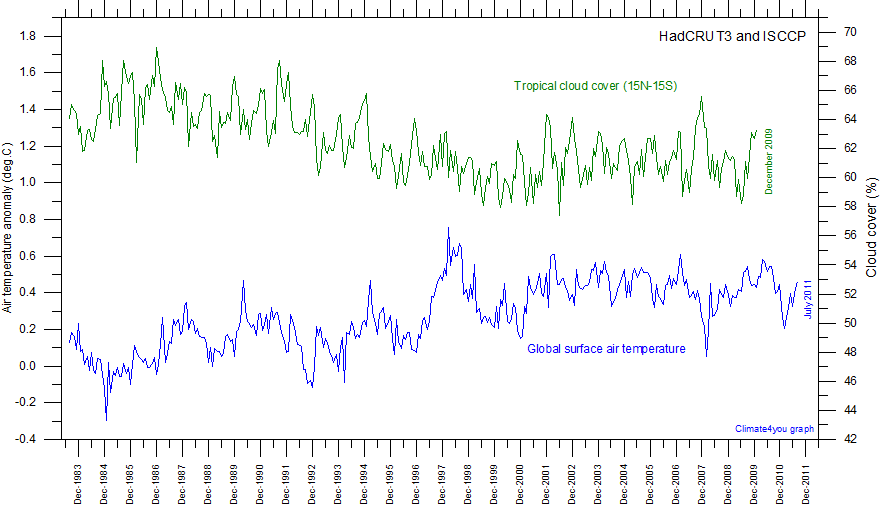
For instance how can any enquiry not consider cloud cover trends particularly over the tropical Pacific Ocean where insolation is greatest and takes up about 50% of the Earth’s circumference at the Equator?
Climate4You? Ole Humlum?
You’re kidding, right? The cloud/climate hypothesis is long ago debunked.
https://stephenschneider.stanford.edu/Publications/PDF_Papers/DamonLaut2004.pdf
Typical, a feeble attempt at ad hominem and a red herring, the cosmic ray theory is irrelevant.
schnieder..lol…. the ultimate in failed scientists
Never been correct with anything, except in hindsight..
… even then, mostly wrong
You were presented with observational data, not a hypothesis. Instead of addressing the graphical data, you offered up a straw man that a related hypothesis had been “debunked.” Deal with the data!
The essence of the Scientific Method is to propose tentative hypotheses to explain deviations from the consensus paradigm. That is how science progresses. Do you have anything substantive to contribute?
Mr Phillips says I misunderstood Pinker’s 2005 paper. No, I understood it correctly. The radiative forcing from the naturally-occurring reduction in cloud cover over the 18 years to 2001 exceeded the period anthropogenic forcing, suggesting that most of the consequent warming was natural.
With the PDO being in the cool phase(-PDO) and the La Nina increasing again later this year, the pause will likely lengthen too………….unfortunately, this increases chances for the drought to continue this Winter in the Western US from this natural weather.
https://www.daculaweather.com/4_pdo_index.php
https://www.marketforum.com/forum/topic/71975/#71978
Sadly true. Las Niñas bring drought to western North America.
Good posting lord Monckton. Thank you!