Guest Post by Willis Eschenbach
A comment on my previous post got me to thinking about cumulative sums of a series of numbers. In a “cumulative sum”, we start with the first value in the series, and make a new series by adding each number in the old series to the total of the new series.
So if the series is say (1, 3, 7, 10), the new series that is the cumulative sum of the old series is (1, 4, 11, 21). It’s calculated as
- 1
- 1 + 3 = 4
- 4 + 7 = 11
- 11 + 10 = 21
Why is a cumulative sum of interest? It can reveal underlying trends and changes in datasets. For example, consider the “Pacific Decadal Oscillation”, also known as the “PDO”. This is a slow change in the Pacific, in which the northernmost part alternately gets cooler and warmer.

Figure 1. The two extremes of sea surface temperatures in the Pacific Decadal Oscillation.
And here is a graph of the PDO Index, which measures the state of the PDO.

Figure 2. PDO Index, and the date of the “Great Pacific Climate Shift” of 1976-1977.
And what is the “Great Pacific Climate Shift” when it is at home? It was the date of the first shift in the Pacific Decadal Oscillation that was identified by scientists. (As a long-time commercial salmon fisherman, I greatly appreciate the fact that the PDO was first noticed in records of salmon catches in the Pacific Northwest … but I digress). From the Journal of Climate article “The Significance of the 1976 Pacific Climate Shift in the Climatology of Alaska“:
In 1976, the North Pacific region, including Alaska, underwent a dramatic shift to a climate regime that saw great increases in winter and spring temperatures, and lesser increases in summer and autumn, when compared to the previous 25 yr.
And what does the 1976 Pacific Climate Shift have to do with cumulative sums? It becomes obvious when we graph the cumulative sum of the PDO Index as shown below.

Figure 3. Cumulative sum of the PDO Index, and the date of the 1977 Pacific Climate Shift
As you can see, the cumulative sum of the PDO index clearly shows the date of the shift in the Pacific climate to the warm phase of the PDO.
What else can cumulative sums do? They can show us if two datasets are related to each other. Here are the cumulative sums of
along with the PDO.

Figure 4. Cumulative sum of the PDO Index, and the date of the 1977 Pacific Climate Shift
These four indices of the climate are based on very different things. The PDO Index is the first Principal Component of sea surface temperatures north of 20°N. The Southern Oscillation Index is based on the difference in barometric pressure between Tahiti and Australia. The NINO34 Index is based on sea surface temperatures in the region 5°N-5°S and 170°W-120°W. And the North Pacific Index is based on the area-weighted sea level pressure over the region 30°N-65°N, 160°E-140°W.
And despite that, they all clearly show the 1976 Pacific climate shift …
What else can we do with cumulative sums? Well, we can also use them to show which datasets are not related … here’s a couple of examples.

Figure 5 Cumulative Sums, Pacific Decadal Oscillation Index, North Atlantic Oscillation Index, and Monthly Sunspots
Not a whole lot of commonality in those three. And by implication, this shows that sunspots and the North Atlantic Oscillation are also not closely related to the El Nino indices shown in Figure 4 … and that’s it for cumulative sums for now.
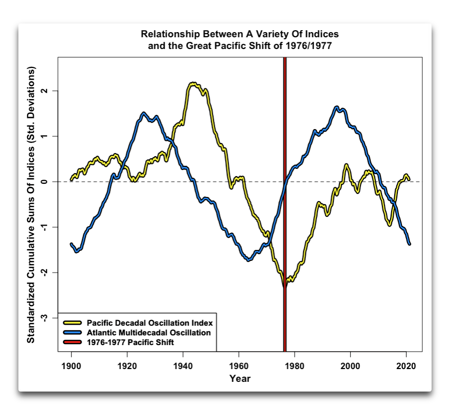
[UPDATE] A commenter pointed out that I hadn’t included the Atlantic Multidecadal Oscillation (AMO) in the analysis. Here’s that graph:

w.
Technical Note: Cumulative sums are very sensitive to initial conditions and anomalies. If there is an upward trend in the data, or if the zero point is lower than the values, a cumulative sum will head for the sky, and vice versa. However, the anomaly of that same data will behave very differently. All of the cumulative sums above were first expressed as an anomaly about the mean of the dataset in question. For trendless indices, this makes little difference. It does ensure that they return to the value at which they started. Taking them as anomalies around any other zero point will lead to an overall trend depending on the point chosen. As a result, the trend of a cumulative sum is generally meaningless, but as shown above, the variations in the cumulative sum can be quite meaningful.
My Usual Note: Please, I implore you, quote the exact words you are discussing. Without that it is often impossible to tell either who or what you are referring to, and misunderstandings multiply.
I think you’ll find that it’s not the SST but the deviation from the global mean ( yet another “anomaly”) .
That is clearly spelled out by Willis in the “technical note” at the end of his post.
From the PDO Index link in the head post:
“EOF analyses were calculated of the monthly SST were based on the temporal covariance matrix from the 1900-1993 period of record. using SST anomalies poleward of 20N in the Pacific basin.”
w.
Surely there is something better than just monthly sunspots. And are sunspots supposed to cook the oceans instantly like a microwave oven?
Sunspots have been observed for centuries.
Everything else have less than 70 years worth of measurement’s.
Only sunspots have a record long enough to honestly seek a trend.
Not true, e.g. the Southern Ocean Index has been observed since 1866.
w.
Willis, minor nitpick, SOI usually refers to The Southern Oscillation Index, not Ocean.
Thanks, Loydo, fixed. Moving too fast bites me again.
w.
I meant observations of the Sun, not the terrestrial factors that are being compared to the solar changes.
The only observations of the Sun that have a long enough history for trending are sunspots.
Methods of identifying and counting sunspots have changed multiple times. Even changes in sunspot determination and counting have occurred within the last couple of decades.
Changes that assume the ability to “correct” previous sunspot counts so that sunspot records can be connected into a long term trend.
The alleged continuous record of sunspots isn’t what they claim. Each individual method should be clearly identified and what adjustments have been made throughout that period.
Sorry, but that’s not true. The original instruments used centuries ago to discover sunspots still exist, so we know very well the differences between those and modern instruments. Thus, there’s no need to “assume the ability to “correct” previous sunspot counts”, because we can actually correct them to a high degree of accuracy. See here for a host of more details about how it was done.
w.
Figure 4 concerns only Pacific indexes (and it is pretty amazing they all hit the same year on the inflection point), but I wouldn’t think comparing the PDO vs the NAO would give you the same plot although the point of Figure 5 is to show just that. The Pacific is huge and not that influenced by land where the Atlantic is smaller and is well effected by the continents.
I will say Fig 5 shows the NAO has changed direction every 20+- years since 1920. That information is pretty insightful. Based on that, it is probably time for it to continue coming back down. Very interesting essay w. I learned something I did not know.
Interesting as always Willis. Clearly there was (??) a major turning point in 1976 that has been very useful for the CO2 warming crowd. Perhaps also a turning point (??) in the 1940’s that powered the prior global cooling scare that has since been done away with by our friends at NASA.
Getting to the point, I like your use of cumulative sums in this analysis. Seems very analogous to using stochastic dominance to compare / rank distributions without having to make any assumptions (e.g., normality) about the distributions themselves. Very powerful, albeit not as tractable as the modelers would like.
Question – is there enough direct or proxy data that would allow past turning points to be identified for purposes of identifying where we are in the current cycle?
Thanks Willis.
“What else can we do with cumulative sums? Well, we can also use them to show which datasets are not related …”.
I would be cautious about drawing this type of conclusion based on a simple exploratory data analysis.
Consider the issue that NINO index data have trends removed by employing a 30 year moving average updated every 5 years. You are quite correct that it can only be used to analyse variability over time, not absolutes.
The point of my comment yesterday was a word of caution when trying to draw linear correlations between indexed data (nino) and raw data (say, sunspots). The point of suggesting a cumulative sum of nino for comparing to raw sunspots was to ensure nino data is normalised in a way that is more directly comparable.
For example, nino index data can be thought of as derivative centred on zero, while most raw observational data is integral by nature such as counts of sunspots over time or temperature over time. These two data types cannot be directly compared without transforming one in a physically logical way.
Next, one should check for normality to see if a linear regression test is appropriate. If linear regression is the preferred method, one or the other data series may require a transformation to log scale or something else for normal parametric tests. For example, in my field it is common that we work with water quality data where we see spikes of chemicals after rain events, followed by a return to ambient baseline. This type of data log-normally distributed.
I do not believe anyone is suggesting NINO index values are linearly related to sunspots, no matter how the data are transformed. This is why tests such as Superposed Epoch Analysis are useful to determine any similarities in periodicity of noisy data without any assumption of linearity. However, like any statistical test, it requires sound judgement about tests used, a reasonable hypothesis of the relationship, and data that are directly comparable in a physically meaningful way. Until these conditions are met it is not useful to draw any conclusion.
regards,
JCM
Good post Willis.
A few comments:
Good posting by Willis, and I agree with dh-mtl that considering lag time may be important. The reason for lag times associated with various physical events, such as sun spot cycles and even larger scale solar minimums or maximums, is that the planet earth is a very large laboratory and it certainly takes some significant time to readjust a changing parameter affecting one area to spread the influence to another area. Shirley the speed of ocean currents compared to wind speeds means an effect mis-match, for example. Try flying over the Yukon or Amazon Basin and you-ll instantly see how big this planet is.
Thanks, Ron. I’ve flown over the Yukon and over the Amazon Basin, and I’ve sailed across the Pacific … at this point in my life, I don’t need any lectures on planetary size.
However, despite the size of the planet, any given spot on land changes air temperature by 5-10°C between day and night … and hemispheric ocean temperatures change than much winter to summer.
There is more than enough solar energy available to change surface temperatures on a short time scale.

Which makes me suspicious of claims that some change in solar output won’t show up for years, a decade, or more.
w.
It is a mystery to me why everyone “says” there are equal amounts of down welling radiation as up-welling.
It seems to me that the absorbed “outward” radiation would be higher then the absorbed down-welling radiation as the Earth is not flat. As the radiation gains height, more and more becomes outward bound. Are they only considering radiation so close to the Earth that the curvature plays too little a role?
The other problem I see is they seem to treat the Earth as some black body radiative object, when in fact a lot of the absorbed and re-emitted radiation is going to be picked up by vegetation and the energy transferred into water vapor by an active system – never mind the large bodies of water covering most of the Earth.
If you’re talking about a difference due to area, the tropopause averages about 36,000 ft, which is about 11 km.
The radius of the earth is ~11000 km.
Area is proportional to the square of the radius, so the area of the tropopause = 0.2% larger than the area of the surface. For most first order analyses, an error this small is generally ignored.
Or if you are talking about the dip of the horizon due to altitude,
… again, small enough that for first-order calculations it’s generally ignored.
w.
Willis
“The radius of the earth is ~11000 km.”
Surely you mean diameter? ie.12,700km…
Psst! Don’t mention specular reflection. I mentioned it once and didn’t get away with it.
Willis, I would never presume to lecture you.
Thanks, Ron, my bad for snapping at you.
w.
Lag time from solar irradiance on atmospheric temperature is a result of oceanic upwelling/downwelling.
Thanks, dh. I’ve added the AMO to the head post. However, the lag between the PDO and the AMO is 13 years, and I see no physical reason to justify a connection based on that lag, or any claim that they’re closely related.
Next, you say that “This is a clear demonstration that global sea-surface temperatures, and thus global atmospheric temperatures, are driven by long term changes in ENSO.” I’d disagree. As the old saying has it, “Correlation is not causation.”
Next, you say that “A significant lag between solar activity and ocean temperatures is to be expected, as it takes a lot of energy, absorbed by the oceans, in order to change the ocean temperatures.” Since the hemispherical sea surface temperatures change by on the order of 5°C every year, I fear that this isn’t true.
Finally, I did NOT show that “there is a definite pattern to the ENSO data within the solar cycle”. I showed that we don’t have enough data to conclude anything about the relationship between sunspot cycles and ENSO. And if there were a clear relationship between sunspots and ENSO cycles, we should have seen it in the century and a half of data that we do have.
Regards,
w.
if you add the running sum of AMO PDO and ENSO and plot them up in one all three combined graph, you might find a very interesting correlation though… especially if you compare it with the temperature record. It doesn’t mean causatiuon of course but it’s surely an area that should need more attention from science in general. not mentioning the beaufort gyre eckman pumping, which is also overdue…
but i guess that’s an article or 2-3 on it’s own 🙂
Willis,
I looked at the same data as you have using a slightly different tool. Rather than using the cumulative sums, I have used the Exponentially Weighted Moving Average (EWMA(i) = EWMA(i -1) + λ*X(i)). As you can see, this is very similar to a cumulative sum, with the exception that the older data decays away exponentially.
If one does a correlation (monthly data) of an EWMA of ENSO with Global Atmospheric Temperatures (for example with the UAH dataset) one finds some very strong corellations, that vary depending on the value of λ. Indeed, the correlation seems to be bi-modal with a weak peak at λ=1/8 (similar to an 8 month moving average) and very strong correlations at λ less than 1/120 (similar to a 10 year moving average).
Indeed, a correlation between the EWMA of ENSO (λ=1/120) and a 13-month moving average of Global Atmospheric Temperatures (Hadcrut 4 – 1950-2010) yields an R2 of about 0.4.
What is interesting is that this same EWMA also has a highly significant correlation with the AMO (13 month centered average).
Given that:
Then: There is no doubt that the very strong correlation between the EWMA (λ=1/120) of ENSO and Global Atmospheric temperatures shows that ENSO is a primary driver of Global Atmospheric Temperatures.
In the same vein, it appears that ENSO drives the AMO (and likely the other ocean indices as you have described).
indeed, what I am describing here, and what you have described with your post on cumulative sums, is in essence Bob Tisdale’s ‘Permanent Effect of ENSO’.
Typo above:
Formula for EWMA should read: EWMA(i) = (1-λ)*EWMA(i -1) + λ*X(i)
Good news about the typo, I couldn’t figure out the formula. This makes much more sense.
w.
Thanks for the extra AMO graphic. Looking at the graphic two things are interesting:
Figure 5 shows that the NAO is not in lock step with the AMO: each Atlantic periodicity has its own pattern. The strong warming of the last twenty years seems strongly correlated with the things happening in the North Atlantic/Arctic: see the high rise of the NAO during this period. For the West European weather the NAO seems to be dominant. The twenty years with warm and dry springs and summers and the warm and wet winters have been an extraordinary period.
All graphics together show the unpredictable character of everything, even of main patterns.
Wim and Willis,
I agree that the added graph comparing the AMO to the PDO based on cumulative sums of each from 1990 to 2021 is very interesting and invites many questions, two of which Wim surfaced.
Granted we are looking at only a little more than one full cycle for each parameter, but as Willis pointed out above, the 13-year average phase difference between the two (apparently) oscillating parameters is difficult to explain . . . and it, together with “cycle” periods of about 75 years (AMO) and 55 years (PDO) would seen to rule out any long-term connection with solar activity (i.e., the Hale, Gleissberg and deVries solar cycles).
Also, if the periods shown are real, it necessarily implies that the 13-year phase “lag” noted around the time of the Great Pacific Shift is only temporary.
The cause of the peak amplitude of the PDO parameter around 1945 being greatly larger than the amplitudes from 2000 and 2021 invites much speculation, assuming the magnitude difference is not an artifact of using the cumulative sums method of comparison (i.e., starting the graph on the increasing portion of the “cycle”).
Likewise, but in comparison, the cause of (control for) the equal-magnitude, symmetric peaks in the AMO invites much speculation.
Cumulative sums of one variable compared with period ‘integral’ of another one often show something unexpected. Here is one example I did about 10 years ago, hence it is a bit out of date
… or on the PDO (again from 10 years ago)
Will we start getting cooling shortly with the seismic activity dropping somewhat through 2017 -2019..?
Thanks Fred, seismic activity graphs look interesting, downloaded images, so will re-label time axis and do comparisons to the volcanic data for N Atlantic & Pacific, although I already see good correspondence with my graph for the SST-AMO further down (@2.27pm)
Will very low solar activity cause La Niña to return?
http://tropic.ssec.wisc.edu/real-time/mtpw2/product.php?color_type=tpw_nrl_colors&prod=samer2×pan=24hrs&anim=html5
Interesting, and partly because of your past history in commercial salmon fishing. I sport fish and for 5 years we have had maybe 2 days where we could get offshore of vancouver island, hence not great fishing.
With the PDO heading negative, will I finally get some nice weather?
Even 2 consecutive days without gale force winds would be welcome
Nice article. Very interesting. 1976 is an interesting time…that is about when they were warning about the new ice age that was going to kill all of us, and just before they started worrying about global warming instead.
Why 1976? It isn’t like CO2 concentrations suddenly shot upwards. Or humidity. Or the Sun started glowing brighter. Really curious.
Ah, finally someone has come up with the correct question, which is, what is so special about 1976? I have no idea, but it’s a good question. I was going to ask it in the head post, but then I decided to see if anyone would wonder about that.
w.
Willis,
I have no idea either about the significance of 1976.
However it is commonly thought of as being the first year of the late 20th Century warming.
There was a slight cooling of the global average surface temperature from 1940 to about 1975 (some 0.1C or 0.2C),with the mainstream reasoning behind this mid-century cooling being global dimming due to anthropogenic sulphate aerosol emissions.
Thus the March 1,1975 edition of Science News speculating about “ The Ice Age Cometh?” regularly published here.
“There was a slight cooling of the global average surface temperature from 1940 to about 1975 (some 0.1C or 0.2C),”
The cooling in the United States from 1940 to 1975 was about 2.0C.
If you start the count at the year 1934, the year James Hansen called the hottest year, then the tempratures dropped 2.5C from 1934 to 1975.
Here’s Hansen’s 1999 US surface temperature chart:
Most, if not all, regional surface temperature charts have the same temperature profile as the U.S. chart.
Tom,
Thanks.
I remember reading Hansen’s1999 piece on1934 being warmer than1998 but may not have seen the graph.
What a 2C cooling in the US in that period underlines is Freeman Dyson’s point (made also by many others) that any global warming,or global cooling, may not have been global.
Climate is local and regional.
Being able to calculate a GAST does not mean you can create a global average climate that is meaningful.
Likewise in Australia,Dr Jennifer Marohasy in her publication “The Homogenisation of Rutherglen” has been pointing out for some years that the BOM has converted a mild cooling trend of that area over the past century to a statistically significant warming.
The 1976-78 time frame occurred during the somewhat odd behavior of the sun. Although odd might be to strong of a word. Sunspot records go back a ways while other data is only several decades long. Correlations are meaningless anyway without a causation.
Here’s a thought: In reality, there is insufficient data presented (not even two full cycles of PDO oscillation) to show that there is anything special about 1976, let alone it deserving the name of the “Great Pacific Climate Shift”?
In other words, “great” compared to what? Just because the Journal of Climate article “The Significance of the 1976 Pacific Climate Shift in the Climatology of Alaska” deemed it so when compared to the previous 25 years of Pacific Ocean “climate”? Really???
NASA, NOAA and most other scientific organizations involved with meteorology have settled on the proposition that a period of 30 years or longer is needed to establish a given “climate”.
Never discussed: the location and strength of low and high pressure areas. A change in their relative position changes strength and direction of winds. Changed winds change oceans. And changed oceans create persistent wind patterns. Until… low and high pressure areas change strength and/or location.
For example when a warmer Arctic ocean after some time cooled down, sea-ice returns and covers ice-free areas that can’t evaporate and so prevent low pressure areas to develop and persist. Wind patterns will change etc. etc.
1976 was such a turning point and I would not be surprised when 2021 is the next one.
Very interesting finding. I did the same inspired by you for the AMO which also reveals a very clear signal. In principle the cumsum provides a kind of integral of the signal. Integrals tend to be more stable than derivatives. A decade ago we hunted for the AMO oscillations which we could see using advanced filtering techniques, Henriksson et al 2012. This simple method seems to give a very clear signal. One might argue that the climate is the integral of the weather details. This way of reasoning would motivate a comparison of the radiation balance and maybe cloudiness, albedo, deep sea temperatures…. In the short run it is hard to draw conclusions but in the long run there has to be a balance. Thanks for a very inspiring idea.
Most of these Oceanic indices timelines can be associated with volcanic activity in the nearby ares, here is one with the AMO (using same formula as one in my comment further above for the SOI)
It’s not credible that volcanoes show such clean oscillations. And that all geologists except you have missed them all this time. The climate is not passive. It contains internal oscillations, both intrinsic and periodically forced. Assuming only astrophysical-magnetic factors drive climate change is as wrong as saying that only atmospheric forcing from CO2 and volcanoes changes it. The ocean changes climate by its internal intrinsic dynamics. The use of the word “forcing” in analysing climate change means that you are on a road to nowhere before you’ve even started. Climate forces itself. To know how, find out about Ilya Prigogine’s nonlinear thermodynamics and “dissipative structures”.
Hi Hatter
Thanks for showing interest. How would you know if you don’t look. I had a look and regarding the above graph, the annual number of events since 1600, and LPF output are shown below. Note about 50ish or so year periodicity of peaks since 1825
It is possible that the region is due for another peak of volcanic eruptions during the next 10-15 years (note: you heard it here first)
I’ve just done spectral analysis, the main spectral component 1700-2015 is 56 years, this is too close to the AMO to be ignored. Spectral peaks might be even closer if we had 300+ years of the AMO data
Which “volcanoes” are you doing the spectral analysis on? Here are the Indonesian eruptions since 1700 …
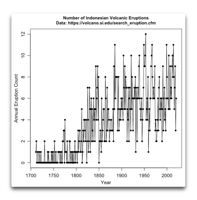
As you can see, there was a very large change around 1800. Given how long ago that was, I suspect that it was a change in REPORTED eruptions and not a change in the number of eruptions.
Next, you claimed that El Nino was a consequence of Indo eruptions. But you get only one El Nino event every few years … and there hasn’t been less than one eruption every year in Indonesia since 1850, and often four or more.
w.
Yes, I do agree. In case of Indonesia I would think anything before 1850 would be incomplete, but since then presence of Dutch, British and French in the region would most likely ensure relatively reliable records. Although the data appear to have a random distribution, it is difficult to tell if there is any periodicity to it without doing analysis.
I doubt that this region would have any effect on the AMO and the N. Atlantic, although I looked only at the Solomon Sea archipelago, where appears to be a degree of correlation with the ENSO, as per my comments on the previous thread, where I listed data.
Great insight. Climate IS an integral of weather. Not only temperature, but other factors also. Humidity, rainfall, insolation in an area, clouds, etc.
Here is the image of the cumulative AMO.
Interesting, the peaks periodicity just under 70 years.
I made the same graph from the data. i also looked at it by month. I have no idea what the data is saying
I just realised that the Pacific North West is in fact the northeast of the Pacific and the Atlantic North East is in fact the northwest of the Atlantic.
Probably wildly off topic but there may be a oscilatshundocadoal doo doo in there..
Ctrl+F didn’t find it nor any mention of ‘climate’
(You will be directed to the BBC in a mo, so: This Is Serious)
Prolly the Jet stream wot did it.
No need for explanation of how or why, It Just Did
Quote (1) “This situation is unheard of,” the agriculture minister said.“”
Quote(2) “Green politicians in the Gironde area around Bordeaux have objected to paraffin lamps causing a thick haze and leading to the worst air quality in the country on Thursday””
Quote (3) “Boris Calmette told French radio, “It literally turns your stomach,”
Some of us will agree with you Boris, but for diametrically opposite reasons
Be curious no more
That global warming apparently burnt the leaves on the vines, they turned black.
The cumulative sum I work with every day is a profit and loss sum. If you have a portfolio of stocks, each stock position that you hold either makes money or loses money each day. If you look at a graph of that data it is very choppy. But if you do the cumulative sum graph it looks much smoother.
For example look at a graph of the SP500 daily change for last 20 years. It will look quite choppy. Now do the graph of the cumulative sum of the those daily changes. It will look much smoother.
Now if the mean of the daily changes is positive over those 20 years, your cumulative sum graph will be higher at the end of the graph than the start of the graph.
Willis
Could the 1976 climate shift be more about when most of the adjustments in the records and less about the actual climate?
Seems very doubtful, Bob, because e.g. the SOI is based on the difference in barometric pressure between Papeete in Tahiti and Darwin in Australia, and neither one has ever been “adjusted”.
w.
Granted, but the BOM have a paper about the change from Fahrenheit to Celsius temperatures in Australia in 1975. There is a “warming” on metrication of about 0.15C that could be from the metrication or from the climate shift. The jump is still there IIRC.
Rather than wondering what the climate shift is all about, it might be better to muse that if climate changes in jumps as opposed to a gradual drift, then 1975 is an example that can be studied to see what else changed. Probably been done but gets too speculative.
Geoff S
Off topic but I need someone smarter than me to look at and comment on this new paper from University of Oslo. CO2 forcing tested and doubted
https://www.scirp.org/pdf/acs_2020041718295959.pdf
Willis, Probably nothing more than a coincidence but it almost seems like the PDO and AMO have a balancing act to a certain extent. Is there a reason why the other one crosses the cumulative sum of 0 deviation as the other one is approaching a peak or trough? I noticed it first with your red line through the Great Pacific Shift.
Indeed they look about 90 deg out of phase.
The two cycles in the AMO look pretty purely sinusoidal.
There is only one cycle evident in the PDO data and it flattens out in the 20 years at the ends rather than continuing to swing. That suggests there are harmonic factors present in the PDO (sort of an oscillation in the oscillation).
E.g. compare the PDO cum-sum plot to a plot of sin(-t)+sin(-2t), plotted from -pi to pi.
I just wondered could there be an equilibrium like state shared between the two. The PDO can effect the Aleutian Low. The Aleutian Low sea sea saws with the NAO, locational wise. The NAO and ATL SST’s have a relationship. The deviation between the two, during the peaks and troughs, stays within about 1.5. Besides one of them being close to 0 at the time.
The only time their difference strayed to 2.0 was the Great Pacific Shift and the prior PDO flip in the 40’s. Would the PDO now stay close to the 0 deviation line if the AMO continued going Negative for a number of years down the road. Is 2.0 and important signal?
The cumulative sum (CUSUM), I was told in 1968 was “invented” by the famous mathematician John Von Neumann. He proposed this data analysis technique to detect a change from a required performance and showed the US Army how to use it to detect from a required performance on assembly lines of any product being made during WWII.
Basically it is a quality control tool. I was also told that he refused to publish this because it was so simple! The engineer who told me this also gave me a copy of an early article:
https://doi.org/10.1093/biomet/41.1-2.100 and apparently was used also in England.
I used this technique to my advantage to detect a change (+ or -) from the results of regular samplings to remain within what I wanted.
Wikipedia has some examples and publications:
https://en.wikipedia.org/wiki/CUSUM
Certainly works quite well to stop deviations of product specifications and adjusting. Not sure it helps for climate change, since we have no specifications and obviously no way of adjusting if + or – deviations are found. However it is an interesting way of plotting the data!
” we can also use them to show which datasets are not related”
No such thing as unrelated I’m afraid Willis. What you mean is that we don’t understand the relationship.
Mike, my climate rule of thumb is:
“In climate, everything is related to everything else, which in turn is related to everything else …
…
… except when it isn’t”
w.
Makes sense, accounts for the relative ‘Hiatus’ too.
La Niña brings heavy downpours to New Guinea and the Solomon Islands.
What you are calling ‘cumulative sum’ is numerical integration. That is what I used to generate this graph which helped to justify the assumption of a saw-tooth profile to represent the net of all ocean cycles in a simple algorithm. The algorithm with two additional factors calculates temperatures that match measured 96+% since before 1900. The graph, made about 2017, is Figure 5 in the blog/analysis.
So your claim is that the temperature of the Pacific Ocean, which covers something like a third the planet, can be used to calculate the temperature of the whole?
Sorry … not news. That’s as exciting as saying you can calculate the temperature of your whole body based on the temperature under your tongue.
w.
Of course I am not talking about the temperature of the Pacific Ocean or any other body of water. I am talking about the net CHANGE to the temperature of all of the oceans as it affects the average global temperature change.
The measured temperatures are of lessor importance. Even typical bias can be ignored. What really matters is that the temperatures are taken in exactly the same protocol and that the instrument drift is negligible or at least known. Then what matters is the change. Some of the agencies report ocean temperature and land temperature but using reported ocean temperature in a calculation which is 71% ocean is circular reasoning.
What’s not news is numerical integration.
It seems worth to include in any consideration the temperature shifts in the early 1940s as a possible contribution by naval war in the North Pacific west of Hawaii, since Pearl Harbor in December 1941, discussed at http://www.seaclimate.com/h/h.html
In the following three Figures:
http://www.seaclimate.com/h/images/rand/b/gb_1.png
http://www.seaclimate.com/h/images/rand/b/gb_2.png
http://www.seaclimate.com/h/images/rand/b/gb_14b.png
Cumulative oceanic indices look like a useful insight very relevant to climate. This is likely due to the lag always present in heat movements from ocean to atmosphere. The 1976-77 inflection is particularly striking. And the phase shift between PDO and AMO is very clear.
One suspects that without adjustments, the global temperature record would look similar to these oceanic cumulative records. Particularly astounding that the editors have ironed flat temperatures between the 1940s and 1970’s.
Speaking of numbers, and not alot of people know this but, avocado’s number is equal to one guaca mole. True story.