By Andy May
On January 22, 2021, John Christy presented a new online talk to the Irish Climate Science Forum. The talk was arranged by Jim O’Brien. A summary of the presentation can be read at clintel.org here. In this post we present two interesting graphs from the presentation. These compare observations to the IPCC Coupled Model Intercomparison Project 5 climate models (CMIP5, 2013) and CMIP6 (current set of IPCC models) climate model projections.

The next graph compares the newer CMIP6 models to both the weather balloon data (light green) and the weather reanalysis data (dark green).

The difference between the models and the observations is statistically significant and shows that the models have been invalidated. It is also significant that the CMIP6 spread of model results is worse than the CMIP5 spread. Thus, the newer models show less agreement to one another than the previous set. “Houston, we have a problem.”
Told you so.
The so called greenhouse effect is a product of atmospheric mass moving up and down within a gravity field.
Air moving up cools. Air moving down warms. Net result. Zero.
No warming here.
There is a delay in releasing energy to space, hence a temperature rise.
Huh? A delay in the energy exchange under quasi-steady conditions?
Warning: that does not compute.
There is no delay.
Certainly less than a day.
It takes time for air to rise from surface to tropopause and then back down again.
The delay is the time it takes to complete one convective overturning cycle in the Hadley cells which are the larger of the three cells created by the Earth’s rotation. The others are the Ferrell and Polar cells.
Energy required to sustain those cells is energy delayed from emission to space so the surface temperature has to rise to keep them running.
The so called delay, to the extent that it even exists, is a matter of seconds to minutes. Many orders of magnitude too small to create the effect you need.
Pretty fast Hadley cells then. You’d get your hat blown off if not your head.
Even if there was a delay, which there isn’t, once the system reaches steady state the amount of heat and the amount of cooling must balance, so not net warming or cooling.
It reaches steady state at a higher temperature than that predicted by the S-B equation.
My simple explanation of this has been that a real greenhouse does not stay warm because of the operation of heat trapping so called greenhouse gases. A real greenhouse stays warm because the glass reduces cooling by convection, There is no radiant greenhouse effect in a real greenhouse. So too on Earth where instead of glass we have gravity and the heat capacity of the atmosphere.
Yes.
Beneath descending air, clouds dissipate to allow solar energy in like a glass roof and the descending air suppresses convection like a glass roof.
Hence the greenhouse effect.
The earth is not a greenhouse
And has no glass roof.
That’s why the rain gets in.
Not if you fix the hole.
Descending air does not suppress convection. Descending air is convection.
Regardless, even if descending air did suppress convection, then rising air would enhance convection, so once again the affects cancel out.
William, you stated: “A real greenhouse stays warm because the glass reduces cooling by convection.”
Would it not then follow that in the blaring overhead sun of summer day with an external air temperature of, say 100 °F, a greenhouse without any plants or water inside, will never heat up to or beyond 100 °F because heating by convection has been reduced?
To the extent that rolled-up car windows in parked cars sitting outside on hot, sunny days simulate a greenhouse configuration, it leads me to believe your “simple explanation” does not ring true.
A glass house warms up by allowing radiation in and reducing convection out.
Also, the IR transmitted from the plants and earth inside the greenhouse is at a longer wavelength than that coming in from the sun (because of the difference in temperatures between the two) and the glass is opaque to that longer wavelength. The last I checked, the sky isn’t made of glass.
Richard, glass is not opaque to infrared. IR lamps are made of glass. IR cameras have glass lenses.
To expand upon Andy May’s comment, here is a nice summary (from https://www.quora.com/Can-infrared-light-pass-through-glass ):
“Near infrared (NIR) and Short-Wave Infrared (SWIR) will pass through most glass, though the amount will vary based on the glass and the specific wavelengths within those bands.
Mid-Wave Infrared (MWIR) and Long-Wave Infrared (LWIR) are blocked by most glass. This is the wavelength of IR light that thermal cameras use, so contrary to what the movies would have you believe, thermal infrared cameras cannot see through [most types of -GD] glass.
This isn’t an absolute rule. Some types of glass are more transparent to IR than others. Sapphire is transparent to most wavelengths of IR all the way down to MWIR wavelengths, so cooled thermal cameras can see through sapphire. Below is a graphic from Edmund Optics* that shows the transparency spectrum of various lens materials.”
*see Figure 4 at https://www.edmundoptics.com/knowledge-center/application-notes/optics/the-correct-material-for-infrared-applications/
The sky isn’t made of glass, but it does have a lot of greenhouse gasses in it, which are also opaque to that longer wavelength.
I said that the glass reduces cooling by convection.
And I maintain that if this were true, then it must following that glass reduces external heating by convection.
But I may have overlooked the possibility that greenhouse glass acts as a thermal diode for convective heat transfer . . . maybe.
There is no external heating by convection to be reduced.
MarkW,
You mean to say that a hot dessert air, with temperatures of 100 deg-F or so, cannot ever blow over a hot house that is at, say 80 deg-F or so, internal temperature from having cooled overnight?
I am unaware of any rule (i.e., physics) that says hot house internal temperatures must always be hotter than external, ambient temperatures. Place cite a reference for this.
Where is the convection heating coming from?
Ambient air at, say 90-100 deg-F, blowing around a hot house having glass, metal and internal air temperatures of, say 70-80 deg-F as might occur in early morning hours, would create the thermal conditions for convective heating of the greenhouse to be coming from the outside air.
And that convective heating would be (at first) only very weakly influenced by whether or not convection was happening in the air inside the greenhouse.
Where did William state “heating by convection“?
That is one sloppy red herring logical fallacy.
Before getting into why plants or water apparently, according to your wording, increase a greenhouse’s temperature.
To maintain the same temperature as exterior to the greenhouse requires that the greenhouse have the exact same open air movement capability as the outside world does.
Restrict air movement, especially convection air movement will greatly increase the temperature inside.
“Restrict air movement, especially convection air movement will greatly increase the temperature inside.”
Hmmm. . . that doesn’t seem to happen in my house closets, nor in storage containers in my kitchen, nor in underground basements having no fans or AC.
None of the things you list are being heated by the sun.
Strange . . . I thought the whole Earth was heated by the Sun.
That’s an analogy for our atmosphere
But the ocean is most important aspect of our
global climate and it controls the temperature of
the atmosphere.
The entire ocean average temperature determines
whether we in an Ice Age or not.
We in an Ice Age because we have a cold ocean.
And the relatively thin ocean surface, determines our global
temperature.
Or 70% of surface is ocean and it’s average temperature is
around 17 C and 30% of surface is land with average temperature
of 10 C. If ocean surface average is colder, then land surface is
colder. Ocean surfaces warm land surface, though the tropical ocean
surfaces could be said to have the greater effect. And it’s said tropical
ocean surface is heat engine of the world.
But since tropical ocean is only about 40% of the world surface, it’s only the high
average temperature of tropical ocean surface which gives it’s control of global air {and land surface air within the tropics, in which ocean is about 80% of this tropical zone}.
Or can say ocean controls air temperature because it simply has more global surface area {or atmosphere above it}. And tropical ocean is only about 40% whereas entire ocean is 70%. Or roughly one has a temperature difference related
to latitude, the 23.5 north and south latitude of tropical zone is strongly control by dominate amount area which is tropical ocean, but globally it’s rest or the entirety of ocean surface which controls global atmosphere temperature.
Of course in terms of tropical ocean dominating, one has the transport of warmer tropical oceanic heat warming Europe {the Gulf Stream}.
Or Europe due to it’s high latitude “should” have much lower average temperature
but the Gulf Stream, adds to Europe’s average temperatures {Europe would have average temperature about 0 C} without this tropical energy.
I have always said that the climate change we are experiencing today is caused by the sun and the oceans.
I think there is next to no doubt about that.
Unless your grant money depends on your ignoring that fact.
I attended an orchid growing presentation given by a Canadian orchid grower.
At one point, he showed us pictures of his greenhouse surrounded by snow.
The presenter insisted that the visible rivulets of melted snow were caused by burning ground dollar bills.
Even in high humidity enclosed greenhouses, once that sun drops over the horizon the inside temperatures plummet as heat is radiated away or conducted by the glass to cooler exteriors.
Daytime greenhouse temperatures caused by sunny days are likened to car interiors on sunny days. Without convection, they rapidly warm excessively.
Cars are not warmed by sunlit CO₂, at least not to any measurable extent.
Commercial greenhouses frequently use swamp coolers to keep daytime temperatures from killing plants or greenhouse workers. Greenhouses in northern areas might get along by opening the upper windows. Only, most growers dislike inviting passing fungi, insects or foreign plant material to come visit.
One thing is certain about commercial greenhouses, CO₂ levels in excess of 1,000ppm do not change daytime heating.
That bears repeating..
CO₂ levels in excess of 1,000ppm do not change daytime heating.
How does The True Believers explain this inconvenient truth?
Well, to make a fair comparison, one should take into account the ratio-ing of 1,000 ppm vs. 410 ppm as compared to a LWIR radiation path length of ~6 m vs. ~15,000 m.
Fred
Great point. This old fossil exhales 40,000 ppm CO2 in my breath.
I often wonder what harm my fellow humans are doing to their health by blocking a large amount of that by wearing dog muzzles – now some idiots are wearing two or three on top of each other.
As Orwell wrote two legs good three legs better or was it four?
ATheoK – That last sentence is very signficant. Can you point me to a source for it? Thanks
Indeed. Real greenhouses have small vents in the roof which are opened when the temperature inside becomes too great. The effect is dramatic and immediate as the hot air can escape by convection, allowing cooler air from outside to replace it. These vents are far more effective than blinds.
Large exhaust fans are used in real greenhouses to blow out the overheated air and keep the interior to the desired temp. These come on automatically and are controlled by a thermostat, just like home heating/cooling systems. Greenhouses come in all temperatures, depending on the ideal temperature preferred by the plants being grown. Thus there are hot houses for some tropicals and cool houses for forcing bulbs and everything in between. A field trip to a real greenhouse seems to be in order….
Gravity has no affect on radiation.
While gravity has no direct effect on an EM wave, it does have an affect on radiation. At low altitudes gravity increases density to the point that CO2 collisions far outweigh CO2 radiation by a factor of 1000 to 10000 times. It also causes pressure broadening of what wavelengths can excite a CO2 molecule.
Many, many scientists believe the “greenhouse effect” as it’s talked about regarding Earth’s climate “forcings” is inherently due to where spectral absorption/emission lines of gases comprising Earth’s atmosphere are located relative to the solar spectrum and the LWIR spectrum from Earth’s land and sea surfaces (with and without ice and/or vegetation).
I am not aware of any scientist that associates the vertical motion of atmospheric gases as being the cause of the “greenhouse effect.”
Perhaps I can be proven to be wrong in this . . . but I don’t think so.
The adiabatic compression of the atmosphere means lower altitudes must retain more energy. That is what causes the lapse rate.
Steven Wilde is totally correct.
The atmosphere is CONTROLLED by bulk energy transfers, lateral and vertical, that CO2 has absolutely zero effect on.
If this were true, then bicycle tires would stay hot after they were pumped up.
The heat from compression is not retained, it is radiated and convected away just the same as all other forms of heat are.
Bad analogy. While there is some convection of the air in the tire, the heat is finally CONDUCTED thru the rubber, and into the atmosphere/pavement…
Earth’s atmosphere, without any vertical motion, has a normal lapse rate that is caused by the temperature difference between the surface and the beginning of the tropopause. It is characterized in the “standard atmosphere” temperature versus altitude correlation. This has nothing at all to do with adiabatic compression (or expansion) of parcels of moving air. As stated at https://www.britannica.com/science/lapse-rate :
“The lapse rate of nonrising air—commonly referred to as the normal, or environmental, lapse rate—is highly variable . . . it averages about 6.5 °C per kilometre (18.8 °F per mile) in the lower atmosphere (troposphere). It differs from the adiabatic lapse rate, which involves temperature changes due to the rising or sinking of an air parcel.”
Forced vertical motion of air parcels (such as a weather front forcing air up or down a mountain) can create adiabatic expansion cooling/adiabatic compression heating, with this added onto the normal lapse rate.
In addition, there is the dry adiabatic lapse rate (about 9.8 °C/km) and, once water vapor condensation occurs, the wet adiabatic lapse rate (which has been observed to vary from about 3.5 °C/km to 6.5 °C/km, averaging around half the value of the dry adiabatic lapse rate). Clouds occur over a great range of altitude, from Earth’s surface to 18 km, typically. This is a function of temperature and water vapor content, having nothing to do directly with gravity or vertical air movement.
Adiabatic compression of the atmosphere is not the cause of the lapse rate, although it can contribute to it.
Gordon, the go-to explanation of adiabatic lapse rate is the expanding and compressing “parcels” meme you have used. However, no parcel movement is required. The statistical thermodynamics of molecules fighting against or being assisted by a gravitational field as they vibrate up and down, and imparting momentum to their neighbors, gives the same result. Say a molecule has a velocity of 500 m/sec. Say the atmosphere consists of only one molecule to avoid the statistics part. Now you can calculate how far straight up you would shoot that molecule before its velocity is zero, thus its temperature is absolute zero…..
DMacKenzie, your post stands or falls on its own . . . no reply needed, or even possible, from me.
0.04% of the atmosphere is CO₂.
Atmospheric CO₂ is minimally interactive in a miniscule few infrared bands; as in count them on ten fingers few.
Water, whether in in gaseous, liquid or solid physical states is highly interactive across the majority of the infrared wavelengths; and very interactive in quite a few of the higher energy wavelengths.
CO₂ is a flea compared to H₂O’s atmospheric influence.
A) You have zero credibility for arguing from authority.
B) Another sloppy red herring logical fallacy; “associates the vertical motion of atmospheric gases as being the cause of the “greenhouse effect.”
• Stating a false reality does not make you correct!
C) Meteorology requires a cornerstone understanding about atmospheric convection.
• Convection is one of the causes for clouds.
• Convection causes thunderstorms.
• Convection is a leading cause for rain, hail, snow and lightning.
• Convection is an indirect cause for winds.
• Convection is a major conveyor to moving heat into the upper atmosphere.
D) Alarmists frequently trot out “greenhouse effect” to explain their theories for demonizing CO₂.
Real scientists do not cite “greenhouse effect” since such words are only legitimate when describing a glass enclosed greenhouse.
It’s not a red herring, it’s the core of their argument.
From Stephen Wild’s 2pm Feb 2 post
Thank you MarkW.
And I’ll just add that Stephen Wild’s OP that you referenced currently stands with five positive votes. Yes, there is a “their” there . . . go figure.
ATheoK,
Methinks thou doth protest too much.
Gorden Dressler seems to be intent on converting everyone’s statement to the opposite of what was actually written.
How is Gorden’s comment the opposite of what Stephen wrote which was
AndyHce seems to be ignorant of the sage advice, which I follow, that is given in the Bible (1 Thessalonians 5:21, NKJV): “Test all things; hold fast what is good.”
… a very fertile imagination and a high degree of creativity.
No:
Ongoing energy exchange from lasting atmospheres weight WORK to same atmosphere HEATING.
Harald Lesch: Druck erzeugt Wärme – was nützt uns Jupiter
https://youtu.be/n4eWlZvU-xA
https://www.google.com/search?client=ms-android-huawei&sxsrf=ALeKk027Pi-vxcEXx0zYorLUmXoZX9_apQ%3A1611020986297&ei=ujoGYKjJEaSvrgSLpb-YAg&q=harald+lesch+was+n%C3%BCtzt+uns+Jupiter&oq=harald+lesch+was+n%C3%BCtzt+uns+Jupiter&gs_lcp=ChNtb2JpbGUtZ3dzLXdpei1zZXJwEAM6BAgjECc6BQghEKABUKgXWNlyYO5yaAFwAHgAgAHXBIgBvROSAQcwLjkuNS0ymAEAoAEBwAEB&sclient=mobile-gws-wiz-serp
The Gravity does the WORK on atmospheres MASS. When electrostatic gathered that same Mass.
The four and only natural laws:
Gravity, electrostatic, the weak and the strong Nuclear power.
No problem that I can see. We will use the models for enforcing all the new green political controls, and the observations will just need correcting a bit.
I fear that there might be a much worse problem during the next 10 years, since the AMP is now in its downward phase. So it is becoming VERY important to drop the observations as soon as possible….
AMP = AMO, of course. Where is the edit?
Just at the right corner of the comment, appears with mouse-over
Ayup, twould be nice if it was visible until the comment was locked in
Don’t forget the PDO.
AMO hasn’t yet started its major decline and might not for up to 5 years or so
Yep , been bouncing around the top for a while, as it seems to do…..
(hence the zero trend in Arctic sea ice over that period),
a few years before it starts to drop in earnest.
Darn chaotic cycles…. why can’t they be nice and regular 😉
Needs more fibre, obviously!
Since they’re up to CMIP6, they obviously need Hex-lax
Modelling climate over 45 year period is bound to fail; climate has multidecadal (60+ years) and centenary cycles. Lot of people don’t like cycles, but that is the way nature on this planet is.
Cyclo-maniacs Unite!
30+ ice ages in the last 2.6 million years anyone?
Exactly.
I visited Stonehenge couple of times in past, its boulders are absolutely unique to the area. There are many theories how they were transported from the Welsh mountains where rocks have same chemical composition.
They were deposited in Wiltshire by nature, by glaciers from any one of the (30+) previous glaciations periods (mavukcevic).
Stonehenge apparently was built about 5-6,000 years ago, when the Europe and the N. Hemisphere were in one of the warmer Holocene periods, when food was plentiful and natives could indulge in building this impressive structure.
https://www.english-heritage.org.uk/visit/places/stonehenge/history-and-stories/stonehenge360/
The Niagara Adjustable data with Cyclo-massage unit
horses for courses
And no one can talk to a course of horse.
Speaking of cycles, just looked at the very low normal winter sea level height where the highest acceleration rate was claimed. Dry oyster reef. When highest in northern Gulf, it’s lowest in southern, haven’t seen that explained lately (sea-saw?). Sixteen years (2004-2020) does not a trend make, especially at three decimal places and may be much shorter. Probably due to some Harvey effect, after all he was an invisible rabbit.
“The 2020 report cards show an accelerating rate of sea-level rise at 27 of the 32 monitored stations. Rockport, Texas recorded the highest acceleration rate in 2020, with a value of 0.262 mm/yr……The difference between the linear rates used in NOAA’s sea-level forecasts and the non-linear, accelerating rates used in VIMS’ report cards can lead to sharply different forecasts of our sea-level future”
https://www.vims.edu/research/products/slrc/compare/east_coast/trends/index.php
HD, it’s not that difficult….they just cherry picked their start date
…if they had cherry picked 1975-1990….they could show Rockport bone dry in 10 years
if they had cherry picked 1990-2000…they could have shown an even faster rate of acceleration
NOAA tide gauge Rockport > https://tidesandcurrents.noaa.gov/sltrends/sltrends_station.shtml?id=8774770
Not to overlook Geodetic adjustments to tidal measurements.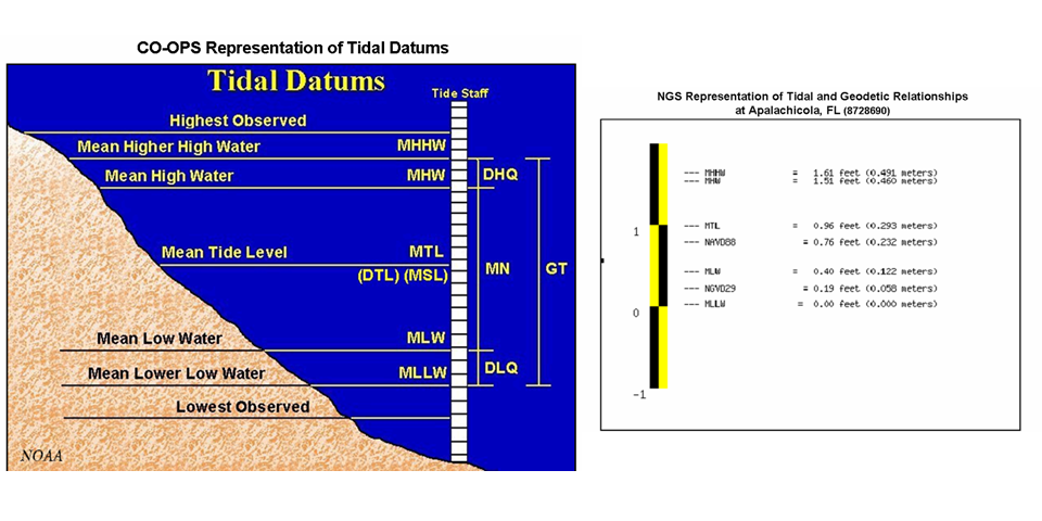 s
s
Co-Ops Tidal Datums:
Isn’t everyting at above absolute zero temperature vibrating and therefore cyclical?
Absolutely Vuk, as anyone who really observes nature can testify to, a constant feeling of cycles in literally everything.
Here is a recent rediscovery of two oak capricorn beetles (Cerambyx) in a 3785 year old log. The log was preserved in boggy conditions in a flatland area in the East of England.
These beetles no longer inhabit the UK because it’s too cold for them.
https://www.nhm.ac.uk/discover/news/2021/january/perfectly-preserved-ancient-beetles-uncovered.html
No model is able to replicate past climate history — therefore those models are doomed to failure. In the meantime, I’m enjoying global warming because civilizations do better in warmer climates, just like they have in the past. Even the very slowing rising sea levels are once again making the oceans great again — and making the fish happy too.
I, for one, certainly have a reasonable model. This is how I see myself in the future:
Careful what you wish for, gringojay.
Back in the 70s, I worked in a sporting goods store.
Had a regular customer who resembled that picture, only without the tattoos.
He arrived one night and bought two 100 pound Olympic iron plates.
I brought them up to the cashier on a two wheel handcart, then grunted them up to the cash register.
He paid for the plates. Then when I went to put them back on the cart to help him out to his car, he said “never mind”, and put both plates under one arm and walked out like they were newspapers.
Another time he bought a heavy duty folding hunter knife.
He came in again several days later and bought another. Then he paid us to sharpen the knife for him.
He had broken the first one trying to sharpen it.
I told him when he picked up the sharpened knife to bring in the broken one and I’d send it back to the manufacturer. I really wanted to hear that manufacturer explain how their knife broke so easily…
Turns out he broke lots of stuff without meaning to; like his steering wheel, door handles, etc.
probably broke it on the head of a charging moose
floated around BB forums for a long while, some of these giants are ridiculously strong… almost makes one wonder if they have a few of those special orangutan muscle fibers that make some of our primate cousins’ arms strong enough to tear ours right off our bodies if the mood takes them
Biden will be very interested in these models because he likes to sniff their hair.
Hunter likes all the lines.
… must be young models then, not into double digits yet.
Dr. Spencer has put out the UAH sat. temp for January 2021.
The anomaly is down to +0.12 C. That is almost down to level that existed from 2002-2015.
The La Nina is finally blowing cold.
It will be interesting to see what the temperatures do after we go back to ENSO neutral conditions.
I believe I will go long on wool socks.
BBC: “Meteorologists said (in the UK) January this year was the coldest since 2010, with an average temperature of 2.2C.”
https://www.bbc.co.uk/news/uk-england-55899744
Seems like a good time to return to this classic from 2010 December 24:
Snowfall “…a very rare and exciting event”
https://wattsupwiththat.com/2010/12/24/snowfall-a-very-rare-and-exciting-event/
Since 2010 in one small part of the world? Global cooling?
One tree was enough for mickey mann !!
If you really believe that it is only one place, then you haven’t been paying attention.
I am expecting temperatures to drop below the baseline by the end of this La Niña or the next and then we should see the first downward step for some time.
below what baseline exactly?
I assume Steven means the old UAH baseline.
Why would you assume that? It has a better chance of falling below their current baseline, given that it is so much warmer than the previous one.
I think that the point here is that the average January temperature for the UK has trended downwards this year rather than up if this continues and other months follow then the UK will be getting colder.
.
roflmao
about 0.12ºC.. scary. !!
WOW !!! you are getting DESPERATE !!
Need some rust converter?
The alteration in the UAH baseline changes the anomaly from +0.56 above baseline to +0.12 above baseline so basically 0.44c has been Adjusted out of the anomaly. Finally, an adjustment that you and Griff and Loydo Can’t Accept. Perhaps you should admit that record adjustments are bad and push for the temperature records to have all adjustments removed.
To be clear, that’s using a new base period of 1991-2020. It would be +0.26°C using the old base line.
The average January anomaly during 2002 – 2015 was 0.05°C using the new base period.
Yep, Will have to redraw old graphs when the full set becomes available
If you read his comments he mentions 0.15ºC for Dec 2020, whereas the old reading was 0.27ºC
Reference change seems to be around 0.12ºC, but varies for different regions.
This will not affect the zero warming from 1980-1998 and from 2001-2015
Meaningless calculated linear trend through the two large El Nino steps will stay the same.
fred
If you are using Excel, put in a cell with the value of the current baseline to make future updating easier. There will almost certainly be another revision in the future.
Nah, I’ll wait until the full set becomes available in a few days time.,
Baseline changes are different for different regions.
I’ll archive the old data file
Paste in the new data to the main sheet, and all my graphs “shouldᴸᴼᴸ” redraw themselves.
Anywho, the downward trend continues.
death to all base periods
let none survive
absolute uber alles
CAREFUL.
There has also been a change in reference period
On the old reference it is only a drop of about 0.03C from last month.
Roy says January 2021 is +0.12C warmer than the average January between 1991 and 2010. Above average for that month then, even using the most recent 30-year average. During La Nina conditions too. Global cooling?
NOT global warming, rusty.
CLIMATE NORMAL for the tail end of the Holocene
Much cooler than most of that period,
… only a degree or so above the coldest period in 10,000 years.
Climate Normal (past 30-years) is well above the previous 30 year average.
Is this cooling?
Its NOT warming
Past 30 years are WELL BELOW the last 10,000 years.
Don’t be so DESPERATE..
You have us all rolling around in laughter. 🙂
Climate normal is 3 to 5 C less than the Holocene optimum. Is this warming?
equal 13th place, after a large El Nino warming.
Desperation is becoming blatant in your posts, rusty
Its funny to watch 🙂
Equal 13th warmest after much-heralded La Nina cooling would be another way of framng it.
Yawn
La Nina is only starting to take affect
much desperation…. poor rusty !
Rusty?
…Nail
…Bucket
…Griswold
We are coming down from a fairly extensive period of mainly El Nino conditions. This warmed up the upper oceans and it takes time for that heat to be released. Give it some time. If you watch HadSST3 you can get an idea of where we are heading. About a 3 month lag.
https://woodfortrees.org/plot/uah6/from:1979/to/plot/uah6/from:1979/to/trend/plot/hadsst3gl/from:1979/to/offset:-0.2/plot/hadsst3gl/from:1979/to/offset:-0.2/trend
All of the warming occurred during El Ninos.
Dr Spencer changed baselines so that number was lowered accordingly. The drop from December was only .03 C. I do expect to see a bigger drop in February based on what is happening to SSTs.
The drop in Australia makes sense.
Only had half a dozen or so decently warm days in January.
And the U.S. looks like it will have a below-normal February. Arctic air heading this way.
The southern third of the U.S. is fairing better as the jet stream is keeping the really cold air from moving too far south. At least for now.
RealClimate posted something a few days ago showing that the models are awesomely awesome. What’s different? Are the two pieces of work comparing different measured temperatures or different model sets?
I can’t source the tropospheric model data sets Christy is citing here (which may be my bad). I cant find it anywhere. They seem to exist but who knows where? The RC charts are comparing surface data to models. Alll these data are easily accessed.
GISS et al are NOT reliable indicators of the surface temperature.
They are HIGHLY CORRUPTED by urban effects, infilling, sparse and irregular changeable sites, as well as agenda-driven homogenisations and other agenda-driven “adjustments”, that make them TOTALLY MEANINGLESS
They are actually FUDGED to try to fit the models. !
NOT SCIENCE of any kind.
UAH on the other hand, has been VALIDATED again the pristine surface data of USCRN, and against balloon data, so is provably a good proxy of surface temperatures.
Models are a SPECTACULAR FAILURE.
So tell us about the wondrous reliability of balloons.
Here come empty Nick again with NOTHING to say, yet again.
FAR more reliable than surface stations, wouldn’t you agree, Nick !!
Nick’s paycheck must have been late last month, he’s given up trying.
“Are the two pieces of work comparing different measured temperatures”
Yes. Real Climate was comparing predictions for global surface temperature. Christy is comparing predictions for a very specific region – 200-300 mb tropical. Very high troposphere, and not global. I wonder why he did that?
Also RC compares with the huge database of surface thermometer measurements. Christy compares with the sparse set of balloon measurements. And, typically, while showing the model spread, he compresses the balloon data to a single average, so you can’t see the spread there.
Climate models work on the atmosphere, Nick
You don’t think the farcical surface data is “compressed” to a single value….. ROFLMAO !!!
Your comments get more bizarre by the week ! 🙂
UAH is validated against the only pristine surface data in the world.
GISS et al are known to be a total mess of sparse, erratic, urban-affected, in-filled, homogenise to a whim, and adjusted to an agenda, load of junk non-science.
“I wonder why he did that?”
We all know why he did it. Of all the cherries he picked, it was the most divergent. Why else? What possible other explanation could there be to choose only one region of the atmosphere and 12,000m above the surface?
Instead, it’s all “mmm” and “uh huh” and “I told you so”. Andy May, it’s your by-line, aren’t at all interested in even asking the questions? Do you think Nick has a point regarding the spread of the ballon data? Would you like to see a comparison graph showing other levels? Or other regions?
Where are the so-called skeptics asking why tropical 200-300mb? Or is that just a tap that can be conveniently turned off when appropriate?
Climate models don’t work anywhere.. PERIOD. !!!
They are ATMOSPHERIC models, why wouldn’t they be expected to work in the atmosphere?
Any evidence of warmening by atmospheric CO2 yet, Loy-dumb
Or is this just another EMPTY drive-by attention-seeking yap.
The Connelly father and son duo have shown that once pressure is taken into account balloon data is remarkable stable.
But don’t let facts get in the way of your chihuhua impersonation.
What would be really funny is if someone cherry-picked a part of the atmosphere that is warming more than the models, posted it here claiming the models run cool. Because you know better than most you can cherry-pick anything you want. That might slam the skepticism switch back to ‘on’, because there is nothing but “mmms” and “uh huh” and “I told you” so here at the moment.
So, do it Loydo.
Nick, The surface temperature datasets are all controversial and have serious problems. Further, basic physics and model results show that the mid-Troposphere should warm faster than the surface, by about 1.2x. This is because increased evaporation carries more latent heat from the surface to the mid-tropospheric cloud region.
Yet, balloon data, reanalysis of weather data AND satellite data from this region are warming slower than shown by HadCRUT, GISS, NASA, etc. surface temperatures. This alone shows they are flawed.
Nick’s paid to believe that all of the problems with the surface data set have been solved by thoroughly cooking the data.
“Nick, The surface temperature datasets are all controversial and have serious problems.”
So you think balloon data doesn’t have problems? Do you actually know anything about it?
Or satellite data? You say that they show less warming than surface? Well, UAH does. But RSS (formerly WUWT’s favorite) shows more warming. That is just different calculations on the same data.
But the unshakeable thing is that, whatever their merits or faults, they aren’t surface measurements. A discrepancy doesn’t disprove the latter; it just means that they are measuring a different place. By far more unreliable processes.
Nick, The models and basic physics says that mid- to upper-troposphere should be warming faster than the surface if GHGs are the cause of the warming. Surely you agree with that. Let us establish a point of agreement first.
If you are happy with that, then we have several independent datasets that say that is not the case, weather reanalysis, weather balloon datasets and UAH, when combined with HadCRUT, GISS, or other surface datasets. You surely agree with this point also.
RSS is higher than HadCRUT, I agree with you on that, they are not in agreement with the models, but at least RSS has a higher rate of warming like the models predict.
The bottom line? There is no agreement, we haven’t a clue what is going on, which has always been my point.
Nick, Out of curiosity, I downloaded the ERA5 reanalysis data for the surface(2 meters) and 300 mbar. The plot is shown below. They are almost identical, which I find surprising. I usually believe reanalysis data, after all it is modeled after the fact. But, this is odd, the 300 mbar data should be steeper. But, anyway, it supports what Christy did – as being relevant to the surface.
RealClimate takes the view that since the models predicted warming, and it warmed, therefor the models are perfect. The amount of warming is just a meaningless detail.
the model should start from 1940, even before, which corresponds to a AMO peak period until 2020, another peak period . Wait a few years and this model will collapse completely !
How is the Russian model doing? My eyesight is as dodgy as the models.
“How is the Russian model doing?”
Here is an article which gives some information on the new Russian model:
<strong>2018 Update: Best Climate Model INMCM5</strong>
Update February 4, 2020
<blockquote>A recent comparison of INMCM5 with other CMIP6 climate models is discussed at the post: Climate Models: Good, Bad and Ugly</blockquote>
https://rclutz.wordpress.com/2018/10/22/2018-update-best-climate-model-inmcm5/
The Russian model is doing very well and explains why Russia isn’t going on about cutting their emissions, just builds pipelines instead
Thanks RicDre
She’s put on a few pounds but looks better.
Need a bit of body mass for those long cold Russian winters. 😉
Within reason, of course.
Is that the purple line that seems to be roughly in line with the observations?
If so, it looks as though it could be quite a good one.
Still full of Russian evil, though.
RoHa, yes, that line is INMCM4.
Most of whatever trend we are seeing is close to the top of a approximate sine wave trend and is no where near any kind of linear trend. The ice core data has natural trends in 50 year averages that far exceed what we are currently observing.
http://www.palisad.com/co2/ic/dc_dt.png
The Y axis is the change in a 50 year average and the X axis is time. The larger p-p variability in more recent times is due to ice core slices containing successively more years as they get further back in time. The older changes in temperature are across averages of many centuries and then evenly distributed across 50 year segments across the period of the longer term average.
This next plot is the most recent 20K years of the first plot, all of which have sufficient temporal resolution in the DomeC ice core for producing consistently representative 50 year averages. Notice that a change of 0.5C per decade or more in either direction (+/-2.5C over 50 years) are not uncommon. Keep in mind that these are trends across 50 year averages and not trends across 5 year averages which are necessarily larger as illustrated by the first plot.
http://www.palisad.com/co2/ic/dc_dt_20k.png
Imagine what the graph would look like without all the data manipulation.
Putting the CHIMP5 models against UAH satellite data…
(which has been validated against pristine surface stations)
Would be VERY unkind to the models
So can you reference your sources please?
The CMIP5 models are doing pretty well against the surface temperature data as far as I can see.
GISS et al are NOT reliable indicators of the surface temperature.
They are HIGHLY CORRUPTED by urban effects, infilling, sparce and irregular changeable sites, as well as agenda-driven homogenisations and other “adjustments”, that make them TOTALLY MEANINGLESS
UAH on the other hand, has been VALIDATED again the pristine surface data of USCRN, so is provably a good proxy of surface temperatures.
Models are a SPECTACLULAR FAILURE.
You truly are getting DESPERATE, aren’t you rusty !
Nobody mentioned GISS fred.
What are your sources for comparing UAH (lower troposphere} observations against models? Where are these models to be found? Thank you.
John Christy discusses the surface data at the link shown above.
You mentioned global surface temperatures as used by the SCAM site RC..
What were you actually referring to if not GISS et al fantasy fabrications ??
Maybe he’s referring to HadCRUT … who knows. You’re right though, any “data” that needs to be continuously adjusted is not data … especially when it always appears to need “adjustments” in only one direction. There is no rational point in altering data.
TheFinalNail,
From John Christy’s talk:
I would add that it is simply logical that if GHGs warm the surface, more evaporation will take place, which cools the surface. The increased latent heat, from the surface condenses in the mid to upper troposphere, releasing the heat. This warms that region. This is what is seen in the models, but observations by satellite, weather balloons and weather reanalysis show a smaller warming rate in this region than HadCRUT, etc. show on the surface. Doesn’t make sense does it?
So predicting 2 to 3 times as much warming as actually happened is “doing pretty well”?
It’s also been validated against balloon data.
I’ve asked before but with no answer.
Does any model exist that simulates the Arctic region being basically the same temperature in the 1940s as now. ?
Will Christy ever publish one of these earth-shattering charts in a peer reviewed paper?
Why not? He gets other papers published. Why not this?
I can’t replicate his charts based on the data I can access. Where can I find this data he is using?
Its right in front of you, open to review by everyone in the world.
Not that you are ever going to be remotely a peer to Christy.
“Where can I find this data he is using?”
No answer, came the firm reply.
All these ‘skeptics’; so willing to accept what they want to believe but so unwilling to question the sources they rely upon.
The links are there.
Nobody can help you through your incompetence though.. can they, rusty.
The answers were given. Just not in the form that your narrow little mind wanted.
TheFinalNail, Excuse my ignorance, I thought you could read. The analysis of the above charts, and another version of them was published in 2018 in a peer-reviewed journal:
https://agupubs.onlinelibrary.wiley.com/doi/full/10.1029/2018EA000401
This is clearly linked in my post above (caption of Figure 1) and in the clintel.org post.
1) Peer review was never the gold standard you wish to believe. It was never much more than checking for spelling errors and that comments matched the charts they were attached to.
2) Peer review has been thoroughly corrupted. It is now little more than pal review, in which cohorts clear each others papers and block the papers from outsiders.
3) Places such as WUWT do actual review of papers, in depth analysis of both data and methods.
4) If you can find problems with Dr. Christy’s work, please present it. Otherwise you just present yourself as a mindless troll whining about how people are allowed to disagree with you.
Terrific. First CMIP6 model/observational delta T comparison I have seen. TY.
First rule of holes appears to apply to CMIP6:
If you are in a hole and want out, first stop digging.
Do you know where the data he’s using is Rud? I can’t find any reference to it.
Yes. For CMIP5 He has it all footnote referenced in his Congressional testimony. The six observational data sets used in his Congressional testimony were 4 balloon datasets maintained by NOAA, two sats (UAH and RSS), and two ‘reimagined’ reanalysis weather inputs, NOAA and ECMF.
For CMIP6 data go to the Dutch (KNIP?) on line mandatory IPCC CMIP6 archive. Is still incomplete. I just checked. http://Www.knip.cmip6 takes you there. The site navigation is still very poor. Your to do.
Is that not a reference to the old chart Christy used Rud? RSS is much warmer now than UAH, so I would expect satellite data to be higher.now, given RSS v.4.
RSS is “ADJUSTED” to match the models
It even uses “climate modelsᴸᴼᴸ” to create its fairy-tale values.
TheFinalNail,
All the data can be downloaded here:
https://climexp.knmi.nl/start.cgi
The AGW apostle incompetence shining through.
poor rusty…
And yes, a reference link to the CHIMP 5 and CHIMP 6 pages is given.
Off you trot.
No reference to the “balloon data”?
YAWN !
TheFinalData,
You are really helpless aren’t you. Weather balloon data:
https://www.ncdc.noaa.gov/data-access/weather-balloon/integrated-global-radiosonde-archive
Weather reanalysis data is in the KNMI site:
https://climexp.knmi.nl/selectfield_rea.cgi?id=someone@somewhere
And many other places.
Second reply to Final Nail— you are upon reflection an obvious rolcon joke. Bye.
Didn’t take you long to figure that out, hey Rud. 😉
Sorry you see it that way. Bye.
You are what you are, rusty. !
It’s in the paper. If you knew how to read you could find it for yourself.
Tried to overlay yearly UAH on the CHIMP6 chart graphically by eye-balling trendline and scales.
Probably not exact, but close enough.
Any chance of a source reference?
Sorry if you don’t know where to find UAH data
So Sad.
The UAH data I can get, which is why I have been able to correct your mislabled and otherwise erroneous charts over time.
No, you have shown your INCOMPETENCE and IGNORANCE over time.
You are STILL doing it now.
You really are stuck on demanding others do all the work.
Why was the satellite data not shown here?
It is now, Just above.
How do they run the new models starting in 1975?
Bringing up the dreadful question, why do they start their models in 1975?
One quickly gets the idea that their pathetic models are tuned to emulate historical temperatures poorly.
Nor does their “model mean trend” highlight any information of substance. Garbage averaged is still garbage.
I’ve been told that the individual models have no skill when you look at their regional forecasts, however they are trusty worthy for the globe as a whole.
Only in climate science can someone admit that all of his answers are wrong, but then claim that if you average all the wrong answers together, you somehow, magically, get the right answer.
These graphs as presented in this essay and the first I saw by Roy Spencer several years ago should end the CAGW bandwagon for good. But the scheme continues and CAGW continues to run around in circles.
Some wealthy soul should put these graphs on every billboard for a year. The costs of the billboards would be less than the costs of the continued economic destruction being done by the so-called green agenda. The green agenda is nothing short of robbery and fraud.
In the order of “Brewster’s Millions”, give me a billion($) and I’ll show you how to spend it with nothing tangible to show at the end! But a lot of people would become wiser!
eyesonu:
Yes! And even on milk cartons.
Note the graph is of the TROPICAL troposphere, not world wide.
IIRC, the hallmark of CO2 related warming was thought to be in the high latitudes, at night and in the winter.
Since the models can’t get correct the swath of the planet that receives most of the heat from the sun, no surprise they can’t correctly predict elsewhere.
And of course the Alarmists will always use surface temps as a comparison for their models since both run hot – they were literally made (tuned?) for each other.
However, the weather occurs in the troposphere, not at the surface.
Dr. Christy’s update of this UAH/CMIP5 comparative graph is well timed given
Biden’sthe Left’s obsession in destroying the US economy over the already disconfirmed CAGW scam.Since the end of the devastating impacts of the Little Ice Age (1280~1850), we’ve enjoyed around 1C (0.0.55C/decade) of beneficial warming, most of which was simple LIA recovery, and the remainder (around 0.4C) from CO2 forcing..
Most of the warming trend we’ve enjoyed since 1980 (0.14C/decade) has been from PDO/AMO warm cycles (not CO2), which will be evidenced when the PDO/AMO warm cycles unfortunately switch to their 30-year cool cycles within the next 5 years or so..
All physics and empirical show ECS is around 1C, which not only isn’t a problem, it’s a net benefit.
So let’s say we not waste a gazillion dollars to supposedly keep global warming below 1.5C by 2100 (used to be 2C..) and destroy the world economy in the process, when we don’t need spend another dime on this absurd CAGW hoax and enjoy 1C of beneficial CO2 warming under business as usual, and enjoy another 80 years of phenomenal economic growth and astounding technological advancement.
I see the debate over what causes the air temperature of a specific place is back. The answer is, it’s the First Law of Thermodynamics. Change in internal energy, represented generally by temperature change, is equal to heat input minus work output (this is the mechanical engineer’s version, chemists and physicists often use a different sign convention).
dU =
dQ –dWStephen Wilde points to the work portion, but ignores the heat portion (radiation, convection, and other transport means).
I don’t ignore anything.
Radiation imbalances from any cause including radiative gases are neutralised by convection adjustments.
The proof is that the temperature within the atmosphere of Venus at a pressure equal to that at the surface of the Earth is much the same as that on the surface of the Earth subject only to accounting for the different distance from the sun.
Radiative theory cannot explain that.
“Radiative theory cannot explain that.”
Anybody?
They’ve all been climate failure… models.
That needs to be shouted from the rooftops.
🤨 Did any one else notice that the ballon data from 2016 to present is missing?
Who wants to have a guess at what the trend line might be like if they added that data too?
I’d say cooler!
Earths average temperature is not defined by the radiation balance. The outgoing radiation is proportional to T^4 (=T*T*T*T). It means that earths radiation is strongly dependent on the temperature distribution.
A body with a non-uniform temperature distribution radiates more than a body with uniform temperature but same average temperature.
When people calculate the atmosphere contribution to earth temperature (+33K), they use a model with uniform temperature. It is straightforward to do the same calculation but assume that half of earth (equatorial) is 50 K hotter than the other half (polar). Then you end up with completely different numbers.
What does it mean ? It means that there are different average temperatures that are consistent with the radiation balance. Earth could well be +10 C or +20 C and still have the same radiation balance (but different temperature distributions).
In order to fix the average temperature you have to fix the temperature distribution. Since the temperature distribution is not fixed it means that earths average temperature can vary.
Change the temperature distribution (change in winds, sea streams, jet streams, cloud location …) and the average temperature will change.
One can not state that a change in earth average temperature implies that the equilibrium radiation balance has changed. It can very well be a change in the temperature distribution.
This kind of behavior means that earths average temperature has a chaotic behavior.
Can you model chaotic processes ?? Not really.
You mean ENERGY distribution, don’t you..
No, I mean temperature distribution. Earth’s radiation is dependent on the temperature distribution.
Do a simple calculation. A Sphere with uniform temperature distribution will radiate X W. A Sphere with a non-uniform temperature distribution will radiate X+ something.
Bottom line – earth can be in radiation equilibrium at different average temperatures.
Someone email this to John Kerry.
John Kerry said he couldn’t understand why anyone would be opposed to Biden’s climate change plans.
I’m not sure an email would help ole John. I think he already has his mind made up.
I see that IN M CM4 boogies right log with the data. Why is that and what does it mean?
Ron Clutz may chastise me for saying it, but I think it means the Russians are just doing the scientific work and ignoring the politics. In the country that supported Lysenko, I find that maddening, but their model seems honest and straightforward.
See Ron’s take here: https://rclutz.wordpress.com/2020/01/26/climate-models-good-bad-and-ugly/