Author: Thomas K. Bjorklund, University of Houston, Dept. of Earth and Atmospheric Sciences, Science & Research
[Notice: This November 2019 post is now updated with multiple changes on 5/3/2020 to address many of the issues noted since the original posting]
Key Points
- From 1850 to the present, the noise-corrected, average warming of the surface of the earth is less than 0.07 degrees C per decade, possibly as low as 0.038 degrees C per decade.
- The rate of warming of the surface of the earth does not correlate with the rate of increase of fossil fuel emissions of CO2 into the atmosphere.
- Recent increases in surface temperatures reflect 40 years of increasing intensities of the El Nino Southern Oscillation climate pattern.
Abstract
This study investigates relationships between surface temperatures from 1850 to the present and reported long-range temperature predictions of global warming. A crucial component of this analysis is the calculation of an estimate of the warming curve of the surface of the earth. The calculation removes errors in temperature measurements and fluctuations due to short- duration weather events from the recorded data. The results show the average rate of warming of the surface of the earth for the past 170 years is less than 0.07 degrees C per decade, possibly as low as 0.038 degrees C per decade. The rate of warming of the surface of the earth does not correlate with the rate of increase of CO2 in the atmosphere. The perceived threat of excessive future global temperatures may stem from misinterpretation of 40 years of increasing intensities of the El Nino Southern Oscillation (ENSO) climate pattern in the eastern Pacific
Ocean. ENSO activity culminated in 2016 with the highest surface temperature anomaly ever recorded. The rate of warming of the earth’s surface has declined 45 percent since 2006.
Introduction
The results of this study suggest the present movement to curtail global warming may by premature. Both the highest ever recorded warming currents in the Pacific Ocean and
technologically advanced methods to collect ocean temperature data from earth orbiting satellites coincidently began in the late 1970s. This study describes how the newly acquired high-resolution temperature data and Pacific Ocean transient warming events may have convolved to result in long-range temperature predictions that are too high.
HadCRUT4 Monthly Temperature Anomalies
The HadCRUT.4.6.0.0 monthly medians of the global time series of temperature anomalies, Column 2, 1850/01 to 2019/08 (Morice, C. P., et. al. 2012) was used for this report together with later monthly data to 2020/02. Only since 1979 have high-resolution satellites provided
simultaneously observed data on properties of the land, ocean and atmosphere (Palmer, P.I., 2018). NOAA-6 was launched in December 1979 and NOAA-7 was launched in 1981. Both were equipped with microwave radiometry devices (Microwave Sounding Unit-MSU) to precisely monitor sea-surface temperature anomalies over the eastern Pacific Ocean and the areas of ENSO activity (Spencer, et al., 1990). These satellites were among the first to use this technology.
The initial analyses of the high-resolution satellite data yielded a remarkable result. Spencer, et al. (1990), concluded the following: “The period of analysis (1979–84) reveals that Northern and Southern hemispheric tropospheric temperature anomalies (from the six-year mean) are positively correlated on multi-seasonal time scales but negatively correlated on shorter time scales. The 1983 ENSO dominates the record, with early 1983 zonally averaged tropical temperatures up to 0.6 degrees C warmer than the average of the remaining years. These natural variations are much larger than that expected of greenhouse enhancements and so it is likely that a considerably longer period of satellite record must accumulate for any longer-term trends to be revealed”.
Karl, et al. (2015) claim that the past 18 years of stable global temperatures is due to the use of biased ocean buoy-based data. Karl, et al. state that a “bias correction involved calculating the average difference between collocated buoy and ship SSTs. The average difference globally was
−0.12°C, a correction that is applied to the buoy SSTs at every grid cell in ERSST version 4.” This analysis is not consistent with the interpretation of the past 18-year pause in global warming. The discussion below of the first derivative of a temperature anomaly trendline shows the rate of increase of relatively stable and nearly noise-free temperatures peaked in 2006 and has since declined in rate of increase to the present.
The following is a summary of conclusions by Karl, et al. (2015) (called K15 below) by Mckitrick (2015): “All the underlying data (NMAT, ship, buoy, etc.) have inherent problems and many teams have struggled with how to work with them over the years. The HadNMAT2 data are
sparse and incomplete. K15 take the position that forcing the ship data to line up with this dataset makes them more reliable. This is not a position other teams have adopted, including the group that developed the HadNMAT2 data itself. It is very odd that a cooling adjustment to SST records in 1998-2000 should have such a big effect on the global trend, namely wiping out a hiatus that is seen in so many other data sets, especially since other teams have not found reason to make such an adjustment. The outlier results in the K15 data might mean everyone else is missing something, or it might simply mean that the new K15 adjustments are invalid.”
Mears and Wentz (2016) discuss adjustments to satellite data and their new dataset, which “shows substantially increased global-scale warming relative to the previous version of the dataset, particularly after 1998. The new dataset shows more warming than most other middle tropospheric data records constructed from the same set of satellites.” The discussion below shows the warming curve of the earth has been decreasing in rate of increase of slope since July 1988; that is, the curve is concave downward. Based on this observation alone, their new dataset should not show “substantially increased global-scale warming.”
Analysis of Temperature Anomalies-Case 1
All temperature measurements used in this study are calculated temperature anomalies and not absolute temperatures. A temperature anomaly is the difference of the absolute measured temperature from a baseline average temperature; in this case, the average annual mean temperature from 1961 to 1990. This conversion process is intended to minimize the effects on temperatures related to the location of the measurement station (e.g., in a valley or on a mountain top) and result in better recognition of regional temperature trends.
In Figure 1, the black curve is a plot of monthly mean surface temperature anomalies. The jagged character of the black temperature anomaly curve is data noise (inaccuracies in measurements and random, short term weather events). The red curve is an Excel sixth-degree polynomial best fit trendline of the temperature anomalies. The curve-fitting process removes high-frequency noise. The green curve, a first derivative of the trendline, is the single most important curve derived from the global monthly mean temperature anomalies. The curve is a time-series of the month-to-month differences in mean surface temperatures in units of degrees Celsius change per month. These very small numbers are multiplied by 120 to convert the units to degrees per decade (left vertical axis of the graph). Degrees per decade is a measure of the rate at which the earth’s surface is cooling or warming; it is sometimes referred to as the warming (or cooling) curve of the surface of the earth. The green curve temperature values are close to the values of noise-free troposphere temperature estimates determined at the University of Alabama in Huntsville for single points (Christy, J. R. May 8, 2019). The green curve has not previously been reported and adds a new perspective to analyzes of long-term temperature trends.

In a recent talk, John Christy, director of the Earth System Science Center at the University of Alabama in Huntsville, reported estimates of noise-free warming of the troposphere in 1994 and 2017 of 0.09 and 0.095 degrees C per decade, respectively (Christy, J. R., May 8, 2019). These values were estimated from global energy balance studies of the troposphere by Christy and McNider using 15 years of newly acquired global satellite data in 1994 (Christy, J. R., and R.
T. McNider, 1994) and, a repeat of the 1994 study in 2017 with nearly 40 years of satellite data (Christy, J. R., 2017). From this work, using two points derived from the 1994 data and the 2017 data they concluded the earth warming in the troposphere for the last 40 years was approximately a straight line that sloped 0.095 degrees per decade. They call this curve the “tropospheric transient climate response”, that is, “how much temperature actually changes due to extra greenhouse gas forcing.”
The green curve in Figures 1 and 3 could be called the earth surface transient climate response after Christy, although some longer wave-length noise from 40 years of intense ENSO activity remains in the data. The 2017 average value for the green curve is 0.154: this value is 0.059 degrees per decade higher than the UAH estimate for the troposphere. The latest value in February 2020 for the green curve is 0.117 degrees C per decade. The average degrees C per decade value of earth warming based on the green curve over 2,032 months since 1850 is 0.068 degrees C per decade. The average from 1850 through 1979, the beginning of the most recent ENSO, is 0.038 degrees C per decade, a value too small to measure.
A warming rate of 0.038 degrees C per decade would need to significantly increase or decrease to support a prediction of a long-term change in the earth’s surface temperature. If the earth’s surface temperature increased continuously starting today at a rate of 0.038 degrees C per decade, in 100 years the increase in the earth’s temperature would be only 0.4 degrees C., which is not indicative of a global warming threat to humankind.
The 0.038 degrees C per decade estimate is likely beyond the accuracy of the temperature measurements. Recent statistical analyses conclude that 95% uncertainties of global annual mean surface temperatures range between 0.05 degrees C to 0.15 degrees C over the past 140 years; that is, 95 measurements out 100 are expected to be within the range of uncertainty estimates (Lenssen, N. J. L., et al. 2019). Very little measurable warming of the surface of the earth has occurred from 1850 to 1979.
In Figure 2, the green curve is the warming curve; that is, a time series of the rate of change of the temperature of the surface of the earth in degrees per decade. The blue curve is a time series of the concentration of fossil fuel emissions of CO2 in units of million metric tons of carbon in the atmosphere. The green curve is generally level from 1900 to 1979 and then rises slightly due to lower frequency noise remaining in the temperature anomalies from 40 years of ENSO activity. The warming curve declined since early 2000 to the present. The concentration of CO2 increased steadily from 1943 to 2019. There is no correlation between a rising CO2 concentration in the atmosphere and a relatively stable, low rate of warming of the surface of the earth from 1943 to 2019.

In Figure 3, the December 1979 temperature spike (Point A) is associated with a weak El Nino event. During the following 39 years, several strong to very strong intensity El Nino events (single temperature spikes in the curve) are recorded; the last one, in February 2016, the highest ever recorded mean global monthly temperature anomaly of 1.111 degrees C (Goldengate Weather Services (2019). Since then, monthly global temperature anomalies declined over 23 percent to a temperature of 0.990 degrees C in February 2020 as the ENSO decreased in intensity.

Points A, B and C mark very significant changes in the shape of the green warming curve (left vertical axis).
- The green curve values increased each month from 0.088 degrees C per decade in December 1979 (Point A) to 0.136 degrees C per decade in July 1988 (Point B); this is a 60 percent increase in rate of warming in nearly 9 years. The warming curve is concave upward. Point A marks a weak El Nino and the beginning of increasing ENSO intensities.
- From July 1988 to September 2006, the rate of warming increased from 0.136 degrees C per decade to 0.211 degrees per decade (Point C); this is a 55 percent increase in 18 years but about one-half the total rate of the previous 9 years because of a decrease in the rate of increase each month. The July 1988 point on the x-axis is an inflection point at which the warming curve becomes concave downward.
- September 2006 (Point C) marks a very strong El Nino and the peak of the nearly 40- year ENSO transient warming trend, imparting a lazy S shape to the green curve. The rate of warming has declined every month since peaking at 0.211 degrees per decade in September 2006 to 0.117 in February 2020; this is nearly a 45 percent decrease in 14 years. When the green curve reaches a value of zero on the left vertical axis, the absolute temperature of the surface of the earth will begin to decline, and the derivative of the red curve will be negative. The earth will be cooling. That point could be reached within the next decade.
The premise of this analysis is the rate of increase of surface temperatures over most of the past 40 years reflects the effects of the largest ENSO ever recorded, a transient climate event. Since September 2006 (Figure 3), the rate of increase in surface temperatures has slowly decreased as the intensity of the ENSO has decreased. The derivative of the red temperature trendline, that is; the green curve, does not remove all transient noise during the past 40 years
of ENSO activity. The curve shows a slight increase and decrease in rates of change of temperatures during that period. Nevertheless, the continuous slowing of the rates of increase in surface temperatures since September 2006 is highly significant and should be accounted for in long-term earth temperature forecasts.
Analysis of Temperature Anomalies-Case 2
Scientists at NASA’s Goddard Institute for Space Studies (GISS) updated their Surface Temperature Analysis (GISTEMP v4) on January 14, 2020 (https://www.giss.nasa.gov/). To help validate the methodology of the HadCRUT4 earth temperature data analysis described above, a similar analysis was carried out using NASA earth temperature data and NASA’s derivation of the temperature trendline.
Figure 4 is comparable to Figure 1 but derived from a different data set. The NASA land-ocean temperature anomaly data extend from 1880 to the present with a 30-year base period from 1951- 1980. The solid black line in Figure 4 is the global annual mean temperature, and the solid red line (trendline through the temperature data) is the five-year Lowess Smooth. Lowess Smooth (https://www.statisticshowto.datasciencecentral.com/lowess-smoothing/) creates a smooth line through a scatter plot to determine a trend as does the Excel sixth-degree polynomial best fit method.

The director of the Earth System Science Center at the University of Alabama in Huntsville reported estimates of noise-free warming of the troposphere in 1994 and 2017 of 0.09 and 0.095 degrees C per decade, respectively, located by the solid blue circles on Figure 1 (Christy,
J. R., May 8, 2019). The rates of warming of the earth surface estimated from the derivatives of the red temperature trendline shown on Figure 1 and Figure 4 are 0.078 (average of 170 years of data) and 0.068 (average of 138 years of data) degrees C per decade, respectively. These temperature estimates are probably too high because not all noise from several decades of strong ENSO activity has been removed from the raw temperature data. Before the beginning of the current ENSO in 1979, the average rate of warming from 1850 through 1979 estimated from the derivatives of the red temperature trendline is 0.038 degrees C per decade, possibly the best estimate of the long-term rate of warming of the earth.
Truth and Consequences
The “hockey stick graph”, which had been cited by the media frequently as evidence for out-of- control global warming over the past 20 years, is not supported by the current temperature record (Mann, M., Bradley, R. and Hughes, M. 1998). The graph is no longer seen in the print media.
None of 102 climate models of the mid-troposphere mean temperature comes close enough to predicting future temperatures to warrant drastic changes in environmental policies. The models start in the 1970s at the beginning of a time period that culminated in the strongest ENSO ever recorded and by 2015, less than 40 years, the average predicted temperature of all the models is nearly 2.4 times greater than the observed global tropospheric temperature anomaly in 2015 (Christy, J. R. May 8, 2019). The true story of global climate change has yet to be written.
The peak surface warming during the ENSO was 0.211 degrees C per decade in September 2006. The highest global mean surface temperature ever recorded was 1.111 degrees C in February 2016; these occurrences are possibly related to the increased quality and density of ocean temperature data from the two, earth orbiting MSU satellites described previously rather than indicative of significant long-term increase in the warming of the earth. Earlier large intensity ENSO events may not have been recognized due to the absence of advanced satellite coverage over oceans.
The use of a temperature trendline to remove high frequency noise did not eliminate the transient effects of the longer wavelength components of ENSO warming over the past 40 years; so, estimates of the rate of warming for that period in this study still include background noise from the ENSO. A noise-free signal for the past 40 years probably lies closer to 0.038 degrees C per decade, the average rate of warming from 1850 to the beginning of the ENSO in 1979 than the average rate from 1979 to the present, 0.168 C degrees per decade. The higher number includes uncorrected residual ENSO effects.
Foster and Rahmstorf (2011) used average annual temperatures from five data sets to estimate average earth warming rates from 1979 to 2010. Noise removed from the raw mean annual temperature data is attributed to ENSO activities, volcanic eruptions and solar variations. The result is said to be a noise-adjusted temperature anomaly curve. The average warming rate of the five data sets over 32 years is 0.16 degrees C per decade compared to 0.17 degrees C per decade determined by this study from 384 monthly points derived from the derivative of the temperature trendline. Foster and Rahmstorf (2011) assume the warming trend is linear based on one averaged estimate, and their data cover only 32 years. Thirty years is generally considered to be a minimum period to define one point on a trend. This 32-year time period includes the highest intensity ENSO ever recorded and is not long enough to define a trend. The warming curve in this study is curvilinear over nearly 170 years (green curve on Figures 1 and 3) and is defined by 2,032 monthly points derived from the temperature trendline derivative.
From 1979 to 2010, the rate of warming ranges from 0.08 to 0.20 degrees C per decade. That trend is not linear.
Conclusions
The perceived threat of excessive future temperatures may stem from an underestimation of the unusually large effects of the recent ENSO on natural global temperature increases. Nearly 40 years of natural, transient warming from the largest ENSO ever recorded may have been
misinterpreted to include significant warming due to anthropogenic activities. All warming estimates are theoretical and too small to measure. These facts are indisputable evidence global warming of the planet is not a future threat to humankind.
The scientific goal must be to narrow the range of uncertainty of predictions with better data and better models before prematurely embarking on massive infrastructure projects. A rational environmental protection program and a vibrant economy can co-exist. The challenge is to allow scientists the time and freedom to work without interference from special interests. We have the time to get the science of climate change right. This is not the time to embark on grandiose projects to save humankind, when no credible threat to humankind has yet been identified.
Acknowledgments and Data
All the raw data used in this study can be downloaded from the HadCRUT4 and NOAA websites. http://www.metoffice.gov.uk/hadobs/hadcrut4/data/current/series_format.html https://research.noaa.gov/article/ArtMID/587/ArticleID/2461/Carbon-dioxide-levels-hit- record-peak-in-May
References
- Boden, T.A., Marland, G., and Andres, R.J. (2017). National CO2 Emissions from Fossil- Fuel Burning, Cement Manufacture, and Gas Flaring: 1751-2014, Carbon Dioxide Information Analysis Center, Oak Ridge National Laboratory, U.S. Department of Energy, doi:10.3334/CDIAC/00001_V2017.
- Christy, J. R., and R. T. McNider, 1994: Satellite greenhouse signal. Nature, 367, 325.
- Christy, J. R., 2017: Lower and mid-tropospheric temperature. [in State of the Climate 2016]. Bull. Amer. Meteor. Soc., 98, 16, doi:10.1175/ 2017BAMSStateoftheClimate.1.
- Christy, J. R., May 8, 2019. The Tropical Skies Falsifying Climate Alarm. Press Release, Global Warming Policy Foundation. https://www.thegwpf.org/content/uploads/2019/05/JohnChristy-Parliament.pdf
- Foster, G. and Rahmstorf, S., 2011. Environ. Res. Lett. 6044022
- Goddard Institute for Space Studies. https://www.giss.nasa.gov/
- Golden Gate Weather Services, Apr-May-Jun 2019. El Niño and La Niña Years and Intensities.
- https://ggweather.com/enso/oni.htm
- HadCrut4dataset. http://www.metoffice.gov.uk/hadobs/hadcrut4/data/current/series_format.html
- Karl, T. R., Arguez, A., Huang, B., Lawrimore, J. H., McMahon, J. R., Menne, M. J., et al.
- Lenssen, N. J. L., Schmidt, G. A., Hansen, J. E., Menne, M. J., Persin, A., Ruedy, R, et al. (2019). Improvements in the GISTEMP Uncertainty Model. Journal of Geophysical Research: Atmospheres, 124, 6307–6326. https://doi.org/10. 1029/2018JD029522
- Lowess Smooth. https://www.statisticshowto.datasciencecentral.com/lowess- smoothing/
- Mann, M., Bradley, R. and Hughes, M. (1998). Global-scale temperature patterns and climate forcing over the past six centuries. Nature, Volume 392, Issue 6678, pp. 779- 787.
- Mckitrick, R. Department of Economics, University of Guelph. http://www.rossmckitrick.com/uploads/4/8/0/8/4808045/mckitrick_comms_on_karl2 015_r1.pdf, A First Look at ‘Possible artifacts of data biases in the recent global surface warming hiatus’ by Karl et al., Science 4 June 2015
- Mears, C. and Wentz, F. (2016). Sensitivity of satellite-derived tropospheric temperature trends to the diurnal cycle adjustment. J. Climate. doi:10.1175/JCLID- 15-0744.1. http://journals.ametsoc.org/doi/abs/10.1175/JCLI-D-15-0744.1?af=R
- Morice, C. P., Kennedy, J. J., Rayner, N. A., Jones, P. D., (2012). Quantifying uncertainties in global and regional temperature change using an ensemble of observational estimates: The HadCRUT4 dataset. Journal of Geophysical Research, 117, D08101, doi:10.1029/2011JD017187.
- NOAA Research News: https://research.noaa.gov/article/ArtMID/587/ArticleID/2461/Carbon-dioxide-levels- hit-record-peak-in-May June 4, 2019.
- Palmer, P. I. (2018). The role of satellite observations in understanding the impact of El Nino on the carbon cycle: current capabilities and future opportunities. Phil. Trans. R. Soc. B 373: 20170407. https://royalsocietypublishing.org/doi/10.1098/rstb.2017.0407.
- Perkins, R. (2018). https://www.caltech.edu/about/news/new-climate-model-be-built- ground-84636
- Science 26 June 2015. Vol. 348 no. 6242 pp. 1469-1472. http://www.sciencemag.org/content/348/6242/1469.full
- Spencer, R. W., Christy, J. R. and Grody, N. C. (1990). Global Atmospheric Temperature Monitoring with Satellite Microwave Measurements: Method and Results 1979–84.
Journal of Climate, Vol. 3, No. 10 (October) pp. 1111-1128. Published by American Meteorological Society.
Similar material on the WUWT website is copyright © 2006-2019, by Anthony Watts, and may not be stored or archived separately, rebroadcast, or republished without written permission. For permission, contact Watts. All rights reserved worldwide.ro
Similar material on the medium.com website may need permission to be republished.
This seems an exercise in curve-fitting. And not a very good one.
1) The r-squared value for the 6th order polynomial from the author is 0.75. For a 2nd order fit, I got r-squared = 0.73. Adding extra terms does basically nothing to improve the fit. (The r-square value for a linear if drops dramatically to 0.60, so that is a bit too simple). A 6th order polynomial is highly over-fit.
2) If you project this 6th order curve fit 50 years back, it is -17C! If you project it forward 50 years, it is -8C. While the fit is OK for the years it is aiming at, its complete inability to project forward or backwards shows that it is not at all predictive. A 6th order polynomial is highly over-fit.
3) 2nd and 3rd order fits give much better predictions forward and backward 50 years. This also strongly suggests they are better fits. A 6th order polynomial is highly over-fit.
So a 2nd or 3rd order (quadratic or cubic) polynomial is probably a better function to use for the fit. These give a straight line and a parabola respectively when taking the slope (ie when generating the “green curve” for the graphs above). A parabola is an excellent fit for the CO2 curve — the “green curve” matches the shape of the “blue curve” quite well. Even the straight line for the “green curve” would be a pretty good fit.
“A 6th order polynomial is highly over-fit. ” John von Neumann
Oops … the quote should have been
“With four parameters I can fit an elephant, and with five I can make him wiggle his trunk.” — von Neumann.
Tim
I don’t think that von Neumann meant a 5th order polynomial with ONE parameter when he talks about 5 parameters.
However, I do agree that a 6th-order polynomial is probably overfitting the time series.
With respect to your second point, extrapolations or projections are always fraught with risk if you are dealing with a system that is not well behaved and well understood. The order of the polynomial is not all that important except that the end-points may head off to infinity faster than physically possible with high order polynomials.
Clyde, he could have fit the T series with a cosine plus a line.
I did that in a post at Jeff id’s tAV site here, 8 years ago(!).
When the cosine is removed from the GISS or HadCRU temp series, one is left with a linear trend showing virtually no increase in the rate of warming since 1880.
The cosine 58 year phase is a pretty close match to AMO+PDO.
Pat,
So, 2 parameters?
Pat
I just read your analysis at the link you provided. It is very interesting It is a shame that it only had 8 votes after 8 years.
Might I suggest that you re-do the analysis with current data and re-publish it here, where it will almost certainly get more attention. It would be interesting to see if there are any substantive changes, and how well your predictions fared during that time.
Would it were that those receiving grant money for climatology research were as creative as you.
Pat, your analysis suffers from the same sort of extrapolation problems I described for the original post here
* Going back before 1880, your ‘model’ predicts anomalies around -0.6 C in the 1840’s which was definitely not the case.
* Going forward past 2010, your model predicted slowly dropping anomalies. Instead, actually temperatures were already above your predictions in 2010 and have gone up, not down since then.
It was an excellent empirical fit for the data you used, but fails going forward or backwards.
Clyde, the fits included a fitted scaling constant and a couple of necessary offsets, but the business end of the fit included three fitted parameters (c, d, and e below).
The whole thing was ‘a+b*cos(c*temp+d)’ and the linear part was ‘e*temp+f,’ where a and f are offsets, b is a scale factor, and e the fitted linear slope.
It’s kind of you to suggest reworking and publication, but it seems overwhelmingly likely it would never see the light of day.
I’ll be writing up a paper on the air temperature record after the holidays. Without giving anything away, there’s something that’s really going to blow those folks right out of the water.
Tim, the fit is not a model of the climate. It was never meant to be predictive.
It was only meant to show the structure that could be extracted from the known temperature trend.
Once the cosine part was removed, the remaining linear trend showed about zero evidence of accelerated warming across the 20th century.
Clyde,
A 6th order polynomial like the one used here has 7 adjustable parameters:
y = (a1)x^6 + (a2)x^5 + (a3)x^4 +(a4)x^3 + (a5)x^2 + (a6)x + (a7)
This is pretty much exactly what von Neumann was a talking about. It is pretty clear that a 6th order polynomial was used here not for any mathematical reason, but because that is as far as Excel will go.
Yes, extrapolations are always fraught with difficulties. That is a very good reason to keep fits simpler.
Tim
I would call them coefficients of the same parameter, raised to various powers. If one wanted to go to higher dimensions, then additional parameters would be necessary.
Yes, fits should be kept simple, except when they shouldn’t be. There is no demonstrated physical reason why a 6th-order polynomial is justified in this instance. However, that’s not to say that there might not be a case where it would be justified. Air friction varies with the cube of the velocity, even for streamlined objects. I suspect that turbulent behavior might add at least another order to the modeled behavior.
Air friction depends on the square of the velocity:
Fd= 0.5*Cd*A*𝛒*v^2
That quote should have been:
“With four parameters I can fit an elephant, and with five I can make him wiggle his trunk.”
The math doesn’t look rate or at least it’s discordant with the claim.
The first order derivative shows the rate of change over time. You clearly have a significantly increasing rate of change. You address this in section to claiming it’s ENSO but I don’t see the work proving it to be ENSO.
Bjorklunds paper is clearly consistent with my 2017 paper “The coming cooling: usefully accurate climate forecasting for policy makers.” which said:

” This paper argued that the methods used by the establishment climate science community are not fit for purpose and that a new forecasting paradigm should be adopted.”
The reality is that Earth’s climate is the result of resonances and beats between various quasi-cyclic processes of varying wavelengths.
It is not possible to forecast the future unless we have a good understanding of where the earth is in relation to the current phases of these different interacting natural quasi-periodicities which fall into two main categories.
a) The orbital long wave Milankovitch eccentricity, obliquity and precessional cycles which are modulated by
b) Solar “activity” cycles with possibly multi-millennial, millennial, centennial and decadal time scales.
When analyzing complex systems with multiple interacting variables it is useful to note the advice of Enrico Fermi who reportedly said “never make something more accurate than absolutely necessary”. The 2017 paper proposed a simple heuristic approach to climate science which plausibly proposes that a Millennial Turning Point (MTP) and peak in solar activity was reached in 1991,that this turning point correlates with a temperature turning point in 2003/4, and that a general cooling trend will now follow until approximately 2650.
The empirical temperature data is clear. The previous millennial cycle temperature peak was at about 990. ( see Fig 3 in the link below) The recent temperature Millennial Turning Point was about 2003/4 ( Fig 4 in link below ) which correlates with the solar millennial activity peak at 1991+/.The cycle is asymmetric with a 650 year +/- down-leg and a 350+/- year up-leg. The suns magnetic field strength as reflected in its TSI will generally decline (modulated by other shorter term super-imposed solar activity cycles) until about 2650.
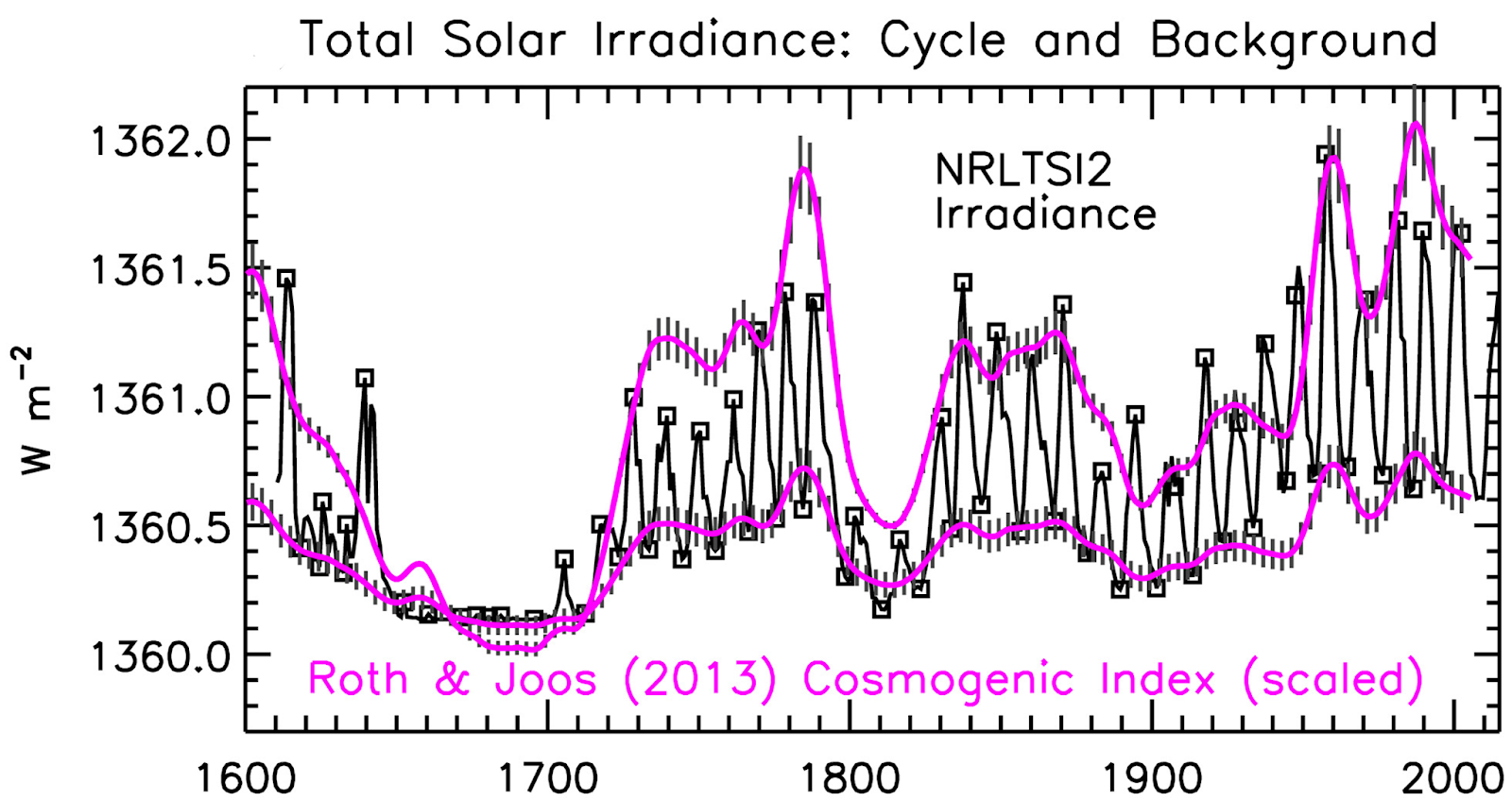
The temperature increase since about 1650 is clearly chiefly due to the up- leg in the natural solar activity millennial cycle as shown by Lean 2018 “Estimating Solar Irradiance Since 850 AD” Fig 5
Fig1
Lean 2018 Fig 5.
This Lean figure shows an increase in TSI of about 2 W/m2 from the Maunder minimum to the 1991 activity peak . This TSI and solar magnetic field variation modulates the earths albedo via the GR flux and cloud cover. From the difference between the upper and lower quintiles of Fig 4 (in link below) a handy rule of thumb a la Fermi would conveniently equate this to a Northern Hemisphere temperature millennial cycle amplitude of about 2 degrees C with that amount of cooling probable by 2,650+/-.
Fig 2
The MTP in cloud cover was at about 2000.
Fig 3
The decline in solar activity (increase in neutron count ) since the 1991 solar activity MTP is seen in the Oulu neutron count.
The establishment’s dangerous global warming meme, the associated IPCC series of reports ,the entire UNFCCC circus, the recent hysterical IPCC SR1.5 proposals and Nordhaus’ recent Nobel prize are founded on two basic errors in scientific judgement. First – the sample size is too small. Most IPCC model studies retrofit from the present back for only 100 – 150 years when the currently most important climate controlling, largest amplitude, solar activity cycle is millennial. This means that all climate model temperature outcomes are too hot and likely fall outside of the real future world. (See Kahneman -. Thinking Fast and Slow p 118) Second – the models make the fundamental scientific error of forecasting straight ahead beyond the Millennial Turning Point (MTP) and peak in solar activity which was reached in 1991.These errors are compounded by confirmation bias and academic consensus group think.
See the Energy and Environment paper The coming cooling: usefully accurate climate forecasting for policy makers.http://journals.sagepub.com/doi/full/10.1177/0958305X16686488
and an earlier accessible blog version at http://climatesense-norpag.blogspot.com/2017/02/the-coming-cooling-usefully-accurate_17.html See also https://climatesense-norpag.blogspot.com/2018/10/the-millennial-turning-point-solar.html
and the discussion with Professor William Happer at http://climatesense-norpag.blogspot.com/2018/02/exchange-with-professor-happer-princeton.ht
Pat,
I agree that analyses often under-value cycles; under-value natural ebbs and flows that can influence climate patterns.
OTOH, I think you may be over-valuing the cycles. Even you fudge with phrases like “quasi-cyclic processes” and “possibly multi-millennial, millennial, centennial and decadal time scales”. Other than Milankovitch cycles that can be predicted based on celestial mechanics, other cycles like sunspots, el Nino, AMO, PDO are not predictable enough to make definitive predictions about the future.
Your own admonition “the sample size is too small” could be applied to your own analysis. As far as I can tell, you have data for *one* 990 year “cycle” and from this you assume a similar pattern in the next 990 years. Without 3+ clear, repeating cycles (or a strong theoretical basis to predict a cycle of specific amplitude and period), there is no reason to expect the cycle to repeat (or to expect that it is a cycle to begin with).
Also, any prediction of future behavior is predicated on conditions remaining similar so that similar cycles will persist. The changes in CO2 in the past ~ 100 years are not natural and will have some warming effect. So at a minimum, your cooling theory will compete with CO2 warming. You do not have sufficient data nor sufficient theory nor sufficient knowledge of future CO2 levels to definitively state whether the warming effect or the cooling effect will have a greater influence.
Tim /Pat? You obviously didn’t check the data in the links See Fig 2 at

http://climatesense-norpag.blogspot.com/2017/02/the-coming-cooling-usefully-accurate_17.html
“Fig. 2 shows that Earth is past the warm peak of the current Milankovitch interglacial and has been generally cooling for the last 3,500 years.
Fig. 2 Greenland Ice core derived temperatures and CO2 from Humlum 2016 (8)
The millennial cycle peaks are obvious at about 10,000, 9,000, 8,000, 7,000, 2,000, and 1,000 years before now as seen in Fig. 2 (8) and at about 990 AD in Fig. 3 (9). It should be noted that those believing that CO2 is the main driver should recognize that Fig. 2 would indicate that from 8,000 to the Little Ice Age CO2 must have been acting as a coolant.
Dr Norman,
Figure 2 shows a variety of peaks of various sizes and periods. Some of the major recent peaks are:
1000 years ago (1000 year period)
1600 years ago (600 year period)
2000 years ago (400 year period)
3300 years ago (1300 year period)
There is no clear pattern I see. A power spectrum like in figure 6 would be very illuminating. Have you done such an analysis?
I think the Holocene peaks mentioned above are clearly there.
Fig 6A spectral analysis covers the entire Holocene and the same spectrum peak is also seen in the Miocene in 6B .As the paper says – also “Kern 2012 (19) presents strong evidence for the influence of solar cycles during the Holocene and in a Late Miocene lake system. It is noteworthy that the Millennial periodicity is persistent and identifiable throughout the Holocene Figs. 2 and 6 and in the Miocene – 10.5 million years ago Fig.6. The prominent Millennial unnamed peak in Fig. 6a above is also seen in Scaffetta’s Fig. 10 in the C-14 data (20) and is correlated with the Eddy cycle with a suggested period of 900 to 1050 years. ( Ref 20 -Fig10 spectral analysis)
Scaffetta N, Milani F, Bianchini A, . On the astronomical origin of the Hallstatt oscillation found in radiocarbon and climate records throughout the Holocene. Earth Sci Rev 2016; 162: 24–43. Google Scholar CrossRef
Looks reasonably solid to me especially when correlated with the 1991 Millennial solar activity peak.( with 12 year +/- delay because of the temperature inertia of the oceans.)
Dr Norman,
1) The ~1000 year periodicity in Figure 6 is for *sunspots*. This only vaguely related to temperature.
2) The data for the past ~ 10,000 years (Figure 2) shows no predictable pattern for temperature spikes. There are some peaks about 1000 years apart; there are peaks closer together; there are peaks farther apart. There simply is not a strong enough pattern that can be used to predict what should happen next.
3) Many of the peaks are much larger than the current rise seen in Figure 2. By that reasoning, there should be be a large uptick yet before cooling sets in.
4) CO2 is a wildcard. CO2 levels have dramatically and artificially risen in the past century. This alone could be enough to disrupt subtle 1000 year cycles. If nothing else, it could cause warming to offset the cooling that might have happened.
1. Yes the periodicity is related to solar activity cycles just as I am saying. There is about a 12/13 year delay between the solar activity peak in 1991 Fig 3 above and the temperature trend millennial turning point at 2003/4 Fig 4 in the paper link.
2. When you have multiple variables of different wave lengths their actions are sometimes additive sometimes subtractive . The millennial peaks appear often enough to strongly show their existence. The 990 and 2003 millennial peaks and turning points are well marked.
3.Yes. You didn’t notice that the ice core data ended at 1813. Since then the earth has indeed warmed and is now very close to the Millennial peak at 1000 +/- See Fig 7 a and d in the 2017 paper.
4. There is no indication that CO2 has much effect on temperature but an increase on CO2 certainly” greens ” the earth.
From the 2017 paper.
The IPCC AR4 SPM report section 8.6 deals with forcing, feedbacks and climate sensitivity. It recognizes the shortcomings of the models. Section 8.6.4 concludes in paragraph 4 (4): “Moreover it is not yet clear which tests are critical for constraining the future projections, consequently a set of model metrics that might be used to narrow the range of plausible climate change feedbacks and climate sensitivity has yet to be developed”
What could be clearer? The IPCC itself said in 2007 that it doesn’t even know what metrics to put into the models to test their reliability. That is, it doesn’t know what future temperatures will be and therefore can’t calculate the climate sensitivity to CO2. This also begs a further question of what erroneous assumptions (e.g., that CO2 is the main climate driver) went into the “plausible” models to be tested any way. The IPCC itself has now recognized this uncertainty in estimating CS – the AR5 SPM says in Footnote 16 page 16 (5): “No best estimate for equilibrium climate sensitivity can now be given because of a lack of agreement on values across assessed lines of evidence and studies.” Paradoxically the claim is still made that the UNFCCC Agenda 21 actions can dial up a desired temperature by controlling CO2 levels. This is cognitive dissonance so extreme as to be irrational. There is no empirical evidence which requires that anthropogenic CO2 has any significant effect on global temperatures. “
One more voice showing evidence of a flaw in Mr Björklund’s argument.
Grant Foster aka Tamino confirms below, among others, Tim Folkerts’ opinion. You may appreciate Tamino or not. But his ability to accurately show statistic flaws is undeniable.
Let me quote him:
We see here
that there are more correct ways to show what happens.
*
But beyond this inaccurate use of polynomials, I feel also disturbed by this eternal global cooling claim ‘since 2016′.
Apart from the fact that the time span since 2016 is by far too small to allow for such claims, they ignore even the recent past.
If we look at a comparison of HadCRUT4 (surface) with UAH6.0 LT (lower troposphere) we see of course at the plots’ right end a clear hint to a temperature decrease:
https://drive.google.com/file/d/16kkyvMfCvWmAJXE9U0GdGdAt8_G6atC8/view
No doubt! But a closer look at the plots shows that the same situation is visible after the El Nino event in 1997/98.
This becomes even more visible when we extract, for both 1997/98 and 2015/16, identical periods out of the time series, and superpose them by letting them both begin at zero, btw getting rid of the warming difference between the two events:
1. HadCRUT:
https://drive.google.com/file/d/1O4p-M9wTvaweGzVxauecZyRura652zkh/view
2. UAH:
https://drive.google.com/file/d/1y1zmzMt_1gD5jxCOH13UVYvbocYulbNz/view
We see that within both time series, the relative anomalies increase after the decrease usually subsequent after a strong El Nino.
This time series’ behavior similarity is amazing, and should motivate us to wait for a couple of years before deciding wether or not the Globe moves toward the pretended cooling.
*
Last not least, these relative anomaly comparisons show us moreover that there is, as shown by the MEI index anyway
https://www.esrl.noaa.gov/psd/enso/mei/
no reason to pretend that the 2015/16 El Nino edition was stronger than that of 1997/98. This claim is probably due to the fact that many people confound UAH and El Nino.
The numbers from the derivative are probably smaller than the possible error range. TSTM. The main take home is not the numbers but lack of a correlation with an increasing CO2 concentration.
It’s hard to imagine a more flawed analysis of climatic time series than curve-fitting a sixth-degree polynomial to the HADCRUT monthly anomalies, followed by first differencing and rescaling to obtain the decadal rate of change. Contrary to naive assumptions, such curve-fitting doesn’t actually “remove” any noise from the data; it indiscriminately eliminates high-frequency components in a inconsistent, nondescript way. Nor does the subsequent first-differencing produce a rationally smoothed version of the “first derivative” of actual temperature variations; this quaint metric is largely an artifact of the arbitrary curve fitting.
The recently announced aim to make WUWT more scientifically respectable is not served well by providing, one again, a platform for sheer analytic ineptitude. Even Tamino is more credible: https://tamino.wordpress.com/2019/11/15/back-to-basic-climate-denial/#more-10979
1sky1
Thank you.
We disagree about a lot, but here we don’t.
I could hand draw the trendline with a crayon and get the same results. The data are well-behaved. If you do not like the end-effects, knock off 30 years on each end. I think you are picking nits. With your logic, we would forever be a few years away from an answer.
Look, Facts don’t matter when it comes down to science. Repeat: Facts don’t matter!!! Look at those folks that are Global Warmers that cite science as their authority. No, facts just don’t matter when it comes to science. My “facts” trump all other ones and the perpetrators fully believe that. They are just as sincere as “deniers” but terribly misguided. Unfortunately it will take a long time to unravel the science and produce a “consensus” just as the hoax of the Piltdown Man did.
On the subject is the atmosphere increasing in temperature. I give this a “possibly”.
On the issue is CO2 influencing temperature. I give this a “not from the available measured data and information from the atmosphere”. If carbon dioxide is responsible, I am unable to explain how an increasing atmospheric CO2 content can 1) decrease atmospheric temperature, 2) maintain a constant atmospheric temperature, and 3) increase atmospheric temperature?
Years Temperature CO2 Content
% change % change
1850 – 1876 zero +1.6
1876 – 1878 + 0.15 +0.2
1878 – 1911 – 0.20 +3.4
1911 – 1929 + 0.07 +2.0
1929 – 1938 + 0.12 +0.8
1938 – 1976 – 0.08 +7.8
1976 – 1997 + 0.22 +9.3
1997 – 2013 zero +9.0
2013 – 2016 + 0.10 +1.7
2016 – 2018 – 0.10 +1.0
Observations on Carbon Dioxide
> increases during all time periods
> increases are not linear
> the changes are an order of magnitude greater than changes of Parameter A
Observations on Parameter A
> 3 time periods totalling 73 years (42% of the time) have a negative change
> 2 time periods totalling 42 years (25% of the time) have no change
> 5 time periods totalling 53 years (33% of the time) have a positive change
> the various change, or no change, periods are randomly distributed over the 168 years
Mean Global Annual Average Temperature from UK Meteorological Office (Hadley Centre): http://www.metoffice.gov.uk/hadobs/hadcrut4/data/current/time_series/HadCRUT.4.6.0.0.annual_ns_avg.txt
Annual Average CO2 content from USA’s EPA: http://www.epa.gov/sites/production/files/2016-08/ghg-concentrations_fig-1.csv
Significant corroborating evidence exists to support the observed changes in temperature. A couple of example:
Mt. Baker glaciers in NW Washington State, USA, reached their maximum extent of the past century in 1915 which is consistent with the cooling period from 1878 to 1911. They then retreated during the subsequent warming period. The following cooling period saw strong advancement of the glaciers. Warming following 1976 resulted in retreat. The extent of the glaciers now is about the same as in 1950.
In the other direction, the increases during 1911 to 1938 was caused by anomalous tropical sea surface temperatures which extended warm waters into the far north Atlantic and cooler waters into the eastern Pacific oceans. See Schubert et al (2004) NASA. 30 of the 50 US States and 9 of the 10 Canadian Provinces set record high temperatures during the 1911 to 1938 period which to this point in time have never been exceeded.
Conclusively, atmospheric CO2 has no influence on atmospheric temperature.
B Sanders
Like so many, you forget the action of the oceans, which – in our minds arbitrarily – store and release warmth, CO2 or both at a time.
That the results of GCM models doing that do not fit to what we think they should is do: that is imho our problem.
It makes absolutely no sense to keep on surface temperatures and to compare them with atmospheric concentrations of CO2.
The first you should add is for example:
http://www.data.jma.go.jp/gmd/kaiyou/english/ohc/ohc_global_en.html
So the oceans influence the atmosphere’s temperature, and not CO2. Thanks.
B Sanders
“So the oceans influence the atmosphere’s temperature, and not CO2.”
If you say so!
But it was of course not what had to be interpreted out of what I wrote 🙂
We know now. We always somehow knew but it starts to become overwhelming. I am waiting for decision-makers in the dock charges being pressed against the, For having exposed the developed bits of the world to economic doom and calamity on the basis of a scam. Politicians will not want to bear the brunt so they will start to look for scapegoats as they always do. Have fun watching the hyenas fighting among themselves.
This figure might help to explain some of the problems using Excel trend line equations as well as showing 6 polynomials for the Harcrut Data.
https://drive.google.com/file/d/1S84N92lhRaUezwD-IxQ-96M49IzNm8DN/view?usp=sharing
MicroSoft limit the number of digits printed out in the trendline equations just to save space, I think!
The coefficients can be made more accurate as explained on the figure but if the size of text on the graph is changed it seems not to work so increase accuracy before enlarging the equation. The problem in using the equation is exacerbated when using large numbers, like dates, so I tend to reduce the dates by subtracting, say 1800, as most data is post 1800.
High rate of change temperature anomalies like the recent warming are usually short-lived, decades. There is a slower rate of change for the underlying millennium trend associated with the Milankovitch cycles.
https://wattsupwiththat.com/2018/03/28/modern-warming-climate-variablity-or-climate-change/