Gregory J. Rummo
On February 2, 1978—41 years ago!—The Wall Street Journal warned in a headline that “Low-Lying Lands Could Be Submerged by Climatic Disaster.”
Fears of apocalyptic sea-level rise are nothing new despite the fact that they seem to have recently taken on a new life of their own, especially in South Florida, where I live.
The only scientific correlation I can make with any certainty is that these fears rise in direct proportion to the number of socialists elected to Congress.
So, let’s first talk about the science of climate change as it pertains to sea-level rise.
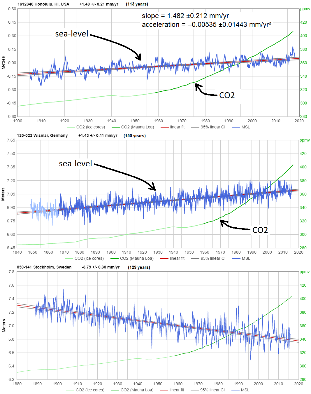
Dr. Roy Spencer, who has a Ph.D. in meteorology, writing in An Inconvenient Deception, states that compared to Al Gore’s warnings of a sea-level rise of 20 feet, the actual measurement is one inch per decade for over 150 years with no observed acceleration.
This could not be true if it were anthropogenic (human-caused), since there has been ample time for acceleration since 1940, “which is the earliest that humanity’s greenhouse gas emissions could have had any substantial effect.” Sea-level rise is a process that is mostly natural since it “predates the Industrial Revolution,” Dr. Spencer explains.
This may be small comfort to the people living in Miami Beach, for example, where sea-level rise has been worse than the average. But a 2017 study reported that the land is sinking at a rate of 3 mm per year—equal to the sea-level rise—causing a doubling of the effect and magnifying the rise of water at lunar high tides.
No one should “deny” climate change per se. It is a characteristic of the planet upon which we live.
The argument boils down to how much of it is due to relatively recent anthropogenic increases of atmospheric carbon dioxide compared with the Earth’s natural climate fluctuations caused by other factors including solar activity.
And it’s not just the science that is on the side of those appealing for moderation. The Earth’s climate history also has a story to tell.
Spencer reproduces the graph below of the Earth’s mean temperature over the last 2,000 years that shows two previous periods when temperatures were warmer than they are now; from 1–200 A.D., an epoch called the Roman Warm Period, and more recently the Medieval Warm Period from 900–1100 A.D.

Historical records during the Medieval Warm Period report many benefits such as extended growing seasons, a reduction in infant mortality, and the explosive growth of Europe’s population. The Vikings colonized portions of Greenland and were able to plant warm-weather crops.
It is worth noting that both of these climate optima occurred centuries before the discovery of fossil fuels and the invention of the internal combustion engine.
Getting back to that 41-year-old Wall Street Journal headline, the article that accompanied it reported that the temperature rise due to the burning of oil and gas would result in a “sudden deglaciation of the West Antarctic, unfreezing enough water to raise world sea levels by five meters (about 16 feet).” It was further stated that such a sea-level rise could “result in the submergence of much of Florida, Holland and other low-lying areas in the next 50 years.”
That scenario, though, depended on the worst-case scenario for greenhouse gas emissions, the worst-case scenario for warming, and the worst-case scenario for the effect of warming on the ice. None of those was at all likely, and none of them happened.
It was far more likely that continental ice melt would continue at about the rate of the past thousands of years—about a foot per century, meaning it would take 1,600 years to achieve the feared 16-foot rise.
And indeed that’s what’s happened. Sea level has continued to rise at about the same rate of a foot per century, or 1.2 inches per decade. To achieve the 16 feet warned of 41 years ago in 50 years, the rate would now have to jump to 208 inches per decade—nearly 200 times as fast. Anyone want to put a bet on that?
If you’ve ever visited a new housing development, inland or along the coast, it doesn’t matter, you already know the sandy soil is littered with the shells of mollusks. Have you ever wondered why?
A December 3, 1993, article that appeared in The Sun Sentinel may have the grim news: “Rising and falling ocean levels complicate the geologic picture. The coast has shifted several times, which is why shells can be found far inland ….”
Apocalyptic sea-level rise may simply be just a thing of the past.
Gregory J. Rummo is a Visiting Instructor of Chemistry at Palm Beach Atlantic University and a Contributing Writer for The Cornwall Alliance for the Stewardship of Creation. The views expressed in this column are his own.
Thanks to all of you for your comments; pro and con but mostly pro. And sorry for the potatoes. Several readers explained on another site that I meant “like” potatoes as in no, not potatoes but “like” potatoes. Well, all I can say is my bad. And I go to Peru every year, the potato capital of the world. Many of you are very astute readers and it gives me some hope that there are still very intelligent people out there who understand the climate change apocalypse is not helpful to the discussion. If you follow me on Twitter @ProfeGreg you will find in the media section of my Twitter page, photos of the mollusk shells scattered everywhere throughout south Florida. The photos posted there were taken from a housing development that is directly behind my home 10 miles as the crow flies from the coast.
As I said in my comment on potatoes, the article as a whole is good. I wasn’t being pedantic (I think), but aiming to be helpful, because alarmists will use anything to discredit sound work. I’m British, and we Europeans tend to think that potatoes are naturally a part of our life, so it’s an easy mistake to make. JRR Tolkien, in “The Lord of the Rings”, has “taters” and “pipeweed” in Middle Earth! Thanks for the work.
Dave Burton (August 9, 2019 at 3:57 pm)
“Actually, the globally averaged rate of coastal sea-level rise is only about 1½ mm/year, or six inches per century:
https://www.sealevel.info/avgslr.html”
Agreed.
“… But there’s been no significant, detectable acceleration since the 1920s.”
Sorry, but this is not correct.
When you evaluate the PMSL tide gauge data located at
https://www.psmsl.org/data/obtaining/rlr.monthly.data/rlr_monthly.zip
and generate an anomaly time series out of a global average of all tide gauge data, you obtain the following trends for all consecutive periods, starting with 1883-2018 and ending with 2013-2018:
1883 0.87 ± 0.03
1888 0.91 ± 0.03
1893 1.05 ± 0.03
1898 1.28 ± 0.03
1903 1.49 ± 0.02
1908 1.58 ± 0.02
1913 1.55 ± 0.02
1918 1.57 ± 0.02
1923 1.64 ± 0.02
1928 1.67 ± 0.02
1933 1.60 ± 0.02
1938 1.49 ± 0.02
1943 1.49 ± 0.02
1948 1.53 ± 0.03
1953 1.74 ± 0.03
1958 1.86 ± 0.03
1963 1.94 ± 0.03
1968 1.90 ± 0.04
1973 1.95 ± 0.04
1978 2.20 ± 0.05
1983 2.44 ± 0.06
1988 2.68 ± 0.07
1993 3.07 ± 0.09
1998 2.96 ± 0.12
2003 3.63 ± 0.15
2008 2.83 ± 0.27
2013 3.33 ± 0.62
https://drive.google.com/file/d/1QwHCRa1ReAXa3WMoB0w0l-uZYgeU-Wsx/view
Let us ignore all trend computations following 1998, because a trend computation over a period smaller than 20 years isn’t very useful.
The trend for 1993-2018 (3.07 mm / yr) perfectly fits to that of satellite altimetry (3.0 mm / yr, no GIA):
https://drive.google.com/file/d/1rzU5uoo-JFQoFOvKFQfDQliS5P0-VeCC/view
I hope you will agree that if there was no acceleration since 1920, the trend time series would be flat.
The acceleration since 1883 is extremely small, but not negligible.
*
Here is a sorted trend list of PMSL tide gauges with an activity time over 50 years (spurious extremes removed):
https://drive.google.com/file/d/1MgguUuWLbJeUbVKjc3Fm8YkmXY70ZnW_/view
The list has a good fit to NOAA’s tide gauge info page (click on Global):
https://tidesandcurrents.noaa.gov/sltrends/sltrends.html
“All tide gauge data” refers to different sets of locations depending on what time period you’re discussing. So the data points in your graph are actually for measurements of sea-level trend at different locations.
Sea-level trends vary greatly from one location to another. So if you change your mix of measurement locations, as you have done, you’ll usually also change your average measured trend. That doesn’t mean there’s been any actual change in trend.
Additionally, the trends calculated from from measurements at locations with less than about sixty years of data will often be badly distorted by cyclical changes. So it is folly to use short sea-level measurement records for trend analysis.
Dave Burton
1. “‘All tide gauge data’ refers to different sets of locations depending on what time period you’re discussing. So the data points in your graph are actually for measurements of sea-level trend at different locations.”
When I write ‘all tide gauge data’, then I mean ‘all tide gauge data’, Dave Burton.
It is absolutely useless to consider 10, 20 or even 100 single sites.
The trend time series is computed out of for the entire tide gauge data since 1880 (PMSL has a directory of in the sum over 1570 gauges active since measurement begin).
2. “Sea-level trends vary greatly from one location to another. ”
A bit teachy! Didn’t you inspect the list?
https://drive.google.com/file/d/1MgguUuWLbJeUbVKjc3Fm8YkmXY70ZnW_/view
3. “Additionally, the trends calculated from from measurements at locations with less than about sixty years of data will often be badly distorted by cyclical changes.”
How do you know that? Did you compare all the gauges?
4. “So it is folly to use short sea-level measurement records for trend analysis.”
Sorry: it isn’t. Simply because one never considers single stations, but builds the average of lots of them, even of all of them if a global average is intended.
Most cycles cancel out, and most negative trends cancel out positives, up to a certain extent of course. Otherwise, sea levels wouldn’t increase at all.
Here is a graph showing the whole tide gauge average anomalies over the period 1880-2018:
https://drive.google.com/file/d/188SYA1fiQyAri1ZPfWZYyBd546MBvkJg/view
and out of which the trend information communicated above of course was generated.
Interest in a PMSL’s spatiotemporal distribution?
– Active PMSL tide gauges and encompassing 2.5 degree grid cells per year:
https://drive.google.com/file/d/1X3TlvgOQl_m2chV0RCmRlOkyNKZTbQG5/view
{ I hope that this dramatic station presence crash has nothing to do with savings. When you download data on August 12, 2019 and nothing is visible from the year 2019, you think about it … }
– Tide gauge grid cell distribution:
https://drive.google.com/file/d/1iCIoZqp0ImvktVLUkJ0yNet1DVVafhzG/view
This is evidently all layman’s work. Should you think I got it wrong, so I recommend you to do the same job, and to come back with your results, so we can compare. It’s a lot to do 🙂
Rgds
J.-P. D.
Bindidon wrote, “1. … When I write ‘all tide gauge data’, then I mean ‘all tide gauge data’, Dave Burton. It is absolutely useless to consider 10, 20 or even 100 single sites.”
Actually, it is absolutely useless to compare sea-level trends from different places at different times, if your goal is to try to learn whether sea-level rise is accelerating.
However, most of the factors which cause different locations to experience different sea-level trends are approximately linear, on centennial time scales. So even a very small number of high quality long measurement records can tell you whether or not the global trend is changing (“accelerating”) significantly:
Bindidon continued, “3. … How do you know that [the trends calculated from from measurements at locations with less than about sixty years of data will often be badly distorted by cyclical changes]? Did you compare all the gauges?”
That fact is well known in the community. I gave you a link to a long list of papers about it, but I guess you didn’t click it:
https://www.sealevel.info/papers.html#howlong
Example:
Douglas B (1997). Global Sea Rise: a Redetermination, Surveys in Geophysics, Vol. 18, No. 2-3 (1997), 279-292, doi:10.1023/A:1006544227856. Excerpt:
Bindidon continued, “4. … Sorry: it isn’t [folly to use short sea-level measurement records for trend analysis].”
Yes, it is:
Zervas, C. (2009), NOAA Technical Report NOS CO-OPS 053, Sea Level Variations of the United States, 1854 – 2006
Bindidon continued, “Most cycles cancel out, and most negative trends cancel out positives, up to a certain extent of course. Otherwise, sea levels wouldn’t increase at all.”
Not so, if you’re using stations with measurement records less than about sixty years, or if your station distribution is not uniform (and, of course, the tide gauge distribution is far from uniform), or both.
To learn about the problems, read some of the papers at that link I gave you, or read about the AMO, here:
http://sealevel.info/resources.html#amo
Bindidon closed, “Rgds
J.-P. D.”
What does “J.-P. D.” stand for?
loving the work all, please keep it up, As a geo I especially love David Middleton’s as it is written in a way that makes sense to the layman, a real geopoet.
One question I have for you David, is whether you (or anyone else) has a graph which has observed SLR plotted against the various IPCC RCP pathways, I am especially interested in seeing any divergence from about 1990 when they first started modelling this?
Much appreciated
An interesting paper and set of comments.
One point that readers may not be aware of appears in the second figure in David Middleton’s contribution. On this the Exponential line is shown with an equation which is as one would get using Microsoft’s Excel. There is a known error in Microsoft’s Excel when Trend Line equations are quoted on the graph. This is greatly exacerbated when using actual dates on the x axis like 1950. This can be worked round by reducing the x values by subtracting, say 1900, and so working with smaller numbers. Alternately the accurate values in the equation quoted can be obtained by clicking on the equation, formatting the Trend Line Labels via the category “Number” and setting a high number of decimal places, up to 30. Details are available on Google.
Many of the papers on sea levels use various curve fittings and a year or more ago the Nerem paper that quoted high accelerations (high that is for average sea levels) led me to study the CSIRO and NASA readings. I approached this as an engineer with no preconceptions and not knowing anything about items such as Decadal Oscillation. But as an engineer with over 40 years’ experience I know you cannot do quadratic fit over 25 years and extrapolate for over 80 years unless you are dealing with a very well-behaved system, which the sea is not.
I eventually produced a paper
https://drive.google.com/file/d/17lXnNtsLSlzSOx7tRvbDPwYMDibpvXKG/view?usp=sharing
this being a corrected version of an earlier version in which a few typos appeared – apologies for that.
The two main findings in the paper were
1 That having fitted best fit curves to the CSIRO and NASA results deviations (or residuals) of the actual results picked up effects of 57-year and 22-year decadal oscillations respectively.
2 Nerem’s acceleration was the result of the methodology employed and not inherent in the actual data.
Now, having read Gregory Rummo’s article I see a possible third finding. Whilst looking at best fit curves for the CSIRO data I tried quadratic, exponential and sinusoidal. The last of these, which resulted in a fit of a 770-year sinusoidal curve, was a “eyed in” curve and not mathematically optimised in any way. Now Rummo’s first figure shows a roughly sinusoidal curve of temperature anomalies over the last 2000 years or so. This as a period of about 900 years peaking at about 150AD 1050AD and now. Plotting the 770-year curve and it’s first (velocity) and second (acceleration) derivatives shows that whilst the sea level is still rising, and will peak 250mm higher in 2200, the velocity has peaked at about 2mm/year and the instantaneous acceleration is roughly zero. Going back a half cycle reaches a minimum velocity of -2mm/year and corresponds roughly with the Little Ice Age. If temperature is a major driving force in sea level rises these 2 extremes of sea level velocity rises coincide with maximum and minimum temperatures. The patterns will continue backwards with due allowance for the 770- and 900-year difference in periods.
The fitted sinusoidal curve is given by, in Excel format
y = 65+240*sin(((1100+2t)/770)*pi)
where t is the date with 1800 set at zero.
Alan,
Great comment. I recommend that you look at the work of Dr Nils-Axel Mörner.
For example Mörner, N.A., 2019. Rotational Eustasy as Observed in Nature. International Journal of Geosciences, 10(7), pp.745-757.