A 40-y record reveals gradual Antarctic sea ice increases followed by decreases at rates far exceeding the rates seen in the Arctic
Claire L. Parkinson
PNAS first published July 1, 2019 https://doi.org/10.1073/pnas.1906556116
Contributed by Claire L. Parkinson, May 24, 2019 (sent for review April 16, 2019; reviewed by Will Hobbs and Douglas G. Martinson)
Significance
A newly completed 40-y record of satellite observations is used to quantify changes in Antarctic sea ice coverage since the late 1970s. Sea ice spreads over vast areas and has major impacts on the rest of the climate system, reflecting solar radiation and restricting ocean/atmosphere exchanges. The satellite record reveals that a gradual, decades-long overall increase in Antarctic sea ice extents reversed in 2014, with subsequent rates of decrease in 2014–2017 far exceeding the more widely publicized decay rates experienced in the Arctic. The rapid decreases reduced the Antarctic sea ice extents to their lowest values in the 40-y record, both on a yearly average basis (record low in 2017) and on a monthly basis (record low in February 2017).
Abstract
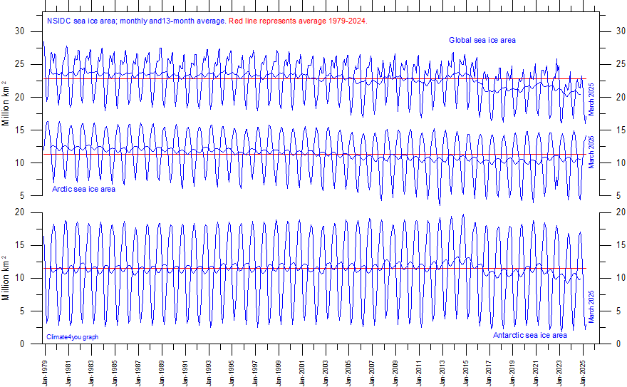
Following over 3 decades of gradual but uneven increases in sea ice coverage, the yearly average Antarctic sea ice extents reached a record high of 12.8 × 10⁶ km2 in 2014, followed by a decline so precipitous that they reached their lowest value in the 40-y 1979–2018 satellite multichannel passive-microwave record, 10.7 × 10⁶ km2, in 2017. In contrast, it took the Arctic sea ice cover a full 3 decades to register a loss that great in yearly average ice extents. Still, when considering the 40-y record as a whole, the Antarctic sea ice continues to have a positive overall trend in yearly average ice extents, although at 11,300 ± 5,300 km2⋅y−1, this trend is only 50% of the trend for 1979–2014, before the precipitous decline. Four of the 5 sectors into which the Antarctic sea ice cover is divided all also have 40-y positive trends that are well reduced from their 2014–2017 values. The one anomalous sector in this regard, the Bellingshausen/Amundsen Seas, has a 40-y negative trend, with the yearly average ice extents decreasing overall in the first 3 decades, reaching a minimum in 2007, and exhibiting an overall upward trend since 2007 (i.e., reflecting a reversal in the opposite direction from the other 4 sectors and the Antarctic sea ice cover as a whole).
Since the late 1990s, it has been clear that the Arctic sea ice cover has been decreasing in extent over the course of the multichannel passive-microwave satellite record begun in late 1978 (1⇓–3). The decreases have accelerated since the 1990s and have been part of a consistent suite of changes in the Arctic, including rising atmospheric temperatures, melting land ice, thawing permafrost, longer growing seasons, increased coastal erosion, and warming oceans (4, 5). Overall, it has been a consistent picture solidly in line with the expectations of the warming climate predicted from increases in greenhouse gases. In particular, modeled sea ice predictions showed marked Arctic sea ice decreases, and the actual decreases even exceeded what the models predicted (6).
The Antarctic situation has been quite different, with sea ice extent increasing overall for much of the period since 1978 (7⇓⇓⇓–11). These increases have been far more puzzling than the Arctic sea ice decreases and have led to a variety of suggested explanations, from ties to the ozone hole (12, 13; rejected in refs. 14, 15); to ties to the El Niño–Southern Oscillation (ENSO) (16), the Interdecadal Pacific Oscillation (17), and/or the Amundsen Sea Low (10, 13, 17); to ties to basal meltwater from the ice shelves (18; rejected in ref. 19). None of these has yet yielded a consensus view of why the long-term Antarctic sea ice increases occurred.
In the meantime, while the unexpected, decades-long overall increases in Antarctic sea ice extent are still being puzzled out, the sea ice extent has taken a dramatic turn from relatively gradual increases to rapid decreases. On a yearly average basis, the peak sea ice extent since 1978 came in 2014. Since then, the decreases have been so great that the yearly averages for 2017 and 2018 are the lowest in the entire 1979–2018 record, essentially wiping out the 35 y of overall ice extent increases in just a few years. This dramatic reversal in the changes occurring in the Antarctic sea ice will provide valuable further information to test earlier suggested explanations of the long-term Antarctic sea ice increases. We now have a 40-y multichannel passive-microwave satellite record of the Antarctic sea ice cover, all of which resides in the Southern Ocean. The purpose of this paper is to present that record both for the Southern Ocean as a whole (labeled “Southern Hemisphere” in the figures, to emphasize the inclusion of the entire hemispheric sea ice cover) and for the breakdown of the Southern Ocean into the 5 sectors identified in Fig. 1.

Full paper here. Not paywalled.
Its barely noticeable on the plot.
I’m wondering why its unusual for ice so far out from land in a wild ocean. Has anything been changed in how its calculated?
It would have been much more noticable if that guy had not used a 13 month smooth for a strongly seasonal variable. It’s very unwise since it creates an antiphase wave.
Let him write a hundred times on the blackboard so he learns:
“A year has 12 months, not 13”
While I often criticise these running average “smoothers”, you need to make a credible point. Maybe use a better filter which shows what you consider to be the correct interpretation. It actually seems that you do not understand what the problem with runny means actually is.
He uses 13mo in order not to introduce a 0.5 mo phase shift, an odd length window can be centred on the middle month. 12 vs 13mo is not the cause of the antiphase ripple.
You may find this helpful:
https://climategrog.wordpress.com/2013/05/19/triple-running-mean-filters/
I’ve actually suggest to Ole Humlum, who run climate4you, that he chose a different filter, he replied but still uses the messy running mean.
I think its a she
In these times of progressively imposed gender fluidity, who knows?
Not even itself
The hiatus brought about a temperature adjustment. The Antarctic sea ice started the “rapid decline” around about the same time????
Not only that – but the data shows there was no reduction until 2016. 3 years is hardly dramatic or important.
“The case studies focusing on Antarctic sea ice retreat in late 2016 illustrate well the interconnected global climate system, as they tie the sea ice changes not just to circumstances in the vicinity of the sea ice but also to events in the tropical and midlatitude oceans, the tropical and midlatitude atmosphere, and the upper atmosphere (30⇓⇓⇓–34). However, the sea ice retreats in late 2016 occurred in just a few months of the 2014–2017 period of extreme rates of Antarctic sea ice decreases. I hope that the 40-y record discussed in this paper will encourage further studies into the atmospheric and oceanic conditions that could have led to the extremely rapid 2014–2017 decline of the Antarctic sea ice cover, the comparably rapid decline in the mid-1970s, and the uneven but overall gradual increases in Antarctic sea ice coverage in the intervening decades. More broadly, the environmental datasets may be nearing the point where they are long enough and rich enough to enable the linking of several of the modes and dipoles and oscillations now spoken of separately, just as the El Niño and Southern Oscillation phenomena were linked together years ago as ENSO; once that further linkage happens, the understanding of Earth’s very interconnected climate system, including the sea ice cover, could be markedly enhanced.”
Good Point
And when it is markedly enhanced, it will reveal that sea ice extent is like the weather, a local event and nothing to do with CO2 globally. Sea ice in Hudson Bay Canada was greater in 2018 than in 1981 since it was 1st tracked by satellite.
Define ‘greater than’. Hudson Bay freezes over completely every winter so parameters must be ‘at specific dates’ or ‘integrated over a full season’ or the like.
I wonder what about potential volcanoes effect: https://wattsupwiththat.com/2017/08/14/scientists-discover-91-volcanoes-below-antarctic-ice-sheet/
Yeah, I’m a little reluctant to read any paper talking about the causes of the melt that do not address the volcanoes. That’s an awful lot energy to absorb.
they are talking about ocean ice
and they are talking about volcanoes on the ocean floor, not on land.
Exactly, Kevin. Thank you.
I’d say that was obvious, but I’d be wrong.
and they are talking about volcanoes on the ocean floor, not on land.
The best place for installing underfloor heating is – below the floor.
I was actually wondering if there was a calculating reason for there to be less than 10% variation in max extent of sea ice (area >15% ice) in winter when it extends out into almost constantly choppy seas. Temperature (or half a degree changes) is going to be a minor variable. Has something changed and the real variability been exposed?
Robert B
“Its barely noticeable on the plot.”
You are right!
But… what about downloading, for the Antarctic, the sea ice data from
ftp://sidads.colorado.edu/DATASETS/NOAA/G02135/south/monthly/data/
and by the way, why not, for the Arctic as well, from
ftp://sidads.colorado.edu/DATASETS/NOAA/G02135/north/monthly/data/
and processing all that using your spreadsheet calculator?
For the Antarctic you obtain this:
https://drive.google.com/file/d/1-bIQ6QSOh9QEMjT55noNlLreHKMtCiJL/view
We can clearly see what the lady means: after a decade-long increase, suddenly such a harsh drop.
Strange things can happen, as we know.
Sea ice does not only consist of extent (15 %+); to that you must add what few people tell about, namely the so-called area (or pack ice, 100%). The3 sum of both tells you more.
For the Arctic, a similar processing gives you this:
https://drive.google.com/file/d/11mbboMwJg-X_nkRa0mv5qWlSZnmK0B4p/view
and, if you add the two:
https://drive.google.com/file/d/12yPvYDIiqrsXufCcxvN5tfyHyD_QRB3T/view
You can see that some guesses about this sudden Antarctic sea ice decline being perfectly compensated by an inverse process in the Arctic are a pure invention.
One could say: stop guessing, start checking.
Regards
J.-P. D.
The glass is half empty due to global warming.
Alex, the problem with half empty glasses –
Don’t touch them with bare hands, thei’re obviously used and one doesn’t know the user.
Prior grab a rag and put them glasses into the dishwasher.
Wow, they re-discovered the polar ice see-saw.
Amazing.
https://en.m.wikipedia.org/wiki/Polar_see-saw
What’s next… lemmee guess… a New Ice Age circa 1975.
Yes, exactly what I pointed out to the Guardian’s readers’ editor after their typically alarmist claims a couple of days ago. The problem is the press have failed to report the good news in the Arctic where the summer minimum is still as much sea ice as it was in 2007.
The ‘flip’ in the Antarctic in 2014 was preceded by a 65% increase in the summer minimum in the Arctic a year earlier, which also remains totally unreported in the media.
https://climategrog.wordpress.com/cpom_arctic_ice_vol_mths_2019-2/
The paper clearly shows the Antarctic ‘trend’ over the full record is still clearly upwards:
https://www.pnas.org/content/early/2019/06/25/1906556116
err no.
The trend in a simple linear MODEL applied to the data shows a trend in the STATISTICAL MODEL.
Applying a linear model to that data doesnt look like the only choice. and it is a choice.
Steven,
So for over 40yrs the trend is up and you are talking about what exactly?
Do you ever wake up late at night and think, if I wasn’t here the world we be a much better place?
If not, it’s still an idea worth considering! 😉
“Steven,
So for over 40yrs the trend is up and you are talking about what exactly?”
‘the trend” is the result of CHOOSING to fit the data with a LINEAR model.
Guess what? A linear model doesnt work very well for this data.
Mr. Mosher, empirical data is not a model. You could, however, take the data and create a model trend that shows Antarctic sea ice disappearing soon, as was done by CliSci with the Arctic sea ice trend.
Exactly what are you recommending?
Isn’t this a bit extreme for a climate blog?
Why would he think the world would be a better place without him?
Get a life.
Dave
“Mr. Mosher, empirical data is not a model. You could, however, take the data and create a model trend that shows Antarctic sea ice disappearing soon, as was done by CliSci with the Arctic sea ice trend.”
the data have no TREND. a trend is a parameter in a model used to explain the data.
in this case they FIT a linear MODEL to the DATA.
y = mx +b
m is the trend.
in the MODEL.
the model ( y=mx+b) is choosen to EXPLAIN the data (x and y)
the trend “m” is not IN the data it is IN the model used to “explain” the data
its not a very good fit. check the residuals
I assume the term “b” in your y=mx+b stands for your b(s), Mr. Mosher. Ex-english majors should not try to instruct ex-system engineering modelers in math nor models.
Do you get invited to dinner parties much? [Now would be the time to jump on my English.]
“Exactly what are you recommending?
Isn’t this a bit extreme for a climate blog?
Why would he think the world would be a better place without him?
Get a life.” – Spalding Craft”
Yes I agree, it was a very poor choice of words.
I do apologise for the post, particularly as I can’t now edit or delete it and it was not my intention to recommend anything!
The point I intended is that Steven is “Straining at a Gnat” while swallowing a camel!
I did mean and I do believe that the world would be better served and a better place, if there were less activists willing to lie for a cause.
He is making a ridiculous argument about the slope of a line when the annual winter ice sheet extent has grown
ever since that particular record began!
He goes beyond playing devils advocate, finding fault where it is absurd to do so!
If you think 40 yrs of annual ice sheet growth is alarming then by all means defend him and his ridiculous defence of the indefensible.
trends – was already discussed in whattsupwiththat:
http://variable-variability.blogspot.com/2016/12/scott-adams-non-expert-problem-climate-change.html?m=1
err actually yes, err, well, maybe. The article says it, so perhaps it really is a point worth making:
“Still, when considering the 40-y record as a whole, the Antarctic sea ice continues to have a positive overall trend in yearly average ice extents, although at 11,300 ± 5,300 km2⋅y−1, this trend is only 50% of the trend for 1979–2014, before the precipitous decline“
no its a point worth criticizing.
“the polar ice see-saw”
Um, no. From your own link: “Estimates of the period of delay vary, one typical estimate is 1500 years.”
“the good news in the Arctic”
Um, no. Extent currently second lowest for the date, a fraction behind 2016 and with warmer temperatures very likely to overtake. https://ads.nipr.ac.jp/vishop/#/extent
Global total sea ice lowest on record and dropping, daylight second.

So much wishful thinking, it reminds me of Sunday School
Loydo , never take WonkyPedia as reliable for anything on climate. That comment does not even match the refs ( 2/3 were broken anyway ).
There is a much shorter see-saw as noted in:
“Twentieth century bipolar seesaw of the Arctic surface air temperatures
and Antarctic” Chylec , Folland et al 2010.
There is also a 4-5 year component see-saw probably related to shifts in the ITCZ.
Look at my other replies for CPOM ice volume. This really has not changed in ten years. Summer minima have increased in fact.
One if the three links was fixed earlier today, and I fixed the other one, so all should now work.
“There is a much shorter see-saw.”
True, thanks.
“This really has not changed in ten years. Summer minima have increased in fact.”
Also true but volume is now below the long term trend and this year is going very close to a new record low.
http://psc.apl.uw.edu/wordpress/wp-content/uploads/schweiger/ice_volume/BPIOMASIceVolumeAnomalyCurrentV2.1.png
http://psc.apl.uw.edu/wordpress/wp-content/uploads/schweiger/ice_volume/BPIOMASIceVolumeAprSepCurrent.png
The Artic has warmed considerably since 2010.
http://berkeleyearth.org/wp-content/uploads/2018/01/Arctic2017.png
Yet here we are and no-one really cares … it’s a wiggly line and has all that significance.
If your into your doomsday fairytales Asteroid-FT3 is probably more interesting.
Ah 40 year “records” are to global climate like the Biblical 5000 year old earth is to its actual age. You must teach that Sunday school class. People who talk of “record climate this or that” based upon 40 years of data are seeking to manipulate, not illuminate because we know that the natural variation in climate values vastly exceeds (both up and down) any “record” cited. It’s the customary way climate scientists lie.
There is evidence from sediment patterns that Arctic Sea ice has not been this low in 800,000 years.
That’s a tad more than 40.
James.
Your evidence is where?
There is evidence of whole villages in Greenland below the ice that were established by the Vikings 1000 years ago that r only becoming visible now…
Antarctic ice extent has a peculiar 5yr oscillation, the last trough was in 2017. If it does its usual thing, it will be rising again during the next years. There is something more journalistic than scientific in this “study”. Do they know about this peculiarity?
They know everything. That’s why the science is settled.
if you publish , maybe folks will have a look.
write up your “observation”
There is definitely a strong 5 year cycle of Antarctic sea ice extent as shown by wavelet analysis. However this 5 year cycle is only present post-1996.
https://imgur.com/a/5qOHOjq
Uh, what is the Antarctic sea ice thickness? Have changes in the prevailing winds and currents just jammed the same amount of sea ice into a smaller space?
I vaguely remember something about Antarctic winds shifting over the last few years, speculation being it was caused by changes to O3 and CO2.
I live in NZ and I feel that we have had far fewer southerlies than usual.
Yes i agree with you mikebartnz.
I live in Chch and we only had
2 days of south winds,
3 days of southwest winds,
10 days of west winds,
2 days of northwest winds,
3 days of north winds,
8 days of northeast winds,
2 days of east winds.
It seems like the south-southwest winds are also drier as well.
Sorry, should of said this was for June 2019.
I live north of Auckland and fish in Kawau Bay (got six nice snapper yesterday). At this time of year, a light westerly or nor’wester is the only wind I’m comfortable about going out in. We never get enough of them . . . who do I see about that? Met Service are no help.
One reason the “Brass Monkey” cafe (No longer there IIRC) was named as such on the south coast of Wellington in Island Bay.
I am sick and tired of these desperate attempts to justify the big lie by small truths.
Any “study” that begins in the coldest period of the end of 1970s is cherrypicked by definition.
Agreed. And one of the most worrying aspects (also highlighted by Greg Goodman above re one-sided reporting) is that the obsession with linking everything to global warming is that nobody is digging deep enough to unearth what may be the real cause for many of these events.
Trying to convert the human race to a subsistence-level existence (which appears to be the aim — except for the élite of course; scum always rises to the top) could have serious consequences if it turns out that this obsession is indeed masking a future downturn in temperatures and a decline in CO2 to levels that could have genuinely serious consequences.
I don’t know the reason for the disconnect between Arctic and Antarctic behaviour but as a layman I would very much like to know the answer, out of curiosity if for no other reason. I find it amazing that scientists, who supposedly have enquiring minds, simply settle for “oh, it’s global warming.” Presumably because genuine enquiry and research might just show that it isn’t. Which would never do, would it?!
It’s simple: a mix of grabbing grant money and noble cause corruption.
“disconnect between Arctic and Antarctic behaviour ”
There is not a “disconnect” the two are related but tend to move in opposite directions.
I found here that there was a general complementarity between the two poles , particularly when Arctic was lagged by three years.
https://climategrog.wordpress.com/ant_arctic_melting_season_lag/

As Joel O’Bryan pointed out above the “polar see-saw” is a well noted phenomenon. Though little money goes into it since it is not attributable to anthropogenic CO2.
link to global warming?
“The ice covers of each of the 5 sectors of Fig. 1 and of the Southern Ocean as a whole have experienced considerable interannual variability over the past 40 y (Figs. 2–7). In fact, the Southern Ocean and 4 of the 5 sectors (all except the Ross Sea) have each experienced at least one period since 1999 when the yearly average ice extents decreased for 3 or more straight years only to rebound again afterward and eventually reach levels exceeding the extent preceding the 3 y of decreases (Figs. 2–7). This illustrates that the ice decreases since 2014 (Fig. 2) are no assurance that the 1979–2014 overall positive trend in Southern Ocean ice extents has reversed to a long-term negative trend. Only time and an extended observational record will reveal whether the small increase in yearly average ice extents from 2017 to 2018 (Fig. 2C) is a blip in a long-term downward trend or the start of a rebound. Still, irrespective of what happens in the future, the 2014–2017 ice extent decreases were quite remarkable compared not only with the rest of the 40-y Antarctic record but with the Arctic record as well.”
“Several studies have examined the extreme Antarctic sea ice retreat in late 2016 and have related it to surrounding atmospheric and oceanic conditions (30⇓⇓⇓–34). Among the likely influences discussed are the following: 1) a strong northerly atmospheric flow causing rapid ice retreat in the Weddell Sea (30); 2) an unusually negative southern annular mode in November 2016 causing rapid ice retreat in the Ross Sea and elsewhere (30⇓⇓⇓–34); 3) the extreme El Niño that peaked months earlier, in December 2015 through February 2016, contributing to unusually warm ocean waters in the Bellingshausen, Amundsen, and eastern Ross Seas, anomalous warmth that persisted into the austral spring (31); 4) a persistent zonal wave 3 atmospheric circulation around Antarctica contributing to reduced sea ice extents in the Indian Ocean, Ross Sea, Bellingshausen Sea, and western Weddell Sea (32⇓–34); and 5) a weakened polar stratospheric vortex weakening the surface-level circumpolar westerlies and contributing to reduced sea ice extents in the Indian and Pacific Oceans (32). None of the studies suggests that a single cause resulted in the extreme Antarctic sea ice retreat in 2016, all instead recognizing multiple influences, both atmospheric and oceanic.”
It’s not cherry picked, that’s when satellite data became available. What starting point and source of data do you suggest?
“What starting point and source of data do you suggest?”
I suggest recalling the irrefutable fact that there were times when Antarctica, Greenland, Northern Alaska, and other polar regions were covered with forests and populated by anumals. Let’s make this our starting point and make conclusions.
Why not? Just because you need to prove to yourself an “origial sin” of all human beings and, therefore, feel better about your own personal sins?
Or how about the fact that as recently as 11600 ybp we had a 3 mile ice dome over the Hudson Bay, with 2 mile thick ice terminating at approximately the Arctic circle. Think upon that. Geologically speaking it vanished in moments.
13600 -11600 years ago we had some type of event(s) that ushered in about 400 feet of sea level rise and completely removed an ice sheet on average 2 miles thick, the size of the Arctic circle… And you people are talking about diminishing sea ice extents from highly suspicious satellite data.. Suspicious in the fact that it began during the depths of a cooling phase after an extreme heat wave of the 1930s.
Let me repeat for all the propagandist, religionist, charlatans like Moshe and Loydo, Chris, Nick, Griff, et al…
The entire Arctic circle was covered with miles of ice and it disappeared rapidly causing sea level rise unheard of and unimaginable in the modern era. We had massive die off of mega flora and fauna.
Days above 100 and 90 in America have been dropping precipitously some the 1930s heat waves.
Hurricanes have diminished in both intensity and frequency as of late
Major tornadoes have diminished
Deaths from extreme weather have dropped precipitously
We just had the coolest, wettest October through May in United States history.
The Earth has greened at least 15% in the last 30 years largely in part to increased nutrition from co2 levels that have climbed out of the basement necessary for life.
Plus countless other evidence that is net beneficial, not to mention the proper historical climate perspective that you’ve purposely omitted.
And you people continue to cry wolf!
At this point you are either sociopaths, misguided useful idiots, paid propagandists, or religious zealots
I wouldn’t lump Mosh-man in with those others. He’s…different and often has good insight on particular issues.
Mosh man still believes his mentor Richard Muller is honest about global warming. Muller knows it isn’t true but he is afraid of funding cuts if he bucks the groupthink.
jorgekafkazar that just means he fits in yo the “misguided useful idiots” part of Matthew’s comment.
It is not “cherry picking” it is the start of the data. It should be recognised that this is a short record in terms of climatology but there is nothing unscrupulous about using all the data !!
If you want to be sick and tired, find a valid reason: there are plenty.
How about sick and tired of drawing conclusions on short term data.
Jeff,
Right on. Antarctica has been an isolated, icy continent for about 34 million years, ever since the Andean mountain-chain link to West Antarctica was severed and the cold Antarctic Circumpolar Current (ACC) was initiated. Forty years of satellite observations amount to a little over one one-millionth of the history of an ice-bound landmass. Tens of thousands of cycles of sea-ice expansions and contractions have occurred since then.
what conclsuions did they draw?
I posted their conclusion.
did you read it?
Our many alarmists will now say with much glee and smug satisfaction, “We told you so!”. But, in fact, this just goes to show that our knowledge of the changing global climate is so limited. I find this decrease in ice extent most interesting. Watch this space.
It’s good to see WUWT becoming more even-handed in its reporting of new research.
….ROTFLMAO…….
Mark seems to have a problem with people viewing CliSci outputs critically. Shut up; we’ll tell you what to think!
There’s actually nothing new at all. They are using the same satellite records, the same NASA extraction methods and the same interplatform calibration methods. It is nothing more than an update.
They do seem to have done their own stats on the linear fits and clearly describe the methods limitations. That may be “news”. Their long term trend for Antactic is +11,300 km^2/ year.
They’ve been publishing this type of stuff for a good while now, often without comment. (They still miss some things on occasion, though.) Then the commenters down below can slice it and dice it and dissect it, as they see fit. There’s often gold to be found down here.
WUWT is the ONLY mass media outlet that has always reported on research that’s not junk science, which describes the vast bulk of mainstream media news.
They have always published these kinds of papers.
And they are always quickly picked apart.
WUWT provides pee review of peer reviewed garbage CliSci “studies.”
WUWT is, in fact, always quite even-handed with its choice of articles – but its many commentators are not!
The lose of ice equals ### rise in sea level. No rise in sea level? Maybe the ice is under the rug.
Sea ice, has no effects on sea level.
So why panic? So much ink used to tell no worry.
Sea ice melting. Who cares?
A good fight is going on, for nothing.
Ok, sea ice is melting. So sea is cooling. Cooling sea -> cooling planet -> ice age -> RUN !
Don’t believe it, didn’t even read it really, had a look down here for comments but am the first seemingly. I did look at SST anomalies and the Antarctic is still below average. Has been ever since I started looking at it and at that time the Antarctic was growing massively every season…this was at a time when we were told hysterically that Antarctica was about to collapse blah blah blah…..I don’t believe it…
https://www.eldersweather.com.au/climimage.jsp?i=sstag
Colder conditions always produces higher winds and higher ocean waves, fraying of edges creating thicker ice.
told hysterically that Antarctica was about to collapse
The ice-cap keeps Antarctica stable & balanced. If it melts unevenly, it could tip over and sink! 😉
…Kind of like Guam…
I read the westcoast-area of Antartica is filled with semi-active underwater vulcanos!
https://www.theguardian.com/world/2017/aug/12/scientists-discover-91-volcanos-antarctica
So what are the Greens doing to stop these volcanoes melting the ice and causing terrible sea-level rise?
Probably blame it on Trump
Excerpt – ” I hope that the 40-y record discussed in this paper will encourage further studies into the atmospheric and oceanic conditions that could have led to the extremely rapid 2014–2017 decline of the Antarctic sea ice cover, the comparably rapid decline in the mid-1970s, and the uneven but overall gradual increases in Antarctic sea ice coverage in the intervening decades. More broadly, the environmental datasets may be nearing the point where they are long enough and rich enough to enable the linking of several of the modes and dipoles and oscillations now spoken of separately, just as the El Niño and Southern Oscillation phenomena were linked together years ago as ENSO; once that further linkage happens, the understanding of Earth’s very interconnected climate system, including the sea ice cover, could be markedly enhanced.”
I’d call it a very sensible and informative article. Pity about the starting point though.
This is all garbage. His own graph shows a massive decrease from 2016-2017, and a slight rebound for 2018. There was no massive decrease between 2014 and 2016 …. at least not according to his yearly average graph.
As I recall …. something happened in 2017 …. big loss of ice, stormy seas I think, or a chunk of one of the shelves broke off …. can’t remember. But to be sure …. this has NOTHING to do with catastrophic CO2 assumed global warming.
Excerpt (short version) : Send us money, because we want be rich enough too.
Chris Turney should sally forth and investigate the warmings!
YES! If this Antarctica Ice loss was so dramatic by 2017, then it must all be practically gone by now! Chris should pack up his Ship of Fools right now and set sail for the South Pole. Damn the Icebergs, Fool Speed Ahead!
^¿^
Is it just me, or is this so poorly written that it’s almost unreadable?
Either way, the summary of the article is that Antarctic sea ice inexplicably increased since the 70’s but it has fallen in the last few years.. therefore global warming??
That is the conclusion the average reader is likely to draw, especially when every mainstream news outlet will spin the story — assuming it hasn’t already been spun in the original release — to guide us in that direction.
And whether you call the use of post-1979 data “cherry-picking” or not, the fact remains that whatever has been going on at the poles in the last 40 years is no guide to what it has been doing for the last 400, 4,000 or 40,000. Any conclusion drawn from data over less than the lifetime of many of those involved in this research is meaningless.
And pretty much the same applies across most of the field.
It’s poorly written and about of about the same significance as bat droppings given we are talking about timescales of 5-10 thousand years.
LdB,
Don’t belittle droppings – remember stalagmites and stalagtites.
The real, perennial witnesses to the world’s climate history.
Another paper alarmed when after a lot of data manipulation it discovers that beneath the data manipulation it reveals that … climate changes.
4.5 billion years of climate change and what evolves out the ooze?
People alarmed by climate change/
The appropriate response should be, from everyone on the planet: “Yay! Maybe it will all melt and we will have a chance of getting our planet back from the vast icy wasteland of hellish cold that has gripped it in icy fingers of death for millions of years!”.
I couldn’t follow the reasoning – they say Antarctic sea ice great then shrank over a short period. But compare the loss to Arctic sea ice loss, not Antarctic gain?
They then say over the forty years period there’s a net gain – so what’s the problem?
Well, let’s see what all of this boils down to:
“Antarctic sea ice extents reached a record high of 12.8 × 10⁶ km2 in 2014”
-> 2014: More ice than ever
-> 2017: Lowest level since 1979
-> 2018/2019: More ice than 2017 -> growing!
“Still, when considering the 40-y record as a whole, the Antarctic sea ice continues to have a positive overall trend in yearly average ice extents.”
1984?
You got it, Doc! Kinda spoils all of the petty alarmism from the trolls, over a mere 3 years of declining data, doesn’t it?
Short term linear thinking in a long term cyclical world.
But it gets the CO2 doomster headlines.
This crap will continue until the Yellow Vests come out en masse.
Yes! Pure newspeak straight from the guide book.
Is Antarctic sea ice threatened?

Excellent graphic, ren!
Nothing to ‘get alarmed about’ in the antarctic, is there?!!
We are all doomed. We will drown. Let us build a big ship like Noah.
Noah’s Arc are looking for summer workers. One of the perks are you have a place to stay in the event of a little flood.
https://arkencounter.com/
It is built, ready to go.
Cliff
you might like my latest blog post?
http://breadonthewater.co.za/2019/07/04/the-big-puzzle-of-life/
Aren’t Musk and Bezos working on that? Not for Earth, no, but to outer space? Unlike Noah, I doubt if it will be the “good” on their space ships but the rich.
I doubt there will be many animals, either.
I’m sorry but I just don’t trust these guys anymore and I wasn’t reassured by going to the NSIDC update page either!
On the daily image update page (https://nsidc.org/arcticseaicenews/antarctic-daily-image-update/) the thumbnail I’m seeing is an image from summer 2017 (http://i66.tinypic.com/51oi1y.png)! Clicking it opens the completely unremarkable and unfrightening current image (http://i66.tinypic.com/10frryd.png)!
Inconsequential stuff IMO.. We are just witnessing a polar dance that no doubt has gone on for millennia. The difference now is that we can see it. I am not alarmed! …Try harder warmists!!
“The decreases have accelerated since the 1990s”
Wrong! The Arctic ice has been stable or slightly increasing since 2007.
As somebody has already noted these fellows seem to have rediscovered the Bipolar Seesaw, but then I have long given up any hope that “climate scientists” have any knowledge of previous research in their field. For them the world and the IPCC were created together.
It’s the work of the “missing heat” you see. CarbonHeat™ is unlike regular heat, and doesn’t follow the laws of physics.
Many volcanoes have been discovered recently around the area of the WAIS for example. Has increased volcanic activity had a significant effect melting ice as the SST and the air temperatures do not seem to be likely to have caused significant melting.
So what has happened to the Antarctic sea ice before the satellite era in the
late 1978 period.
If indeed the sea ice is melting, it should show up in the sea buoys, has any
warming been detected. Or is it just that rough sea conditions also affect
such sea ice.
MJE VK5ELL
Archimedes and I do not think so.