By Steven Mosher,
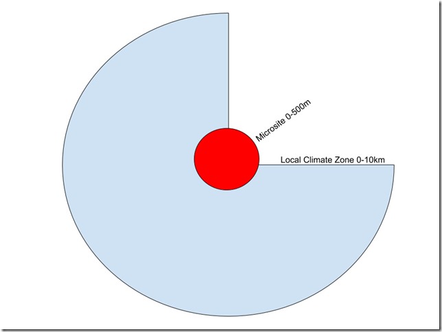
AC Osborn made an interesting comment about airports that will give me an opportunity to do two things: Pay tribute to Willis for inspiring me and give you all a few more details about airports and GHCN v4 stations. Think of this as a brief but necessary sideline before returning to the investigation of how many stations in GHCNv4 are “ruralish” or “urbanish”. In his comments AC was most interested in how placement at airports would bias the records and my response was that he was talking about microsite and I would get to that eventually. Also a few other folks had some questions about microsite versus LCZ, so let’s start with a super simple diagram.
We can define microsite bias as any disturbance/encroachment at the site location which biases the measurement up or down within the “footprint” of the sensor. For a thermometer at 1.5meters, this range varies from a few meters in unstable conditions to hundreds of meters in stable conditions . In the recent NOAA study, they found bias up to 50 meters away from a disturbance. I’ve drawn this as the red circle, but in practice, depending on prevailing wind, it is an ellipse. The NOAA experiment (more on that in a future post) put sensors at 4m, 50m, and 124m from a building and found
The mean urban bias for these conditions quickly dropped from 0.84 °C at tower-A (4 m) to 0.55 and 0.01 °C at towers-B` and -C located 50 and 124 meters from the small-scale built environment. Despite a mean urban signal near 0.9 °C at tower-A, the mean urban biases were not statistically significant given the magnitude of the towers standard 2 deviations; 0.44, 0.40, 0.37, and 0.31 °C for tower-A, -B, -B’, and -C respectively.
While not statistically significant, however, they still recommend precaution and suggest that the first 100m of a site be free of encroachments. In field experiments of the effect of roads on air temperature measured at 1.5m, a bias of .1C was found as far as 10m away from roads. At airports this distance should probably be increased. At an airport where the runway is 50m+ wide, the effect the asphalt has on the air temperature is roughly 1.2C at the edge of the runway and diminishes to ~.1c by 150m away from the runway. (Kinoshita, N. (2014). An Evaluation Method of the Effect of Observation Environment on Air Temperature Measurement. Boundary-Layer Meteorology) Exercising even more caution, I’ve extended this out to 500m, although it should be noted that this could classify good sites as “bad” sites and reduce differences in a good/bad comparison. Obviously, this range can be tested by sensitivity analysis.
Outside the red circle I’ve depicted the “Local Climate Zone”. Per Oke/Stewart this region can extend for kilometers. In simple terms you can think of two kinds of biases: Those biases that arise from the immediate vicinity within the view of the sensor and have a direct impact of the sensor, and those that are outside the view of the sensor and act indirectly– say that tall set of buildings 800m away that disturb the natural airflow to the site. In the previous post, we were discussing the local scale; this is the scale at which we would term the bias “UHI.”
There is another source of bias, from far away areas, and I will cover that in another post. For now, we will use airports to understand the difference between these two scales. Let’s do that by merely picturing some extremes in our mind: An airport in Hong Kong, and an airport on a small island in the middle of the ocean. Both airports might have microsite bias, but the Hong Kong temperature would be influenced by the urban local climate zone with its artificial ground cover. The airport on the island is surrounded by nonurban ocean, with no UHI from the ocean. Simplistically, the total bias a site might be seen as a combination of a micro bias, local bias, and distant bias.
There are, logically, six conditions we can outline:
| Rural–natural | No Micro Bias | Warm Micro Bias | Cool Micro Bias |
| Urban–artificial | No Micro Bias | Warm Micro Bias | Cool Micro Bias |
It is important to remember that micro disturbances can bias in both directions, cooling by shading for example. And note that logically you could find a well sited site in an urban location. This was hypothesized by Peterson long ago:
“In a recent talk at the World Meteorological Organization, T. Oke (2001, personal communication) stated that there has been considerable advancement in the understanding of urban climatology in the last 15 years. He went on to say that urban heat islands should be considered on three different scales. First, there is the mesoscale of the whole city. The second is the local scale on the order of the size of a park. And the third scale is the microscale of the garden and buildings near the meteorological observing site. Of the three scales, the microscale and local-scale effects generally are larger than mesoscale effects….
Gallo et al. (1996) examined of the effect of land use/ land cover on observed diurnal temperature range and the results support the notion that microscale influences of land use/land cover are stronger than mesoscale. A metadata survey provided land use information in three radii: 100 m, 1 km, and 10 km. The analysis found that the strongest effect of differences in land use/land cover was for the 100-m radius. While the land use/land cover effect ‘‘remains present even at 10,000 m….
Recent research by Spronken-Smith and Oke (1998) also concluded that there was a marked park cool island effect within the UHI. They report that under ideal conditions the park cool island can be greater than 5 C, though in midlatitude cities they are typically 1 –2C. In the cities studied, the nocturnal cooling in parks is often similar to that of rural areas. They reported that the thermal influence of parks on air temperatures appears to be restricted to a distance of about one park width….
Park cool islands are not the only potential mitigating factor for in situ urban temperature observations. Oceans and large lakes can have a significant influence on the temperature of nearby land stations whether the station is rural or urban. The stations used in this analysis that were within 2 km of the shore of a large body of water disproportionally tended to be urban (5.8% of urban were coastal versus 2.4% of rural).
Looking at airports will also help you cement the difference between the micro and the LCZ in your thinking. With that in mind we will turn to airports and look at various pictures to understand the difference between the micro and the local- the nearby city or the nearby ocean or field.
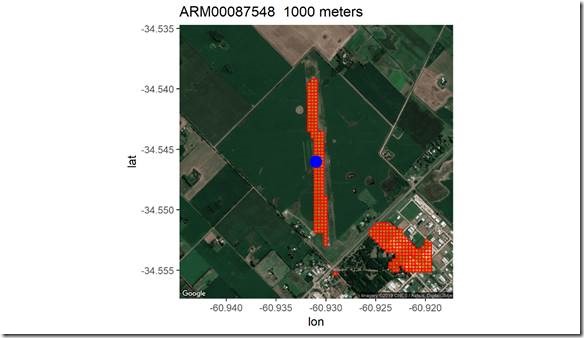
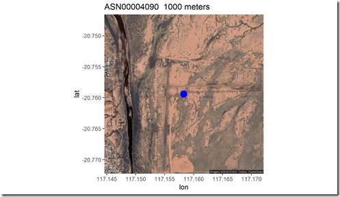
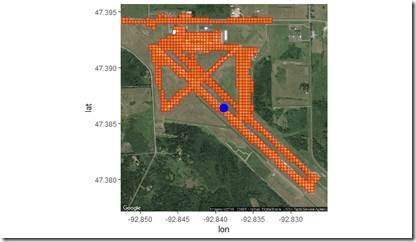
First a few details about airports. In my metadata I have airports classified as small, medium and large
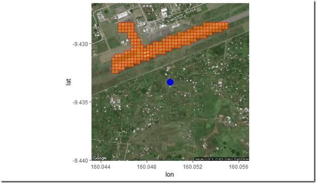
First, the small: some are paved. Pixels (30m) detected as artificial surface are colored orange:
Some are dirt
Now large airports
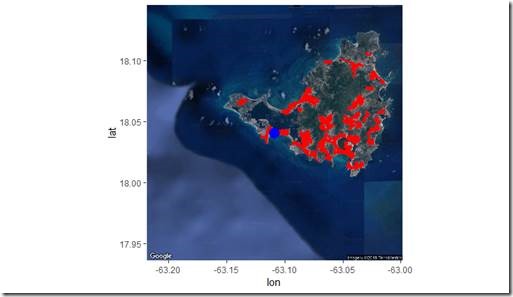
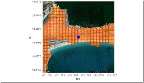
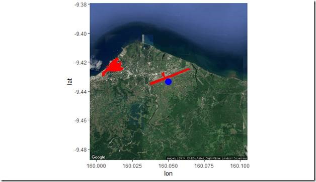
We will get to medium, but first a few other airports by water, a 10km look, the blue dot is the station, red squares are 30meter urban cover
Zooming in
The medium airport I choose was one of Willis’ favorite airports, discussed in this post. Before we get to that visual, I encourage you all to read that post, because it put me on a 6 year journey. Willis is rather rare among those who question climate science. He does his own work, and he raises interesting testable questions. He doesn’t merely speculate; he looks and reads and does actual work. He raised two points I want to highlight:
Many of the siting problems have nothing to do with proximity to an urban area.
Instead, many of them have everything to do with proximity to jet planes, or to air conditioner exhaust, or to the back of a single house in a big field, or to being located over a patch of gravel.
And sadly, even with a map averaged on a 500 metre grid, there’s no way to determine those things.
And that’s why I didn’t expect they would find any difference … because their division into categories has little to do with the actual freedom of the station from human influences on the temperature. Urban vs Rural is not the issue. The real dichotomy is Well Sited vs Poorly Sited.
It is for this reason that I think that the “Urban Heat Island” or UHI is very poorly named. I’ve been agitating for a while to call it the LHI, for the “Local Heat Island”. It’s not essentially urban in nature. It doesn’t matter what’s causing the local heat island, whether it’s shelter from the wind as the trees grow up or proximity to a barbecue pit.
Nor does the local heat island have to be large. A thermometer sitting above a small patch of gravel will show a very different temperature response from one just a short distance away in a grassy field. The local heat island only needs to be big enough to contain the thermometer, one air conditioner exhaust is plenty, as is a jet exhaust
I think we both agree that the micro, what he calls local, is important. However, the area outside of the immediate area cannot be discounted: Hong Kong airport next to a huge city is going to be influenced by that locale, whereas, a large airport ( see above) on an island next to the sea, is arguably not going to be biased as much.
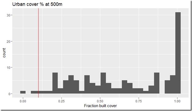
The second point Willis made was about the problems with 500meter data. In particular the MODIS classification system which required multiple adjacent pixels before a pixel was classified as urban. At that time we did not have a world database at 30m; Today we can look at that station and calculate the artificial area using 30m data. The next 4 images show the site at various scales: 500m, 1000m, 5000m and lastly 10000m. At the microscale ( <500meters) it classified as greater than 10% artificial, at 1km greater than 10% artificial, and at 5km and 10km it was less than 10% artificial.
There were some concerns about the temperature at this station being used. However, there has never been enough data from this station to include in any global series, even Berkeley’s. Nevertheless, it lets us see the kind of improvements that can be made now that higher resolution data is available for the entire world. Also, even when airports are included in the data analysis, the bias can be reduced in some cases. Here a 2C bias is removed.
One last small airport to give you some kind of idea of that data that we can produce today.
AC Osborn also wanted to know just how many airports were in GHCN v4; and, I think it’s safe to say that many skeptics believe that the record is dominated by airport stations. Well, is it? We can count them and see. For this count I will use 1km as a distance cut off. There are couple ways to “determine” if a station is at an airport. The least accurate way is to look at the names of the stations. This misses a large number of airports. To answer the question I use GPS coordinates compiled for over 55000 airports world wide, including small airports, heliports, balloon ports, and seaplane ports. I then calculate the distance between all 27K stations and the 55K airports and select the closest airport. I then cross check with those stations in GHCN that have a “name” that indicates it is an airport.
For this we consider a 1km distance for being “at an airport”. While this is farther than the microsite boundary, the point of the exercise is to illustrate that not all the stations are at airports.
Using 1km as a cut off, I find there are 1,129 stations by small airports, 1830 by medium airports, and 267 by large airports. That’s from a total of ~27,000 stations.
To assess the ability of the 30m data to detect airport runways and other artificial surfaces we can look at the stations that are within 500 meters of a large airport and ask? Does our 30m data show artificial surface?. There are 131 stations within 500m of an airport. We know that no sensor data/image classification system is perfect, but we can see that in the aggregate the 30m data performs well.
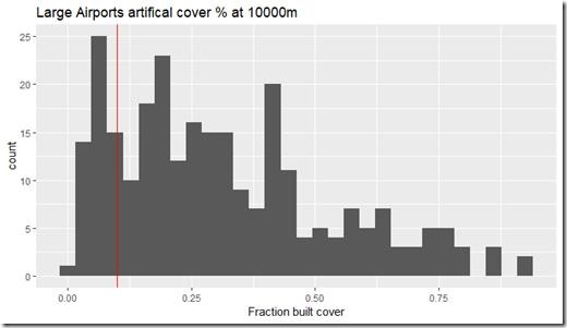
We can also ask how many large airports are embedded in Local climate Zones that have less than 10% artificial cover out to 10km. As expected large airports are in local areas that are also built up at levels above 10%. You don’t get large airports where there are no people.
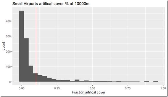
Conversely, you get small airports embedded in local zones that are not heavily built out, a few cases of small airports embedded in Local Climate Zones that are heavily built out.
Summary
Here are the points that I would like to emphasize.
1. We can discuss or differentiate between at least 2 types/sources of bias: the close and immediate and those sources more distant
2. Bias at the short range (micro) can be more important than bias at the long range.
3. A good site can be embedded in a “bad” area or “good” area, similarly for a bad site.
4. 30m data is better than 500m data
5. Skeptics should not argue that all the sites or a majority are at airports. They are not.
6. There are different types of airports.
7. One way to tell if there is a bias is by comparing Airports with Non airports.



“It is important to remember that micro disturbances can bias in both directions, cooling by shading for example.”
Well, it certainly feels cooler in the shade, but is it really cooler than the true temperature?
JohnWho: “it certainly feels cooler in the shade”
Typically, we can feel a temperature difference when moving from direct sunshine into the shade. Shielding from the sun’s direct radiation is noticeable.
We’re told that “greenhouse gases” in Earth’s atmosphere emit enough radiation to keep the Earth 60F warmer than it would be without them. Yet there is no noticeable difference when standing under a tree on a cloudy night and being shielded from all of that radiation emanating from the clouds. It’s as if the cloud’s (or even the sum of all greenhouse gases) radiation has no effect.
By the siting standard that Anthony supports, yes
he and I agree on this. if you disagree, perhaps he could stand in and explain why.
A consensus “argumentum ad vericundiam” logical fallacy?
If it’s all ya got …
See the red circle
See the larger circle
The thermometer is required to be placed such that the Micro area
is the same as the Local scale.
So: if the Local scale ( see that bigger circle??) is a grass feild 2sq km
you do NOT
A) place the sensor under the Lone giant oak tree in the center of the area
B) place the sensor next to the lone small pond in the center of that area.
The reason for this is the sensor is supposed to represent the LOCAL scale
to do this right your micro features should not be different than your local features
This is even true in urban climatology.
you might research Oke’s orginal work on siting Guidelines for urban measurements as well. For example, when measuring UHI in a city,
you generally avoid placing your sensor in the shade.
Unless you want to argue that measuring in the shade in the most accurate way of
estimating UHI?
I do need to thank you for surrendering on the question of how many airports there are
in the data. It was wise to run from that issue
Wait: Anthony supports the notion that the temperature in the shade is actually lower than what the actual temperature is?
The site is suppuse to be representative of the area ( the Local climate zone) such that
if you had the site in an open field of grass in which there was one tree, you would not place the sensor beneath the tree as it would not represent the entire AREA.
The same goes for siting by water. If you had a park 1sq km with a pond of water 50m sq
you would not place the sensor next to the water as it would be cooler than the rest of the area
The whole point is the sensor is suppose to represent the AREA, the LCZ, so if you have known microsite biases in either direction, you dont site in the UNREPRESENTATIVE location
If you shouldn’t site in an “Unrepresentative” location then once it is determined that you are then you should not accept the readings of that site as valid.
The Siting Guide I posted is missing:
“Class 5 (CRN5) (error >= 5C) – Temperature sensor located next to/above an artificial heating source, such a building, roof top, parking lot, or concrete surface.”
My concern remains valid: How do you know when the error is +5C, or +4C, or … (or any of the +/- .1Cs in the series)? Do we know how the angle of the sun influences each reading? The wind direction? The cloud cover? The precipitation? Other factors? For each improperly sited station the variables may be, and probably are, different.
Further, if the cause of the observed bias is natural then isn’t it part of the nature of the climate? Only a cause that is not natural (i.e. asphalt surface) is problematic. Don’t site near a naturally biased area but don’t say it is “mucking up” the climate because IT IS THE CLIMATE.
At least, that’s my untrained observation.
“My concern remains valid: How do you know when the error is +5C, or +4C, or … (or any of the +/- .1Cs in the series)? Do we know how the angle of the sun influences each reading? The wind direction? The cloud cover? The precipitation? Other factors? For each improperly sited station the variables may be, and probably are, different.”
Actually the LeRoy standard was never fully field tested so the numbers +4C ect
are not accurate. They really represent the range of extreme individual
values.. not average biases. In 2012 when I worked on the station quality paper
I contacted LeRoys partner ( who spoke english) to ask him for the field
test reports and he explained that there were none. And that limited testing
had been done. the Average bias they saw in all cases was +-.1C. but on
SOME days they saw large spikes..
To date there is are only TWO actual field tests of micro site:
1) 1 in japan that showed a .1C bias next to roads
2. the NOAA study which showed an statistically insignifacnt bias out to
50 meters
“Further, if the cause of the observed bias is natural then isn’t it part of the nature of the climate? Only a cause that is not natural (i.e. asphalt surface) is problematic. Don’t site near a naturally biased area but don’t say it is “mucking up” the climate because IT IS THE CLIMATE.”
the “climate” is an average. the point with siting is this
See that red circle? See that!
See that bigger circle?
you want them to be SIMILAR
A) if the big circle is grass, and the red circle is dirt…. bad job
B) if the big circle is urban and the little circle is shaded tree.. bad job
C) if the big circle is crops, and the little circle is bbg pit… bad job.
At least, that’s my untrained observation.
From
“Climate Reference Network Rating Guide – adopted from NCDC Climate Reference Network Handbook, 2002, specifications for siting (section 2.2.1) of NOAA’s new Climate Reference Network:
Class 1 (CRN1)- Flat and horizontal ground surrounded by a clear surface with a slope below 1/3 (<19deg). Grass/low vegetation ground cover 3 degrees.
Class 2 (CRN2) – Same as Class 1 with the following differences. Surrounding Vegetation 5deg.
Class 3 (CRN3) (error >=1C) – Same as Class 2, except no artificial heating sources within 10 meters.
Class 4 (CRN4) (error >= 2C) – Artificial heating sources = 5C) – Temperature sensor located next to/above an artificial heating source, such a building, roof top, parking lot, or concrete surface.”
They don’t say +/- “X” degrees C, just >=”X” degrees C and since talking about a heat source, clearly mean + “X” degrees C.
None discuss or mention a possible -X degrees C.
Just wondering out loud.
The issues of locating near to shading and water is covered in Le Roy 2010.
It’s the same problem regardless of how you measure the temperature, you are only ever covering a tiny percentage of the actual global energy flow. Then you pray your proxy is somewhat representative of the overall system while the wild fluctuations which go against your prediction tells you that you have real problems with the proxy.
Knowing all that you put up the most stupid doomed to failure way to tackle the problem thru emission control and call yourself a climate scientist.
Except that there is a substantial directional tendency. Sites, that were once reasonably placed, tend to be encroached by concrete, buildings, development in general. While the opposite would be very rare. So the net macro impact in the data is to bias toward warm. Airports are the prime example. I can think of more than a few examples where taxi-ways have been added in the last 40 years so that they surround a weather station that was originally sited out in a field. They include ORD, DTW, MSP, Kennedy, EWR, ATL, and DFW
“I can think of more than a few examples where taxi-ways have been added in the last 40 years so that they surround a weather station that was originally sited out in a field. They include ORD, DTW, MSP, Kennedy, EWR, ATL, and DFW”
A couple points.
1. YES
2. We can estimate the effect of this bias on the TOTAL record by
A) removing these stations
B) adjusting these stations.
In a record of 27000 stations what have you calculated this bias from these 7 to be?
Bias towards warming across time.
The man-made global warming theory basically has time as the independent variable.
They include ORD, DTW, MSP, Kennedy, EWR, ATL, and DFW.
ORD
Adjusted Down, .5C
http://berkeleyearth.lbl.gov/stations/37567
ERW
Adjusted Down 1.2C
http://berkeleyearth.lbl.gov/stations/163164
ATL
Adjusted Down .25c
http://berkeleyearth.lbl.gov/stations/161109
Kennedy
Adjusted Down .5C
http://berkeleyearth.lbl.gov/stations/167584
Dallas Love feild
Adjusted down 1.1 C
http://berkeleyearth.lbl.gov/stations/170005
Dallas FW regional
adjusted down .25C
http://berkeleyearth.lbl.gov/stations/170007
Lubbock Airport
adjusted dwn 1.2C
http://berkeleyearth.lbl.gov/stations/161105
Mephis
Adjusted down
http://berkeleyearth.lbl.gov/stations/167441
Portland
Adjusted down
http://berkeleyearth.lbl.gov/stations/164883
Reno
Adjusted down 1.15 C
http://berkeleyearth.lbl.gov/stations/173102
San Francisco
Adjusted down .8C
http://berkeleyearth.lbl.gov/stations/162082
Moffet feild
Adjusted Down 1.5C
http://berkeleyearth.lbl.gov/stations/32174
Las vegas Mccarran
Adjusted Down 2.7 C
http://berkeleyearth.lbl.gov/stations/161705
Thank you for my next post idea !
Now that we have a good list of airports from GHCN v4 we can do the following
A) test WITH and WITHOUT the airports
B) Test How the PHA adjustments work with Airports
Recall there are the following Logical things to look at
1. The average with Airports
2. the average without airports
3. the ability of adjustments to REDUCE bias ( not eliminate it ) in the record
And note, Not all airports will be adjusted down . Only those airports that disagree with
the surroiunding stations will get adjusted.
Great test idea that will satisfy a lot of curiosity.
I have to add that I know PDX in Portland very well and due to geography it’s not a good station to use for global temperature (or for anything but local). PDX sits right on the Columbia Gorge, what happens is the gorge channels westerly/easterly winds which means the temperature there can be heavily influenced from high desert to coastal climate depending on which way the wind is blowing. That makes it impossible to have a fixed adjustment in either direction. If it gets a coastal influence in August it would need to be adjusted up but if the winds are draining the high desert temperatures in August there would need to be a downward adjustment. Also due to geography, using a city like Beaverton (right next door) to adjust Portland isn’t cut and dry because there’s a line of hills between the two. Those hills help shield Beaverton from what’s going on in Portland.
Of course that’s just my opinion but I hadn’t given it any thought before until you mentioned Portland and the adjustment.
Weirdly the comment showing how brekely earth adjusts airports downward has been
disappeared.. or delayed
https://www.jma.go.jp/jma/en/Activities/qmws_2010/CountryReport/CS202_Leroy.pdf
“Annex : definition of site classification for air temperature and humidity, surface wind,
global and diffuse solar radiation, direct radiation and sunshine duration
Air temperature and humidity
Sensors situated inside a screen should be mounted at a height determined by the
meteorological service (within 1.25 m to 2 m as indicated in the CIMO Guide). The height
should never be less than 1.25 m. The respect of the higher limit is less stringent, as the
temperature gradient vs. height is decreasing with height. For example, the difference in
temperature for sensors located between 1.5 and 2 m is less than 0.2 °C.
The main discrepancies are caused by unnatural surfaces and shading.
• Obstacles around the screen influence the irradiative balance of the screen. A screen
close to a vertical obstacle may be shaded from the solar radiation or “protected”
against the night radiative cooling of the air, by receiving the warmer infra red (IR)
radiation from this obstacle or influenced by reflected radiation.
• Neighbouring artificial surfaces may heat the air and should be avoided. The extent
of their influence depends on the wind conditions, as wind affects the extent of air
exchange. Unnatural or artificial surfaces to take into account are heat sources,
reflective surfaces (e.g. buildings, concrete surfaces, car parks) and water sources
(e.g. ponds, lakes, irrigated areas).
Shading by nearby obstacles should be avoided. Shading due to natural relief is not taken
into account for the classification (see above).
The indicated vegetation growth height represents the height of the vegetation maintained
in a ‘routine’ manner. A distinction is made between structural vegetation height (per type
of vegetation present on the site) and height resulting from poor maintenance.
Classification of the given site is therefore made on the assumption of regular maintenance
(unless such maintenance is not practicable).
Class 1
• Flat, horizontal land, surrounded by an open space, slope less than 1/3 (19°).
• Ground covered with natural and low vegetation (< 10 cm) representative of the
region.
• Measurement point situated:
o at more than 100 m from heat sources or reflective surfaces (buildings,
concrete surfaces, car parks etc.)
o at more than 100 m from an expanse of water (unless significant of the
region)
o away from all projected shade when the Sun is higher than 5°.
A source of heat (or expanse of water) is considered to have an impact if it occupies more
than 10 % of the surface within a circular area of 100 m surrounding the screen, makes up
5% of an annulus of 10m-30m, or covers 1% of a 10 m circle. "
Maybe one other thing to consider is the importance of a reporting station when it is used to determine the “temperature” of a large area of rural land. In the US, Europe and most of Asia there are many reporting stations not too far apart. In central Africa, Siberia, northern Canada, etc. there are a lot fewer reporting stations compared to the land area.
If a reporting station in northern Canada is reporting +.5C over what it should be due to local influences and is used to estimate temperatures surrounding it, its error would be magnified much more than the reporting station at RDU for instance, where there a many other stations close by.
Yes. one of these things we look for is reginal consistency. Since Monthly temps are correlated out to 1000km even outlier far away can be detected.
Debiasing them is harder.
Where can I find an explanation that makes some sense for a 1000 km correlation for regional consistency?
If I draw a 1000km radius around my local area I will end up on the Pacific Ocean to the west, well into the Mexican side of the Sonoran Desert to the south, close to the Oklahoma/North Texas border to the east and the northern border of Utah to the North. There will be no consistency in the temperatures inside that circle.
Not trying to be argumentative but I’m not seeing it.
“There will be no consistency in the temperatures inside that circle.
Not trying to be argumentative but I’m not seeing it.”
1. Did you TEST for consistency or just think there would be none?
2. Take all the stations in that region. construct all possible pairings of monthly avergae
temperature. Compute the correlation. at 1000km it will be around .5
I believe I read here, several years back, about how the global warming crowd may have built in “warming” in the process of “adjusting bias:”
-you find one thermometer that has not been consistent with two nearby thermometers. You assume the one oddball should be in line with the other two. You adjust the oddball to that degree.
Further: you include the news values as original, raw data, and go forward. Since the temps from that oddball are now “correct,” the data is now supposedly closer to reality than when the thermometer was supposedly reading wrongly.
Repeat the process next year: find triplets of geographically adjacent thermometers, figure out if two are more correlated than a third, and adjust the third.
In reality, if you look at any three thermometers, there will always be two that correlate more closely with each other than with a third.
So, you go find adjustments until the entire modeling comes out just the way it has been believed, since 1896.
First a couple questions. The topic here is airports, and the difference between micro and local.
do you agree with the following
1. We can discuss or differentiate between at least 2 types/sources of bias: the close and immediate and those sources more distant
2. Bias at the short range (micro) can be more important than bias at the long range.
3. A good site can be embedded in a “bad” area or “good” area, similarly for a bad site.
4. 30m data is better than 500m data
5. Skeptics should not argue that all the sites or a majority are at airports. They are not.
6. There are different types of airports.
7. One way to tell if there is a bias is by comparing Airports with Non airports
I would appreciate some indication if we can agree on basic facts, first
Next
“I believe I read here, several years back, about how the global warming crowd may have built in “warming” in the process of “adjusting bias:”
-you find one thermometer that has not been consistent with two nearby thermometers. You assume the one oddball should be in line with the other two. You adjust the oddball to that degree.”
A) this describes the process rather crudely.
B) not all adjustments are UPWARDS… 50% down, 50% up
C) you compare more than 3 stations, more like dozens to hundreds
Further: you include the news values as original, raw data, and go forward. Since the temps from that oddball are now “correct,” the data is now supposedly closer to reality than when the thermometer was supposedly reading wrongly.
A) No. There are always 2 datasets. Unadjusted and adjusted
This allows us to examine adjustments, fine mistakes, and improve the
algorithm
B) the “oddball” is never consider “correct” Correct can never be recovered.
The Goal of the algorithms ( tested and validated) is to REDUCE the bias
in the record. Nobody claims adjustments are perfect. But we do know
from testing that they reduce bias, both warm and cold bias
Repeat the process next year: find triplets of geographically adjacent thermometers, figure out if two are more correlated than a third, and adjust the third.
In reality, if you look at any three thermometers, there will always be two that correlate more closely with each other than with a third.
So, you go find adjustments until the entire modeling comes out just the way it has been believed, since 1896.
Steve: good post. My question relates to Arctic Canada. Most of the reporting stations are coastal, where ocean influence is significant. Canada recently announced that warming was twice world average. How accurate can the necessary “homogenizing” be with wide-spread coastal biased stations? No. Canada is a vast expanse. Also, when frozen, wouldn’t surface temps have to be readjusted above and below ice to allot to either ocean or land?
So as a schoolkid in Canada, we went on “tours” to the local weather station. I know the local insurance agent took the daily readings. If he didn’t take a reading. The station had the mercury thermometer with high-low floats. If there was a blizzard, he couldn’t even get to the station for maybe 3 days, maybe 4 times a winter. The temperature eventually recorded was a guesstimate based on the low temp recorded, since he would have known the high temp occurred either before the storm started or after it was over. The “high” temp recorded could easily be low by 3 C for 3% of the year from this “blizzard effect” alone. With modern electronic recorders this does not happen. Ergo, a warming bias in modern records of possibly 0.1 C due to station inaccessibility during weather events and human desire to fill the reporting sheet.
adjustment by personal anecdote!
And as I tried to point out on another recent thread, these biases are then fed into climate models where the warming is further amplified by modeled water vapour feedbacks.
Over a 100m square they would be ignored but over a large area the models get ridiculous.
“And as I tried to point out on another recent thread, these biases are then fed into climate models where the warming is further amplified by modeled water vapour feedbacks.”
no. climate models do not input temperature data.
read the code
I have.
“It is important to remember that micro disturbances can bias in both directions, cooling by shading for example. ”
It feels cooler in the shade but is it really a lower temperature than the actual air temperature?
(Sorry if duplicate posts)
“It feels cooler in the shade but is it really a lower temperature than the actual air temperature?
(Sorry if duplicate posts)”
If the entire local climate zone were shaded, then a sensor in the shade would REPRESENT the area
if there is one tree in an open field 1sq km, you do NOT site beneath the tree because the
coolness under the tree does not represent the AREA
“The mean urban bias for these conditions quickly dropped from 0.84 °C at tower-A (4 m) to 0.55 and 0.01 °C at towers-B` and -C located 50 and 124 meters from the small-scale built environment. Despite a mean urban signal near 0.9 °C at tower-A, the mean urban biases were not statistically significant given the magnitude of the towers standard 2 deviations; 0.44, 0.40, 0.37, and 0.31 °C for tower-A, -B, -B’, and -C respectively.”
Should be a quote
Should be a block quote
““In a recent talk at the World Meteorological Organization, T. Oke (2001, personal communication) stated that there has been considerable advancement in the understanding of urban climatology in the last 15 years. He went on to say that urban heat islands should be considered on three different scales. First, there is the mesoscale of the whole city. The second is the local scale on the order of the size of a park. And the third scale is the microscale of the garden and buildings near the meteorological observing site. Of the three scales, the microscale and local-scale effects generally are larger than mesoscale effects….
Gallo et al. (1996) examined of the effect of land use/ land cover on observed diurnal temperature range and the results support the notion that microscale influences of land use/land cover are stronger than mesoscale. A metadata survey provided land use information in three radii: 100 m, 1 km, and 10 km. The analysis found that the strongest effect of differences in land use/land cover was for the 100-m radius. While the land use/land cover effect ‘‘remains present even at 10,000 m….
Recent research by Spronken-Smith and Oke (1998) also concluded that there was a marked park cool island effect within the UHI. They report that under ideal conditions the park cool island can be greater than 5 C, though in midlatitude cities they are typically 1 –2C. In the cities studied, the nocturnal cooling in parks is often similar to that of rural areas. They reported that the thermal influence of parks on air temperatures appears to be restricted to a distance of about one park width….
Park cool islands are not the only potential mitigating factor for in situ urban temperature observations. Oceans and large lakes can have a significant influence on the temperature of nearby land stations whether the station is rural or urban. The stations used in this analysis that were within 2 km of the shore of a large body of water disproportionally tended to be urban (5.8% of urban were coastal versus 2.4% of rural).”
I fly sailplanes and I can tell you thermals will take you to the base of the clouds during a summer day, which may be 2km or more above the ground depending. Fly over a heavily wooded area or lake and the sink will bring you right back down. Pretty easy to figure out the land/water below isn’t the same temperature.
rbabcock, I went for a ride in a sailplane once, bad mistake. It was mid-morning and when the tow plane turned us loose we started gliding down. The pilot said “don’t worry, I know a trick” wherein he turned toward a black asphalt outdoor movie lot and the rise of the thermal over that was impressive. Why a mistake? The pilot had to bank the plane in a tight spiral and pretty soon my personal spiral-monitor misfunctioned, leading to unintended consequences. That’s right, UHI made me sick.
Block quote
“Many of the siting problems have nothing to do with proximity to an urban area.
Instead, many of them have everything to do with proximity to jet planes, or to air conditioner exhaust, or to the back of a single house in a big field, or to being located over a patch of gravel.
And sadly, even with a map averaged on a 500 metre grid, there’s no way to determine those things.
And that’s why I didn’t expect they would find any difference … because their division into categories has little to do with the actual freedom of the station from human influences on the temperature. Urban vs Rural is not the issue. The real dichotomy is Well Sited vs Poorly Sited.
It is for this reason that I think that the “Urban Heat Island” or UHI is very poorly named. I’ve been agitating for a while to call it the LHI, for the “Local Heat Island”. It’s not essentially urban in nature. It doesn’t matter what’s causing the local heat island, whether it’s shelter from the wind as the trees grow up or proximity to a barbecue pit.
Nor does the local heat island have to be large. A thermometer sitting above a small patch of gravel will show a very different temperature response from one just a short distance away in a grassy field. The local heat island only needs to be big enough to contain the thermometer, one air conditioner exhaust is plenty, as is a jet exhaust”
Back in the mid 90’s Santa Rosa airport had all their thermometers Box and all
ON THE ROOF of the Terminal.
Phoenix Sky Harbor wasn’t much better. the equipment was next to a brand new Tarmac
within 20ft.
Yes Remeber all those charts about the WARM 30s and 40s?
thermometers on rooftops.
cleaning the record of these ocurrances of course causes skeptics to argue we are cooling the
past
The plains and prairies didn’t dry up and blow away because a few thermometers were poorly placed.
I have stated this before on other sites. With the advent of solar cells and satellite internet it would not be too costly to add 10s of thousands of new sites in rural areas away from the heat islands. We are making Trillion dollar decisions with data supplied by biased equipment. The only sane conclusion is that powers behind AGW do not want these new stations because they fear the new data that they would generate.
We’re making trillion dollar decisions based on junk science, because the assumption that rising temperatures are caused by CO2 is just that – nothing more than an assumption. Further, the notion that rising temperatures are “bad” is just completely wrong. When the climate starts inexorable cooling, that’s when we’ll have something to worry about.
MODIS can measure Land Surface Temperatures (LST) ( skin temperature not 1.5 m air temperature) and changes in vegetation at the needed scale for calculating regional and global changes. MODIS does not measure minimum temperatures well due to cloud cover. But it does measure changes in maximum temperatures which is truly the metric needed to determine if there is any heat stress. Changes in vegetation have a huge effect. Changes from forest to grassland can raise temperatures 20C. Likewise from grasslands to urban pavements. And growing urbanized areas show a strong correlation between reduced vegetation and higher temperatures. No matter how various research groups classify urban and rural, their instrumental data will always overestimate climate warming due to land use changes and local effects where their instruments are sited.
I suggest tree ring data is least affected by local effects temperature and trend from tree rings better reflect climate change in natural areas compared to instrumental records that will always be biased . The latest tree ring derived reconstructions show a strong cooling between 1950 and 1980. Instrumental data shows only a plateau which Suggests an instrumental warm bias from urban/land use effects. The cooling isfollowed by a warming trends after 1980 but must less intense in tree ring data than trends in instrumental data (the divergence problem). I argue the difference between tree ring and instrumental trends is the result of urban/land-use changes that bias instrumental data higher.
In the USA 82% of the stations are considered urban. Only 65% of BEST’s station trends show a warming trend that would surely overwhelm any averaging with the 35% cooling trends.
“In the USA 82% of the stations are considered urban. Only 65% of BEST’s station trends show a warming trend that would surely overwhelm any averaging with the 35% cooling trends.”
Nope, not by any objective verifiable quantitative measure.
ROTFLMAO. Mosher denies a paper he co-authored
In the 2013 BEST paper “Influence of Urban Heating on the Global Temperature Land Average using Rural Sites identified from MODIS C;assificztaions” by Wickham C1, Rohde R2, Muller RA3,4*, Wurtele J3,4, Curry J5, Groom D3, Jacobsen R3,4, Perlmutter S3,4, Rosenfeld A3 and Mosher
They state, ” Although the continental USA looks saturated with very-rural sites this is due to the density of stations in the USA and over plotting of points. In actuality 18% of the stations in the USA are classi$ed as very-rural by our method.”
Maybe you didnt read my other post about issues I have with MODIS.
some raised by Willis.
Picture this. Picture you have a filter that separates urban from rural and uses
a criteria that is Too strict, that takes rural stations and put them into urban
Now compare the diference in trend between the two.
This is not that hard Jim.
To classify urban in 2013 we had only 500 meter data and you needed MULTIPLE
adjacent pixels to classify as urban
Today we have 30 meter data
You think the answer is the same?
Guess
Likewise in the same paper that MOsher co-authored they state “A histogram of the station trends is shown in Figure 3A, categorized by station record length. !e distribution is broad with
a width substantially larger than the mean; 65% of the slopes are positive, i.e. there are about twice as many stations that appear to warm as stations that appear to cool. ”
Now Mosher says “Nope, not by any objective verifiable quantitative measure.”
Slippery little devil is Steve Mosher!
Maybe I wasnt clear Jim.
Not talking about the trend data, talking about the 82% number .
for the trends, as I have explained before, that chart in the paper doesnt
control stations having the same time period.
“I have stated this before on other sites. With the advent of solar cells and satellite internet it would not be too costly to add 10s of thousands of new sites in rural areas away from the heat islands.”
Not necessary.
Perhaps we should simply accept that surface temperatures cannot be measure to better than plus/minus 0.1 deg Celsius due to all the confounding factors.
I think 0.1 °C uncertainty is quite optimistic. 0.5 °C seems a more prudent number according to metrological good practice.
Such issue where accepted, they along came ‘settled science ‘ the issue remained but the willingness to admit to them went in the interest of ‘saving the planet ‘
indoors, measuring temps in a controlled environment, “state of the art” Pico tech, state they cannot get within 1deg of accuracy.
A single platinumt resistance sensor cannot measure a temperature. It only measures the temperature of the sensor. To measure temperature you need multiple duplicate instruments in close proximity , taking care the layout does not itself bias temperatures. Then you can examine the readings statistically and get estimates for the average, mean, mode temperatures and an error statistic for the array. The plus/minus range for any individual reading.
This is one of the reasons the short, 140 year temperature record using multiple different measures gives less that stellar results.
0.1C is pretty close to limits of what the sensor itself is able to do.
That’s before talking about micro and macro contamination issues, undocumented instrument changes issues, or the fact that we would need at least 2 to 3 orders of magnitude more sensors before we could start to claim that the surface of the earth is adequately covered.
“Perhaps we should simply accept that surface temperatures cannot be measure to better than plus/minus 0.1 deg Celsius due to all the confounding factors.”
I dont think you understand was an area average is.
There is no average area, what size is your area?
is it made up of-
Upland regions
• Coastal regions
• Forest
• Urban regions
“If we compare the climate statistics for three locations in Devon, one upland and the other two coastal,
namely Princetown, Plymouth and Teignmouth, each only 20 miles apart, you would think that the climate
of these three locations would be very similar. However, looking at the statistics below, you can see that their
climates are quite different”
and the temps will be very different.
“biases the measurement up or down within the “footprint” of the sensor. ” ?
What could possibly bias it down ?
“Willis’ Favorite Airport
Guest Blogger / 1 hour ago May 7, 2019
Reader AC Osborn made an interesting comment about airports that will give me an opportunity to do two things: Pay tribute to Willis for inspiring me and give you all a few more details about airports and GHCN v4 stations.”
Guest blogger means it isn’t Anthony. Paying tribute to Willis means it isn’t him. So who is ‘me’?
I suppose it shouldn’t matter as it is the content and ideas that matter, but I am curious. Most everybody else has their name attached.
It is from Stephen Mosher…
His first post on this is….
https://wattsupwiththat.com/2019/05/03/mosher-microsite-bias-matters-more-than-uhi-especially-in-the-first-kilometer/
Perhaps you missed out the line that said “by Steven Mosher”?
Another useful article to add to my increasing collection on temperature readings and biases. I would echo Flavio Capelli’s point that trying to make anything less than 0.5°C meaningful is a waste of time. I cannot differentiate between 18°C and 18.5°C and I doubt whether any other living organism can either. Unless we can be reasonably certain that the bias is significant we are into “angels on the head of a pin” country — fun for the theologians; irrelevant in the real world.
On the other hand, there is at least a suspicion that changes to siting and the inclusion or exclusion of sites over time, and the use of readings to cover large swathes of remote, usually cold, parts of the planet, may well have contributed to a warming trend which is an artefact of the modeller’s art rather than an accurate recording of observations!
It certainly helps when virtual all of the ‘mistakes ‘found in past readers are ‘corrected ‘ in the manner that by ‘lucky chance ‘ favours the claims of ‘climate doom’
“by Steven Mosher” was not there at c07:00 EDT.
I knew it was by Steven from reading his previous article. But “by Steve Mosher” was not there.
“It is important to remember that micro disturbances can bias in both directions, cooling by shading for example”
I thought that was why they painted them with a specific kind of white paint, so direct sunlight would not effect them ?
Thanks for another interesting article, Mr. Mosher.
Hong Kong airport next to a huge city is going to be influenced by that locale, whereas, a large airport ( see above) on an island next to the sea, is arguably not going to be biased as much.
Just in keeping with your “data is king” methodology (a good one): “arguably,” or has this theory been tested? E.g., I was surprised to learn in your previous post that rural areas could actually be warmer than urban in certain instances.
When you say that you determine the distance of a station from an airport, how is the location of the airport determined?
Geographic center? Location of the tower?
If a station is located at the end of a runway, it can be a large distance from the geographic center or the tower.
How was jet exhaust weighted ?
That is not so silly. I’m using my phone so I’m struggling to read the actual paper but looking at mean differences seems to be avoiding the issue, especially in Australia where maximums are short spikes over a degree higher than a 10 minute average.
The primary purpose of these stations when they went in wasn’t to track long-term climate changes, but that’s what we want to use them for now. If we eliminated from the data-set all the stations that have become corrupted over time, aren’t there enough remaining to estimate temperature trends on decadal time scales?
We don’t have enough to do that now. Much less after the bad ones are eliminated.
Taking a station placed over a small patch of gravel, how does the bias chsnge on cloudy, rainy, kr windy days or when there’s snow cover. LHI/UHI is a complex thing and a blanket adjustment is no better than none and therefore no dataset is worth a light
Okay, here goes…
Where is direct energy consumption considered?
A doubling of CO2 will supposedly lead to 3.7 watts per square meter added to the atmosphere. Much effort is directed to detection and attribution, but I never see any mention of whether the weather stations might be influenced by something other than CO2, or grass and trees, or concrete, bricks, and asphalt.
How much does a watt really care about its origin?
Until recently I lived in a subdivision that was a 5-acre farm prior to 1991. Based on my electricity consumption, energy consumption for that five acres went up about twenty times, to 1.5 watts per square meter. That’s electricity only; most central and space heating is supplied by natural gas. But the global average temperature is calculated from daily Min and Max temperatures, when heating or air conditioning loads are near their peak. So it would probably be reasonable to at least double the consumption to 3 watts per square meter when those observations are made.
Nearby I watched older houses on half-acre lots demolished to make way for higher density strata-title developments. They’re probably closer to 10 watts per square meter now.
But this post is about airports, so I looked up the area of Toronto Pearson International… 1867 hectares.
From what I can determine, an order of magnitude estimate for a Boeing 747 during takeoff is 100 MW, a little over 5 watts per square meter. For Canada’s busiest airport, between building heating and A/C, planes landing, engines cooling off, planes taxiing, planes taking off, etc., etc., 5 watts per square meter could be the continuous consumption.
What would it have been fifty years ago?
My main point: isn’t it likely that – for the purpose of attribution – observations and trends are seriously compromised at any station where (in the vicinity) there has been a change – usually an increase – in direct energy consumption that approaches or exceeds the warming predicted to result from the contemporaneous increase in CO2?
Twenty years ago a Dutch physicist friend of mine and I set about to estimate the heat load from human sources in various large cities. Practically every mW of energy delivered by fossil fuels, electrical power, and so forth ends up as waste heat. How would this compare to the amount the “driver” CO2 adds to the climate? I could find our original calculations if pressed, but I recall it being in the neighborhood of 0.5W/m^2. We were only interested in average values over large urban areas. What you have stated above is that in the immediate neighborhood of a specific temperature sensor it could be a much larger disturbance.
The more one ponders the problem of temperature measurement, the more problems one begins to ponder.
What, precisely, would be the geographical and structural definition of a “non-airport”
The St. John’s River at Jacksonville FL?
[You asked for precision]
And to think all this research started with a simple question: “Whatchu talkin’ about?”
We older folks can appreciate the humor in that.
Airports are not always bad sites. Take Uppsala is Sweden, an important site since it is one of the longest series in the world (since 1722). The orginal site is now near the center of a city of 200,000 while the “airport” is a now little used Air Force Base north of the city with lots of grass and greenery. The temperatures there regularly are 1-2 C lower than in town.
“Using 1km as a cut off, I find there are 1,129 stations by small airports, 1830 by medium airports, and 267 by large airports. That’s from a total of ~27,000 stations.”
I’m not happy with your 1km cutoff, because many airports have runways with length greater than 2km. I’d consider a site at the far end of a runway still ‘at the airport’.
The UK’s Heathrow covers 12.5 square km. Adding 1km onto the perimeter will give an area nearly 30 km^2. A circle of diameter 3.5km from any of the four terminals? There are a couple of stations within that sort of distance.
Not sure what to make of comment regarding airport stations not being dominant in numbers. Fred Singer referred to a graph from NOAA that certainly looks that way:
http://www.independent.org/images/article_images/2019/2019_02_07_singer_fig2_475x344.png
Singer’s article is at http://www.independent.org/news/article.asp?id=11715
Check my logic, but once, say, black top is laid around a station, you will get a bump up. But it will be like a plateau, not an continually increasing effect. Right?
True, however if you don’t remove that bump it biases the trend.
Beyond that, airports rarely put down one runway then stop growing.
Yeah, but some days it might be 3 degrees F, some 1F, and some no difference at all.
I’ve now figured out that my posts are going into the “delay bin” for awhile before appearing. I thought I’d done something wrong and re-posted some.
Sorry.
Yeah, but … some days it may be 3 degrees F, some 2 F, some 1 F, some a number of “.1” difference, and some there may not be any “bump” at all.
How to tell when each is happening – that is the $64k question.
There is also the effect of airplane traffic especially jet engines.
add a plateau here, add a plateau there, and soon you have a nice little trend
This whole discussion, while important, it only hints around the edges of the problems temperature data from terrestrial weather stations. How does one assess how changes over time (e.g., since 1850 or 1950) affected the temperature data for a given site and separate those artificial changes from natural changes? In some areas like Florida or Las Vegas we are talking about wide spread land use changes. In Florida we went from relatively wetter environments to far more urban environment today. We have state parks once surrounded by forest now surrounded by urbanization. During Hurricane Donna in 1960 the official NWS weather station was lost and not replaced for sometime. Even where the station was located has gone from an airport to other uses. So the wind speed actually reported for Donna from the official Orlando site was an “educated”. In Las Vegas land use went from desert to urban.
“An airport in Hong Kong, and an airport on a small island in the middle of the ocean. Both airports might have microsite bias, but the Hong Kong temperature would be influenced by the urban local climate zone with its artificial ground cover. The airport on the island is surrounded by nonurban ocean, with no UHI from the ocean.”
Hong Kong Airport is located on an artificial island connected to Kowloon by a bridge over the ocean which 1.3 km long.
The old airport was located in Kowloon.
Describing Hong Kong airport as “surrounded by ocean” is stretching the definition of ocean somewhat. In reality it is situated on the edge of a relatively narrow channel between Lantau Island and the mainland that opens at the western end to the Pearl River estuary.