Steve, in Seattle writes:

I began this project out of both frustration and a specific curiosity. I have, over the years, studied many excellent articles at WUWT. The articles that are mathematical / graphic “ heavy “ are of particular interest to me. While I appreciate that many authors have statistical and / or graphical applications available to them, I do not.
Thus, it has been frustrating to me that I could not fully understand the detailed steps of such analysis, let alone reproduce them on my own laptop. With respect to climate science, I have one topic of particular interest : The temperature data presented by NOAA at the USCRN website. While there has been much written on WUWT about temperature trends, significance and the various temperature databases, the interests of the more casual readers seems to have been ignored.
I wish to introduce an ability to use a “ state of the art “ temperature data base and relate it to atmospheric CO2 concentration only. Further, this would be work that the interested reader can take up and continue on his / her own.
I want to document a detailed methodology to examine the possible strength of relationship between the USCRN temperature dataset and atmospheric CO2 concentration measured at the NOAA site in Hawaii. First, note that my tools to use will only be those that are available to anyone with MS Office installed upon their home computer OR access to in a public library. Specifically I will use MS Excel 2013 as one of two applications, this because it is the most current version available at my public library. Data source will be two files, the starting page URL’s are listed next :

https://www.ncdc.noaa.gov/temp-and-precip/national-temperature-index

These pages may be examined on line. In the case of the USCRN page, parameters can be loaded for that application to input and construct a plot. Both pages include a link to data files that can be downloaded. Both are text files and both have data fields delimited by either a comma or a space. It is important to notice that because of the design of both files, an important relationship exists, one that will make possible the construction of an Excel scatter plot ( chart ). Specifically, the data with respect to temperature and CO2 concentrations is in a one to one relationship with respect to each line of both files. Both files have one data value for each month that is archived. Note however that the USCRN data file has not been in existence as long as the NOAA CO2 data file. Care must be taken to extract the same amount of data points, with the same starting date, from each file so as to maintain this one to one relationship. At the time of writing this article the CO2 data file had not been extended to the end of 2018, thus I selected my data end point to be December, 2017. Additional data will be available for use in the coming months and years. The results of this exercise will be an Excel scatter plot ( chart ) that can be used to further explore possible relationships between the two entities.
This chart may be thought of as an X, Y graph, with the X values being CO2 concentrations, in parts per million, and the Y values being Temperature anomaly, in degrees Fahrenheit. My hope is that once readers understand the methods employed, there will be interest in forming and continuing a group that can track this relationship for the coming years. Yes, I understand that :
The USCRN represents data for the 48 contiguous states, Alaska and Hawaii only, it is not global.
The USCRN represents hardware measurement technology AND site selection which, in my opinion, far exceeds ANY of the historical global data sets.
The “ trend analysis “ tool in Excel has it’s limitations, with respect to regression analysis.
Using Temp anomalies versus absolute values is a decision worthy of a separate discussion.
Remember, NOAA can upon occasion, make their websites look different, rearrange the URL’s or add new pages. In the future you may have to hunt to find what is referenced here.
Also, you can:
Check the status of USCRN data sets here :
https://www1.ncdc.noaa.gov/pub/data/uscrn/products/DATASET-STATUS.txt
I am unable to locate a similar file for CO2 data.
As long as there are independent observers that will keep the USCRN data set “ honest “ and report findings as they currently are, for usage, the exercise I outline below should allow for the casual user to both examine the strength of a relationship and further understand the tool and mathematics that are introduced. Please be aware, for this work the order of steps is important, particularly so IF you are not familiar with MS Excel. This article will not make you an Excel expert, rather explain a very specific set of steps and Excel selections to get to an end point of interest. Remember, the goal is an X,Y plot ( chart ) where the X data are “ imported “ into Excel first, the Y data next, and the mean data added last. Upon completion of these steps, Excel has a application that will be introduced to construct a trend line, by user choice of mathematical selections. One Excel function will be introduced and it’s use explained so that the mean of the temperature data can be added to the chart. The work here is not intended to make you an Excel expert and the output of your effort is neither a complete or the “ correct answer “ for this topic, rather it is a start, for the layman. Let’s begin at the beginning.
IF you’re a new user of Excel and you have not examined the specific data files from NOAA in the past, take some time now to familiarize yourself with the mechanics of opening and closing Excel. Also take some time to examine the data files you will be working with, study the layouts of each data line in the files. I have tried to insure that instructions involving a mouse click are both consistent and correct, please incorporate your MS knowledge IF I have errored here. When you are ready :
I – In Excel :
Open MS excel ( 2013 or the latest version you have ). Select or create a blank workbook.
FIRST, How to take ( copy ) and use ( paste ) CO2 data by using MS keyboard shortcuts :
Refer back to the ESRL / GMD FTP data finder page shown previously. At the bottom of the page there are two records shown as available, each on it’s own line. Chose the in situ file and click on the icon ( shown in the data column ) to open the text data file in a new window.
Open the CO2 text datafile.
Notice that the data starts at a much earlier year than the Temp data. I show the first few lines of the file and a further few lines at the start of actual data that will be used.
Scroll down to the start of data for the year 2005. This year is chosen because the Temp data in the second file begins January 1, 2005
# header_lines : 148
#
# ————————————————————->>>>
# DATA SET NAME
#
# dataset_name: co2_mlo_surface-insitu_1_ccgg_MonthlyData
#
# ————————————————————->>>>
# DESCRIPTION
#
# dataset_description: Atmospheric Carbon Dioxide Dry Air Mole Fractions from quasi-continuous measurements at Mauna Loa, Hawaii.
#
#
# VARIABLE ORDER
#
site_code year month day hour minute second value value_std_dev nvalue latitude longitude altitude elevation intake_height qcflag
.
.
MLO 2005 1 1 0 0 0 378.46 0.41 31 19.536 -155.576 3437.0 3397.0 40.0 …
MLO 2005 2 1 0 0 0 379.75 0.71 24 19.536 -155.576 3437.0 3397.0 40.0 …
MLO 2005 3 1 0 0 0 380.82 1.12 26 19.536 -155.576 3437.0 3397.0 40.0 …
MLO 2005 4 1 0 0 0 382.29 0.49 26 19.536 -155.576 3437.0 3397.0 40.0 …
Highlight ( select ) all the rows of data ( 156 or more, a function of how the file has been updated ) and simply ” copy ” using ” Ctrl + C ” keys. Remember you must maintain a one to one relationship between the two data sets you will be importing into Excel.
The entire column of CO2 data can be moved, for use in Excel, by pasting, using “ Ctrl + V “ keys, into Excel column A. Select ” Ctrl + V ” to past the data into the A column. CO2 data will be the independent variable and thus it must be moved into Excel column A.
Below is an illustration of the blank workbook you will be using. The Excel tabs along the top allow access to the sub menus that can be selected to expose further specific tools. Notice that the header for column A is highlighted. This column, by default, is ready to accept data.

When you do the “ paste “ ( CO2 data ) you will see the following warning message in Excel. Continue by clicking on the OK button.

Now you have moved all the data fields for each row, into Excel Column A. The eighth data field from the left, is the only field we need to keep in Excel column A.

Next, use the Text to Columns tool in Excel to “ throw away “ all data fields on each row, except the CO2 ppm data.

Select the Excel DATA tab and then move your mouse cursor over the Text to Columns icon, and this informational window should appear. Using this tool ( Wizard ) by right clicking on the icon you will be at step 1 of 3.

At this step you have a choice to make, you can either leave the radio button selected for fixed width OR you can change to Delimited. Either will enable the desired outcome, however the selection you make will drive how the window for Step 2 of 3 displays. The choice of selection will also impact the subsequent actions you will take to finish the import.
IF you left the default, Fixed width, selected, you should see the following window for Step 2. The particular differences for either choice have to do with the internal Data preview window and instructions or other choices you can make.
Notice below, that in the Data preview window there are two vertical lines with arrow heads to the left of the window, which are delineating the first data column from the second and the second from all remaining. You can right click and hold on the black arrow heads at the top and move these lines as you wish. In our case, you can position them so that we will import the eighth data column ONLY and let the tool discard all other data. It is most important that when you position to select the CO2 data that you snug the vertical lines immediately to the left and right of the first and last Char of the CO2 data ( do not include any SPACE Chars ).

IF however you chose Delimited, you should now be looking at the window shown below for Step 2. Now, each field is separated by a thin vertical black line. When Delimited is chosen, the tool lets you move from left to right and highlight each successive field in black and then decide to import it or to throw it away.
Notice that while in step 2 of this option, you also must set up the Delimiters check boxes, for Space only, check the Treat consecutive delimiters as one and chose (none) for the Text qualifier input box.

To clarify the remaining work, the Step 3 window for Delimited will first be shown, so that you can finish the import work IF you had made this the initial decision in Step 1

This window is explaining several items that will help to guide you. With the General radio button selected, the data field is imported, subject to a following Excel rule: as a numeric value for “ numbers “, a date value for “ dates “ and a text string for all other data types. You can now highlight each data column in the Data preview window ( right click and make the column reverse video ). Then use the Do not import column radio button to skip that column. Notice that when you select this radio button for a column, the header for that column will change from Gener to Skip. To finish at step two and import, you must move to the right, column by column and mark as Skip, all columns of data except column eight ( CO2 ppm values ).
For the sake of finishing the import here, the Fixed width option, from step 1 will be continued to completion, so you can see the complete import into Column A in Excel having been taken thru the steps for each option.
In this Step 2 you will set two break lines, used so as to teach the tool which fields you wish to throw away and which field you want to import. Use the MOVE option to achieve the break line positions as shown below. You will in step three, throw away everything to the left of column eight, in the preview window, keep column 8 for import and throw away all columns to the right of the second break line. Make sure you set the break lines tight against the digits of the data field. You do not want to import any unnecessary spaces into Excel column A. Next continue to step 3, by right clicking on the Next button.

In this last step, you will do the work to finish the import.
As it says, this screen lets you select each column that you want to import and set the data format for that imported column ( data field ).
Notice that column 1 is highlighted, in black. This shows in the Data preview window. Notice that the “ General “ radio button has been changed to “ Do not import “. Thus, the column highlighted in black has had it’s header description changed to “ Skip Column “. You can highlight the second column by right clicking on it and importing it as General, which the tool will do and convert to a numeric value. And for the 3rd column, again select “ Do not import “.

At this point, your window should look as follows :

The import will take place when you click on the finish button. The results of the import should look as follows, with respect to the Excel workbook home screen.

II – How to take ( copy ) and use ( paste ) Temperature data by using MS keyboard shortcuts:
Refer back to the USCRN time series page shown previously. Use the link to arrive at the default page setup. You will not be using the default view. Here are the text entries used to create the maximum size data file that will source the data imported into Excel :
under Time Series, select USCRN
under Parameter, select Average Temperature Anomaly
under Time Scale, select Previous 12 Months
under Start Year, select 2005
under End Year, select most current year 2017
under Month, select December
Click on the ” Plot ” button, the chart will appear. Immediately below the chart Y axis vertical you will see a ” Download ” text string with 3 small symbols to it’s right. Right click on the middle symbol, the Xcel icon.
A text file will open in a new window.
Here is an example of the first few lines you should be seeing :
Contiguous U.S. Average Temperature Anomaly (degrees F)
Date,USCRN
200501,1.75
200502,2.50
200503,-0.88
200504,0.41
Remember : This data set starts at the year 2005, month 01 and thus will limit the CO2 dataset usage, to begin use at the same year and month !
Highlight ( select ) all the rows of data ( 156 now, more as time proceeds ) and simply ” copy ” using ” Ctrl + C ” keys.
The entire column of Temp data can then be moved from the data text file. Highlight the B Column tab in Excel. Select ” Ctrl + V ” to past the data into the B column. Again, you will see a text box warning that the data to paste is not the same size as the B column you are pasting. Click ” OK “.
The import of Temp data follows the same flow and steps as you used to import the CO2 data. Simply review previous steps and repeat now for column B in your Excel workbook.
When all import work is finished, your Excel workbook should look as follows, you can scroll down to see that you have 156 ( or more, in the future ) lines of data pairs, as a matched one to one data set.

III – EXCEL TREND ANALYSIS
To do any sort of regression analysis in Excel we must first create a chart. Making the chart ( 2 dimensional graph, X,Y ) is as follows. Excel calls this X,Y graph a scatter chart.
At the top of the Excel tool bar, select the INSERT tab. Look to the right along the top and see the charts grouping section. You can highlight ( move the mouse cursor over ) the symbol for a scatter chart ( it’s the small symbols with a tiny pull down arrow that is just above and slightly to the right of the word “ Charts “ ) and from the pull down menu that appears, select the scatter chart icon, without lines.

You will create a chart that looks like this :

Notice that the CHART TOOLS tab has appeared, with the option to either DESIGN or FORMAT this new chart. Also notice that there are about eight variations of the chart design that you could click on to change the “ look “ and that the default is the first style, left most. Although this illustration shows the horizontal axis having grid line labels going from zero to 180 the chart you have created will show labels representing the CO2 values that were imported.
This chart can be resized by dragging a corner to make it larger for the following work. The work will consist of adding a trend line ( regression ) for Temp versus CO2, adding a Mean column of data for all 156 existing data points ( using Column D ) and then adding mean trend plot points for all existing Temp data points on the chart.
Last, you can do some formatting work to add beginning and ending data point flags and format the horizontal and vertical axis labels and chart title field.
The chart you have created should look like this. Notice that CO2 values are shown on the horizontal axis and Temp data ( degrees F ) on the vertical axis. From this point on you will work with either the + button ( upper right corner of the chart ) or by enabling a new window menu by right clicking with your mouse cursor anywhere on the chart itself.

IV – Adding a regression line & MEAN data points
A right click on the + brings up the CHART ELEMENTS window, followed by another right click on the small grey arrow head to the right of the Trendline check box brings up the secondary window. Chose the More Options option and right click.

A Format Trendline pane opens up to the right of the Excel workbook area, this is the gateway window to allow for many choices you can explore with respect to displaying regression types. The default is Linear, and IF you move to the bottom of this pane and check the Display options for the equation and the R squared values, they will show up on your chart. Also note that you have a dashed linear regression line, same color as the CO2 data points.
Along with the dotted line, the linear equation is displayed and the R squared value. If you chose, you can move your mouse cursor onto the equation text and drag both text items to a location on the chart that promotes easy reading. You can also format the text, make it larger or BOLD simply by highlighting either line of text and using the Excel Font area OR left clicking on the highlighted text to open a options window for the texts.

Place the mouse cursor on the cart in the area shown below and right click.

This new window will allow you to Select Data, which is the starting point to adding a second plot line on your chart – the plot line for the MEAN value of the temperature data. The plot line is constructed by using an Excel math function and a unused data column. Let’s use the D column. The high level steps are to put a MEAN value into each row of the D column, thus allowing for a one to one relationship for MEAN with all the CO2 data points you have incorporated in the chart.

At this point the chart doesn’t directly display the Temp data’s singular MEAN, however. To add that MEAN to a scatter plot, create a separate data series that plots the MEAN against your data’s X-axis ( CO2 ) values.
Step 1
Click a cell ( row 1 ) in a new column ( use column D ), to act as a temporary data holder.
Step 2
Type the following formula into the Excel formula text bar which is directly above the column identifier tabs :
=AVERAGE($B:$B)
Type the formula exactly as shown, use upper case and no spaces between chars in the string enclosed in the parenthesis OR anywhere else. The dollar sign locks values when you transfer the formula output to other cells. The B:B is, I believe, is Excel for “ take the formula input from column B ( Temp data ) and use all rows in column B.
Notice as your typing the formula, the formula is also appearing in the first cell in column D. Also notice that when you have finished typing the $B:$B string turns blue in color.

Step 3
Now, move your cursor down to the header label “ tab “ for column D and left click. Notice that a numeric value appears in the row one cell and all the cells in column D are highlighted. This numeric value is in fact the MEAN ( average ) for all rows of Temp data. At this point however it is only in the first row.

Step 4
To create a MEAN line on your existing chart, you will have to replicate this numeric value into the same number of rows in column D as there are rows of data values in Column B ( the Temp data ).
Step 5
Move the cursor into the row 1, column D cell. The cursor will be displayed as a “ fat cross “. Left click once and all the rows in Column D will no longer be highlighted. Also notice that in the lower right corner of the cell outline there is a very small black square. Move your cursor over this black square and see that the cursor itself changes from the “ fat white cross “ to a black “ plus “ sign.

Step 6
Left click and hold then drag this “ plus sign “ down, inside column D as far as the number of rows of Temp data that you have imported previously. When you release the left click, you should see the value of cell row 1, replicate itself into all the rows you have just highlighted.

This is the first significant way point into creating a MEAN plot line on the chart. You now have as many points of mean data as you have Temp data. A one to one relationship has been created. To finish, use Excel to create a MEAN series of points on the existing chart.
Step 7
Put mouse cursor back on the scatter plot. Right click on the chart. Click “Select Data” from the pop up menu that opens. This opens the “Select Data Source” dialog box.


Step 8
Click the “Add” button, which opens the “Edit Series” dialog box. Don’t panic when OR IF the data points in the background appear pushed over on the chart.

Step 9
Type “Mean” into the “Series name” text box . Notice that the default name has changed to what you typed.
Step 10
Put your cursor in the Series X values text box.
Step 11
Right click – hold and drag your cursor over the original series X-values ( CO2 ppm ) to select them all. Release the click and you will see the Series X values text box fill with the formula to use this data as the same X values for the “ Mean “ data plot as was used before. Notice that the default label for this text box now shows a starting value of a string of the actual data values.

Step 12
Put your cursor in the Series Y values text box. Delete the string ={1} IF it appears by default in this text box.
Step 13
Right click and drag your cursor over the series of cells ( MEAN ) that you created above.
Step 14
Click “OK” in both the “Edit Series” and “Select Data Source” dialog boxes. Points now appear on the scatter plot marking the data’s mean for each of the Temp data points on the original version of the chart.

Format start and end data points with labels, and the vertical and horizontal axis labels and the chart label as you wish. When finished your chart should look like what is shown here, with the assumption that you have used 156 data points ( Jan 2005 thru Dec 2017 ) and selected format choices and labeling.

Remember, the work you have accomplished is only the end of the beginning. A discussion of what MS Excel displays based upon choices made must follow. Any issues with using these applications must also be considered in such discussions. The mystery of “ how that graph came into being “ has, for one path, been removed.
Excel is a very handy tool to make your own charts. Choosing the data to examine is probably the hard part.
It would be great if we could once again post the charts we make here on WUWT.
It is a serious handicap to the efficient presentation of data and arguments.
It needs sorting.
Agreed. Posting URLs of graphics posted elsewhere when they just show up as a link does not catch the eye and is easily missed when scanning pages and pages of textual comments ( most of which are of little merit).
If anyone has done some work or found some useful data, it would be a BIG plus to be able to actually see it.
I hope our host will be able to fix this to work as it used to for years. I would imagine it is just a WP config option somewhere. Not a big problem.
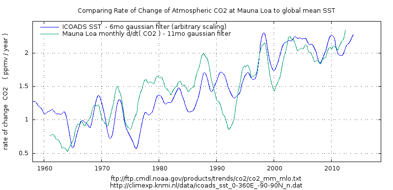
For example here is a more interesting correlation: d/dt ( CO2) vs SST.
A scatter plot with some form , indicating that there is some actual relation between the variables.
Shame the reader needs to click to see the graph 🙁
Here are the two datasets plotted side by side:
And in the end, you only have the US data? Why bother.
Because it is the most sampled and complete data set and when testing a theory that is based upon the contention that CO2 is a well mixed gas which as a matter of physics an increase in which must always lead to warming, unless someone can explain why and what geographical and/or topographical features would render the contiguous US an outlier and not representative of the latitude bands in which the Contiguous US lies in the Northern Hemisphere, then the data of the Contiguous US is extremely important and insightful.
Can you explain the geographical and /or topographical features that would render the Contiguous US an outlier and not.representative?
“Can you explain the geographical and /or topographical features that would render the Contiguous US an outlier and not.representative?”
Good comment, richard.
Let me answer for him: No, he can’t explain why the US temperature record is not representative.
On top of that, unmodified local and regional charts from around the world, and in both hemispheres, all show the same temperature profile as the US temperature profile, i.e., the 1930’s was as warm or warmer than subsequent years. So we actually have confirmation of the US temperature profile (up until the Climategate manipulators started changing the charts)..
We have no confirmation of the bogus Hockey Stick charts. None of the unmodified regional and local surface temperature charts resemble the bogus, bastardized Hockey Stick chart. The Hockey Stick chart is one of a kind. All the rest of the charts look like the US chart.
Extra energy is retained by the planet and it results in the storm tracks being colder in the winter. Where are the storm tracks and how do their sfc temperature averages affect regional averages?
Why bother.
For those that live in the US, that is the relevant data. And the USCRN temperature dataset is the only one with the equipment and siting designed to eliminate urban and microsite issues.
trafamadore
“And in the end, you only have the US data? Why bother.”
Well I wouldn’t say there is no reason to bother about CONUS’ data. But I understand what you mean.
And that’s why I clearly disagree with both Richard Verney and Tom Abbott: not in the form of polemical comments, but on the basis of real comparisons using NOAA’s ‘GHCN daily’ (here: GHCND) dataset:
ftp://ftp.ncdc.noaa.gov/pub/data/ghcn/daily/
The dataset contains over 100000 stations, about 36000 of which perform temperature measurements.
Last year, Roy Spencer published in one of his head posts a graph composed by John Christy:
http://www.drroyspencer.com/wp-content/uploads/US-extreme-high-temperatures-1895-2017.jpg
which was intended to show us that there was no significant warming (in the US of course: as was visible on the chart, only USHCN stations were used).
Christy had the interesting idea to use as marker the number of daily maxima per station per year.
It was not long before a commentator wanted to see the same statistics for the globe. I thought: why not to do the job? Fits perfectly to my data cracking hobby, after all.
*
1. As the USHCN record is restricted to the US, I had to choose the GHCND instead, and generated a graph out of it similar to Christy’s (of course with Celsius instead of Fahrenheit):
https://drive.google.com/file/d/1qGV5LfKw_lFKNdZMlq15ZHz6sA1CA294/view
GHCND has about 18,000 US stations compared with USHCN’s 1100, and thus the yearly averages differ, but the similarities are evident.
2. Then the same was done for the Globe:
https://drive.google.com/file/d/1GMuNs9ptRzDd7KxFQbKv0o5ySR5VNc9b/view
This is the point where both commenters would ask: “Where is your point, Bindidon? We just told you before that the Globe looks like CONUS!”
3. Sorry guys, but… this is wrong. It is easy to show it by generating a daily maxima graph out of a GHCND data subset in which no CONUS stations are present:
https://drive.google.com/file/d/1UcLK3usYjICeHeAsAb5ivcusW0Y0EdNe/view
The difference is somewhat incredible. But what is it due to?
It is simply because the graphs shown in (1), (2) and (3) present data where all station daily maxima are averaged together in each year.
Thus you have worldwide 18000 US stations competing each year with 18000 non-US stations: this means that about 6 % of the Globe’s land surface has the same weight as the remaining 94 %. When you exclude the US stations, you irremediably get another picture of the Globe.
4. If you now average, in a preliminary step, all stations worldwide into grid cells of e.g. 2.5 degree (about 70000 km^2 each) you obtain the following graph:
https://drive.google.com/file/d/1TFdltVVFSyDLPM4ftZUCEl33GmjJnasT/view
Yes: it looks as the preceding graph in which all US stations had been excluded!
This is due to the fact that now, about 200 CONUS grid cells compete with 2000 grid cells outside of CONUS. Thus CONUS’ weight is reduced to about its surface ratio wrt the Globe.
*
Thus: no, CONUS is definitely NOT an appropriate field to unerstand worldwide temperature distribution.
5. Coming back to the beginning of the story, we see that ironically, the gridding method gives, when applied to CONUS itself, a graph
https://drive.google.com/file/d/16XwogXkjltMuSzCdC5mPKqC1KNev4ayy/view
showing that the number of daily maxima per station per year above 35 °C even decreases.
The reason for that is again that the gridding gives more weight to isolated stations whose ‘voice’ was diluted within the yearly average of the entire CONUS area.
From me too: nice job, Steve in Seattle. I’m sure you will motivate many WUWT commenters to have a closer look e.g. at temperature data.
1. A little technical remark: you use for your presentation of time series the coordinates of the data points, instead of lines linking them.
This is useful for randomly distributed points, but is it good for time series with highly correlated data? I’m not quite sure.
Please think that your readers quickly might loose the relation between the series and the points representing them, especially when you compare two or more time series, even if these are displayed in different colours.
Here is a picture comparing two time series, based on points
https://drive.google.com/file/d/1p2PwRPw7yOG50EQY7aUpWN7UUnurfiLQ/view
and a picturing showing the same data, but based on lines
https://drive.google.com/file/d/1HY3NrkHAlZRJIAlJxysw8Vb1K9gLydPZ/view
But… maybe it’s just a matter of taste.
2. Do I understand you right, Steve? Do you want to compare CONUS’ temperatures and the atmospheric CO2 concentration, and draw some conclusion?
Good luck…
J.-P. D.
Looks like Excel Hell. Python + Pandas is a great alternative.
https://talkpython.fm/episodes/show/200/escaping-excel-hell-with-python-and-pandas
Remember, he did say he specifically used Excel because nearly everyone has access to them either at home or in a library. I’m also assuming he is not a programmer-type person.
Brett — there are several widely used alternatives for data visualization:
– Excel
– OpenOffice/LibreOffice
– R
– Python -numpy-pandas
– Matlab
– some sort of preprocessor (Python in my case) + gnuplot
They all work I’m told. And all the ones I’ve tried can all dump you into digital hell if you annoy them — which is distressingly easy to do.
But as James Schrumpf points out, the tool most likely to be available to a Public Library user is probably Excel. I’m no fan of Excel. The variety of unpleasant surprises it has tucked away to spring on users is quite large. But it is useable and I suppose you work with the tools you have not the tools you might want or wish to have.
I use OpenOffice/LibreOffice. I love them and have no more difficulty than I did with Microsoft’s nightmare Excel. The cost is right and you can get just about as much help with these from internet sites as Microsoft ever gave with Excel. I used Excel because I had no choice—my employer at the time used it. I really love the open source programs much more than the standard ones.
I’ll be trying OpenOffice with the ideas and instructions presented here and will see how well it works.
Thanks to Steve for this article. My weak point in this is downloading the data in a usable format. Had the same problem when using Access. It may just be a mental block. I’m going to give it another run using this article as a guide.
Indeed, if all you want to do is visualise data you do not want the mess with head by trying to use mastodon progs like Mathlab or R.
Gnuplot is free, crossplatform and fast. ( In fact you can do a lot more with it but just plotting is fast and flexible. ).
http://www.gnuplot.info
You will likely want some text manipulation tool since everyone seems to use a different file format.
NOAA climate alarmists actually hate the USCRN data.
In Tucson last October, the NWS kept claiming the Tucson had the warmest September EVAH.
Of course the temp record they use for that is GHCN station at TIA airport (TUS) where there has been significant infilling of buildings and solar panels all around for miles of the airport in the last 30 years, including significant runway, taxiway, and asphalt parking lot expansions.
I downloaded the September Tucson USCRN station data for September, which is out in the desert away from any structures for a kilometer in every direction. I ran the daily averages to create a monthly average for every year of data for September. The Tucson USCRN site was setup in 2003 and that data showed that September 2018 was the third warmest with 2010 and (IIRC from memory) 2003 were 1 and 2.
Sent the data results to Tucson NWS and a TV station meteorologist who was crowing about it on the nightly weather.
Never heard a peep back nor from one TV station meteorologists who was also trumpeting the “hottest evah” propaganda.
Bottom-line is NOAA/NWS and the propaganda spewing alarmists love the UHI effect in the raw GHCN data. And they clearly dislike USCRN because it isn’t giving them their obviously hoped for clean record of steady, climate model-like surface warming in the US.
Question:
A) USCRN is a gold standard.
B) The rest of the network sucks
Hypothesis time:
If you compare all of USCRN with the junk stations which will show more warming?
If you use USCRN as a yardstick and compare RAW ghcn and adjusted ghcn to this yardstick
WHICH will be closer to the yardstick?
is your mind open to evidence?
Steve, glad you popped in. I was over on the BEST site Sunday and happened to read the description of your fractional year you calculate by taking (Julian day of year – 0.5)/ 365 (or 366 in a Leap Year).
What’s the point of subtracting 0.5 from the day-of-year? You don’t need to. If you just take the Julian day and divide by the days in the year you’ll get a perfectly usable fraction.
Why all the thrashing in the first place? No language I know of works with a fractional year like that, but they can all use the standard date formats. I don’t get it.
Well, my logic works this way: the raw data is the world as it was. If you have two adjusted data sets that match and are off from the raw data, all you’ve done is degrade the adjusted data to the same degree.
In the search for truth, one can’t alter what one sees, decide they like the new version better, and call it “the truth.” The raw data is the world as it is, but you’ve decided you don’t like that version, for whatever reasons, and have made up adjustments and justifications for the adjustments, but you still don’t know any more about the data than before, though you think you do; it just fits into the pigeonholes better and looks nice and neat and clean.
You can’t show any evidence that the new, adjusted data is better than the raw data. You’ve looked at it and decided that it needs a tweak here and a nudge there, but you can’t prove those changes make the data better — you can only justify in your mind, and attempt to do so for others, that the adjustments are “right”, but there is no real, objective “truth” with which to compare the adjusted data.
James Schrumpf
Stephen’s a marketing guy with qualifications in English and Philosophy. His employer ‘awarded’ him the title scientist.
You certainly could be forgiven for questioning whether he had a qualification in English when faced with the arrogant opacity of his comments and seemingly addressing a technical matter.
On the other hand, maybe he just doesn’t want to communicate clearly.
Steven, I’m having some difficulty discerning what you want and my apologies not being able to articulate my thoughts better. Maybe, I’m just dense. Perhaps, I’m just over-complicating but please define “junk stations”. And, does ”closer” (meaning more equal to, not location) mean “the same as” or “similar”. And, if the USCRN is the standard, why should we compare to ghcn/adjusted ghcn (are these the “junk”) to the USCRN unless the ghcn sites are co-located to the USCRN sites on a one to one basis? Maybe that’s what your doing? Otherwise, the comparison does not seem logical to me because of the difference between ghcn/USCRN location/sampling standards. Regardless of any comparison, we would agree that the USCRN is a better dataset than the ghcn for the USA, I think. Maybe a comparison would be more valid if the USCRN could be compared to the ghcn over a longer time period as UHI became a bigger factor? I’m sure you have further explanation that will clear my cobwebs.
sorry, I was doing a quick post from a DIDI here in Beijing. Super cheap, much better than Uber
“Steven, I’m having some difficulty discerning what you want and my apologies not being able to articulate my thoughts better. Maybe, I’m just dense. Perhaps, I’m just over-complicating but please define “junk stations”. ”
Lets try this.
1. Many comments/commenters here assert/believe/argue that CRN sites are a good standard. Lets call them a gold standard. They meet all the siting criteria that Anthony cites in his papers. In the past, I recall, Anthony was even going to build a national average based on CRN
Question: do you agree that CRN, the reference network is better than the other stations in the country? That is, there are 110+ of these stations, all the sites have pictures. All the sites meet ( or met) the siting guidelines. All have triple redundant temperature sensors. Are these 110 Better than ( high quality, more reliable, more accurate, less biased ) the OTHER stations that everyone criticizes.
The other stations have spotty records, are located in cities and at aiports, They have 1 sensor producing only min max. They have no been sited properly. WUWT volunteers looked at about 1000 of them and gave a huge percentage of them bad quality score.
So, Simple question. Do you think the 110 stations in CRN are better than the thousands of stations that are located on pavement, in cities, by airports, by air conditions, etc etc etc?
Assuming you agree that CRN is better than non CRN. Then there come these questions.
1. if a CRN station showed .5C of warming over 10 years. Would the neighboring stations
those neighbors in growing citys , those neighbors at growing airports, those neighbors that are not sited well, etc etc etc.. Would you expect the bad stations to show MORE warming than the good CRN stations or LESS warming? Recall that around 10 years ago when folks discussed CRN here they had definate hypothesis about what CRN would show after 10 years.
2. Suppose you have a CRN station that shows .5C of warming.
if you look at surounding stations oh say within 200km. what would you predict
for the raw station records of surrounding sites? More warming than CRN? or less warming than CRN?
Now look at the adjusted records of those neigboring stations. After NCDC has fiddled
with this data.. will they put more warming in? or will adjusted stations match CRN?
3. With 110 stations I can create a average for the USA. suppose I do this with CRN
Suppose I also create average with the other 1000s of stations. All those stations at
airports with HUGE jet exhaust. All those stations by air conditioners blowing hot air on the thermoters ( alomost melting the glass Im sure) all those stations in growing cities .
Now I compare those two USA averages. which will be higher? which will have the higher trend? the good stations (CRN) or the bad stations? your prediction?
Psst. you dont want to answer these questions. If you wait a while somebody will make a personal attack on me and folks will forget the question. just wait.
Global warming is not global. It is mostly confined to the arctic which argues strongly the cause is something other than co2.
UHI effects are not a result of population. They are the result of population change. This was confirmed in a recent paper that showed the loss of 60 million people caused 0.15C of cooling.
In the US there is a migration underway of people from the NE to the SW. This has led to a cooling in the NE and warming in the SW.
Depending on how uniform the sitting of your 110 stations, you may see on average a net cooling, warming, or no change.
The correct way to handle this is to apply a gridding and random sampling algorithm the satisfies the central limit theorem.
From what i’ve seen none of the main temperature reconstruction satisfy the central limit assumption of randomness and thereforee cannot be trusted when using standard statistical analysis.
Well, Steven, thanks for your response and I don’t mind answering any question that is legitimate, which yours seems to be; and, I’m guessing, that you will tell me that the “junk” stations will have the lowest rate of warming based on min-max data. But, you would agree that the USCRN provides a more accurate (estimate) of a daily temperature profile and any time-averaging that follows? And, if the USCRN is more accurate, then, the other “junk” stations are less accurate and, therefore, any conclusion drawn from that data, good, bad or indifferent, is less accurate, as well? Is USCRN better for the reasons you state and requires less in-filling/interpolation (is that a big enough issue?) which gives us more certainty in that data? I think we are looking for better data, not a preconceived outcome, and the issues associated with the “junk” stations taint the results no matter what they are. I know the other stations are all we’ve had for a very long time, and I accept that, but that doesn’t mean they are free from critical analysis. Rate is important but accuracy/precision comes before rate. It wasn’t clear to me if your post was criticizing the USCRN or not, that is, believing that it isn’t as accurate (estimate) of temperature as the older datasets. And, my comments should not be taken as any criticism but just the asking of questions to get a better perspective on the temperature datasets.
On a related matter, the UAH satellite data give a consistent global rate of +0.13 C per decade. Your thoughts?
Wasn’t this the substance of the paper Anthony Watts presented? The more poorly sited the station, the greater the warming rate? I think we have the answer already unless you disagree with his conclusions. In which case, do you have your own analysis to demonstarte your point?
Steven Mosher’s “A” and “B” and following question about the comparative warning rates among the USCRN and ghcn raw and adjusted data stirred some thoughts in my mind; and, and although I’m sure most (all) have moved on, I wanted to finish that stirring. I’m not sure to whom Loren was addressing his comment but I certainly would not take issue with Anthony’s et.al. paper regarding siting conditions at various reporting stations. That was outstanding work. And, no criticism directed toward Steven’s question, other than I think the comparison should have been between USCRN and non-UHI ghcn sites.
No, I was thinking of the old phrase that was pounded into my head starting in high school, through undergraduate and then into graduate school, “good experimental design” and how the USCRN was purpose built to record weather data with satisfactory accuracy/precision/redundancy away from interferences (UHI) over the time frames necessary to provide insight into climate.
So, two points: 1) The value of the USCRN is in the future. 2) And, no amount of statistical analysis, ranting, raving, magic or adjustments will trump a poor experimental design.
“Night All.
2003-2018 Warming:
GHCNraw > USCRN > GHCN adj
Why? because CRN does a better job sampling daily average than GCHN b/c aliasing.
Question: how do you prove your assertions on which everything else is based?
Turn Aand B around and your question makes no sense, so prove A and B, otherwise you are just Begging the Question.
Steven Mosher – I give hats off to anyone attempting to look at data and make conclusions themselves. It’s called critical thinking – it may not give the best answer but it’s an iterative process.
On a related note, correlating temperature to atmospheric CO2 concentrations seems to me like correlating rain-gauge data to atmospheric water content. I can design the most accurate rain gauges using weight scales accurate to 0.001 grams to weigh the water in a rain gauge calibrated to the National Bureau of Standards. Then I can check the rain measurement with a laser as a QC check the water depth. I can hire the best scientists and mathematicians to homogenize the data globally. In the end, I suspect the global rain gauge data will correlate with atmospheric water content about as well as atmospheric CO2 concentration does with global temperature, sea level rise, or “pick your parameter.” It’s my opinion that if you focus on global temperature and not energy, you are going to get an unreliable correlation.
Hi Mr. Mosher, a Question:
Since you deal with these historical data sets,
To your knowledge does any one make temperature adjustments to correct for station differences in density altitude or relative humidity (heat content)?
In other words is it possible to convert the temperature records into actual heat content records?
Then we would be getting somewhere.
Regards.-R-
Richard G. – Yours may be a good question to ask the satellite jockeys.
Joel O’Bryan February 25, 2019 at 6:45 pm
“NOAA climate alarmists actually hate the USCRN data.”
Why should climate alarmists hate the USCRN data?
They should love it and embrace it, because the CONUS temperature trend calculated from USCRN data has a 0.115 C/decade higher trend than that based on Climdiv (the large network with “adjusted” regular met stations).
http://postmyimage.com/img2/954_USCRN_ClimDiv.png
0.115 C/decade is quite a large difference. I don’t know whether the cause is urban cooling, adjustment cooling, or something unknown.
(the graph is produced with OpenOffice Calc)
It’s already been settled. Warming is global and doesn’t apply to the U.S.
No kidding Shearer, it’s almost March and we have experienced record snow in MN and it won’t warm the eff up 😡
Stay bundled up. The next 8 days in MN is going to be colder still.
No kidding Derg, last year we experienced here in Northeast Germany a centennial summer, warm and very dry for the corner.
Since a few years we lack what we in earlier years knew as ‘winter’.
Nearly no snow, no ice, temperatures far above average.
NOAA predicted for 2017/18 an extremely mild winter for Western Europe, it it came as predicted. The prevision was repeated for 2018/19, and it is as predicted again.
CONUS is a very special country. It is a mix of warm and cold, but does not warm that much, at least at the surface.
Bindidon February 26, 2019 at 3:10 pm
“NOAA predicted for 2017/18 an extremely mild winter for Western Europe, it it came as predicted. ”
I guess this never happened exactly 1 year ago so… I must have imagined it.
https://www.bbc.com/news/world-europe-43218229
Please don’t confuse the willfully ignorant with facts.
No you didn’t.
And this I didn’t too:
1. Berlin, Germany
https://www.wetteronline.de/?pcid=pc_rueckblick_data&pid=p_rueckblick_diagram&sid=StationHistory&diagram=true&iid=10382&gid=10382&month=04&year=2018&metparaid=TXLD&period=20&ireq=true
2. Ajaccio, Corsica
https://www.wetteronline.de/?pcid=pc_rueckblick_data&pid=p_rueckblick_diagram&sid=StationHistory&diagram=true&iid=07761&gid=07761&month=04&year=2018&metparaid=TXLD&period=20&ireq=true
Do you see the terrible winter, ADE?
On Corsica island, it was no more than a one-day-drop. And we in Berlin horribly suffered half a week, oh Noes.
But that of course is BBC not worth a line, n’est-ce pas?
Do you know how many homeless people die in Europe every year during real winters?
Thanks for “the willfully ignorant”, Mr Gorman.
To the attention of these people considering hot BBC news be facts: here is the end of the descending sort of a monthly average of the GHCN daily data for Germany (1880-2018, 1668 months).
2010 1 -3.81
1917 2 -3.81
2010 12 -3.85
1933 12 -3.93
1891 1 -4.06
1887 1 -4.06
1901 2 -4.19
1940 2 -4.24
1969 12 -4.56
1979 1 -4.62
1929 1 -4.84
1947 1 -4.89
1890 12 -5.00
1941 1 -5.31
1945 1 -5.46
1987 1 -5.54
1985 1 -5.61
1942 2 -5.61
1881 1 -5.72
1963 2 -5.73
1986 2 -6.13
1895 2 -6.38
1947 2 -6.59
1893 1 -7.18
1963 1 -7.37
1942 1 -7.87
1940 1 -9.00
1929 2 -9.75
1956 2 -9.96
Be sure that I never will forget winters like those of 1956, 1986 and 1963, even if they can by no means be compared with an average winter in Minnesota or Montana.
Oh, do you miss Feb 2018? I apologise! It is about 90 lines above…
I love facts, Mr Gorman!
If you keep up with the news, you would know Trump pulled the U.S. out of the Paris agreement so Global Warming no longer applies to the U.S. We can cool back down to where we want to be.
If you BELIEVE the “news” you would THINK that “Trump pulled the U.S. out of the Paris agreement “.
If you informed yourself you would find out that he has done nothing but talk about doing: he wants a “better deal”.
All he did was ( temporarily ) stop the US contibuting the UN Green Slush Fund.
Can Excel do a 2nd or 3rd level regression plot? I use linux and Gnuplot to do it with my data. It is enlightening to watch the trend line bend up and down over the years. It lets you predict whether short-term trends will turn into long term trends much easier. A linear regression of my own data (here in central Kansas) since 2002 shows a slight upward trend. Yet a 2nd level regression shows a curve with an upward slope through about 2012 and then with a slight downward slope through today. A global warming alarmist would predict the linear regression shows the area here will keep warming forever. It doesn’t look that way to me, however! Looks to me like we are seeing a moderating trend at worst and perhaps even a cooling trend!
Here is a list of Excel statistical functions. If you learn some Visual Basic for Applications you can do some interesting stuff. I have made animated graphs and wrote a FIR filter program as just 2 examples.
Can Excel do a 2nd or 3rd level regression plot?
======
Yes. It is trivial to do. When you create the trend line you have the menu option to make it linear or to fit a curve. Of various types and degree/level. You can also project past and future from the menu.
I’ll add Fred what you pointed to earlier- it’s pointless to try and plot data that you can’t show complies with statistical tests:
“The correct way to handle this is to apply a gridding and random sampling algorithm the satisfies the central limit theorem.
“From what i’ve seen none of the main temperature reconstructions satisfy the central limit assumption of randomness and thereforee cannot be trusted when using standard statistical analysis.”
I’ve come across a number of arguments over climate, psychology, physics, biology… where the same problem was demonstrated.
So very true.
I keenly await each month update to the USCRN.
I can’t see much of a warming trend for the 14 years it has been operating so far.
https://www.ncdc.noaa.gov/temp-and-precip/national-temperature-index/time-series?datasets%5B%5D=uscrn¶meter=anom-tavg&time_scale=ytd&begyear=2005&endyear=2019&month=1
can you help me understand what this means:
“National USHCN monthly temperature updates have been discontinued. The official CONUS temperature record is now based upon nClimDiv. USHCN data for January 1895 to August 2014 will remain available for historical comparison.”
Thanks for the Excel lesson(s). I’ve had Excel loaded onto my computer for some time but did not have the knowledge or skill to explore any data file as complex as this and in this complex a manner. I plan to use your road map to do some mining.
Again, Thanks
From this resulting chart I can conclude either…
When temp increases CO2 increases.
Or
When CO2 increases temp increases.
This only implies correlation not causation.
????????
The chart shows that there is absolutely no correlation.
That number, 0.0355, is the R^2 value, the coefficient of determination. That is about as close to 0.0 as you are likely to see.
Perhaps you mistakenly thought it was a p-value, and less than 0.05?
Am I wrong or was there a paper discussed in here many years back by Andrew Dessler with a chart boasting an even lower R2?
Tim
If your question is, “Can Excel do a 2nd-order polynomial or 3rd-order polynomial fit to the data?”, the answer is “Yes” and more. But, you have to be careful that you aren’t ‘over-fitting” and just following the noise.
Heh. That gave me an “A” for a presentation in a college statistics class.
I ran comparisons of several stations here in Southern Arizona, showing clearly that every urban station was showing a pronounced hockey stick (after “adjustments,” the 2009 version of them, I believe).
The one station that showed a flat line (with any reasonable fit) was Tombstone (now not reported, but it was then) – a record going back to 1880, with the station being in the same place and no UHI development anywhere (not even paving; the nearest pavement is more than a half mile away). Explained how that station was far more reliable than TIA.
So far, so good, everyone completely bored. Then I showed the graphic after a fourth order polynomial fit, with a clear cooling trend at Tombstone. That brought up some heads, and I could see the professor about to rip me a new one – until I said “Of course, this ‘trend’ is completely bogus! Give me enough data points and sufficient polynomials, and I’ll draw you a unicorn.”
Last slide was, of course, a My Little Pony Unicorn. Never say you can’t have fun in a stats class!
I once did some higher order fits on Excel graphs of production and quality data for our company’s monthly business meetings.
Heads were swirling. I had some ‘splainin’ to do ;o)
But I Like over-fitting the data. I can use a higher order polynomial and a carefully selected start point to show 50 meters(!) of sea level rise by the year 2100. All coastal areas of the entire planet destroyed.
I can also get the polynomial to plunge down. This is the “Iceball Earth” scenario depicted in that dreadful movie “The Day After Tomorrow”.
{For those who do not know, higher order polynomials zoom way up or plunge way down as soon as they get past the end of the data in both directions. It is a well known property and just the nature of the beast. The primary use of these algorithms seems to be generating scary scenarios for the Global Warming industry. }
The higher order fits will give you insight into short-term trends. Short-term trends often become long term trends that linear regressions miss. The current cooling trend after the last El Nino is a good example. Will it continue? Who knows? Data fitting is not prediction. The current climate models are perfect examples. If they were anything other than data fitting algorithms they would have predicted the current pause (or perhaps large reduction) in warming that we are seeing. The models may be monuments to building large artifacts of non-linear differential equations with accompanying boundary conditions (i.e. fudge factors) but they really don’t output anything more than a simple linear regression of the data would provide! As you so aptly show!
To answer ToryL and Willing Observer, regression fits of data are *not* predictions of future physical conditions. To predict future physical conditions you must understand all underlying factors well enough to make a educated judgments concerning trends, especially current short term trends. Merely extending a regression data fit into the future, especially a linear one, is just assuming that the past is the future. In a chaotic system like the Earth that is prescription for getting things wrong, both in the short term and the long term. In a chaotic system the past is not necessarily the future.
I can give you a concrete example. Trying to determine where to locate new telephone switching centers. Traffic data from existing switches won’t always work unless you are in a tight urban area where you can plot the traffic based on current loads. Demographics data is not always based on a small enough grid to be useful, e.g. county level data or city level data isn’t sufficient. One of the other predictors is building permits and real estate prices. But you can’t just simply plot a linear regression of past data on these and learn much. All you get is the past is the future. You *have* to look at current , short-term trends using higher order regressions. Typically, a 2nd order regression is sufficient. But then you also have to have enough knowledge of the area in question to determine if it is a true trend into the future or just a short term blip. Past data and math can only take you so far. Anything beyond that requires a basic understanding of the system. Something which I don’t believe current climate models actually have.
Past data and math can only take you so far.
=======
In point of fact, it has been repeatedly shown that modern mathematics cannot calculate the future. What we end up with is a probability. X% chance it will be warmer, cooler, wetter, drier.
Even the IPCC knows this, which is why they changed prediction to projection.
The only practical solution to chaotic problems that exists today is largely an adaptation of astrology.
We break the past down into fundamental frequencies, and when the frequencies align, the future and the past will align.
We do this very successfully for the earths tides. Elliott waves try and do this for the stock market. Recently WUWT had an article on predicting the sun via Kuramoto oscillation. It is likely the old farmers almanac predicts using cycles.
I expect we will need to forecast climate using a similar approach if any real progress is to be made.
We cannot predict the tides from first principles. We can’t even predict the orbit of the heavens from first principles. Yet we want to believe it will somehow magically work for climate,, having failed everywhere else when the system is nontrivial.
Nice job, Steve in Seattle.
You made playing with the data much more accessible to Joe and Jane Average. The number of lurkers to the number of regular commenters here on WUWT is incredible.
Hard to say how many people will sit down and flip between Excel and your instructions and wind up with their own set of records and graphs, but given the world-wide readership here I’m sure it will be quite a few.
You sorta mentioned it in your intro that your wish was for a community of users to keep up with their Excel data tables and discuss changes or findings as more data is added. I’d like to emphasize that it’s trivial to add another line to the Excel sheet as the monthly data comes in and then update the graphs. Once you’ve gone through the recipe above, you own it and it’s easy to keep current thereafter.
Thanks, Steve!
You use temperature anomaly to get rid of seasonality in the data.
They also give you smaller standard deviations, and thus smaller errors in the mean.
Yes, the USCRN is great, no “adjustments”.
This needs to be more widely communicated and shown.
What we really need is a world wide CRN without adjustments and excellent equipment and siteing.
The last article here an WUWT is from 5 years ago, a good update and analysis should be done.
This article is a good start, but Excel is a poor statistical tool, and misses the auto-correlation effects.
Is the USCRN protected from tampering at the data level?
Then you always hear, well the US is a tiny part of the globe. But the best part is for debunking the USA alarmists, that rising temps are causing “X”, weather is is pine bark beetles or deaths due to warmer temperatures. In the US, if we can show no rise in temperature over the period of interest, the alarmist claim for the USA crumbles.
Nice presentation for the spreadsheet users.
I will add one little thing.
In the beginning step, when you are on the websites and hit the “Data” button:
The data set displays in a new browser window. Use your browser menu
File–File save as…
to save your data set locally as a text file.
Then you can edit out the file header and load directly as a tab delimited file. This saves breaking the text lines into separate fields as the load operation does that for you.
AND:
You get a snapshot of the data set as it is. Going forward, as you download the same data set in future years, you will build a record of changes to the earlier data so you can do comparisons. This is especially true of NASA-GISS data, but maybe most of the really big edits to the historical record have already been done.
+1… okay, maybe a few more.
I have to upvote your helpful comment, TonyL, which was given in the spirit and intent of the original post.
Excellent step-by-step. Remember during the Climategate incident, some of the emails stated that someone who could do a regression analysis was treated like a deity. The next step would be to evaluate the correlation coefficient (R) and coefficient of determination (R^2). Tiny values show that there is poor correlation. R^2 measures the percentage of the variation in Y explained by the variation in X. The last step would be to calculate the confidence interval around the line of best fit. For example:
https://people.stfx.ca/bliengme/exceltips/RegressionAnalysisConfidence2.htm
For the 90% confidence interval, the lower curved line is the 95% exceedence and the upper line is the 5% exceedence. The difference is the 90% interval. Counting data points, about 90% should lie within the interval. The interval is a reality check, because if a horizontal line (no correlation) through the data points can pass within the confidence interval, no correlation cannot be ruled out.
The confidence intervals are 68%, 95% and 99.7% for the normal distribution. These are also know as 1,2,3 standard deviations.
Climate science uses 2 standard deviations which is a pretty weak standard of proof. It means there is a 5% chance your conclusion is bogus.
Would you deposit all your money in a bank knowing there is a 5% chance you will never get it back?
Here are a few tips and how I usually deal with multiple data sets I want to combine.
1. For the co2_mlo_surface-insitu_1_ccgg_MonthlyData.txt and CO2 data files you can select all the text data by pressing ctrl + a then ctrl + c to copy.
2. When pasting to Excel don’t select the whole column, just select A1 and paste. You won’t get the message “The data you’re pasting isn’t the same size as your selection” warning.
3. To get rid of the extraneous text (CO2 data) scroll down to the point you want to save, select the row just above then press and hold the shift key, press the end key followed by the up arrow, release the shift key. All the rows you want to delete will now be highlighted. Right click on the selected rows and select delete. This will delete the the selected rows and move everything up. If you don’t right click to delete but instead use the delete key it will just delete the rows but not move the data to the top of the worksheet.
4. When dealing with multiple data sets I find it easier to paste the data in separate worksheets first (CO2 on one sheet, temperature data on different sheet). Then do the text to columns and don’t worry about skipping any columns as your going to copy and paste only the rows you want into a 3rd sheet.
5. Combine the data from the 2 datasets on a 3rd worksheet. Select the column for each column of data you want to use and paste into the 3rd worksheet. Use the Shift-End-Arrow keys for convenience. Again, on the 3rd sheet only select the the cell where you want your data to begin and paste (in this case A1 and B1).
Good presentation, Steve in Seattle. I noticed that you kinda fell into the trap Excel makes so available, that of overprecise results. Don’t worry the professional “climate scientists” do it all of the time.
The basic rule is that your results are only as precise as your least precise measurement. You can’t start with degrees in tenths and get anomalies in the thousandths. Can’t be done.
The rules for propagation of uncertainty and significant digits are pretty simple actually, which makes why so many pros break them a bit of a puzzle. There’s a really good online “lecture” at the Penn State chemistry department website (http://chemistry.bd.psu.edu/jircitano/sigfigs.html) that begins with this basic statement:
“There are three rules on determining how many significant figures are in a number:
Non-zero digits are always significant.
Any zeros between two significant digits are significant.
A final zero or trailing zeros in the decimal portion ONLY are significant.”
It’s a very informative — and dryly funny — lecture on how to propagate uncertainty properly, and get the significant digits correct. I especially like this bit:
” How many significant figures will the answer to 3.10 x 4.520 have?
“You may have said two. This is too few. A common error is for the student to look at a number like 3.10 and think it has two significant figures. The zero in the hundredth’s place is not recognized as significant when, in fact, it is. 3.10 has three significant figures. Three is the correct answer
“Four is also an incorrect answer given by some ChemTeam students. It is too many significant figures. One possible reason for this answer lies in the number 4.520. This number has four significant figures while 3.10 has three. Somehow, the student (YOU!) maybe got the idea that it is the GREATEST number of significant figures in the problem that dictates the answer. It is the LEAST.
“Sometimes student will answer this with five. Most likely you responded with this answer because it says 14.012 on your calculator. This answer would have been correct in your math class because mathematics does not have the significant figure concept. ”
That’s the money quote. I’d say that applies to a lot of people running statistics on temperature data. I think the most important thing to remember is that the result can only be as precise as the least precise measurement. If you start with tenths of a degree, your results can’t have any more than that precision. Calculating the error in the mean is a different thing. That’s an error in an average; it has no effect on the measurements, or their averaged values.
Yeah, but every climate scientists knows about the square root of N thingy, whereby you can average ten thousand temperatures that were accurate to the nearest degree to make the result accurate to a thousandth of a degree. /sc
If you have 10,000 stations with a standard deviation of say 2.5 (another reason to use anomalies — all that smoothing keeps the std. dev. down), then your estimated error in the mean is 0.025. Where they go wrong is that the precision of the result can’t be greater than the least precise measurement. All of those measurements are in tenths of a degree, and the least precise measurement is going to have two significant digits: X.X. That means the anomalies can’t have more than two significant digits as well, so results like 2.5 are the best result that’s valid by the rules.
By the rules, the final anomaly result would be 0.75 C +/- 0.03 C.
Very good comments on how physical SCIENTISTS treat physical measurements. I am totally flabbergasted at how many supposedly educated climate scientists ignore accuracy, precision and error in dealing with temperatures (real physical measurements). There are too many software coders who have no idea how to handle real world measurements since they only deal with numbers and calculators.
If you want to be more accurate, set your calculator or Excel cells to the number of digits of precision that your least accurate measurement has. For this, you should only have one decimal digit, i.e., one-tenth.
Please note that most spreadsheets also don’t follow scientific rules for rounding, they follow math rules. This means round down if less than five and round up if 5 or more. This results in a “bias” and the physical scientists use a slightly different method. If you have a 5 in the digit you are dropping and the digit you are keeping is even, leave it alone. If you have a 5 in the digit you are dropping and the digit you are keeping is odd, round it up. This helps reduce the bias.
I suspect the basis they are using also has an extra digit of precision that is developed through averaging. This is an incorrect procedure to use when measuring temperature. You can not say the average of 1 and 2 is 1.5 when these are physical measurements. The tenths digit is imprecise and must be taken to be +/- 0.5. That means the real values could be the average of 1.5 and 2.5 which equals 2.0 -> 2. Or the average of 0.5 and 1.5 which equals 1.0 -> 1. Or the average could use any numbers in between which will end up rounding to 1 or 2.
To those who say the Central Limit Theory says averages of numbers will converge to an accurate mean, I say, “What will you do when you end up with a repeating decimal?” Do you get an infinite accuracy? If you must round, how do you decide which digits to keep and which to drop? This is the hard question to answer with a cogent, logical answer that applies throughout calculations.
When one thinks about the subject, there’s a lot of error for which to account. Consider:
Individual temperature measurements TMAX and TMIN: sqrt(0.05^2 + 0,05^2)) = +/-0.07 C for the daily average.
Monthly average of daily averages: the std. error of the averages/ sqrt(no. of days in month), plus the residual of the daily average uncertainty.
Annual average of monthly averages (plus the propagation of the monthly averages)
Annual average of all stations’ annual averages. (plus the … you know)
That’s a lot of error-tracking, and I have my suspicions that it’s not being rigorously applied.
The rules for figuring the correct number of significant digits are not difficult to follow.
1) all non-zero numbers are significant
2) a zero between two non-zero numbers is significant
3) a trailing zero ONLY in the decimal portion is significant
The result can’t have more significant digits than the least precise measurement. If your temperature measurements are in tenths of a degree with a minimum of two significant digits, e.g. 1.3, then your results can’t be more precise than that. Calculating the error in the mean only improves the precision of the error side of the mean, not the mean itself.
i recommend Edward R. Tufte *The Visual Display of Quantitative Information*. A true classic.
This is a very effective evaluation of the relationship between CO2 concentration and Temp Anomalies. I also have many statistical tools available as an engineer but use Excel for these simple X/Y relationship comparisons. Yous graph shows that during the time length of the data no relationship was found between the two data sets. This is not surprising from a logical standpoint, for if there was a true relationship this graph would be everywhere. We know however that you will not find a graph of similar construction within the published domain (until now). This explains why the “consensus” need large confusing models to support their theory since the pause started 2 decades ago. Your graphs have basically shown that the pause exists and that CO2 and positive Anomalies are disconnected from each other.
Nice work.
The trend line in the graph argues that the water feedback can be determined by solving for x, where (x log(co2) – trendline)^2 is minimum.
X-1 should then be the water feedback. The ‘1’ is the effect due to co2.
Correction: the lack of correlation means you cannot calculate the feedback.
Further, the lack of correlation means that there is no cause and effect relationship.
Corrupted data renders your post into garbage. Forget the vast reduction in temperature polling stations and the high percentage that are in urban concrete deserts which produce artificially high readings. ALL DATE from NOAA is trash, as it has been retroactively adjusted and manipulated to serve and support the Death Cult of Climate Change’s suicidal ideology. Under Obama, NOAA was changing data and destroying original collection information because of ‘storage costs’ and ‘settled science’. NOAA was destroyed most notably by Italian and Australian weather services whose data contradicts NOAA data because they didn’t cook the books for imaginary climate change. EVERYONE knows it is a huge scam with the goal of subjugation and wealth redistribution. If you want to make real change in this world, go after the biggest offenders: China and India. Any takers? No? Classic liberal socialist progressive cowardice.
I would say that a main enabler of the failure to properly account for the error is the total lack of accountability in climate science. Fail to account properly for uncertainty in engineering and people die. Fail to do so in chemistry or physics and you might die.
Fail in climate science and it’s swept down into the memory hole, never to be mentioned again.
How’s the West Side Highway these days?
+1 to this!
true enough…
there is no man made warming
zilth or near zero…
click on my name to figure it out/
I do need to improve my Excel skills, to tell the truth. 😉 This looks like a useful and practical tutorial.
I (Mark in Seattle) maintain an analysis of US Climate Reference Network data which is updated daily for 7 different regions including the USA48 domain:
https://atmos.uw.edu/marka/crn/
This USA48 “historical record” link shows the ongoing 4-year cooling trend over the USA48 domain. This table shows departures from climatology as of 25 Feb 2019:
2016: +1.41 F
2017: +1.05
2018: +0.18
2019: -1.24
Mark Albright:
That decimal out in the hundredths place: I don’t think the data can really support it. The rules of significant digits say that you can only properly use the decimal place in the LEAST precise measurement. All these temps from the ground stations use temperatures to the tenth place, so that should be the limit. The satellite measurements might be be better, but the GHCN and USCRN aren’t.
I’ve been running some analyses based on the literature of significant digits and uncertainty propagation, and I’ve been really surprised at some of the results. I keep running them from different directions to see if I’m messing up somewhere, but everything seems to be in agreement.
The Law of Large Numbers really isn’t much help, actually. If an annual series of anomaly has a standard error of 1.0, even 10,000 stations are only going to change that 1.0 by a factor of 100, down to an uncertainty of 0.01. That leaves the precision of the anomalies at the tenths level, such as 0.X/- 0.0Y C
This only gets one so far:
The law of large numbers would only seem to apply if you are measuring the exact same thing with multiple devices at the exact same time (or close to it).
If you are measuring different things with different devices, i.e. different geographical locations, then no amount of samples can give you an average with a better error range than the device with the worst error range. If most measurement devices measure to the tenth of a degree then they probably have an error band of +/- 0.05. In other words a temperature reading of 1.5 could actually range from 1 to 2. No amount of averaging that error with other measurements taken at different locations with other devices will change that error band. Any average of measurements taken with devices that have a +/- 0.05 error band will also have a +/- 0.05 error band.
I used to feel that way, but as I read up on the subject I saw too many examples of the LLN being used with the height of individuals or similar populations. In those cases, it is a probability tool, not a means to refine a measurement, but it still applies.
Now I believe that the real problem is not the use of the LLN, but a lack of proper error propagation and significant digits. The values being posted are of a precision not achievable from the starting measurements.
Consider a daily average of TMAX and TMIN to get TAVG. Each of those has a +/- 0.05C measurement error, and when the measurements are added, the error is propagated in the addition as sqrt(0.05^2 + 0.05^2) = 0.07. Calculating the average is a division by a constant, which propagates the error as a fractional, or relative uncertainty. For 01-JAN-2015 this looked like TAVG * 0.07/(TMAX+TMIN)/N = 4.8 * 0.07 /9.7/2 = 0.02C.
Now we have TAVG +/- 0.02C. Add up a month of those and calculate the uncertainty. I’ve run the month of Jan. 2015 at Phoenix Sky Harbor, and the average for the month was 14.8C with a standard error of 3.5C. The error in the mean is calculated with SE/sqrt(N) = 3.5/sqrt(31) = 0.6C. But there’s still that measurement error hanging out there on all those daily averages, so you have to pull them in, too, and since they were added and then multiplied by a constant, it looks like
sqrt(0.02^2 + 0.02^2 + 0.01^2… 31N) = 0.1 C. That’s still an absolute uncertainty, so the fractional is 0.1/[sum of all 31 days’ averages] =0.1/458.9 = 0.0001, which is multiplied by the average for the month to get back to the absolute uncertainty: 14.8 * 0.0001 = 0.001C for the measurement error propagation..
The error in the mean of 0.6C covers up that 0.001C from the measurement error, but it should be accounted for, even though it’s so small.
At the end of the month we have a mean temp for JAN 2015 of 14.8 +/- 0.6 C. FEB 2015 resolved as 18.7 +/- 0.3 C. If you take similar numbers for the rest of the year, the uncertainty is in the area of 2.3C. The average for the month is just dividing the sum of the months by 12. The standard error of 7.9 C is divided by the square root of 12, the number of months, for the error in the mean. The final for 2015 is somewhere around 24.9 +/- 2.3 C.
That hasn’t even accounted for getting the anomaly by subtracting the baseline for JAN. The baseline is going to look like the monthly average, though probably with a smaller uncertainty because of N=30. If similar numbers to 2015 are used, the baseline would be something like 14.0 C with a possible standard error of 0.6 C/sqrt(30) = 1.4C. That gives a JAN baseline of 14.0C +/- 0.01C. Subtract the baseline from the monthly for 0.8 difference and sqrt(0.6^2 + 0.01^2) = sqrt(0.3601) = 0.6. The anomaly for JAN 2015 would be 0.8 C +/- 0.6C.
If all the monthly numbers were like that, the annual average anomaly would be something like 0.8 +/- 0.6 C. Plus the remnants of the measurement error hanging on like fuzz on a cashmere sweater. I’m too tired to do the math.
I did this strictly by the book. I can show web pages from physics and chemistry departments of universities around the web, so this isn’t “Stats for Dummies”. It is possible that I’ve applied it wrong at points. It’s possible that the tiny residue of measurement error from the TMAX and TMIN readings become too tiny over all the averaging to matter.
I think the LLN is a red herring, too. There aren’t tens of thousands of weather stations used in these calculations, and even if there were, N=10,000 means the standard error of, say, 3.7 is divided by 100, still leaving 0.37 (properly rounded to 0.4) as the uncertainty. You just can’t get to those 3-and-4-decimal results going by the rules.
As always, if you disagree with anything, please quote what you disagree with so that we’re all on the same page. I readily grant I could be wrong in my application (or math), but these numbers feel more real coming from tenths of degrees.
Based on my experience this is not how error bands work.
Let’s use the following data and use +/- 0.5 as the potential error, i.e. an error band of 1.
+error 3.5 4.5 3.6 4.6 4
actual reading 3 4 3.1 4.1 3.6
-error 2.5 3.5 2.6 3.6 3
You still get an error band of one after averaging all the possible readings that could be true.
Let’s take the first two measurements. The average can actually range betweeen (3.5+4.5)/2 = 4 and (2.5+3.5)/2 = 3. This is an error band of 1, e.g. +/- 0.5.
Do the first three numbers: (3.5+4.5+3.6)/3 = 3.9 and (2.5+3.5+2.6)/3 = 2.9. We still have an error band of 1.
Do all four numbers: (3.5+4.5+3.6+4.6)/4 = 4.1 and (2.5+3.5+2.6+3.6)/4 = 3.1. An error band of 1.
You can even see this with widely separated readings:
These have an error band of 0.6.
3.3 10.3 22.3 59.3 23.8
3 10 22 59 23.5
2.7 9.7 21.7 58.7 23.2
The error band after averaging is still 0.6.
If your instruments can only read to 0.1deg then your error band is +/- 0.05, or 0.1 total. You truly don’t know if the true reading is 1.1deg or 1.2deg. (e.g. 1.05 rounded to 1.1 and 1.15 rounded to 1.2)
And that error band will hold throughout however many reading you want to average together, at least if the error band is consistent for all measurement devices.
Take your Tmax and Tmin. If the error band is +/-0.05 then you don’t know where in the band of Tmax+0.05 and Tmax-0.05 the actual reading lies. Same for Tmin. The reading could be anywhere between Tmin+0.05 and Tmin-0.05.
So the average reading can lie between anywhere between [(Tmax+0.05) + (Tmin+0.05)]/2 and
[(Tmax-0.05) + (Tmin-0.05)]/2 or an error band of +/- 0.05.
You simply can’t decrease your error band through averaging readings from independent devices of independent entities. If you wee to stick a thousand thermometers around a pole in the back yard and average their readings then I would agree that the average would be close to the true reading. You could ignore the error bands by assuming the errors were randomly distributed and would cancel each other out. That simply isn’t the case for a thousand different devices measuring a thousand different things. In that case you *have* to carry the error bands with the readings. You have no idea if the errors will be random and will cancel or not.
That’s why when NASA says this year was 0.01deg hotter than the last it’s pure garbage. They have no idea if it was or not!